Base-Line Shifts In Commodity Prices


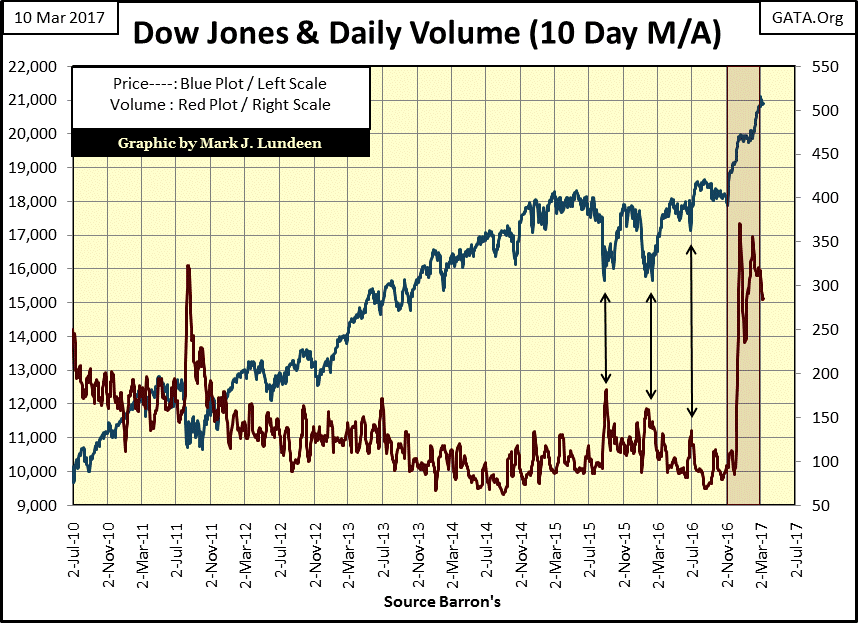
The stock market, as measured by the Dow Jones Index seems to be at an inflection point. It hasn’t seen a new all-time high since March 1st. And for what it’s worth, trading volume (market demand) for the 30 blue-chip companies contained in the Dow Jones Index is falling off. It needs to be noted that until just last November, the Dow Jones had been defying the law of supply and demand for the better part of two decades.
Since January 2000 the Dow Jones has been rising on falling volume, and declining on rising volume. There’s no mystery here; the “policy makers” via monetary inflation from the FOMC, were supporting the market during market declines, and withdrew their support on market advances. It’s the old “Greenspan Put” in action.
If basic economic laws are once again to apply to the Dow Jones, as was the case from January 1900 to January 2000 (100 years), should trading volume continue declining, it will not support the Dow’s current market values as we move further into the year.
But this all rests on the speculation that for the first time since January 2000, the “policy makers” will do nothing as the Dow Jones experiences a double-digit percentage decline. With Donald Trump now sitting in the Oval Office, I wouldn’t be surprised if this is exactly what the FOMC intends on doing, as they, and everyone else in Washington, thinks long and hard on how best to impede the Trump administration’s efforts to drain the swamp in Washington.
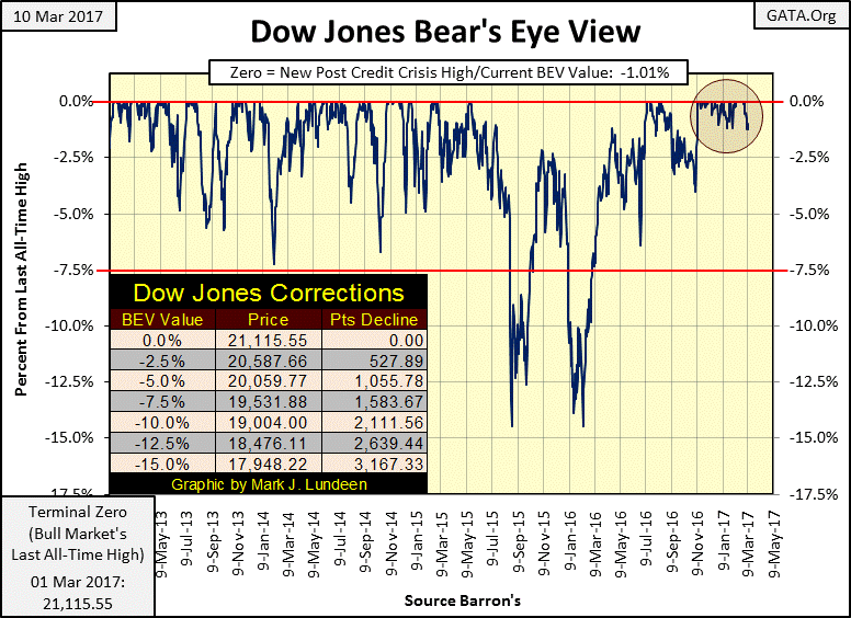
The Dow Jones closed the week 1.01% from its last all-time high of March 1st. But on Wednesday it closed 1.23% from it; just short of the half-way point between the 0.00% and -2.50% lines. That’s interesting. This was the furthest from a BEV Zero (a new all-time high) the Dow Jones has found itself since the beginning of last November (four months), as seen in the circle in the BEV chart below.
I’m not expecting the beginning of a stock-market crash next week as a result of what happened last Wednesday. However, understanding this event as signaling the turn in the tide of the tsunami of “liquidity” flowing into the stock market since the presidential election isn’t an unreasonable assumption to make. If sometime next week the Dow Jones closes nearer to its BEV -2.50% line below than its BEV Zero line, something greater than -1.50% from its last all-time high of March 1st, I expect the stock market is signaling a significant correction, the first in over a year.
The table in the Dow’s BEV table below shows the dollar declines required for the Dow Jones to break below the listed BEV lines. A 10% correction in the BEV chart below would take the Dow Jones down to 19,000, a 2,111 point decline from its last all-time high of March 1st.
Looking at the NYSE 52Wk Highs and Lows supports this view; that the flood tide has turned to an ebb tide in the past few weeks. Below is the chart for the NYSE 52Wk High-Low Ratio. The data points are computed by taking the daily net of the NYSE 52Wk High – 52Wk Lows, and divide that by the number of shares traded at the NYSE that day.
Looking at the last 20 years in the ratio, one thing is made very clear; fear is a more powerful emotion in the market than is greed. Since January 1996, the ratio has breached its +20% line only once (April 2010). But breaking below its -20% line is common in market declines.
The ratio peaked years before the Dow Jones did during the NASDAQ market bubble. But then for the mortgage bubble, seeing the ratio decline to -31% in August 2007 was an excellent predictor of the Dow Jones mortgage bubble peak that followed only two months later.
In the following year, the NYSE 52Wk High-Low Ratio fell below -85% in October 2008 (Square) as the Dow Jones saw its first -40% market decline since 1974. But note what the ratio did when the Dow Jones saw its credit crisis market decline bottom. In March 2009, on the second deepest market decline in Dow Jones history (since 1885), a 54% crash in valuation; the ratio declined only to -26% (Circle). Seeing the NYSE producing so many fewer 52Wk Lows in March 2009 than it did a half year earlier in October, signaled the bottom was in.
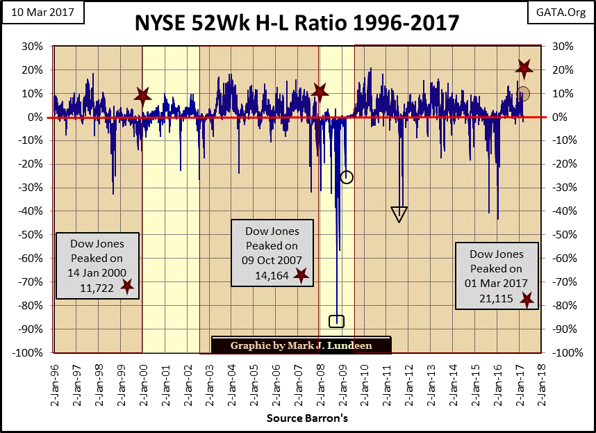
So, in March 2017 what’s the ratio telling us now? The first thing I note is how since January 2016, when the ratio last broke below its -40% line, the NYSE has seen very few days with more 52Wk Lows than Highs. Until this week, there has only been thirteen trading days at the NYSE with more 52Wk Lows than Highs since 24 Feb 2016. Looking at the chart above, this desert of 52Wk Lows is something not seen since the 1990s, and then again in 2003-04. But this week we saw four days at the NYSE with more 52Wk Lows than Highs; interesting.
The table below displays the NYSE 52Wk High Low data for January 2016, and for the past month. Note the peak in 52Wk Lows for January 20th of 2016: 1,393. Typically on market declines, and advances, the NYSE 52Wk data will hit an extreme, marking an important psychological turning point in the market. This peak in NYSE 52Wk Highs or Lows may not mark the exact high or low of the Dow Jones, or the other major market indexes. But for the NYSE’s 52Wk Highs and Lows, things quickly reverse, and the major market indexes will soon follow.
Look at the 1,393 52Wk Lows on 20 January 2016; the following day there were only 100 52Wk Lows, and a month later 52Wk Highs were to dominate the NYSE for the following year
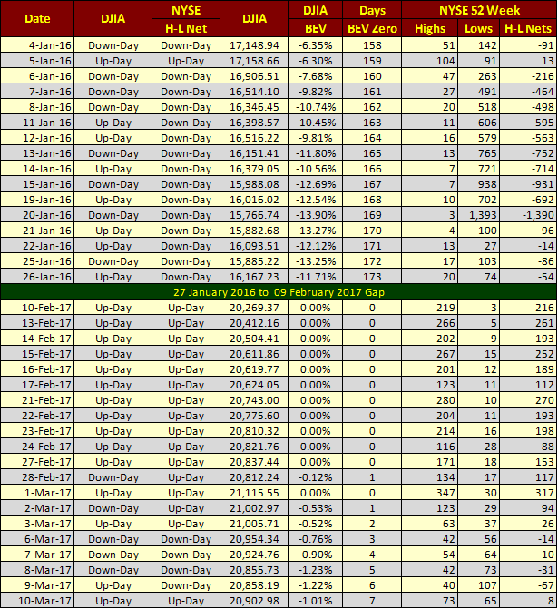
Moving on to the last month’s data in the table, the Dow Jones made its last all-time high on March 1st, as the NYSE saw 347 new 52Wk Highs. Since then 52Wk highs have been declining. Then on March 9th 52Wk Lows were in the triple digits for the first time since December 15th; three months ago.
I’m not saying we’re at the cusp of a major market decline. But if we were, this is what the NYSE 52Wk High Low data would look like.
I hear that the US Treasury’s debt limit is to become an issue again come next Wednesday (March 15th). The last time the US debt limit became an issue in the market was in August 2011. Take a moment to review the NYSE 52Wk High-Low Ratio chart above to see what happened then (Triangle). It wasn’t a good time to be in the stock market. And then the FOMC has almost guaranteed everyone that they’ll increase their Fed Funds Rate next week. The next few trading days at the NYSE promises to be interesting for us market watchers!
Where did the DJTMG’s top 20 close the week at? Unchanged for the week at forty eight. I expect this series post credit-crisis bubble highs will prove to be the 52 seen in July 2014. If the NYSE is soon to be dominated by 52Wk Lows for an extended period, we’ll soon see the top 20, and the major market indexes follow.
I’m not in the business of selling hot market tips. I provide good market research for my readers to assist them in making their own decisions. Sometimes that will prove to be profitable, and then sometimes not. But really, after the gains from the stock market’s March 2009 bottom, how much more in the way of capital gains can this market provide investors? If someone were to tell me they were getting out of the market, and not come back in for the next three years – I wouldn’t talk them out of doing so!

So how are gold and silver prices doing? Could be better, and then it could be worse. Here’s silver with its step sum going back to 1998. Since its highs of April 2011, silver has seen a net of 15 up days in its step sum, as its price declined by 63%. I frequently take a look at silver and its step sum, if only for the comic relief it brings me during its market declines.
Silver was also like this during the 1980 to 2002 bear market; more up than down days as its price remained 90% below its highs of January 1980 for twenty years. It is what it is! Like when silver resumes it bullish advance, we’ll see its step sum once again rise up as it did from 2002 to 2011.
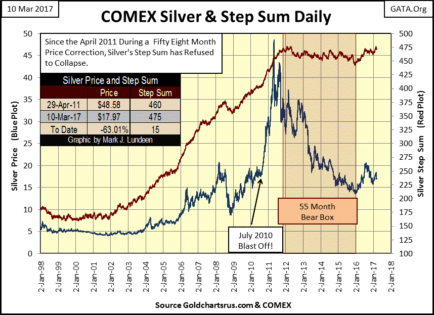
Finding silver down 65% from its highs of April 2011 is pretty darn bad; how could it get worse? Look at what silver did after its last all-time high in January 1980; it soon found itself down over 90%, and pretty much stayed there for the following two decades.
This chart illustrates something I call inflationary base-line shifts, where old resistance levels become new lines of support. The first base-line shift for silver occurred shortly after the August 1971 decoupling of the dollar from its $35 gold peg. Shortly thereafter, $5 stopped being an overhead resistance level, and became a line of support in the price of silver for the next thirty years.
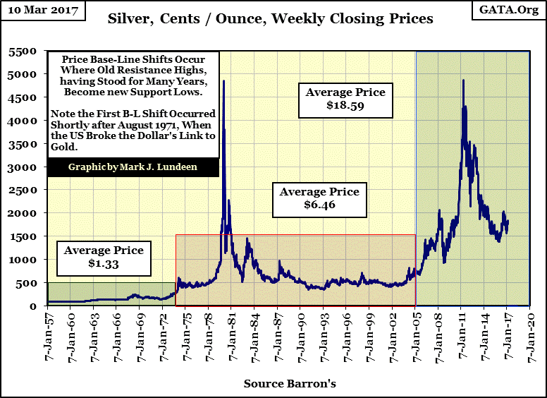
It’s been twelve years since we’ve last seen silver trade anywhere near $5. So looking at silver’s chart above, I’d say when the “policy makers” inflated their sub-prime bubble, they also pushed the silver market into a higher base-line shift sometime in 2004-05.
But there’s something wrong with this chart of silver and its base-lines shifts. Looking at gold’s base-line shifts since 1957 below; do you see the anomaly above? Silver’s $50 resistance level from January 1980 is still in place, and seeing $50 silver evolving into a floor in the market is still far from becoming a reality.
This is not so for gold’s $840 resistance level from January 1980. It’s been replaced with one at $1,888 with $840 gold now deep in market support. And the current level of resistance WILL NOT BE the final line of resistance in gold’s current base-line shift. The inflationary monetary policy of the past two decades demands that gold will one day trade at something over $20,000.
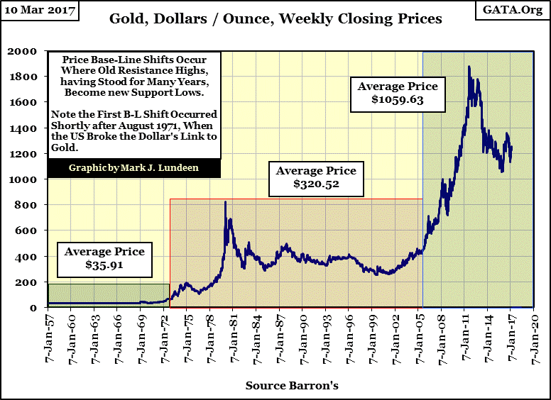
You think that’s impossible? With the guys at the FOMC printing dollars at break neck speed (chart below), I don’t see how gold could fail to trade over $20,000 sometime in the future. It’s just that it’s not going to happen next week.
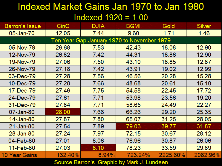
Currently, monetary inflation is behaving as the dudes setting “monetary policy” at the FOMC would like it to; flowing into financial assets, not into the old monetary metals or into the cost of living. But things can change, as they did after Barron’s 05 January 1970 issue in the chart’s insert below.
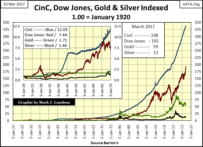
The following table is a better graphic to visualize what happened during the 1970s, when newly created dollars flowing from the Federal Reserve behaved badly; flowing into commodities and consumer prices. That plus rising interest rates and bond yields deflated the debt markets, sending flight capital towards precious metals investments.
CinC inflation from 1970 to 1980 never stopped, but it did stop flowing into the Dow Jones and the stock market. In the ten years from January 1970 to 1980, CinC inflation increased by 132%, as the Dow Jones only increased by 8.94%. In a decade where double-digit CPI inflation became normal, investing in the stock market became an inflationary mug’s game.
But note how in the 1970s CinC inflation formed new channels, and began flowing into precious metal assets. And their indexed gains in January 1980 were much greater than CinC’s indexed gains. Keep in mind, gold, silver and their miners are like tiny barnacles on the side of the whale known as the financial markets. It really doesn’t take much in the way of “flows of liquidity” from a deflating financial market to get an oversized reaction in the gold and silver markets.
Returning to silver and gold’s base-line shift charts, to make my point that the price of silver has been greatly retarded – as seen in its base-line shift chart with its $50 resistance from 1980 still in place, here are some other commodities base-line shift charts. Like gold (and unlike silver) they have all left their resistance high of the early 1980s far behind.
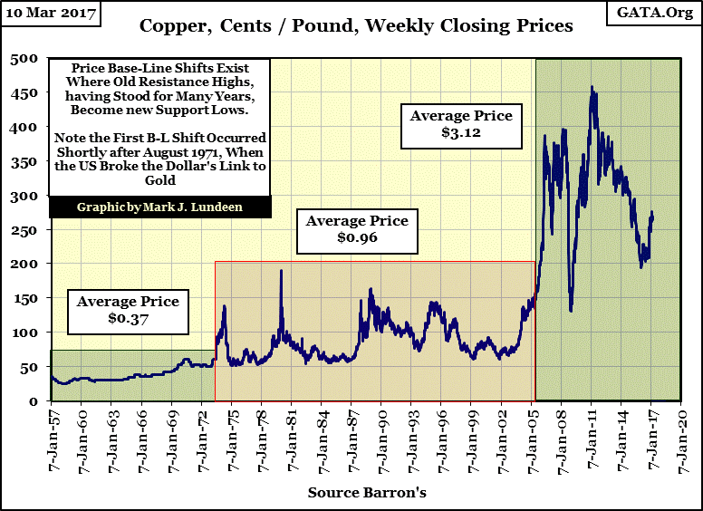
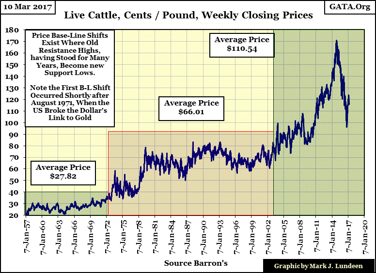
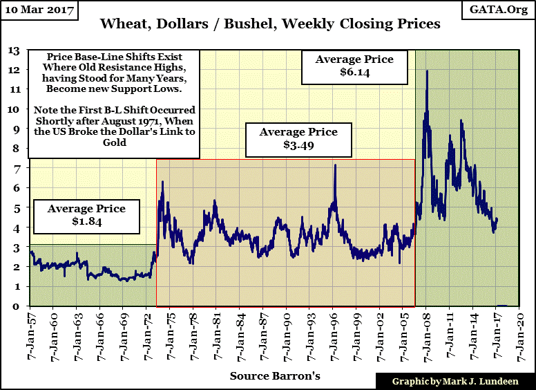
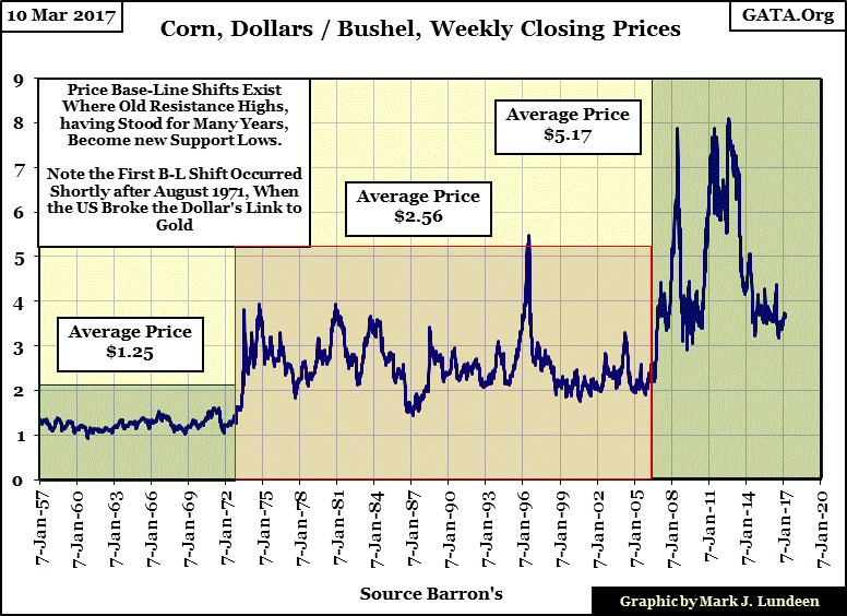
I must admit my commodity price data going back to 1957 is rather limited. But looking at the data I do have, it’s obvious how shortly after the US Treasury decoupled the dollar from its Bretton Woods $35 gold peg in August 1971, commodity prices experienced an upward base-line shift. And the same thing happened again during the sub-prime mortgage bubble; around 2005 commodity prices once again saw an upward base-line shift; where old resistance levels become new areas of support. Except for silver, whose price structure hasn’t changed much since the 1980s.
Currently, for the price of an ounce of gold, one could purchase over 70 ounces, or 4.3 pounds of silver. I expect silver will prove to be the superior investment as it seems silver has some catching up to do with the rest of the commodity market. But when? Like me, you’re going to have to wait to find out – damn it.
Mark J. Lundeen
[email protected]
More from Gold-Eagle


