Bond Yields Continue to Rise


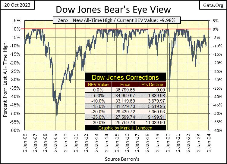
The Dow Jones closed the week with a BEV of -9.98%, a mere 0.02% from being a double-digit BEV value (-10.0% BEV). I take this to mean the Dow Jones is going down, but not fast enough to alarm the investment public; not yet anyway. Give it time, it will.
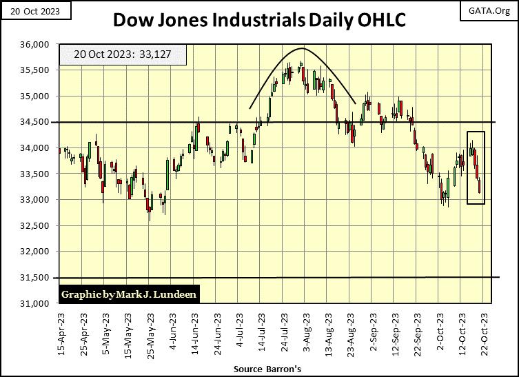
Here is the Dow Jones in daily bars, displaying a more brutal picture for the week. For the month of October, the Dow Jones was advancing. But try as it might, it failed to close above 34,000 before Mr Bear this week, took the market into full reverse. In the past three trading days, most of the gains of October have been erased – in only three trading days.
It seems the Dow Jones is finding it easier going down than up. This is exactly the type of market best enjoyed by sitting high above the playing field, safe in the market’s peanut gallery.
I haven’t published the Dow Jones with its 52Wk High & Low lines for a while. This seems like a good week to review the Dow Jones with its 52Wk extremes, so here it is below.
The Dow Jones this summer did make a new 52Wk High, but it was below the 52Wk High / All-Time High of 04 January 2022, and has since turned down. What kind of bull-market advance is that?
Take a moment to study the chart below; since 2015, whenever the Dow Jones made a new 52Wk High, it was also making a new all-time high. So it was for five years, but things changed after January 2022. Then this summer the Dow Jones made a few new 52Wk Highs, but doesn’t seem interested in making a new all-time high.
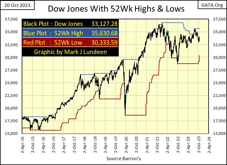
In a couple of months, the last all-time high for the Dow Jones will be two years old, getting staler by the day. If in the past two years the bulls haven’t taken the Dow Jones into market history, can they do so in the next two years?
Sure, they could. But that doesn’t seem likely. What is more probable is seeing Mr Bear in the next two years drag all the hopes and desires of bullish retail investors downward, towards the 15,000 line in the chart below.
In October 2023, being a bull on the stock market is increasingly becoming a bad habit. A bad habit Mr Bear is going to help retail investors break, on the Dow Jones’ journey to unknown depths, somewhere far below this week’s closing price of 33,127.
I’ve mentioned many times in the past years that the Dow Jones is my proxy for the broad-stock market. Over the many decades the Dow Jones has been published daily by its publisher (Dow Jones), it did exactly that; mimic the movements of the majority of the stocks trading at the NYSE.
However, currently my proxy for the broad-stock market is at the #2 position in the BEV table below, one of only two major stock indexes not to have a double-digit BEV value. Not much of a proxy for the broad-stock market, when every other major stock index has deflated more than 10% from their last all-time highs, some by much more than 10%.
Look at the market’s small-cap stocks, as measured by the Russell 2K Index (#18). The Russell 2K closed the week down 31.19% from its last all-time high. A point that should be everyone’s concern, is how poorly the financial indexes are doing. The NYSE Financial Index (#16) closed the week down 21.76% from its last all-time high, and the NASDAQ Banking Index (#20) is down a stunning 46.83% from its last all-time high.
Could these depressed BEV values be markers, leading indicators of a bear-market bottom in finance? I don’t think so, not with the massive debts’ individuals, corporations and governments are now carrying in a rising bond-yield environment. We aren’t going to see any bottom to this bear market until massive defaults, shocking market events of corporate and individual ruin become daily news events, even in the main-stream media.
What that will do to the BEV values of the major market indexes seen below will be very ugly; BEV values way below -50%, with the XAU being the likely, and very profitable exception. That would be a market event similar to the valuation collapse seen during the Great Depression, and why not? This market shares much in common with the market during the depressing 1930s – the Federal Reserve’s abusive “monetary policy” and credit creation during the previous bull market boom.
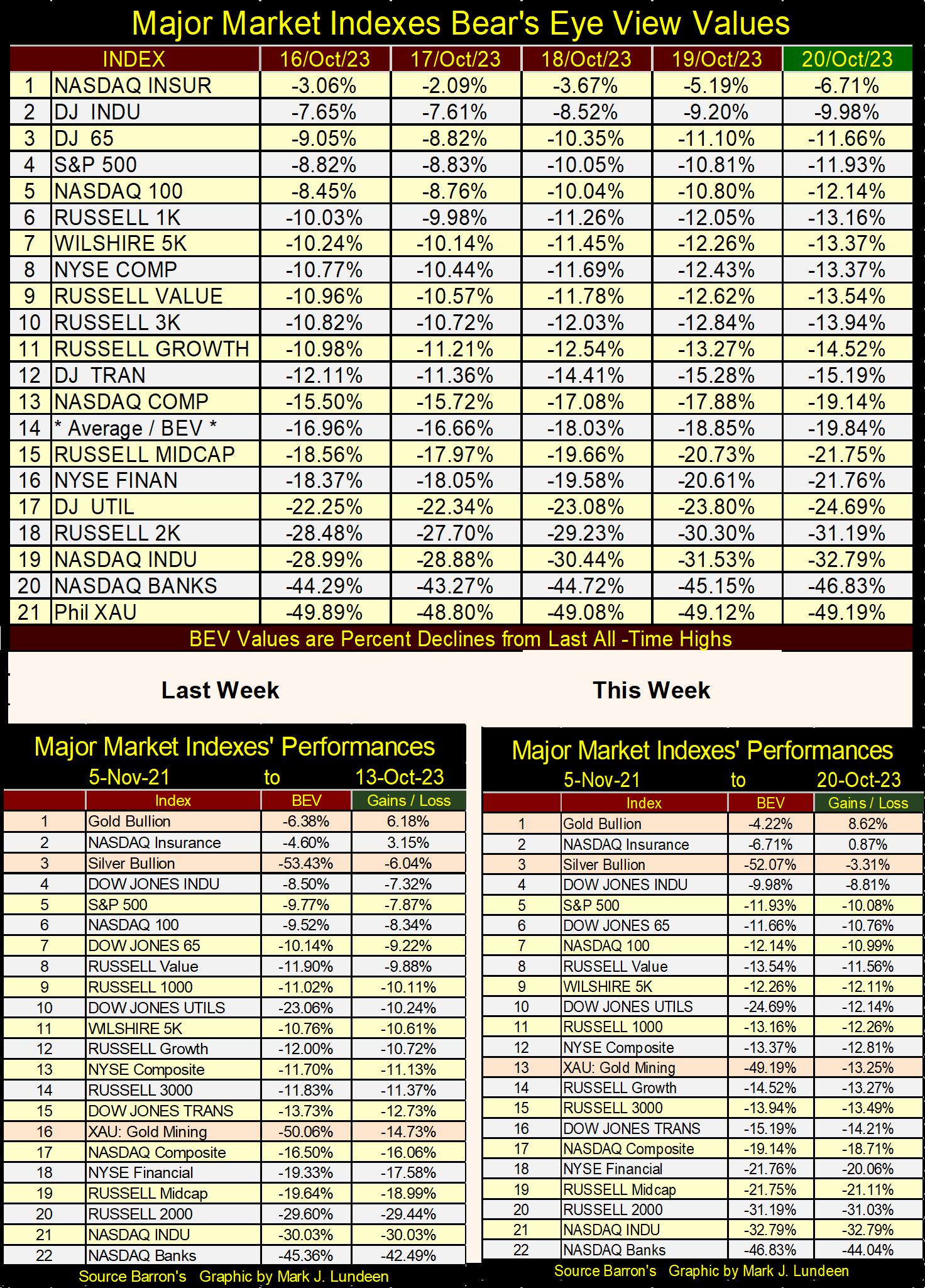
In the performance tables above, precious metal assets once again had a good week. The percentages in the Gains / Loss column, are the gains / losses from 05 November 2021, the market top from the post March 2020 Flash Crash recovery. Other than gold (#1) and the NASDAQ Insurance Index (#2), everything else is down, most by double-digit percentages in the past two years. It will only get worse as time goes by.
What is the problem? The financial system is dying from a loathsome disease it somehow contracted while walking the streets in lower Manhattan. Thanks to a financial system, controlled by a bunch of idiots at the FOMC, everybody, and everything has been getting their regular “injections of liquidity” from the FOMC. After decades of this malpractice in credit, we are now in the terminal phase of this disease.
Geeze Louise, when interest rates were declining from 1981 to 2020, it felt so good to feel that needle, held by an idiot “inject” all that goodness into the financial system. But with yields and rates now increasing, the consequences of these “injections” of cheap credit are now becoming painfully self-evident, to all the credit junkies hanging around Needle Park.
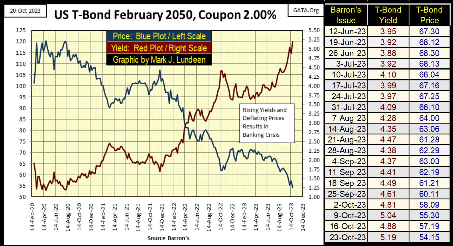
For the 30yr T-bond below, issued in February 2020 with a coupon of only 2%, this week it closed with its current yield over 5% (Red Plot). From its highs in August 2020, its valuation (Blue Plot) has deflated by 54.9%. Yeah, the credit junkies that had this turkey “injected” into their portfolio, are now upchucking their net worth somewhere in Needle Park.
This is a T-bond, the stuff the US national debt is made of. The US national debt closed the week at 33.629 trillion dollars. Looking at the T-bond below, one must wonder what the actual market value of the US national debt, now trading in the debt markets, actually is? Above or below 20 trillion dollars?
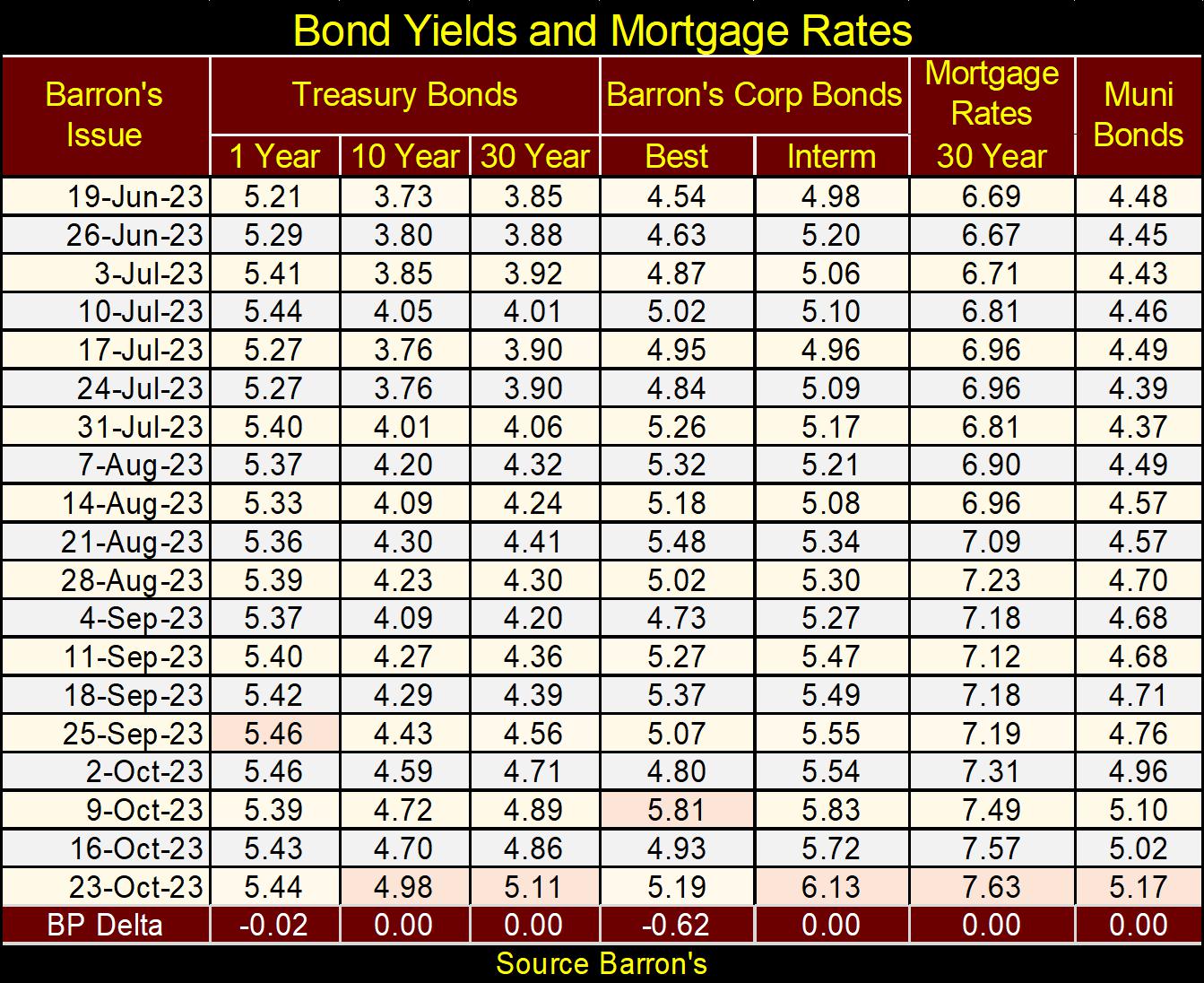
Here is my table listing some of the bond yields and mortgage rates I follow. Until these yields and rates peak, thinking about the pleasant-green pastures the bulls once graze on, is only delusional day dreaming. How high could these yields rise up to? Higher than today’s “market experts” and Wall Street economists believe possible. We are in the very early stages of a massive bear market, where counterparty failure, and debt default will be the leading market commentary for a long time. Whatever that means, we’ll all find out together.
There was a time when the seeing the yield curve invert, having the Fed Funds Rate higher (Blue Plot Chart below) than long-term T-Bond yields (Red Plot below) resulted in a flood of bear-market warnings from the financial media and market watchers. For good reason too; the inversion of the yield curve indicated FOMC has decided it’s time to pop the bubble they’ve inflated somewhere in the economy.
Today, chart below, the yield curve has been inverted since Barron’s 21 November 2022 issue, for almost a year, with little note by the financial media, or apparent effect in the stock market. That is odd. Though, due to the soaring bond yields, red plot below, valuations in the bond market have greatly deflated in massive bear market since January 2022.
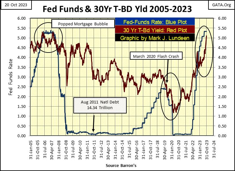
I’m more than just a little amazed after seeing the yield curve invert as seen above, the Dow Jones (my proxy for the broad stock market) is down only 9.98% from its last all-time high of 04 January 2022. That was almost two years ago, two years of nothing much for investors in the stock market. Looking at the yield-curve chart above, with its current inversion, I don’t expect the current good times on Wall Street, such as they are to continue for much longer.
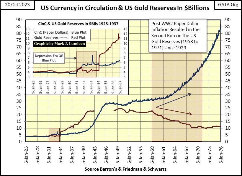
The key to understanding this market is to study the history of the bond market, with this chart plotting the yield for the US Long T-Bond going back to 1952 (two charts down). Long T-bond yields began rising in 1958, when a run on the US gold reserves began. Why would a run on US gold begin in 1958? Because the US Federal Government implemented a monetary policy of inflation, of printing more paper dollars (Blue Plot below) than the US Treasury had gold (Red Plot) to back them.
That is the essence of a gold standard; the volume of paper money is limited by the availability of gold to back it. A $35 gold peg is just that; no more than $35 paper dollars for each ounce of gold held by the US Treasury. But politicians love spending dollars, as much as their constituents’ love receiving them. As the $35 gold peg limited the supply of dollars they could spend, they did away with it.
In January 1976, chart below, the US had about $85 billion paper dollars in CinC, far above its reserves of gold. This week the Federal Reserve reported CinC at $2,325 billion dollars. That is monetary inflation on a massive scale. But then the Federal Reserve is the great engine-of-inflation, the fountain head of “liquidity” responsible for every boom and bust on Wall Steet since 1913 when Congress legislated it into existence, that plus it is the source of rising consumer prices for the past 110 years.
Here are a few quotes on paper money inflation from Howard Buffett, Warren Buffett’s father.
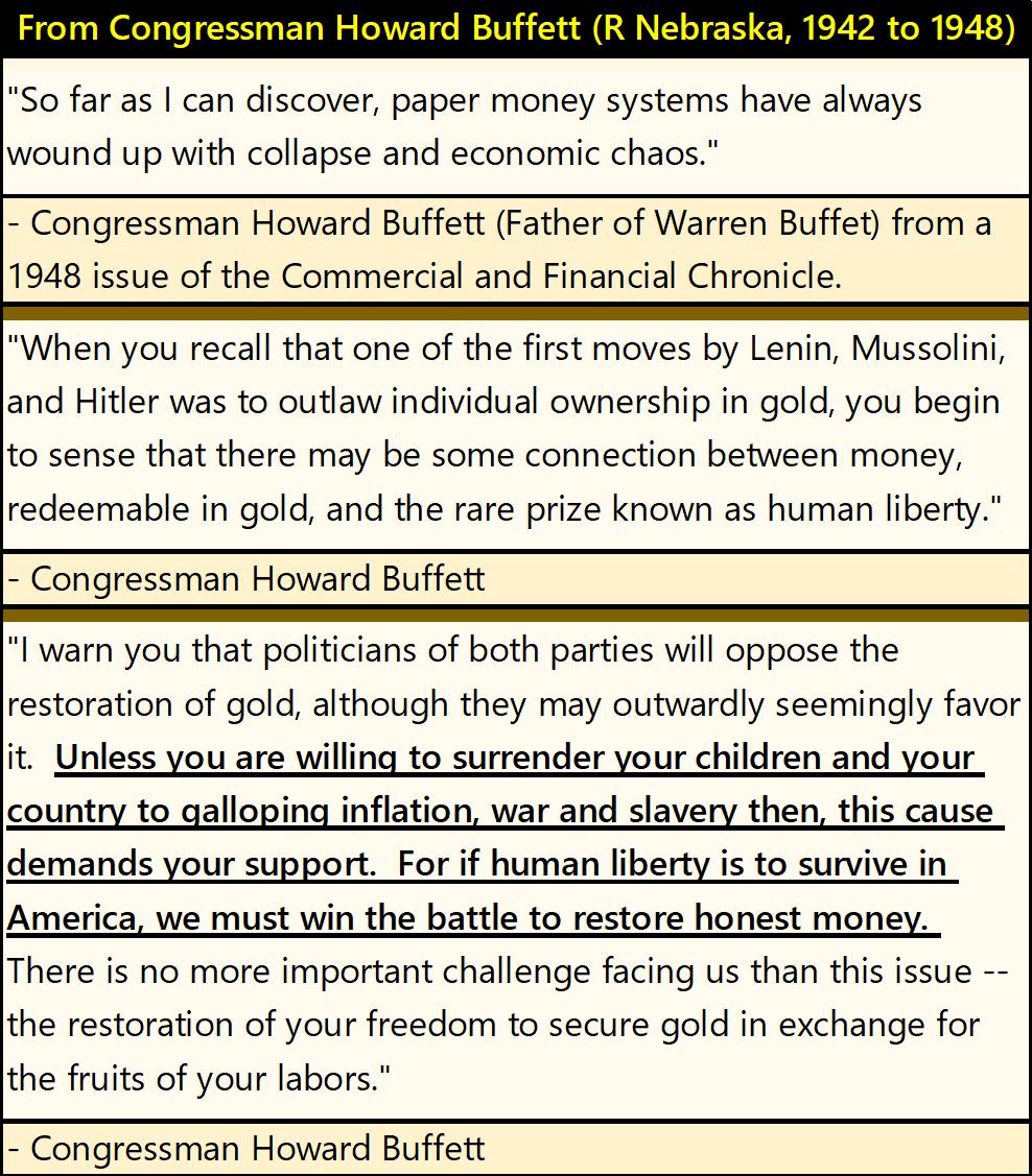
Look around you. Have Howard Buffett predictions from the 1940s proven correct?
The run on the US gold reserves ended when the US Treasury “closed the gold window” in August 1971. This prevented foreign central banks from exchanging their ever-growing piles of paper US dollars into US gold, at a rate of $35 paper dollars for an ounce of Treasury gold, which they could, and did before August 1971.
Now freed from honoring this $35 gold peg, the US Treasury and Federal Reserve began increasing the volume of paper-dollars in circulation. No longer were they worried about those pesky foreigners demanding the Treasury’s gold reserves, for the good reason they knew the US dollars they held in their banking reserves were losing valuation due to monetary inflation.
Soon thereafter, gold entered a bull market as Treasury long-bond yields, and consumer-price inflation continued rising, to double digit percentages by the late 1970s. The bull market in gold peaked in January 1980, T-bond yields peaked in October 1981.
As bond yields, and consumer-price inflation began declining, gold became locked in a massive twenty-year bear market, as a massive bull market in stocks and bonds at the NYSE began in August 1982. Monetary inflation flowing from the Federal Reserve inflated the Dow Jones from 776.92 on 12 August 1982, to 36,799.65 on 04 January 2022, an increase in valuation by a factor of 47.36 over a forty-year span.
That was the boom. The bust has already begun in the bond market, we are now waiting for the bust to begin in the stock market.
Gold’s twenty-year bear market ended in February 2001, when it closed at $255.10, down 69.1% from its high of $825.50 on 21 January 1980. It’s important noting gold’s second bull market began when the NASDAQ High-Tech bear market was still the leading story in the financial media. The media over the past twenty-two years has said little about the rising price of gold, though they seem much interested whenever the price of gold and silver are going down.
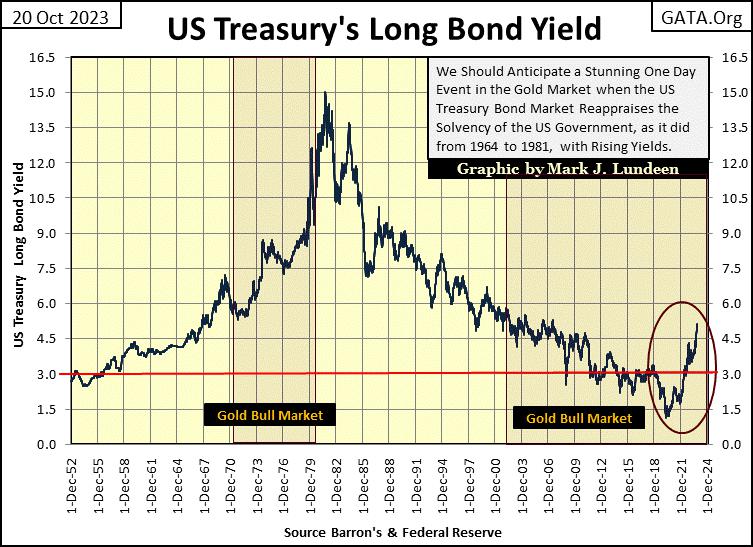
Yields for Treasury long-bonds bottomed in August 2020, about the same time gold saw its last all-time high. Since then, in the past three years bond yields have soared as gold has struggled to break above its last all-time of August 2020.
But why are bond yields now going up? First, we should ask why did 30yr T-bond yields decline to 1.20% in August 2020? I’m no economist. I have no academic background in the markets, but as a market enthusiast I’ve followed the markets for decades. I remember what these makers of “monetary policy” said, and did, and they manipulated bond yields down to absurd levels because they said they wanted to “stimulate economic activity,” also known in the financial media as “growth.”
This “growth” and lower bond yields greatly benefitted the big houses on Wall Street, making their derivatives desks hugely profitable, as it inflated a huge bubble in the stock and bond markets.
However, since August 2020 things have changed; with bond yields now going up with rising consumer-price inflation, as they did in the 1970s. How much longer must we wait, until like in the 1970s, before gold, silver and precious metal mining shares once again become the biggest bull market in finance?
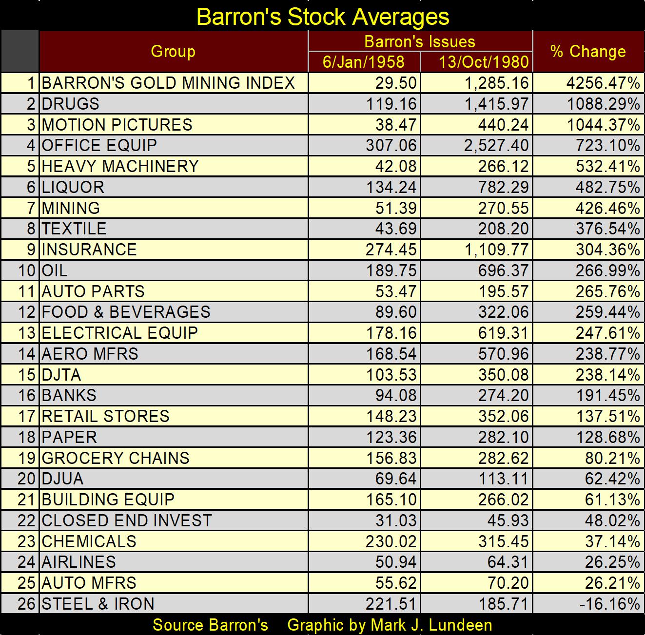
This is now long forgotten, but from January 1958 to October 1980, a prolonged period of rising bond yields and interest rates, the Barron’s Gold Mining Index was the top performer in the Barron’s Stock Averages, by a huge measure, as seen in the table below.
30Yr mortgage rates this week closed at 7.63%. Looking at my mortgage data as published by Barron’s, chart below, one must go back to December 2000 to see rates higher. In other words, this week mortgage rates closed at twenty-three-year highs.
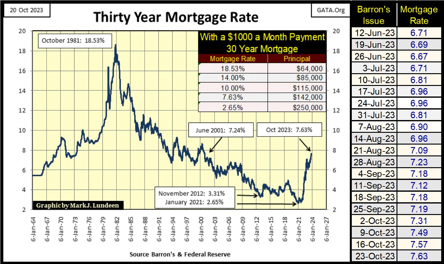
One thing seldom seen today, is the occasional for-sale sign on lawns as we drive through the city, because mortgage rates are at twenty-three-year highs. Look at the table in the chart above. In January 2021, 30yr-mortgage rates were at historic lows – 2.65%, and a 2.65% mortgage rate qualified anyone with the ability of servicing a 30yr-mortgage with a $1000 a month payment, a $250,000 mortgage.
But that was the top of the market. Three years later, in October 2023 mortgage rates have increased to 7.63%, and now a $1000 a month payment only qualifies a prospective homeowner with a $142,000 mortgage. In other words, this increase in mortgage rates has contracted the credit available to the mortgage market by a massive 43.2% in the past three years.
People have postponed selling their homes, as they are waiting for the market to turn. That is why the for-sale sighs on people’s lawns are now seldom seen. But this is a bear market in real estate, Mr Bear is now squeezing those homeowners who want to, but won’t or can’t sell at current market prices. Mr Bear is a real bastard, someone incapable of compassion when it comes to easing distress in a deflating market.
One of my younger relatives told me the county continues assessing their property’s market valuation higher, which is ridiculous in a real estate market subjected to rising mortgage rates for the past three years. But the banks holding their mortgages don’t think so. So, their banks have jacked up their escrow expenses by over a $1000 annually to cover their property’s rising insurance costs, associated with rising housing prices, in a real estate market that is actually suffering a general deflation in market valuation.
As they teach kids today in college; we live in a jungle, where the strong eat the weak. Of course, to learn that life-lesson from the experts in academia, most kids have to take on over $80,000 in school loans. Who said bankers and academics don’t have a sense of humor?
As noted before, following every boom inflated into the market by the idiots at the FOMC, comes a bust. The only question in my mind is; will this bust in real estate bottom with mortgage rates above, or below the 18.53% seen in October 1981? As a big bear, I’m thinking mortgage rates will soar above the old all-time high of 18.53%. That, or the mortgage market as we know it, will completely self-destruct, and mortgage rates become a historical curiosity noted in economic history books.
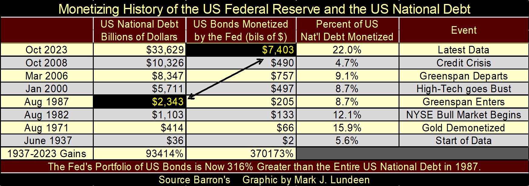
That isn’t impossible. Look at the “monetary” shenanigans our politicians have allowed academic idiots at the FOMC and Wall Street’s bankers to do to America’s finances (table below). The holdings of T-debt monetized by the Federal Reserve in October 2023, is 316% greater than the entire US national debt in August 1987, when Alan Greenspan became FOMC idiot primate at the Fed.
No country can survive idiocy at this level in its national financial affairs and survive.
Here is something that should cheer my readers up; gold closed the week in scoring position in its BEV chart below. About a month ago, I was wondering whether gold would next cross its BEV -15% or -5% line, and now in late October we now know it was to be gold’s BEV -5% that would be crossed.
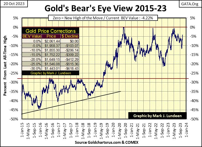
Gold closing the week in scoring position is a notable market event, that plus the bottom gold is now rising from was only a BEV of -11% or so. If gold was in a bear market, one would have expected its BEV value to have broken below last’s autumn’s low of a BEV below -20%, and that didn’t happen.
Should this uptrend in gold continue, we may see gold close at a new all-time high in the next few weeks, or maybe next week.
In gold’s step sum table below, the easing of selling pressure is on display. That the price of gold is responding so well to the increases in daily advances is very encouraging. Also worth noting is how gold daily volatility’s 200D M/A is going up, closing the week at 0.64%. Gold bull markets are volatile markets. If this week’s advance in the price of gold is legit, we’ll soon see daily volatility rising above 1.00%.
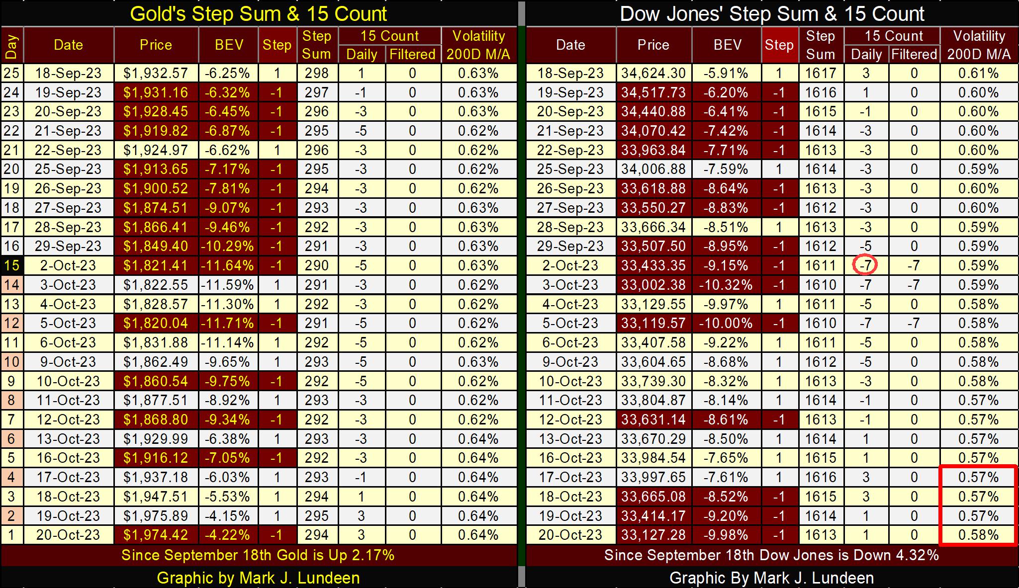
The Dow Jones has also seen an increase in advancing days since October 3rd. And like gold, the Dow Jones was going up with this increase in daily advances. But then came October 18th through October 20th, when this advance was shut down hard.
I placed a red box over the Dow Jones daily volatility’s 200D M/A for the last week, to point out that daily volatility on Friday closed at 0.58%. Question; did daily volatility for the Dow Jones bottom on Thursday with its 0.57%?
If so, the stock market may be heading into a new deflationary phase in the twilight of 2023. Should we see days of extreme market volatility, 2% days for the Dow Jones in the next few weeks, daily volatility will soon be going up, and the Dow Jones going down. I’m not making a promise on this, just thinking of what could be.
Mark J. Lundeen
*********


