Bull And Bear Step-Sum Boxes In the Dow Jones, Gold And Silver


The step sum is a single item Advance – Decline Line using the daily closing prices of a market price series, but hourly or weekly data would work. Should gold, silver, or the Dow Jones close higher than yesterday’s close, it’s a +1. Should they close lower it’s a -1. The step sum is merely the sum total of the number of plus days and minus days plotted over time – a single item advance-decline line.
One of the surprising things about all markets is that there are always about as many up days as down in both bull markets and bear. For instance in the 11,755 trading sessions at the NYSE since January 1969, there have been 5,665 sessions with the Dow Jones closing down, and 6,090 with the Dow Jones closing up. That’s a net difference of only 425 up days over the past forty seven years. Yet thanks to this slight difference between up and down days since 1969, the Dow Jones has increased from 940 to over 18,000.
The step sum is a sentiment indicator of the only people who really matter in any market: those who show up day in and day out to buy and sell. If as a group these people are bullish they will bid up the market price, driving the step sum up over time. If they are bearish they will liquidate their holdings allowing the market to sell off, with the step sum following the market price down. So typically when a market trends higher, it does so with its step sum following along. This is true during bear markets as well with the step sum following the price trend down.
But there are times when a price trend and its step sum decouple, forming what I call a step-sum box. Within these boxes market sentiment, as measured by the step sum, contradicts the market’s primary-price trend. There are two types of step-sum box, identified by the price trend: Bull and Bear Boxes. In general within a step-sum box the price trend is the superior indicator of the primary-price trend’s future direction than is its step sum.
The chart below plots the step sums for gold, silver and the Dow Jones from 02 January 1969 to present. Interestingly silver (Green Plot) has seen the most net up days, yet since January 1969 its price has advanced the least. But that’s not really fair as silver is currently in a bear market, dropping 70% in price since April 2011. Just look at its step sum; four and a half years into a massive bear market yet its step sum still refuses to collapse. This is because after every down day in the silver market the bulls are back bidding up the price the next. Truth be told, these people are most likely the same ones buying it on the down days.
The most logical reason for silver’s intractable step sum is that silver is much more than an old monetary metal investors purchase to hedge their inflation risk. It’s also an industrial metal required by industry for its unique chemical, medical and electrical properties. Though essential for cell phones or automobiles, the cost of the silver used in an IPhone or car is insignificant, even if the price of silver rose to hundreds of dollars an ounce.
Unfortunately, industry and consumers don’t recycle silver. It’s just not economic with current prices. Many billions of ounces of silver have passed through assembly lines on the way to consumers, and ultimately to the world’s landfills – gone forever. No doubt about it; the mishandling of one of the Earth’s precious metals is a tale of woe, except for those purchasing silver at today’s ridiculous low price with the patience to outwait the current bear market.
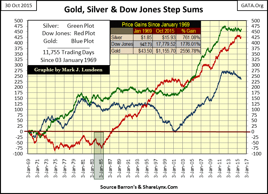
Moving on to gold’s step sum above (Blue Plot): of the three step sums it has had the fewest net advancing days since 1969, yet has enjoyed the largest price advance. Gold’s current bull market, which began in 2001, can easily be identified by its step sum which for the first time since the 1970s took off along with the price of gold. Our current four year 40% correction in the price of gold is also easily identifiable, as gold’s step-sum began trending sideways.
The Dow Jones step sum (Red Plot) has seen almost as many net up days as has silver, while its price has increased nearly as much as gold. Just keep in mind that the Dow Jones (and its step sum) may currently be near all-time highs, but only after six years of ZIRP and QE. Using step-sum plots spanning decades, we can identify those times when it was profitable to be in the market and when it wasn’t. However it’s not always that easy. The green box on the Dow Jones step sum identifies a seven month bull box at the beginning of its historic 1982-2000 bull market, when the Dow Jones was rising while its step sum was collapsing. For now let’s have a look at the massive bear box that developed during the Great Depression stock market crash (chart below).
Bull and bear step-sum boxes form during emotional periods in a market, when market sentiment detaches from market reality. That’s why the box is labeled bull or bear according to the bullish or bearish price trend, not the sentiment based step-sum trend which is usually incorrect when decoupled from the price trend.
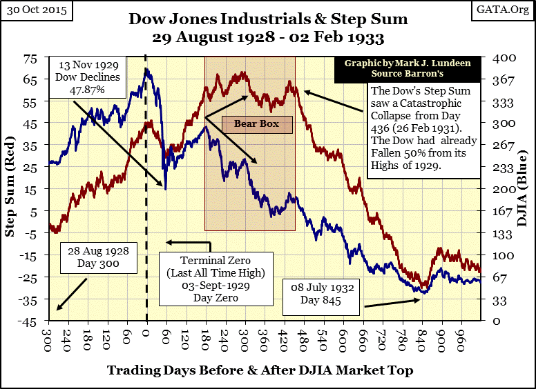
The final all-time high of the Roaring 1920s bull market occurred on 03 September 1929. Just sixty trading days later the Dow Jones had crashed 47.87%. This was the second largest Dow Jones decline since 1885 when Charles Dow first compiled his stock market averages exceeded only by the crash of 1907 (48.54%). To provide a little insight into what was to follow, from 1885 through January 1930 the Dow Jones had never declined more than 49%. After a traumatic 47.87% collapse in just sixty trading days, the worst surely had to be over, or so it seemed to the market survivors in November of 1929.
During the opening crash of the 1929-32 market disaster, the Dow Jones’ step sum (Red Plot) faithfully followed the Dow Jones price trend (Blue Plot) downward, just as it followed the Dow Jones up during the November 1929 to April 1930 dead cat bounce. However, in April 1930 the Dow’s step sum decoupled from its price trend, forming the bear box in the chart below. Over the next ten months as the Dow Jones suffered unprecedented percentage declines, its step sum either increased or trended sideways. It wasn’t until the belated collapse in the Dow Jones step sum in late February 1931 that the bulls finally understood that this was a bear market with no bottom. For the next nineteen months the Dow Jones’ values imploded as its step sum collapsed, until July 1932 when the Dow Jones had fallen 89% from its highs of September 1929.
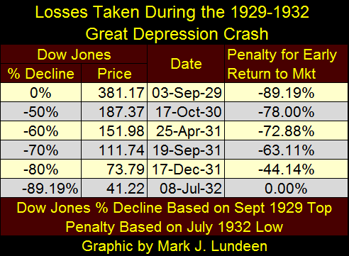
But the 89% decline from the Dow’s 381.17 high of Sept 1929 to its 41.22 low of July 1932 doesn’t begin to explain the horror investors faced when attempting to find a profitable entry point back into the market. We can see their dilemma in the table below.
On 17 October 1930 the Dow Jones had fallen to 187.37: a full 50% below its last all-time high of the previous year. For the first time in history the Dow Jones had declined 50%; for market contrarians of the Great Depression what could be more bullish? However two years later the Dow reached its ultimate bottom of only 41.22. So, even though the Dow Jones had already suffered a 50% decline at 187.37, FROM 187.37 the Dow Jones was to see another 78% decline before it ultimately bottomed out at 41.22 in July 1932.
Even in December of 1931, after the Dow Jones had already declined a full 80% from its September 1929 high, (just 9.19% away from its ultimate bear market bottom), entering the market at that point with the Dow Jones already down to 73.79 resulted in a loss of 44.14% six months later when the market finally bottomed at 41.22.
Forget calculus; bear-market mathematics is harder when the market enters a deflationary implosion as it did in the early 1930s. And with the Dow Jones currently elevated by years of monetary shenanigans such as ZIRP and QE, it’s likely we’ll see a similar deflationary implosion in the near future.
This is a fascinating historical study of the Great Depression crash, but what does it have to do with step sum boxes? Well, using step sum theory investors of the early 1930s would have recognized that becoming bullish while a bear box was being formed was not the prudent thing to do. Knowing this would have alerted investors in the 1930s that the four month market recovery from November 1929 through April 1930 (days 60 to 180 in chart above) was nothing more than a dead cat bounce. And when the step sum ultimately began its collapse on day 436 of the Great Depression, Mr Bear was far from finished clawing back the stock market’s inflationary gains of the 1920s. Also looking at the chart above, we see how the step sum offered investors an unambiguous safe entry point back into the market; when the Dow Jones’s step sum once again began to rise (more net up days than down) in July 1932 with the price of Dow Jones.
The Dow Jones in the years that followed saw two bull boxes form (chart below). Step sum boxes typically form during emotional markets. In the wake of an 89% crash the primary emotion bulls were feeling in 1933 and 1934 was trauma. So it was no surprise seeing bull boxes form, or that the first one fail as the Dow Jones price trend reversed, following its step sum down. Remember; the price trend in a step-sum box is usually the key whether future prices will be up or down. This bull box failed because within the box the bearish step sum trend proved correct, which is unusual but can happen.
Then, a year later another bull box formed, with the Dow Jones’ price plot trending sideways for the next four months (July – Nov 1934) as the Dow Jones was saw more days closing down than up, resulting in a declining step sum. The bull box “closed” (dashed line) after the step sum’s trend reversed and began following the Dow Jones price trend up. This resulted in a very nice bull market that saw the Dow Jones peaked in March 1937 at 194.40.
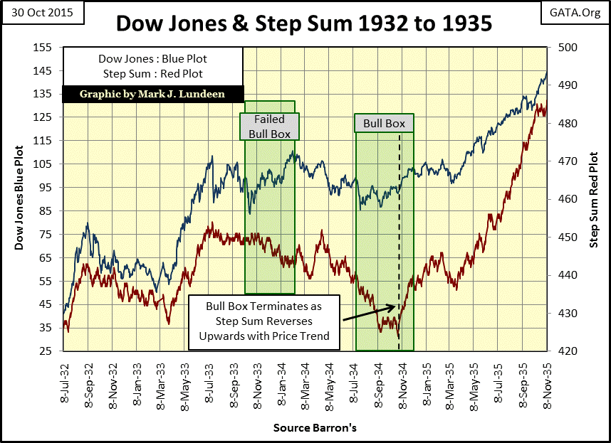
As noted before, the price trend in a step-sum box has historically been a better predictor of future price trends than the step sum. So within a bull box, seeing the step sum decline is actually a pretty bullish development.
Like the 1930s, the years spanning 1962 to 1982 were also emotional. But unlike the terror of the Great Depression, these years began with much excitement as the Dow Jones approached its 1000 line for the first time. But the excitement eventually changed to great frustration as the Dow Jones saw five failed attempts during two decades to break above, and stay above 1000.
Here’s the chart of the period, which I call the Dow Jones’ 1,000 Line of Death.
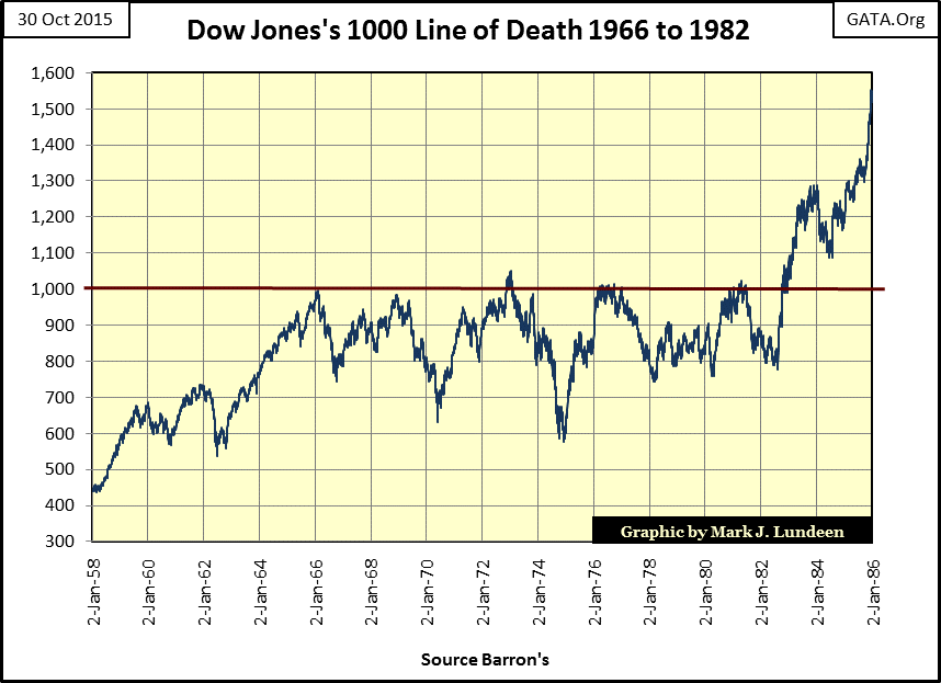
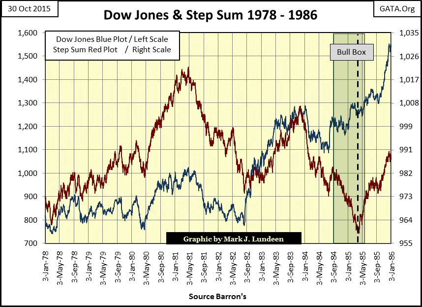
When the Dow Jones (below) bottomed at 776.92, and then took off into history in August of 1982 the bulls went along for the ride until January 1984 when the first of many bull market corrections began. For the next seven months the step sum followed its price plot down. However in August 1984 as the Dow Jones’s price plot resumed its bull market advance, its step sum continued crashing forming a bull box. Obviously the market feared the Dow Jones in 1984-85 would for the sixth time fail to stay above its 1000 line.
As is usually the case with step-sum boxes, the price trend once again proved to be the more accurate predictor of the future market trend. After decoupling with its price trend for eight months, the step sum reversed closing the bull box in late April 1985. The Dow Jones got a nice little price boost shortly thereafter, and the market finally lost the fear of the Dow Jones 1000 line.
Below is the latest Dow Jones step sum chart, which shows a bear box forming at the very top of the sub-prime mortgage market (October 2007), which was unusual. What was also unusual was seeing the step sum stubbornly refuse to decline for the next eleven months as the Dow Jones crashed 40%. These bulls were different, and equipped with all the monetary inflation needed to fight off a massive deflationary bear market in the aftermath of the mortgage market debacle. The step sum never went down because after each day the Dow Jones closed down, the Plunge Protection Team (PPT) pushed it back up the next, just not up as much as Mr Bear had clawed it down the previous day.
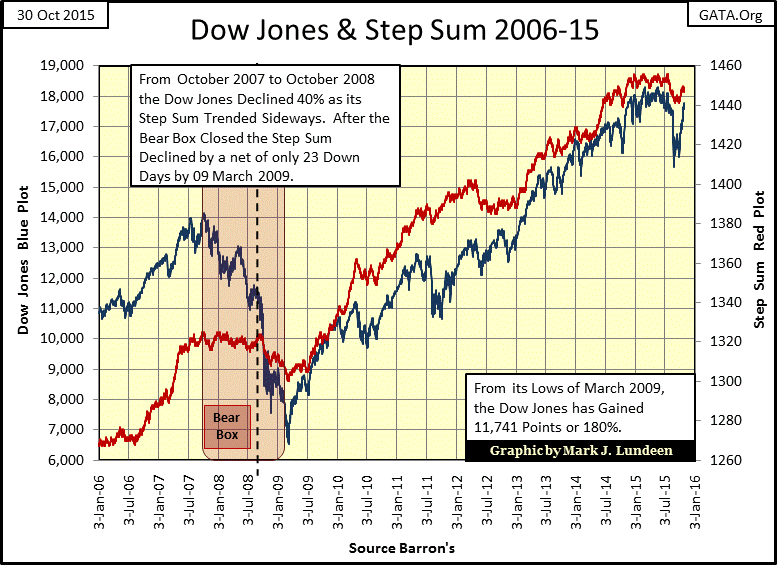
Since the March 2009 bottom the Dow Jones and its step sum are back on track, tracking each other’s ups and downs, so we see no boxes being formed. However, I wouldn’t be at all surprised to see another massive bear box form when the stock market begins deflating again as it did in October 2007. The “policy makers” are not going to allow the stock market to deflate 40% or more without a fight.
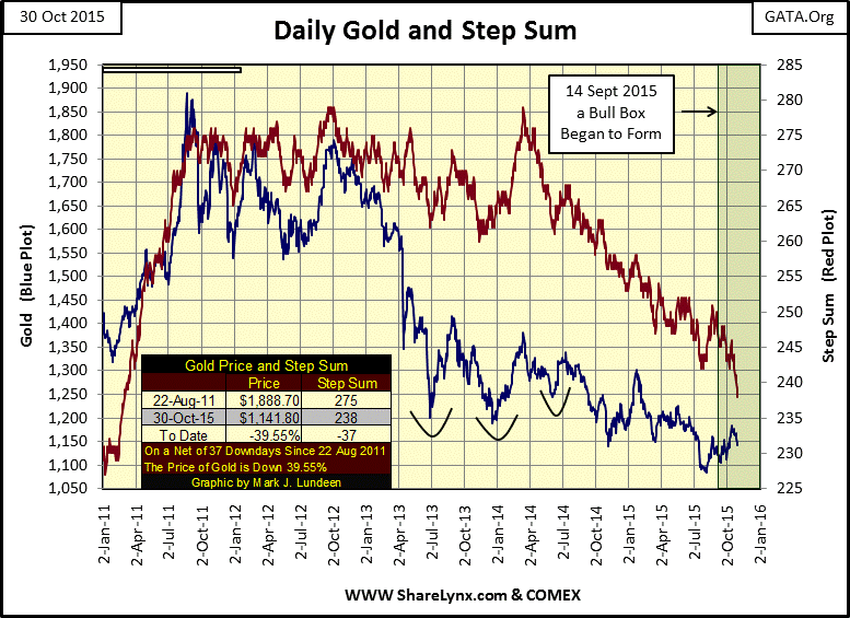
Below is gold’s step sum chart. I could have placed a bear box at the very beginning of the chart. Seeing the step sum collapse on so many net down days with little effect on the price of gold is the very definition of a bear box.
I noted the March – July 2008 bear box. Gold peaked above 1000 in March and the bulls were expecting more, as we see in the step sum plot for the next four months. But the “policy makers” weren’t about to allow a bull market in gold during a deflationary collapse in the mortgage market, so gold corrected from March to October 2008. In the months to come the bulls realized the gold market was going down, so its step sum eventually reversed downward in July, and fell in step with the falling price trend.
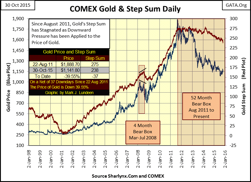
Gold’s current four-year bear box above is becoming annoying. Look at the step sum; is it still trending sideways or is it collapsing? Hard to say. But a net total of just 37 down days since August 2011 isn’t much of a collapse, so it appears the bear box is still ongoing. What I’d really like to see is the price of gold take a dive down toward 1000 with its step sum declining sharply to get out of this damn box. Better yet make this bear box fail with the price of gold just taking off out of nowhere!
It gets worse when we look at the chart below. Since March 2014 we see the step sum collapsing with the price of gold holding up pretty darned well. I almost feel like placing an eighteen month bull box here, but gold’s price trend isn’t really trending sideways or going up so I didn’t.
But one thing I did do is place a bull box over the past six weeks, making it the first bull box I’ve ever seen inside a bear box. This is actually a pretty bullish development in the gold market, but I’ll want to see this bull box age for a few more weeks before I get too excited. And even then I still want to see the bull market in gold resume with the price of gold surging boldly upward. But keep in mind that gold is a managed market, so don’t be too disappointed should the price trend reverses and declines along with the step sum, causing this bull box to fail. Still, since mid-September something has changed in the gold market. The step sum is really going down hard as the price of gold inches upwards. If this box resolves itself as bull boxes have in the past, we long suffering gold investors might just have a Merry Christmas this year.
Next is silver’s step sum chart. All you need to know about this chart is shown in the table:
April 2011 / Price $48.58 / Step Sum 460
October 2015 / Price $15.54 / Step Sum 460
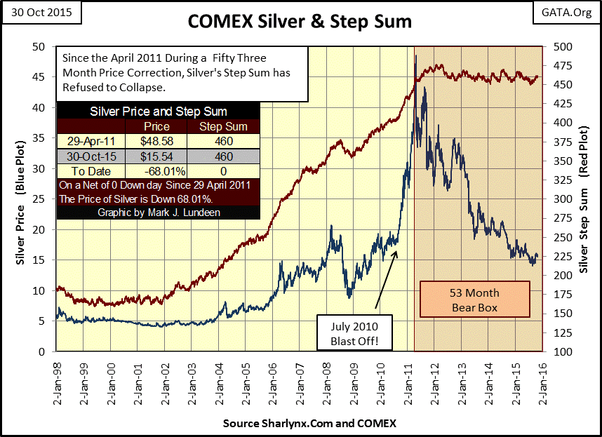
A fifty three month, 68% price decline on a net of Zero down days in the step sum. This bear box is doomed since industrial demand alone will never allow silver’s step sum to collapse. The only question is: when will the price of silver take out $50 on its way to $100?
Mark J. Lundeen


