Coming Market Crash - Last Week Was The 2nd And Final Warning...


 Many were talking about the market crashing last week and the mainstream financial press were waxing hysterical, but as we will now see the crash hasn't even started yet. If the press got like that last week, imagine what they will be like when it really does crash - last week was just a "warmup", the 2nd and final warning, the 1st warning was the plunge last August.
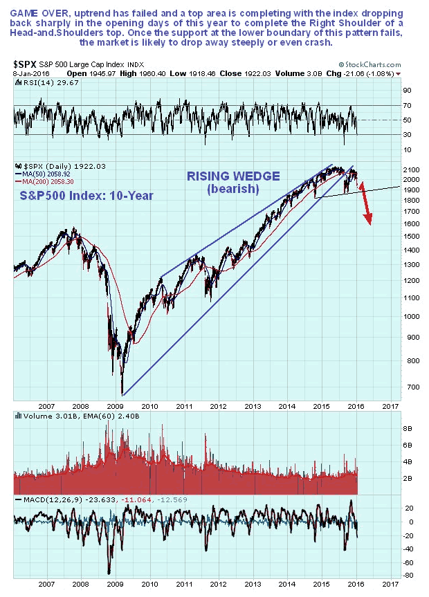
On the 10-year chart for the S&P500 index, we can see that while the market did indeed drop hard last week, it still has not broken down from its Head-and-Shoulders top, the lower boundary of which is shown by the thin black line. When it does break down from the top area, there is an awful lot of air below it - it has a long, long way to drop, and the decline is likely to be precipitous.
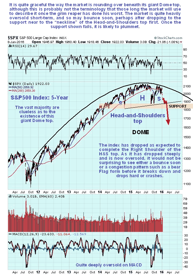
On the 5-year chart for the S&P500 index we can see a big Head-and-Shoulders top pattern completing gracefully beneath a giant Dome top, with the index dropping back exactly as predicted in the 2nd January update from its Right Shoulder peak, where we shorted it. The drop last week was steep, resulting in a short-term oversold condition, so we should not be surprised to see a bounce soon, or at least a period of choppy sideways movement, before it breaks down from the top area and plunges.
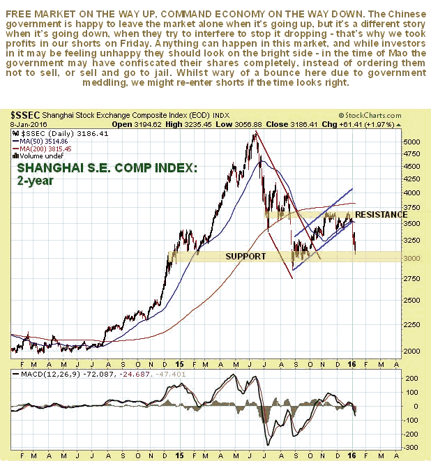
An important catalyst for the steep drop in world markets last week was the sudden renewed mayhem on the Chinese markets. Before the end of last year we had worked out that the preceding rally was a countertrend bear market rally that had run its course, and that it would be followed by another steep drop, so we shorted the Chinese market via a triple leveraged inverse ETF.
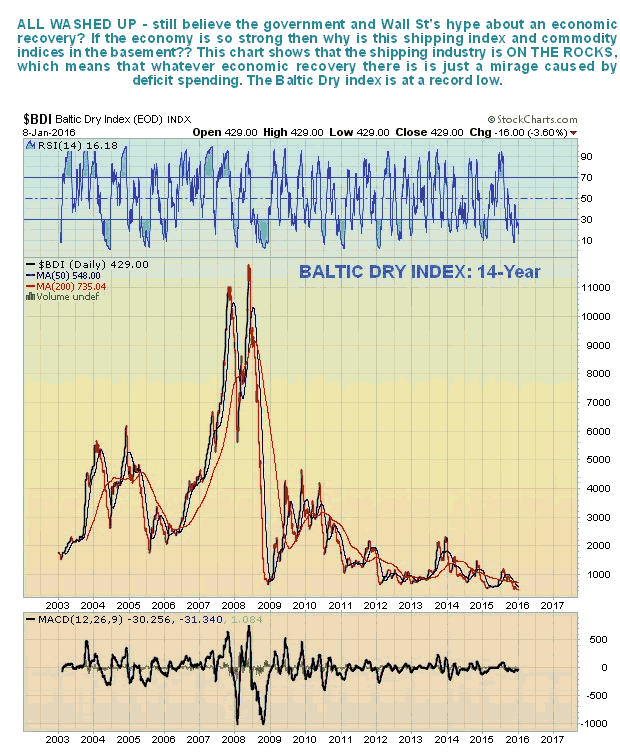
Any claims that a genuine economic recovery has taken hold are exposed as hollow and lacking any substance by the following 2 charts. The first is for the Baltic Dry shipping index, which even taking into account a glut of newly constructed ships, looks absolutely terrible - and is a harbinger of economic depression.
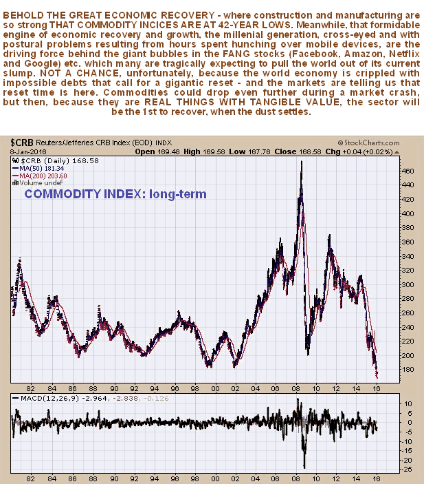
That the pitiful level of the Baltic Dry index is not an anomaly is made plain by the long-term commodity index chart. This shocking chart reveals that commodity prices are at more than 42 year lows and it shows that the world is tipping into a debt induced depression. Low as it is, it could drop even further if we now see a stock market crash soon, as looks likely.
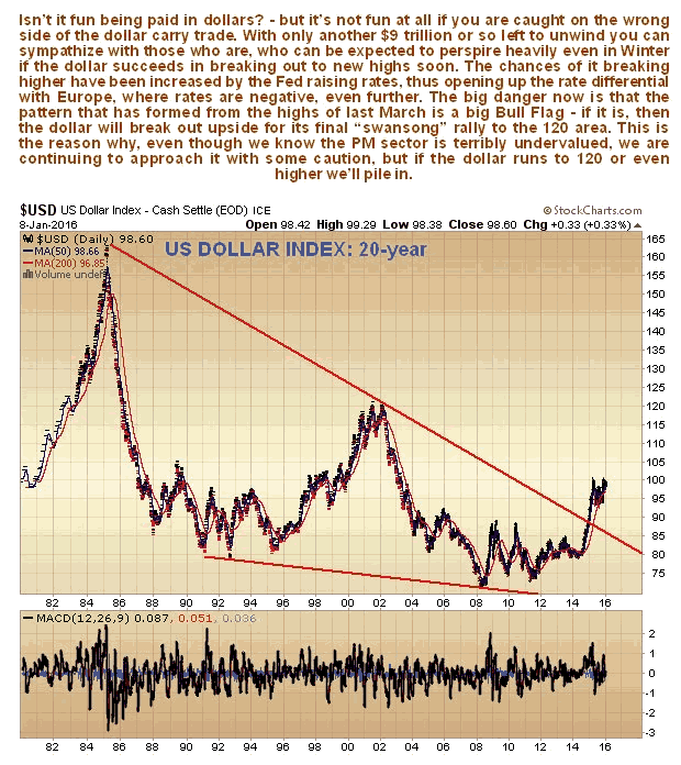
The Fed's recent raising of rates, and statement that further rises are in the pipeline, is widening the differential between (negative) rates in Europe and the US, and tightening the stranglehold on who collectively still hold a cool $9 trillion or so carry of trade obligations. This is threatening to force an upside breakout by the dollar from its recent lengthy trading range. If it does break out upside from the range, all hell will break loose and the dollar could ramp up to the 120 area on the index and perhaps even higher. On the long-term chart for the dollar index below, we can see that the pattern that has formed from the highs of last March now looks like a bull Flag. If it is, the dollar will soon be on its way to the 120 area. This risk is the reason why, even though we are aware of the extreme undervaluation of gold and silver stocks, we have been hesitant about piling into them until now. If the dollar does make a last "swansong" rally to the 120 area, that is when we will pile into the PM sector in a more unrestrained manner. Senior economic geologist Nigel Maund has written an extensive report on the best Australian mid-cap gold mining stocks, entitled GOLD MID-CAPS PLAN OF ACTION, PART 1: THE AUSTRALIANS, in preparation for this time, and will be writing a similar report on the best Canadian mid-cap gold mining stocks in due course.
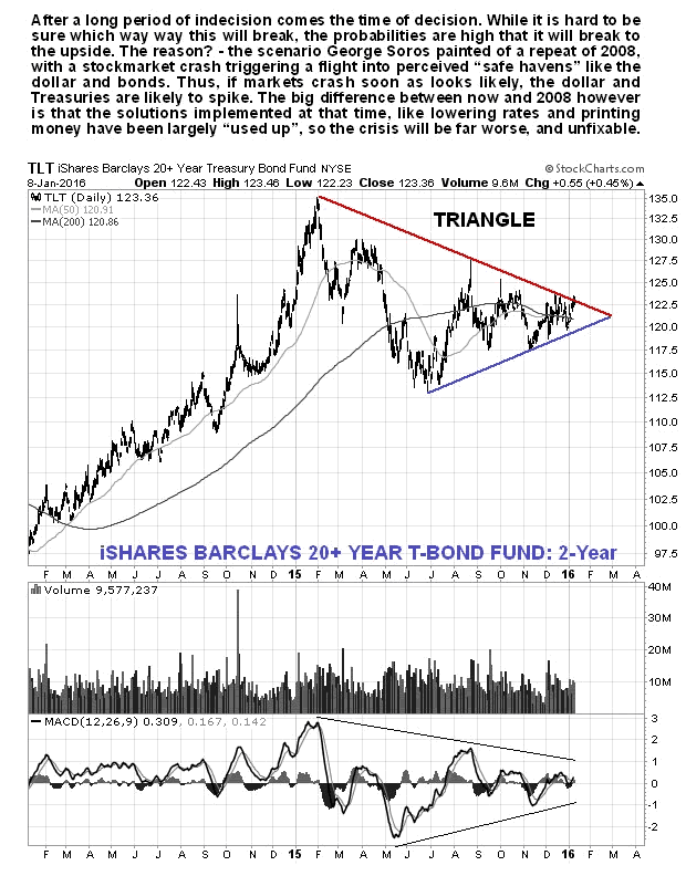
If global stock markets crash, as in 2008 only probably worse, then in addition to the dollar going on a tear it is likely that investors will seek safe haven in US Treasuries again, despite growing Sovereign risk. On the 2-year chart for T-Bond proxy TLT below, we can see that they are now set up for a substantial rally with a large Symmetrical Triangle closing up, although this Triangle could theoretically break in either direction. A rally in Treasuries would occur in lockstep with a dollar rally.
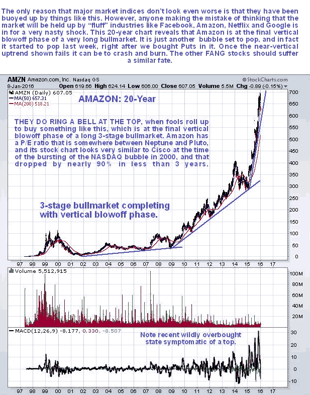
Finally, a number of investors, brain-addled by Wall St propaganda, have taken to entertaining the fanciful notion that world stock markets will be towed higher by the stocks of "fluff" companies like Facebook, Amazon, Netflix and Google, who now have the acronym of the "FANGs". This seductive but dangerous presumption might be more believable if these stocks weren't already well into bubble territory. The long-term chart of the most extreme of these, Amazon, which we bought Puts in at the start of the month, is shown below. As we can see it is in the final vertical blow-off phase of a multi-year bull market, and once the extremely steep vertical 3rd trendline fails, which should happen soon, it will crash and burn, probably along with the other FANGs, and the Tech sector at large, including, and especially, Biotech, and the market will finally lose its low grade leadership and plunge.
********
Courtesy of Courtesy of http://www.clivemaund.com

Clive P. Maund’s interest in markets started when, as an aimless youth searching for direction in his mid-20’s, he inherited some money. Unfortunately it was not enough to live a utopian lifestyle as a playboy or retire very young. Therefore on the advice of his brother, he bought a load of British Petroleum stock, which promptly went up 20% in the space of a few weeks. Clive sold them at the top…which really fired his imagination. The prospect of being able to buy securities and sell them later at a higher price, and make money for doing little or no work was most attractive – and so the quest began, especially as he had been further stoked up by watching from the sidelines with a mixture of fascination and envy as fortunes were made in the roaring gold and silver bull market of the late 70’s.
Clive furthered his education in Technical Analysis or charting by ordering various good books from the US and by applying what he learned at work on an everyday basis. He also obtained the UK Society of Technical Analysts’ Diploma.
The years following 2005 saw the boom phase of the Gold and Silver bull market, until they peaked in late 2011. While there is ongoing debate about whether that was the final high, it is not believed to be because of the continuing global debasement of fiat currency. The bear market since 2011 is viewed as being very similar to the 2-year reaction in the mid-70’s, which was preceded by a powerful advance and was followed by a gigantic parabolic price ramp. Moreover, Precious Metals should come back into their own when the various asset bubbles elsewhere burst, which looks set to happen anytime soon.
Visit Clive at his website: CliveMaund.com


