Commodities And Precious Metals Next Leg Down


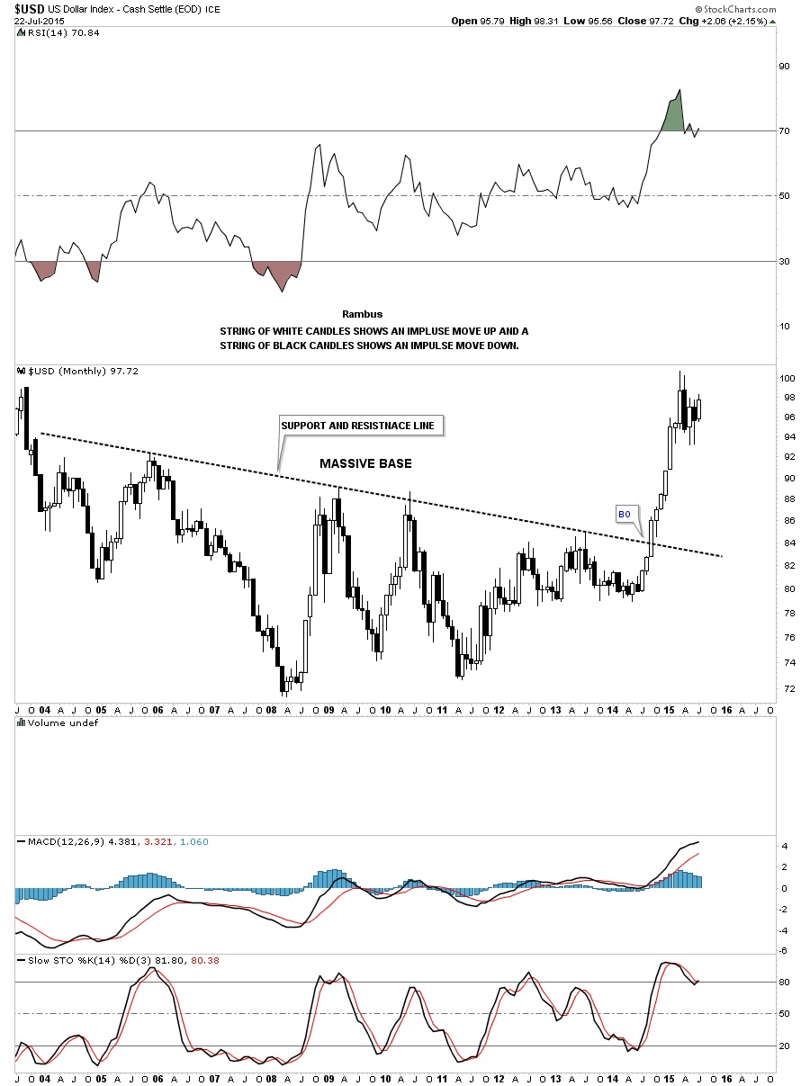
There is a lot to go over tonight in regards to commodities and the precious metals complex. A while back I wrote a report on the commodities in general getting ready for the next possible leg down which will fuel the deflationary pressures that really took hold last about this time. That’s when the US dollar finally broke out of its massive base and charged higher topping out in March of this year and has been consolidating those gains ever since. Let’s start by looking at the big base the US dollar broke out of last year at this time and the strong impulse move up as shown by the string of white candlesticks. That’s what a strong impulse move looks like when all the pent up energy finally has a change to escape.
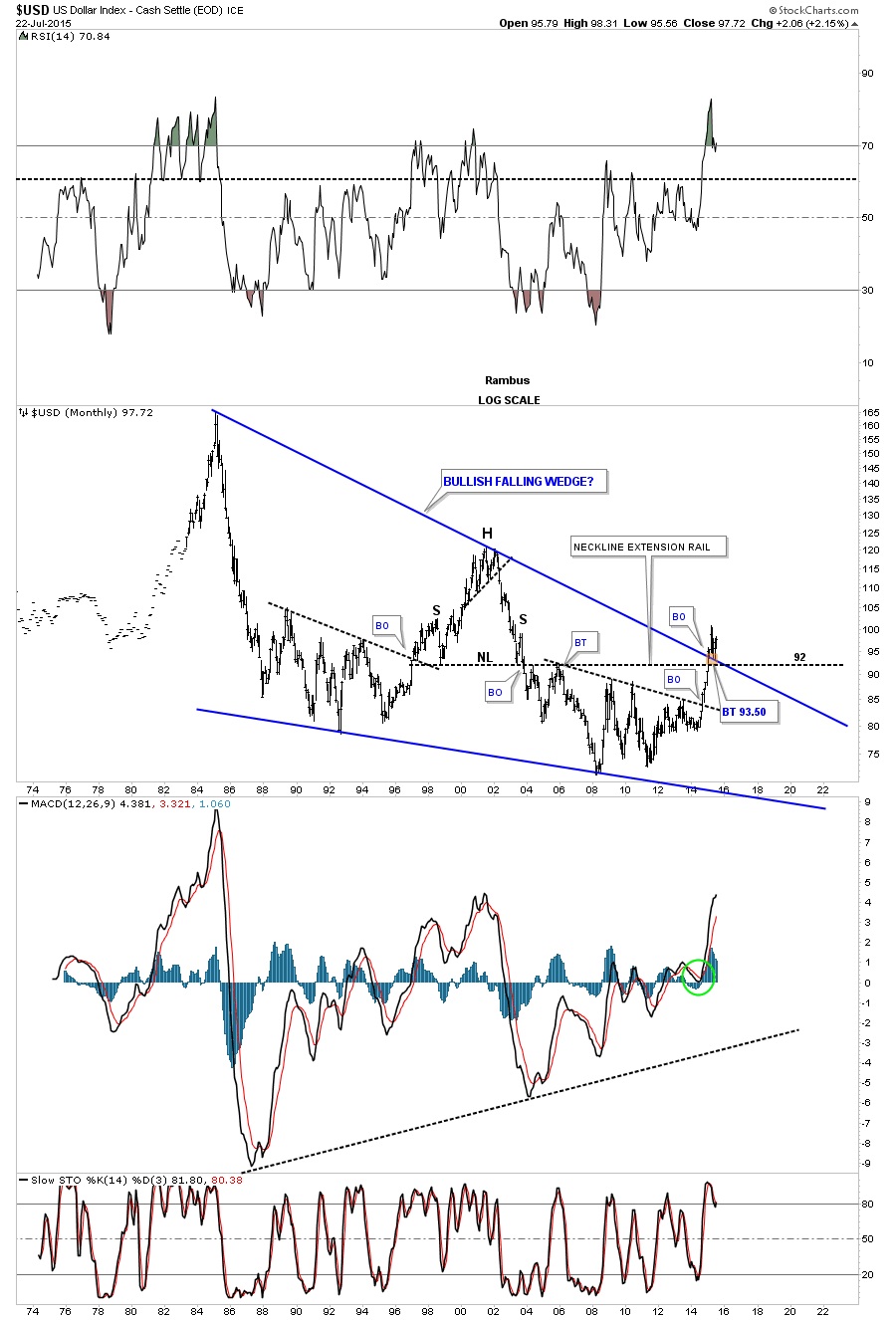
That powerful impulse move out of that big base was strong enough to take out a very long term trendline going all the way back to 1985 or so. That thirty year top rail of the bullish falling wedge has now reversed it role to what had been resistance to now support during this consolidation phase the US dollar has been going through since March of this year.
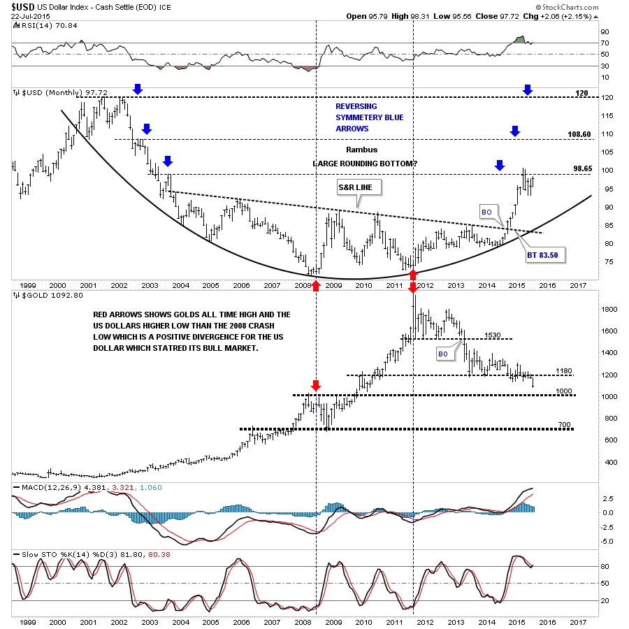
Below is a 15 year combo chart that has the US dollar on top and gold on the bottom. Notice how the US dollar is reversing symmetry back up based on the decline that started at the 2000 top as shown by the blue arrows. Once the dollar takes out our current high the next area I’ll be looking some resistance to show up will be the 108 area. This combo chart also shows you the big positive divergence the US dollar had with gold which was the first real big clue for me that the dollar was ready to rumble. Note the low for the US dollar in 2008 and the high for gold which was normal at the time. From that point in 2008 gold almost double in price but the US dollar actually made a higher low vs the 2008 low. That’s what really got my attention. Note the last bar on the monthly gold chart which is now trading below the previous lows of the last two years. They say a picture is worth a thousand words but I think this combo chart is worth a whole lot more.
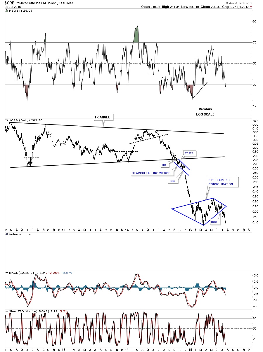
Knowing what the commodities did during the US dollar’s big impulse move out of that big base, lets review some of the commodities indexes I showed you a while back, when I suggested the the other shoe maybe getting ready to drop in regards to the ongoing deflationary spiral. The first chart is a daily look at the CRB index which gapped out of an eight point diamond consolidation pattern. It’s now approaching the low made back in March.
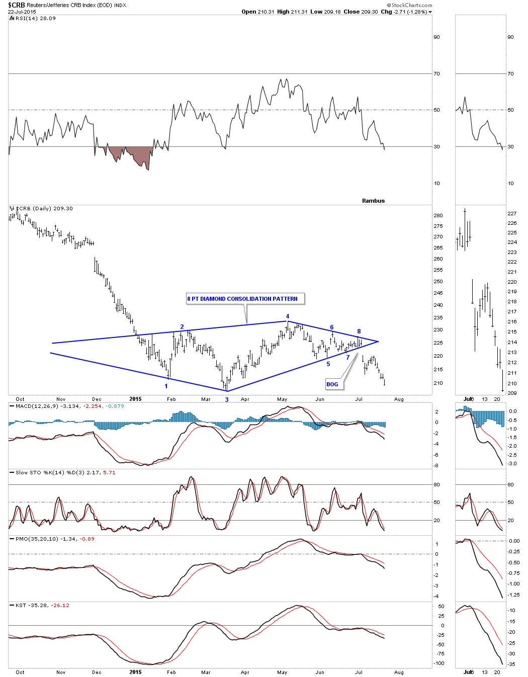
Stepping back about four years or so you can see how the diamond consolidation pattern fits into the big decline. I’m viewing this diamond consolidation pattern as a halfway pattern to the downside. Notice the decline that occurred during the first impulse move down out of the big black triangle. I expect a similar move to take place that matches the first leg down in time and price. It doesn’t have to be exactly the same but we can use it as a guide to let us know where we’re at once the impulse move breaks the March low.
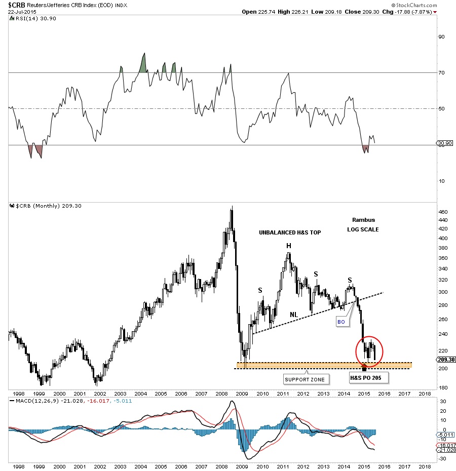
Below is a long term monthly candlestick chart which shows us the massive H&S top the CRB built out before the first impulse move down I showed you on the daily chart above. The diamond, red circle, has formed on a very important support and resistance zone, brown shaded area. As I have shown you many times in the past a stock will make a small consolidation pattern just above an important support and resistance line before it finally breaks it. The moment of truth has now arrived for the CRB index. One last note on this long term monthly chart for the CRB index. With the US dollar’s monthly candlestick chart I showed you a string of white candlesticks in its strong impulse move up. Here you can see this monthly chart for the CRB index shows a string of black candlesticks during its first impulse move down showing us the inverse correlation is alive and well.
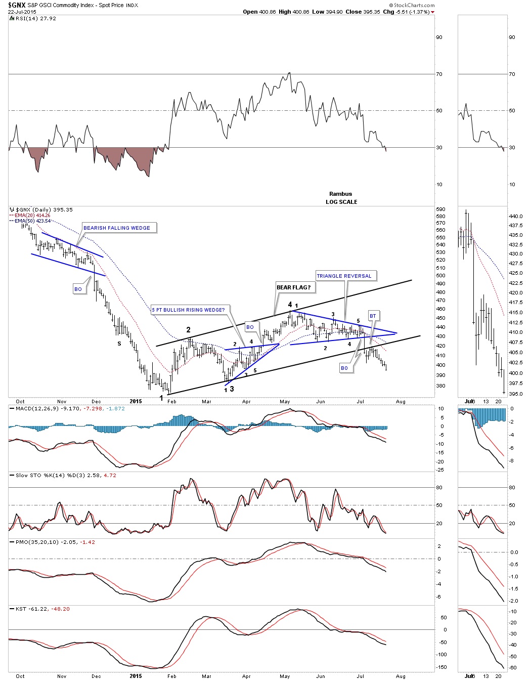
Another commodities index I follow is the $GNX commodities index. This index bottomed out a bit earlier than the CRB index as it first bottomed in February of this year. This daily chart has some very nice Chartology which is showing us a seven month black bear flag that is made up of bullish rising wedge and a triangle reversal pattern. The breakout from the bottom rail of the bear flag was picture perfect with a nice clean backtest.
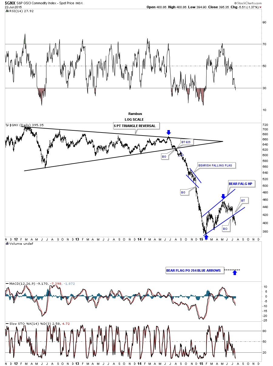
The long term daily chart for the GNX puts the bear flag in perspective within the context of the big move down out of the black triangle. Longer term members should remember the little blue bearish falling flag that formed roughly at the halfway point in the first impulse move down that was also showing up on most of the currencies at the time. I know it seems impossible that we could experience another leg down equal to the first impulse move down with the blue bear flag showing up somewhere in the middle but until something changes this scenario this is my game plan.
 Meet Rambus, a seasoned trader and technical analyst renowned for his unbiased and insightful chart work. Through his website, Rambus Chartology, and Substack newsletter, Rambus shares his expertise with a global community of subscribers, providing daily updates, commentaries, and hands-on training in the art and science of chartology. With his calm, humble, and down-to-earth approach, Rambus demystifies complex market trends, helping his followers navigate the challenges of today's volatile markets. Join the Rambus Chartology community today and discover a unique blend of technical analysis, trading expertise, and time-tested protocols. Subscribe now at www.rambus1.com or https://rambuschartology.substack.com/