Current Position Of The Market


SPX: Long-term trend - Bull Market
Intermediate trend - While everything technical points to an overbought condition which should require an adjustment, the exact timing of that correction is for the market itself to decide and reveal.
Analysis of the short-term trend is done on a daily basis with the help of hourly charts. It is an important adjunct to the analysis of daily and weekly charts which discusses the course of longer market trends.
TECHNICAL INDICATORS WORSENING
Market Overview
Last week, the SPX traded in a very small range. That had the effect of creating even more deceleration than occurred two weeks ago. At that time, the waning uptrend was rescued by the announcement that the Bank of China had cut its lending rate. This caused the index to gap open, and move to a new high, but the rally quickly ran out of steam and prices went essentially sideways for most of the week.
There was another announcement which impacted the market on Thursday! OPEC left its production rate unchanged. While this was clearly a negative for oil stocks, the rest of equities were not sure and the index quickly stabilized near unchanged, but sold off at the close. Since Friday was a short session, the week-end may be required to fully digest the impact of this decision and, by Monday, we will know better how the overall market is taking the news, although the longer-term effects are likely to be negative.
Let's look over the week's impact on the technical indicators.
Momentum: The weekly MACD continued to edge up with severe negative divergence. The SRSI is, at best, neutral with a strong negative bias. With its histogram at .46 the daily MACD is very close to making a bearish cross, while the SRSI has (finally) begun to roll over. The hourly MACD is still positive but has started to accelerate its decline.
Breadth: The McClellan Oscillator rolled over after posting strong negative divergence. The Summation Index pushed slightly higher.
Structure: Probably still in primary wave 3. It remains within the confines of its intermediate channel.
Accumulation/distribution. Short-term: A small distribution pattern has formed on the 1X P&F chart. Long-term: No sign of distribution on 3X chart.
XIV: Has played catch-up with SPX in the past few days and may have filled a projection. It sold off sharply on Friday.
Cycles: It may be time to consider the implications of the 7-year cycle topping in this time frame with a low towards the end of 2015.
Chart Analysis
We start with the weekly SPX (chart courtesy of QCharts, including others below) with the McClellan Summation Index posted underneath it.
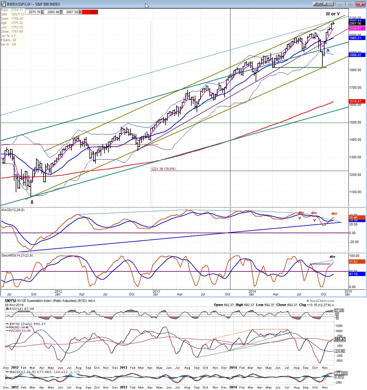
For one, the index is at, or approaching, a cluster of Fibonacci projections taken from a number of points along the path of the bull-market. It has also arrived at a point of major resistance created by the top of its intermediate channel (primary wave III) as well as the top of the weekly Bollinger Band. And, its excursion outside of its primary bull market channel has stretched its channel to 1.382 of its original width. It is unlikely that all this can be overcome without a serious correction, especially considering what is coming down the road.
Furthermore, the weekly A/D indicator (NYSI) shows strong negative divergence at the same time that its RSI is becoming severely overbought, suggesting that a correction is near. This has support from the momentum indicators (MACD, SRSI) which are in an uptrend but exhibiting strong negative divergence.
A weekly close below 2040 would be likely to start a correction.
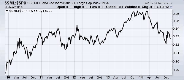
Another weekly chart (SML:SPX, courtesy of StockCharts.com) adds a strong confirmation to the uptrend deterioration described above. In order to suggest a continuation of the uptrend, this chart would have to turn up and keep going. It may already have tried and failed.
The daily SPX chart which appears below has several interesting (and telling) features.
Here also we can see that the top of the green intermediate channel has practically been reached. The index has also exited the steep channel which was formed from the 1820 low and started to trade outside of it. Last week it also broke outside of a more recent trend line.
One of the most interesting aspects of this chart is that the entire history of the uptrend from the 1820 level may be represented by the gaps in price (marked in light blue) which occurred along the way. The three types of gaps are clearly represented with a breakaway gap occurring when the index moved strongly out of its downtrend channel at 1909. This was followed by two continuation gaps at 1964 and 2001, and finally what is most likely an exhaustion gap at 2057 which has yet to be filled. The most conclusive proof that the uptrend has ended would be if an island reversal pattern was in the process of forming with a gap down occurring in the near future. That may be asking for too much, and simply filling the gap and continuing to decline would be proof enough.
Structurally, SPX may be forming an expanding triangle pattern which is almost complete. This pattern is represented by the red trend lines.
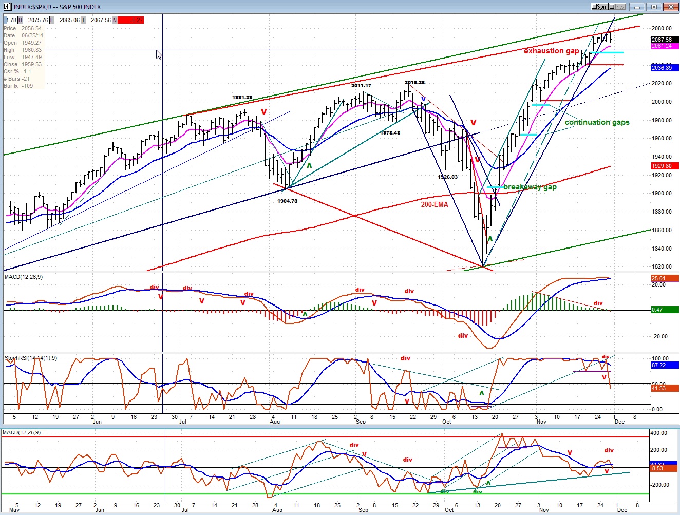
The oscillators fully concur with this analysis. All three have now rolled over, the lower A/D one showing by far the most negative divergence. This seems to be a common warning that a price reversal is about to happen.
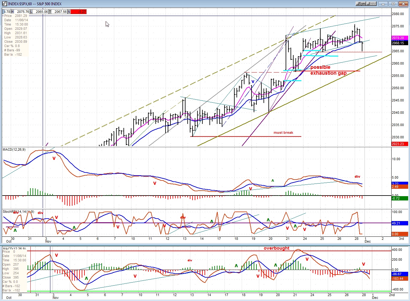
The hourly chart shows that not one, but two exhaustion gaps have occurred with a good possibility that the small second one at 2063 will be filled as early as Monday. The first one, ten points lower, may see a little more distribution form above it (with the possibility of a slightly higher high) before it, too, is filled. All three oscillators, which were already trending negative, took a turn for the worse on Friday and this could lead to some additional selling on Monday.
All in all, every chart is showing a strong indication that the trend from 1820 is finally coming to an end. A reversal at this time (or even a little later) could have more serious implications than is expected by most market participants.
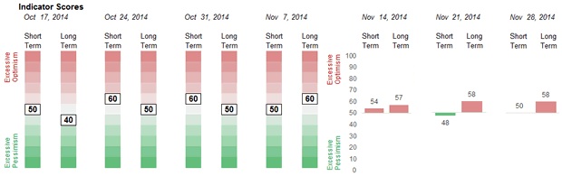
Sentiment Indicators
TheSentimenTrader (courtesy of same) long term indicator remains unchanged at 58.
XIV (Inverse NYSE Volatility Index) - Leads and confirms market reversals.
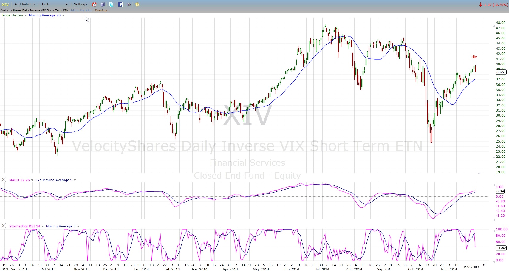
Last week, XIV tried to keep up with SPX but gave up on Friday and turned down again. This little burst of strength in the index did not even come close to erasing the divergence that had built up in this indicator since the previous tops were made. We could be approaching the beginning of the end.
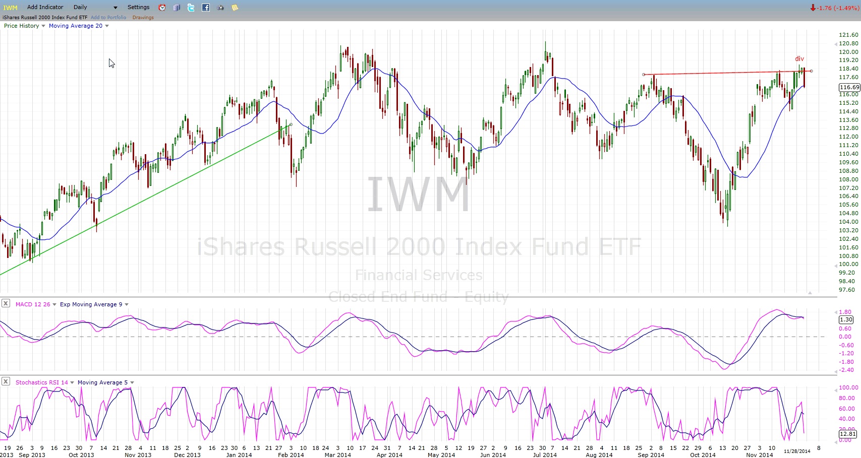
IWM (iShares Russell 2000) - Historically a market leader.
The same thing happened to IWM last week. Exactly the same price action over the near-term! Since both are leading indicators, what they are telling us over the intermediate and short-term should be considered strong warnings. In order to nullify its bearish posture, IWM would have to sustain a strong breakout and clear its former tops.
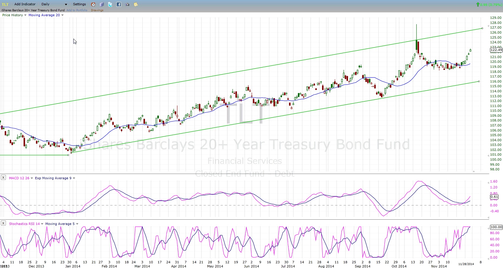
TLT (20+yr Treasury Bond Fund) - Normally runs contrary to the equities market.
TLT got tired of waiting for SPX and started to move on its own. Unless this is a head fake, it's likely that SPX will soon have a reaction in the opposite direction.
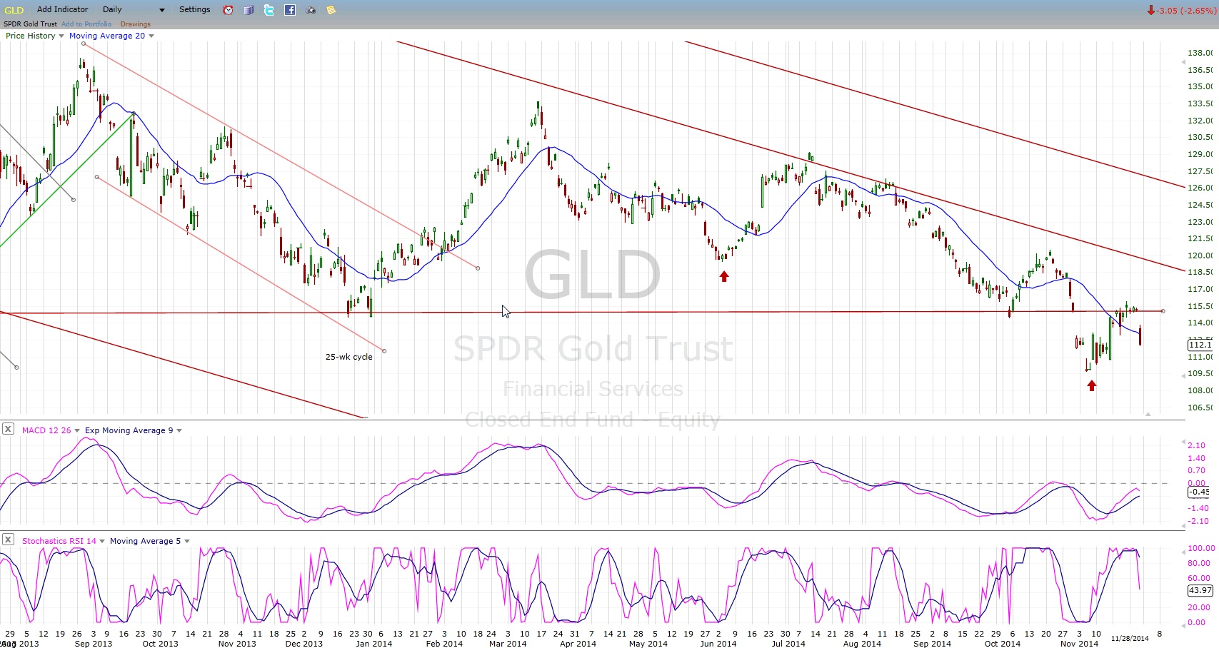
GLD (ETF for gold) - Runs contrary to the dollar index.
GLD reacted negatively to falling oil prices. This has the effect of nullifying the upward push of the 25-wk cycle, but it may be only a temporary interruption of GLD's short-term uptrend. After a couple of days, the index may find that the cycle still carries enough upward lift for it to resume its advance.
More evidence of this may be found in the next chart.
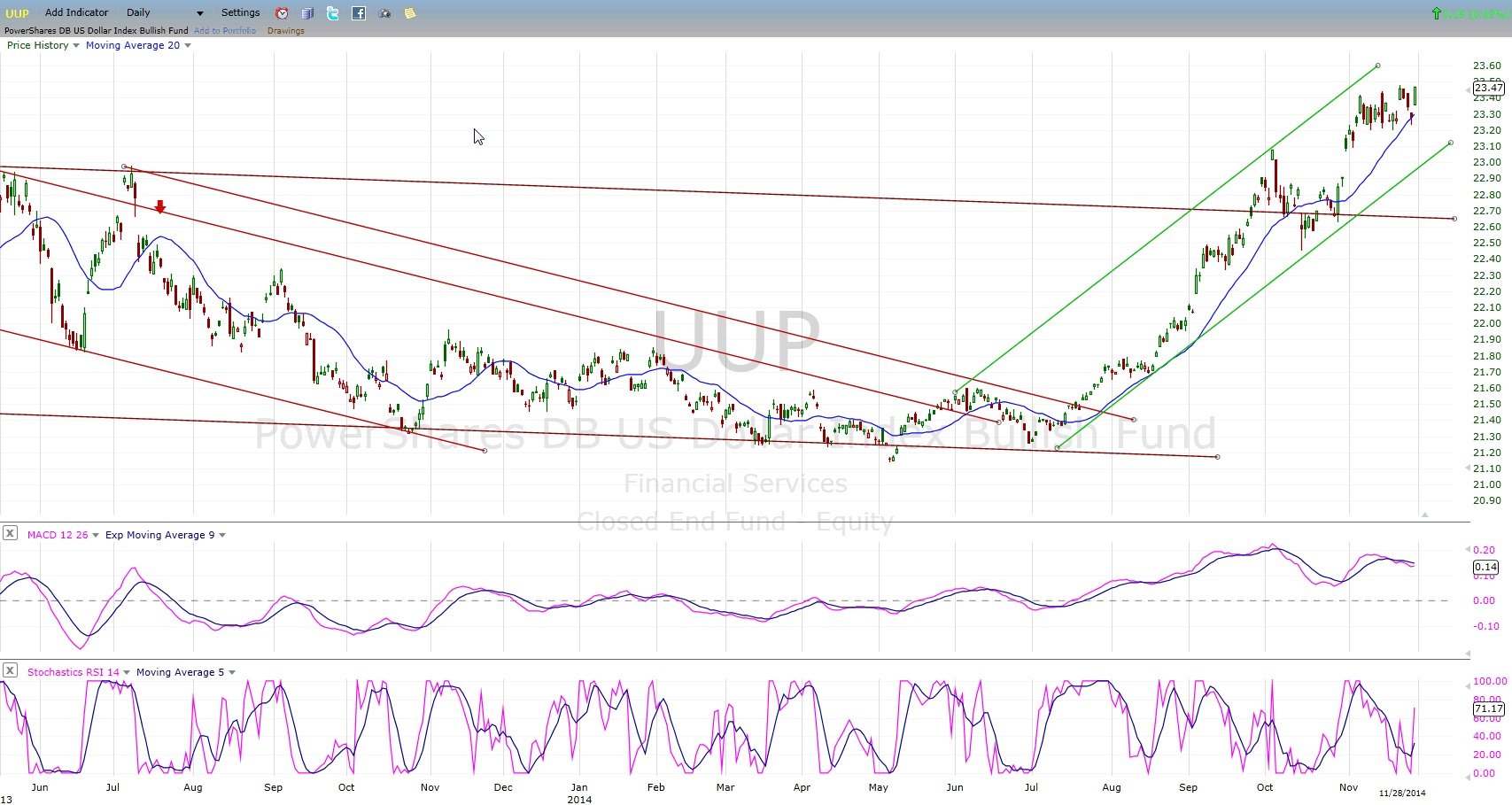
UUP (dollar ETF)
A week ago, UUP looked as if it had completed its upward structure and was ready for a consolidation. The plunge in oil prices may have delayed it for a couple of days. It does not look ready to extend its advance by much more without consolidating first.
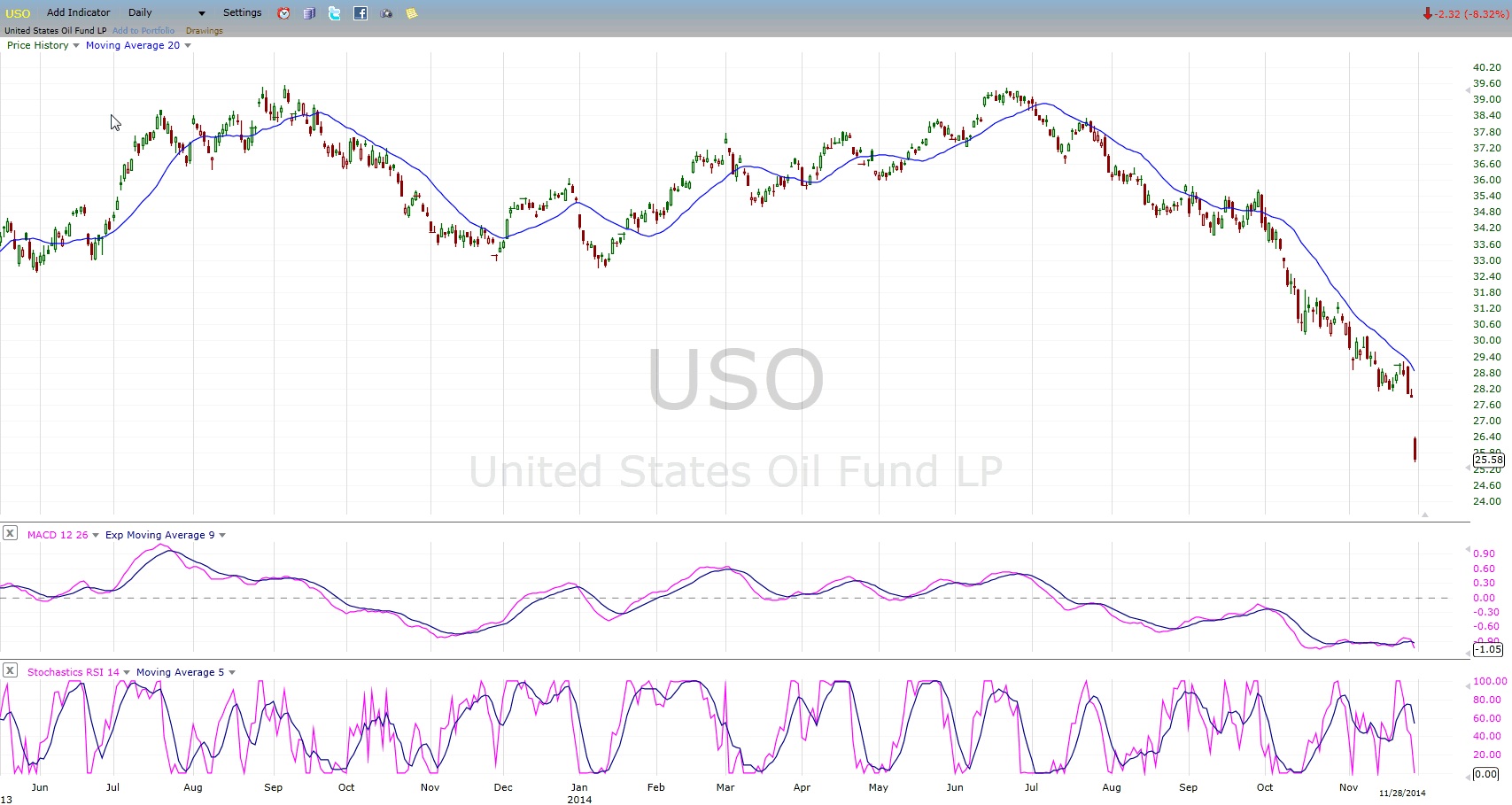
USO (US Oil Fund)
Ouch! This is adding insult to injury! Last week, I thought that after all that steady decline, USO was finally ready for a little consolidation. I guess it was "little -- only lasting four days.
At 26, USO may have filled a temporary projection, although this is by no means the full extent of the potential downward count which could eventually prolong the decline to much lower levels.
Summary
With the mounting evidence against prolonging this uptrend much farther, it is increasingly risky to remain bullish on the market until it has had a solid correction. By at least one measure, this could turn out to be a substantial one, lasting into the end of 2015.
I'll discuss this possibility in detail after we have definite proof that the SPX has made an important reversal.
FREE TRIAL SUBSCRIPTON
Market Turning Points is an uncommonly dependable, reasonably priced service providing intra-day market updates, a daily Market Summary, and detailed weekend reports. It is ideally suited to traders, but it can also be valuable to investors since highly accurate longer-term price projections are provided using Point & Figure analysis and Fibonacci projections. Best-time reversal estimates are obtained from cycle analysis. An increasing use of EWT for structural analysis and the recent addition of CIT (Change In Trend) time slots has greatly improved the exact timing of reversals.
For a FREE 4-week trial, send an email to: [email protected]
For further subscription options, payment plans, weekly newsletters, and for general information, I encourage you to visit my website at www.marketurningpoints.com. By clicking on "Free Newsletter" you can get a preview of the latest newsletter which is normally posted on Sunday afternoon (unless it happens to be a 3-day weekend in which case it could be posted on Monday).

When Andre Gratian was a stock broker years ago, a friend introduced him to technical analysis of the market. Consequently, it is not an exaggeration to say that Andre fell in love with this approach! Ever since then, it has become an increasingly important part of his professional life. Gratian has studied the works of Wyckoff, Edwards & Magee, Edward J. Dewey (cycles) and many others. However, one of my most profitable undertaking has probably been to study Point & Figure charting, which he finds invaluable in analyzing stocks and indices. If he were restricted to one methodology, this is the one that he would choose. This well-rounded background has given him what he feels to be a special insight into the stock market, facilitating the recognition of meaningful patterns and the ‘turning points’ in all trends, whether they be short or long term. Andre feels very comfortable discussing the stock market and passing on meaningful information to others. His subscribers include individuals and money managers throughout the world. Moreover, his Newsletters are currently published on several financial sites, here and abroad.


