Current Position Of The Market


SPX: Long-term trend – Bull Market
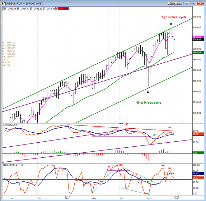
Intermediate trend – Is the 7-yr cycle sketching an intermediate top?
Analysis of the short-term trend is done on a daily basis with the help of hourly charts. It is an important adjunct to the analysis of daily and weekly charts which discusses the course of longer market trends.
IS THE 7-YEAR CYCLE ROLLING OVER?
Market Overview
Since its 200-point correction of mid-October, SPX has had rallies of rapidly diminishing proportions. The one which started last week failed to follow through on Friday and produced a 17-point decline instead of making a new high like the previous two. If it does not regain its upside momentum over the next few days and weeks, this change of pattern could be significant, suggesting that an intermediate top may be forming. Let’s see what next week will bring!
Momentum: For the past year, the weekly MACD has slowly, but steadily, been declining. This is a sign of long term market deceleration. Since it is about to make a bearish cross, (and if it does) the process could accelerate. The daily MACD is already in a bearish position and looks ready to go negative as well.
The weekly and Daily SRSIs have rolled over and are both about to become negative.
Breadth: After poking its head into positive territory, the McClellan Oscillator retraced to neutral on Friday.
Structure: It looks more and more as if primary wave III is coming to an end.
Accumulation/distribution: A large, long-term distribution pattern may have started.
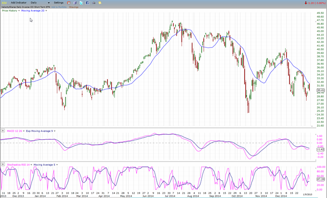
XIV: This indicator continues to increase its relative weakness to the SPX
Cycles: The 7-year cycle appears to be slowly getting a foothold.
Chart Analysis
We start with the weekly SPX (chart courtesy of QCharts, including others below) with the McClellan Summation Index posted underneath it.
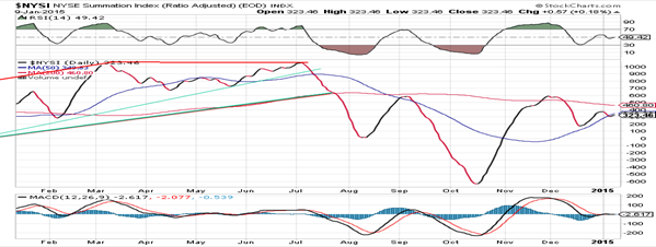
 It is not possible to fully appreciate the large topping formation which appears to be taking shape in the SPX on this chart. It is much more noticeable on the daily chart (below). But it is clearly visible in the weekly oscillators. As mentioned earlier, the MACD has been making lower highs for a whole year. SRSI has begun the same process over the past six months. The last top is of particular interest because of its double divergence pattern. It is joined in this negative display by the McClellan NYSE Summation Index. This should warn the bulls that something which is not in their interest may be about to happen.
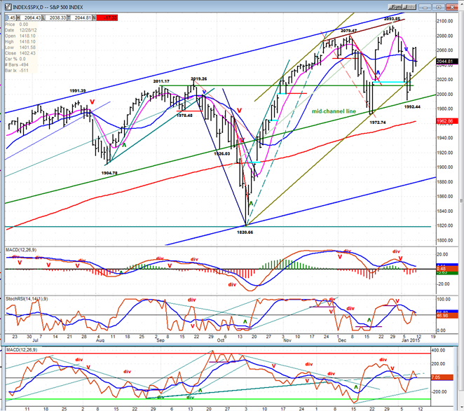
On the daily chart I have drawn two channels! The blue one is an intermediate channel which encompasses what EW analysts would probably call primary wave III. It has its origin at the October 2011 low with a trend line drawn from that date to the November 2012 low, and a parallel line drawn across the April 2012 peak. That top parallel has contained all rallies since that date, including the December 29, 2014 top which came within 10 points of touching it. Also remarkable is the fact that the October 2014 decline stopped right on the bottom channel line. As you can see on the chart, the (green) mid-channel line is not going to be outdone! It has stopped the last two short-term lows. But will it also stop the next one?
The next channel that I have drawn is a wide, short term channel which defines the trend from the low of last October. Prices within that channel quickly decelerated when they approached the top line of the blue channel and now, the last decline slightly breached the lower channel line before prices rallied. So it appears that, if Friday’s top is not surpssed, we have deceleration taking place over the short-term as well as the long.
This is fully confirmed by the MACD and the A/D oscillator, both of which showed some good negative divegence on the second top. With Friday’s action, all three oscillators have started to turn down again, and all three are ready to go negative.
Next week’s trading activity should clearly define the short-term course of the market.
Below is the Hourly Chart which only shows the top portion of the blue intermediate channel, but shows clearly the bottom channel line of the short-term trend. If the bounce from Tuesday’s low turns out to be a small bearish flag (although the formation may be a little too steep to be called that) and the decline resumes, we could continue down to the red parallel trend line; but I am not sure that we are quite ready for this much weakness just yet.
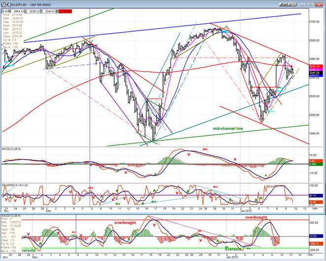
In fact, the two lower oscillators are getting close to being oversold and there is not that much weakness in the MACD, so any further immediate weakness may be limited with prices making a completely different pattern than the one suggested.
XIV (Inverse NYSE Volatility Index) - Leads and confirms market reversals.
XIV continues to increase its relative weakness to the SPX. Its low of last week surpassed the previous low and its rally was nothing to write home about. As long as this pattern continues, the pressure on the market should be on the downside.
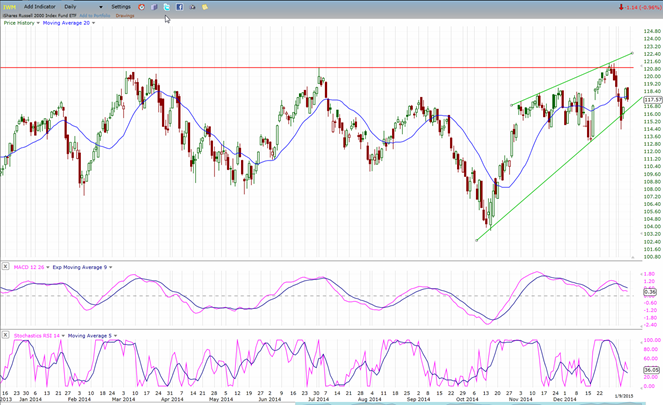
IWM (Russell 2000 ETF) - Historically a market leader.
In the last rally, IWM showed some renewed strength which took it to a fractional new high. Much of that strength was lost in the subsequent decline and now, the index is pretty much in a neutral position. What it does next could signal the direction in which the market chooses to go.
TLT (20+yr Treasury Bond Fund) – Normally runs contrary to the equities market.
TLT has now equaled its former high but has not pulled back. In fact it has already exceeded it by a minute margin. Since it is also trading at the top of its short term channel, one would expect that the combined resistance formed at that level should cause it to pull back and consolidate before attempting to move higher.

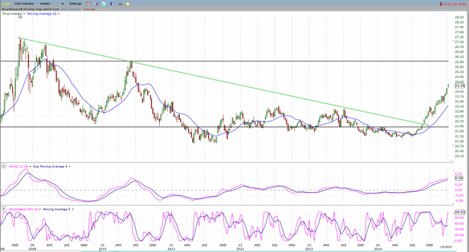
UUP (dollar ETF)
UUP continues to move up after breaking out of a long term (6-year) trend line. That, in itself, argues for a protracted uptrend. Furthermore, the base that was created during this time period is enormous and if there is any value to projections derived from Point & Figure patterns, that base should eventually carry the USD (currently 92.16) to 140. While that might seem like an impossible feat at this time, it would still leave the index 25 points short of the high of 164.72 achieved in 1985.
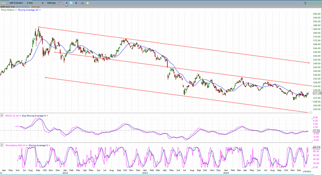
GLD (ETF for gold) – Runs contrary to the dollar index.
Since its peak of 2011, GLD has been in a declining phase which has all the markings of a continuing long-term downtrend. When a channel is drawn of this downtrend, we can see that the index is trading in the lower portion of its channel, so we can assume that it is not ready to resume its uptrend at any time soon. And why should it, if the dollar is expected to be at the beginning of long term uptrend? Consequently, the prospects for gold may be limited price gyrations as long as it is influenced by its 25-wk cycle, and as the long term downtrend persists.
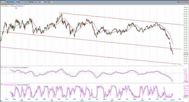
USO (US Oil Fund)
The long term trend of USO since its secondary high of 2011 (the same year that gold peaked) is beginning to look very similar to that of GLD. The only difference being that USO traded in the top portion of its channel for a long time before suddenly dropping into the bottom half. I suspect that it will contine to decline until it reaches the bottom of that channel. If the dollar scenario has any validity, it should have the same influence on oil that it is having on gold.
Summary
The SPX appears to be at the beginning of a long-term distribution process which is forming a top of intermediate proportions. I want to stress the word “appears”, because the various indices are not yet unified in this process. It will probably take several more weeks to verify that premise, although it would be consistent with the topping action of the 7-year cycle which is due in this time frame.
If in fact, the 7-year cycle is beginning to roll over, its downward pressure is likely to continue for most of 2015.
********
FREE TRIAL SUBSCRIPTON
Market Turning Points is an uncommonly dependable, reasonably priced service providing intra-day market updates, a daily Market Summary, and detailed weekend reports. It is ideally suited to traders, but it can also be valuable to investors since highly accurate longer-term price projections are provided using Point & Figure analysis and Fibonacci projections. Reversal estimates are obtained from cycle analysis, an increasing use of EWT for structural analysis, and a thorough understanding of conventional technical analysis
For a FREE 4-week trial, send an email to: [email protected]
For further subscription options, payment plans, weekly newsletters, and for general information, I encourage you to visit my website at www.marketurningpoints.com. By clicking on “Free Newsletter” you can get a preview of the latest newsletter which is normally posted on Sunday afternoon (unless it happens to be a 3-day weekend in which case it could be posted on Monday).
The above comments and those made in the daily updates and the Market Summary about the financial markets are based purely on what I consider to be sound technical analysis principles. They represent my own opinion and are not meant to be construed as trading or investment advice, but are offered as an analytical point of view which might be of interest to those who follow stock market cycles and technical analysis.

When Andre Gratian was a stock broker years ago, a friend introduced him to technical analysis of the market. Consequently, it is not an exaggeration to say that Andre fell in love with this approach! Ever since then, it has become an increasingly important part of his professional life. Gratian has studied the works of Wyckoff, Edwards & Magee, Edward J. Dewey (cycles) and many others. However, one of my most profitable undertaking has probably been to study Point & Figure charting, which he finds invaluable in analyzing stocks and indices. If he were restricted to one methodology, this is the one that he would choose. This well-rounded background has given him what he feels to be a special insight into the stock market, facilitating the recognition of meaningful patterns and the ‘turning points’ in all trends, whether they be short or long term. Andre feels very comfortable discussing the stock market and passing on meaningful information to others. His subscribers include individuals and money managers throughout the world. Moreover, his Newsletters are currently published on several financial sites, here and abroad.


