Devastating Trends in “Economic Growth”


Economic growth – who could possibly be against that? Okay the environmentalists are but certainly not me! However when we define exactly what constitutes economic growth, I’d have to say I’m against what today passes for it: an ever increasing number of dollars of GDP. Don’t get me wrong; if someone offered me a few hundred thousand dollars of GDP, like many members of Congress I would take it. But I know where these dollars come from: they are borrowed into existence by the US Treasury from the US central bank. What will they will ultimately be worth someday in our uncertain future? Nothing!
The following quote from C. Edward Griffin tells the little known story how dollars are created.
The Mandrake Mechanism
The American dollar has no intrinsic value. It is a classic example of fiat money with no limit to the quantity that can be produced. Its primary value lies in the willingness of people to accept it and, to that end, legal tender laws require them to do so. It is true that our money is created out of nothing, but it is more accurate to say that it is based upon debt. In one sense, therefore, our money is created out of less than nothing. The entire money supply would vanish into bank vaults and computer chips if all debts are repaid. Under the present System, therefore, our leaders cannot allow a serious reduction in either the national or consumer debt. Charging interest on pretended loans is usury, and that has become institutionalized under the Federal Reserve System. The Mandrake Mechanism by which the Fed converts debt into money may seem complicated at first, but it is simple if one remembers that the process is not intended to be logical but to confuse and deceive. The end product of the Mechanism is artificial expansion of the money supply, which is the root cause of the hidden tax called inflation. The expansion then leads to contraction and, together, they produce the destructive boom-bust cycle that has plagued mankind throughout history wherever fiat money has existed.
http://www.activistpost.com/2011/08/g-edward-griffin-mandrake-mechanism-and.html
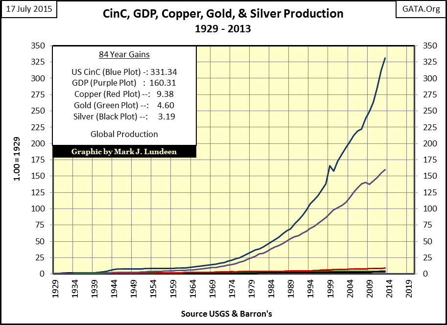
My first chart tells the shocking tale; which is why we’ll never see it published in any economic textbook. In the chart’s table we see that US GDP was only $104 billion in 1929. Today there are more billions of dollars at the table when Bill Gates and Warren Buffet get together to play bridge than total goods and services in the entire American economy back in 1929. But in 1929 $104 billion dollars represented the wealth of an entire continent, not just two guys playing cards.

In 1929 the national debt was a mere $17 billion dollars, just sixteen percent of total GDP. Today it’s over $18,000 billion dollars and exceeds total GDP. US Currency in Circulation (CinC / paper dollars and coins in circulation) was only $3.90 billion back in 1929; I believe Oprah and Michael Jordan could cover that amount today. What hasn’t gone ballistic since 1929 are the nation’s gold reserves. In 1929 the dollar was fixed at about 1/20th ounce of gold and the US Treasury had more in gold reserves than paper dollars in circulation (CinC). Today CinC is two orders of magnitude greater than the Treasury’s gold reserves. As stunning as that may be, over the past nine decades the national debt has grown by three orders of magnitude. These trends are certainly not sustainable; and considering everything now going on in the world the inevitable crisis can’t be far away. Will 2015 be the year of crisis? Like me you’ll have to hang in there to find out.
The next chart plots the growth in annual production of nickel, cement and pig iron along with CinC and GDP since 1929. For your information CinC (Blue Plot) is calculated using the year end quantity of dollars in circulation since 1929, so the CinC plot is not exactly equivalent to the others. But it does make the point that it’s misleading to measure “economic growth” using an inflationary monetary unit. Scientifically, the best way to analyze any relationship is to observe the changes in a single variable (GDP) while holding all other variables constant. Using the dollar as the unit to measure GDP introduces a second variable: the purchasing power of the dollar over time as determined by the number of dollars in circulation (CinC).
Unfortunately, US GDP (Purple Plot) is based upon annual sales of goods and services measured in dollars (a variable, not a constant unit). If GDP is rising faster than annual production of basic commodities it’s because the finished goods and services are measured in a wasting asset (the dollar). So most of the increase in GDP since 1929 has primarily been due to rising prices, not from increases in goods and services available in the economy.

Next the chart plotting copper, gold and silver. Sorry but the green gold plot has increased so little relative to the blue CinC and purple GDP plots, it looks like it’s missing – but it’s there.
Here’s a table listing the 1929 to 2013 increase of the same items plotted above, along with some others. It should be obvious that GDP computed by government statisticians is just another bogus “growth” data series. Since CinC has not been kept constant, it is impossible to separate that portion of GDP growth resulting from actual increases in the production of goods and services, from the portion resulting from increases in CinC. So in 2015 it’s not surprising to see “growth” in GDP even as employment opportunities continually dwindle.
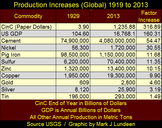
Here’s the link to the US Geological Survey data used in this article.
http://minerals.usgs.gov/minerals/pubs/historical-statistics/
And the link to the Commerce Department’s Bureau of Economic Analysis for GDP data.
http://www.bea.gov/national/index.htm#gdp
My favorite measurement of true economic growth is weekly electrical power consumption’s 52Wk moving average, a measurement of economic growth based upon the kilowatt; an engineering unit of measurement whose definition has been fixed since its conception. Barron’s statistics department has published this weekly data series continuously since August 1929 – Thanks guys!
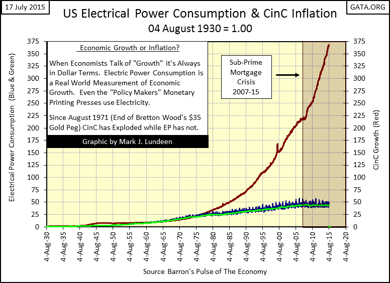
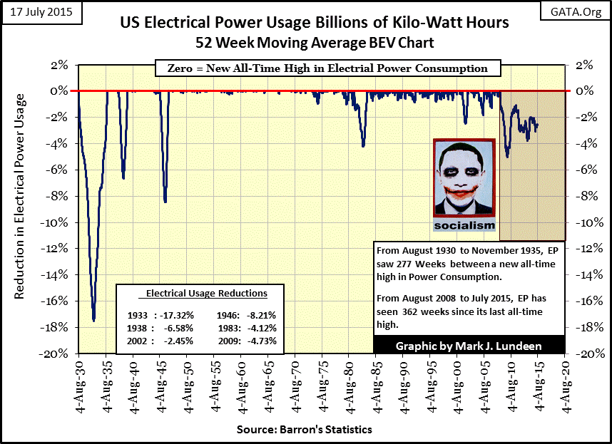
In the red box above we see the Federal Government’s accelerating production of paper dollars since the sub-prime mortgage crisis. However this huge increase in circulating dollars has had no impact on electrical power usage since August 2008. As we see in EP’s Bear’s Eye View chart below, it’s been a long time since EP has made a new BEV Zero (new all-time high), with no sign of recovery to 2008 levels of power consumption any time soon. With self-serving politicians and academics in control of “economic” and “monetary policy” I personally expect the current decline in EP to bottom only after it exceeds its 1933 bottom of -17.32%; but I hope I’m wrong.
When I look at these charts the following quote concerning the economic collapse of the Western Roman Empire from William Durant comes to mind;
Morals, which had been loosened by riches and wealth had not been improved by destitution and chaos, for few conditions are more demoralizing than poverty that comes after wealth.
- Will Durant: Caesar and Christ, page 211.
Let’s pray it doesn’t come to that for us, because as the Greeks have discovered we live in a very uncertain world controlled by people at the top of the food chain who don’t give a damn about anything but themselves. Now some may point out that Greek socialism’s attitude was much the same. But had the global banking system been forced to live under the discipline imposed by the old gold standard, Greek socialists (and American consumers) would be better off having long ago been forced to live within their means.
“Economic growth” seen in rising stock market valuations is also distorted by monetary inflation. Since 1920 the Dow Jones (Green Plot below) has seen major advances in dollar terms, but only once did it exceed the increase in the rate of production of dollars in circulation: during the Roaring 1920s bull market. In the decades that followed, even at its current lofty level of 18,000 the Dow Jones has failed to keep up with increases in CinC inflation.
Now compare how the Barron’s Gold Mining Index (BGMI / Red Plot) has performed relative to CinC inflation over the decades. From 1965 to 1996 the advances in the BGMI was either above the rate of CinC inflation or just below it. Mr Bear finally took the BGMI down in 2001, then twice in the past fourteen years (March 2008 & April 2011) it attempted to rise above the rate of CinC inflation. Both these post 2001 advances in the BGMI were powerful upward thrusts, outperforming anything the Dow Jones had done since the 1920s.

Better yet to look at the 30 & 90-month gains in the Dow Jones in the chart below. Thirty months being the length of time the BGMI advanced 248% from November 2008 to April 2011. The 90-month gains for the Dow Jones corresponds to the length of time the BGMI advanced 526% from August 2000 to March 2008.
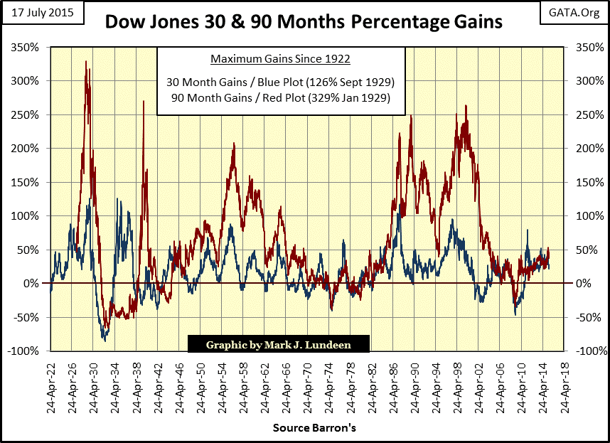
Next are the 30 & 90-month gains for the BGMI. Since 1922 the Dow Jones has never seen a bull market advance comparable to percentage gains seen in the BGMI. That the financial media provided no proper coverage of the gold mining shares during two significant bull market run ups since 2000 should raise questions. Had the gold mining shares received any sponsorship by the media to inform investors of a profitable market opportunity, the gains in the BGMI would have been significantly higher.
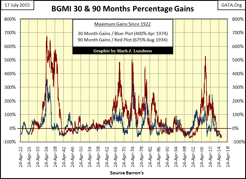
Had the “policy makers” not whacked gold mining shares at their March 2008 & April 2011 tops, I expect we’d see the BGMI currently performing well above the rate of CinC inflation, just as it did decades ago. Looking at the 90-month gain (Red Plot) above, had the “policy makers” not interfered in the precious metals market in early 2008, it wouldn’t have surprised me to see the BGMI’s 90-month gain rise to new all-time highs by a considerable margin. Today, after more than a decade of “monetary policy” shenanigans, the current depressed level of the BGMI is an insult to the intelligence of anyone who has made the effort to study market history, but a sad fact nonetheless.
The next chart documents an amazing fact on the long-term “growth” for the Dow Jones earnings: since 1929 for every billion dollars of currency put into circulation, the Dow Jones attempted to produce about one dollar in earnings. But since 1979 every time the Dow Jones actually does manage to produce a dollar in earnings per billion dollars in circulation, something bad happens to the Dow’s earnings and sometimes to the Dow Jones itself.
The last time the Dow’s earnings managed to reach one billionth the amount of currency in circulation was in the first week of November 2007, a month past the peak of the Dow Jones sub-prime bull market. General Motors’ disastrous earnings report in the second week of November marked the beginning of the Dow Jones’ second deepest bear market since 1885 as Dow earnings crumbled by more than $900 over the next year. In August 2008 earnings for the Dow Jones went negative for the first time since 1932.
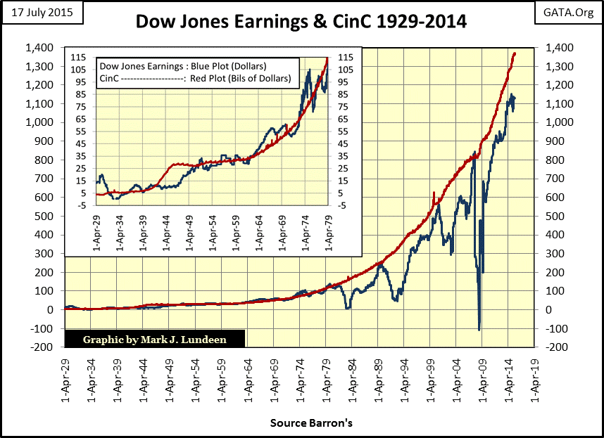
However, there was one major difference between the earnings collapses of 1932 and 2008. The Great Depression earnings collapse took twenty years before the Dow’s earnings returned to their peak level of April 1930, and twenty-five years for the Dow Jones itself to return to its September 1929 all-time high. With the credit-crisis collapse in earnings, the Dow Jones’ earnings soared to new all-time highs in just four years, and the Dow Jones itself made a new all-time high just 5.5 years after its October 2007 peak. It’s no mystery why the credit crisis crash recovered so quickly; the difference between the two market events was the direct intervention by the Federal Reserve to re-inflate market valuations and corporate earnings.
What could be wrong with that? Nothing as far as Doctor Bernanke is concerned, as we see in the quote below.
“--- the U.S. government has a technology, called a printing press (or, today, its electronic equivalent), that allows it to produce as many U.S. dollars as it wishes at essentially no cost.”
- Doctor B.S. Bernanke, Federal Reserve Board Governor, November 21, 2002
But it occurs to me that when something, like corporate earnings and stocks trading in the stock market, are defined in terms of something (the dollar) that is potentially infinite in quantity which is produced at “no cost”, then what value do the stocks that trade in the stock market or their earnings actually have? I’ll be the first to admit that few would jump to the conclusion that they are worth nothing. Currently people who see value in the dollar are correct, but they will be so for only as long as the dollar remains a monetary unit that people are willing to use as a means of exchange in their economic activities.
But there are those, including Timothy Geithner, Obama’s first Treasury Secretary, who is on record discussing whether to terminate the dollar’s reserve currency status. Organizations such as the IMF have been preparing for the demise of the dollar for decades with their SDR, for the good reasons seen in these charts; the mindless expansion of debt and currency. Here’s a CNN link where the IMF calls for an alternative to the dollar as the global reserve currency from February 2011. The IMF claimed their “Special Drawing Rights, or SDRs, could help stabilize the global financial system.” No explanation is given how the global financial system became unstable or why those at the highest levels of global finance saw the need to consider an alternative to the US dollar. CNN, as always dumb as a rock, never bothered to ask.
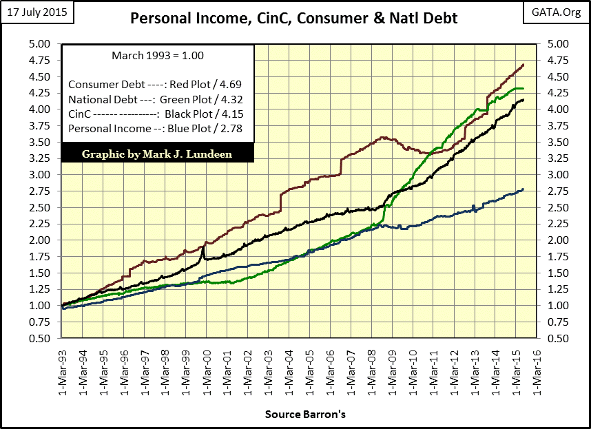
It’s all very sad, and we can see the effects of this pernicious “monetary policy” on “American consumers” in the chart below. But it’s no different than what is now happening in the European Union thanks to the ECB: “economic growth” (debt and currency creation / Red, Green & Black Plots) is expanding faster than personal income (Blue Plot). Wage earners attempt to augment their lagging earning power by leveraging their purchases with consumer debt (Red Plot). But eventually debt service for their personal debts and increases in taxes to service the national debt (Green Plot) consumes their income.
If you’re wondering why retail chains like Best Buy and fast-food outlets like MacDonald’s are closing stores, it’s because the thugs controlling the Federal Reserve and the ECB have impoverished their countries’ middle class with “economic growth” aka the expansion of credit and currency, an expansion as noted by Doctor B.S. Bernanke, that cost them nothing but will eventually cost the laboring classes everything. We live in a world that has rejected the Judeo-Christian ethics of right and wrong that has served the West so well for so long, choosing instead to embraced the Darwinian notions of academia and their minions in government and finance. So don’t be surprised that today the strong are now feeding on the weak because we now live in a world where might and the ability to create unlimited currency and credit makes right.


