Dow Jones’ Daily Volatility Continues to Increase


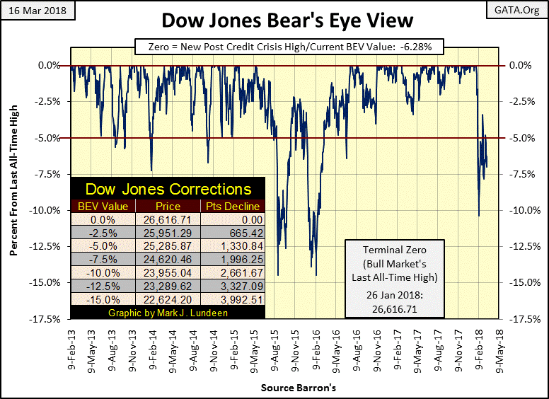
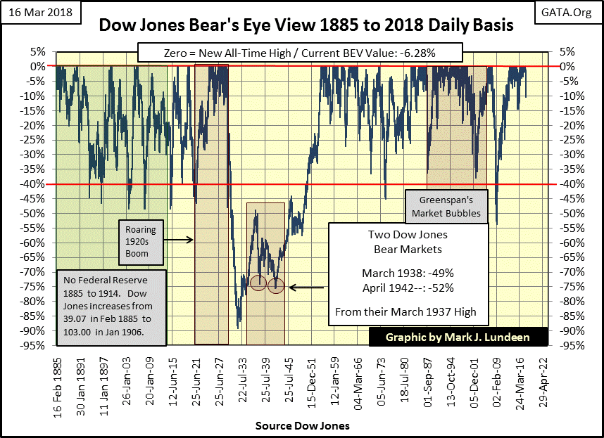
Since February 8th when the Dow Jones broke below its -10% BEV line in the chart below, it’s been building a pennant formation. I don’t know how significant it will be when the BEV plot breaks above or below the pennant, as technical analysis in today’s “regulated” markets isn’t what it used to be. However, I’m still short term bullish, expecting more BEV Zeros in the Dow Jones’ BEV chart before the next major market decline begins. So, I’m expecting the Dow Jones will break above this pennant by first crossing over its -2.5% line, and then increasing to new all-time highs in the weeks and months to come.
Do I have to say should the Dow Jones first break below its -10% BEV line I’ll have to reconsider all that?
The Dow Jones Total Market Group’s (DJTMG) top 20 declined by one this week, from 53 down to 52.
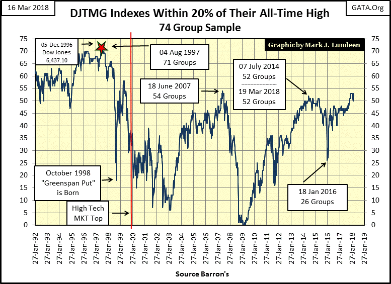
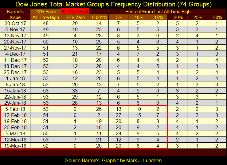
Next is the DJTMG’s top 20 frequency distribution table. There is movement between the BEV Zero down to the -15% columns, from which the top 20 is calculated, but since November the top 20 itself has remained above 49.
This is a trying market for both bulls and bears, as nothing new is developing. We did have the big drop in BEV Zeros in Barron’s 05 February issue. However looking at the table’s –0.001% column (groups just below a new all-time high down to -4.99% from one), it becomes apparent how the DJTMG has only stabilized at a lower level. What do I think of that? Only that this will continue until something changes, which will be clearly evident in the DJTMG’s top 20 chart above and its frequency distribution table below. When that will be I haven’t a clue.
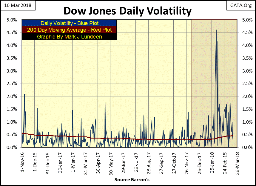
Still, I do note daily volatility for the Dow Jones is once again rising, as seen in its 200 Day Moving Average. As seen below, daily volatility for the Dow Jones bottomed last November near historic lows (0.30%) and has been rising since.
Historically, using this chart for making money in the stock market has been very simple: * be emotionally prepared * to buy the market when daily volatility is at a peak, then hold as volatility declines and sell when it declines somewhere below 0.5%. And I do mean emotionally prepared, as peaks in daily volatility are bear-market bottoms, times where bulls in the stock market are hard to come by. Buying at such times you’ll be doing so as everyone else is selling and that’s not easy. Lows in daily volatility are bull market tops, times where bears like me are widely discredited, but ultimately are proven correct.
So, seeing daily volatility for the Dow Jones bottoming last November, and then rising for the past four months is a very bearish development in the stock market.
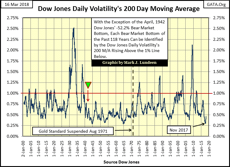
Should this development continue until the Dow Jones’ volatility’s 200 Day Moving Average rises to, and then above 1.0%, it won’t be good for the stock market’s bulls. Below is a table for the Dow Jones’ big-bear markets, bear markets where the Dow Jones has declined by 40% or more. I call these market declines 40% Bear markets. With the exception of the April 1942 -51.51% Dow Jones bear market bottom, as well as the August 1896 -44.77% decline, all the other big Dow Jones bear markets noted in the table can be identified in the chart above as its volatility’s 200 Day Moving Average increased above 1.0%.
There were times the plot above increased to 1.0% without producing a 40% bear market, but a bear market decline of just short of 40% typically resulted. One exception to that occurred in late summer of 2011, where the plot above broke above the 1.0% line with a Dow Jones decline of only 16% from its April highs. I attribute this anomaly to the fact that the market had not fully recovered from the trauma of the sub-prime mortgage bear market, a historic bottom that was separated from this spike in volatility by only two years from 2011.
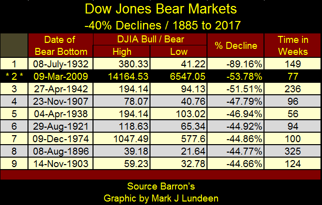
Here’s the BEV chart for the Dow Jones going back to 1885 that can be compared to the table above. Note on this chart: there’s a 45% bear market in 1914-15 not included in the table above. I don’t because the NYSE was closed for business from July 31st to December 11th 1914 because of the start of WW1. Also during this time Dow Jones Inc. totally reconfigured how it constructed the Dow Jones. So, I excluded this Dow Jones 40% bear market in the table, but you can see this 45% decline (?) in the charts.
One more chart on the increase in daily volatility of the Dow Jones showing the daily % moves since last October (Blue Plot) along with the 200 day moving average (Red Plot) seen two charts up. The four Dow Jones 2% days (daily moves of greater than 1.999%) are clearly seen in the chart, but there have only been four of them since the beginning of 2018, and they aren’t totally responsible for the rising trend in the 200 day moving average.
Look at the chart prior to January of this year, with all the daily moves of less than 0.5%. Since the beginning of the year the most prominent daily percentage moves have been those of more than 0.5%. It’s this increase in daily volatility that’s taking the 200 day moving average upward, should this continue it won’t be good for the stock market, as seen in the charts and table above.
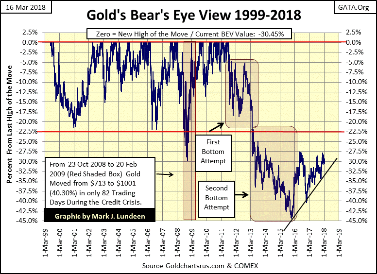
Gold, like the stock market, is in a holding pattern. However its BEV chart below is very encouraging. The question is whether gold next move is one that takes it below its rising trend line, or above the highs of July 2016, a question I’ve been asking since the first of the year.
I usually don’t cover much in the silver market as silver is only a source of frustration for me, but I still prefer silver to gold as an investment. I like the following chart plotting silver in both its BEV values and in dollars as it shows how versatile a BEV chart can be.
Between BEV Zeros (all-time highs) the dollar and BEV plots can be overlaid with each other. As silver’s last all-time high is still from January 1980, it’s possible to produce a remarkable chart where over a thirty-eight year period, one can see how far the price of silver has declined in percentage terms from its last all-time high (left scale), or see silver in dollar terms (right scale) from the same plot.
Once silver finally breaks above its last all-time high of January 1980, we’ll see the blue dollar plot shift ever lower to silver’s BEV plot.
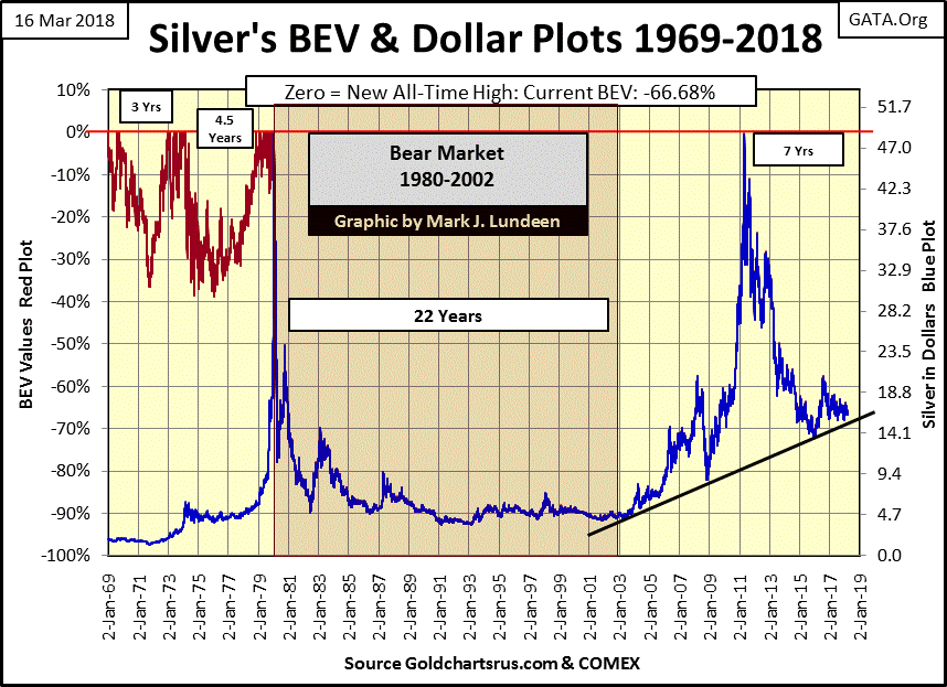
One of these days silver is going to go absolutely ape. What else today can still be purchased for a price that’s 66% less than what was going for in January 1980? Not much that I’m aware of. Yet the above ground supplies, and known reserves of silver ore are much smaller today than they were in 1980, as applications (demands) for this amazing metal have exploded.
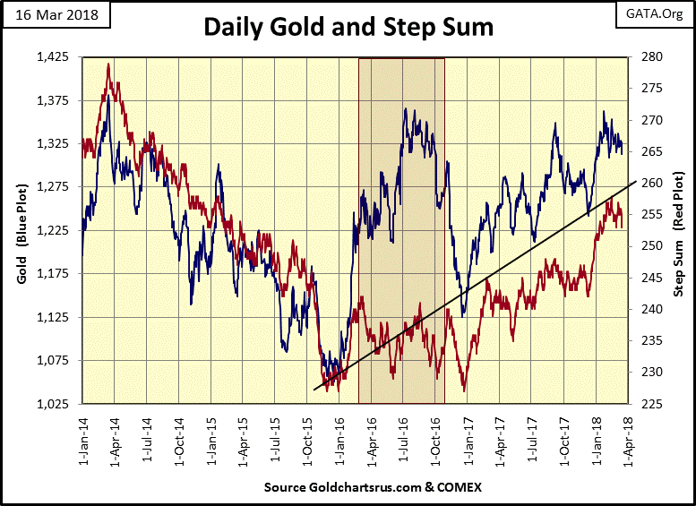
Here’s gold’s step sum chart. Both gold and its step sum have been trending sideways since January, but they won’t do that forever. One of these days this metal of kings is going to either take off or break lower, changing this eight week pattern. I’m thinking it will break this pattern by taking out the highs of July 2016 and beyond.
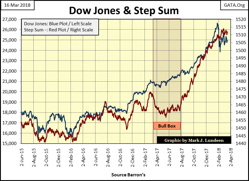
Here’s the step sum chart for the Dow Jones. Like gold, the Dow Jones (my proxy for the broad-stock market) is waiting for the next big thing to happen.
Moving on to gold and the Dow Jones’ step sum table, we see that for all the down days gold has endured in the past twenty-five trading sessions, its only off by $1.14 from February 9th. The bulls in the gold market may not be having their way at the COMEX, but they’re not running towards the tall grass either.
The Dow Jones since February 9th has seen more days advancing than declining, until February 27th, where like gold it has seen eight declining day and seven advancing, as seen in their 15 counts of -1. With their 15 counts of -1; gold has declined 1.64% since February 26th, while the Dow Jones is down by 2.97% in the past fifteen trading sessions. For what’s it worth, in my book that means that gold outperformed the Dow Jones at the end of the week.
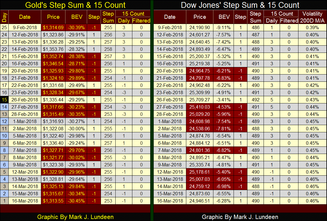
In the table’s far right we see the Dow Jones daily volatility’s 200 day moving average, which ended the week at 0.46%, continuing a rising trend in volatility that began last November when this moving average bottomed at 0.30%. You may want to review this data from 1900 to today in the chart I discussed earlier in this article. Should this continue it will be very hard for the stock market’s bulls, but ultimately very good for the bulls in the old monetary metals.
Weekly data on the Federal Reserves’ holding of US Treasury Debt (Red Plot below) has been published weekly in Barron’s since its 21 Dec 1936 issue ($2.43Bil). As of this week the Fed has monetized $4.18 trillion, an increase of three orders of magnitude and just short a double in the past eighty-two years. Now that’s some real “policy making.”
Barron’s also began publishing foreign central bank holdings of US Treasury Debt (Blue Plot) in its 08 May 1995 issue. As seen below, foreign central banks haven’t been slouches either when it comes to making “policy.” But so what? How does this impact us?
For one thing, when you, I or our pension funds make the decision of purchasing US Treasury Debt for our portfolios; we can only purchase as much of the US national debt as our savings or cash inflows will allow. Central banks on the other hand can, and do purchase as much as they want, as purchasing US Treasury debt for them is an act of money creation. To be sure there are considerations other than just a desire to corner the Treasury-debt market, but basically the more T-debt central banks monetize, the more T-debt they can monetize.
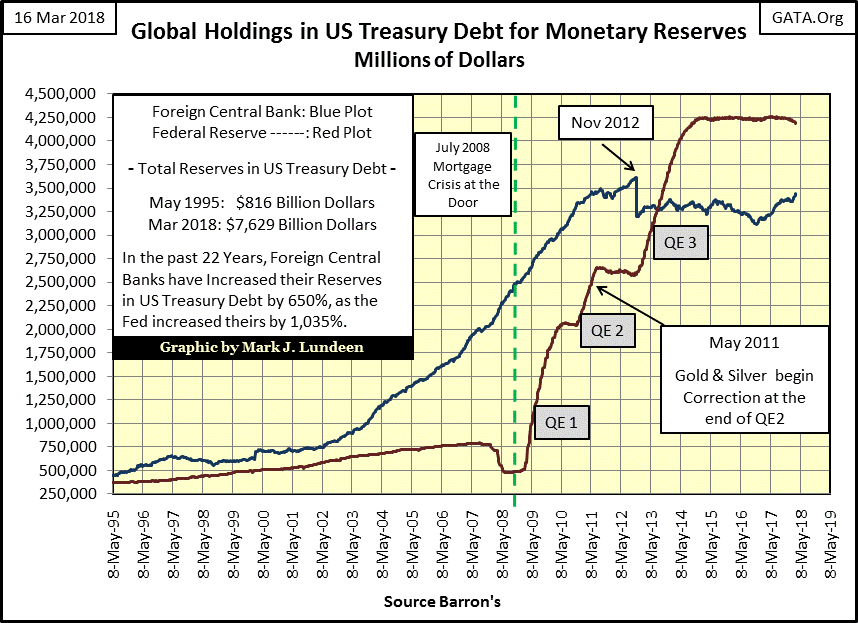
So, since May 1995 where has all this monetary inflation flowed to? Not into precious metals assets, especially since May 2011, proof that valuations in gold and silver are * NOT * driven by monetary inflation. If they were, the historic increase in monetary inflation seen above would have driven gold and silver prices far above where they are now.
As I’m not privy to the intimate details of the “policy makers” discussions, I can’t say with certainty exactly what they’ve done with all the money they’ve created since May 1995. But by asking ourselves where have bubbles formed in asset valuations since May 1995, I expect we’ll come close to the answer we’re looking for.
I made the table below listing the big bubbles and busts since May 1995. The dates are subjective rather than facts set in concrete, however the table makes my point that inflation flowing from central banks are either inflating bubbles in the financial markets, or opposing deflation during bear markets.
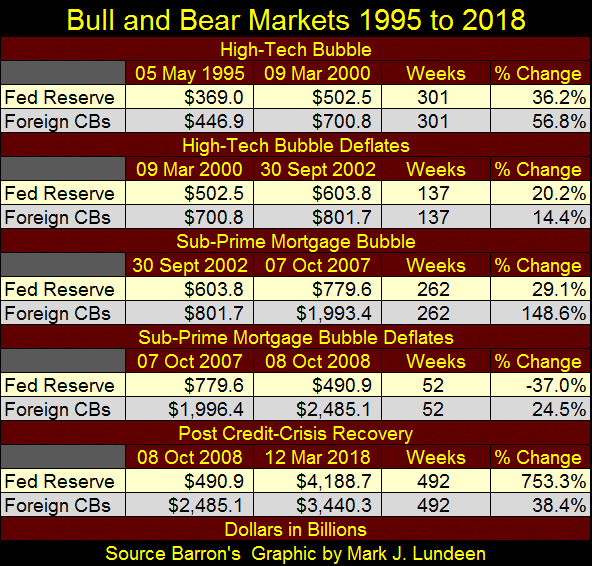
Apparently, “monetary policy’s” primary goal in inflating the money supply is to seek the pleasures of rising asset valuations, while minimize the pain of deflation in the following bear market.
This week demand for electric power (EP) is set to rise above its BEV -2% line for the first time since October 2015. I don’t believe this is due to seasonal factors, so it must be from rising demand for electrical power from the economy.
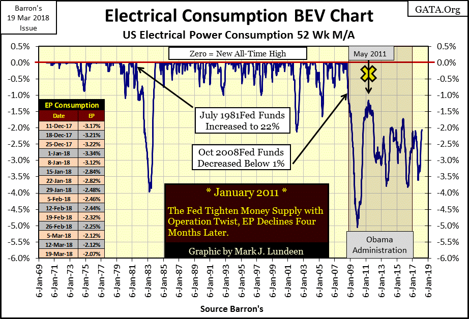
I’ll give President Trump credit for this, as a year into his administration he has brought back to the United States some manufacturing jobs the “policy makers” had exported abroad since the 1970s. There are even stories of steel mills reopening in America’s rust belt, and steel mills consume large amounts of EP.
One thing I don’t agree with Trump is his selecting Larry Kudlow as his new economic advisor. Kudlow’s first entry into the White House was during the Reagan Administration, coming in with Jack Kemp’s supply siders. This was when the US national debt first broke above 1 trillion dollars, the same time the United States stopped being a creditor to the world, and became a net debtor. Kudlow is a big believer in “policy making” and no friend to gold and silver investors.
During the Reagan administration, Larry Kudlow and the supply siders were very successful in turning around the economy and the financial markets. But at the time (1981) bond yields in the US Treasury bond markets were around 15%, beginning a decline that ended only in July 2016. In such an economic environment it was only natural that stock and bond valuations would rise, while gold and silver based assets declined.
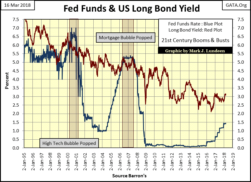
Today’s situation is completely different, as bond yields are now rebounding after hitting a historic low two years ago (Red Plot above). The “policy makers” have been very successful in postponing the coming bear market for a long time, as they’ve been successful in controlling bond yields and interest rates. Let’s see what the world looks like when the red plot above breaks above 4%, with or without Kudlow advising Trump.
On a lighter note, here’s a video of a cat watching Alfred Hitchcock’s Psycho.
https://www.youtube.com/watch?v=_kgRFHaNo-Y&feature=youtu.be
I don’t believe it for a second. That cat looks too young to understand the plot, but it’s hilarious anyway.
Mark J. Lundeen