Dow Jones And The Barron’s Gold Mining Index - A Ninety-Eight Year Examination


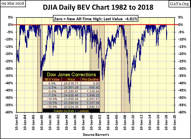
Looking at the market at the close of this week, apparently the “policy makers” have once again gotten a handle on the financial markets. In the Dow Jones BEV chart below it did correct 10%; but only for one day, February 8th, with the Dow Jones coming back since. It closed the week only 4.81% from its last all-time high of January 26th, and so could easily make a new BEV Zero in the days and weeks to come. As 10% corrections go, as seen in the thirty-six years of the Dow Jones BEV chart below, this wasn’t much of a double-digit correction.
This plus the Dow Jones Total Market Groups’ (DJTMG) top 20 closed the week back at 53 of 74 groups within 20% of their last all-time highs.
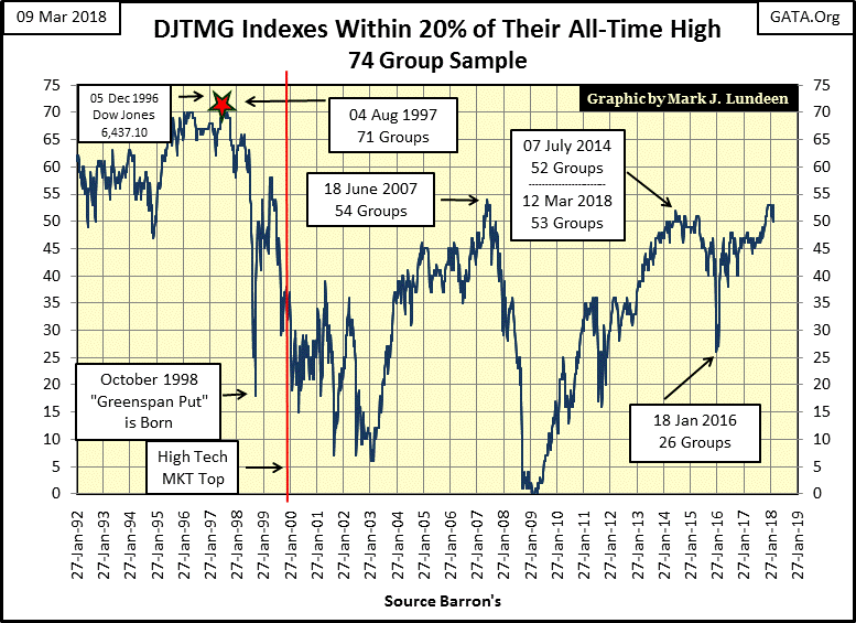
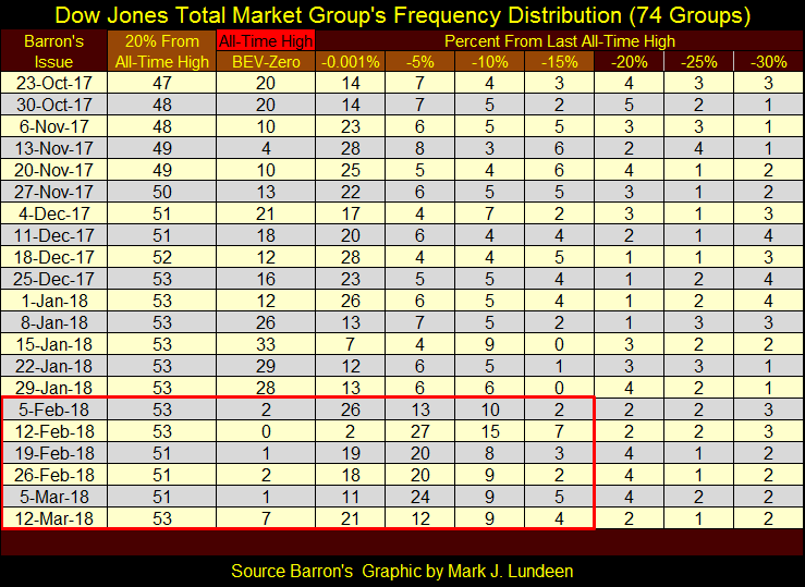
Here’s the frequency table for the top 20 below. The DJTMG’s high-water mark was in Barron’s January 29th issue; after which the BEV Zeros (new all-time highs) dropped dramatically as groups shifted lower, to the right of the table. But after the top 20 declined to only 51, groups are once again migrating upward towards the left side of the table. Like I said, it wasn’t much of a 10% correction in the market.
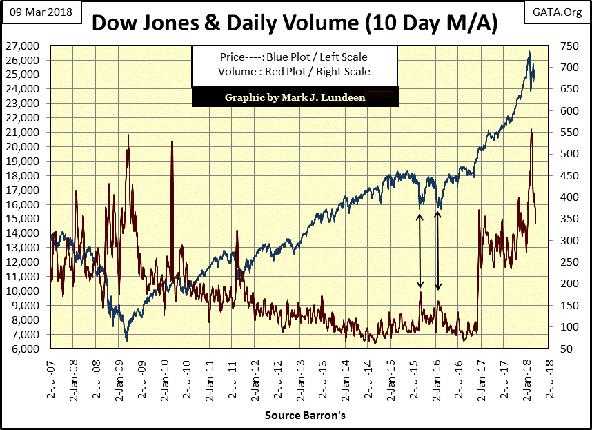
If this continues the Dow Jones and the general market may once again rise into record territory; and why not, as the “policy makers” are once again doing their “market stability” thing, as seen in the chart below.
As so many times before in the chart, the latest decline in the Dow Jones (Blue Plot) was accompanied by a spike in trading volume (Red Plot), followed by the Dow Jones increasing on declining trading volume. This is a total inversion of the law of supply and demand, so I’m thinking it must be some kind of “policy initiative.”
If the “policy makers” find it so easy to manipulate the stock market higher, why shouldn’t we join in the party on Wall Street? With the Dow Jones so close to making a new all-time high after a pitiful double-digit correction, I refuse to argue the point. I’m only pointing out that what the “policy makers” are doing is ultimately self-destructive, as “stabilizing” the market as they do requires that debt loads on someone or something must increase; and there’s a limit to how much debt an individual, a corporation, a government or an economy can carry.
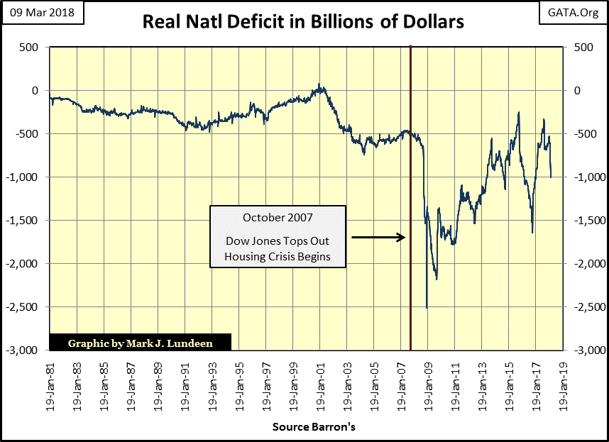
Below is a chart of what I call the Real National Deficit. I take the US national debt from 52weeks before and subtract from that the national debt published in this week’s Barron’s. This week it was -$1,000 billion (-$1 Trillion), illustrating the debt carried by the US Treasury increased by a trillion dollars from 52 weeks before.
That sounds pretty bad, but during the mortgage crisis of October 2007 to March 2009 it was worse. In January 2009 the US national debt had increased by over $2.5 trillion in a 52wk period as the “policy makers” used the US Treasury’s balance sheet to bailout Wall Street’s big banks.
This is “implementing market stability” of a kind; the kind of “market stability” that ends in national bankruptcy. But when will that happen? When bond yields in the Treasury market rise above an unknown threshold, possibly around the 5% seen in the chart below, though that is pure speculation on my part. What isn’t speculation is that bond yields (Red Plot) in the corporate, municipal, and US Treasury markets have been rising since the summer of 2016.
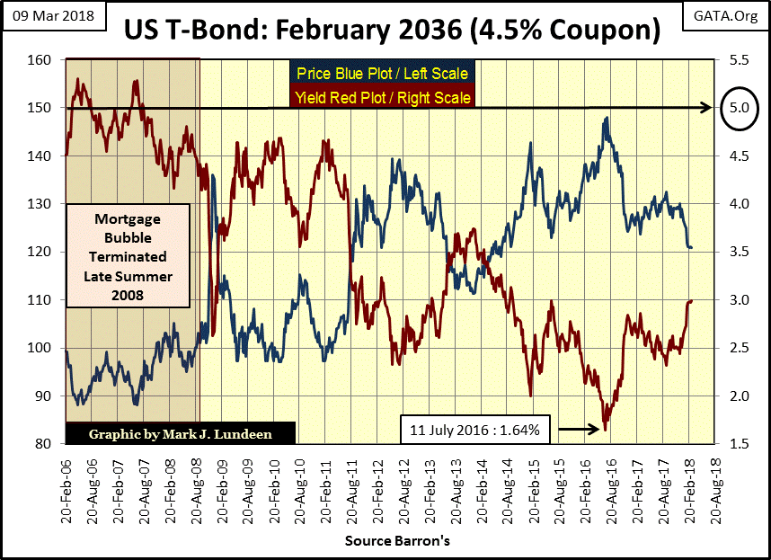
As they do bond prices decline, and this is the problem as Wall Street has bundled most bonds trading in the bond markets with interest-rate derivatives to “hedge interest-rate risks.” Right now these derivatives are worthless. But as interest rates continue to rise they will come into the money and become tens or even hundreds of trillions of dollars in liabilities to someone.
Who stands behind these derivatives? The big banks would say that they do, but as we discovered during the mortgage crisis, it was actually the US Government that ultimately did, as seen in the Real National Deficit chart above. This is what we’ve come to expect when we have the best Congress money can buy.
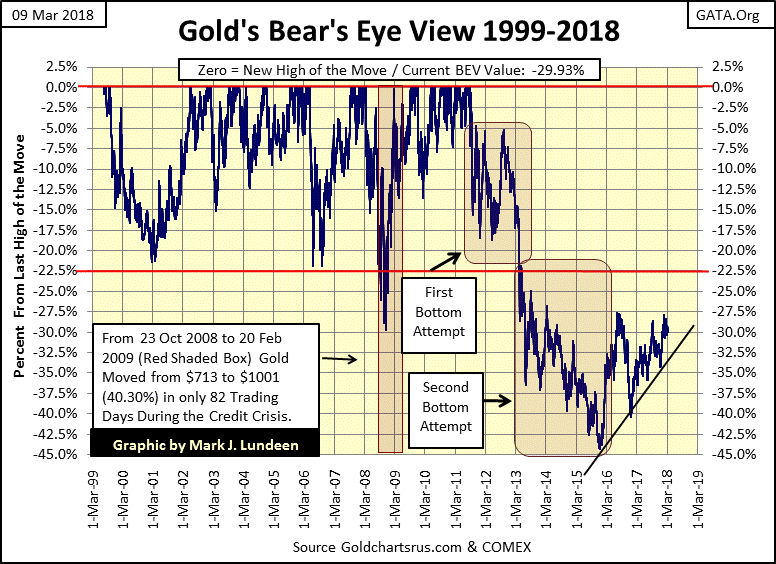
Gold is looking good in its BEV chart below. True it’s not going up as we would all wish, but I’m grateful it’s not going down.
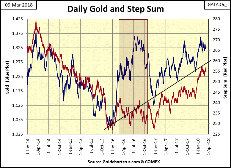
For another look at gold here’s its step sum chart, and everything is looking good there too. There isn’t much to say I haven’t said for the past month, as nothing new or exciting in the gold market has really happened for weeks now. What I’m waiting for is for gold to do something different than just move in its current trading range seen below. Hopefully gold’s next big move will be to the upside and take out its highs of July 2016.
Last week I said the only thing I can think of when looking at the chart below was a historic market top. A week later I’m beginning to change my mind, thinking of the real possibility that the Dow Jones still has some more new all-time highs coming its way before its terminal bull market top.
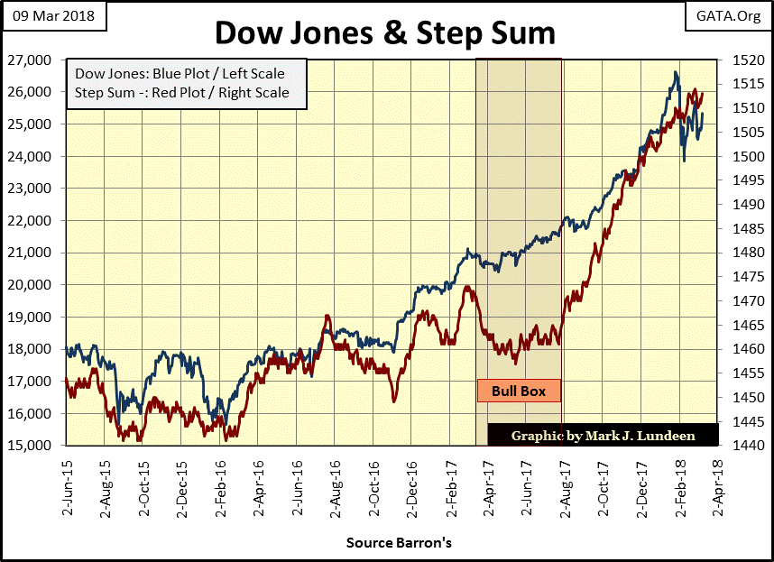
What changed from last Friday was this week, a week that saw the Dow Jones close up in four of the five days, with two of the days moving the Dow Jones up by over 1.25%. As I’ve noted many times in my commentary, bull markets move upwards in tiny steps from one day to the next. And seeing the Dow Jones advance on Monday by 1.37% and again on Friday by 1.77% really isn’t all that bullish.
Also I added a new column on the Dow Jones side of the step sum table below; its daily volatility 200 Day Moving Average. In the past twenty-five NYSE trading sessions it has increased to 0.45% from 0.34%. Since 1900 (118 years) seeing this indicator advance towards, and then above 1.00% has frequently been a trigger for real bear-market action. So let’s follow it and see if that proves to be true once again.
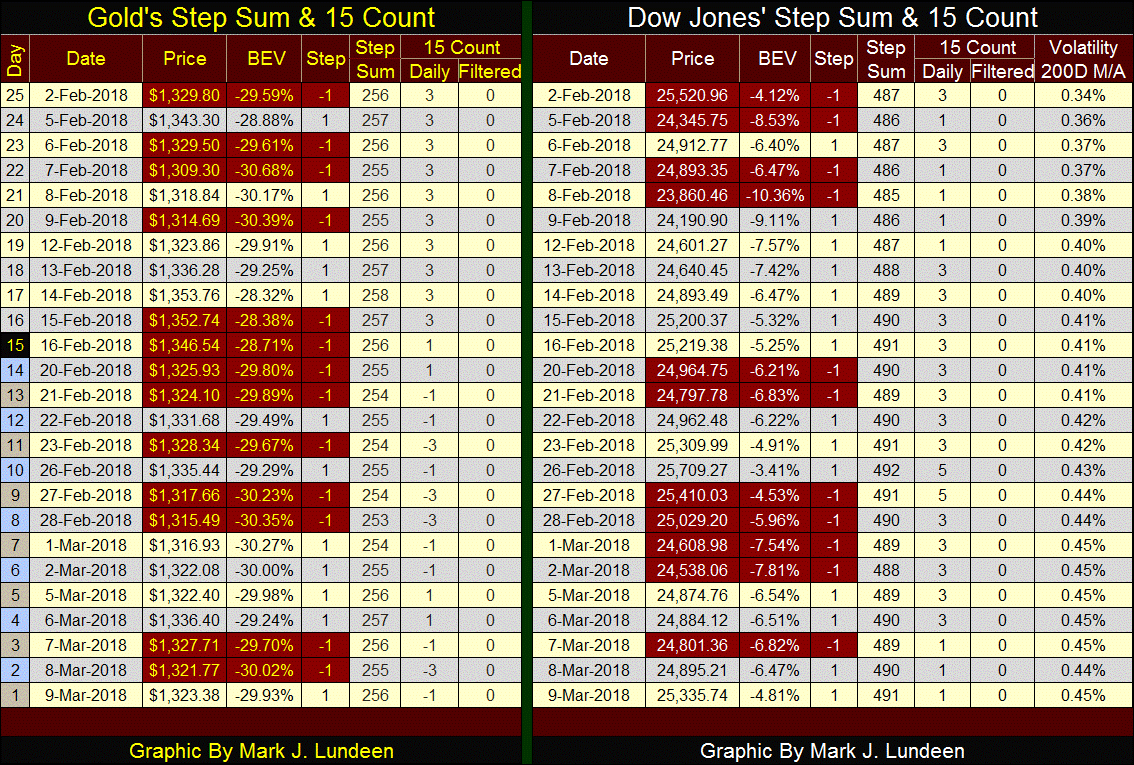
Unlike the Dow Jones, gold’s step sum ended the week unchanged from twenty-five days ago (256), as its price fell just a tad below where it was on February 2nd. As I’ve said before, gold and by proxy silver and the mining shares are just waiting for their next big move. Whether it will be up or down I can’t say, but I’m thinking it will be up.
What I can say with certainty is that the days where gold and its step sum in the table above continue lounging around doing a lot of nothing are numbered. As gold has been trending upward since its very hard bottom of December 2015, I’m anticipating the next big move in gold will be to the upside.
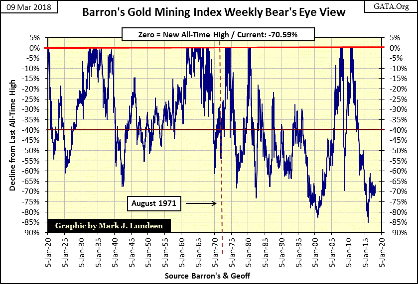
For a decade investing in precious metals mining has been an exercise in futility. Yes, beginning in 2001 (chart below) the Barron’s Gold Mining Index (BGMI) was off to a good start; then came the sub-prime mortgage crisis and the miners got whacked -70% in the seven months from March to October 2008.
However, in October 2008 they broke to the upside five months before the rest of the market bottomed in March 2009. On that advance the BGMI broke above its March 2008 highs in the spring of 2011. Unfortunately, in early May 2011 they began a four year decline that took the PM miners back to where they were in 2001, declining 85% in the process – Ouch!
Their last advance began in December 2015, and believe it or not, in the summer of 2016 the gold miners were frequently the top performing group in the Dow Jones Total Market Groups (DJTMG / Red Box). Sadly, as seen in the chart below, this advance in the BGMI’s proved to be short lived. For the best part of the last two years the BGMI has been in a tight trading range as it decides whether its next big move will be to the down, or upside.
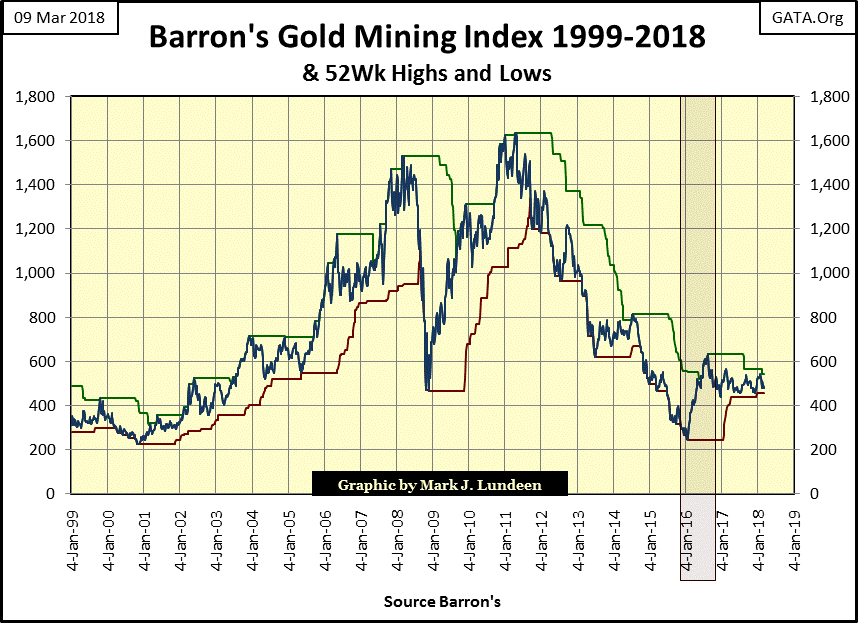
All and all, the chart above tells a tale-of-woe for people investing in gold and silver mining for the past decade. But investing in gold mining hasn’t always been this way.
In the chart’s insert below, the gold mining shares were a rare bright light shining in the depressing 1930s. They didn’t do much during the following two decades, but beginning in the early 1960s they once again began to rise, along with bond yields, as consumer price inflation began rising.
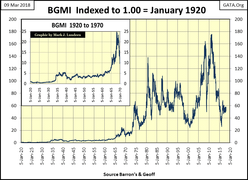
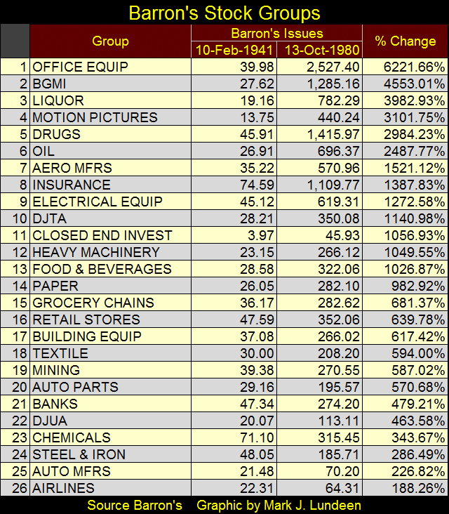
In a bull market advance that began in the early 1960s, the mining shares peaked in October 1980, ten months after gold and silver did in January 1980. The power of that advance can be seen in the table below, comparing the BGMI to the other groups in the Barron’s Stock Averages data set; a data set that was discontinued in October 1988, with the sole exception of the BGMI, which Barron’s has continuously published since 1938.
Below we see from 1941 to October 1980, the BGMI (#2) had outperformed all groups in the Barron’s Stock Averages with the sole exception of the Office Equipment Group, the group that contained computer manufactures like IBM. The difference between the gold-mining bull market of 1960 to 1980, and the bull market seen in the PM mining sector since 2001 (if I dare call it that) is remarkable.
And exactly what is that difference? Maybe the chart below plotting the indexed values of the Dow Jones (Red Plot), the BGMI (Blue Plot) and Currency in Circulation (CinC: the volume of paper money in circulation / Green Plot) can cast some light on this.
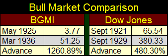
Looking first at the chart’s insert for 1920-70 we see the Dow Jones’ Roaring 1920s bull market, a bad time for the gold miners who took losses of 60% from 1920 to 1925. However, with the arrival of the Great Depression, the BGMI proved immune to the losses taken by just about everything else trading on the NYSE.
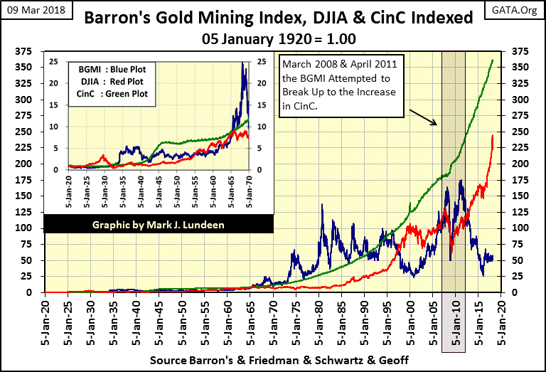
As seen the market action of the Dow Jones and the BGMI in the insert, the 1930’s bull market for the BGMI was actually greater than the bull market for the Dow Jones in the 1920s. Here’s a table giving the specifics for the Dow Jones and the BGMI from their 1920s’ bear market bottoms to their bull market tops.
Back to the above chart’s insert. It took the next two decades for the Dow Jones to catch up with the gains the BGMI made in the 1930s. When the Dow Jones finally caught up with the Green CinC plot in 1966 (my proxy for inflation) it began a frustrating period where from 1966 to 1981, the Dow Jones attempted to break above, and stay above 1000 five times, but failed to do so as the green CinC plot advanced relentlessly upward. This is an important point, how since 1966 the Dow Jones has failed to catch up to the green CinC plot. This proves the gains seen by the broad-stock market have not kept up with the rate of inflation since 1966.
The BGMI was different. On a January 1920 basis, the BGMI has outperformed the Dow Jones for most of the 20th century; and from 1965 to 1996, seldom dropped below the rate of inflation as seen in the green CinC plot. However, since 2001 the BGMI twice attempted, but failed to catch up with the green CinC plot in March 2008 and again in April 2011. Currently the BGMI has fallen into the largest gap between it and the advance in CinC since 1920, as the Dow Jones is now attempting to catch up to CinC inflation. To do so the Dow Jones would have to close at 39,559, with CinC at current levels.
Well good luck to the stock market bulls for that! My view on this is the Red Dow Jones plot hasn’t risen above the Green CinC plot since 1966, and isn’t likely to do so in the life time of anyone reading this article.
As for the BGMI, a study of the data seen above proves that the BGMI has been in-the-main countercyclical to the general stock market for almost a hundred years. I wouldn’t be surprised to see the Blue BGMI plot sometime in the next few years once again rising above the Green CinC plot. At the current level of CinC, that would take the BGMI above 3,395 (it closed this week at 477), but * NOT * until the Red Dow Jones plot once again enters into a major bear market.
As seen in the 1920s and again from 1958 to 1981, bull markets in the BGMI are not fueled by the rising CinC plot (monetary inflation from the Federal Reserve), the Dow Jones is. What drives the BGMI to record levels is deflation in the Dow Jones, which motivates refugee dollars fleeing the previously inflated, but now deflating stock market into the safety of the BGMI.
As there are a good number of companies trading daily at the NYSE whose market capitalization is larger than the combined market cap of the entire gold & silver mining industry. The potential for monster gains in the BGMI in a big bear market at the NYSE and NASDAQ is enormous!
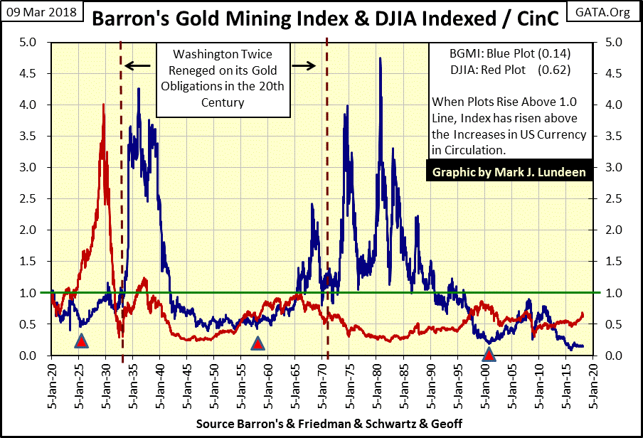
The following chart uses the same data displayed in the chart above, but uses the CinC data to create ratios for the Dow Jones and BGMI. In effect we’re seeing the market action in the Dow Jones and BGMI in terms of CinC.
When these plots rise, they are appreciating faster than the rate of inflation as seen by increases in CinC. When they decline they are underperforming the advances in CinC. When they are above the green 1.0 line, their advances since January 1920 have been greater than the increases in CinC. Below the green 1.0 line, and their advances have been less than the increases in CinC since January 1920. I find the resulting plots for the Dow Jones / CinC and the BGMI / CinC ratios remarkably insightful and I hope you do too.
I have to note my gratitude to Geoff from the Land Down Under who made the effort to obtain historical price data for Home Stake Mining from 1920 to 1938, which allowed me to push back this data to January 1920. He really made a huge difference in this and the chart above. Thanks Geoff!
I placed three triangles in the chart to identify three triggering events for bull markets in the BGMI.
The first triangle marks April 1925, when the then new Federal Reserve extended a HUGE $200 million dollar line of credit to the Bank of England. This action in “monetary policy” not only ignited the Roaring 1920s bull market for the Dow Jones, but marked the bottom of the 60% bear market decline in the BGMI.
Of the two bull markets seen in the chart above for the 1920s, note how the Dow Jones inflated first, and how the bull market for the BGMI really didn’t get going until after the Dow Jones began deflating from its 1929 top.
This pattern also proved true after the second triggering event in 1958, when increases in CinC finally triggered a run on the US gold reserves that didn’t end until August 1971 when the US Treasury terminated the Bretton Woods $35 gold peg on the US dollar.
Looking at the Dow Jones and BGMI plots, both advanced from 1958 to 1966, but as the Dow Jones began its 1966 decline (in terms of CinC), the BGMI began its best bull market of the past 100 years. One regrettable feature of gold mining shares is their extreme volatility, especially after August 1971, which is on full display in the chart above, and BEV chart below.
The third triggering event (third triangle / two charts up) was when Alan Greenspan’s Federal Reserve made the decision to re-inflate the stock market after the NASDAQ bubble of the 1990s burst in 2000, by inflating a bubble in the mortgage market for single family homes.
Looking at the BGMI and Dow Jones’ CinC ratio plots after 2001 (two charts up), the BGMI was clearly the winner until May 2011. Since then the BGMI saw its deepest bear market decline since 1920, an 85% collapse from its highs of April 2011 in December 2015. Ouch! That’s the bad news. But the good news is that after such a decline we can be fairly certain that the bottom was put in December 2015.
No one ever became rich by buying high and selling low. So, the trick is to find an investment class that few people want, because that’s when it’s cheap, and have the patience to wait until it once again becomes valuable to all. In March 2018, I believe that describes the gold and silver mining companies. And when will the world once again discovers the value of investing in these miners? That should be fairly clear to anyone who takes a few moments of their time to study the three charts above; when the stock and bond markets, now inflated to historic valuations, once again begin deflating in a historic bear market.
Mac Balkam, CEO of Eskay Mining has released a report on the company’s plans for 2018 in the link below.
http://eskaymining.com/index.php/2018/03/05/update-on-ongoing-geological-review/
Eskay’s property high in the Canadian Rockies has many exciting prospects, of which Silver Standards current project of exploring for another Eskay Creek deposit is only one. No one can offer guarantees with mineral exploration, so don’t risk the baby’s milk money speculating in a mineral exploration play. But if Eskay is successful in discovering another huge ore body Canada’s Golden Triangle is known for, pennies invested could become dollars.
Mark J. Lundeen


