Dow Jones Averages or S&P500 Index. Which is Better?
 share
share
 share
share
 share
share
 share
share
 share
share
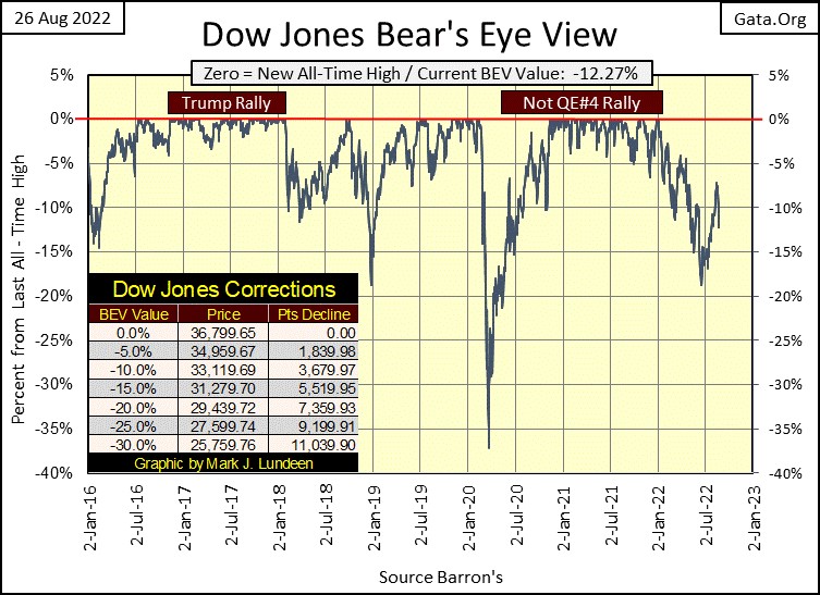
Last week for the most part, was a quiet market. Then came Friday and the Dow Jones dropped over 1000 points, becoming a day of extreme volatility, a dreaded 2% day, closing 3.03% down from Thursday’s close, taking the Dow Jones back below its BEV -10% line in the BEV chart below.
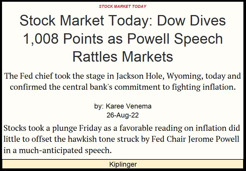
What happened? Fed Chairman Powell gave a speech at the annual Jackson Hole “Policy Conference”, or whatever these vile people call this infernal get together. It appears the FOMC remains committed to fighting inflation, so the stock market swooned.
I haven’t read the speech; I don’t care to read the speech, because if anyone really believes the FOMC is committed to “fighting inflation”, they are totally ignorant of what the Federal Reserve has been doing to the American dollar for the past century – destroying the dollar via inflation. These people are not going to stop issuing dollars in ever greater volume, until either the FOMC, or the dollar ceases to be.
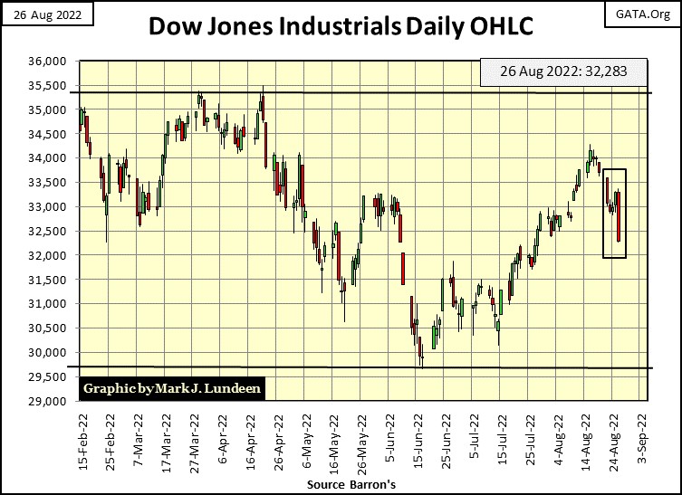
Here's the Dow Jones in daily bars below. It was a bad week for the Dow Jones.
It was also a bad week for the other major market indexes I follow in the table below.
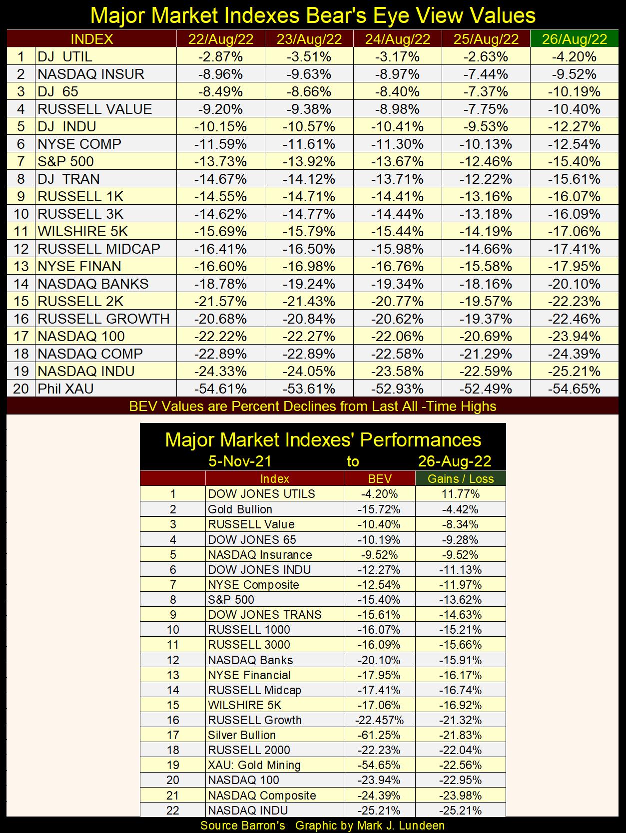
So, do I still believe the Dow Jones could be making new all-time highs sometime before the November elections? Keep in mind, as I sit high above in the market’s peanut gallery, I have no exposure to this market. So, if I’m wrong it won’t cost me any money. But yes, I’m still optimistic the Dow Jones will recover from the losses of this week, and begin advancing again before November.
This assumes that today’s Dow Jones 2% day is a one-time market event. Should market volatility increase, and we once again experience multiple days of extreme volatility (Dow Jones 2% days) in the coming weeks, I just might change my bullish outlook for the next few months. I should also note the NYSE was just short of seeing a day-of-extreme market breadth; a 70% A-D Day, as today closed as a -69% NYSE A-D Day, so not far from one.
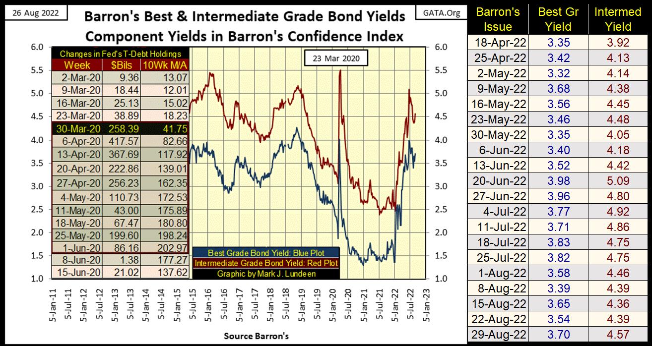
One bearish factor I’m following is corporate bond yields. They bottomed a few weeks ago in Barron’s August 8th issue (chart below), but began rising again this week. Should they break above their recent highs seen in Barron’s June 20th issue, that would not be good for the stock market.
It’s not evident in the chart below, but the lows in corporate bond yields seen in 2021-22 are increasingly looking like the bottom of a forty-one-year declining trend in bond yields. A market move that took bond yields from over 15% in 1981, down to low single-digit yields in 2021-22. That is what a BIG-BULL MARKET in bonds looks like.
The rise in bond yields since January 2022, has the appearance of the beginning of a BIG-BEAR MARKET in bonds. Typically, bonds go into bear markets as an inevitable reaction to rising consumer price inflation. So, seeing these two bond series’ yields jump up this week, a week where Chairman Powell restated the FOMC’s commitment in fighting inflation, is the bond market telling the FOMC exactly what it thinks of their supposed commitment in fighting inflation – you stink, boo!
I’m keeping my eyes on bond yields.
Bond yields are good to follow, but most people think of market prices when thinking about a bull or bear market. So, here is a chart on the prices for the Dow Jones Corporate Bond Index going back to 2016. Looking at the decline in bond yields since 2019 above, resulting in a nice increase in bond prices below.
Then, as bond yields above began rising in January 2022, above, bond prices began deflating below.
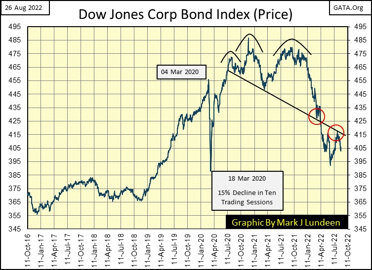
I don’t consider myself a market technician when it comes to reading a chart, but there are some nice technical chart formations in the chart above, that suggest the current bear market in bonds has further to go.
First, a beautiful head & shoulders (H&S) top formation that began in July 2020. In January 2022, when the bond prices began breaking down from this formation’s right shoulder, bond prices kept going down until it hit the H&S’s neckline (black line), where it bounced in late March (red circle). A few weeks later, bond prices once again began declining, but this time braking below the H&S’s neckline.
Bond prices bottomed in May, and began advancing, until it hit this same neckline in July (second red circle), when bond prices hit a ceiling, and began declining again. That is not a good technical feature for the bulls.
As I said before, I don’t consider myself a chart technician, but then one doesn’t have to be a weatherman to know which way the wind blows. Looking at the bond yields, and prices above, I believe bonds are in the early stages of a massive bear market that will ultimately devastate pension funds and insurance company reserves.
It's a shame, but all too many retired-wage earners who had little, to no personal exposure to the financial markets, will someday in the not too distance future, receive an education on counter-party risk they won’t like one bit, for what we see happening in the bond market in these charts.
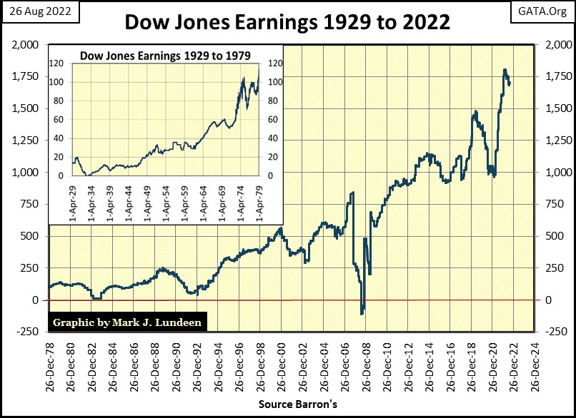
Let’s look at the earnings for the Dow Jones below; they’re coming off an all-time high. These near record earnings are a bit of a puzzle when we consider all the shutdowns in the global economy since the introduction of the CCP / Covid virus in late 2019.
Then again maybe not, as like everything else denominated in dollars, corporate earnings are subject to increasing levels of dollars (monetary inflation) circulating in the economy. Or will be until a bubble pops somewhere in the financial market place, as happened in late 2007 when the sub-prime mortgage bubble popped.
Dow Jones earnings actually went negative in 2008. The only other time that happened was in 1932, during the Great Depression Crash. As the bubble the FOMC has inflated into our current market, in stocks, bonds, and real estate is the largest they have ever attempted, what are the chances, that from their current lofty levels, Dow Jones earnings will for the third time in a century once again go negative? I don’t know, but I believe such a market event is a sure thing before the pending bear market hits its ultimate bottom.
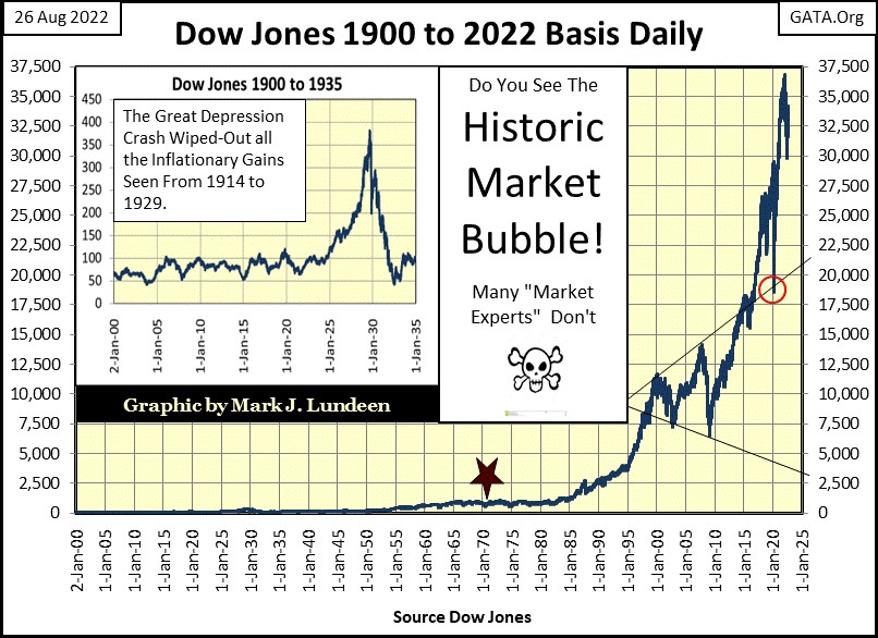
I like market history. So, here is a little back ground on the Dow Jones Industrial Average.
The Dow Jones Industrials (what I call the Dow Jones) is composed of thirty big dividend paying, blue-chip companies trading in the stock market. All the Dow Jones Averages are unique among today’s major-market indexes, as they are constructed by using a mathematical average of share prices. Something that could be done using a pencil on paper, as a century ago, that is exactly how these averages were calculated before being published. The Dow Jones averages were created before digital calculators or computers were even thought possible. So, Dow Jones (the publisher) kept it simple; an average of thirty blue-chip stocks.
Over the decades, there have been many different companies used in the Dow Jones. General Electric was included in the Dow Jones in 1896, until it was omitted some years ago. But for most companies, inclusion in the Dow Jones is only a temporary event, as what is considered a major manufacturing company in the economy changes over time. For example; Baldwin (steam) Locomotive Manufacturing was in the Dow Jones in 1916, but ain’t no more.
When a company is removed from a Dow Jones Average, and replaced by another, their share prices are always a mismatch. To adjust for the many different share prices that have come and gone, or have them halved via a stock split, the Dow Jones (the publisher) uses what is called a divisor to adjust for the change.
Within the professional investment community, some saw a problem with the Dow Jones Averages; that they were the average of share prices. Problems came about because of this. Such as when IBM refused to declare a stock split for many years when its share prices increased well over $100 a share, when the other companies in the Dow Jones always declared a stock split before their share prices broke over $100. This situation resulted in a 1% daily move in IBM to overwhelm a 1% daily move, in say General Electric in the Dow Jones Industrial Average. Before computing power for crunching numbers was a reality, there was always the trusty pencil on paper. What was to be done?
Standard and Poors began their S&P500 Index when digital computing power became commercially available. I don’t know exactly when; sometime in the 1960s I believe. The S&P500 is an index of the market capitalization of the 500 largest corporations trading in the stock market.
I have to admit; an index of market capitalization, as compared to an average of share prices is the way to go. That was until the market capitalization of 21st century high-tech companies developing trillion-dollar plus market caps, the problem of one or more companies dominating a stock average or index, was for a time solved.
So, which is the superior method for measuring the ups and downs of a market? An average of thirty share prices or an index of market capitalization of 500 companies?
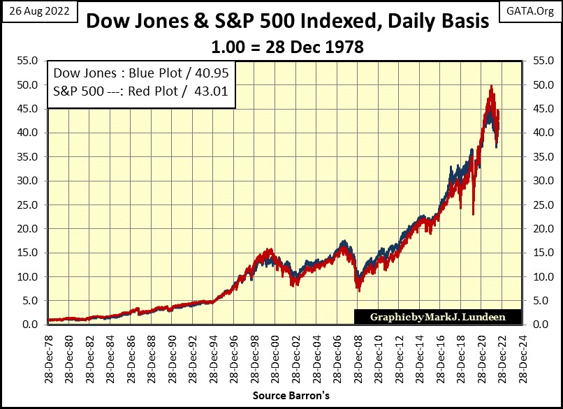
At this week’s close; there isn’t much difference between the two, as seen in the chart above plotting the indexed value of the Dow Jones (Blue Plot) and the S&P500 (Red Plot). Indexed to 1.00 = 28 December 1978, after forty-four years the S&P500 was 2.06 points, or (5.0%) greater than the Dow Jones. But over the decades, there were times when the Dow Jones was larger than the S&P500, but never by much.
So, this is why I like using the Dow Jones in my market commentary, because it is just a good, if not better than the S&P500. That plus the Dow Jones is so historical. When horses pulled taxi-cabs in front of the New York Stock Exchange, and high-tech was a smoke belching steam locomotive, pencils on paper were doing long division to calculate the Dow Jones somewhere in an office at Dow Jones Inc, under a kerosene lamp. There is a lot of history in the chart below.
Another very positive factor favoring my use of Dow Jones data, is I could go to the public library to compile amazing market data from old issues of Barron’s. Try that with Standard & Poors data going back to the 1920s! I’m sure it’s available, but S&P is going to charge you for the data as they have always targeted their services toward institutional consumers of financial data. While Dow Jones has always focused publishing financial data for anyone interested in the market, including the individual / retail investor.
In truth, both Dow Jones (the publisher) and Standard & Poors are great financial publishing companies; truly unique in the world. Is it possible for anyone to get dependable, in-depth market data for say Germany, Japan or the UK going back to the 1920s? What about Canada or Mexico? I think not.
That week after week, I can publish charts of historical market data, is only because Dow Jones (the publisher) has made all this wonderful market data available to the public for many decades, all for the price of an issue of the Wall Street Journal or Barron’s Financial Weekly. Thanks guys.
Let’s move on to gold’s BEV chart below. This week there was some excitement in the stock market. But market action for the precious metal markets remains tedious.
Why? Gold and silver prices are manipulated, and they have been for a very long time. One can see the finger prints of the manipulators in the chart below plotting the 10Wk M/A of the indexed price of gold, and the yield for the long T-bond.
During the 1969 to 1980 bull market in gold (Blue Plot), a massive bear market in bonds (Red Plot) was a fact of life on Wall Street, as seen by rising bond yields. Many “market experts” today say that rising bond yields are a negative for gold and silver prices. That rising bond yields make bonds more desirable than holding an asset that offers no return to its holder, such as gold and silver bullion.
BUT, that wasn’t true from 1969 to 1980, as rising bond yields always come with deflating bond prices. By the late 1970s, bonds had earned their moniker of “certificates of confiscation” as rising CPI inflation, as well as declining bond prices decimated many personal fortunes, endowments for colleges, and trust funds invested in the bond market. Gold, offering no rate of return to its holders, looked very attractive to many bond holders in the 1970s as a means of preserving their wealth in an inflationary economy.
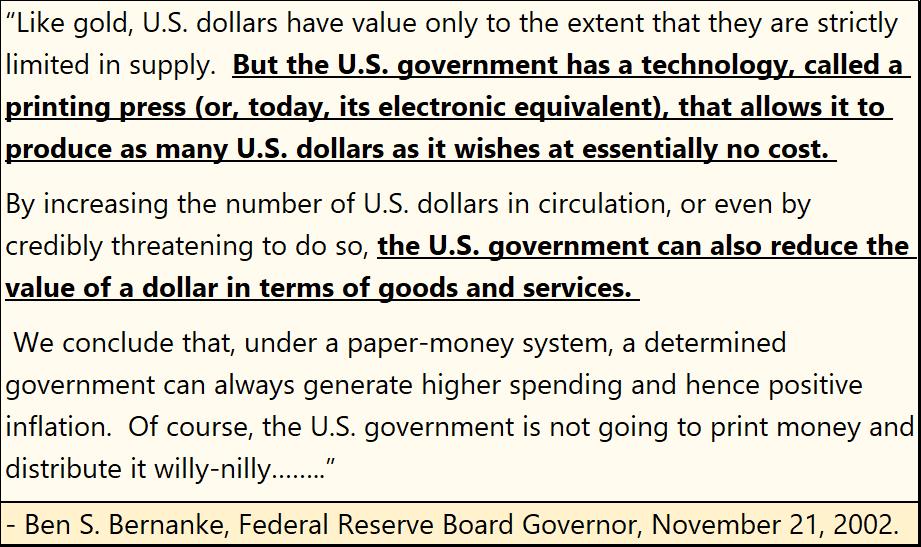
Then came the early 1980s, a time when CPI inflation was put in a box by then Fed Chairman Paul Volcker, which resulted in a bull market in bonds, a bull market that continued to the 2020s. Gold in 1980 began a twenty-year bear market, that not surprisingly, ended when Doctor Ben Bernanke made a speech in November 2002 concerning the deflation seen in the NASDAQ High-Tech stocks. A speech boasting how the FOMC was willing, and able to issue as many dollars as needed, if that is what it took to break the back of deflation in market valuations.
A promise Doctor Bernanke kept with his three QEs six years later (January 2008).
He was very aware of the decline in the dollar’s purchasing power such a “policy” would inflict on holders of dollars, not that he, and the other members of the FOMC were much concerned about that.
What is so odd about the chart below is the interest rate environment the two bull markets in gold began in. The first in the late 1960s began as CPI inflation and bond yields were rising. The second in 2001, as bond yields, and CPI inflation still had twenty years to decline. Why the difference?
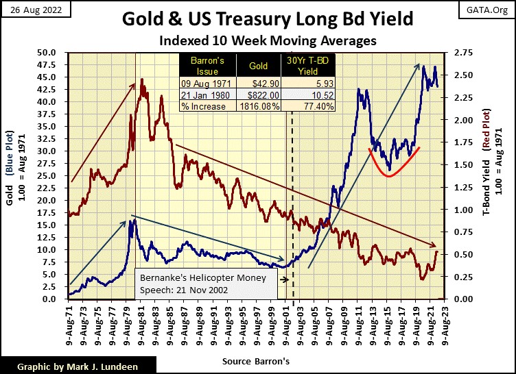
I believe the difference between the two, is the degree of control the “policy makers” had over market prices from the early 1970s to the 2000s. Before 1980, the price of gold was fixed in the spot market, where sales of physical gold set market prices. Gold prices began rising in the early 1970s, because the “policy makers” had not the means to stop that from happening.
But by 2000, the price of gold was now fixed in the COMEX futures market, where paper promises, promised to deliver gold sometime in the future, as many tons of phantom gold, or silver, as needed to suppress precious metal prices.
Had, during the 1980 to 2001 precious metals bear market, the precious metal pricing mechanism NOT been switched from the physical spot, to the paper futures market, gold today would be trading many times the prices seen today.
Considering the huge increases in the volume of dollars now circulating in the economy, as seen in the expansion of the Federal Reserve’s balance sheet below, how high would gold and silver prices be today in 2022: $5000 / $250, possibility even $10,000 / $500?
We’ll never know. But considering the massive inflation the FOMC has “injected” into the economy (below), it’s safe assuming they would be much higher than where gold and silver closed this week on Friday; $1737.36 / $18.87.
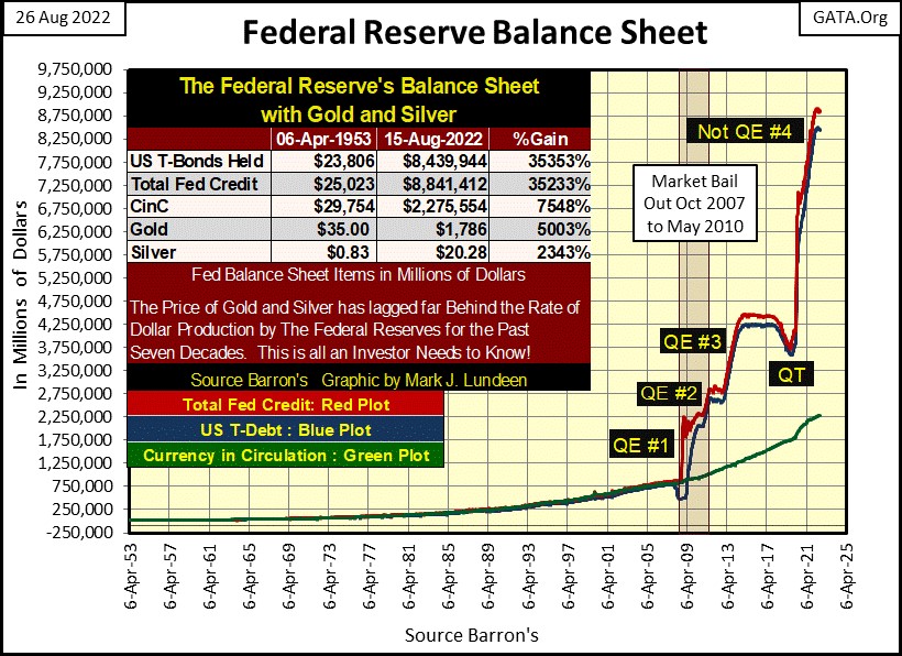
Then there are bond yields to consider too. With the FOMC increasing their balance sheet by more than a factor of 10 in the past fourteen years, where would bond yields be today if the “policy makers” did not manipulate prices in the fixed income markets. That is a really frightful thought!
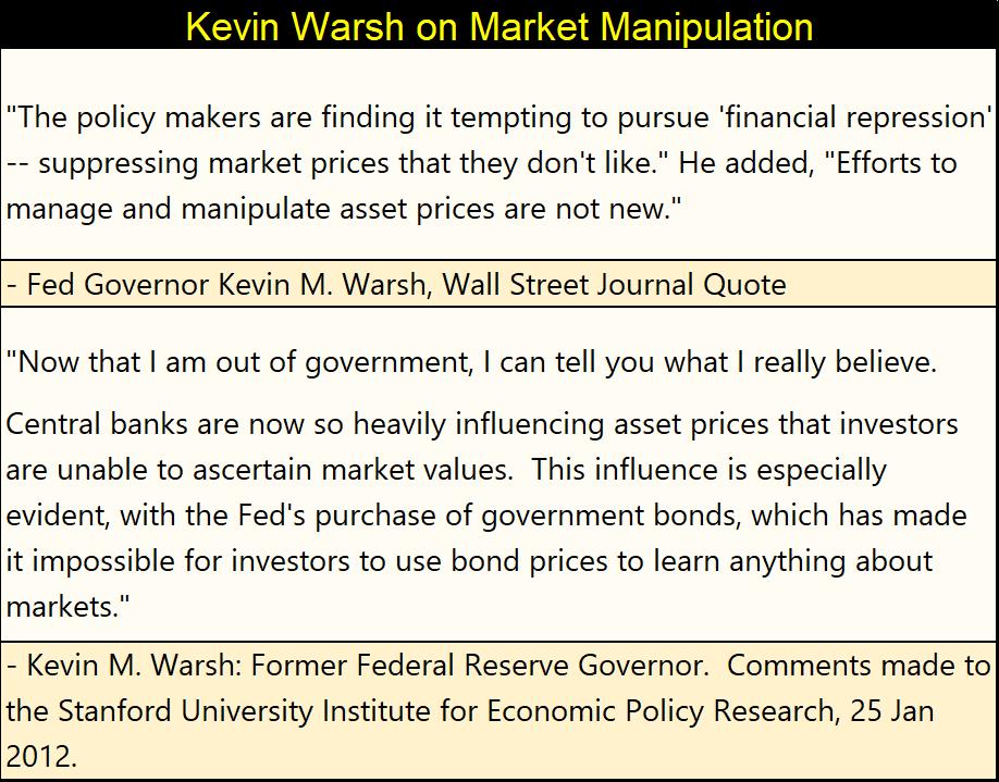
And the “policy makers” do manipulate market valuations, as admitted by Kevin Warsh, former Fed Governor (Member FOMC).
None of the tricks played by today’s “policy makers” are new. These tricks, and their devastating consequences have been known for many hundreds of years. So, why are “policy makers” today doing the same monetary shenanigans as were done many centuries ago? These people are highly educated in all things economic, yet still they do what they do; because they are bad people.
During the regency of France’s King Louise XV, John Law below, was given control over early 18th century France’s “monetary policy”, during which he received an interesting education on monetary inflation. As will all of us, when all is said and done concerning the FOMC and their inflationary “monetary policy.”
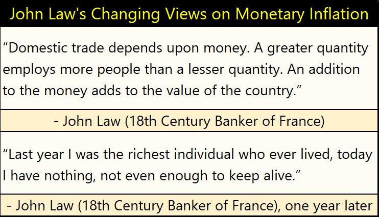
It’s just so sad that America’s political, and economic elite are so indifferent to the fate they are inflicting on the little people; society’s “useless eaters” they have total contempt for. Because they do know exactly what they are doing, and do it anyways. In case you are wondering who the useless eaters are; that’s you and me!
So much for that. Let’s move on to the step sum tables below for gold and the Dow Jones.
Gold closed this week very near where it was a month ago, gaining just over $12 since July 25th. I included a chart on gold going back to 1970 above. Go back and look at it. Since 2001, gold has been advancing. So why doesn’t it feel like gold (silver too) are in a bull market? Give it time, it will. How much time? How long before bond yields are twice that of this week’s close?
Gold’s step sum is doggedly staying above 290, meaning since July 25th there have been as many advancing days as decliners. But gold doesn’t really want to go down on the down days, and can’t move up much on the advancing days. Thanks to the COMEX goons, this is what a bull market in gold looks like in 2022.
Look at gold’s daily volatility’s 200D M/A. It closed this week exactly where it was a month ago 0.68%. I can tell you exactly why this bull market in gold is such a BS market – bull markets in gold are exciting markets, as deflating valuations inspires people to dump stocks and bonds. Looking for a safe harbor in the storm, they move into gold and silver, and not minding paying top dollar to do so.
That too will come; but when? I’d say when bond yields are double where they closed this week. People then, will be happy they bought gold now.
And it’s not just gold. Silver and precious metal mining shares are excellent purchases today for the same reasons given above. But get a core holding of gold and silver bullion first, before buying their miners. The mix of bullion and miners is important. In the future, you won’t want to sell bullion for dollars, because one day, the dollar is going to be a dead financial asset. That is when gold and silver bullion is really going to shine brightly. Still, between now and then, you’re going to need dollars to pay your bills and taxes, that is where the precious metal miners come in.
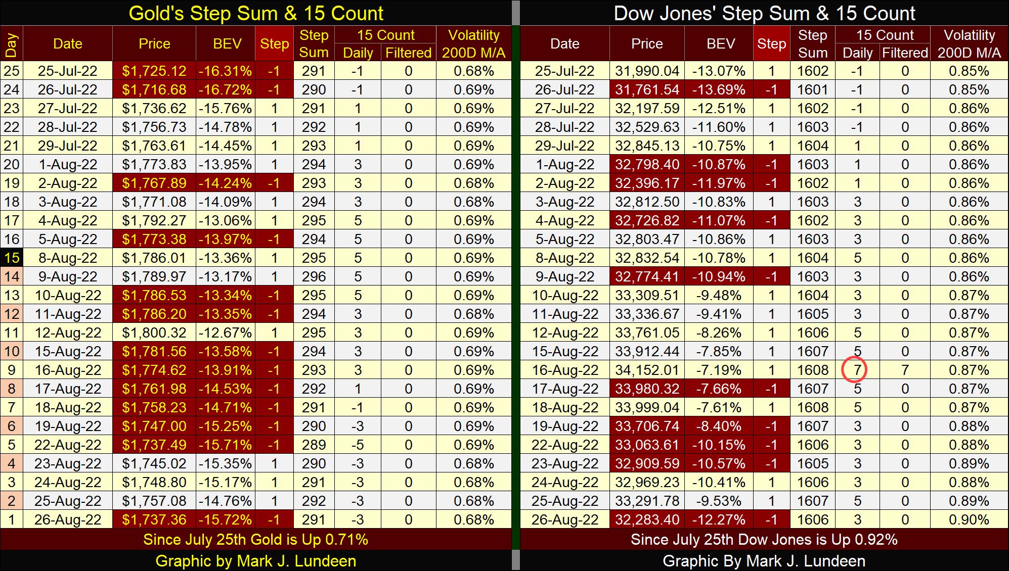
Everything I said about gold can be said about the Dow Jones in its step sum table. Except for the Dow Jones, its daily volatility’s 200D M/A; is trending up. Unlike daily volatility for gold, rising volatility for the Dow Jones is NEVER good. If history is any guide, and it usually is, should daily volatility for the Dow Jones continue to advance, somewhere between this week’s close of 0.90% and 1.00%, we just might see some excitement not just in the stock market, but in gold and silver too.
For next week, I’m watching if we see more extreme days in the stock market. A couple of Dow Jones’ 2% days, and a NYSE 70% A-D Day; a day of extreme market breadth would make me wonder if I’m right about the Dow Jones making a few new all-time highs before the November election.
Mark J. Lundeen
26 August 2022
*******
share
share
share
share
share