Dow Jones Industrials Average Market Volatility Daily Close to Close Prices 1900 to 2008


Drug addiction is precisely the correct analogy of what has happened to the world’s capital markets during the Greenspan’s Chairmanship of the Federal Reserve.
Heroin’s pleasures are short term and pernicious as are credit expansions of bubble proportions. The pleasure comes upfront and at great cost to the internal workings of the addict or an economy. As the addiction progresses to its terminal phase, previous normal behavior is abandoned. The addict devotes all his time and energy in avoiding withdrawal. Addiction ceases to be fun when thieving and prostitution becomes a way of life. For the heroin addict, he steals everything he can get his hands on, while the “policy makers” attempt to inflate the money supply to a degree that would have been inconceivable only a few years before.
There is only one difference between an individual’s heroin addiction and the credit addiction of our current world. One is a personal tragedy, the other global catastrophe.
The world is in need of new sources of energy, while civil and capital infrastructure must be maintained. These are the concerns of a normal economy. But our current economy is not normal. The nation’s energy is spent attempting to satisfy its credit addicted economy’s needs of ever more “liquidity” to avoid debt deflation. It is addictive reasoning that drives “policy makers” to “inject” hundreds of billions of dollars of additional inflationary credit again and again into a deflating credit market.
Monetary “liquidity injections.” How Freudian is that? Deep down inside, the “policy makers” know who they are and what they do.
But there is nothing new under the sun. We’ve seen this addictive behavior before, but not to this degree. Yale economics professor Irving Fisher is an exact 1929 analogy to Allan Greenspan. Fisher was the hero of a new economic era of the 1920s.
He never chaired the Federal Reserve, but his influence in the Fed eighty years ago was significant. His work created the first inflation indexes. His economic series of statistics was published weekly in Barron’s over eighty years ago. Do the two following quotes sound familiar?
"The nation is marching along a permanently high plateau of prosperity." - Irving Fisher, Yale University 1929 (5 days later Black Tuesday occurred)
I don’t have a date for the quote below, but clearly the consequences of the credit bubble he championed became apparent even to Professor Fisher.
"Thus, our national circulating medium is now at the mercy of loan transactions of banks, which lend, not money, but promises to supply money they do not possess." - Irving Fisher, 100% Money
So what should we know about credit addiction and markets? Simple: Just say no.
Still, when “policy makers” do “inject liquidity” into a financial market, the price-discovery mechanism in the market becomes obviously distorted. After all, the intention of “policy” is to achieve a desired price that the market itself will not produce. Let’s see if we can detect “policy’s needle tracks” in the Dow Jones Industrials in the chart below. The daily closing price volatility of the Dow Jones Industrials from 1900 to 2008 has a story to tell.
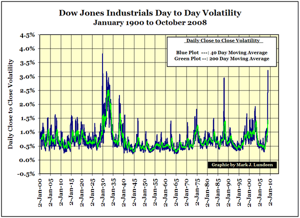
I would ignore the 1987 spike. For a day the computers went wild.
What’s actually displayed in the above chart is how enthusiastically market participants rushed toward profits and then fled their losses whether under the influence of “policy” or not. The chart below proves that fear trumped greed from 1900 to 2008. For 108 years, DJIA bear bottoms and spikes in volatility match up almost exactly.
There are three types of market volatility above as defined by the 200-day moving average.
1) Low-Range Market Volatility.
The 200-Day Moving Average oscillates above and below the 0.5% line. Economically, type 1 volatility is the most productive type of volatility. Greed urges capital to seek profitable risks, while fear checks imprudence. We see it from 1942 to 1972. For the most part, banks were the good shepherds of scarce capital, Dow Jones Average companies produced real goods and services, stock trading was largely done by professionals and the public’s idea of “investing for the long term” was purchasing US savings bonds.
2) Mid-Range Market Volatility.
The 200-Day Moving Average shifts up 0.5% and ranges between 0.5% and 1.0%. Type 2 volatility provides more excitement for stock traders and investors with good money to be made, and lost. The public is discovering the stock market.
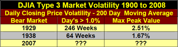
3) Persistent, Extreme Market Volatility.
Type 3 volatility is identified by its intensity and uniquely, its duration as the market undergoes “policy” withdrawal.
- 200-Day Moving Average rises above the 1.0% line and remains there for longer than a year.
- 200-Day Moving Average peaks above the 1.5% line peaks.
Since January 1900, type 3 volatility has occurred only twice. We see it occur during the crash of 1929-32 and again in the 1938 bear market, but not since. I suspect that if the Great Crash had not pistol-whipped investors from 1929 to 1932, the 1938 bear would not have seen these extremes in volatility. Strangely, the second worse market decline in the 123 year history of the DJIA was in 1942, and it occurred in type 1 volatility. Look at the chart. Clearly the “policy makers” were busy with a world war and left the stock market alone.
As I’ve noted before, I am not cheering for the bear. But things were done by the “best and the brightest” in finance and academia that we lesser mortals will soon have to cope with. This study of market volatility suggests that the stock market will enter into type 3 market volatility the next few weeks as deflationary forces overwhelm “policy.” That is not good for future share prices. If the past is a guide to the future, we will have to endure years of persistent, extreme volatility.
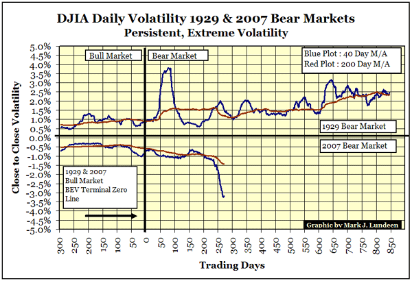
As seen in the chart above, type 3 market volatility effect price swings on both the upside as well as the downside as the market convulses in “policy” withdrawal. As we see in the chart above, the strongest stock market rallies of the 20th century occurred during the Great Depression stock market crash.
That is a fact.
So if in the current bear market, the DJIA should rally a thousand or more points in a few weeks time, it is not necessarily a sign of restored health in the stock market. Quite the opposite should be assumed.
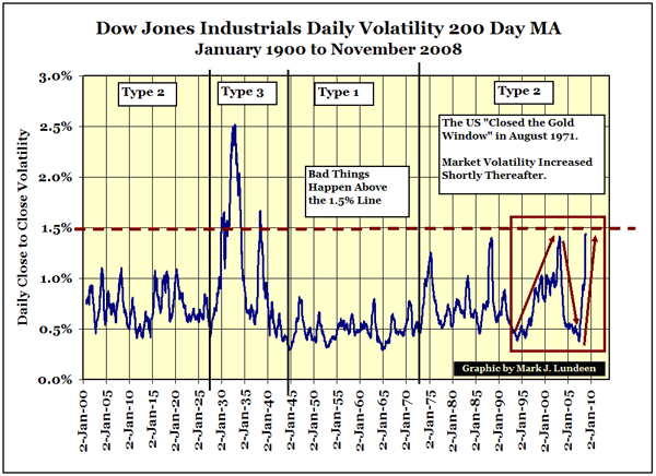
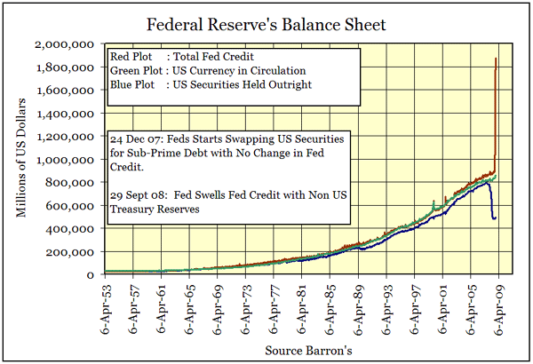
The chart above is disconcerting. Within the Red Box we see Greenspan’s bubble market as well as the 1995-99 “Greenspan Puts” in action. Doctor Greenspan’s “liquidity injections” changed the way the stock market worked. His “Policy” trumped fear – for a while.
When the 200 day moving average crosses the 1.5% line, the first condition of type 3 volatility will have been met. If in the next year the 200 day moving average does not fall below 1% line, type 3 market volatility will have been confirmed. For the market to achieve this a year from now, the DJIA will be trading at significantly lower levels than it currently is. The 2007 DJIA bear is going to get some real respect before this is all over.
The following chart will become a weekly addition to my weekly 1929 & 2007 Bear Market Race Report The values for the 2007 bear are negative in the chart only as I inverted the series by multiplying each data point by a -1. That allowed me to have the 1929 bear on the top half of the chart and the 2007 bear on the bottom. Ignore the 2007 bear’s negative values, focus on the percentage terms.
One more closing thought. Many economic assets and commodity prices have had wild price swings both up and down in the last year. I suspect it is not just the stock market suffering from monetary toxic shock syndrome. I expect energy and precious metals to do very well in the years to come as the “policy makers” finish their work on the dollar. When wealth can not be defined in dollar terms, wealth will be defined in some other term.
Note on the data used in this article. I used my factor corrected Dow Jones Industrials series. The data is daily. The volatility measurement is closing prices differentials from one day to the next.