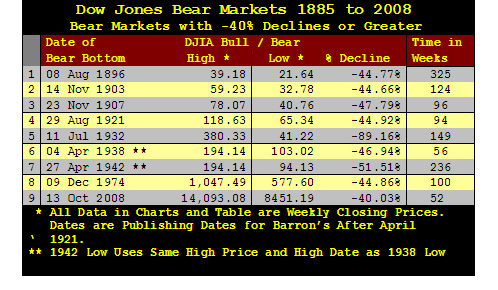
Dow Jones Industrials -40% Declines 1885 to 2008


From 1885 to 2008, (123 years) the Dow Jones Industrial Average, (DJIA*) has fallen -40% from a bull market high on only nine occasions. Such deep bear markets are always historic and distressing.
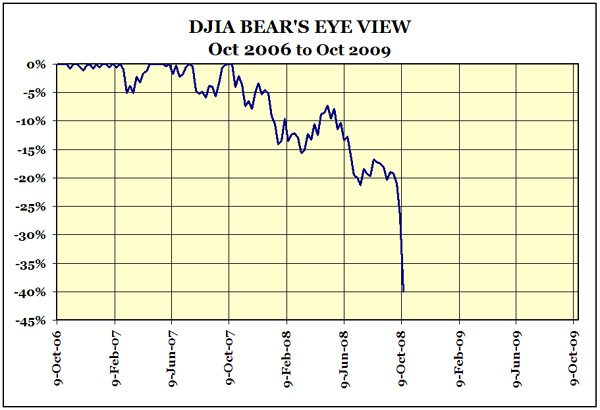
Using my “Bear’s Eye View” (BEV) chart below, we see 123 years of DJIA market history in chart format below.
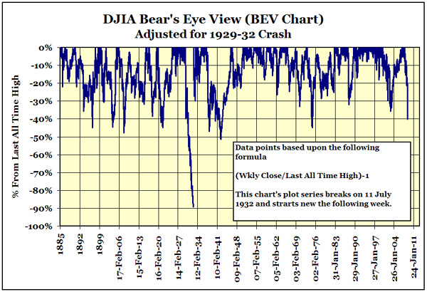
The above BEV chart is “adjusted” for the 1929 to 32 crash. The chart below is unadjusted.
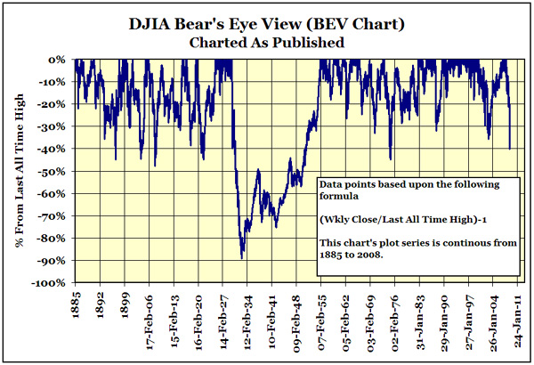
As you can see, without the adjustment we lose data on the Bull-Bear cycles of 1938 and 1942.
My BEV Chart presents a unique view of the 123 year history of the Dow Jones Industrial Average by rendering each Dow data point into specific percentage information ranging from 0% to -100%. This format allows direct comparison of every bull and bear market cycle from 1885 to 2008.
For those who are familiar with my BEV chart technique and my 1885 to 2008 DJIA factor unified data series, they may want to skip down to the BEV charts below the next few paragraphs.
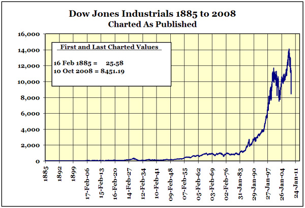
When new all-time highs occur, they are recorded as 0% in the BEV chart. So understand that bull markets are seen as a series of 0% in a BEV chart. All other data points that are * not * new all-time highs are reduced to a precise negative percentage decline from its last all-time high. There are compromises in processing market data like this, but more is gained than lost by compressing 123 years of DJIA history into percentage terms bounded in a range between 0% to -100%. Charting the data as published actually provides little historical information due to the effects of monetary inflation over the decades. Below is a chart of the unaltered data I used in creating my DJIA BEV charts. Compare the information displayed by my above BEV charts with what you see below.
(*) A quick note on my data is in order. The Dow Jones Averages had many modifications over decades to arrive at their present construction. In 1885 Charles Dow compiled a single average of 14 stocks consisting of 2 industrial and 12 rail-road companies. The current 30 stock Dow Jones Industrial Average was not published until 01 October 1928. The data charted and used in the table above uses Dow Jones approved sources of what is available from Dow Jones from 1885 to 1928. Dissimilar data series were combined into one unified data series by the use of factors. The author chose to use his unified data series in the table for continuity purposes for the 6,452 weeks of data of the Dow Jones Averages. So the values listed in the above table prior to 01 October 1928 will not match those published values as published by Dow Jones.
Just to satisfy people’s curiosity of how the S&P500 has done, here is a BEV chart of the S&P500 from 1978 to present.

The S&P500 also fell below the -40% line this week.
An examination of the nine times the DJIA experienced a -40% drop from an all time high.
With all that out of the way let’s look at the nine occasions from 1885 to 2008 where the DJIA fell below the -40% line in the above charts. To accomplish this I made nine charts from my factored unified data series. I have included approximately 52 weeks before the terminal bull market high and 52 weeks after the bear market’s terminal lows in each chart. The dates given on the charts are for the period charted, * not * the period of the bear market decline. Remember, I included a year before and after the bear market in the charts. However, the weeks listed in the table are the number of weeks from terminal 0% to terminal bottom in the bear market.
There is much to be learned in studying these nine charts. Keep your eyes on the following.
1. Look at the bull market’s series of 0% data points leading up to the fall into a bear market phase in the cycle. Specifically how deeply does the DJIA correct before and after the last bull market all time high or in BEV terms the “terminal 0%?”
2. Does the bear market decline orderly, in stages, or a catastrophic terminal collapse?
3. After the bear market terminal low, does the new bull market take off like a rocket or gradually collects its strength?
With little commentary on my part, now onto the BEV charts of DJIA weekly closing prices. But remember, before the bull market’s terminal 0% and after the bear market’s terminal low point, I have charted approximately 52 weeks of additional data.
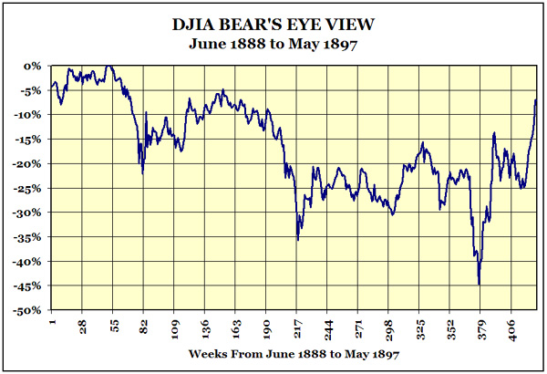
The X-Axis is labeled in weeks as Excel does not do dates prior to 01 Jan 1900. From bull market top to bear market bottom took 6 years and 3 months.

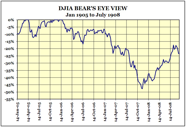
This is a rather famous bear market. Horses pulled taxis on Wall Street and government was very small when this happened in 1906-07. It seems that this crash created the desire in high finance to have a central bank in the United States to prevent crashes from happening again.

This was the first boom-bust stock market since the Federal Reserve was created. World War One produced significant inflation via the Federal Reserve System that eventually found itself in the stock market and consumer goods. As in 2008, commodity prices in 1921 fell along with the stock market. But back in 1921 there were few “policy makers” to interfere with this deflation as it cleaned out balance sheets. That is always painful. Unlike 2008, the US Congress in 1919 did not make defending toxic credit paper a national priority and allowed the necessary deflation to occur. The pain was over in a little more than two years.

If you take a moment to examine the first two charts in this article showing all 123 years of the DJIA, we see a natural rule of thumb. With the exception of the 1929 stock market crash, once the DJIA fell -40% it signaled an all clear to start buying stocks again. In fact that is what people did in December 1929 after they saw a double bottom -40% declines in a 3 month period. The financial media of the time urged people to buy bargain-priced stocks. Remember this chart when we examine our current -40% lows of 2008.
Note on this rule of thumb: I have never seen anyone comment on this before in any financial literature. And I have spent many hours in research libraries reading decade old financial publications. But when plotting the DJIA with a BEV chart, the -40% rule just stands out and has only failed once, in 1929.
BEV charts display bear markets better than bull markets. Looking at the recovery from July 1932 to July 1933 the above chart shows a very weak recovery. The reality is that from July 1932 to July 1933 the DJIA increased by 154% even while the Great Depression caused bank closings, DJIA stock earnings were negative and US unemployment was over 25%!
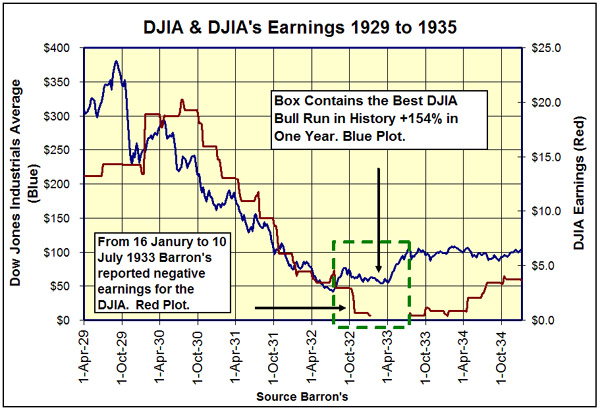
July 1932 to July 1933 is the best year the DJIA ever had in its 123 year history. I suspect this historic bull move made money for only a very few. The 1929-1932,
-89% decrease killed off most of the 1920’s investment-banking industry’s customers. By 1932, the very thought of investing in the stock market, or borrowing money from a bank produced a sense of revulsion and dread in most people.
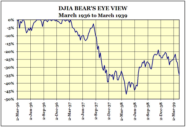
This was the second stock market crash during the Great Depression.

Note the beginning dates for the two charts above. I made the 1936-1939 chart its own bear market but also used the 1937 terminal 0% with the 1942 -51% DJIA decline. The -45% occurred in a world of soup-lines and high unemployment while the -51% decline happened in a world at war with full employment. Two different bear markets that share a common bull market terminal 0% point in 1937. It makes sense to chart these two -40% lows together in the above chart when looking at the 1942 low.
What I find amazing in the above chart is the V formation from September 1941 to March of 1943. The Pearl Harbor attack stock market decline started 3 months before Pearl Harbor. The actual bombing of Hawaii on 07 Dec 1941 only made a small notch in the chart. The sharp V bottom reversal happens two months before the Battle of Midway. There was no way Wall Street could have known that 3 American Aircraft Carriers would have had their way with the Imperial Japanese Fleet! It is amazing how prescient the stock market has been in the past on major events.

Here is the Post Vietnam War and then developing Watergate Scandal Bear Market.
Our current market plotted on a BEV chart is one nasty chart pattern. Watching CNBC on Friday 10 October 2008 anyone would think that the DJIA was having its worst week ever. But was it? No better way to quantify a bear market mauling than with a BEV chart. I took the data for 1929 & 2008 and aligned their terminal 0% point on the same starting line, row 6420 on my Excel file. I also included their previous 52 weeks prior to their terminal 0% to see the last year of their bull markets. The result is below.

In this race of shameful fiduciary irresponsibility, it does seem that the 1929 bear is the clear winner. However, back in 1929, Wall Street did not have a Treasury Secretary blasting the market with a congressional-approved financial “bazooka” or a Chairman of the Federal Reserve flying over Wall Street “dropping bales of $100 bills” from his helicopter to maintain “positive inflation in financial assets.” Give a “policy maker” a few trillion dollars to do something and something will happen. Last week’s performance in the DJIA shows exactly what those trillion dollars purchased for the voters, about -20% on the DJIA.
I expect a bounce before the ground opens up underneath the market in the months to come. Look at that double bottom just above the -40% line in 1929 just before the bounce from December 1929 to March of 1930. It looked good to Barron’s, Forbes, and the Wall Street Journal as they signaled the all clear to investors; just before the floor dropped out. Again, look at the first two charts in this article. In 1929, for the only time since 1885 to present, the -40% bear market low proved to be a lethal bull trap.
Personally, I think 2008 is a market with some catching up to do with 1929. The “policy makers” using bazookas and a fleet of black helicopters blasted hundreds of billions of dollars at the market last week, but “policy” couldn’t keep the 30 stocks that make up the DJIA from falling 20%. That is some serious disrespect.
Dude - it was as like those dollars were totally worthless or something. Wow!
There is a good chance that 2008’s bear will give the 1929 bear a run for his money. This may be the second time that a -40% will prove to be another historic bull trap. Washington, Wall Street and yes the American voters are corrupt all the way down to the bottom. The financial markets and the US dollar will not be far behind.
As a public service, I will provide a weekly updated GIF file of the 1929/2008 Bear Race to the bottom to any blogger who wished to make it available free to the public.
Mark J. Lundeen
12 October 2008


