Electrical Power Consumption, Economic Growth And Global Warming
 share
share
 share
share
 share
share
 share
share
 share
share
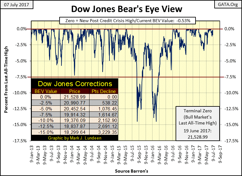
The Dow Jones hasn’t seen a new all-time high since June 19th. But as the Dow Jones’ BEV chart below shows, it closed the week in scoring position, only 0.53% away from a new all-time high. If the bulls are willing, the Dow Jones could see a new all-time high at the close of Monday’s trading. Do they want to?
We’ll see. But let’s face it, in July 2017 the bulls driving this market are central banks, and I doubt they want to transform the current advance into an all-consuming mania as they did in 2000 or 2007.
Next chart has the Dow Jones plotted along with the NYSE 52Wk H-L Net step sum.
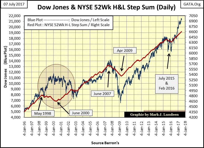
What’s the NYSE 52Wk H-L Net step sum? In the table below, every time the 52Wk H-L Net is positive it’s a +1; a negative net produces a -1. And like all step sums, it’s just a single item A-D line that adds the (+ / -) 1s to construct the line; in this case the Red plot above.
The thing that stands out from this data is the frequency the NYSE sees days with more 52Wk Highs than lows. Looking at the red plot above, during the sub-prime mortgage bear market above, the NYSE 52Wk H-L Net step sum declined only from June 2007 to April 2009; less than two years. However, since January 1996, days with more 52Wk Highs than Lows have dominated NYSE.
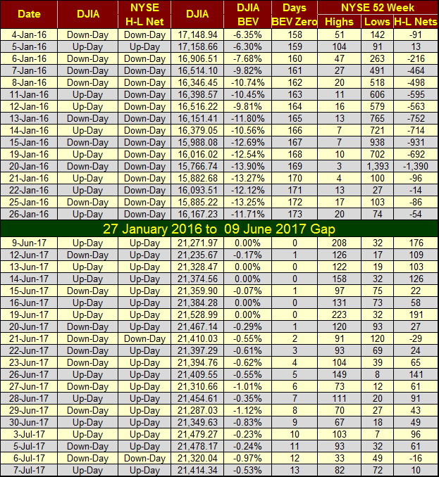
Look at 20 January 2016 in the table above; the NYSE saw 1,393 new 52Wk Lows and only 3 new 52Wk Highs. That proved to be an extreme from which the stock market pivoted from a declining to an advancing market.
Such market extremes are events investors should look for during market declines. Of course, for someone looking at this extreme market event on the evening of 20 January 2016, there was no guarantee that there weren’t even more extreme days pending in the future.
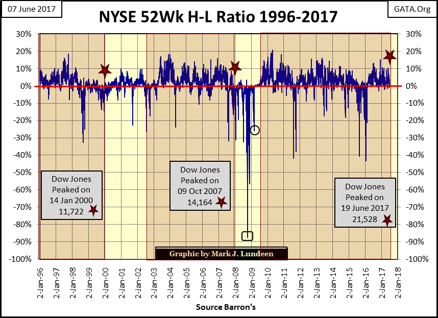
Below I have the daily NYSE 52Wk H-L Ratio plotted. The ratio is computed by taking the daily NYSE 52Wk H-L Net (see table above) as a percentage of total shares trading (active shares) on the NYSE that day.
The high-tech mania of the late 1990s is an interesting study of the stock market. We see the 52Wk H-L Ratio break below -30% in 1998; two years before the market top. What happened there? Everything not high-tech began their bear market two years before the high-tech issues did.
Go back to my chart plotting the Dow Jones with the NYSE 52Wk H-L Net step sum (Red Plot). I placed an egg over this period of market history. Note how the step sum went down (more 52Wk Lows than Highs) during the last two years of the bull market (1998 & 1999), and how the step sum went up (more 52Wk Highs than Lows) during the 2000-2002 high-tech bear market.
What happened there? Those groups that began their bear markets in 1998 began their recovery in 2000 as the high-tech shares declined for the next two years. You don’t see that happening every day!
What’s more typical is what happened during the 2007-09 credit crisis bear market below. I placed a square over the -87.45% decline that occurred on 10 Oct 2008. On the day the Dow Jones saw its first -40% decline since November 1974, the NYSE saw 2901 of the 3306 shares trading (active shares) make a new 52Wk low, driving the 52Wk Ratio down a massive -87.45%.
It’s a pity, I don’t have this data during the September 1929 to July 1932 Great Depression market crash. However I do have it beginning in the mid 1930s, and only the 19 Oct 1937’s 88.81% was more extreme. The -87.45% ratio on October 10th proved to be a market extreme for the bear market, but not the actual bear market bottom for the Dow Jones or S&P500. That came on 09 March 2009, which I’ve identified with a circle below.
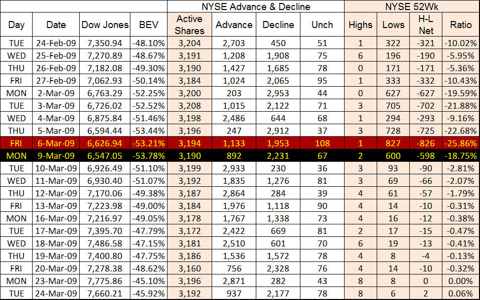
For another view of what happened in early March 2009, we move to the table below.
On March 9th, the Dow Jones saw its second deepest decline since 1885 (-53.78% from its all-time high of October 2007). Note there were only 600 new NYSE 52Wk Lows at the Dow Jones bear market bottom; far from the 2901 seen five months earlier when the Dow’s BEV first broke below -40%.
The broad stock market had turned upward before the Dow Jones did on March 9th. The following day, NYSE 52Wk lows declined into double-digits as the great post credit-crisis recovery began with the tsunami of “liquidity” coming from Dr. Bernanke’s QE flowing into the stock market.
Retail investors should make the effort to maintain simple market statistics, such as daily NYSE market breadth data seen above. As the professionals have known for decades, following 52Wk Lows is as good a method as any to infer the bottom of a bear market.
On to gold and silver. Just look at what we gold and silver investors have to put up with. If the old monetary metals traded in a free market, sometimes we’d see them have strong up days too. But no! The media is concerned with possible nuclear war over North Korea and what do we see? The Price of gold and silver hit air pockets!
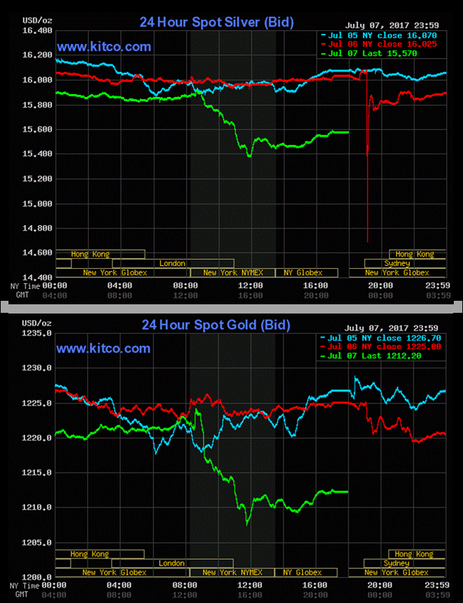
This too shall pass.
The current precious metals market action reminds me of what happened from March to October 2008 when the sub-prime market began melting down. The “policy makers” did a preemptive strike on gold and silver in anticipation of the horror they know was coming to the financial markets in the autumn of 2008. Maybe what we are seeing above is a harbinger of disaster for the stock and bond markets in the coming months.
For the short term, I’ve lowered my expectations for precious metal assets. And I don’t expect the gold and silver bulls will see much of what they’d like until we once again see some unpleasantness in the financial markets. Looking at gold’s step sum chart below only reinforces that view.
Gold’s step sum (Red Plot below / market sentiment) is holding firm in the face of declining gold prices (Blue Plot). Not a prudent mindset if one is trading gold using leverage. But for someone who is still working on building a position, they shouldn’t care; as the lower the price of gold goes, the more metal their money can buy. But I have to admit I’m getting very frustrated with the success the “policy makers” have had making the price of gold and silver look more and more attractive to everyone.
Back to gold’s step sum chart below, I’ve seen this before. It’s the beginning of a bear box. Expect the price of gold to continue declining until it breaks down its step sum. That’s usually how this step-sum chart pattern finally resolves itself, but I’m not going to declare it a bear box unless this pattern continues into August.
So, looking at the chart, I expect we’ll see gold break below $1200 next, or the following week, which makes last December’s $1125 the current key support line. Hopefully we don’t see gold break below that.
What I want to see is the bulls stop being stubborn and toss in the towel, allowing gold’s step sum to break down with the price plot. Until that happens, I won’t have anything good to say about the short-term outlook for the gold market.
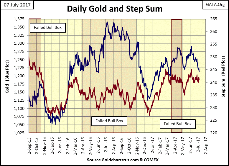
But then there is always the possibility that both gold and its step sum plots above reverse vigorously upwards in the coming weeks. That would result in the failure of this step-sum box formation. For us bulls that would be good.
After all, in gold’s step sum chart we see the failure of three bull boxes in the past two years. But this didn’t just happen; the “policy makers” finger prints are all over this chart. And another thing, these step sum boxes are infrequent market events, typically separated by years from one another. Yet above we see three bull boxes form in the past two years, each a failure, and now a bear box is forming? There’s a real war being waged in the gold market.
As “policy” is still the predominant factor in our “regulated markets”, I expect the current bear box will prove true to form, that the price of gold will continue declining until it breaks down its step sum plot. Unlike its previous three bull boxes, this is one step-sum box that’s not going to fail.
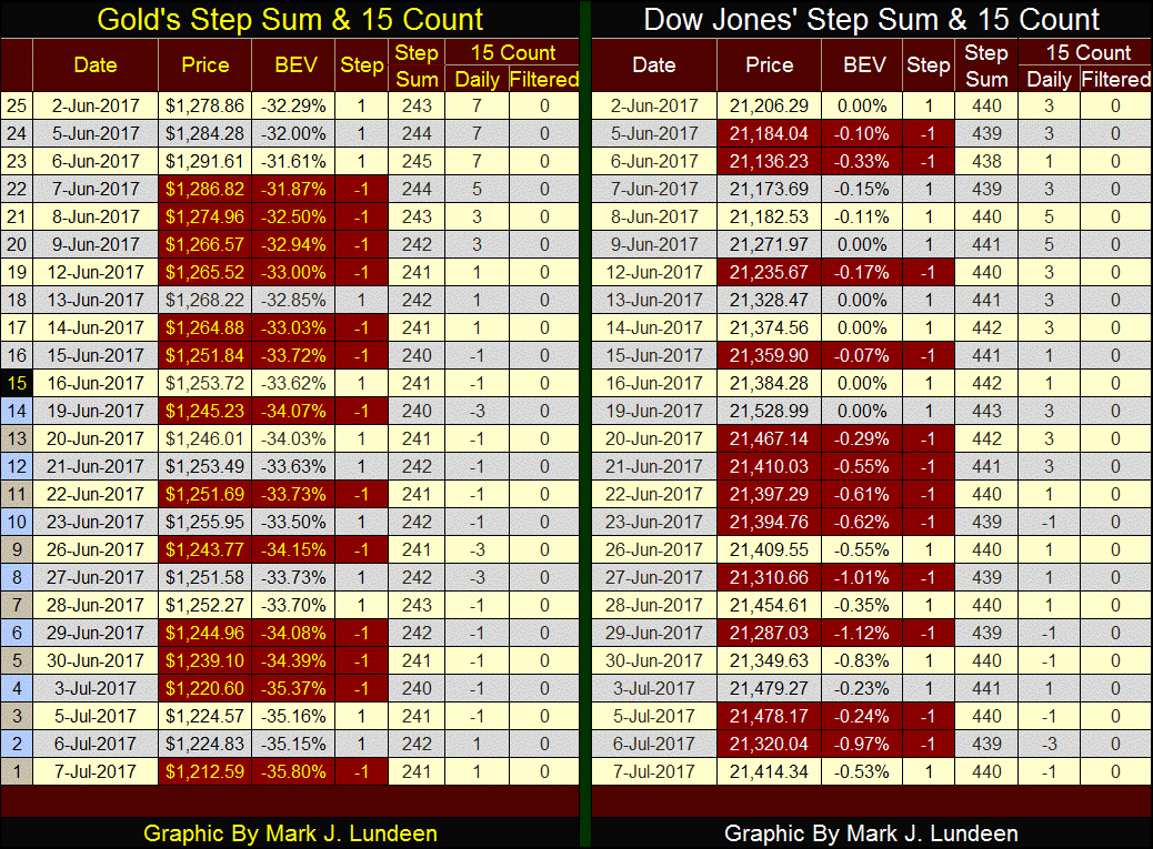
The gold bulls’ current dilemma is seen in the table below. In the last 25 trading days gold has seen only two net down days in its step sum, 241 from 243. But the daily advances have been smaller than the daily declines, so gold has lost $66 since June 2nd.
The Dow Jones’ step sum is unchanged since June 2nd, not all that much different from gold’s step sum, but the Dow Jones is up over $200. As I’ve said before, the Dow Jones wants to go up, something the gold and silver markets currently aren’t doing.
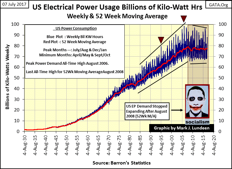
I placed a graphic of President Obama in the following charts for EP. His success in the near destruction of coal mining as an industry, thus raising everyone’s electrical utility expenses by eliminating a significant percentage of coal fired electrical utilities, deserves some recognition.
https://www.youtube.com/watch?v=fVW9g9JVCY4
Since their 05 August 1929 issue, Barron’s has published weekly data on US electrical power consumption (EP). EP’s first data point published was 2.02 billion kilowatts. Nine decades ago, electrical power was increasingly used by consumers for residential illumination and refrigeration. However, in 1929 the primary consumers of electrical power were industrial and commercial users, as they still are in 2017.
Weekly EP consumption data (Blue Plot) and their 52Wk M/A (Red Plot) are plotted below. Previous to the 1960s, there was little need for a 52Wk M/A. But with the arrival mechanical refrigeration for climate control, first for commercial establishments such as department stores, restaurants and theatres in the late 1940, and then for residential cooling in the 1960s, data for US EP consumption developed the seasonal factors so pronounced in the chart below.
Seasonal factors produce two annual peaks rising above EP’s 52Wk M/A. The largest are for summer, the winter peaks are smaller. There are also two annual spikes below the 52Wk M/A, for spring and autumn, when seasonal factors are at a minimum.
Note the two red triangles in the chart. I’ll refer to these later in the article.
There are two types of data that can be derived from US electrical power consumption data:
- Economic Growth (or lack thereof)
- Environmental (Global Warming)
Below I have a Bear’s Eye View (BEV) chart of EP’s 52Wk M/A seen in the chart above. This 52Wk M/A is required to smooth out the seasonal extremes. In BEV charts, each new all-time high registers as a 0% (and never more), or “BEV Zeros” in BEV jargon. Data points not new all-time highs register as a percentage decline from their last all-time high.
It goes without saying how EP’s raw weekly data and its 52Wk M/A plotted above and its BEV chart below complement each other.
The best way to understand a BEV chart is to realize Mr Bear sees each new all-time high as a Big-Fat Zero. He’s only interested in how large of a percentage he can claw back from the bulls in markets, or in with EP the percentage reduction in demand for power by factories no longer in operation and darkened commercial establishments.
For instance, at the bottom of the Great Depression economic demand for electrical power had declined by a massive 17.32% in 1933 from its peak. Remarkably, demand for EP soon recovered and saw new all-time highs in 1935. Then came the second phase of the depressing 1930s, when EP demand once again declined 6.58% from a November 1937 BEV Zero.
The next major decline in EP occurred in 1946, but it wasn’t due to economic factors, but from the American economy retooling from war-time to peace-time production. From 1947 to the early 1980s, demand for electrical power by the American economy went from one new all-time high to another, week after week.
That was until then Fed Chairman Paul Volcker increased short-term interest rates to double digits, which resulted in a 4.12% reduction in the demand for electrical power by the American economy in February 1983. But as with the reductions in EP demand during the 1930s & 40%, the economy soon recovered and began demanding electrical power in ever greater amounts.
During the high-tech bear market of 2000-02, demand for EP contracted by only 2.45%. That doesn’t seem like much, but people felt it.
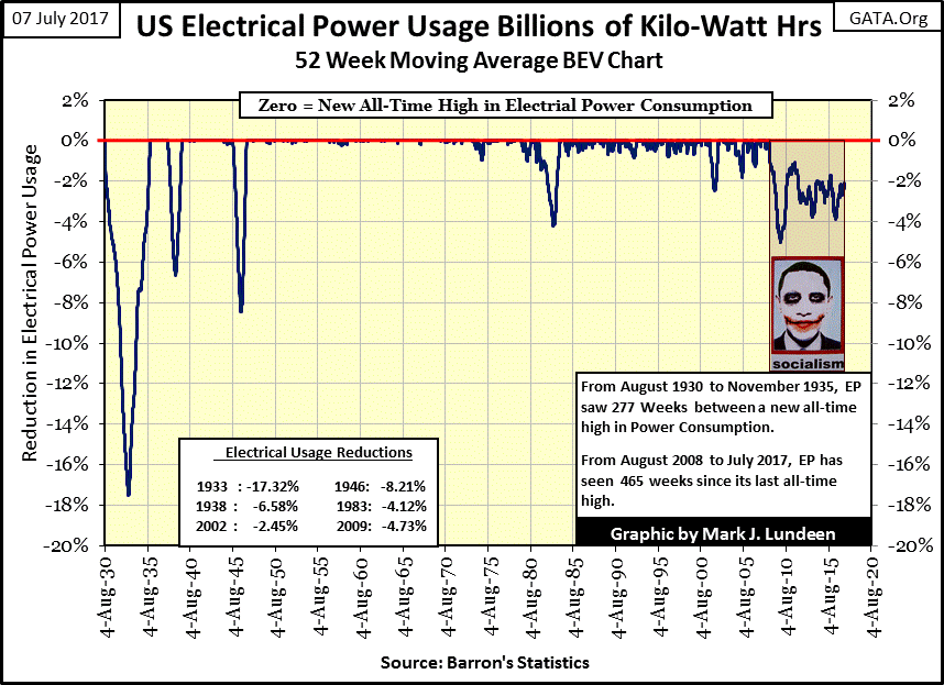
The sub-prime mortgage crisis came next, which began an era unique in the history US EP consumption. Inspite of the FOMC lowering interest rates to near zero, and after three bouts of QE, demand for EP by the American economy has stagnated for the past 465 weeks; not since August 2008 has EP made a new BEV Zero in the chart above.
There’s a reason for this, since August 2008 the burden of debt placed upon the economy (aka: EP) has grown enormously. Below I’ve plotted the indexed values of the US national debt along with CinC (paper dollars in circulation) the Dow Jones and EP.
I have to be careful here. I’m not claiming the relationships between the economic series plotted below are bolted together. However, it’s obvious economic output, as measured by EP (Green Plot) is required to service the national debt (Black Plot), as well as the earnings and dividend payouts for the stock market (Brown Plot). I’m just noting that since August 2008, EP is the one series plotted below that has not advanced, and that has to be a big problem.
And the spread between the debt burdens the US Government intends to place on the real economy (EP) is only going to grow. As per the following link, Washington plans to spend $4 trillion in the coming year, a good portion of that will be from borrowed money.
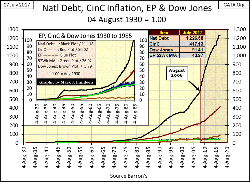
And the national debt plotted above is only one of the many debt series that must be serviced by the American wage earners / consumers / taxpayers, laboring in the real economy (EP). There are also many additional trillions of dollars of debt when we include mortgages, school loans, municipal and corporate bonds that also must ultimately be serviced by the real economy: EP. How much longer can this continue? Not as long as “market experts” and “economists” would have us believe.
We can also derive information on “global warming” from EP, as for decades the response from consumers to summer’s heat and humidity is to turn on the air conditioning (AC).
This next chart is ugly and noisy, but the data is what it is. What we’re looking at are the seasonal peaks of summer and winter, with the minimums of EP consumption of spring and autumn in relation to EP’s 52Wk M/A (Red 0% Line) for the last quarter century.
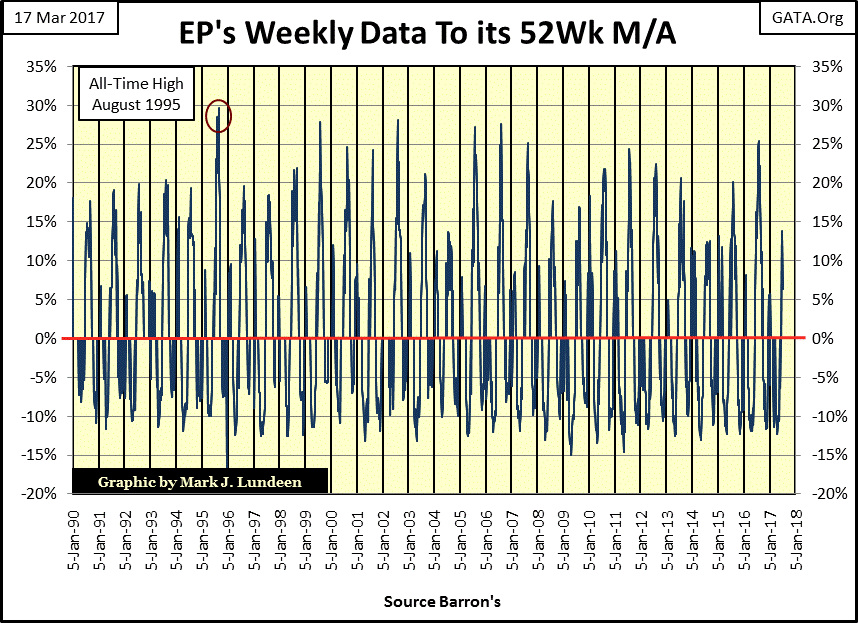
The record all-time high for EP demand occurred in August 2006. But that was for total demand during a hot summer. The largest seasonal peak in EP actually occurred in August 1995, eleven years earlier. Look at my first EP chart (in Billions of Kilowatts) to understand what this data is displaying, as there is a big difference between the two seasonal peaks (Red Triangles).
I find this data fascinating. When it’s hot, people turn on the AC. When it’s not, they don’t. It’s no more complicated than that. So, we’re looking at the response of the public to the extremes of summer’s heat and humidity, as measured by an engineering unit called the Kilowatt, using the United States as its sample.
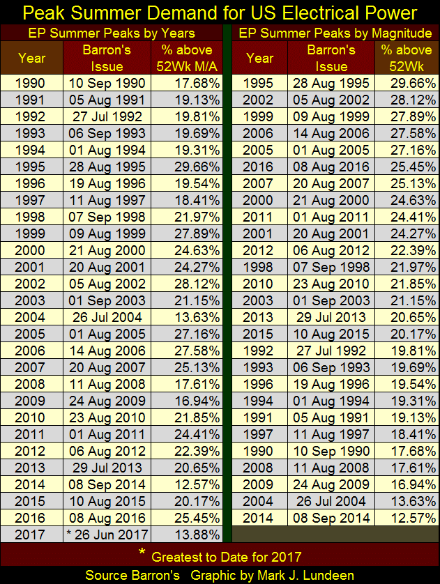
The table below (right side) is sorted by hottest to coolest summers of the past twenty seven years (1990-2016). The largest seasonal demand for EP was 1995, which peaked in Barron’s 28 August 1995 issue (twenty-two years ago). That issue’s EP data-point was 29.66% above its 52Wk M/A. The summer with the smallest seasonal demand for EP was 2014, just three years ago. It’s seasonal peak for summer occurred in Barron’s 08 September 2014 issue, with that issue’s EP value only 12.57% above it’s 52Wk M/A. So far for 2017, its seasonal peak has only risen by 13.88% above its 52Wk M/A (Barron’s June 26th issue), but we have eight weeks left of summer 2017 for it to peak.
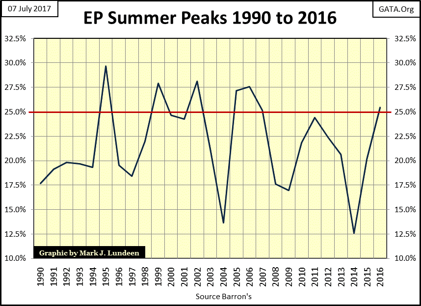
Below are EP’s summer peaks plotted by year, 1990 to 2016 (Left side of Above Table). The charts and table above are informative, but the plot below best tells the tale. The portion of North America serviced by the US electrical grid saw its maximum summer peak in August 1995. In the following two decades summer peaks have been in decline. In other words – no global warming.
The following link confirms this, alleging data supporting global warming has problems with its methodology from one year to the next.
Unlike EP, data published by Barron’s:
“Climate scientists often apply adjustments to surface temperature thermometers to account for “biases” in the data. The new study doesn’t question the adjustments themselves but notes nearly all of them increase the warming trend.”
This article by Dailycaller is damning, how the dirty dogs (aka: government scientists) employed by NASA and NOAA, as well as the UK’s Met Office are conducting political science when gathering global temperature data. Well it doesn’t exactly say that. Okay, it doesn’t say that at all, but that’s what is happening.
Nothing surprises me anymore. I was educated in a Catholic grade school by communist hating Franciscan nuns. Today, it seems the entire Catholic clergy is closeted Marxist Leninists. We even see the Vatican’s Holy Office, the church’s high office of inquisition, the guardians of spiritual hygiene getting busted in a police raid for cocaine abuse during a gay orgy by ordained Vatican officers. Good grief!
http://www.mirror.co.uk/news/world-news/vatican-police-break-up-gay-10743972
What’s next? Does the world offer anything good for us to look forewarned too? Speaking for myself, hopefully Silver Standard (SSRI) pulls some excellent core samples in the months to come from Eskay’s Mining’s property high in the Canadian Rockies. This week Mac Balkam, Eskay’s CEO put out the following press release.
http://eskaymining.com/full_news.asp?nid=122&biraj=News%20Release
Due to late season snow still on the ground (damn global warming), SSRI’s drilling program was delayed, but has begun in early July.
No guarantees with what’s going on with Eskay Mining and Silver Standard. They may come up with nothing. But Silver Standard’s management likes the odds and is spending their own money conducting this exploration on Eskay’s property. So I’m optimistic we shareholders of Eskay Mining will see some good news come this autumn.
Mark J. Lundeen
share
share
share
share
share