Fighting Inflation...Fighting Deflation…Fighting For Their Lives


As we move deeper into 2015, we find our economy and financial systems still in quite a mess. We’re approaching the end of a dark road the “policy makers” have been leading us down for nearly a hundred years. How the Federal Reserve actually stimulates or restrains the economy via interest rates is seldom mentioned today, but decades ago was much discussed in the financial media. To understand our current predicament let’s examine a chart of the Fed Funds Rate (over-night money) and the US Treasury’s long bond yield, both key interest rates in executing “monetary policy.”
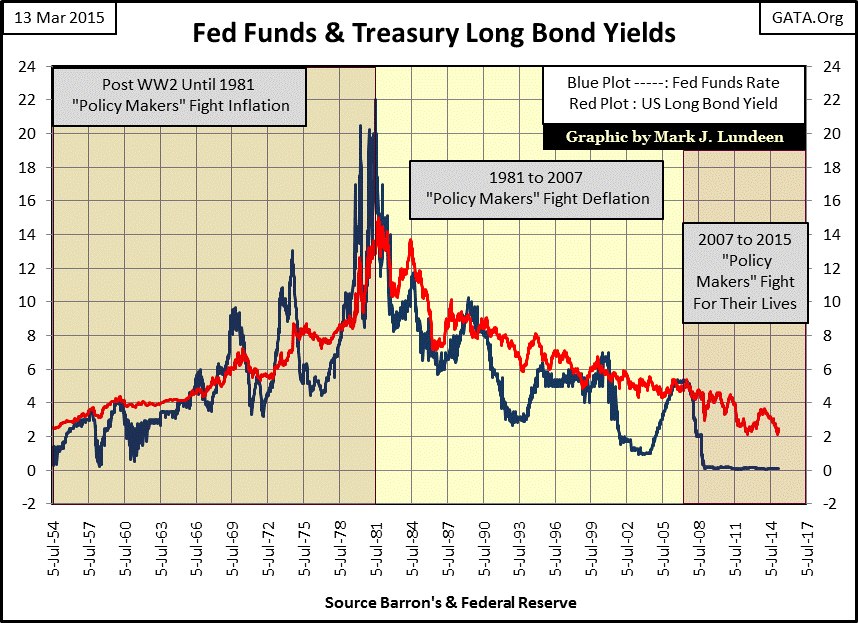
During periods of “growth” when “monetary policy” was “loose” the FOMC would shepherd the Fed Funds Rate (Blue Plot) below the yield of the US Treasury long bond (Red Plot). During periods of “recession” when “monetary policy” was “tight” the FOMC would drive the Fed Funds Rate above the US Treasury long bond yield. How loose or tight “monetary policy” was depended on how far above or below the Fed Funds Rate was relative to the yield of the long bond.
The next table shows the frequency distribution: the number of weeks of tight versus loose monetary policy between July 1954 and March 2015. Tight money was in effect during those weeks when the Fed Funds rate was higher than the US Treasury long bond yield (rows 9 to 1 in the Yield Inversion column). Weeks when money was loose are found in rows 0 to -6. Start by looking at the numbers in the Yield Inversion column. The number 9 row includes the number of weeks the Fed Funds Rate was higher than the yield on the US Treasury’s long bond by 8% to 9%. This indicates a condition of extremely tight money and just two weeks out of 3,167 from July 1954 through March 2015 were this tight. The number 8 row includes the number of weeks the Fed Funds Rate was between 7% and 8% higher than the long bond yield: (six weeks), and so on down the table. The most frequent degree of tightness is found in the number 0 row: 827 weeks (26% of the 3,167 weeks in the sample) where the Fed Funds rate was between 0% and -1% from the long bond yield.
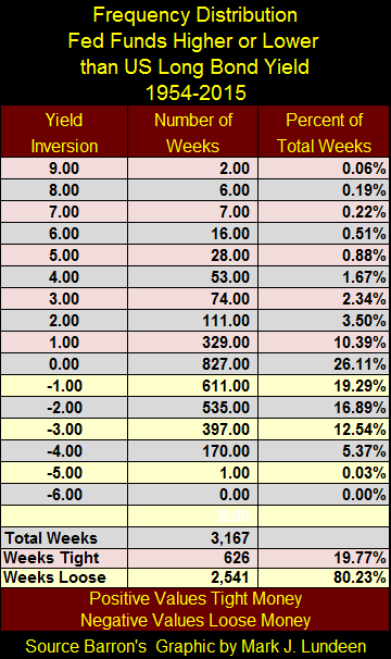
The most interesting fact is that The Federal Reserve’s “monetary policy” has been loose 80% of the time since July 1954, earning it the well deserved moniker “The Engine of Inflation.”
The Fed Funds and long bond yield chart above can be broken into three distinct eras; the general concern of “monetary policy” during the first (1954-1981) was fighting consumer price inflation: three decades of rising interest rates, bond yields and consumer prices.
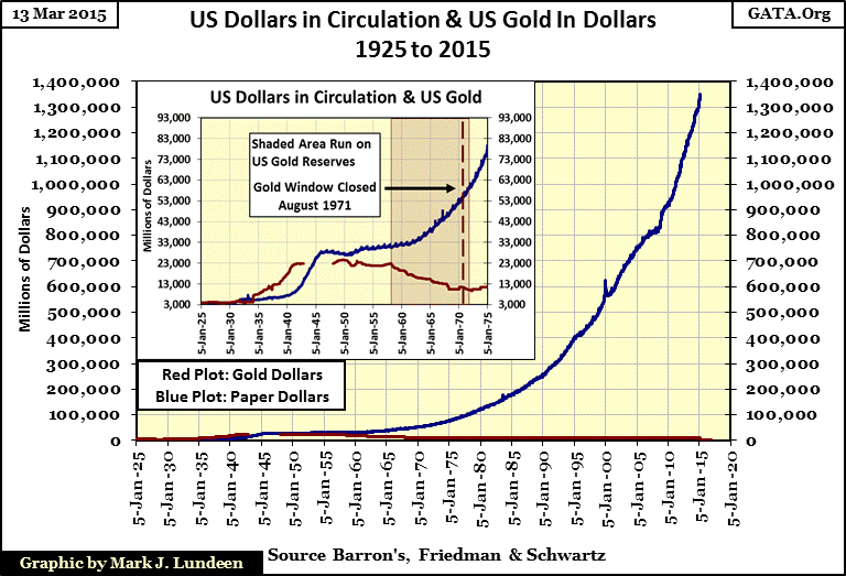
What made it necessary for the “policy makers” to battle price inflation? Because the “policy makers” were continually inflating the supply of paper dollars (Blue Plot / chart below) far beyond what could be backed by the US Treasury gold reserves (Red Plot). The effects of this monetary inflation have been endured for decades by both Americans and the world at large since World War 2 when the US dollar was instituted as the global reserve currency by the Bretton Woods Agreements: an international monetary treaty ratified by the US Senate. The following quote from Barron’s tells the tale:
November 15, 1951 reached a new low of 53 cents in terms of 1935-1939 dollar value. In extended comment on the shrinkage of the dollar, the National City Bank’s December Letter says: “From the standpoint of the creditor—the buyer of Savings bonds, the pensioner, the insurance beneficiary, the school teacher with lagging pay—the experience during and since World War II has been disheartening. Inflation is a concealed type of tax and these are the people who took the brunt of it.” In line with the repeated views of Professor Sumner H. Slichter, the City Bank adds: “People reconciled to a dollar of wasting value look around for real estate or other equity investments as a hedge against price inflation and dollar shrinkage.”
- Barron’s Editorial, 31 Dec 1951
This quote from seven decades ago predicted our subsequent economic history; ruinous monetary bubbles in the stock, bond, and real estate markets; bubbles the “policy makers” are now attempting to re-inflate and maintain to delay the inevitable collapse in the economy and the dollar itself.
Returning to my first chart, we see that bond yields during the Bretton Woods era (1945 to 1971 / Red Plot) rose continually (while bond prices were declining) as the market demanded an inflation premium to compensate bond buyers for rising consumer price inflation. US Treasury long bond yields would increase from 2.50% in 1954 to 15% in 1981 when annual CPI inflation had reached double digits in the late 1970s and early 80s. “Monetary policy” itself was also changing. During the 1950s the Federal Reserve never allowed the Fed Funds rate (Blue Plot) to rise above the Treasury’s long bond yield (known as a “yield inversion”). But that would all change in 1966 when for the first time, (but not last) the Fed Funds Rate rose above the long bond yield. Until the early 1980s each subsequent inversion of the yield curve (and the corresponding economic recession which followed) became more and more extreme as the “policy makers” were forced to apply the brake harder each time to stem the rise in consumer prices.
The best way to understand what happened back during the era when the “policy makers” were fighting inflation is to know that this was a time when the population was being weaned from their understanding that gold was money, to accepting that money was whatever the “policy makers” say it is. Their faith in copper, silver and gold as money had been well established by The Coinage Act of 1792.
Before that the most common money used in the colonies was silver Spanish pieces of eight. The founding fathers were well aware of the value and benefits of real commodity money, having recently been reminded by the failure of the Continental.
“In 1775, the Continental Congress began issuing paper money known as Continental currency, or Continentals. By the end of 1778, Continentals retained from 1/5 to 1/7 of their face value. By 1780, the bills were worth 1/40th of face value. By May 1781, Continentals had become so worthless that they ceased to circulate as money. In the 1790s, after the ratification of the United States Constitution, Continentals could be exchanged for treasury bonds at 1% of face value.”
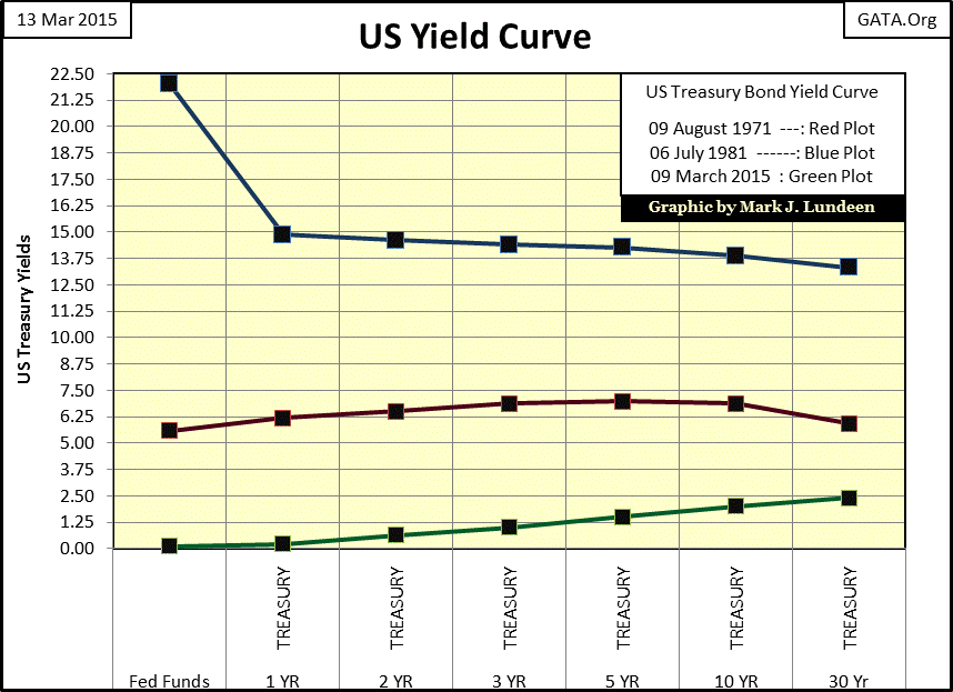
The general population and honest commerce never demanded the termination of the Bretton Woods’ $35 gold peg. Complaints that the gold standard was too “restrictive” always seemed to originate from government officials, and bankers, the two groups who would greatly benefit by doing away with the Bretton Woods’ $35 an ounce gold standard. By 1981 (ten years after the US Treasury closed its gold window), both the economy and the US dollar’s status of reserve currency were on the brink of collapse. When Paul Volcker jacked the Fed Funds rate up above 20%, (and kept it there for the better part of two years), he needed money this tight in order to halt consumer price inflation and preserve the dollar’s status as the reserve currency.
Which brings us now to the “policy makers” second era, they are now fighting deflation (1981-2007). With Fed Funds at 22% and the entire yield curve deep into double digits in July 1981 (Blue Plot below), bond yields were now above the rate of CPI inflation for the first time since World War Two. Inflation flowing from the Federal Reserve stopped flowing into consumer prices, and began flowing into financial assets instead, initiating a repeating cycle of booms and busts that investors have suffered to this day.
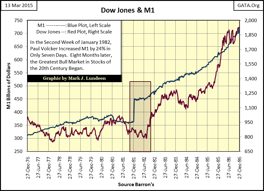
It wasn’t just interest rates peaking above the rate of CPI inflation, and their subsequent decline that continues to this day that ignited the 1982-2000 bull market in stocks. During the second week of 1982 Paul Volcker increased the M1 money supply (Blue Plot below) by 24% in a single week. This had never happened before, (or since) in the history of the Federal Reserve. Eight months later the stock market took off. In October 1982, the Dow Jones (Red Plot below) broke above 1000 (Green Line) for the sixth time since 1966. However this time, thanks to a big shot of “liquidity” from Mr. Volcker’s Fed, the Dow Jones never dropped below 1000 again.
Looking back at the first chart, take a moment to compare the relationship between long term bond yields (Red Plot) with the Fed Fund Rate (Blue Plot); you’ll notice that something changed after 1981. Before 1981 (when the Fed was fighting inflation), positive spreads between the blue Fed Funds Rate and red long bond yield (tight money) were greater than after 1981. Since 1981, extremes in “monetary policy” (wider negative spreads) have been during periods of loose money, as the FOMC’s intent was to foster “growth” (pump up a bubble).
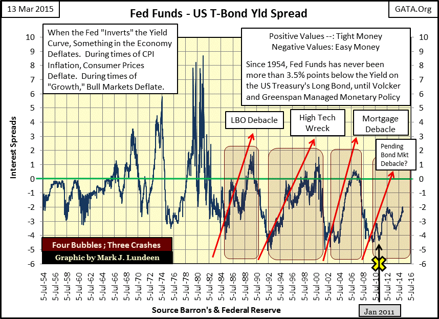
The best graphic to illustrate the difference between “monetary policy” from 1954 to 1981 (fighting inflation), and from 1981 to 2007 (fighting deflation) is the spread between the Fed Funds rate and the US Treasury’s long bond yield; my next chart. A positive spread indicates that the Fed Funds Rate is higher than bond yields and money is tight. A negative spread tells us that the Fed Funds Rate is lower than bond yields and money is loose. The magnitude of the spread tells us how tight or loose the Fed’s “monetary policy” actually is. The yellow X in January 2011 marks the beginning of the Federal Reserve’s operation “Twist.”
It’s clear that the Federal Reserve was fighting inflation from 1954 to 1981. The “policy makers” responded to rising consumer prices by tightening “monetary policy”; raising the Fed Funds Rate above long bond yields. This was especially so after 1966. That is not to say the “policy makers” were acting responsibly. Printing paper money in excess of 35 paper dollars per ounce of gold held by the US Treasury was a criminal act, a clear violation of the Bretton Woods Agreements, the law of the United States by act of Congress.
After 1981 monetary inflation actually accelerated (second chart in this article), but no longer flowed into consumer prices; it began flowing into asset valuations. Another change since 1981 was that each time the “policy makers” inverted the yield curve (chart below) they quickly reversed tightening the money supply when the financial bubble (bull market) they inflated began to deflate.
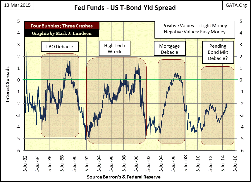
Here are two frequency tables for the periods 1954 through 1981 and 1982 through 2015. From 1954 to 1981 when the Fed was fighting inflation, the Fed invoked tight monetary policy a full 30% of the time. The FOMC wasn’t afraid to invert the yield curve by 4% or more for months or years at a time, and even when “monetary policy” was loose the FOMC never lowered the Fed Funds Rate more than 4% below the long bond yield.
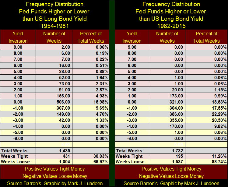
Contrast that with the Fed’s current era of fighting deflation (1982-2007). From 1982 through 2007, the Fed has invoked tight monetary policy only 11% of the time. And since 1982 the FOMC has never inverted the yield curve by more than 2% for fear of causing deflation somewhere in the financial markets. Look at the Fed Funds/Bond Yield chart above, the mortgage bubble was popped when the FOMC tightened the yield curve by a pathetic 0.5% from July 2006 to December 2007. When the Fed Funds Rate exceeds the Treasury Bond Yield, it means that the US government can borrow more cheaply from those who buy government bonds than banks can borrow overnight from the Fed. This, in turn, raises interest rates by eliminating the carry trade where banks borrow at the Fed Funds rate, and use the money to buy US Treasuries, capturing the yield spread.
To believe it’s possible Janet Yellen’s Federal Reserve could increase interest rates this year or next, one would have to believe that the Fed Funds Rate (chart below) will once again rise up from the grave. Which brings us to the third era of “monetary policy” in which the “policy makers” no longer fight inflation or deflation; they now fight to prevent systemic collapse.
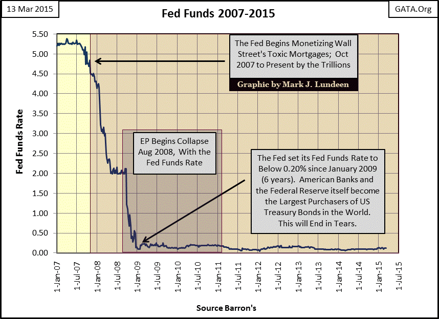
Keep in mind that to raise the Fed Funds Rate is to tighten the money supply, and the last time the Fed increasing the Fed Funds Rate above the long bond’s yield (2006-2007) they nearly destroyed the entire global financial system. Now that Treasury Long Bond Yields have been taken down from 4% to 2% by the Fed’s “Operation Twist” (January 2011), a 2% increase in the Fed Funds Rate from its current level of ZERO would invert the yield curve which in the past has always brought on a recession or popped a bubble in the market. I believe the FOMC is well aware they might not be able to increase the Fed Funds Rate even 1% without creating a deflationary-black hole that would collapse all markets, most likely taking down the global central banking cartel along with it.


