Financial & Precious Metals Update


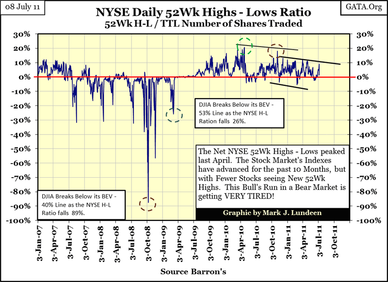
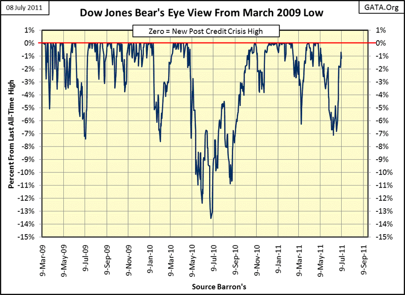
Thursday, the NYSE 52WK High-Low ratio increased to 8.90%. I was thinking that we may have another pseudo-bull run in the stock market in the coming weeks. Then one day later (today, Friday 08 July) the ratio got knocked down to 1.35%. Well, that means that on a down day for the Dow Jones (today), there were still more stocks making new 52Wk highs than lows. That sounds bullish. But looking at the chart below from July 2009 to present, darned if it doesn't look like "liquidity" is draining from the stock market.
Long ago I stopped trying to guess what the market was going to do in the short term. It only takes one kid at the Fed to hit the on his computer, sending a few billion dollars to another kid at Goldman or Morgan, and all my technical work is wasted and just makes me look clueless. Next thing I know my e-mail account starts to overflow, the phone starts ringing, and even my dog begins growling at me. NOPE, I learned my lesson, NO SHORT TERM MARKET CALLS FROM LUNDEEN!
But damned if this chart doesn't look like "liquidity" is draining from the stock market.
Last week as I listened to Goldseek Radio (01 July 2011), and Jimmy Rogers and Louis Navellier were guests, and Mr. Navellier confirmed something I had long suspected. Today's trading volume at the NYSE, and elsewhere, is contracting significantly; yet this bearish action in volume is occurring as share prices have been increasing steadily since March 2009. As per Mr. Navellier, the managements of the giant corporations, whose shares trade in the stock market, are purchasing their own shares in the open market with borrowed money. In other words, as the world chokes on the accumulation of four decades of ill-considered debt, the management of corporate America can find nothing better to do than weaken their balance sheets during a depression, by purchasing their outstanding stock in the open market with other people's money.
"Though this be madness, yet there is method in't." -- William Shakespeare, Hamlet, 2.2
The rising stock market on falling trading volume is just another example of political corruption run amuck. The markets main purpose today is that of a political prop for the next upcoming election. The management of large companies realize if they don't get on "the team", it's only a matter of time before the EPA, IRS, or the National Labor Review Board comes to pays them a visit. Maybe even an invitation to come down to Washington for some live primetime TV exposure on CNBC, like Congress gave the CEOs of General Motors and Chrysler during the 2008 credit crisis, just before President Obama fired them.
But, as bad as the rot is in manufacturing and commerce, manufacturing and commercial companies look like solid oak when compared to the large international banks. The following quote should be a warning for everyone investing in financial companies.
"If you spend a few hours reading the financial statements of Wal-Mart or Proctor & Gamble, then you would understand their business and financial statements reasonably well. It is virtually impossible to do so for the largest global banks." -- Kevin M. Warsh, member of the Federal Reserve Board of Governors: February, 2006 - March, 2011. Quote from May 2011 issue of Central Banking (pages 32-40)
When a former official of the Federal Reserve declares that he hasn't a clue what the big Wall Street banks have done with trillions of dollars that flowed through their accounts in recent years, or that he can't ascertain the quality of the big banks' assets, then I'd say that J.P. Morgan and Goldman Sachs are certainly insolvent. It's only a matter of time now before the global financial system implodes. However, the entrenched political class has corrupted everything it "regulates", and is certainty attempting to keep the lid on the global debt problem until after November 2012 election. I would like to make a guess on the "policy makers" chances of doing so, but I hear someone growling behind me!
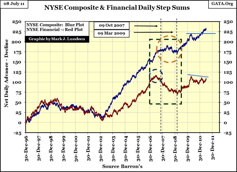
Let's take a look at the NYSE composite and financial indexes and their step sums. A step sum is a single items A-D line. If a market index is up on the day, it's a +1, a down day is a -1 in the step sum's plot.
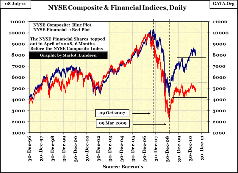
Nether index has found the strength to rise above their 2007's all-time high, but the post March 2009 rebound in the financial index is pathetic! However, when one considers Mr. Warsh's quote above, pathetic can be pretty damn good!
Their step sums (chart below) are very interesting. From 1996 to 2002, their step sums (as were their valuations above) were very closely correlated, but early in the Congress's mortgage bubble, the NYSE's financial index's step sum began lagging the composite's. For the good reason we are all now painfully aware of, the NYSE financial index began seeing more down days than did the composite index. From the highs of 2007, to the lows of March 2009 the NYSE composite fell 59%, not that one could notice this by its step sum. Most likely, the companies in the index were borrowing money from bankers to purchase their own shares on the open market.
The companies in the NYSE financial index must have also been buying their own shares (using borrowed money) during this time, which is not surprising, knowing how unprincipled these people in finance are. Remember, during the crash the SEC had a prohibition on NAKED SHORTING but only on a select list of financial companies. Who was doing the naked shorting? Most likely the same companies on the list! Even with this protectionist policy in place, by March 2009, the NYSE financial index had collapsed by 80%. Looking at the charts above and below, financial companies have been totally flat since September 2009 no matter how many hundreds of billions of dollars Washington has sent their way in "stimulus" and bailouts.
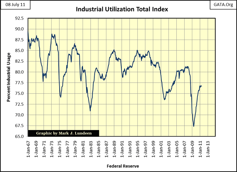
It's not just financial companies Washington is having trouble "stimulating", after a few trillions in quantitative easing. There is still plenty of industrial capacity sitting idle as well. This data is from the US Government, and not entirely trustworthy for that reason. Still, the damage Congress inflicted on the economy with its "affordable housing programs" and by suppressing interest rates was the worst Washington ever inflicted on the economy in the past 42 years.
Considering the massive amounts of unserviceable debt now weighing down personal, commercial, and government finances, the likelihood of industrial utilization plunging below 60% before it reaches 80% is very likely. But as long as corporate America continues to borrow money from the Federal Reserve System for their stock repurchase programs, shuttered windows and locked doors need not impact the stock market's current valuation.
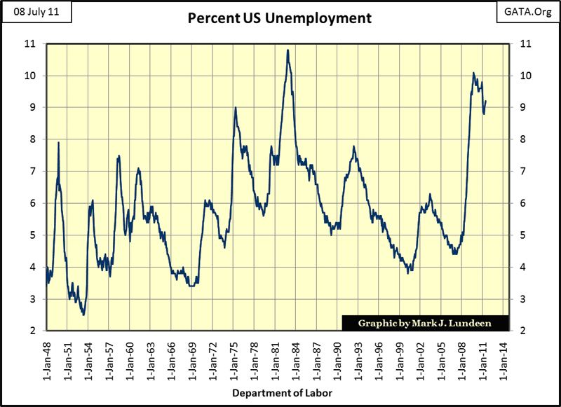
Well look below! Finally, something other than stock prices and precious metals is going up! Whoops, my mistake, rising unemployment after trillions-of-dollars in "shovel-ready stimulus" is nothing to cheer about. Well, what's there to say about the chart below? Only that it's going to get much worse before it gets better. We can't get around it, "it" being "economic policy" formulated by the wizards of pseudo-social science (aka Keynesian economics).
"I prophesy that in 1950 every Treasury in the world will be talking about my ideas, and by that time, of course, the problems will be quite different, and my ideas will be not only obsolete but dangerous." -- "The World will save money in the 1950's", J.M. Keynes, Fortune Magazine
I'm not going to pussy-foot around the topic anymore, Obama and 90% of the Democratic party in Washington are neo-communists in their solutions to social and economic problems: more taxes, more regulations, more government. The whole economy is going to collapse, and we won't even get an "I'm sorry, I guess I made a few mistakes" from Obama. Geez Louise: how does an economy unwind itself from the massive levels of unserviceable debt it must now support? With an aging population like the United States has: social expectations of a generation must be recalibrated downward, deep into the red pain zone!
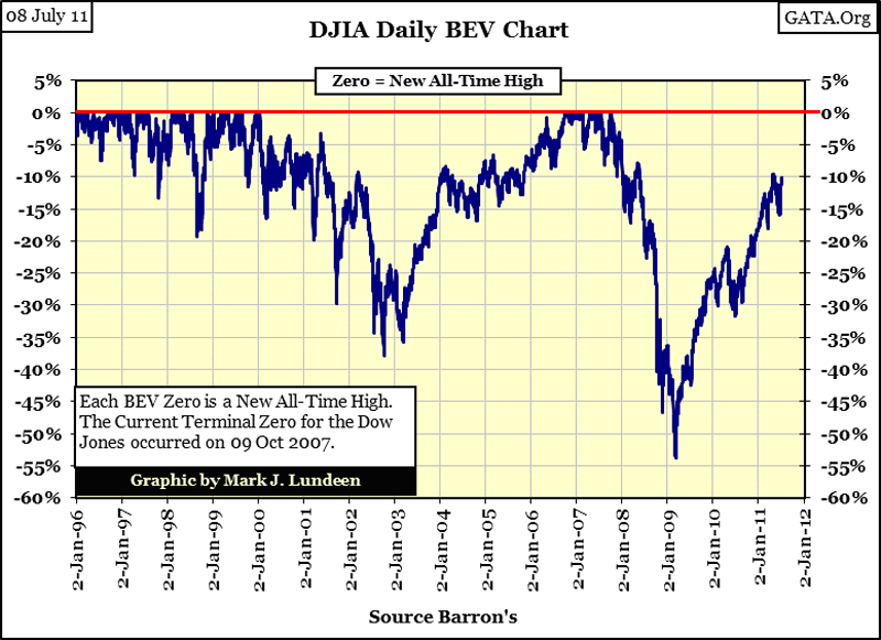
On that cheery thought, let's look at some Bear's Eye View (BEV) charts. The Bear's Eye View looks at the market, or economic indexes, not from the perspective of how far they advance, but how far they have fallen from a previous all-time high in the selected range of data. Heck, Mr Bear doesn't care how far the bulls move the market up from one new all-time high to the next. Every new all-time high look all the same to him! Mr Bear is only interested in how large a percentage of the bulls' capital gains he can claw back. So, the BEV Plot compresses any data series into a neat range of 100% points. Each Zero % = new all-time high in a BEV Plot. All data points not a new all-time high, are converted into a precise-negative percentage from its last BEV Zero (last all-time high), with a BEV -100% a total wipeout in the index.
The following BEV Plots begin at their exact lows of the credit crisis. In the Dow's case, that was 09 March 2009. So why is the bottom of the second deepest bear market since 1885 a BEV Zero? Because 09 March is the first data point in the series, it's also the highest data point in the BEV plot, up to that point.
Anyways, as factories are shutting their doors, and unemployment is soaring, up goes the Dow Jones. So everything is just fine - right?
But the above chart starts its BEV series at the bottom of the Credit Crisis bear market. When we begin our BEV series on 02 January 1996 (below), we see a completely different picture, one with the Dow down 53% on 09 March 2009, with the Dow Jones still 10% below its highs of October 2007! Not only that, but since January 2011, it has twice failed to break above its BEV -10% line. Just so my dog (who is a big bull in the stock market) stops growling at me, I'm going to say that in the months ahead, we might find that the third time the Dow attempts to decisively break above its BEV -10% line could be the charm. But I say that without recourse!
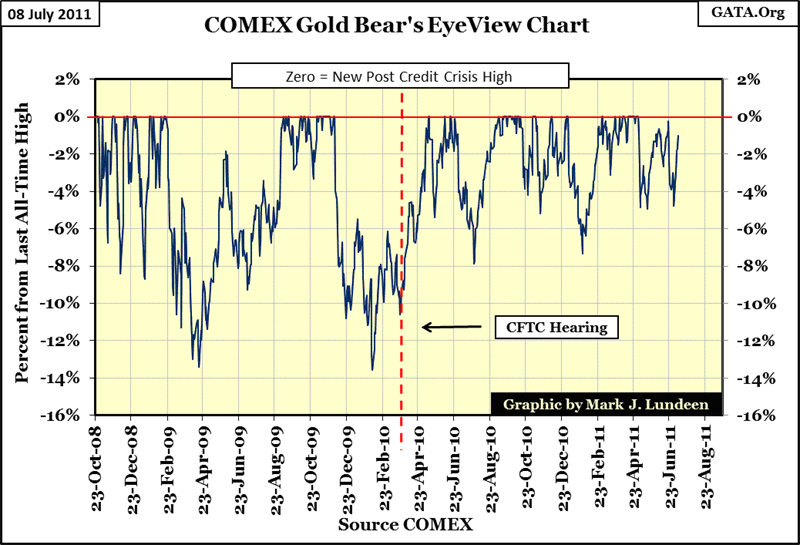
Here is gold's BEV chart starting from its credit crisis lows of October 2008. And unlike the Dow, which has yet to exceed its highs of October 2007, gold is $500 (30% increase) above its pre-credit crisis all-time high of $1003 in March 2008! This is really a strong chart. The bull market in gold is intact!
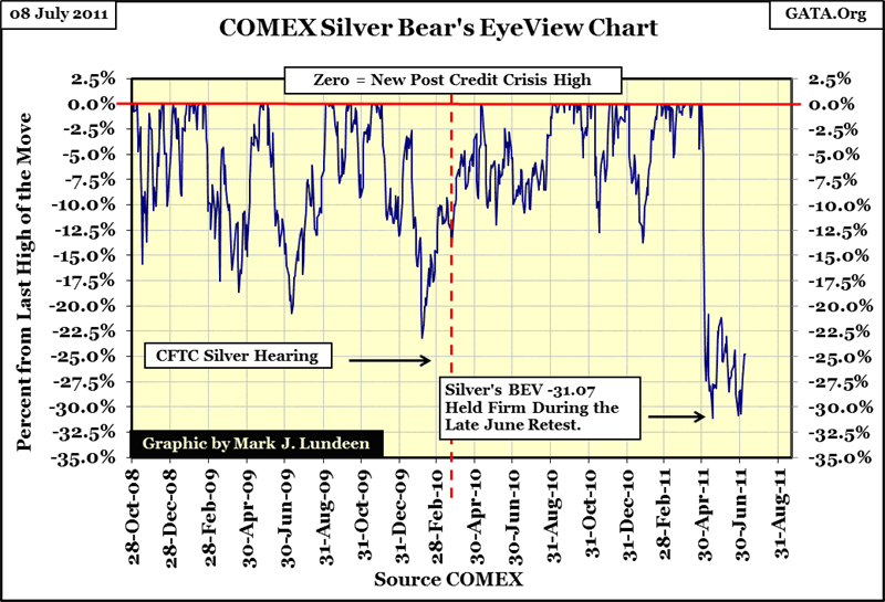
In early May, silver was whacked 31.07%. However, as is clearly shown in the BEV chart below, such declines are like water off a duck's back when it comes to silver. As the BEV plot below makes very clear, the decline in silver since the end of April was the * SMALLEST CORRECTION * in the price of silver in the past thirteen years! That's why I love these BEV plots! It's good to look at the market the same way Mr Bear does to really get a feel for things.
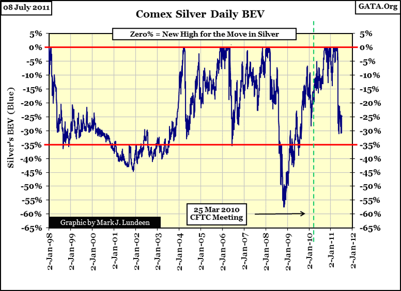
Looking at silver with a BEV plot starting at its Credit Crisis lows in October 2008, the current correction has been the steepest of the past three years, but Mr Bear could not break silver below silver's low of early May. So we have a double-bottom technical formation, which is good. Still, as we can see in the chart above, anytime silver gets whacked 30% or so, it took well over a year for it to kick out a new BEV Zero (new all-time high). So, if silver goes on to break decisively above $50 an ounce after May 2012, that's to be expected in a silver bull market.
BUT, IF IT BREAKS $50 AN OUNCE BEFORE CHRISTMAS - KATIE BAR THE DOORS!
All in all, no matter what my dog believes, stocks and bonds are very vulnerable in July 2011.
As has been the case since 2001, the smart money is moving into gold, and silver. With the Silver/Gold ratio currently over 40, silver is cheap. What are you waiting for?
Mark J. Lundeen
[email protected]
[email protected]