Forecast 2015


“Prediction is very difficult, especially if it’s about the future” – Nils Bohr, Nobel Physics Laureate
“Those who have knowledge don’t predict. Those who predict don’t have knowledge.” – Lao Tzu, Ancient Chinese Philosopher
“The best way to predict the future is to study the past, or prognosticate.” – Robert Kiyosaki, American businessman, investor, motivational speaker, literary activist, financial commentator.
2014 Wrap-up

Stocks
It is 2015, a year ending in 5. Years ending in 5 have been good years for the stock markets. Since 1881 there has been only one year ending in 5 that was not an up year. That year was 2005 and the Dow Jones Industrials (DJI) lost a small 0.6%. Prior to 1881 there were two years ending in 5 that were not up years – 1865 and 1875. The years ending in 5 tend to be strong performers as well. 1915 remains the best year ever for the DJI with a gain of 81.7%. Years ending in 5 have recorded numerous stellar gains.
The year 2015 is also a pre-election year. Pre-election years have a history of being the best year of the four-year Presidential cycle. The last time there was a pre-election year loss for the DJI was 1939. Since then there has been 18 consecutive pre-election year stock market gains. And as to a pre-election year ending in 5, well the record there is a stellar 8 up and only 1 down the last time being in 1875. Oh and the best year ever, 1915, was a pre-election year.
The mid-term election was in November 2014. The markets following a mid-term election tend to be strong. Since 1914, the DJI has gained on average 48.6% from its mid-term election year lows to the high in the pre-election year. The mid-term election year low occurred all the way back on February 4, 2014 for the DJI at 15,284. The high for the year occurred on December 26, 2014 at 18,154. That represented a gain of 18.8% from the mid-term election year low. If the average gain from the mid-term election year low is 48.6% then that would appear to suggest that the DJI could still have a fair way to go.
So is that it? It’s a wrap? The DJI could still rise another 4,600 points from the recent high? If that is the case, I wish all forecasts were that easy. Imagine, another 25% gain from the December 2014 high. Despite all of the negative news in the background, something like that happening is not beyond the realm of impossibility. If a move like that did occur, it would most likely be in the context of a volatile blow off top. And if it did occur, it would most likely happen in the early part of the year or within the first quarter of 2015.
So what might trigger such a move? Given the background news with oil prices collapsing, commodity prices weak, the EU and Japan falling into recession, the EU threatening to break up, China slowing, Russia imploding and the potential for sovereign defaults, it seems rather incredulous to even suggest that the markets could go higher. Stock markets have not exactly started the year on a strong footing. The US continues to show growth signs (or at least they talk up every mediocre economic number) but underneath the rot continues.
Ten-Year Stock Market Cycle
Annual % Change in the Dow Jones Industrials Average*
Year of Decade
The FOMC came out on December 17, 2014 and as expected interest rates were left unchanged. The biggest change was less emphasis on “considerable time” and more on “patience”. In essence, they most likely mean the same. Fed Chair Janet Yellen said that no rate hike is even contemplated for the first few months. That got everyone centering on April. The interest rate hawk crowd bought the US$ and sold gold and bonds. The interest rate dove crowd bought stocks. Interpret it as you will but the reality is that with decelerating inflation (both headline and core CPI came in below expectations thanks to a stronger US$ and falling oil prices) and $18 trillion in debt and rising, the odds of an interest rate hike is most likely low to nil.
Yellen could surprise everyone and hike interest rates by 0.25% in April as their statement appeared to suggest. That would get everyone’s attention. And it would be in keeping with the Fed’s suggestion that they could hike interest rates and they actually do it. No matter what the Fed does, Janet Yellen and the Fed are sure to remain a focus throughout 2015. It seems that it has always been that way. One can almost feel sorry for Stephen Poloz the Governor of the BofC. Despite his efforts, he remains largely an afterthought. Reality is what the Fed does generally impacts what the BofC does and not the other way around.
Overall, the scenario for 2015 seems rosy. Too rosy in fact especially with a number of stock market pundits predicting that the US stock markets should continue their relentless rise. Since the major stock market bottom in March 2009, stock markets have moved relentlessly higher. Not even the 20% decline in 2011 threw markets off course. The exception was precious metals and commodities that have fallen over the past couple of years. 2011 still saw stock markets end the year higher despite the 20% correction earlier in the year. US stock markets have been up for six consecutive years since 2009.
Six years up is a long time. But it doesn’t even come close to the nine consecutive up years the DJI recorded from 1991 to 1999. It was a great run but everyone knows how that finally ended. According to analyst Ray Merriman (www.mmacycles.com) the longest cycle he has determined is one of 75 years with an orb of 12 years. Since 1784 major lows were seen in 1857, 1932 and most recently in 2009. If that assessment is correct according to Merriman the market could be in a new 75 years cycle and should still be in the in the early bullish phase.
Trouble is these long cycles have few observations so one never knows for sure that the low for the cycle is actually in until probably years later. 2009 was 77 years from 1932. Merriman believes there may also be a 90-year cycle in which case that cycle could still be unfolding. Cycles sub-divide by two’s or three’s. Sub-cycles of 75 years are a 37.5-year cycle followed by an 18.75-year cycle. Probably far more important and immediate is a shorter cycle such as the 6.5-year cycle a subset of the 18.75-year cycle. The 6.5-year cycle has an orb of 5-8 years. Since the 1932 major low one can observe important lows in 1938, 1942/1946, 1949, 1957, 1962, 1970, 1974/1978, 1982, 1987, 1994, 2002, and 2009. The next cycle low is due anywhere from March 2014 to March 2017.
If the 6.5 year cycle holds than the current one could be either cresting or is in the process of cresting. For that reason alone the potential for a blow-off remains, although few are calling for one. If the 2009 low was an important 75-year cycle low and the market is in its next bullish phase then the 6.5 year cycle low could be shallow. But if there are longer term 90 year cycles at play then odds could favour another devastating collapse as was seen in 2009.
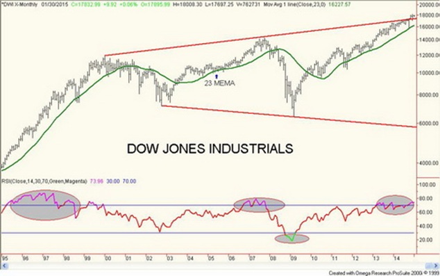
So far, the largest drop in the current 6.5-year cycle was the 20% decline in 2011. That suggests that if the 6.5-year cycle low is bullish longer term for the market the decline from any top should not be much more than 20%. But if it is a devastating drop as was seen in 2009 than the drop could be 50% plus as was seen in 2009. The 2014 low was recorded in February for the DJI at 15,284. If that breaks then it would signal a more serious bear market. The DJI appeared to have formed a huge broadening pattern. The action over the past few months appears to suggest that it has overthrown the top of the channel. If that is correct that does put in play the potential for a blow-off run to 20,000 or higher.
Merriman also suggests there is what appears to be a possible four-year cycle with an orb of 3-5 years. This cycle would overlap the longer 6.5 year cycle. Trouble with the four year cycle is that it does distort from time to time. Since 1932, there have been observable lows in 1938, 1942, 1946, 1949, 1953, 1957, 1962, 1966, 1970, 1974, 1978, 1982, 1987, 1990, 1994, 1998 and 2002. Since the 2002 low, the cycle appears to have distorted, as the next strong low was 2009. The 2011 low was too short to qualify as a four-year cycle low. If there is a four-year cycle, a low is overdue. My belief is that when these cycles distort it appears to indicate that a larger more important cycle is in play.
For the record, the last 37.5-year cycle low was most likely 1974. The next one may have been the 2009 low. As to the 18.75 year cycle observable lows from 1932 were seen in 1949, 1966/1970 although it could have been 1974, then 1987 and 2009. The historical range of the 18.75-year cycle is 13-22 years.
The key to take from all of this is that the markets have moved into a period when important cycle lows could occur. Setting aside the when, the most important question is will it be a shallow correction or a steep correction. Markets have become grossly distorted because of an unusually long period of low interest rates and massive injections of liquidity through quantitative easing (QE). Despite QE, the western economies remain largely in a perennial slump. Growth at best has been anaemic. The EU and Japan have fallen back into recession and both are showing signs of deflation. The collapse in oil prices is not helping the potential deflationary environment. The effects of the 2008 financial crash continue to linger. Despite efforts by authority to tighten the regulatory environment the large financial institutions that were at the heart of the 2008 financial crash have successfully prevented reform.
Charts created using Omega TradeStation 2000i. Chart data supplied by Dial Data
As the markets move into 2015, there are numerous risks on the horizon. These risks are summarized as follows.
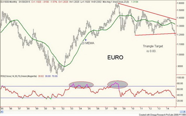
- The EU and Japan are falling back into what appears to be a deflationary recession. Despite the massive injections of liquidity over the years, it seems that more is needed. North America does not live in a detached world. Another EU crisis could erupt given that Greece is on the path to electing a government whose aim is to take Greece out of the EU (the so called “Grexit”). This could prove to be quite destabilizing especially since other EU countries are experiencing problems as well (Spain, Portugal, Italy and of late even France). The Euro ended the year at 1.2110, the low for the year. This was a negative close, and suggests that the Euro could fall considerably further in 2015. Based on the rebound that got underway in July 2012 to the high in March 2014 the Euro could fall as low as 1.02 in 2015. The Euro could fall even further. Based on what appears as a large symmetrical triangle top that formed on the Euro from 2008 to present the ultimate objective could be down to 0.83.
- The balance sheets of the world’s central banks have grown sharply in the past few years. This could well be a destabilizing factor down the road as their massive growth potentially limits them if another financial crisis were to occur.
- The rising US$ and collapsing currencies elsewhere is causing all sorts of distortions. The biggest one is the fact that despite the feeble global economic growth, debt growth has been anything but feeble. Much of the new debt is in US$ particularly for emerging and Asian economies. High debt levels denominated in US$ coupled with collapsing currencies could cause another major debt crisis. On the other hand, government bonds particularly of the major western economies are benefitting, as there has been a rush to safety. Spreads on weak credits are widening. Are widening credit spreads the canary in the coalmine?
- The collapse in oil prices is potentially destabilizing. The world is oil dependent and new sources of oil over the past number of years (shale) have been fuelled by debt and high oil prices. Take away the high oil prices and the debt could become a problem.
Charts created using Omega TradeStation 2000i. Chart data supplied by Dial Data
The Central Banks
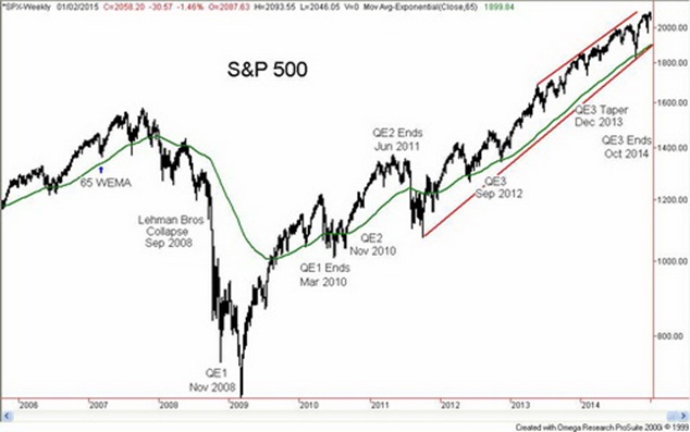
The Fed ended QE in October 2014. Since then the US stock markets have continued higher. There was a hiccup in October when the DJI fell about 10% but it did not last long. The belief took hold that the Fed would somehow continue to back the markets. With the EU and Japan sliding into recession once again the US markets were more appealing. While QE has done an excellent job at keeping the stock markets up its impact on the broader economy is questionable. Only the US (and Canada) have shown consistent low levels of growth. According to Shadow Stats www.shadowstats.com, however, the US recovery is highly questionable. When QE ended in the past, the stock markets started a correction within a couple of months. Could the drop that is currently underway be the start of another “end of QE” correction?
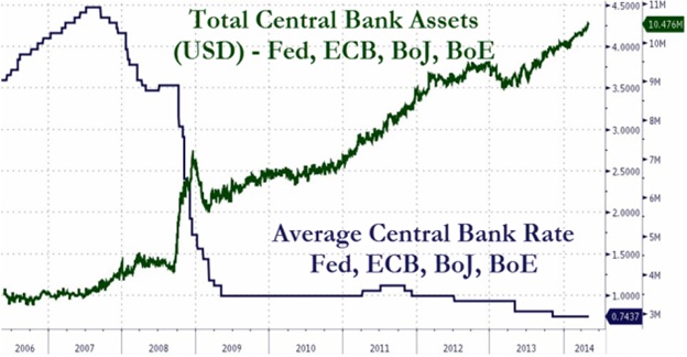
Since 2008, the balance sheets of the western economies central banks have exploded. The combined balance sheets of the four major central banks (Fed, BOE, ECB and BOJ) have seen their balance sheets go from roughly $4 trillion prior to the 2008 financial crisis to approaching $11 trillion today. The Fed alone has seen its balance sheet explode from roughly $800 billion to $4.5 trillion. The western economies have been flooded with a wave of liquidity while at the same time maintaining an artificially low interest environment.
The Fed still owns all of the bonds they have purchased over the past few years. Continuing to hold on to them should help keep bond prices high and yields low. There is evidence that the Fed continues to participate in US Treasury auctions. As a part of the Fed’s bond portfolio, they hold $1.7 trillion of mortgage-backed securities. While the credit quality of these securities is supposedly high, there is no guarantee that the credit quality always stays high. This has to be a concern going forward. While there is no suggestion that the Fed has been buying stocks there is evidence that other central banks may have. This is not necessarily a positive development. Central banks have been accused of being more concerned about maintaining high stock market levels then whether the broader economy actually improves. The equation appears to be, high stock market valuations = strong economy.
Below is a chart of the S&P 500 with QE1, 2 and 3 noted. There is also a chart showing the growth of assets at the major central banks (Fed, BOE, BOJ and ECB). If one were to add in PBOC, the growth would be even higher. The chart also shows how the official bank rate has fallen as well.
Charts created using Omega TradeStation 2000i. Chart data supplied by Dial Data
Source: www.zerohedge.com
Bonds
Many would be surprised to learn that the world has been on a debt binge since the financial crisis of 2008-2009. While household debt in the western economies has improved somewhat the massive debt growth has been primarily to sovereigns and corporations especially in emerging markets. IMF figures point to global debt as high as $158 trillion at the end of 2013. It could well be higher now. Since 2008 global debt as a percentage of GDP has grown from 180% to 212%. That number is most likely higher now as well. The bulk of the debt growth has occurred in emerging economies and Asia (China). The growth in the shale industry was financed with debt at low interest rates and high oil prices.
The sharp rise in the US$ over the past several months could cause problems for the mountain of debt that has accumulated over the past few years. A lot of the borrowing was in US$. As domestic currencies fall it becomes more difficult to service the debt. Countries such as Russia are of particular concern due the collapse of the Ruble. Much of their external debt of about $600 billion was borrowed by Russian corporations in US$ from western banks in the EU and the US. Ultimately the Russian corporate debt is also a debt of Russia because Russia would not want their corporations to default. At least that is the belief.
Further sanctions on Russia coupled with the collapse in oil prices could trigger a Russian default. Recall it was a Russian default in 1998 that triggered the 1998 financial crisis that culminated in the collapse of Long Term Capital Management (LTCM) that in turn triggered a financial crisis that almost brought down the world’s financial system. While 1998 was a sovereign default, a default this time would be Russian corporations. But it would most likely be a strategic default as a part of the “war” with the west.
A Russian default today would pale the 1998 default and the collapse of Lehman Brothers in 2008. But Russia is not the only one as the combination of a collapse in oil prices coupled with the sharp rise of the US$ has put numerous countries on the edge. Examples are Greece, Venezuela and Argentina. The fear is that a large debt default could trigger contagion.
Those that are invested in high yield bonds and high yield bond funds should be concerned. One of the charts below shows the adjusted spreads of high yield US bonds of emerging markets. The spread has widened considerably in the past few months breaking a long-term downtrend. This is one of the weakest, but all high yield spreads have been widening. They are not at levels seen at the height of the 2008 financial crisis nor even at the levels reached during the 2011 EU crisis. The warning is that the downtrend is broken and a default could widen the spread quickly and trigger further defaults. In a bad market even the BBB credits fall. As the markets go into 2015 this is something to note and a potential warning.
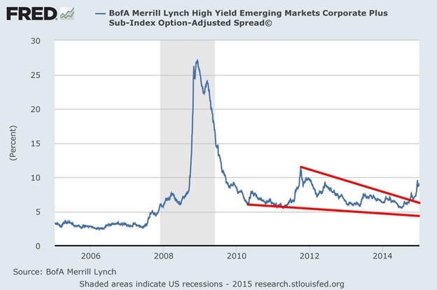
Source: www.stlouisfed.org
If there is the potential for problems in the high yield markets there does not appear to be any problems in the government bond markets of the major western economies. With signs of deflation in the EU and Japan there has been a rush to safety of government bonds in Germany, the US and even Japanese Government bonds. So will moving into government bonds provide cover for investors in 2015? Merriman has often noted a six-year cycle for bonds. There are longer ones but for purposes here the six-year cycle is sufficient (range 5-7 years).
Observable lows since the major bond market low in 1981 occurred in 1987, 1994, 2000, 2006/2007 (double bottom) and 2013. Since the low in late 2013 bond markets have been rising, (yields that move inverse to bond prices have fallen). With the current rush into government bonds (US government bonds in particular), there are signs that the long term US bond market could see new all-time highs in prices (record low yields). For the record, the all-time low yield was 2.46% back in July 2012. The long US Treasury bond market high was at 153^02 also in July 2012. With the 30 year yields down to 2.52% and the long Treasury bonds at 148 and rising there is now a strong possibility that bonds will rise to new highs (new low yields).
The next six-year cycle low is not due until 2019-2021. Yet here the 30-year US Treasury bonds appear to be on the cusp of new all-time highs (low in yields). Is this a blow-off in the making? The problem with blow-offs is that it is difficult to say how high the bonds might go. The other side of the coin is that blow-offs invariably end badly. Blow-offs also occur at the end of the cycle, not at the beginning. The six-year cycle in bonds subdivides into either two three-year cycles or three two-year cycles. If it is a two-year cycle, that cycle low could be due later this year. It is something to keep in mind going forward. A sharp rise in bond prices could well be followed by an equally devastating bond sell-off. If that were to happen it might be on the back of a major credit crisis.
Source: www.arborresearch.com/bianco
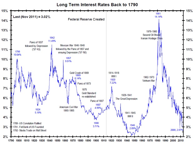
Bonds have been falling in yield now since 1981 a period of 33 years. It is one of the longest runs ever recorded. I found this amazing long-term chart of long-term bond yields going back to 1790. Arguably, the longest decline occurred between 1842 and 1900 a period of 58 years. Grant you there were some significant interruptions in 1857 and 1869 so it may not be fair to compare that decline in yields with the current long-term market decline in yields.
What is significant is that sharply falling bond yields are often associated with financial panics and depressions. Two of the largest drops in bond yields occurred during and after the 1873 panic that led to a period known as the Long Depression. The second big drop occurred during the Great Depression and war. The current collapse in bond yields was triggered by the financial panic of 2008 although yields had been falling for 26 years prior to that. Long bond yields could even fall as low as they were in 1946 at 2.09%. A blow-off might now be suggesting that another financial panic could soon be underway. Something to keep in mind going forward.
Oil
This is not the first time that oil prices have experienced a sharp decline. It has happened before in 1985, 1998 and 2008. The last one was the most dramatic as oil prices collapsed from $147 to $32 in a mere five months from July to December 2008. But that was during the 2008 financial panic. Oil prices quickly recovered and by April 2009, they were back at $87. The previous collapses didn’t see oil prices recover quite as quickly but after bottoming at just under $10 in April 1986 oil prices recovered to almost $23 by July 1987. Similarly, after bottoming just above $10 in December 1998 oil prices recovered to $38 by September 2000.
The collapse in oil prices could be destabilizing. It is battering the budgets of oil exporters. The list of countries negatively impacted include the obvious ones of Russia and Iran but also Nigeria, Venezuela, Norway and possibly even others such as Ecuador, Mexico and Turkmenistan. Even Saudi Arabia who appears to be the leader in allowing oil prices to fall could be negatively impacted. It could also negatively impact the US States of Texas, North Dakota and Alaska – all oil producing states. And here in Canada both the Alberta government and the Canadian government are lowering their projections for oil related revenue.
On the other hand, oil importers such as the EU, China, Japan, the US and the Canadian provinces of Ontario and Quebec could benefit. Consumers are benefitting from lower prices at the gas pump and presumably, they could pay less for their heating oil as well. The highly leveraged shale industry in the US could also be negatively impacted. The shale industry in the US used high oil prices and borrowed money in order to invest. The shale industry has also been a major contributor to job growth over the past five years. Could a collapse in the shale industry be bigger than the collapse in sub-prime in 2007? It’s possible.
Could oil prices have a 12-year cycle (orb 10-14 years)? The Arab oil embargo got underway in 1973. Prior to 1973 oil prices rose only slowly as oil prices were controlled by the large western oil companies. Everything changed in 1973 when OPEC proclaimed an embargo following the fourth Arab-Israeli war in October 1973 known as the Yom Kippur war. If one uses 1973 as a key cycle low, the next significant low was seen roughly 13 years later in April 1986. Following that oil prices recovered peaking with Iraq War 1 in 1990. Prices next made a major bottom in December 1998 some 12 years following the 1986 low.
Prices exploded to a high of $147 by July 2008 because of Iraq War 2 and sharply growing demand from Asian economies led by China. As noted, the collapse occurred during the financial panic of 2008 and bottomed in in December 2008, 10 years after the 1998 bottom. If a 12-year cycle does exist, the next one might not bottom until 2018-2022. The current collapse could be a half cycle decline given it is occurring six years after the 2008 low. Cycles usually sub-divide by two’s or three’s. The previous 12-year cycles appeared to sub-divide into three four-year cycles (orb 3-5 years). The 13 years following the 1986 low saw lows in late 1988 (3 years?) and 1993 (5 years). The 10 years following the 1998 low saw lows in 2001 (3 years) and 2007(6 years, which yes appears too long).
Oil prices fell out of what appears as a large triangle formation that formed between 2010 and 2014. The triangle formation had potential objectives down to between $40 to $45 once it broke under $90 and was confirmed by a breakdown under $80 and $75. Once this low is established, a multi-month rebound could get underway. Given current levels of around $48, a low may soon be at hand. This could occur in the first quarter of 2015. A recovery would find resistance at $60, $70, $80 and $85. Only over $90 would oil prices confirm that a significant low was in. At this stage, I don’t see any reason or have technical targets or indications that oil prices should breakdown under $40. The year-end close under $55 was negative for oil and suggests that the current malaise could be around for some time.
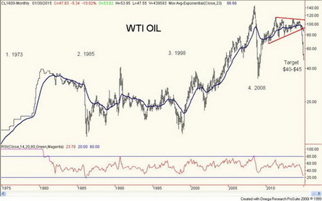
Charts created using Omega TradeStation 2000i. Chart data supplied by Dial Data
Gold
For those looking for a possible major bottom in gold and the beginning of a new bull market in 2015 they might be disappointed. For those looking for at least a temporary bottom in gold followed by a recovery rally in 2015 they might be pleased.
Since the bull market in gold got underway in 2001, they enjoyed a solid 12-year run to the upside that took gold from $250 to $1,900. One can suppose that a correction of some significance might have occurred at some point. Nonetheless the collapse that occurred in 2013 caught most of those involved in the gold and gold resource markets unexpectedly and unprepared. In 2013 gold fell a sharp 28.2%. It was the worst down year since 1997 and the second worst year for gold on record since gold became free trading in the 1970’s.
Ten-Year Gold Cycle
Annual % Change in Gold
Year of Decade
In a lot of respects 2014 was a much better year for gold as it was down only 1.5% in US$ terms. If gold is a currency then gold was the second best performing currency 2014. The US$ was the best performing currency in 2014. Gold as a result was up against currencies other than the US$. Gold gained 12% in Euros, 4.7% in British Pounds, 10% in Swiss Francs, 12% in Japanese Yen and 7.6% in Cdn$. The biggest gain was in Russian Rubles up an incredible 84.7%. Gold may have been down in US$ terms during 2014 but against all other global currencies gold was up on the year.
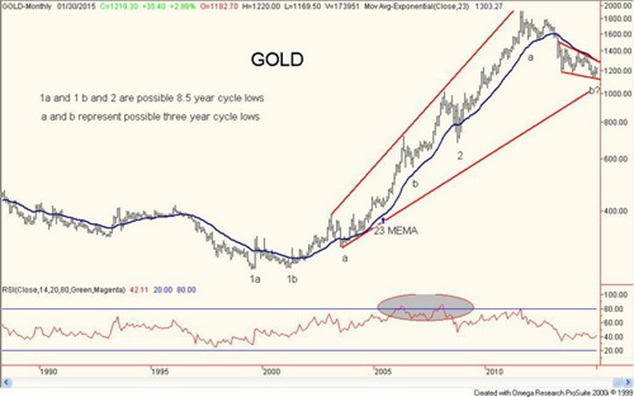
I have noted that if a real bull market in gold is to get underway then gold must be rising in all currencies. Once gold in US$ joins the rising trend then it is possible to suggest at least that at minimum that gold has entered an intermediate bull market. Since gold topped out at $1,911 in September 2011, gold prices have corrected back roughly 40%. Stating this another way, gold has corrected roughly 47% of the entire move from $255 to $1,911.
The history of free trading gold is not long. Detecting long-term cycles is not easy when gold prices were fixed for so many years. Merriman has wondered whether there might be a long-term 25-year cycle for gold. Gold made a significant bottom in 1976 and its next significant bottom was in 2001 a period of 25 years. That cycle was bearish and peaked early in 1980 at $875. Merriman suggests that the 25 year cycle consists of three cycles of 8.3 years (orb 7-9 years). Observable key important lows were seen in 1976, 1985, 1993, 2001 and 2008. Cycles divide into sub-cycles of two and three. For gold that could suggest that the 8.3 year cycle sub-divides into either two 4.15 year cycles or three 33 month cycles. Based on the observations to date it appears more likely that the 8.3-year cycle sub-divided into three 33-month cycles. Observable lows were seen in 2003 and 2006 before the 8.3-year cycle low of 2008 and so far in this cycle there was an observable low in December 2011 and more recently the low in November 2014. There were other lows over the past few years but thus far the November 2014 low at $1,133 is the lowest and it did come 35 months after the December 2011 low. So it is possible that is the 33 month cycle low. However, the low has not been confirmed.
If that 33-month cycle low is in then gold could be beginning the third and final phase of the current 8.3 year cycle. And if this assessment is correct then it is possible that any current up move is only a correction to the decline that has taken place since September 2011 or even October 2012. It is unlikely to be the start of a new bull market for gold as the 8.3-year cycle low still looms due sometime around February 2017 with a possible orb of 17 months (putting the low to occur anywhere between December 2015 and July 2018). It is possible that gold could bottom sooner as was seen with the shortened third phase cycle between 2001 and 2008.
Gold has considerable work to do to confirm that the final low is in. Currently gold needs to take out $1,230 (the recent high) to confirm that a move to $1,270-$1,280 is underway. Gold would most likely face considerable resistance there and up to $1,300. Above $1,300, one could make an argument for a powerful move as high as $1,625. Above $1,300, key areas of resistance would be at $1,340 and $1,380 then again at $1,430. Only above $1,430 could one make an argument that the major low might be in. A failure below $1,300 would be quite negative and suggest that longer-term targets of $1,050, $950 and even down to $850 could still be in play.
While I am loathe to think that even further lows lie ahead what the recent low in November 2014 has demonstrated is that the current 8.3 year cycle is bearish and that suggests that the final phase could see a lower low below the November 2014 low. Once that low is in then gold should embark on the next 8.3-year cycle and the up move could be powerful at least in the first phase as was seen 1976 to 1980 and 2008 to 2011. In other first phase moves gold saw a strong up move from the low in 1985 to a high in 1987 and the low in 1993 was followed by a strong rally that didn’t peak until 1996.
If this is truly a correction to the 2011-2014 collapse then a hopeful target would be the Fibonacci 38.2% correction zone around $1,430. But if the correction is shallow and this current 33-month cycle peaks early then it might only get to just above $1,300 before failing. What is encouraging thus far is that both gold stocks and silver are leading. Gold stocks appear to have broken out this past week and could be pre-ceding a breakout for gold above $1,230.
Gold is the ultimate hedge against loss of confidence in government. With gold rising in Euro terms, it is possible that they are losing confidence in the EU. There are potential threats that Greece could pull out of the EU (the “Grexit”) and there other political parties in France and Britain in particular that also want to pull their countries out of the EU. Britain is to hold a referendum on the subject.
If there is a word I have for what may take place during 2015 it is volatility. 2014 had its volatile moments especially with the collapse in oil prices a possible black swan event. Stocks and bonds could blow-off only to be followed by a sharp decline. Gold could rally strongly then collapse to new lows. Oil prices could find a bottom rally strongly only to fall once again. There is potential for other black swans. The reality is that things are beginning to become unglued but it takes time and numerous false moves could be seen. From that perspective, 2015 could be a traders market but prove unpleasant for investors. Weekly missives should keep you updated.
Charts created using Omega TradeStation 2000i. Chart data supplied by Dial Data
Copyright 2015 All rights reserved David Chapman
General Disclosures
The information and opinions contained in this report were prepared by Industrial Alliance Securities Inc. (‘IA Securities’). IA Securities is subsidiary of Industrial Alliance Insurance and Financial Services Inc. (‘Industrial Alliance’). Industrial Alliance is a TSX Exchange listed company and as such, IA Securities is an affiliate of Industrial Alliance. The opinions, estimates and projections contained in this report are those of IA Securities as of the date of this report and are subject to change without notice. IA Securities endeavours to ensure that the contents have been compiled or derived from sources that we believe to be reliable and contain information and opinions that are accurate and complete. However, IA Securities makes no representations or warranty, express or implied, in respect thereof, takes no responsibility for any errors and omissions contained herein and accepts no liability whatsoever for any loss arising from any use of, or reliance on, this report or its contents. Information may be available to IA Securities that is not reflected in this report. This report is not to be construed as an offer or solicitation to buy or sell any security. The reader should not rely solely on this report in evaluating whether or not to buy or sell securities of the subject company.
Definitions
“Technical Strategist” means any partner, director, officer, employee or agent of IA Securities who is held out to the public as a strategist or whose responsibilities to IA Securities include the preparation of any written technical market report for distribution to clients or prospective clients of IA Securities which does not include a recommendation with respect to a security.
“Technical Market Report” means any written or electronic communication that IA Securities has distributed or will distribute to its clients or the general public, which contains an strategist’s comments concerning current market technical indicators.
Conflicts of Interest
The technical strategist and or associates who prepared this report are compensated based upon (among other factors) the overall profitability of IA Securities, which may include the profitability of investment banking and related services. In the normal course of its business, IA Securities may provide financial advisory services for issuers. IA Securities will include any further issuer related disclosures as needed.
Technical Strategists Certification
Each IA Securities technical strategist whose name appears on the front page of this technical market report hereby certifies that (i) the opinions expressed in the technical market report accurately reflect the technical strategist’s personal views about the marketplace and are the subject of this report and all strategies mentioned in this report that are covered by such technical strategist and (ii) no part of the technical strategist’s compensation was, is, or will be directly or indirectly, related to the specific views expressed by such technical strategies in this report.
Technical Strategists Trading
IA Securities permits technical strategists to own and trade in the securities and or the derivatives of the sectors discussed herein.
Dissemination of Reports
IA Securities uses its best efforts to disseminate its technical market reports to all clients who are entitled to receive the firm’s technical market reports, contemporaneously on a timely and effective basis in electronic form, via fax or mail. Selected technical market reports may also be posted on the IA Securities website and davidchapman.com.
For Canadian Residents: This report has been approved by IA Securities, which accepts responsibility for this report and its dissemination in Canada. Canadian clients wishing to effect transactions should do so through a qualified salesperson of IA Securities in their particular jurisdiction where their IA is licensed.
For US Residents: This report is not intended for distribution in the United States.
Intellectual Property Notice
The materials contained herein are protected by copyright, trademark and other forms of proprietary rights and are owned or controlled by IA Securities or the party credited as the provider of the information.
Regulatory
IA Securities is a member of the Canadian Investor Protection Fund (‘CIPF’) and the Investment Industry Regulatory Organization of Canada (‘IIROC’).
Copyright
All rights reserved. All material presented in this document may not be reproduced in whole or in part, or further published or distributed or referred to in any manner whatsoever, nor may the information, opinions or conclusions contained in it be referred to without in each case the prior express written consent of IA Securities Inc.

David Chapman regularly writes articles of interest for the investing public. David has over 40 years of experience as an authority on finance and investments via his range of work experience and in-depth market knowledge.