Gold And Silver’s Step Sums Give The Metals A Strong BUY


 Gold and its step sum are looking pretty impressive. First a short step sum review from tail end of gold’s last bear market up through today. From January 1998 through 2001 I could have placed a bull box in the chart below. Market sentiment as measured by gold’s step sum (Red Plot) was horrible, yet look how firmly the gold price clung to its $250 line (Blue Plot). Over the course of these three years, that many net down days should have forced the price of gold much lower except the bulls kept coming in to buy whatever supply was offered, never allowing gold to decline below $250. Remember, the late 1990s & early 2000s were a time when the future was seen exclusively as a high-tech digital phenomenon. Oil, steel, dirty smoke stacks, and the old monetary metals were widely seen as outdated investments by most investors, if they gave them any thought at all.
By 2001, however, “liquidity” from deflating high-tech stocks had begun flowing into the price of gold and silver. In October 2008 “liquidity” from deflating stocks and bonds boosted gold and silver prices into their second advance of the bull market. In August 2011 a step sum bear box began forming, when the price of gold saw a multi-year decline as its step sum refused to follow.
The bull’s refusal to become bears was logical. The only reason gold and silver prices were declining was due to the manipulation of the paper future’s markets; the bulls and everybody else, for example the CFTC knew it. In the bear box below the red step-sum plot refused to go down for the first thirty months of the correction. This was due to the bulls lining up day after day to buy tons of fictional gold at the COMEX and LBMA paper markets. This was a waste of time and money for bulls, as well as shameful behavior by the management of the big gold and silver miners who without protest allowed their companies’ metal to be sold at prices far below where a free market would had them.
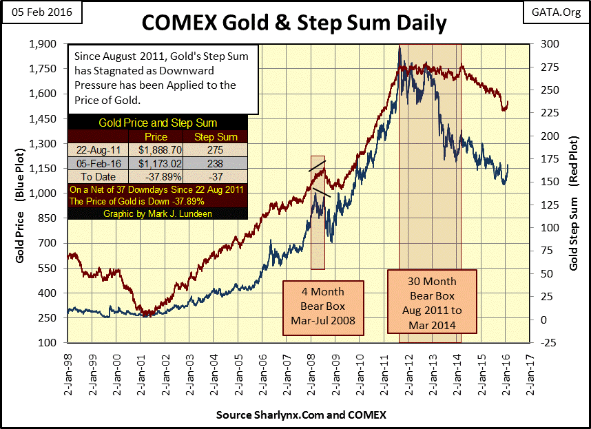
When it comes to step sum boxes, it’s important to realize that future price trends are best predicted by the price trend itself, not the emotional step sum trend. Beginning in August 2011 gold ultimately declined 45% as the bulls unsuccessfully fought the bearish price trend. But as we see in gold step sum chart below, there’s good reason to believe all that is behind us now.
Chart reading is subjective, more art than science. So there are two ways of seeing when the collapse in market sentiment (the step sum) began; the exact point in time the bulls surrendered to the bears. In the chart below one of these is at the star (March 2014), when the step sum peaked and began a twenty three month decline following the price of gold down. In this shorter term chart, (as opposed to the long term chart above), the bear box clearly closed in March 2014 as market sentiment (the step sum) no longer opposed the price trend. The other way is to detect the collapse in market sentiment is when the bulls panic climaxed, as it clearly did from October to November 2015.
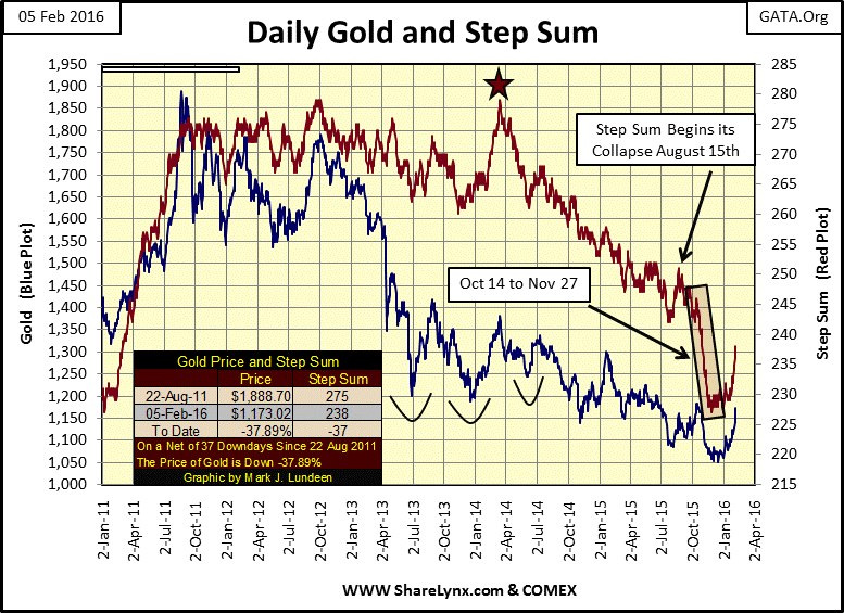
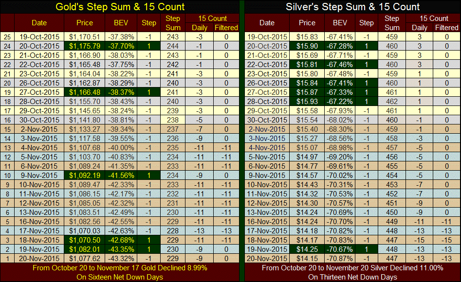
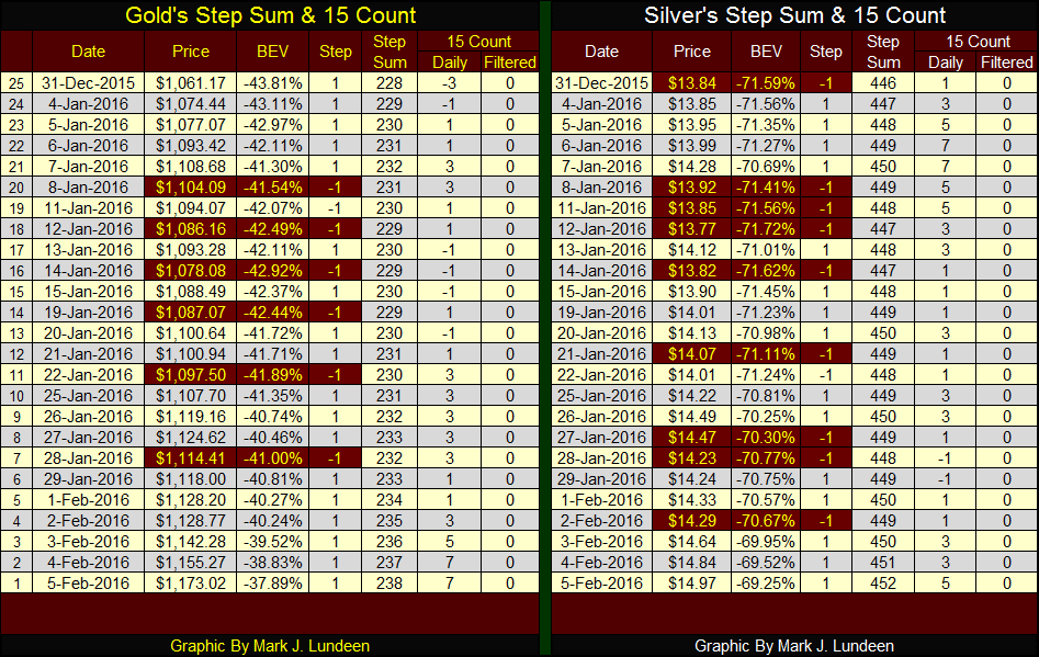
It was during this time I published the table below giving gold and silver’s “15 Count”; the 15 day running sum of the daily steps used in constructing their step sums. In the table below up days are highlighted in green, and there weren’t many up days for gold and silver during this month. In retrospect, this climactic panic selling marked an important event for our current decline in the price of gold and silver – the bulls surrendered which signaled the end of the bear market. This is especially apparent for gold when we look at its price and step sum plots above; both plots bottomed in mid-December then vigorously began rising after Christmas.
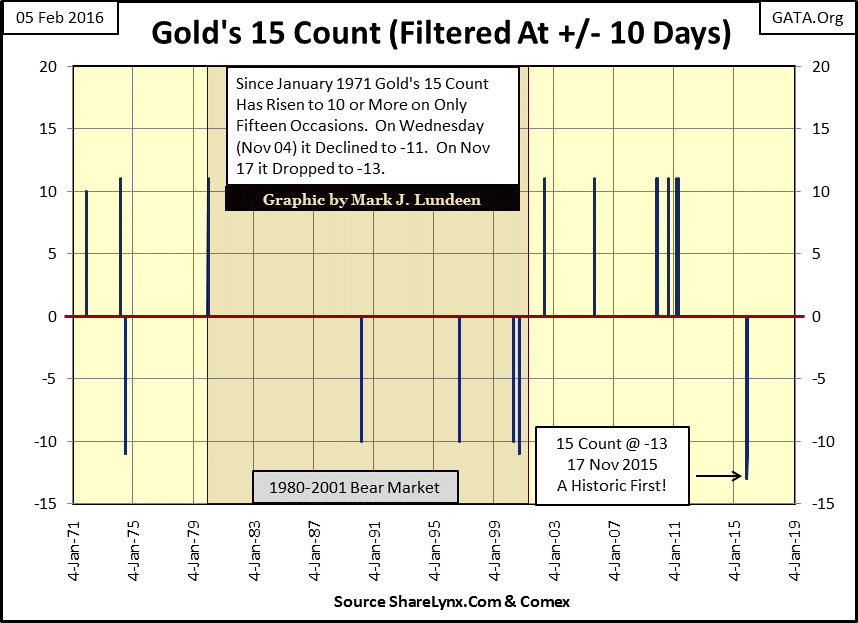
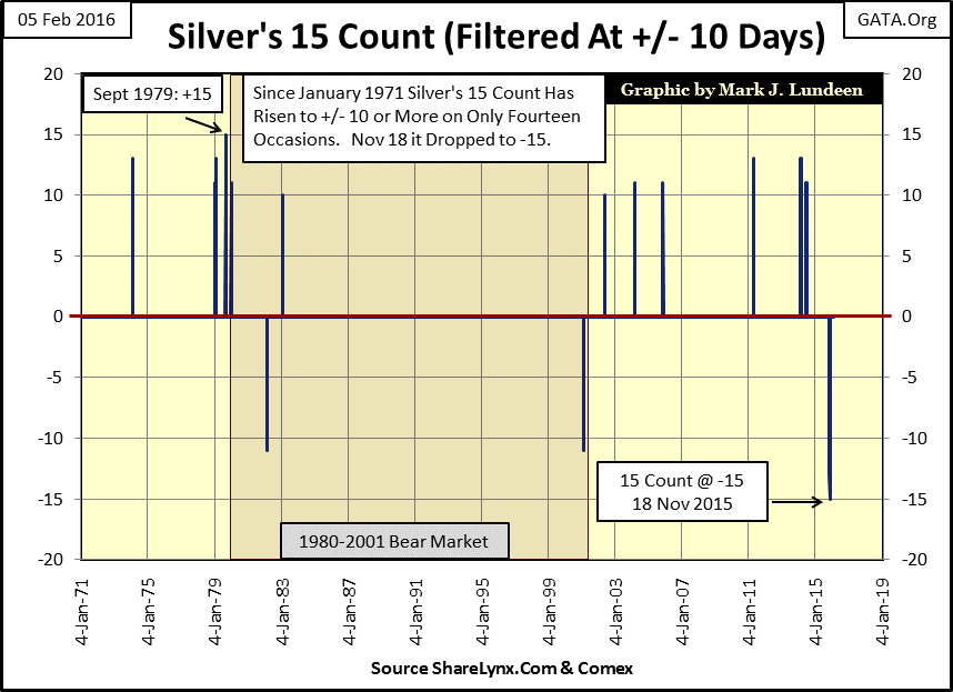
How hard these November bottoms were can best be seen in their 15 count charts below. Using (+/-) 9 as a filter to eliminate daily noise we see the 15 count’s extremes since 1971. Gold’s 15 count reached a few 10s and 11s over the past five decades but never higher. Then last November during the selling panic in the gold market it declined to a 13 for the first time ever.
Silver’s November bottom was even harder; its 15 count declined to -15. In other words the price of silver fell below its previous closing price every day for three trading weeks. That had never happened before, although just a few months before silver’s January 1980 market top we saw its 15 count reach +15 in September 1979.
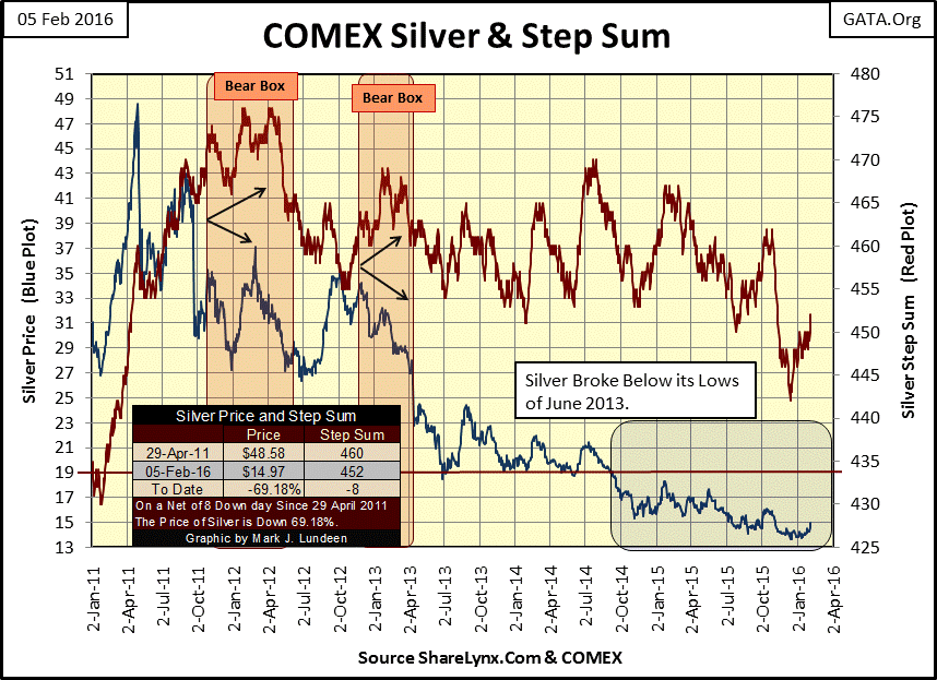
Silver’s step sum chart (below) is not as bullish as gold’s. Its step sum (Red Plot) is rising nicely but the price of silver (Blue Plot) hasn’t yet responded as I would have expected. But it’s still early in the recovery. When silver is ready to move it will be obvious. Just look at what silver’s price and step sum plots did from January – April 2011. The price of silver increased $22 from January 20th to April 29th; a 77.21% gain in just 68 trading days! In the months and years to come I expect to see similar advances in the price of silver once the elephant now sitting on the silver market is forced to move.
Look at silver’s first bear box below; for nine long months the bulls were in denial as the price of silver continued its decline. The same thing happened with silver’s second bear box. As I’ve pointed out many times the price trend in a step sum chart is the superior indicator of future market trends. But it’s important to note that when a box forms, market sentiment (as seen by the step sum) is out of step with the price trend. That tells us that the market sentiment is wrong and the price trend is predicting lower prices in a bear box or higher prices in a bull box.
Below we see the current 15 count table for gold and for silver. I highlighted the down days in red. Why gold is doing better than silver is easily seen in the number of down days silver has suffered since the end of December. Gold’s 15 count is approaching 10. However as you can see in the 15 count charts above, gold or silver’s 15 count rarely exceeds 9. But if we see a buying panic in the precious metals markets in the months to come, expect to see gold and silver’s 15 count go double digit. That would be a nice confirmation of the resumption of the bull market.
Using step sum analysis I can say that gold is now a strong buy – silver too. But after the past five years with all the paper gold and silver flooding the paper futures markets (courtesy of Wall Street and their friends in high places), I am still suffering from battered bull syndrome. Until the price of gold and silver stop being determined at the COMEX and LBMA, I doubt we’ll see gold and silver prices rise as swiftly they did from October 2008 to April 2011. But I feel safe in saying that the bottoms are in for the metal prices.
Not much action in the stock market this week. No days of extreme volatility or breadth. So maybe it’s time to look at what’s happening with earnings at the Dow Jones.
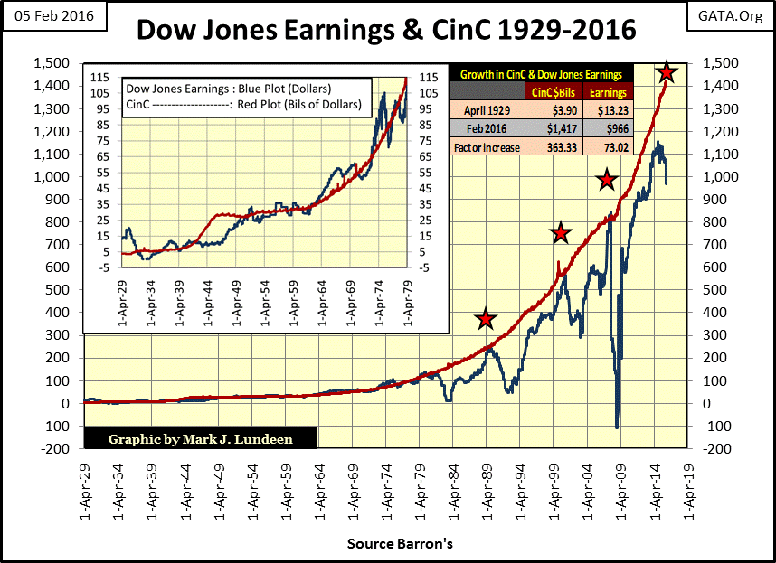
There’s a strange relationship between Currency in Circulation (CinC) and Dow Jones earnings. For fifty years, (from 1929 to 1979) for every billion dollars of CinC the Dow Jones realized about a dollar in earnings. See insert in chart below. Note that these plots are not indexed, but the raw weekly data as published in Barron’s. We’re looking at the stock market, not a scientific experiment so it’s to be expected that this billion to one ratio would not always be exact, however it’s undeniable that it’s there.
Ever since 1979 the rate of CinC inflation has been running away from increases in Dow Jones earnings, as seen below. But we should note that the first three times since 1979 (Red Stars) the Dow Jones earnings did catch up to CinC inflation Dow Jones earnings plunged. (Note: Dow Jones earnings actually reached just one billionth of CinC, as the scale of the red CinC plot is in billions.) The crash in Dow Jones earnings after its October 2007 meeting with CinC was historic in magnitude. From $836.46 in October 2007, Dow Jones’ earnings crashed to -$109.43 ten months later (August); then look what happened. The Dow Jones earnings soared to new all-time highs in just a few short years.
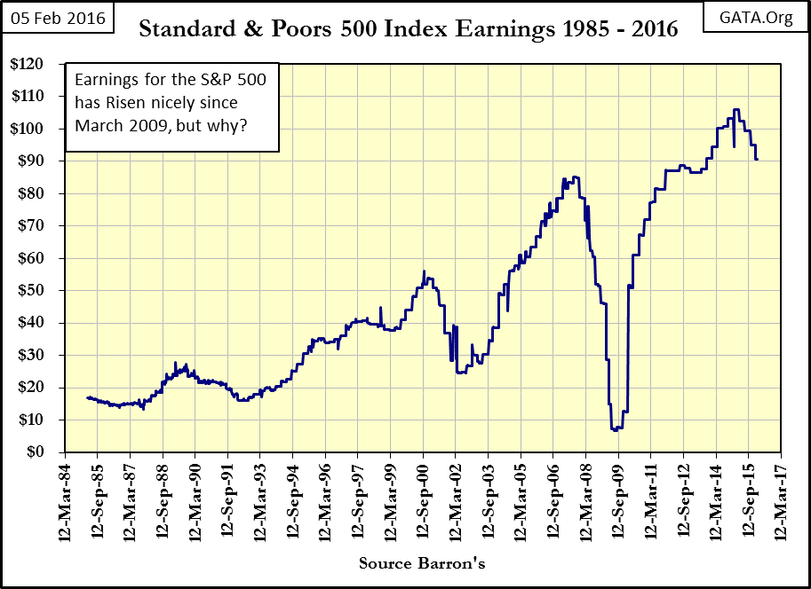
The strange post credit-crisis collapse / recovery in earnings wasn’t isolated to just the Dow Jones. Since the mid-1980s earnings trends for the S&P 500 have mirrored those of the Dow Jones, even during the post October 2007 collapse / recovery.
Barron’s 50 Stock Average’s earnings also saw a remarkable post credit-crisis recovery, and like the other market indexes peaked in 2014-15 and is currently in decline.
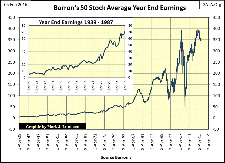
The really odd thing about the post credit crisis earnings recovery was just how quickly they recuperated. The Dow Jones earnings plunged from a record high in October 2007 ($836) to a $945 collapse in less than a year, then on to another new all-time high ($851) in April 2011; all in less than four years. The Great Depression collapse in Dow Jones earnings took twenty years to recover. That somehow seems more realistic than the four year collapse / recovery seen in 2007 to 2011.
The last time Dow Jones’ earnings approached the CinC plot above was in October 2014 with Dow Jones earnings at $1,153 and CinC at $1,295 (Upper Right Red Star / Dow Jones Earnings Chart). Since then earnings for all three data series have turned down as CinC bulldozes ever higher.
After examining these three market series’ earnings amazing maneuvers since October 2007, we should be asking what kind of earnings could do this? Obviously reported earnings today are more ephemeral than current accounting standards would have us believe. With mostly bad news on the economic front and the global banking system near collapse, one has to wonder how resistant to decline today’s earnings will prove to be in the coming months.
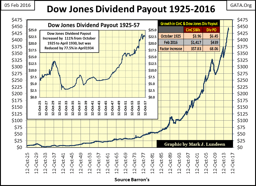
One thing is for certain: the current decline in Dow Jones earnings hasn’t yet affected the Dow’s historic high dividend payout. Not yet anyway.
Keep in mind that since the March 2009 bottom, there has been a major trend on Wall Street to swap equity for debt by selling trillions of dollars of bonds to fund share buyback programs. You can be certain that big companies like Apple and IBM are not the only ones burdening their balance sheets with consumptive debt that will weigh heavily on share prices in the not to distance future.
So what happens when business and sales turn down in a recession or depression? Well earnings will crash – again. And this time I expect we’ll see some substantial reductions in the Dow Jones dividend payout as they shift what income they have left from their dividend program to making bond coupon payments. Reductions in dividend payout have always been hard on stock valuations; this would be reason enough to plunge the Dow Jones below its lows of March 2009.
Here’s a link to Marketwatch on Corporate America’s out of control share buyback program. But they miss the risk these buyback programs place on their future dividend payouts.
But don’t envy the bond holders. In the years to come counterparty failure in a monetary system based on unrelenting monetary inflation will ensure that fixed income once again doesn’t pay. A failing or insolvent business will be unable or unavailable to pay the return of the investor’s principal at the end of a bond’s term. And financial institutions such as banks, brokerages, and insurance companies stuck holding the defaulting bonds will also fail. So even if you hold the bonds of a still solvent company, getting your money back from a defaulting brokerage will be impossible.
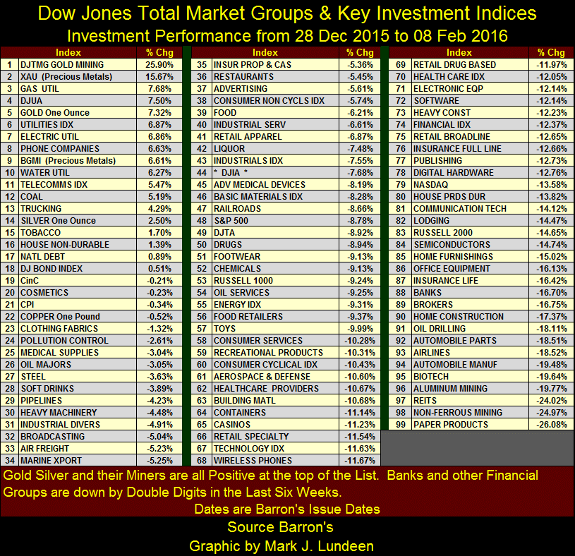
Historically, at such times as these gold and silver bullion have been a wonderful investment. And in case you haven’t noticed gold, silver and precious metals miners are at the top of the list for 2016 in the table below.
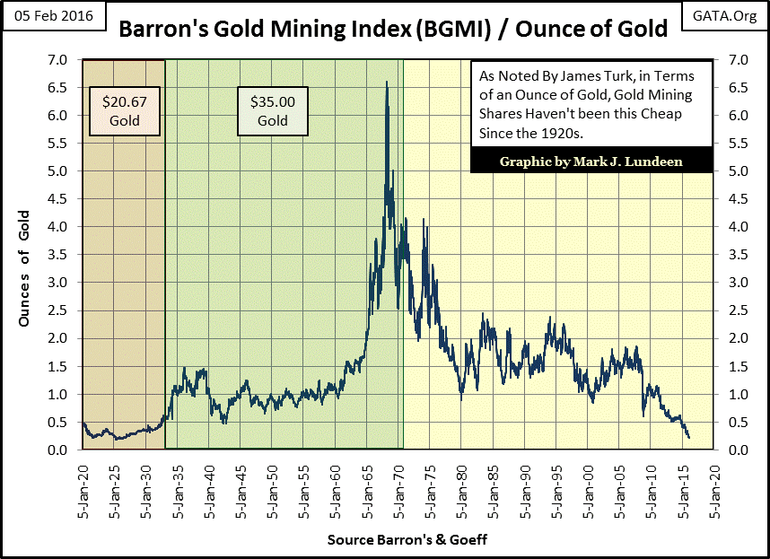
Make sure your portfolio contains gold and silver bullion, physical metal not an ETF, or paper gold held in the banking system. But when you see below how for the first time in ninety years the BGMI can now be purchased for less than a quarter ounce of gold; setting aside some capital to purchase gold mining shares is worth the risk as the potential rewards are huge.
As I’ve said before: gold and silver never benefit from monetary inflation flowing from the Federal Reserve. All those market groups above now in negative territory do, or rather did. Gold, silver and obviously the precious metal miners benefit from wealth fleeing deflating financial assets such as stocks and bonds, and that’s exactly what we are seeing now.
Mark J. Lundeen


