Gold And Silver: The Prozac Markets


The Dow Jones Index on Wednesday broke down to double digits in the BEV chart below (-10.11% / 23,924). I was wondering if this was the week the Dow Jones was going to take out its -11.58% (23,533) from March 23rd. But Friday came leaving the Dow at -8.84% / 24,262.
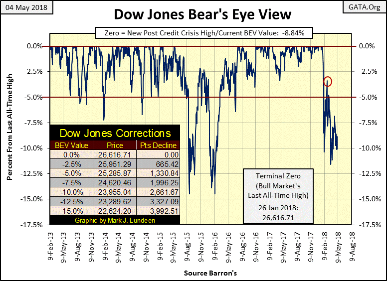
The problem for the bulls in this market is its volatility, as is evident in the OHLC bar chart below. From November 2016 to January 2018, the Dow Jones made 99 new all-time highs over those 303 NYSE trading sessions. On average that’s one new all-time high in every three days, which is a lot.
Look at daily volatility in the chart below from October to its last all-time high on January 26th. During the advance the Dow Jones advanced or declined from one day to the next in small steps. Then came February’s volatility, and the stock market has been struggling ever since.
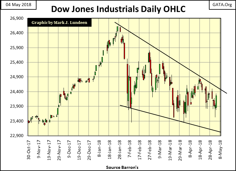
Sure, Friday’s advance pushed the Dow Jones away from the low of March 23rd, but look at how it did it in the chart above; with a single day’s advance that was larger than any seen by the Dow Jones from October to February. In my opinion that isn’t bullish; nor is the current pattern of lower highs and lows so evident in this chart.
I can’t say if the weakness seen above will continue next week. Maybe the next few months will bring a recovery to the stock market, though should the post-January volatility on display above continue, I doubt the Dow Jones will see a new all-time high.
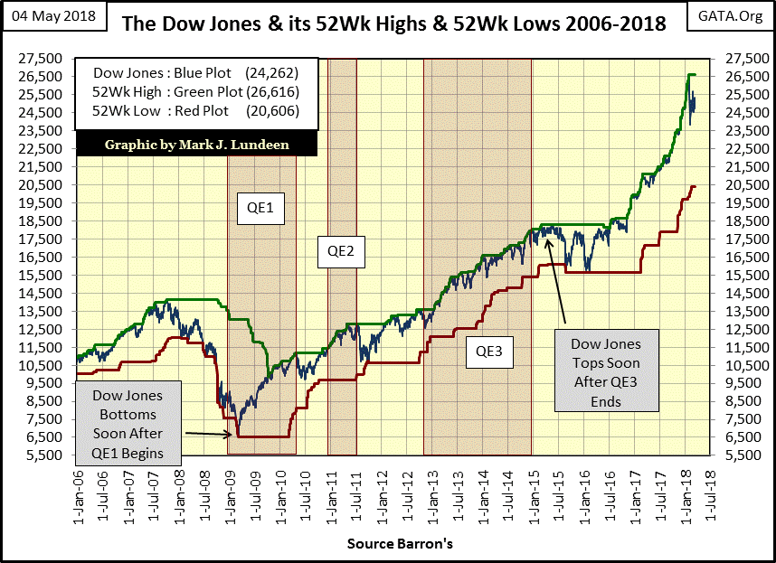
The big problem I have in believing the market advance that began in March 2009 has any strength left in it is best seen in the chart below. From March 2009 to January 2018 the Dow Jones advanced 20,000 points over a nine year period. And that advance was totally artificial, fueled by three Quantitative Easings, a Zero Interest Rate Policy (ZIRP), “Operation Twist” in the bond market, and who knows what else happened in the market’s back rooms.
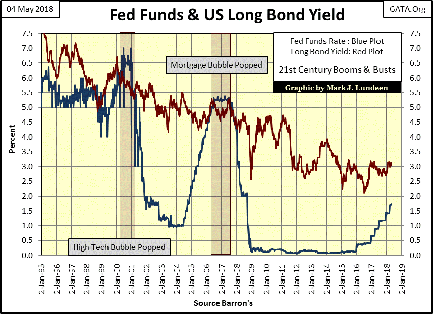
For the past nine years it’s been one shenanigan after another, anything necessary to move this market up. And after nine years the “policy makers” bag of tricks is now empty. Looking at the plots for the Fed Funds Rate and US Long Bond yield below, the seven years of ZIRP is on full display, seven years of Fed Funds Rate at or near zero as long bond yields continued to decline. But since 2016, interest rates and bond yields have bottomed and are now rising, with short-term rates rising faster than the longer term bond yields.
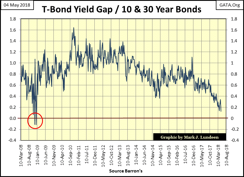
At the end of this week the yield gap between the 10 year and the 30 year Treasury bonds was only seventeen basis points. To appreciate the implications of this development look at the chart below. The last time the yield for the 30 year T-bond found itself below that of the 10 year T-bond was in November / December 2008 (Red Circle). Three months later the Dow Jones saw its second deepest bear market bottom since 1885.
Take a moment and look at the trend below, how likely is it that before 2018 concludes we’ll see the yield gap between 10 year and 30 year T-bonds invert (break below zero) once again? I’d say there’s a darn good chance it will, and that’s not good for the bulls.
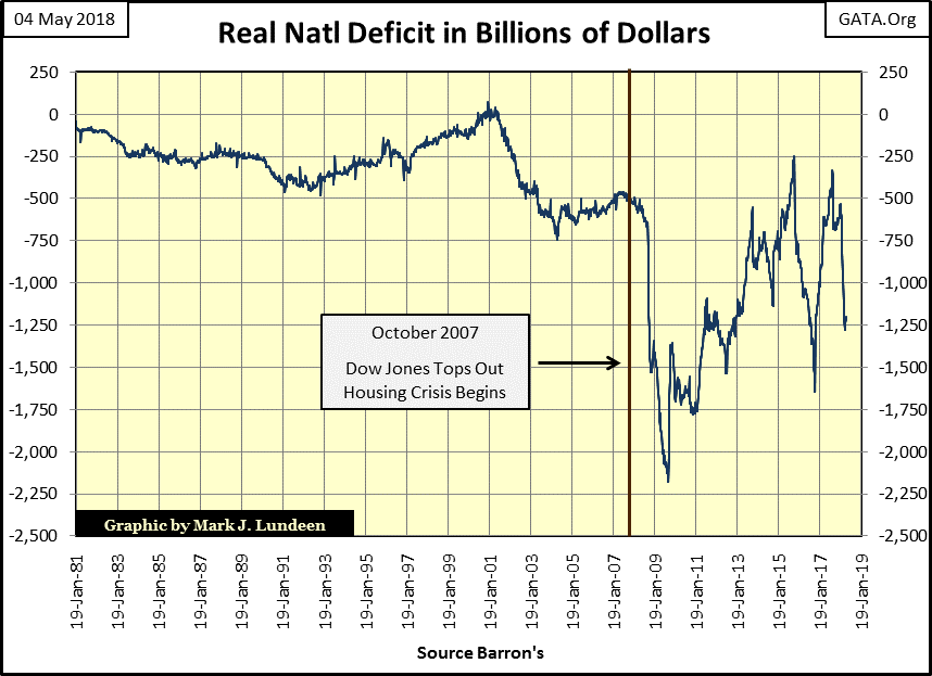
And then there are the big spenders in Washington. It makes no difference which party controls congress. Nancy Pelosi (CA-D) or Paul Ryan (WI-R) as Speaker of the House, they know exactly who they owe loyalty to, and it’s not to the US Constitution, or to the voters back home. It’s to the people they budget hundreds of billions of dollars to, and much of it is borrowed from the bond market.
The data points in the chart below are computed by taking the US national debt of 52 weeks ago, and subtracting from it the national debt from the current issue of Barron’s. Or the billions of dollars the national debt has increased in the past 52 weeks. Congress always loved spending other people’s money. But what happened after the October 2007 hasn’t been the usual squandering of national resources seen before October 2007.
I cringe at the thought of who will come forward to restore “stability” to the markets and economy when this house of cards come crashing down; members of congress, academics staffing the bureaucracies congress created to regulate all things economic, and the bankers who would sell their souls to the devil for a quick buck, if they haven’t already. And the main-stream FAKE NEWS media daily reporting the daily “progress” these clowns are making. The entire system is so corrupt; I get ill just thinking of the evil these selfish narcissists are capable of.
In the coming crisis, should the headline appear that President Trump sent out the MPs to arrest key members of the above groups, with the Air Force providing transportation to Gitmo for their military tribunal, I’d be all for it! That they fear Trump is capable of doing this is why he’s so hated by the establishment.
I’ve followed the stock market since the 1970s. It’s a hobby of mine I picked up while in the Navy. I don’t consider myself a “professional market analysis.” After four decades of following the market, I’ve learned that “professional market analysis” in the main are quick to inform investors of what stock to buy. However, they seem incapable of informing the public when to sell until after the average retail investor figures that detail out for themselves – at considerable loss to themselves.
Nope, what I am is a serious student of the market; and as such I’ve learned that there are times when one should stop looking for reasons to buy, and begin looking hard for reasons to sell and lock in profits. After a nine year / 20,000 point advance in the Dow Jones, the two interest rate / bond yield charts above are two excellent reasons to get the hell out of the market, and stay out until Mr Bear is finished with the bulls.
Fortunately, just because the stock market is due for a significant bear market doesn’t mean there isn’t greener grass elsewhere for us to feast on. Gold, silver and the precious metals miners come to my mind as investments with excellent risk/rewards ratios; this is especially so with the miners.
At a time when the major market indexes are less than 10% from their all-time highs, as seen in the BEV values in the table below; Barron’s Gold Mining Index (BGMI / #23) is still 70% below its last all-time highs of April 2011. In fact, the BGMI at the close of this week is below where it was trading in 1975! From levels such as this, there just isn’t any more inflation to deflate out of the miners current valuations.
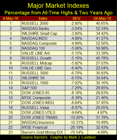
To my way of thinking, numbers 1-22 in the table above have all the risk while the BGMI at #23 offers the greatest potential for reward. But for the miners of gold and silver to go up, gold and silver bullion must also resume their bull markets, which hopefully they will sometime in 2018. If you really believe the way to make money is to buy low and sell high, keep in mind you first must buy low.
I haven’t covered volatility for gold and silver for well over a year. There’s a good reason for that; gold’s last day of extreme volatility (+/- 3% move from previous day’s closing price) was last seen on 04 October 2016: -3.30%, and silver’s (+/- 5% move) on 11 November 2016: -6.66%.
The table below lists gold and silver’s days of extreme volatility by year going back to 1970. Its pointless going back futher in history as the price of gold was fixed by law at $35 an ounce. Silver, whose price wasn’t fixed by law traded as if it might have been. Barron’s once published metals’ spot prices. Silver’s spot price remained unchanged from 09 March 1959 to 27 November 1961 at $0.9138 an ounce, and for the rest of the 1960s traded between $1.00 to $2.00, frequently seeing months pass with no change in price.
The same could be said for most commodities, like copper and crude oil.
It’s simply a matter of history recorded in the dusty old pages of Barron’s that before the economy and financial markets became addicted to monetary inflation flowing from the Federal Reserve, prices for industrial commodities such as metals and energy were increadibly stable.
Before the 1970s, futures markets were exclusively reserved for agriculture’s need to hedge rainfall, or the lack of it. After the 1960s, because of volatility introduced into the US dollar, the futures markets were expanded to allow commerce and industry to hedge the risks of a “monetary policy” managed by the idiot savants sitting on the FOMC. Professor W.H. Hutt put it nicely in 1966.
“How can businessmen coordinate the private sector of the economy effectively when the most important measuring-rod of all; the monetary unit has been left with no reliable defined value? Units of length, volume, and weight have been universally defined with meticulous care; but dollars, lire, francs and pounds have been allowed to change in every significant attribute over time.”
- Professor W.H. Hutt: New Individualist Review, 1966 Winter Issue
But all that changed after August 1971. Not long after the US Treasury demonetized gold, volatility in market prices and interest rates became a major concern of commece and the “policy makers”, and remains so today. The effects of decoupling the dollar from the Bretton Woods’ $35 gold peg are evident in the gold and silver tables below.
In the price section of the tables I’ve listed the first closing price for the year; the range is the percentage spread between the year’s high and low prices. The 3% and 5% Days section lists the number of days gold and silver experienced a day of extreme volatility. I used a different color scheme for bull and bear markets.
Note on the 1969-80 bull market; gold and silver peaked in January 1980. Gold’s first close of 1980 may have been $575.50, but fourteen trading days later (January 21st) it closed at $825.50 on panic buying.
Gold would have gone higher,but the COMEX changed the rules the next day by prohibiting new long orders, in effect prohibiting the purchase of gold on the COMEX. The big banks began selling, collapsing the price of gold forcing the longs to close out their once profitable positions in the gold market at great losses.
Just keep this in mind when you see 1981’s first closing price higher than 1980’s, a two decade long bear market in gold began on January 22nd 1980 when the price of gold collapsed by $143.50, a -17.38% daily move (aka a Gold 3% day).
Also note the red box I placed over the years from 2002 to 2013. Gold for these twelve years only saw annual gains. I know of no other market that has done something like this.
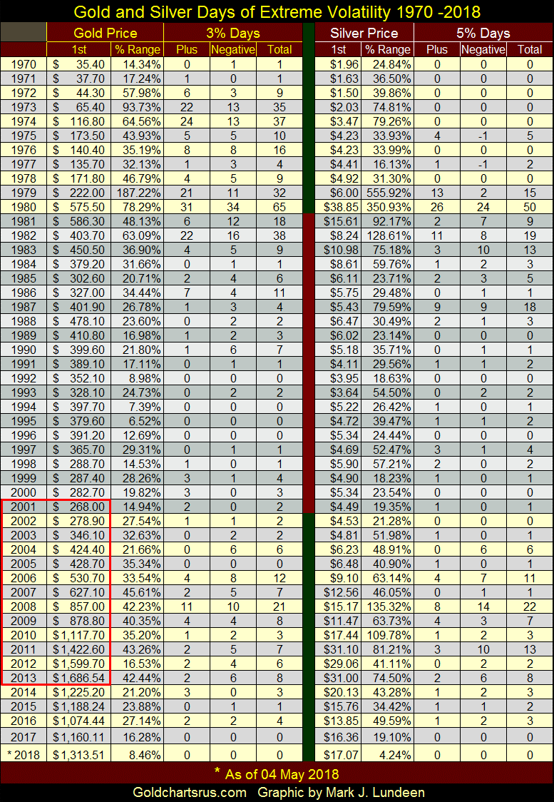
After a short study of the table above, it’s apparent how volatility in the old monetary metals differs from the stock market, as seen by Dow Jones’ 2% days of extreme volatility. For the Dow Jones, bull markets are low volatility affairs, while volatility in bear markets is a huge factor. With gold and silver, volatility raises its head when the metals are in play during both bull and bear markets. When the metals are out of the financial-news cycle for lack of excitement, as they have been since November 2016, they experience few, if any days of extreme volatility.
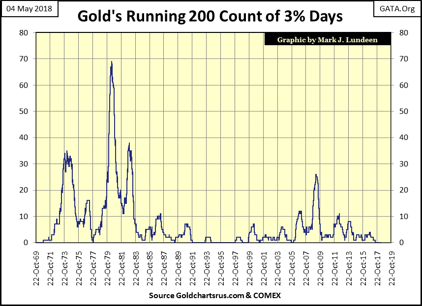
Here’s the chart plotting gold’s days of extreme volatility seen in its table above.
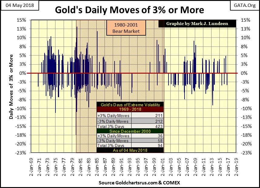
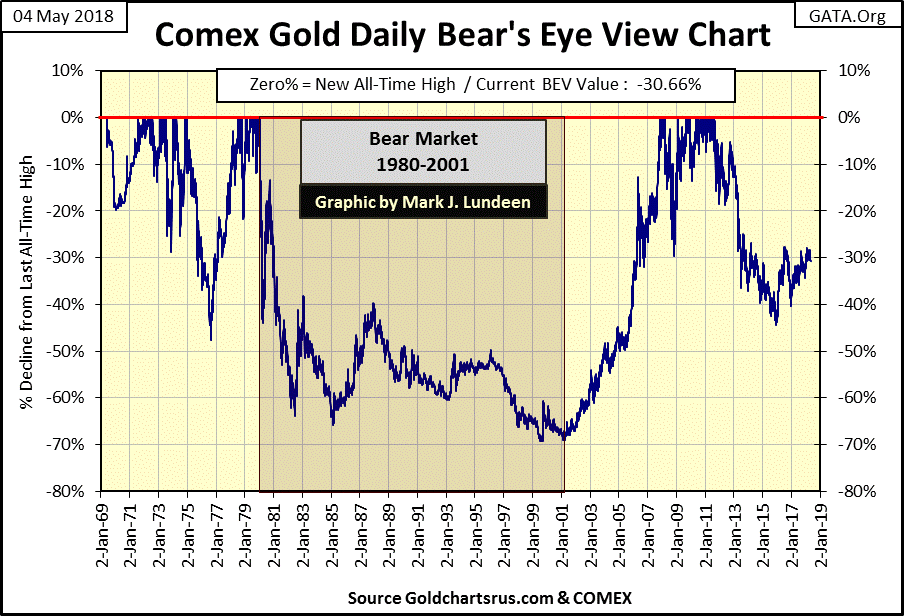
As seen in the chart’s table, since December 2000 gold has seen only 94 days of extreme volatility. When compared to the volatility the gold market saw from 1970 to the early 1980s in gold’s BEV chart below, one is compelled to ask why that would be so given all the excitement seen in the gold market since 2000.
I agree completely with GATA’s Bill Murphy and Chris Powell, that the gold market is rigged by a cartel who dominates global finance and politics. In my opinion, Gold’s lack of 3% days since 2000 strongly supports Murphy and Powell’s views on the gold market, that its valuations are managed.
Here’s gold’s 200 count; the number of extreme days of volatility in a running 200 day count. Without a doubt, since the 1980s something has changed in the gold market. It’s as if the gold market has been medicated with Prozac for the past two decades.
Gold’s trials and tribulations of 2008 are seen below as the 200 count increased to 26 by March 2009. Nothing even close to the quantity of extreme days of volatility market moves such as these would have produced in the 1970s. But the advances and collapses seen from 2010 to 2013 were greater than anything gold saw in 2008-09, yet gold’s 200 count increased by a pathetic 10 for all that - really?
Here is the same data on extreme volatility for the silver market.

Gold and silver haven’t seen a day of extreme volatility since the last quarter of 2016; call it a year and a half. That’s a long time, but the current calm waters gold and silver now cruse in is not a permanent feature of these markets. When gold and silver resume their bull markets, which began in 2001, I’m anticipating their next advance to new all-time highs will be heralded by a resumption of days of extreme volatility.
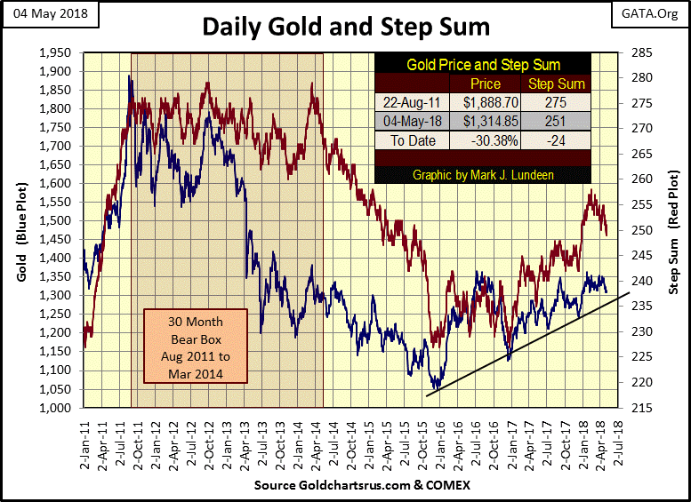
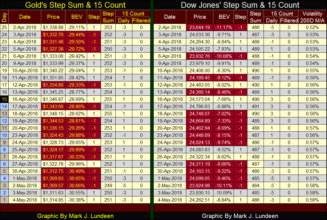
Let’s move on to gold’s step sum chart. Gold’s step sum topped on February 14th at 258, and closed the week at 251. That’s a dramatic decline in the step sum’s red plot below. But note how the price of gold has largely ignored this decline in market sentiment / decline in its step sum. Gold’s step sum chart is telling us the internals in the gold market are bullish.
Absent a surge in the price of gold, seeing its step sum decline in the chart below as the price of gold trends sideways is the next best thing to see; a strong indication the next big move in the price of gold is upward.
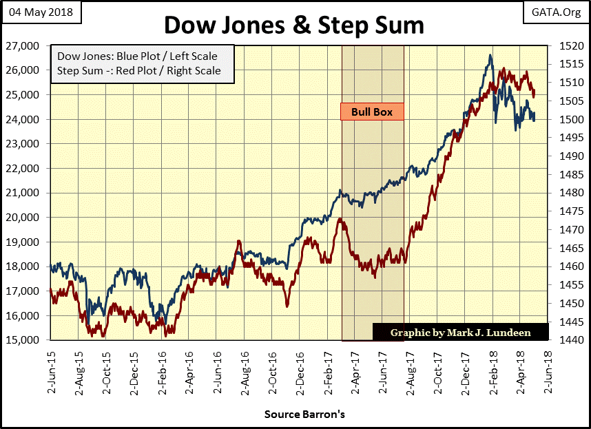
Here’s the step sum chart for the Dow Jones. For the Dow, its step sum is in sync with the declining Dow Jones, and that’s not bullish. Studying this chart, with the Dow’s step sum and price plots trending down together leads me to believe in the coming month the Dow Jones will break down to new lows in its current correction.
Just keep in mind that technical analysis of the markets is more art than science. Like me, you’ll just have to wait to see what the coming months will actually bring to the gold and stock markets. Still, I believe we have better than house odds that by Christmas we’ll see higher gold and silver prices as the stock market continues to deflate.
Below both gold and the Dow Jones this week saw -3s & -5s in their 15 counts. A -5 means that in the past 15 trading sessions, ten of those days were down days, and only 5 days advanced. That’s a lot of downward pressure on market valuations, and as seen above in the step sum charts, gold and the Dow Jones are holding up pretty well under this selling pressure. But I note that the Dow Jones volatility’s 200 day M/A is now at 0.58%, and rising.
But unlike the above step sum charts, these tables are only a 25-day snap shot of these markets. It’s key to keep in mind that gold is in a two year up trend that began in December 2015, rebounding off a BIG 45% market decline. This makes gold much more attractive than the Dow Jones (the stock market), a market that has advanced by 20,000 points in the past nine years.
Poor Venezuela; Reuters reports they saw an inflation rate of 6000% in February. As James Sinclair would say; “this is too stupid to be stupid.”
Economists today have the benefit of hundreds of years of monetary history to do their research from. Yet as a group these idiot savants still advocate a monetary system, which by necessity is managed by them that historically ends in ruin for any society that encourage their sagacious verbal ejaculations on their money and interest rates.
Here’s the problem; beatniks from the 1950s, hippies from the 1960s and hardcore Marxists like former members of the Weather Underground have taken over America’s system of higher education. The results were predictable, as seen in the link below.
https://www.thecollegefix.com/post/43767/
I’m all for eliminating the school loan program, as subsidized “education” does more harm than good to both students and society. What a sad time we live in.
Mark J. Lundeen


