Gold Market Is Holding Strong


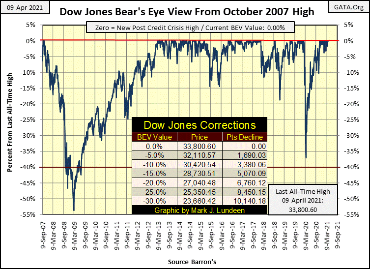
Since I last wrote an article on the markets in mid-March, the Dow Jones has seen four new BEV Zeros in the BEV chart below, and was never more than 1.80% from these new all-time highs. That’s pretty bullish.
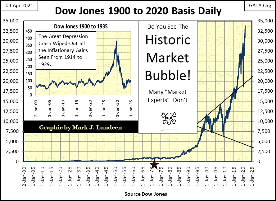
Exactly how “bullish” the market has been may best be seen in my next chart plotting the Dow Jones in dollars since January 1900. After looking at the Dow Jones since 1900, what else is there to say but ask if my readers see the historic market bubble? Many people don’t, but one day they will when the stock market’s valuations deflate far below where they are now.
But when will that be? Now that’s the question everyone wants to know the answer to, but like me, everyone is going to have to wait to see. As I wait, I like the view of the market from the peanut gallery, while others prefer seeing this market’s action from the field.
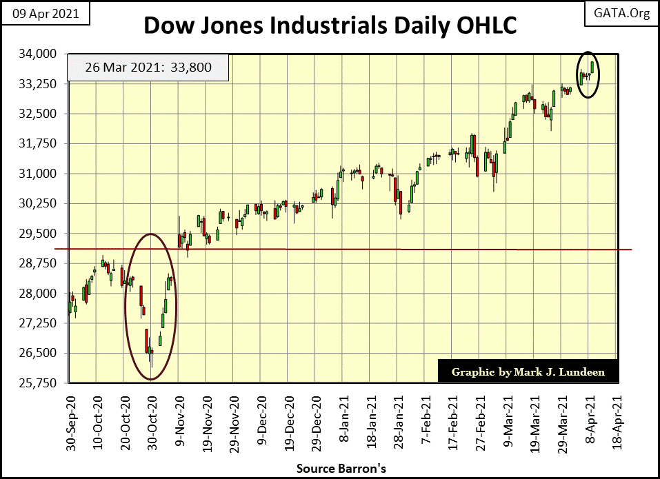
There is after all, money being made as a bull so far in 2021. But the closer the Dow Jones comes to its final high in this advance, a final high the markets are currently ignorant of, the less money is left on the tables for the Johnnies-come-lately to Wall Street’s party. And seeing the Dow Jones close the week at 33,800 is enough to give me a nose bleed from this market’s altitude.
Here are my major market indexes daily BEV values for the week, with 0.00% indicating the index closed at a new all-time high for that day, and a negative percentage value giving the index’s percent decline from its last all-time high. On Friday’s close, twelve of the twenty indexes closed at a new all-time high, with #13 to #16 in scoring position, or within 5% of its last all-time high.
Looking pretty good!
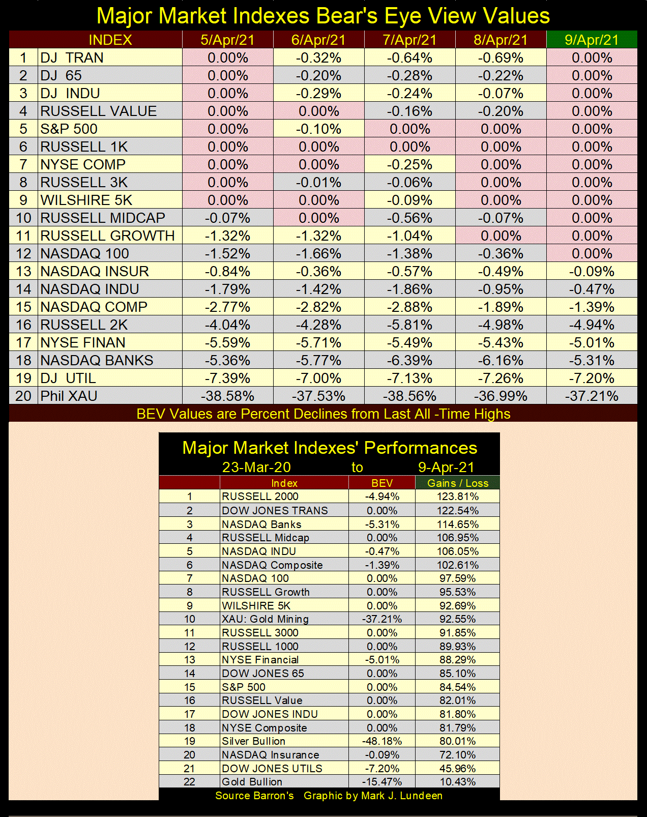
What doesn’t look so good are the percentage gains these indexes have seen since their March 23rd, 2020 lows, when the Dow Jones deflated 38% in less than a month, forcing the FOMC to “inject” over a trillion dollars into the financial system in the following weeks to keep the market from entering a liquidation phase.
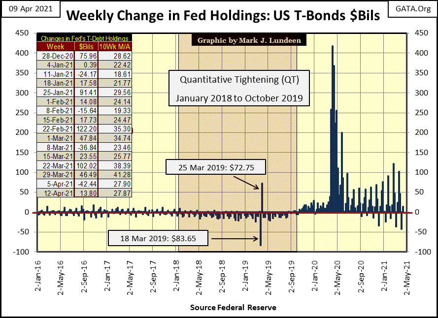
Look at the market advances in the table above. With few exceptions, everything is up over 80% in the past year, with the top six indices seeing gains in excess of 100%. Can the market reproduce these gains in the year to come? If the FOMC continues “injecting liquidity” into the market as it has (chart below), it could.
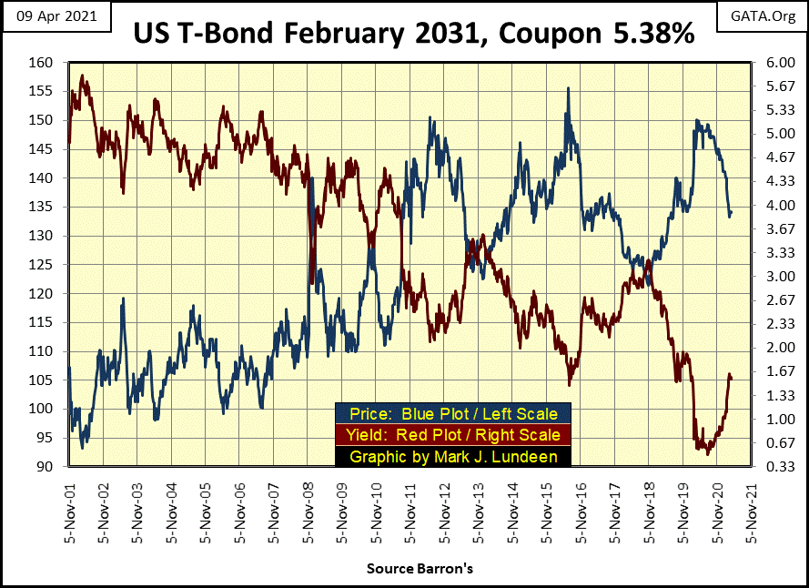
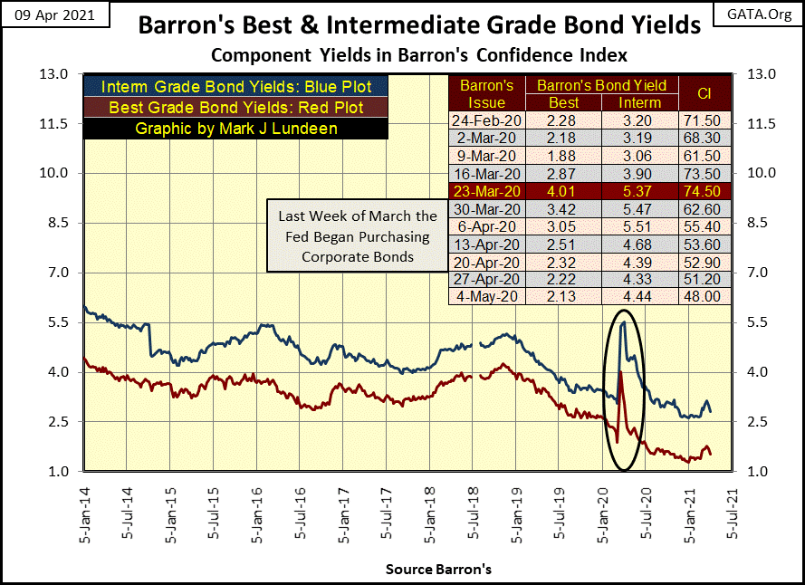
But an “it could” is not the same as a “it will.” And what will happen to market valuations won’t be pretty should bond yields continue to rise, as they have since last August as seen in the red plot on the chart below. A doubling of yields in the bond market from current levels, and continuing increases in consumer prices could result in some gruesome market action long before 2021 comes to an end.
People forget, but they shouldn’t, the market has all too frequently begun upchucking dollars since the NASDAQ Composite began deflating in early 2000, and the real estate market in 2008. It’s going to happen again, and for the same reason; shortly after the final market top, Mr Bear and his bull market cleanup crew are going to do their thing, as they always have following every prolonged market advance. As this advance began in 1982 with the Dow Jones trading at around 700, far from this week’s close of 33,800, there is much work to be done by the bears before the market and the economy sees their ultimate bottom.
But the Tech Wreck of 2000-02 and Sub-Prime Mortgage Crisis of 2007-09 are today seen as historical events from market antiquity. With the Dow Jones closing this week above 33,000, as seen below, what’s there to worry about?
I hate new software. I seems, to me anyway, with all the new upgrades I gain features I don’t need or want, and lose features I came to depend on. But I have to say “upgrading” to Windows 10 from Windows 7 was the least painful I’ve had with Microsoft. I could generate graphics for publishing, my old charts and tables from my Windows 7 files.
The problem came when I wanted to create a completely new chart from scratch, such as the BEV chart below of gold from 1969 to the close of this week. As you can see, I haven’t figured out how to make a new chart from scratch using Windows 10 just yet.
Once problems like this were seen as challenges to be conquered. But that was a long time ago. Today I just get emotionally agitated and shake my walking cane at the computer as I shout obscenities at Microsoft. It’s like Betty Davis said:
“Getting old isn’t for sissies.”
But Betty didn’t have to deal with computers, so what did she know?
Back to my chart. This is an AJUSTED BEV chart. In other words, I used gold’s BEV series as is, until its June 1982 -63% bottom. I then began the BEV series anew from this deep bear-market bottom. So, the first BEV Zero seen following the June 1982 -63% bottom is in fact still -63% from gold’s highs of January 1980. So, all BEV Zeros from June 1982 to November 2007, when gold finally broke above its last all-time high from twenty-seven years before, are not new all-time highs, but new highs for the advance from gold’s June 1982 -63% bottom.
I like this Bear’s Eye View of gold, as it allows us to see how gold climbed out of the hole it found itself in in the early 1980s; with great difficulty.
One problem with this Adjusted BEV chart using Windows 10, it insists in continuously plotting from the June 1982-63% bottom to the first BEV Zero of the plot, or from the red circle around this deep bear market low up to the first adjusted BEV Zero a day later. This is something Windows 7 and Windows XP didn’t do. And it’s doing the same thing from this week’s close, running the plot up to the BEV Zero line in a very annoying fashion.
So much for my trials and tribulations with my new computer running Windows 10. Let’s take a look at how gold advanced from a then alarming $43.50 in January 1969 up to $1742 at the close of this week; a historic advance fueled by the flow of inflation from the Federal Reserve.
But for the benefit of new readers of my work; what’s a BEV Chart?
The BEV stands for The Bear’s Eye View, or how Mr Bear looks at all market series, with each new all-time high (or new high for the advance) being equal to a BIG FAT ZERO, because that’s what Mr Bear thinks of each one of the bulls’ new all-time highs. So, in a BEV Chart each 0.00%, or BEV Zeros as I call them is a new all-time high. The only thing Mr Bear cares about any market series is how much of a percentage claw back he can take from each of the bull’s BEV Zeros and that is exactly what is seen below: new all-time highs and the percentage corrections (Mr Bear’s Claw Backs) from them.
The first notable correction of the 1969 to 1980 bull market saw a -47% bottom in August 1976 from its BEV Zero ($195.50) of 30 December 1974. Since the Great Depression, Americans were prohibited from owning gold bullion. But with the termination of the Bretton Woods $35 gold peg in August 1971, gold ceased being money as far as the US Treasury was concerned.
As I recall, in 1974 Congressman Ron Paul from Texas called on then President Ford to lift the prohibition of American’s owning gold. If the government had downgraded gold from being a monetary asset to just a commodity, no more or less than soybeans or pork bellies, why can’t Americans own gold bullion in the post Bretton Woods monetary system?
President Ford agreed with Congressman Paul. By December 1974 Americans could once again purchase gold. As the price of gold had inflated in value from $43.5 to $195.5 in just three short years, lots of American did so; at the top of the move. Unfortunately, gold in early January 1975 began the -47% correction seen in the BEV chart below.
The next big event in this BEV chart was the resumption of the bull market after the August 1976 bottom ($102.30), where gold soared to $825 in January 1980. Gold then began a two-decade long bear market, declining to a BEV of -64% ($298.00) in June 1982. It’s at this point where my BEV chart adjusts for the bear market, and I reset my BEV series for June 1982, creating a BEV Zero in the chart even as the gold market itself was 64% below its highs of January 1980.
What is useful about this is we see how from gold’s lows ($298) of June 1982, it finally advanced to an actual new all-time high in early November 2007 ($831) – with lots of volatility!
The actual bottom of the 1980 to 2001 bear market in gold happened in the summer of 1999 with a BEV of -69.27 ($253) from gold’s last all-time high of January 1980. Gold then saw a double-bottom in February 2001 ($255). This double-bottom marked the start of gold’s current bull market.
There was the 30% (November 2008) correction during the sub-prime mortgage debacle. The next significant market correction for gold was from August 2011 ($1888), where it corrected 45% ($1053) in December 2015.
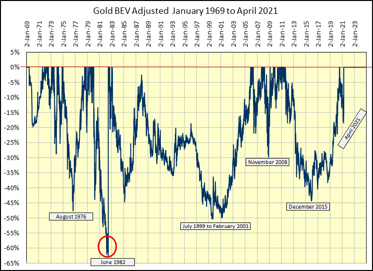
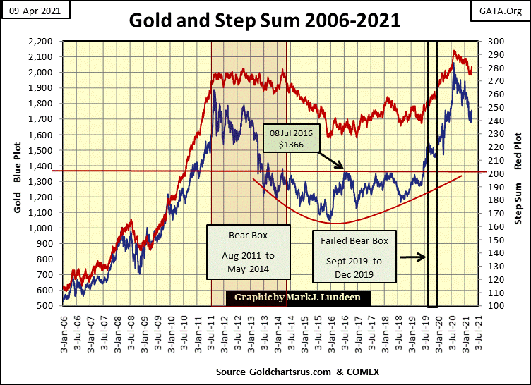
Now to the point of this chart; the wild volatility investors in gold have had to deal with since 1969, or had to until last August to the close of this week. Currently most “market experts” and investors are convinced gold is mired in a deep-market funk. And I admit, every time since last August when an advance in gold was snuffed out by the usual suspects, I too felt that funk pressing down on me even as I’m writing this.
But take a good look at the gold’s BEV chart above. For the past eight months; from its August 2020 last all-time high (BEV Zero) to this week’s close, the bears have been unable to get the price of gold to correct by 20%. Looking at the history of the gold market recorded in its BEV chart above; a 20% correction in the gold market isn’t much of a correction. Are the bears in the gold market having problems here?
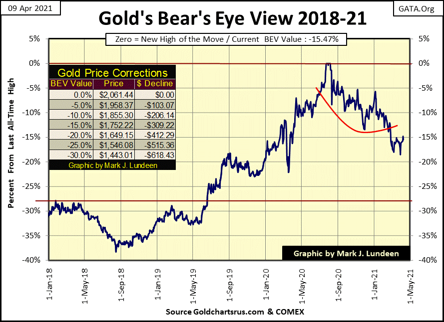
A few weeks ago, I stated that I believed the bottom was in for the current correction in the gold market. At that time the bears had managed to force gold down by only 18.03% from its all-time highs of last August. During my two week break the bears took another shot at forcing gold down below its BEV -20% line, succeeding in only getting gold to close -18.53% from last August’s highs, before gold snapped back once again.
In the following BEV chart for gold, the correction from last August’s high is on display, and my call that the bottom for the current correction in the gold market was in, is still looking good.
In gold’s step sum chart below; market reality (Price of gold / Blue Plot) is showing excellent support at the $1700 level. Market sentiment (Step Sum / Red Plot) has bounced off its 275 level, closing the week at 280. What does this mean? Maybe that in our uncertain world there is a good chance that the correction in the gold market has found a bottom in the past month, and maybe good things are to follow in the weeks and months to come.
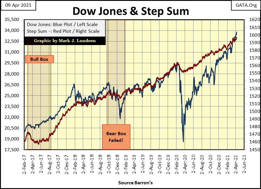
Next is the step sum chart for the Dow Jones. The Dow Jones (Market Reality / Blue Plot) since last November’s presidential stolen election has surged with strength into market history as market sentiment (Step Sum / Red Plot) follows behind like a faithful dog.
No doubt about it, the step sum chart for the Dow Jones is a pretty picture; a pretty picture of a massive market top. Can the Dow Jones break above 40,000? I don’t doubt it could, but that would only be a 18% advance from today’s close of 33,800. That isn’t much when we think of how far the Dow Jones has advanced from its lows of March 2020; 81.80%.
Looking at market history, the way to make money has always been to sell at market tops and buy at market bottoms. Everyone knows that. But what people have trouble with is actually doing that. Applying this historic market rule here in April 2021 would be to sell financial market assets such as stocks and bonds, which are both at near their forty-year historic market tops, and buy precious metal assets; gold and silver bullion and shares of companies that mine them.
So, what if the Dow Jones does go up to 45,000 and gold and silver continue down? If you’re a short-term trader using leverage, that could be a problem. But for someone, like me, who is willing to wait until the inevitable change comes, I’m willing to sell before the absolute top and buy before the absolute bottom. For long-term investors, getting out within 10% of the top, and getting in within 10% of the bottom is pretty darn good.
Looking at gold’s step sum table below, I highlighted (in pink) the two daily closings where gold closed below its BEV -17% line, or below its $1700 level. I think its fair to say there is someone out there who is not just willing, but able to buy gold in volume anytime it trades below $1,700.
So far gold in 2021 has been selling off, a sell off that has so far failed to drive the price of gold down by 20% from its last all-time high of last August. And now we see gold’s step sum has turned up, closing the week at 280. Is this another reason to become bullish on precious metals assets? That’s how I see it, but it will take another month or so before we will know for sure.
There is one thing missing in the precious metal markets; rising daily volatility. Until gold begins a series of daily moves of >(+/-)3%, and silver with daily moves of >(+/-)5%, or days of extreme market volatility, daily trading for the old monetary metals will most likely remain tedious.
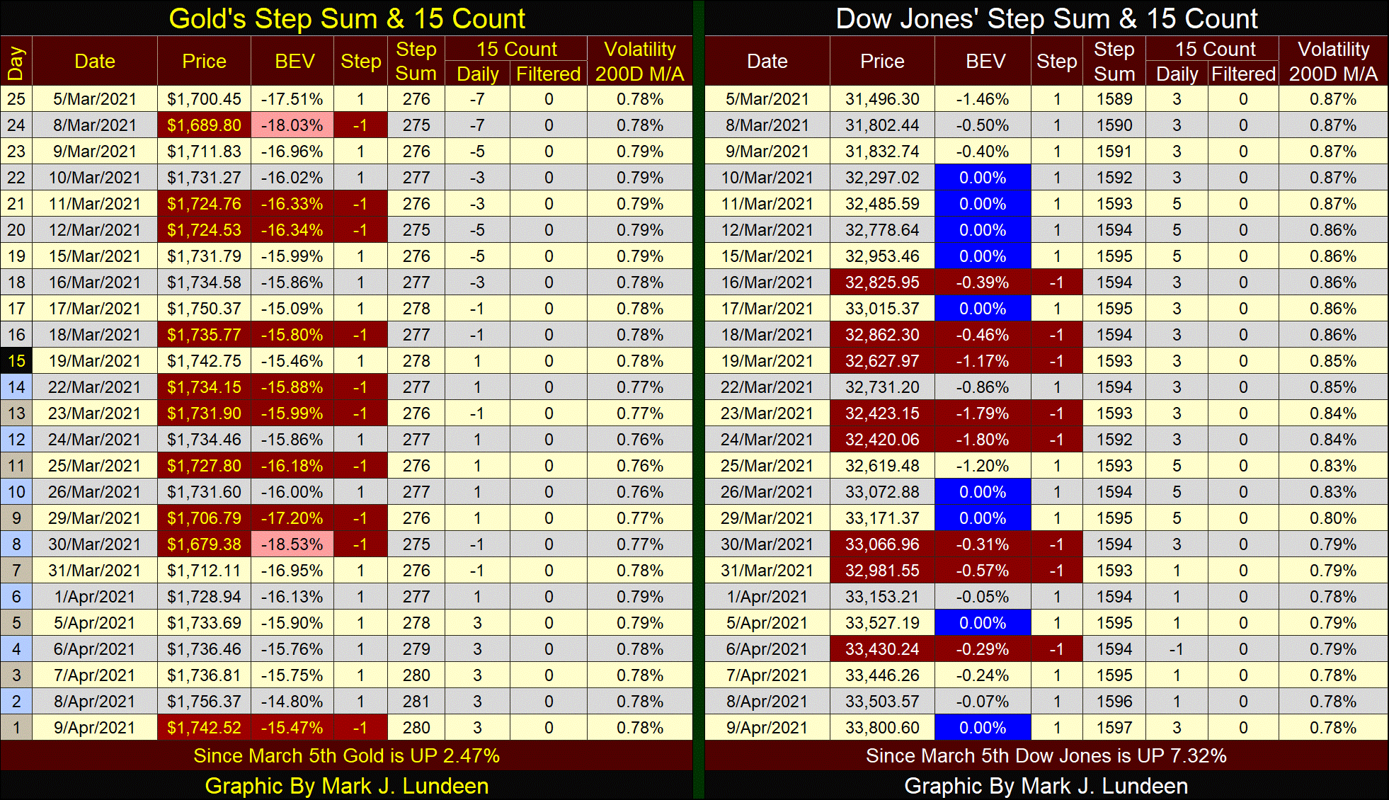
Looking at the Dow Jones’ side of the table above is encouraging. The Dow Jones is up by 7.32% since March 5th with nine new BEV Zeros during the advance.
However, I’m convinced the stock market is closer to the end of this advance, in terms of price gains and duration, than its beginning. My gut feeling about how this historic advance is going to be terminated will be by bond yields and consumer prices rising above a yet unknown threshold level.
That’s exactly what happened in March 2020 when the Dow Jones deflated by 38% in less than a month; corporate and Treasury bond yields spiked, as seen below.
Mark J. Lundeen
********


