Gold Market Update


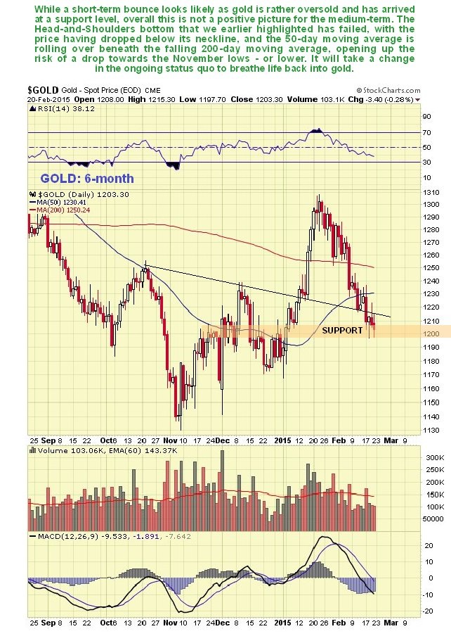
The reaction back by gold over the past month was preceded by an explosion in Commercial short and Large Spec long positions. On gold’s 6-month chart we can see that this reaction has been quite deep, and that it has taken the price back down below the neckline of a potential Head-and-Shoulders bottom pattern, where it should have found support and turned up again. The fact that it didn’t is a negative development, that opens up the risk of a retreat back to the vicinity of the lows, although as it is short-term oversold here and on a support level, it could bounce first, then head lower. Moving averages are in a potentially strongly bearish configuration on a medium-term basis, as the 50-day is rolling over beneath a still falling 200-day.
On the latest COT chart we can see the heavy Commercial short and Large Spec long positions that preceded and forewarned of the drop of the past month. This was a warning that we heeded on the site . While these positions have moderated as a result of the drop, they have no so far moderated sufficiently to prevent further losses.

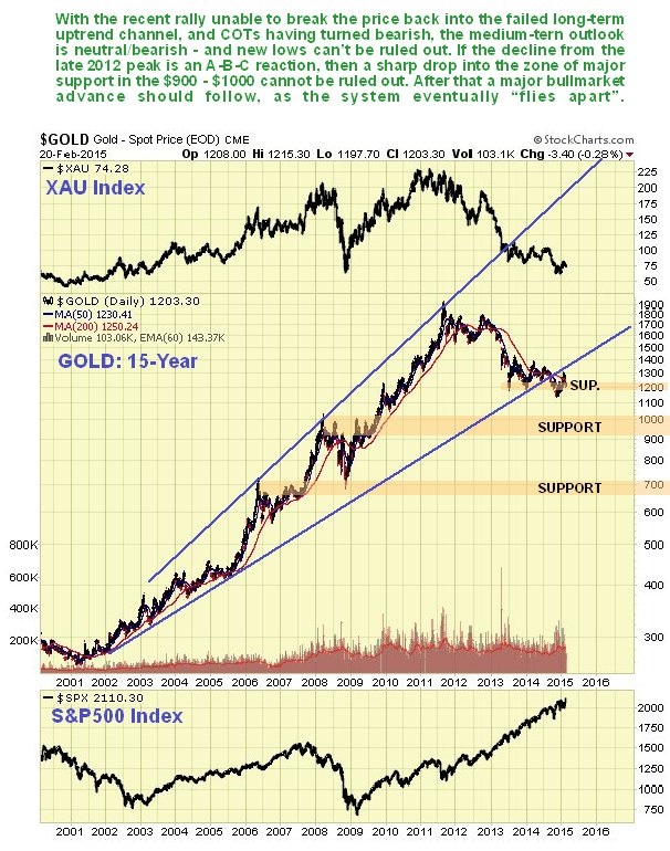
You are doubtless aware of the many fundamental arguments in favor of buying gold, which will not be repeated here. Technically it is in a downtrend as we can see on its 5-year chart shown below, and the trend will remain neutral/down until it can succeed in breaking out above the upper boundary of this downtrend and its moving averages swing into bullish alignment. The surge in Commercial short and Large Spec long positions as the price hit the upper boundary of the downtrend shown accurately called the end of the rally. Although in position for a short-term bounce, the COTs have only moderated somewhat and remain unfavorable.

The latest 15-year chart for gold is not encouraging for the medium-term. Gold broke down from its long-term uptrend, and the rally early this year didn’t make it past the underside of the failed channel before the price turned down again. This is negative action. Worst case now is that the decline from the 2012 peak is taking the form of a big A-B-C reaction, with a big C leg down lying ahead of us that could take the price down into the strong support level shown in the $900 - $1000 zone. On the positive side as we have already noted, the big reaction from 2011 may be compared to the big reaction in the mid 70’s that punctuated the huge bullmarket of that time. This reaction went on for about 2 years and was followed by a blistering parabolic ramp, which is what we are likely to see in the future when our leaders have finished wrecking the world economy with their QE programs whose purpose is short-term expediency and wealth transfer (to them).
The Gold Hedgers position chart (a form of COT chart) has a reading in middling ground – despite gold’s drop of the past month it is still quite a way from being bullish.
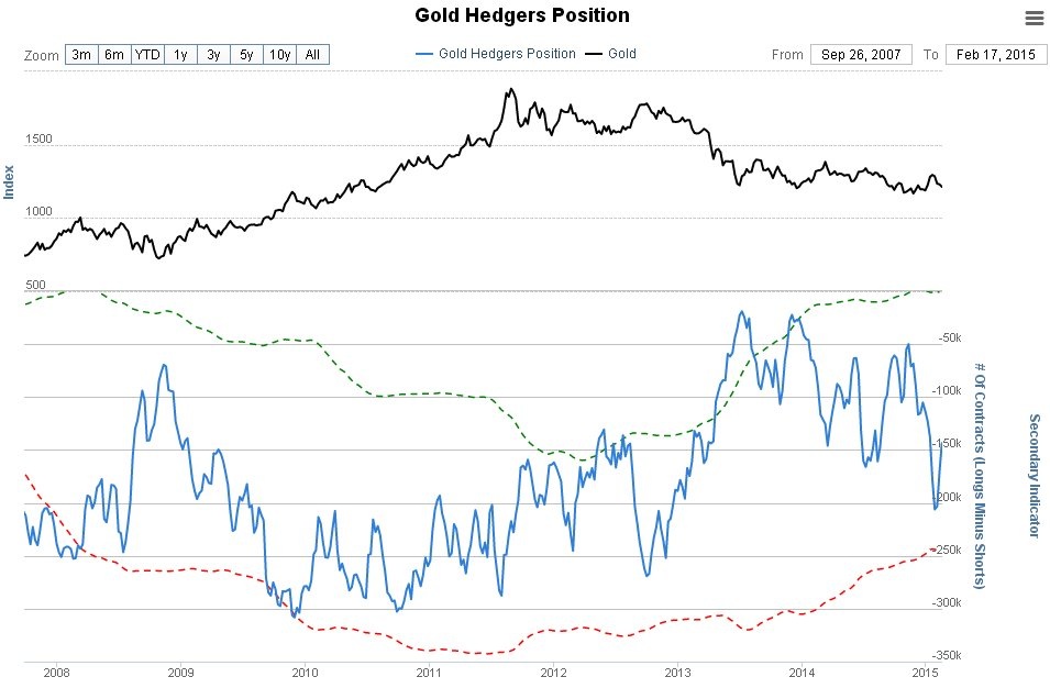
Chart courtesy of www.sentimentrader.com
After rising into middling ground a month ago, the Gold Optix, or optimism index, has improved, but not enough to prevent further losses over the medium-term.
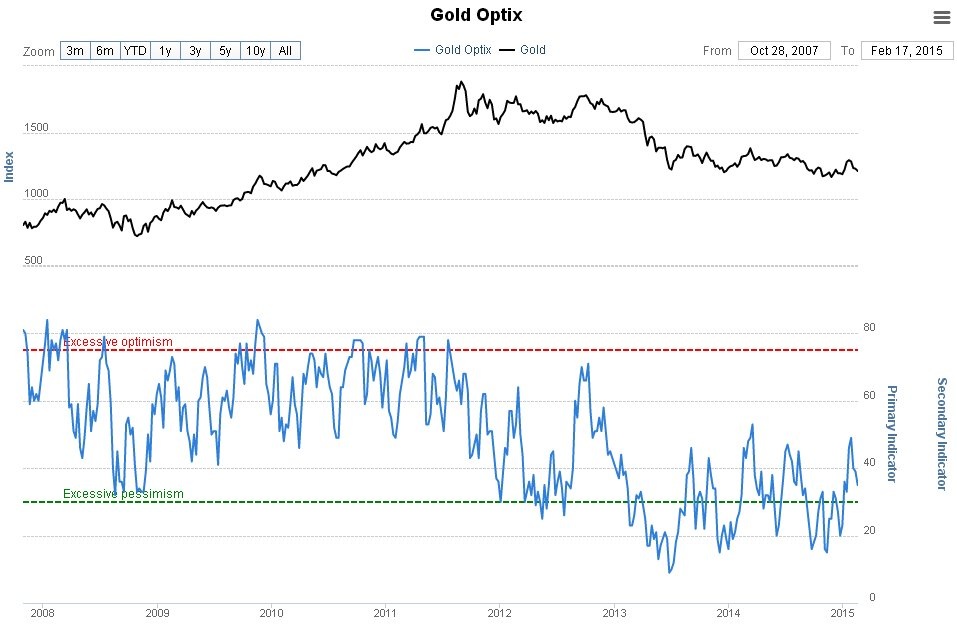
Chart courtesy of www.sentimentrader.com
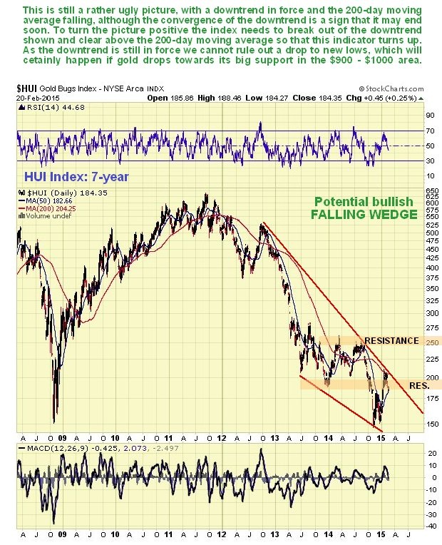
Turning now to Precious Metals stocks, we see that the HUI index reversed to the downside again a month on contact with the upper channel boundary shown and its falling 200-day moving average. This is still a rather ugly picture that could lead to new lows, although the convergence of the channel is a positive sign that it should end quite soon, perhaps after another downleg to new lows. To turn this picture positive the index needs to make a clear break out of the downtrend and above its 200-day moving average so that this indicator turns up.
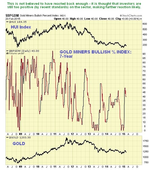
The Gold Miners Bullish Percent Index shows that, by recent standards, investors are still fairly bullish on gold stocks, which of course means that they are likely to drop further, possibly after a short-term bounce.
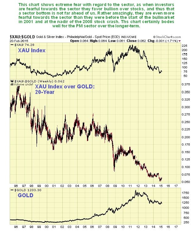
Overall, however, stocks remain monstrously undervalued relative to bullion as the following long-term 20-year chart for the large cap XAU index over gold makes plain. This suggests that when the sector does finally turn, (surviving) stocks are going to perform very well indeed.
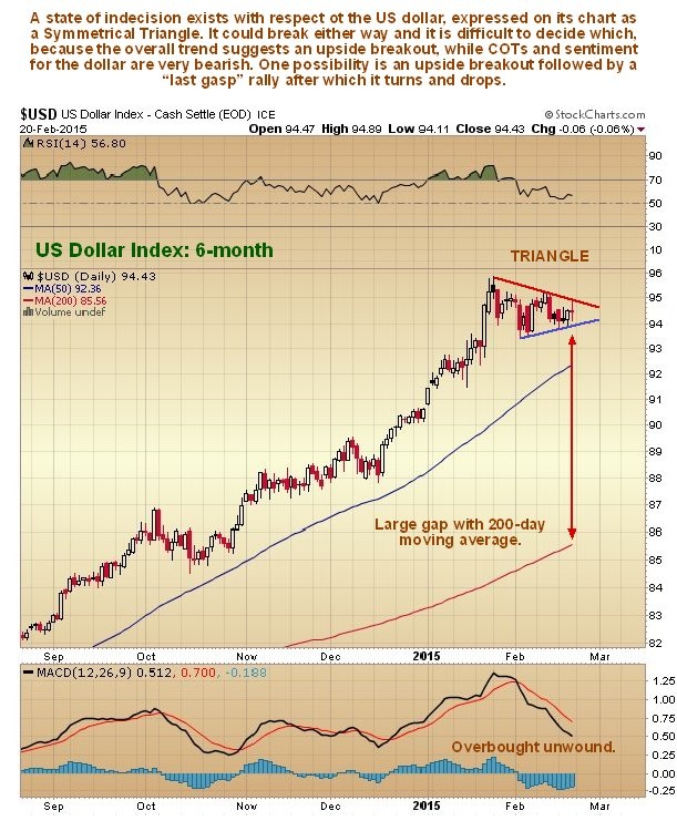
Now we will look at the all-important dollar, the indicators for which would seem to contradict the medium-term bearish outlook for gold expressed above. Starting with the 6-month chart for the dollar index we see that it has been in a narrowing trading range for almost a month now, a Symmetrical Triangle, which could break either way. The situation is paradoxical, because the background major trend suggests an upside breakout, while sentiment indicators suggest the opposite, with the two huge up days in the middle of last month possibly signifying a final blowoff top. With the Triangle now closing up we are going to find out soon enough which way it will break, which will have a big impact on the gold price, as ever.
The US dollar hedgers chart, which is form of COT chart, continues to look terribly bearish and suggests that the dollar is either at, or close to, a final top. Note however, that these apparently severely bearish readings may appear quite some time before the final top as was the case in 2008 and 2010, so the dollar may have some life in it yet. This could explain the medium-term bearish picture for gold set out above.
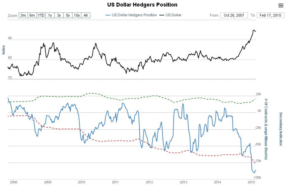
Chart courtesy of www.sentimentrader.com
The US dollar optix (optimism index) chart likewise looks very bearish, although again such readings may appear a while before the final high.
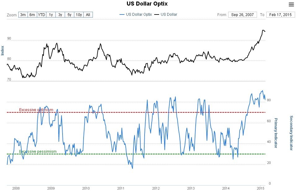
Chart courtesy of www.sentimentrader.com
Conclusion: although a short-term bounce looks likely for the sector as it is oversold on short-term oscillators, medium-term a potentially quite sharp drop looks likely, that could even take gold to new lows. There is some danger of a destructive final C-wave that takes the gold price down to finally bottom in the zone of strong support in the $900 - $1000. We will being looking at this possibility in more detail soon on the site. An upside breakout from the channel shown on the 5-year chart for gold above, leading to the 200-day moving average turning up, would abort this negative scenario.

Clive P. Maund’s interest in markets started when, as an aimless youth searching for direction in his mid-20’s, he inherited some money. Unfortunately it was not enough to live a utopian lifestyle as a playboy or retire very young. Therefore on the advice of his brother, he bought a load of British Petroleum stock, which promptly went up 20% in the space of a few weeks. Clive sold them at the top…which really fired his imagination. The prospect of being able to buy securities and sell them later at a higher price, and make money for doing little or no work was most attractive – and so the quest began, especially as he had been further stoked up by watching from the sidelines with a mixture of fascination and envy as fortunes were made in the roaring gold and silver bull market of the late 70’s.
Clive furthered his education in Technical Analysis or charting by ordering various good books from the US and by applying what he learned at work on an everyday basis. He also obtained the UK Society of Technical Analysts’ Diploma.
The years following 2005 saw the boom phase of the Gold and Silver bull market, until they peaked in late 2011. While there is ongoing debate about whether that was the final high, it is not believed to be because of the continuing global debasement of fiat currency. The bear market since 2011 is viewed as being very similar to the 2-year reaction in the mid-70’s, which was preceded by a powerful advance and was followed by a gigantic parabolic price ramp. Moreover, Precious Metals should come back into their own when the various asset bubbles elsewhere burst, which looks set to happen anytime soon.
Visit Clive at his website: CliveMaund.com
More from Gold-Eagle


