Gold Market Update


Gold’s post breakout reaction back from its early September peak has evolved into a steady downtrend as we can see on its 6-month chart below. The approach of the rising 200-day moving average below suggests that this reactive downtrend will have run its course before much longer leading to a second upleg. However, gold’s COTs have shown no improvement as this downtrend has unfolded, which is a sign that the downtrend has further to run. The now orderly downtrend has one distinct advantage which is that bulls simply have to wait either for a breakout from it or the development of a basing pattern. One indication that the downtrend is a correction and not the start of something more sinister is the positive divergence of the Accumulation line compared to the price.
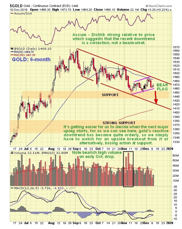
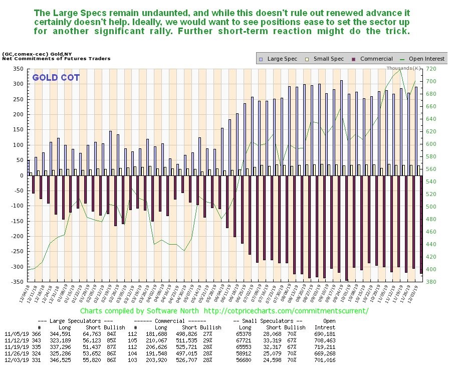
Gold’s COTs continue to sound a note of caution, with Commercials holding big short positions and the Large Specs not giving up and reducing their long positions. Normally this means that the decline will continue. Where is it likely to stop? – to determine that we will now look at a long-term 10-year chart.
Click on chart to popup a larger, clearer version.
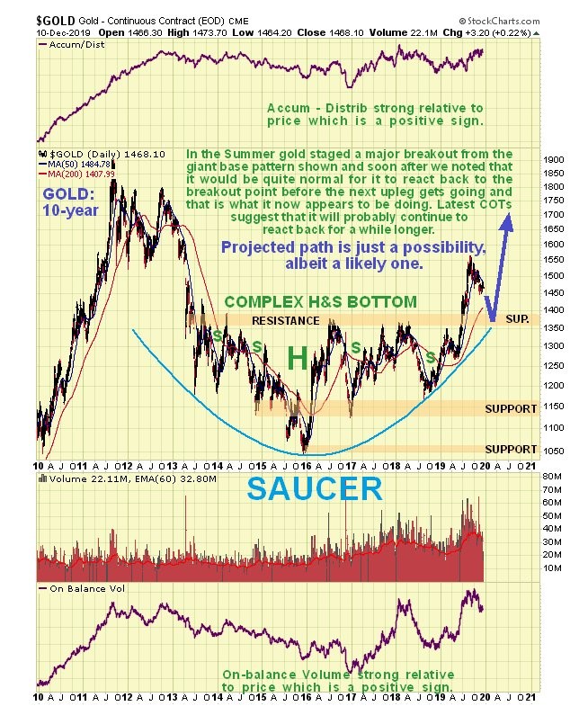
On the 10-year chart we can see gold’s impressive Summer breakout from a giant complex Head-and-Shoulders bottom which also had characteristics of a Saucer base. Not long after it broke out we noted that it would be quite normal for it to react back to test support at the breakout point before the new bullmarket gains traction, and that is what it now appears to be doing. As the reaction back unfolds we can expect all the tired old negative attitudes towards gold to re-emerge – gold is a •”barbarous relic”, don’t fight the Fed, the stockmarket’s going to go up forever, etc. etc. and that is already starting to happen and these negative pronouncements will be the cover behind which we can build positions across the sector once gold drops back into support in the $1360 - $1400 zone near to the top of the giant base pattern, which as we noted above, the COTs suggest is likely.
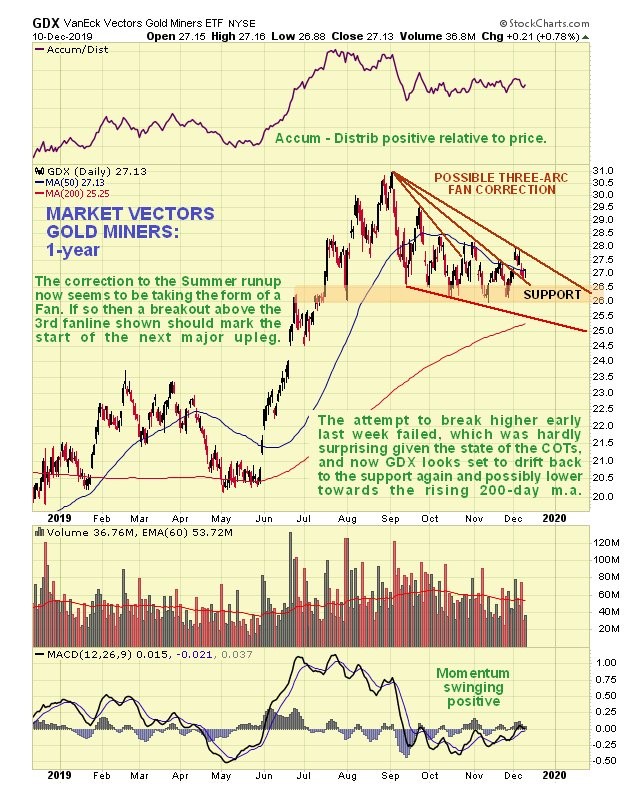
As for stocks we can see that the retreat by GDX from its early September peak does not look like a top formation – it looks like nothing more than a normal correction to the big runup that preceded it. It now looks like it is marking out a 3-arc Fan correction, in which case we simply have to break for a breakout above the third fanline for the next major upleg to start. In the meantime, with gold looking set to react back further, there is scope for it to react drop to the lower trendline shown and into the vicinity of the rising 200-day moving average before this reactive phase is done.
So what about the glorious unassailable dollar? The extraordinary thing about the dollar index is that, despite the relentless and shameless abuse heaped on it by the Fed, it has continued to hold up, but this is largely due to everybody else around the world following suit and playing the same game.
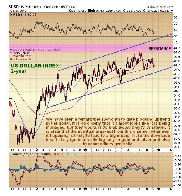
On the 2-year chart for the dollar index we can that it has been shepherded gradually higher for the past 19 months within a remarkably steady uptrend. This uptrend has been so steady and been going on for such a long time that it almost makes one think that it is being managed, but they wouldn’t do that would they? Managed or not, all intermediate-term currency traders need to concern themselves with is to look out for a breakout from this trend channel, because that’s when the fireworks will start, not just in the currency markets but in commodities too.
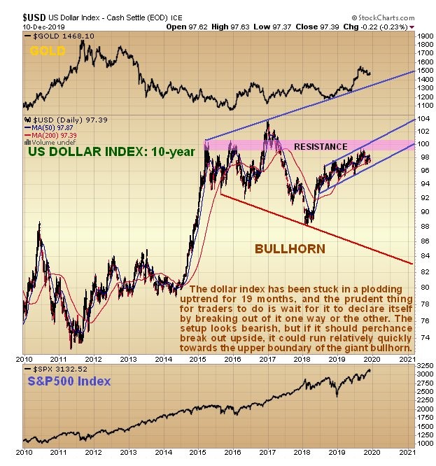
The setup on the long-term 10-year dollar chart looks rather bearish, with the long plodding uptrend bringing the dollar up to a resistance zone at prior highs. On long-term charts gold’s current reaction also looks like a bull Flag, and if it is it makes it more likely that the dollar will soon drop, and here we should not forget that far-eastern efforts to undermine the dollar and dethrone it as the world’s reserve currency are ongoing and will eventually bear fruit. Before leaving this chart we should note that, although the setup looks bearish, if the dollar should succeed in breaking out of its trend channel and above resistance, then it could run quite quickly towards the upper boundary of the giant bullhorn pattern shown, although it does seem rather fanciful to imagine that it would get as high as the boundary of this pattern. This would only be likely to happen in the event of some mass liquidation event which at this point looks unlikely.
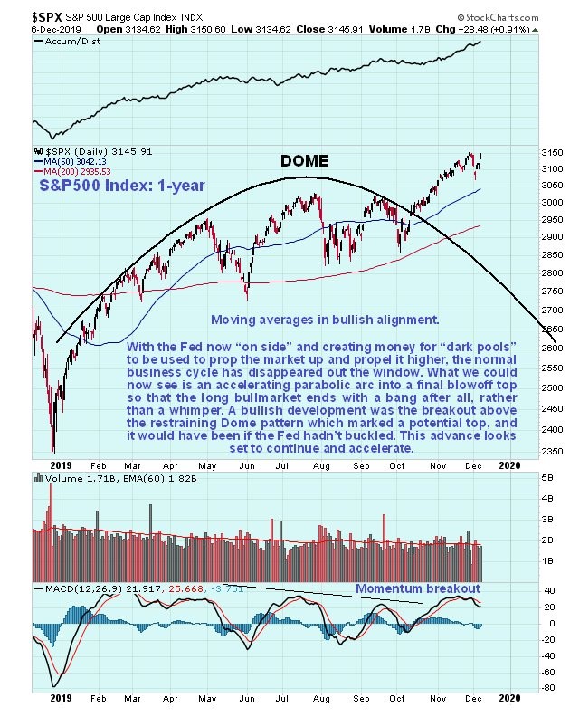
One argument against the PM sector advancing is that the stockmarket is now romping ahead again, fuelled by QE4 and the huge amounts of cash sat on the sidelines piling in. While this argument has some validity we should keep in mind that there are some serious black swans out there that could derail this stock bullmarket out any time, but more importantly what happens to the PM sector going forward depends much more on the fate of the dollar, but as we have already seen on gold’s 10-year chart the technicals say that it is going to react back to the breakout point of its giant base pattern, and after some chopping around there, take off higher again.
*********

Clive P. Maund’s interest in markets started when, as an aimless youth searching for direction in his mid-20’s, he inherited some money. Unfortunately it was not enough to live a utopian lifestyle as a playboy or retire very young. Therefore on the advice of his brother, he bought a load of British Petroleum stock, which promptly went up 20% in the space of a few weeks. Clive sold them at the top…which really fired his imagination. The prospect of being able to buy securities and sell them later at a higher price, and make money for doing little or no work was most attractive – and so the quest began, especially as he had been further stoked up by watching from the sidelines with a mixture of fascination and envy as fortunes were made in the roaring gold and silver bull market of the late 70’s.
Clive furthered his education in Technical Analysis or charting by ordering various good books from the US and by applying what he learned at work on an everyday basis. He also obtained the UK Society of Technical Analysts’ Diploma.
The years following 2005 saw the boom phase of the Gold and Silver bull market, until they peaked in late 2011. While there is ongoing debate about whether that was the final high, it is not believed to be because of the continuing global debasement of fiat currency. The bear market since 2011 is viewed as being very similar to the 2-year reaction in the mid-70’s, which was preceded by a powerful advance and was followed by a gigantic parabolic price ramp. Moreover, Precious Metals should come back into their own when the various asset bubbles elsewhere burst, which looks set to happen anytime soon.
Visit Clive at his website: CliveMaund.com


