Gold Market Update


The technical picture for gold has brightened considerably over the past week, despite the price having continued to drop and the apparent failure of an uptrend. The reasons for this are to be found in the price action of gold itself and in what has been going on elsewhere at the same time.
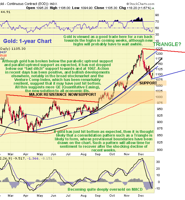
On the 1-year chart we can see how the current downtrend continued to take the price lower early in the week before it bounced back late in the week as the market wound down for the Christmas holiday. Failure of the parabolic uptrend channel was followed by a breach of the parallel uptrend channel, as we had expected, however, applying our 3% rule we see that gold did not drop below our general stop for the sector at $1067 before it bounced above an important support level. With gold just above this support and now oversold on its MACD and various other shorter-term indicators, and still in the vicinity of its rising 50-day moving average, this is a good place for it to turn up. With respect to the trendline failure we should note that it is a favorite trick of Big Money to execute trendline failures in order to run people out of their positions before prices reverse sharply in the other direction. This is why we have our 3% rule. To see why last week's action was bullish we will examine the downtrend from early this month in detail on a 3-month chart.
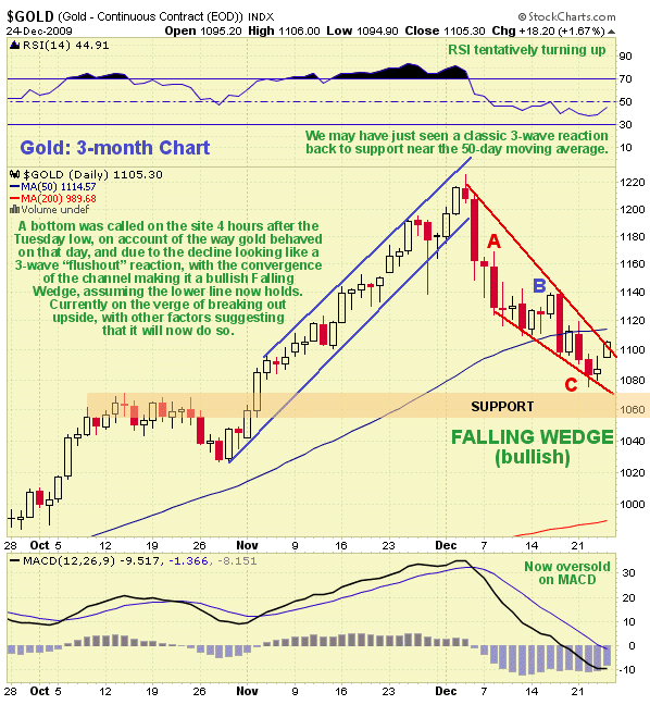
On our 3-month chart we can see that while gold did continue to drop early last week as expected, the rate of decline decelerated, and Tuesday's action was most interesting. There was a further sharp drop on Tuesday morning that was followed by a distinctive V-shaped recovery that confirmed our suspicion that the downtrend in gold from early in the month has been taking the form of a bullish Falling Wedge, the lower boundary of which held on Tuesday as the price bounced back into the channel. This observation prompted a buy alert for gold and the PM sector in general on Tuesday afternoon on the site, issued about 4 hours after the low, after which gold recovered so that it is now on the point of breaking out upside from the Falling Wedge, an event which, should it occur as looks likely, can be expected to trigger a sharp rally. In addition to the bullish Wedge, we can see that the downtrend has taken the form of a clear 3-wave zigzag, which is the classic countertrend reaction waveform whose appearance suggests that this is indeed just a reaction which has now run its course. However, while a sharp rally back towards the highs now looks likely, we should not lose sight of the fact that the heavy reaction of the past month involving trendline breaks has shocked the market, and it will probably take some time for sentiment to recover. It therefore looks likely that some kind of trading range, probably taking the form of a sizeable Triangle, will form before the market has pulled itself together sufficiently to break out new highs. Possible boundaries for such a Triangle have been drawn on the 1-year chart above, which are only intended as a rough guide. Note that in the event of a rally back up towards the highs soon our $1067 exit point, which in any case was and is rising with the trendlines, will quickly become meaningless in the event that gold slopes off sideways into a trading range for a while.
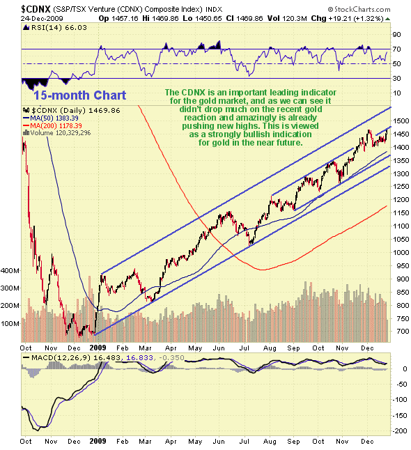
There have been significant developments elsewhere over the past week or two that are regarded as positive for the Precious Metals complex. One is the startling resilience of the Venture Comp Index (CDNX) whose chart is shown below. In the face of a reaction in gold that was quite heavy the CDNX hardly flinched, and it rallied significantly late last week so that it is already pushing new highs. Given that this index has served as an important lead indicator for gold in the past, this action is regarded as most auspicious for the sector.
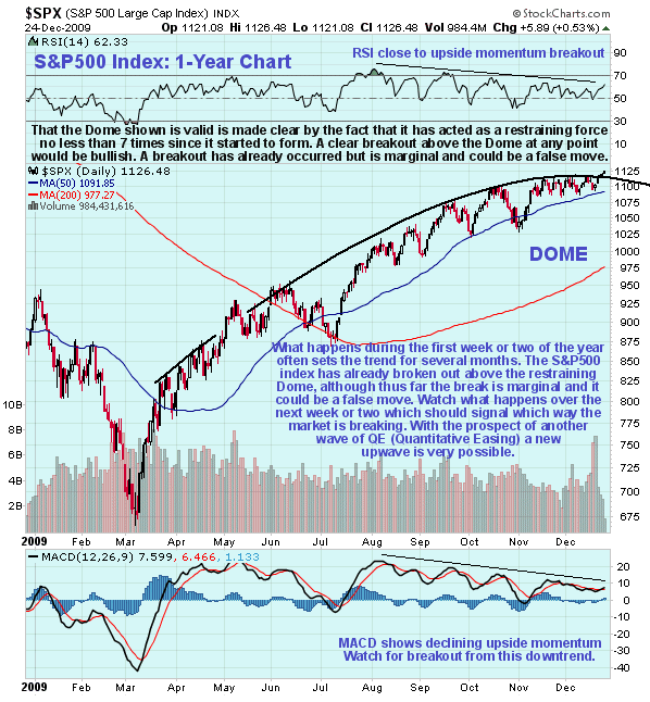
Another intriguing development of the past week or so has been the breakout by the S&P500 index above its massive "Distribution Dome" shown on the 1-year chart below. This Dome is of immense importance as it has acted as a defining and limiting feature since soon after the stockmarket rally began way back last March. Before we draw any conclusions however we should take careful note that this breakout is still marginal and has occurred on light volume just ahead of the holidays. The move is thus not to be trusted - yet - as it could be followed by a violent reversal as tax selling kicks in in the New Year. However, should the market advance away from the Dome in the New Year it will signal that a significant new uptrend has begun, which will have major implications for all markets, as it will be a sign that a new round of QE (Quantitative Easing) or money creation is in the pipeline. For those who do not know QE is the new miracle solution to all economic problems - liquidity, budget or debt problems are solved "at a stroke" by the creation of massive tranches of extra cash. There is unfortunately a downside to QE - inflation, which is of course good news for most hard asset prices, especially gold and silver.
Last week's update was too bearish - especially as there have been a number of positive developments this week not only in both silver and gold but also with respect to major elements having an important bearing on Precious Metal prices.
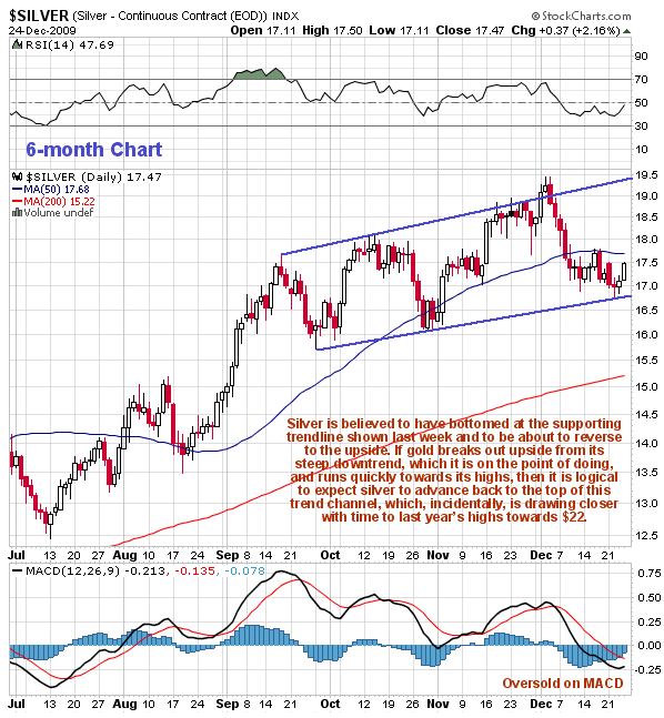
In the Gold Market update we have seen how gold appears to have bottomed and to now be in position to advance again. The action in silver last week was similar, as we can see on its 6-month chart, with it recovering late in the week following an exact contact with the lower boundary of a channel that began to form last September. At the time of this contact a V bottom formed, as with gold, a sign that it had hit a low. Following this positive action and the improvement late in the week it is now in position to advance back towards the top of this channel, a move which would result in appreciable gains from the current level. Various indicators such as the MACD are oversold, providing the leeway for such an advance.
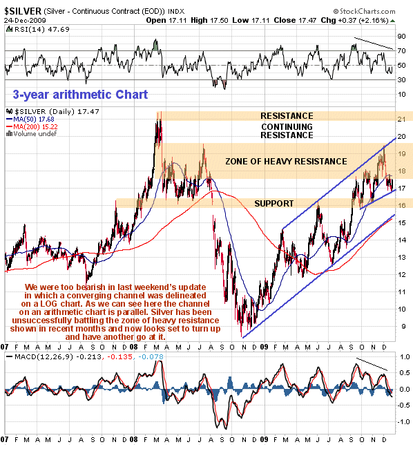
The 3-year chart makes clear why silver has been struggling to make headway in recent months. The reason is that the price has been battling heavy overhanging supply from the extensive trading that occurred around and above the current price during the first half of last year. While it is unlikely that it will overcome this resistance in near future, it does appear to be turning up in preparation for another run towards the top trendline. You may recall that last week's update employed a log chart on which silver's major uptrend in force from last October takes the form of a bearish Rising Wedge. On the arithmetic chart used here the same channel is parallel and at this point it is not known which of these channels takes precedence, as the number of contacts with the trendlines using the different scales is about the same on both, but we can at least be sure that the uptrend remains intact in both cases whilst the price remains above the lower support line (which it is closer to) on the log chart.
Two important external factors having a bearing on the outlook for the silver price, in addition to gold of course, which are the outlook for the CDNX index and the broad stockmarket, have been discussed in the parallel Gold Market update.
Clive Maund, Diploma Technical Analysis
[email protected]
www.clivemaund.com
Copiapo, Chile, 27 December 2009

Clive P. Maund’s interest in markets started when, as an aimless youth searching for direction in his mid-20’s, he inherited some money. Unfortunately it was not enough to live a utopian lifestyle as a playboy or retire very young. Therefore on the advice of his brother, he bought a load of British Petroleum stock, which promptly went up 20% in the space of a few weeks. Clive sold them at the top…which really fired his imagination. The prospect of being able to buy securities and sell them later at a higher price, and make money for doing little or no work was most attractive – and so the quest began, especially as he had been further stoked up by watching from the sidelines with a mixture of fascination and envy as fortunes were made in the roaring gold and silver bull market of the late 70’s.
Clive furthered his education in Technical Analysis or charting by ordering various good books from the US and by applying what he learned at work on an everyday basis. He also obtained the UK Society of Technical Analysts’ Diploma.
The years following 2005 saw the boom phase of the Gold and Silver bull market, until they peaked in late 2011. While there is ongoing debate about whether that was the final high, it is not believed to be because of the continuing global debasement of fiat currency. The bear market since 2011 is viewed as being very similar to the 2-year reaction in the mid-70’s, which was preceded by a powerful advance and was followed by a gigantic parabolic price ramp. Moreover, Precious Metals should come back into their own when the various asset bubbles elsewhere burst, which looks set to happen anytime soon.
Visit Clive at his website: CliveMaund.com


