PM Complex: The Intermediate Term Top is In


I would like to go over some charts to show how the PM complex may have completed an intermediate top that maybe the start of a large consolidation pattern I’ve been mentioning is possible. After a strong bull market rally, we need to see a reversal pattern form to reverse the trend from up to down. Last Friday, we seen the very first sign that a top of some importance completed.
At this point, it’s not a large reversal pattern, but there is a second reversal pattern that has yet to trigger, but will also be part of the topping process. Keep in mind this is an intermediate term topping pattern and not a long term reversal pattern. The job of a long term consolidation pattern is to make you wish you had never laid eyes on your favorite precious metals stocks by the time it’s completed.
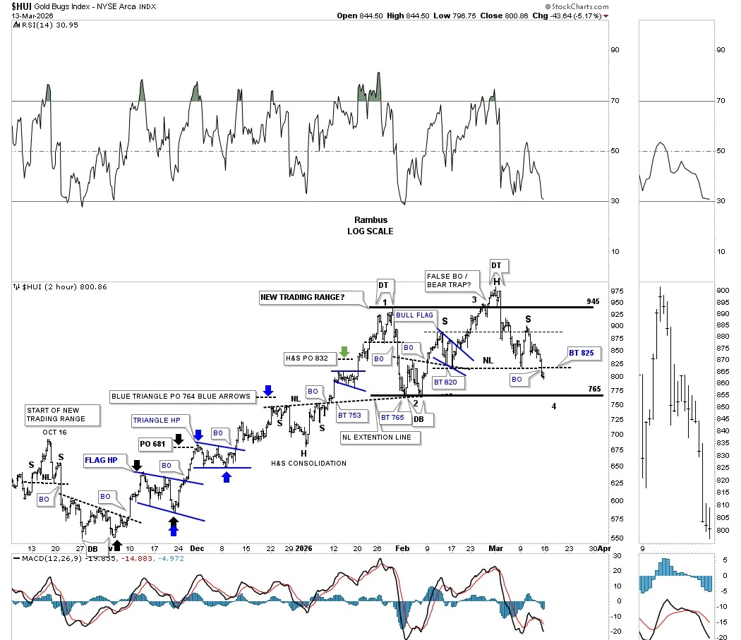
I would like to start using a 2-hour chart for the HUI, which we’ve been following since the October 2025 double bottom low, which launched the most recent impulse leg of the bull market. I apologize for this 2-hour chart being so busy, but these are the small consolidation patterns that formed during this last leg of the bull market. The colored arrows show the measured move price objectives for each small consolidation pattern.
At the end of January and early February of this year, the HUI formed a small double top reversal pattern at reversal point #1, which strongly suggested the October 2025 rally had come to an end, and it was likely that it was time to start consolidating those gains. If you recall, there were two very large down days back to back off the double top high, which setup the double bottom low at reversal point #2 in what I started calling the setup at that time “new trading range.” Now we had a double top reversal pattern at reversal point #1, and a double bottom reversal pattern at the 2nd reversal point low. Keep in mind there has to be a minimum of four reversal points in a consolidation.
The rally off the double bottom low took the whole month of February to reach the top of the trading range, but on the way up, it formed the blue bull flag as a halfway pattern. I was initially looking for the rally to stop at the top of the trading range, but as you can see, it rallied slightly above the top trend line, where it formed another small double top reversal pattern at reversal point #3. Once the price action closed back below the top trend line, I labeled the move as a false breakout / bull trap.
It was at that point that I started to see the potential of a larger reversal pattern forming, which ended up being the H&S top, with the small false breakout, bull trap being the head portion of the H&S top. What became apparent as the HUI declined was the small blue bull flag that formed on the way up as a consolidation pattern might be the left shoulder of the H&S top. Late last week, the HUI had a very weak rally up to the neckline symmetry line, where the right shoulder high formed. Last Friday’s decline broke the neckline, completing the H&S top. This week, we should see a backtest to the neckline before the HUI moves lower.
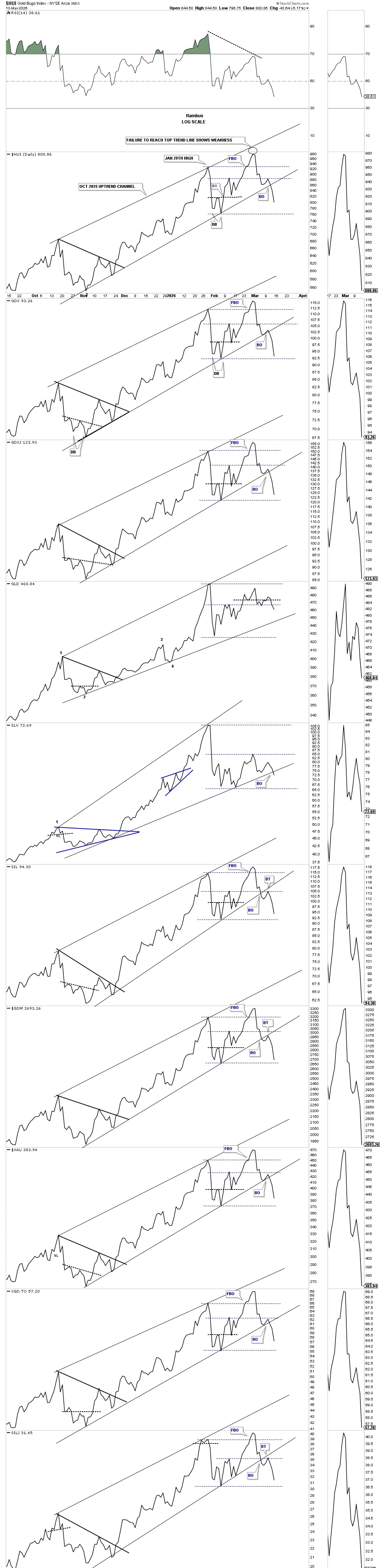
What the H&S top has done is negate the black horizontal trading range, because the minimum price objective for the H&S top is much lower than the bottom trend line, which opens the door to a larger reversal pattern.
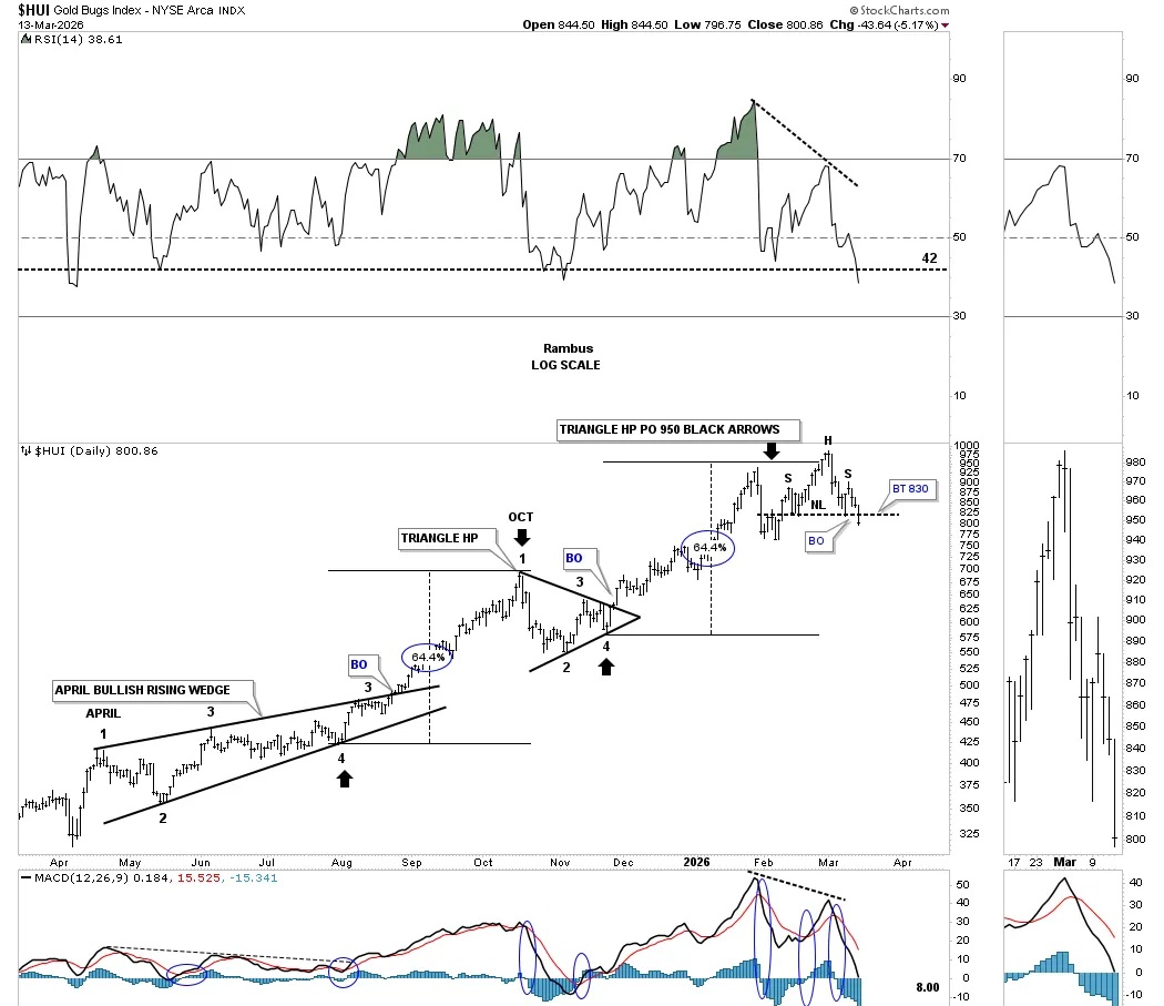
This longer-term daily chart takes out most of the noise from the 2-hour chart above and shows the H&S top more clearly. After the measured move price objective was reached, black arrows, that was the first important clue the impulse leg out of the black triangle was complete. Note how both legs of the impulse move, with the triangle in the middle, were right at 64%. Here again, you can see last Friday’s closing price below the neckline, with a backtest this week most likely.
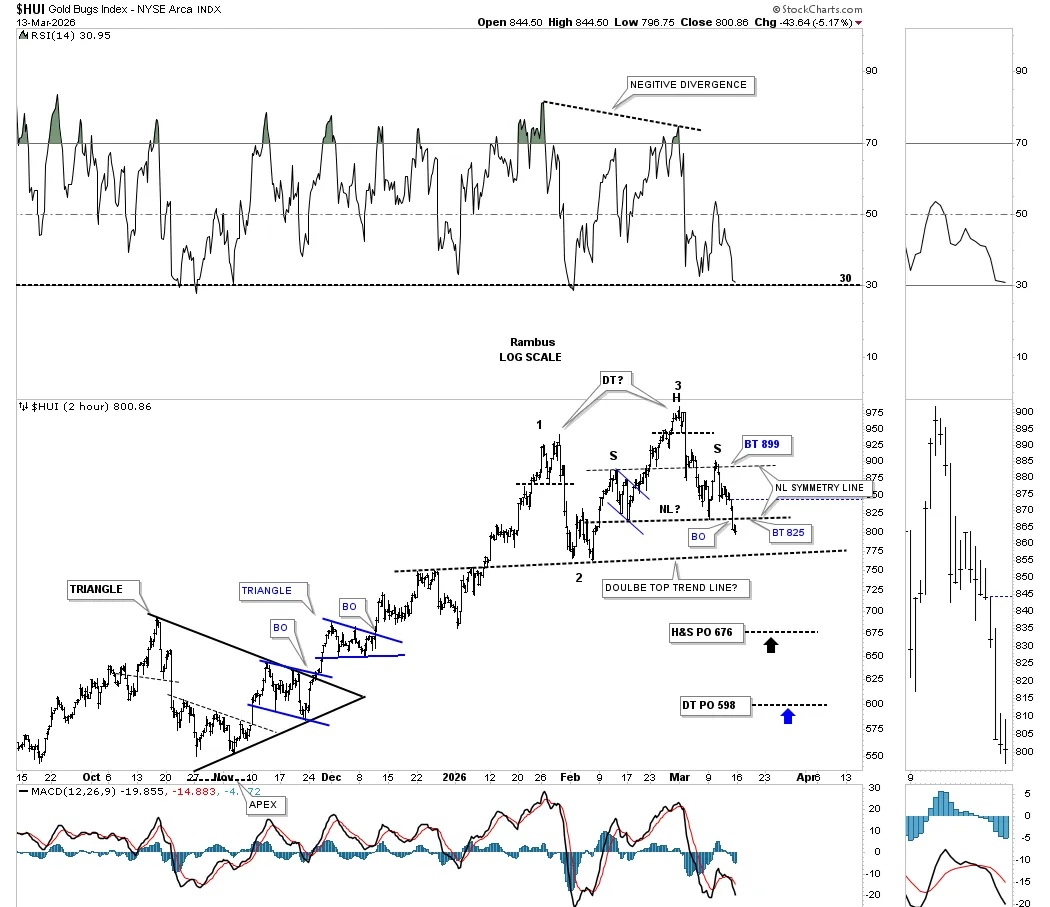
I mentioned at the beginning of this Weekend Report that there was a possible second, larger reversal pattern forming. On the right side of the chart, you can see the H&S top, which is very symmetrical, as shown by the neckline symmetry line, which has a minimum price objective down to the 676 area. This is where it gets very interesting. The late January high on the 2 hour chart above at reversal point #1 now becomes the left side high for the larger double top reversal pattern with the H&S top being the 2nd high for the larger double top. Note the negative divergence on the RSI between the two highs.
I added where the potential double top trend line may be placed, and with the H&S top price objective much lower, the double top reversal pattern has a minimum price objective down to the 598 area. I call this the butterfly effect, how one small pattern can lead to a larger pattern, which can lead to an even larger pattern.
There was also another important development late last week, which has to do with the October 2025 uptrend channels in most cases. I’ve still left the original blue sideways trading range in place for now, so you can see how it fits into the uptrend channel. First, note how the price action broke below the bottom rail of the thin blue uptrend channel with a quick one or two day backtest before the price action moved lower to the bottom rail of the October 2025 uptrend channel, where you can see the initial bounce. Over the last couple of days, the price action has broken below the bottom trend line of the rising channel, which could now lead to a backtest from below.
GLD appears to have formed the blue triangle reversal pattern with the breakout last Friday. SLV formed the blue bearish rising wedge with multiple days of backtesting the bottom trend line, where it formed an island reversal pattern on the last backtest day, blue circles. There were other island reversal days just before the bottom trend line gave way.
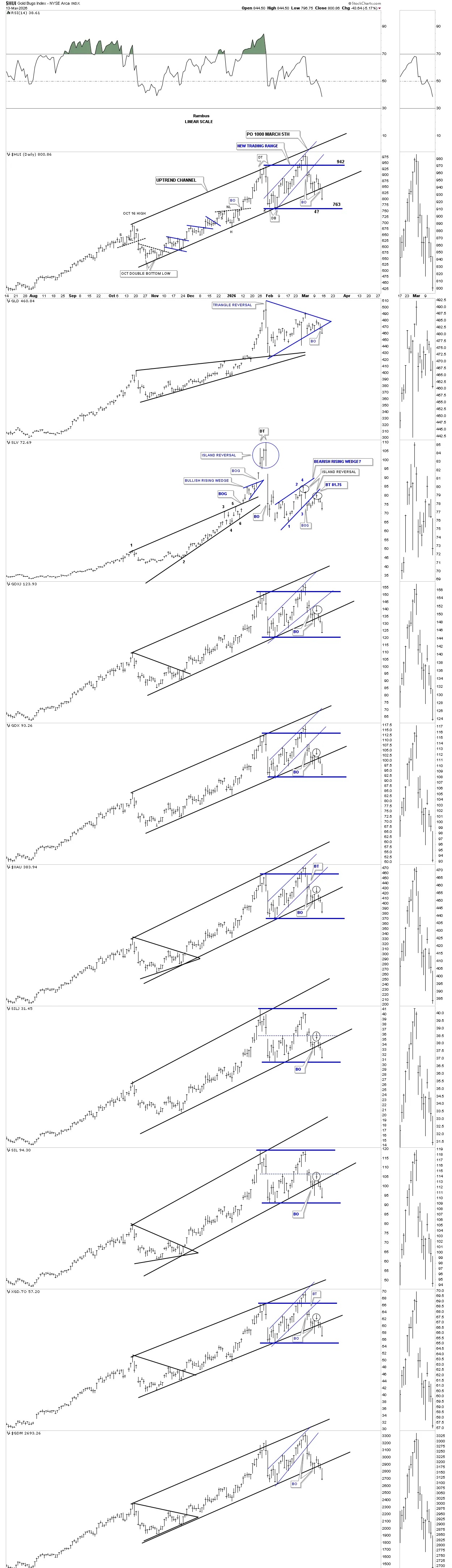
I often mention that a line chart can many times show a breakout before a bar chart does. Below is the original daily line chart showing the uptrend channels in most cases with the breakout move below the lower trend line now becoming more evident. Again, I left the thin horizontal blue dashed lines in place for the time being, so you can see the original trading range, which will become irrelevant once a new lower low is put in. You can also start to see the change in character from a consolidation pattern to a reversal pattern once the lower blue trend line is broken, which will setup a new lower low.
Next is the weekly combo chart we’ve been following, which shows the previous light blue rising wedge. After the breakout, I added the horizontal black dashed line at the apex as a line in the sand. If the price action breaks below the apex, that’s called an end-around move that’s bearish in an uptrend, because the apex should be strong support. You can also see from this longer-term perspective how the double top is forming at the all-time high.
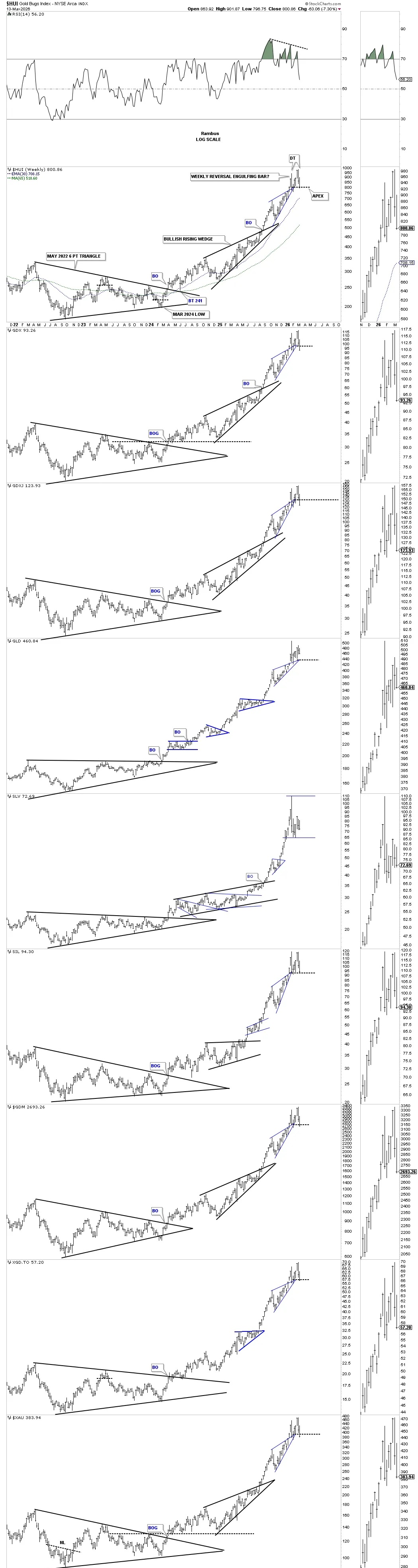
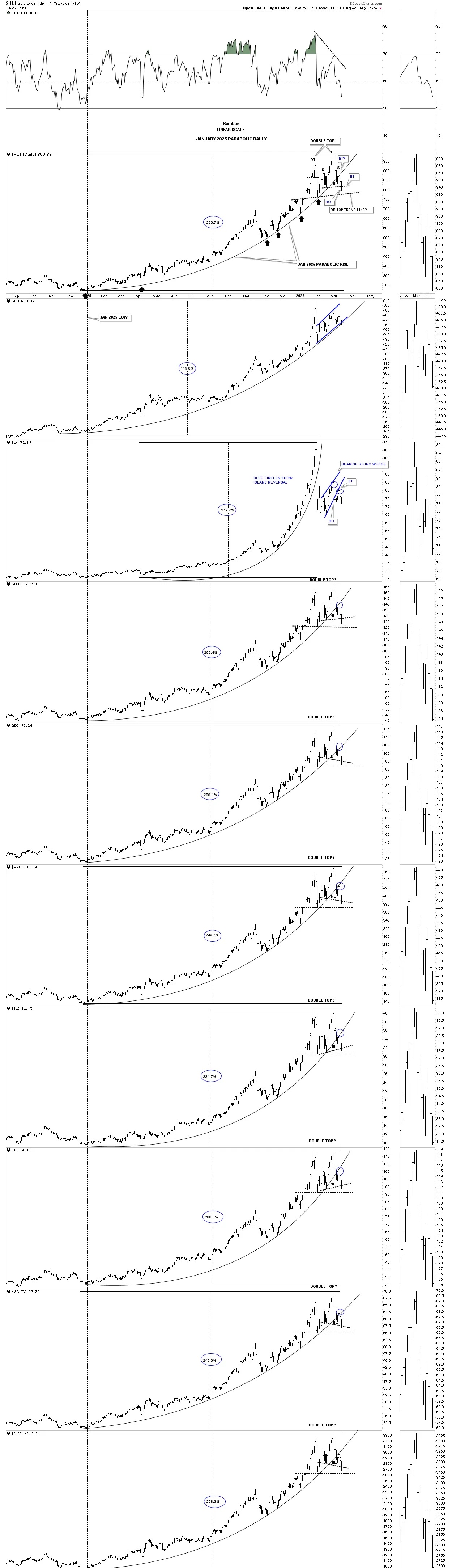
I just recently built this new daily combo chart, which shows the parabolic rally out of the January 2025 low with the percentage gain made by the different indexes. At the most recent all-time high, it’s now becoming more apparent, than at any of the previous highs, the character change in the price action.
Not only do we see the small double top made at the end of January of this year, and now the H&S top with the head forming at the all-time high, but now we see how the price action is interacting with the parabolic arc. Note how the neckline began to form once the parabolic arc gave way, with the right shoulder high forming on the backtest from below. Also, notice the large negative divergence on the RSI. Keep a close eye on GLD, which is the only index to not have broken below its parabolic arc yet.
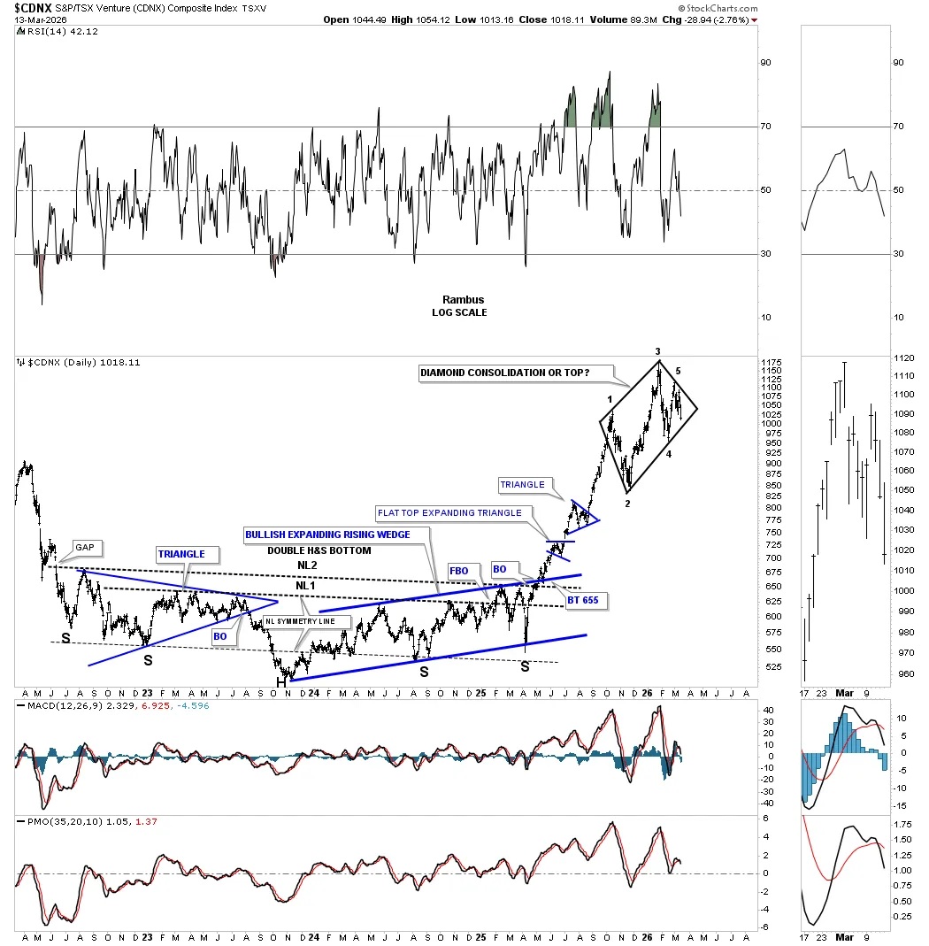
Let’s do a quick update on the CDNX which is attempting to form a 5 point diamond reversal pattern. On Friday of last week the price action closed below the double bottom trend line after forming the possible 5th reversal point. A breakout below the bottom trend line will complete the diamond reversal pattern.
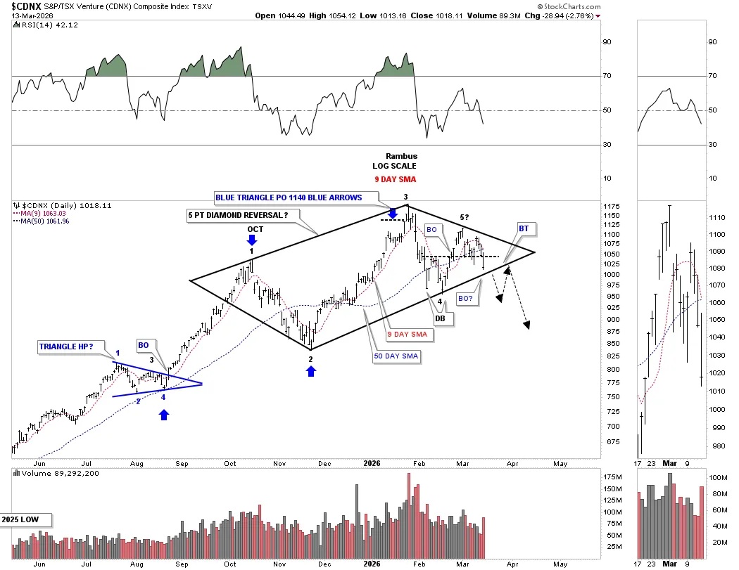
This longer term weekly chart for the CDNX shows how the possible 5 point diamond reversal pattern fits into the very big picture. In order for the diamond to be a bullish diamond consolidation pattern the bottom trend line will have to hold where the 6th reversal point would need to form.
Next is the daily combo chart with the top gold chart being a log scale bar chart and the lower chart being a linear scale line chart for two different perspectives. After reaching its measured move price objective, black arrows, gold began to decline, finding initial support on the backtest to the top rail of the black bullish rising wedge. From that point, the price action formed the blue bearish rising wedge with the small blue bear flag just below the bottom trend line. That little blue bear flag won’t be complete until the bottom trend line is broken.
The linear scale line chart on the bottom shows the blue rising flag breaking below the bottom trend line last Friday after walking up the bottom trend line for over a month.
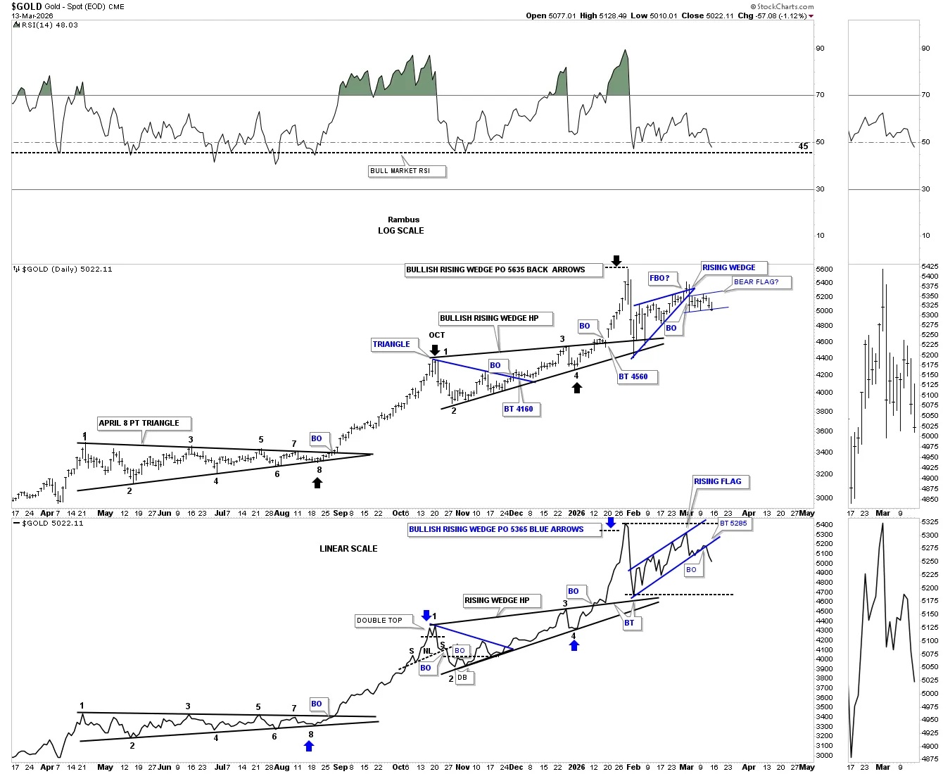
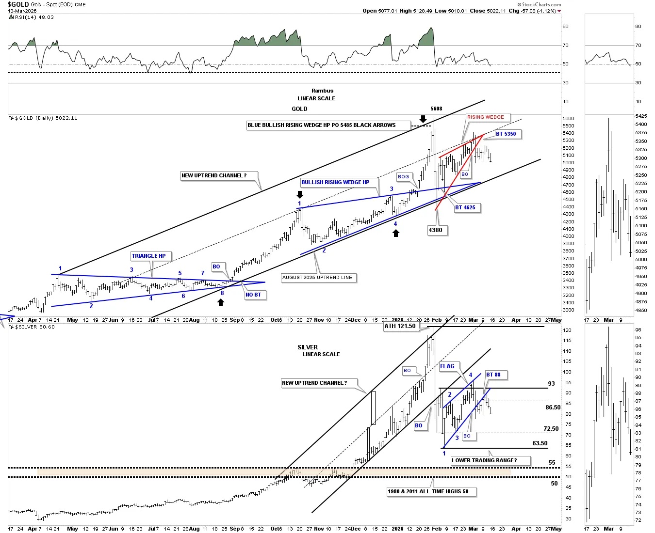
This next combo chart has gold on top with silver below. What gold still has going for it is that it’s still trading inside its parallel uptrend channel, but has formed the red bearish rising wedge.
Silver on the lower chart broke its uptrend channel on that massive one-day decline off the all-time high and was only able to backtest it from below. Since the backtest, silver has traded sideways in the lower half of its potential massive trading range. After completing the backtest to the underside of the blue bearish rising wedge last week, the bottom of the lower trading range should come into play around 64 or so.
During a very strong bull market rally, there can be two and possibly three smaller blue consolidation patterns that form the rally phase. On the lower left side of the chart, you can see the rally out of the 2018 low to the 2020 high, gold produced three small blue consolidation patterns. Now look at the rally since breaking out from the 2020 bullish flat top expanding triangle. Gold has formed four small blue consolidation patterns, which is extremely rare. It shouldn’t be surprising now to see gold start forming a much larger consolidation pattern that could take many months to a year or longer to complete, which is how bull markets work.

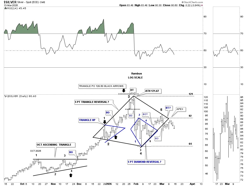
Moving on to silver, below is a short-term daily chart, which shows the measured move price objective up to 126, which was a bit higher than the 121 all-time high, but close enough to call it complete. Since forming the small double top at the all-time high, silver declined strongly to setup the bottom of the new trading range around the 64 area.
For whatever reasons, silver loves to form diamonds as reversal or consolidation patterns. After the hard decline, silver formed the blue 5-point diamond reversal pattern, which had a minimum price objective up to the high of the diamond at reversal point #2 at a minimum. Sadly, silver couldn’t rally much higher than the center of its massive new trading range and has been chopping sideways, finding resistance on the downtrend line. A break below the apex will ensure a move to the bottom of the trading range.
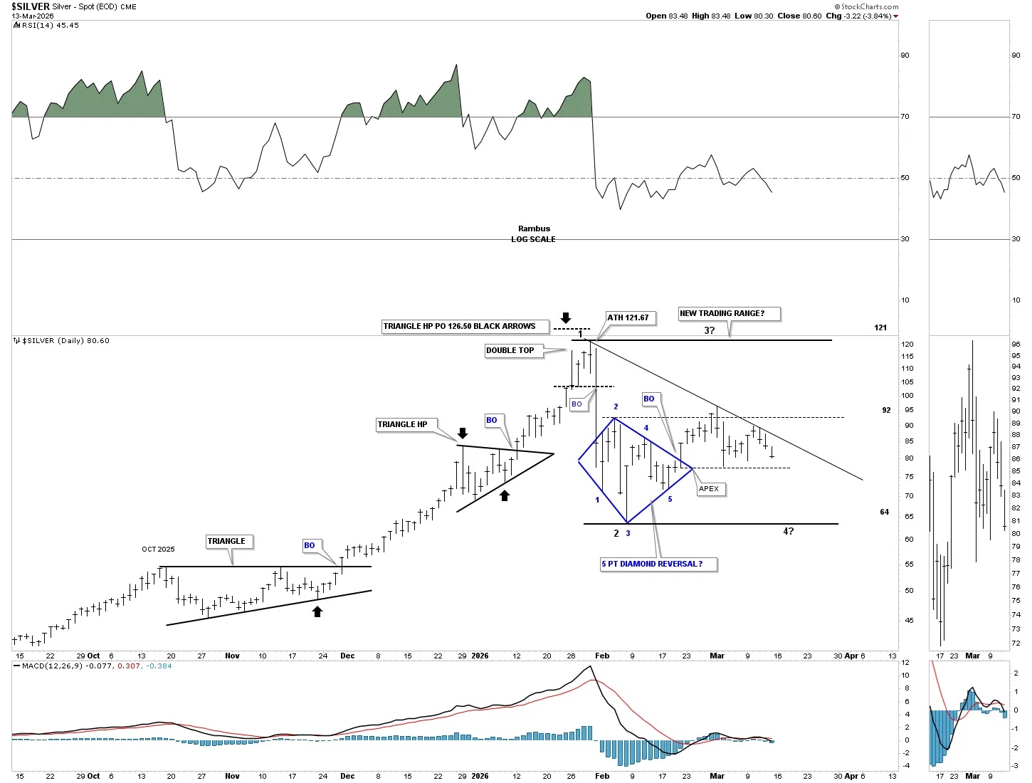
This next chart for silver has a more bearish look to it. The blue diamond on the chart above has 5 reversal points, which is needed to form a reversal pattern. Silver has built a much larger diamond below, which also has 5 completed reversal points. Again, the minimum price objective for the 5-point black diamond would be down to the 64 area, the low at reversal point #2, but that would be a minimum price objective. Since the diamond is a reversal pattern, the price action could fall much lower than the 64 area.
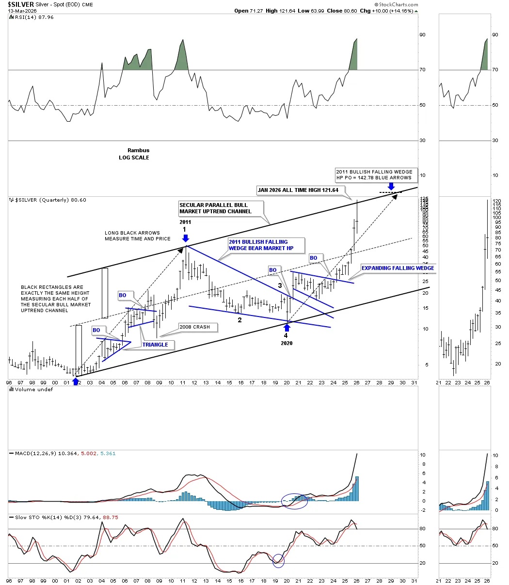
This next chart for silver is a bit concerning. For many years, we’ve been following the 2002 secular parallel bull market uptrend channel. The long black arrows measure time and price off the bottom of the uptrend channel. One thing that took me by surprise was the velocity of the rally out of the 2020 pandemic crash low. I was initially looking for the price action to reach the top trend line somewhere around the 142 area in early 2030 or so, not 121 in January of 2026, but I’m not going to argue with the chart. It could still happen, but there would be a lot of sideways chopping action before silver got there, with only a 25-point gain from the 2026 all-time high.
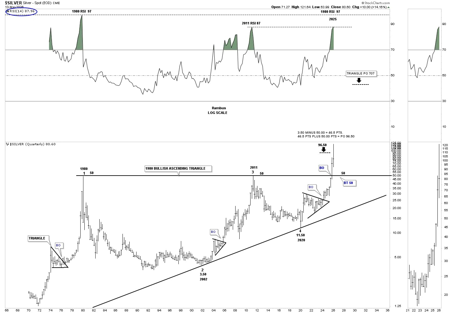
What I think is more likely, looking at the history chart for silver, is that the price action will backtest the top rail of the massive 1980 ascending triangle around 50 or so. From that point, we can see how the price action interacts with the 50 area but that should represent a good low risk entry area.
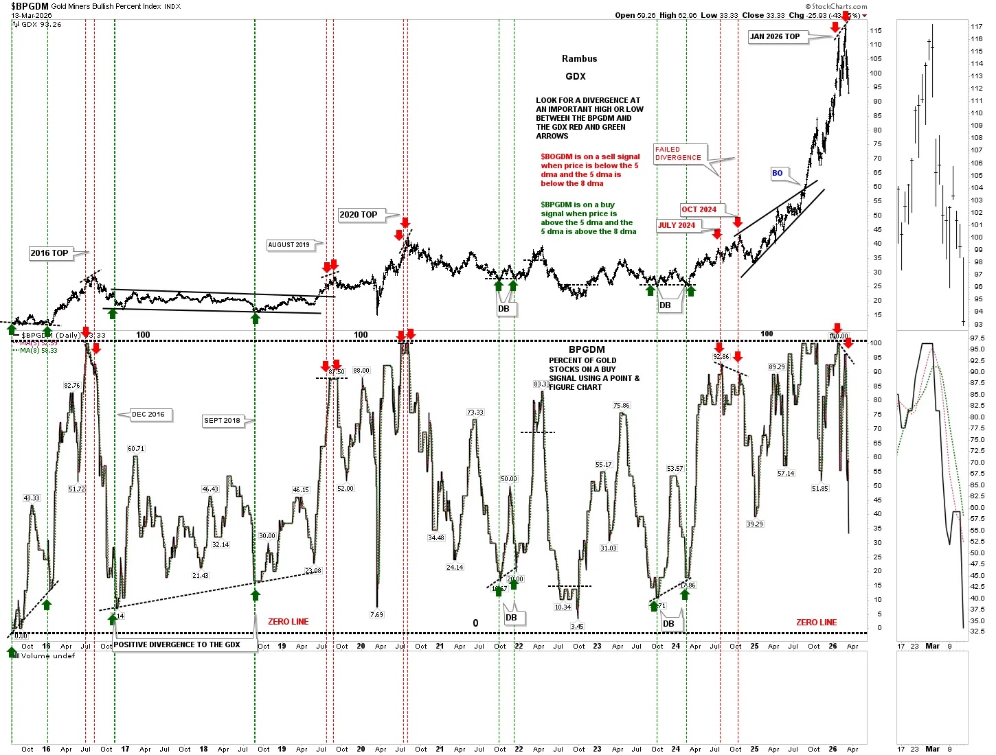
When the PM complex first began to top out in January of this year, we looked at several indicator charts to help guide us. This first chart is a combo chart, which has the GDX on top with the BPGDM on the bottom. The BPGDM shows how many gold stocks are on a point and figure buy signal, with the range between zero and 100, with 100 meaning all the gold mining stocks are on a point and figure buy signal and extremely overbought, and just the opposite at the bottom.
At tops in the GDX, I like to look for a divergence between the two, red arrows and red dashed vertical line, and bottoms, green arrows and green dashed vertical lines. All the important tops since the 2016 high have shown a divergence. In late 2024, we saw the first real failure where the divergence didn’t play out as expected. Most recently, though, we have another divergence where the GDX on top made a higher high while the BPGDM made a lower high, which is leading to the current weakness in the GDX. Note how the BPGDM is now trading lower than the January low, which kicked off the parabolic rise in the GDX.
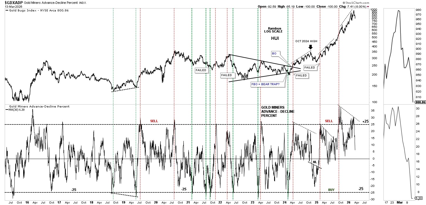
The last time we looked at this indicator chart, which has the HUI on top with the GDXADP, advance decline percent on the bottom, there was a larger divergence between the two. Even though the HUI went on to form the marginally new higher high, the GDXADP didn’t participate and made a lower low, which is not a healthy development.
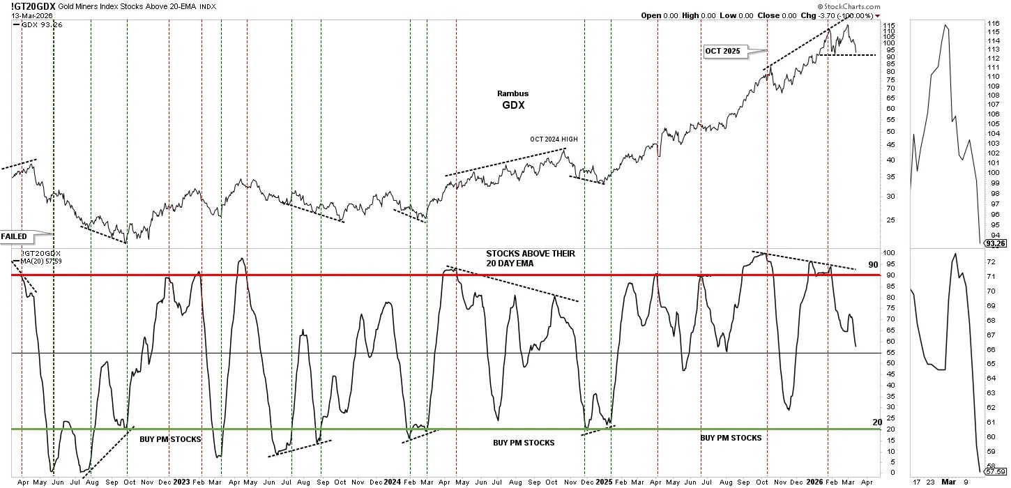
This next indicator chart has the GDX on top with the GT2OGDX on the bottom, which measures PM stocks above their 20-day EMA. Here again, you can see another massive divergence between the two. Keep an eye on the GDX chart on top – I added the possible double top trend line at the most recent all time high.
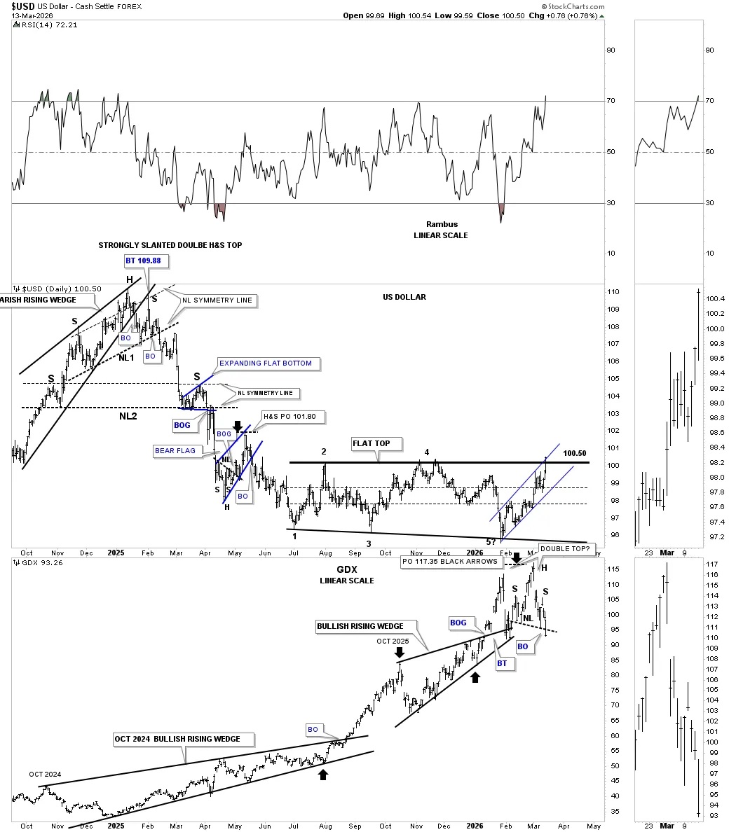
We’ve looked at many charts tonight showing how the PM complex is putting in an intermediate top, but the US dollar is going to be the key going forward. This first daily chart for the US dollar shows the late January low, which coincides pretty closely with the high in the PM complex. Last Friday, as the PM complex was breaking out below their neckline, the US dollar broke out from the small rectangle consolidation pattern.
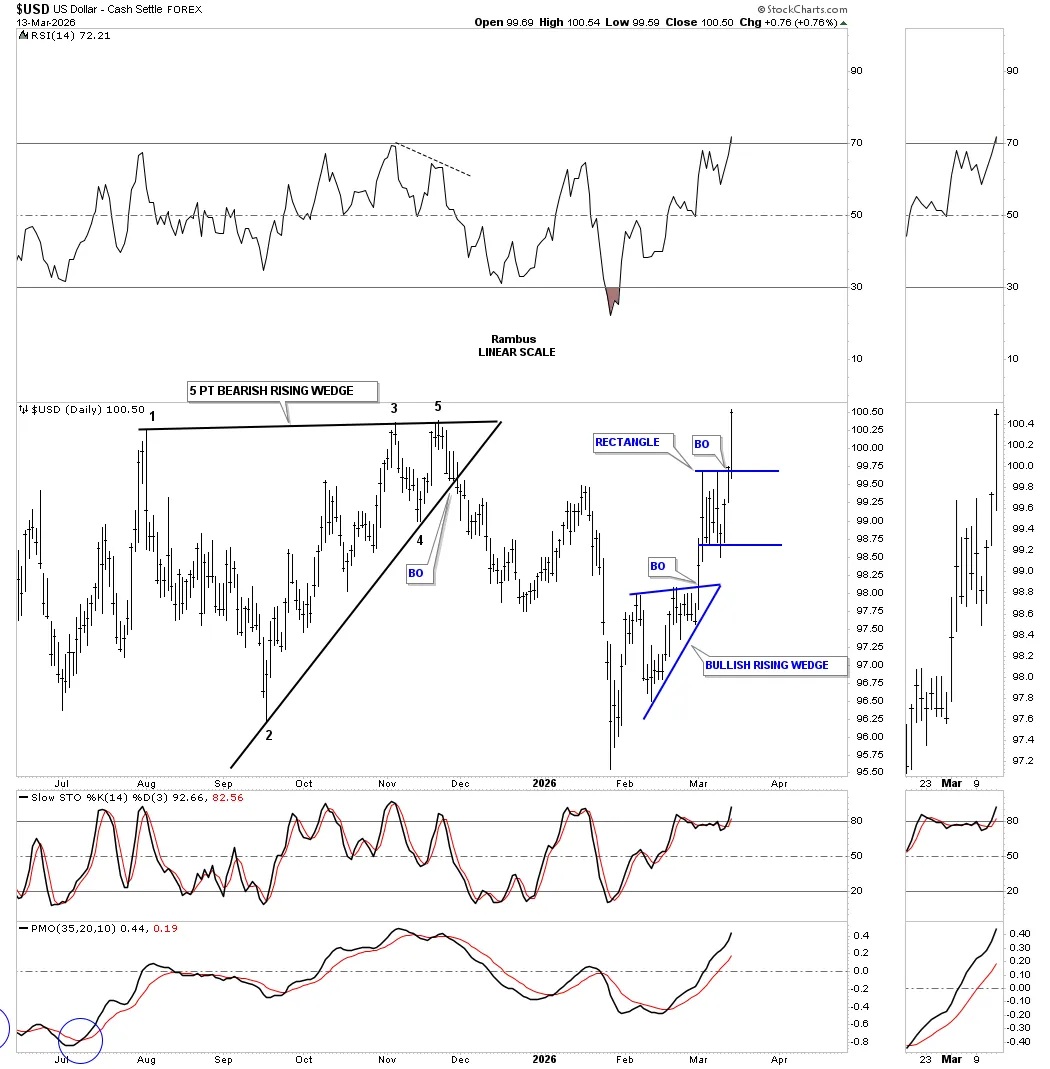
Going back further in time is the daily combo chart, which has the US dollar on top with the GDX below. Remember, it takes an odd number of reversal points to create a reversal pattern. In late January of this year, the US dollar put in its 5th reversal point, which wasn’t completed until last Friday when the price action reached the top of the July 2025 flat top expanding triangle at 100.50. It’s now time for the dollar bears to take charge and stop the US dollar from moving any higher, or a confirmed breakout is going to take place.
Looking at the GDX on the bottom, you can see how, as the US dollar rallied off of reversal point #5, the GDX fought hard, making a new higher high, which may now be a double top reversal pattern along with the H&S top. This is a critical inflection point for both.
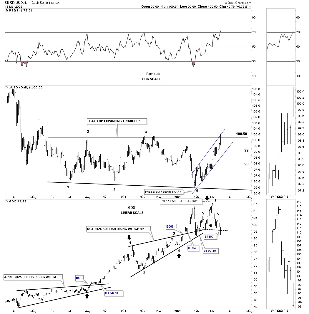
This longer-term daily chart goes back to the 2022 high, which shows the bear market decline for the US dollar. I was originally looking at the black flat top expanding triangle as a rectangle consolidation pattern to the downside, but after the low held support at reversal point #5, I had to switch gears and stay in tune to what the Chartology was strongly suggesting which is a possible reversal pattern and not a consolidation pattern. Again, keep a close eye on the GDX, because if the US dollar breaks out strongly from the flat top expanding triangle, it will not be very good for the PM stocks.
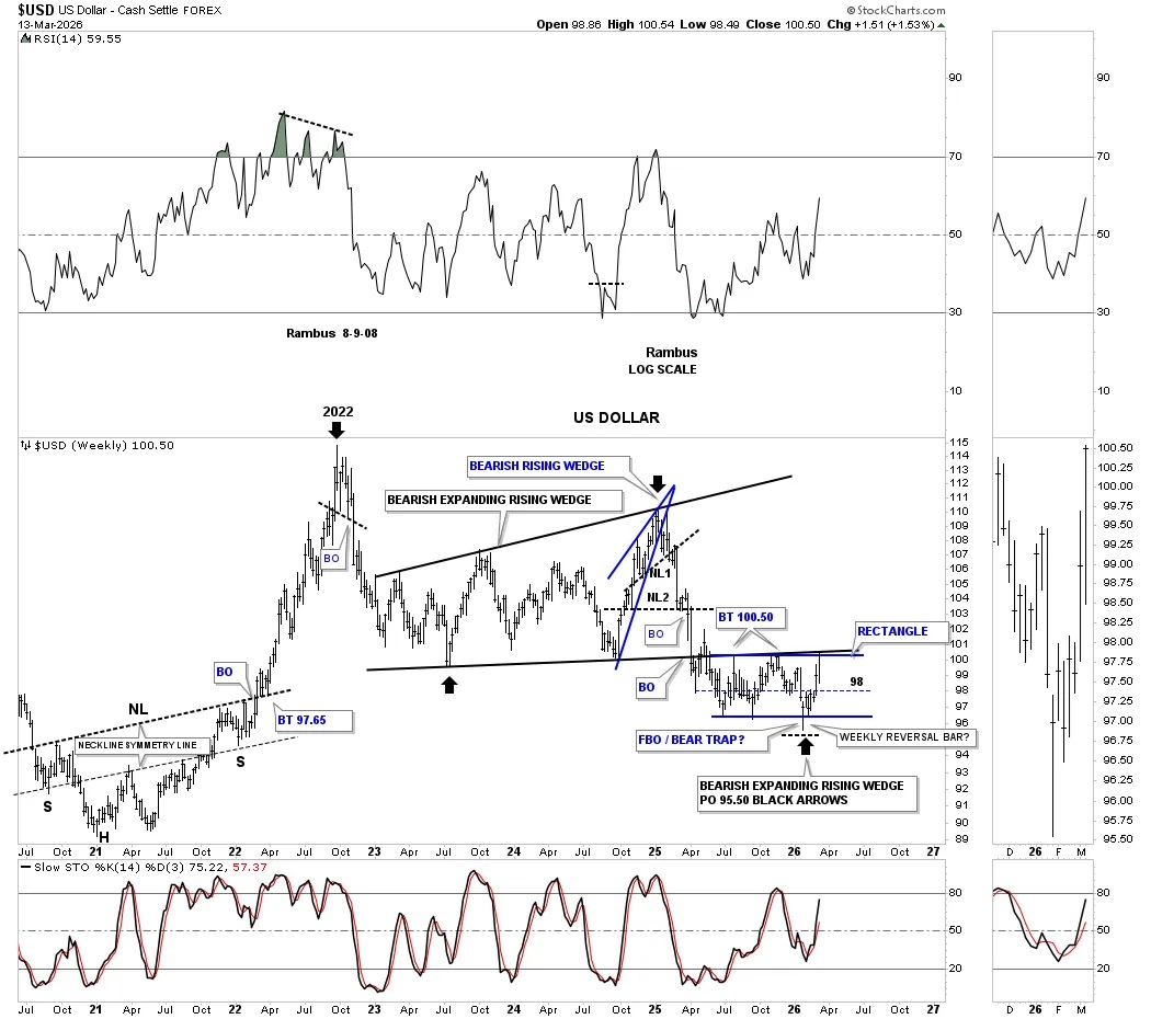
This much longer-term weekly chart for the US dollar goes back to the 2022 H&S low, which led to the parabolic rally in the US dollar and decline in the PM stocks that didn’t bottom until the 2022 high in the US dollar. That 2022 high in the US dollar was the true start of the once-in-a-lifetime rally in the PM complex.
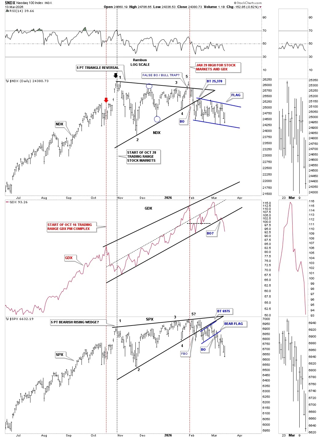
I’ve tried to dispel the ongoing notion that the PM complex needs the US stock markets to crash and burn for a sustained bull market rally, which is far from true. Below is a triple combo chart with the NDX on top, GDX in the middle, and SPX on the bottom.
On the left side of the chart, all three rallied together with the GDX topping out first on October 16th followed by the US stock markets two weeks later on October 26th. As the NDX and SPX traded sideways, the GDX rallied within the uptrend channel, reaching its initial high on January 29th, coinciding with the NDX and SPX’s all-time high. The GDX then made a slightly higher high, forming a double top, and now all three are declining together.
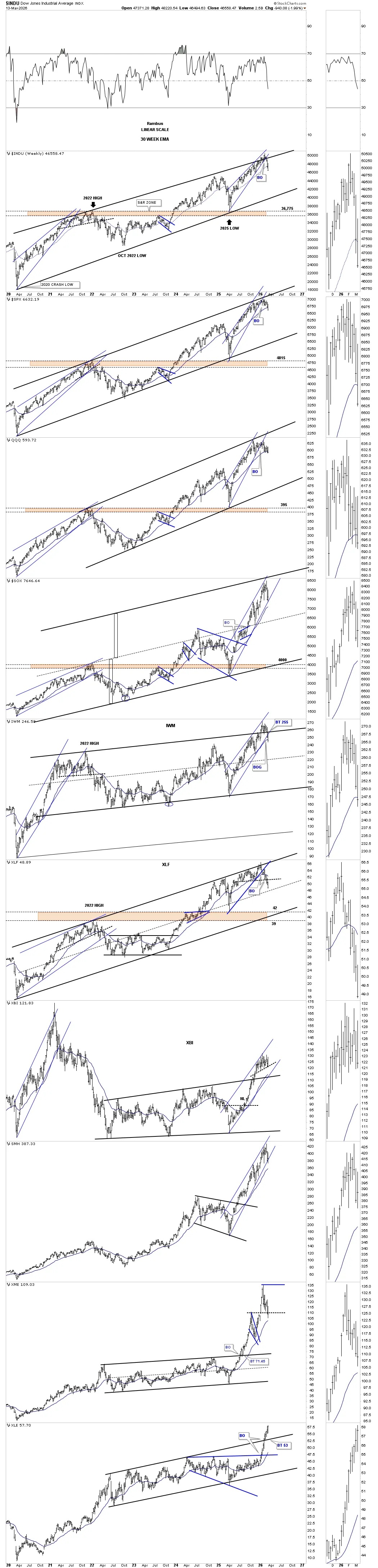
Let’s finish this Weekend Report by looking at a couple of combo charts for the US stock markets, starting with this daily chart. Last year in April, the US stock markets bottomed and began to rally hard to the upside. During the nearly one-year rally, many have formed a bearish rising wedge or channel. The topping process has been long and drawn out, but the indexes are starting to roll over. The XLF banking index is showing the most weakness, which is telling in that it’s leading the way lower. The SOX has held up the best but it’s beginning to show some weakness. Watch how it interacts with the lower rail of the uptrend channel and the horizontal black dashed line that’s been acting as support. The IWM small caps has broken down and made a new lower low.
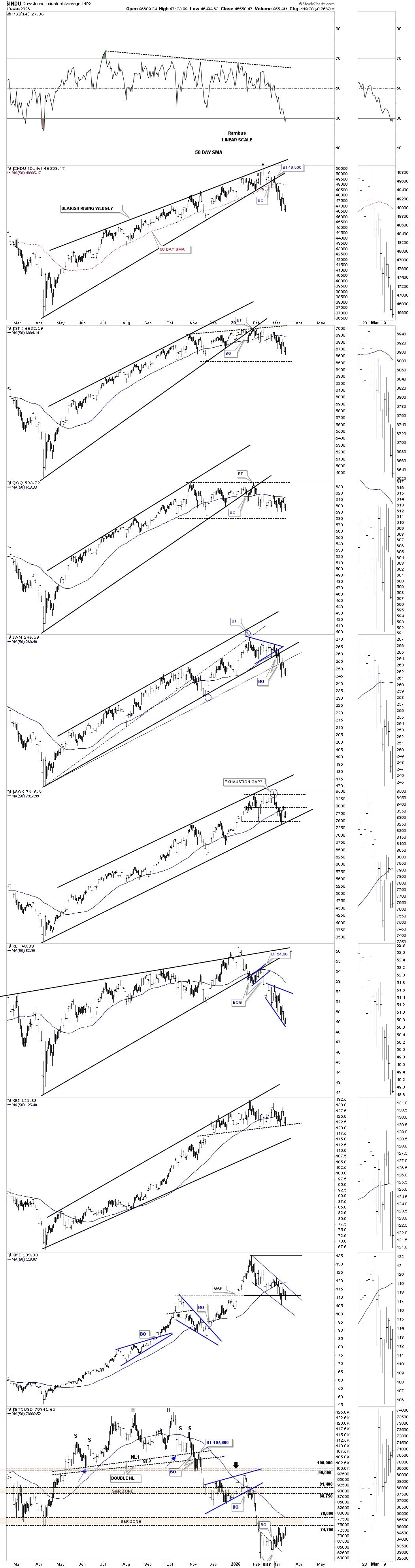
This weekly combo chart for the US stock market shows the parallel uptrend channels, in many cases going back to the 2020 pandemic crash low. It’s been a long period of distribution at the most recent all-time high, but the price action is now starting to roll over. One thing that’s bearish is that for the first time in quite a while, most of the indexes closed below their 30-week EMA last week, which usually does a good job of holding support during bull market rallies.
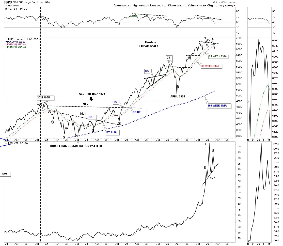
Many times a weekly line chart can show you a pattern that’s hard to see on a weekly bar chart. Below is a weekly line chart with the SPX on top and Silver on the bottom. The last time we looked at this combo chart, the neckline was still holding on the SPX, but last week’s decline now shows the H&S top a little more clearly.
Silver is also showing an unbalanced H&S top but hasn’t broken below the neckline – the pattern is there.
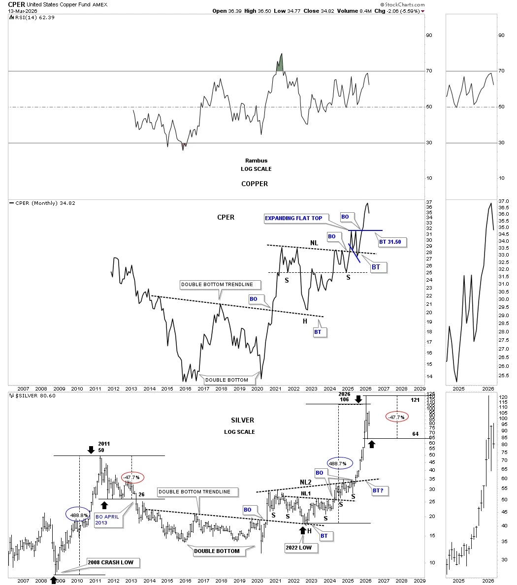
This last chart for tonight is a long-term monthly combo chart with the CPER, copper fund on top and silver below. This chart shows how copper and silver tend to move together, but it’s not a tick-for-tick type correlation. It’s the important reversal points that I look for, which show the positive correlation.
Let’s focus on the bottom chart for silver, which is a fun fact chart. What I did was measure the massive rally out of the 2008 crash low to the 2011 high, which was 488%. I then added 488% to the 2022 low, which gave me a price objective for silver up to the 106 area, which was a little shy of the 121 high – interesting.
What’s also very interesting is the initial decline off the 2011 high was 47%, and the initial decline from the January 2026 all-time high was 47%. Back at the 2011 high, silver traded sideways for close to two years before breaking down into its bear market decline. What is silver going to do this time? Stay tuned to find out. All the best…Rambus
*********
 Meet Rambus, a seasoned trader and technical analyst renowned for his unbiased and insightful chart work. Through his website, Rambus Chartology, and Substack newsletter, Rambus shares his expertise with a global community of subscribers, providing daily updates, commentaries, and hands-on training in the art and science of chartology. With his calm, humble, and down-to-earth approach, Rambus demystifies complex market trends, helping his followers navigate the challenges of today's volatile markets. Join the Rambus Chartology community today and discover a unique blend of technical analysis, trading expertise, and time-tested protocols. Subscribe now at www.rambus1.com or https://rambuschartology.substack.com/
More from Gold-Eagle


