Gold: The New All-time Highs Keep Coming


It’s amazing how quickly things can change. Last week, the Dow Jones closed at a new all-time high, or 0.0% = BEV Zero in its Bear’s Eye View chart below. This week saw the Dow Jones decline at the end of each day’s trading, with a big decline on Friday’s close. Not a Dow Jones 2% Day, but down by 1.90% from Thursday’s close.
“Market experts” said the reason the stock market was down Friday, was because President Trump announced that he was going to place additional tariffs on China, because of their near monopoly on rare-earth minerals. The link below from China Uncensored provides the details.
https://youtu.be/wgNa6uRAJkk?t=240
That explains Friday’s big decline. But the Dow Jones actually began going down on Monday. Though on Monday, other market indexes saw new all-time highs, as they did again on Wednesday (see my Major Market Indexes’ BEV table below).
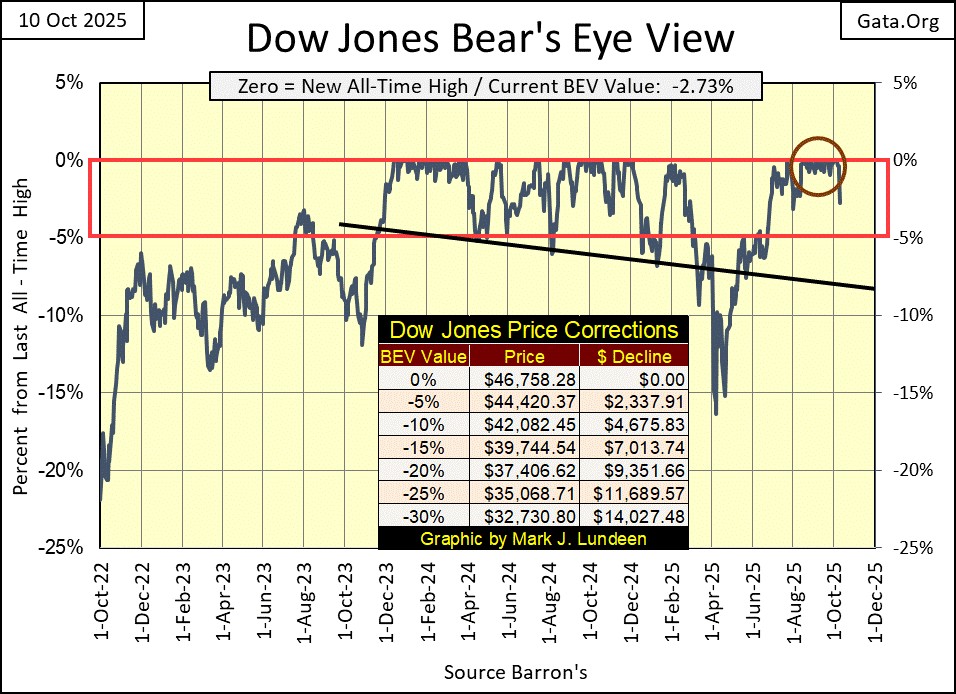
The thing to watch for now in the Dow Jones’ BEV chart above; can the Dow Jones stay in scoring position, within the red rectangle (above the BEV -5% line). If so, we can anticipate additional new all-time highs in the weeks and months to come. If not, should the Dow Jones soon see itself breaking towards its BEV -10% line, that would suggest something completely different.
I have a table in the BEV chart above, giving the specific dollar values for the Dow Jones’ BEV lines, in 5-degree increments. Right now, its BEV -5% line, at 44,420 is the key level the bulls must defend. If the bulls can’t hold that line, then the Dow Jones’ BEV -10% line at 42,082 becomes the next level for the bulls to defend.
Which will it be? Additional new all-time highs, or seeing a deflating Dow Jones break below a succession of key BEV lines, as 2025 comes to its conclusion? I haven’t a clue. Still, I’ll enjoy watching the show.
But then I’m sitting in the market’s peanut gallery, drinking beer, and eating hotdogs, as I avoid all exposure to market risks in the stock market. Yep, except for gold, silver, and their miners, I’m out of this market. “Market experts” would laugh at my current market positions, but I don’t care. The stock market is now a spectator sport to me, so I can afford to just watch the Dow Jones; whether it can stay in scoring position, or not.
Here is the Dow Jones in daily bars below, plus the daily bar chart from March 2020, during the Flash Crash. In the top chart for this week, the collapse in the Dow Jones on Friday looks really bad. However, as bad as it looks, it wasn’t a Dow Jones 2% day. Maybe the market was ready to go down a bit, and on Friday it got that out of its system, and is now ready to resume the advance in the next few weeks.
How can we tell if that is the case? That’s easy; the Dow Jones stops going down, and begins going back up, and continues making new all-time highs in the months to come. Then again, maybe the market just needs a rest for a few months, which would then see the Dow Jones trade above its BEV -10%, hopefully above its BEV -15% line for the duration of the correction.
What the bulls don’t want to see in the weeks and months to come, is what happened in February / March 2020, in the bottom chart.
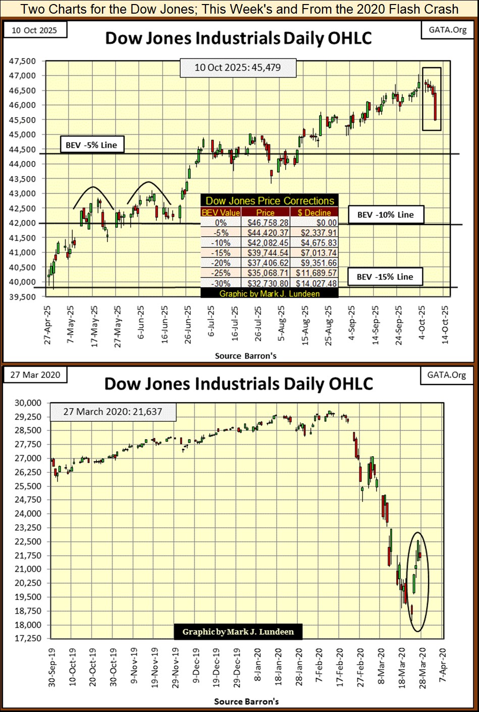
One day in February 2020 (February 12th to be exact), the Dow Jones made a new all-time high. Two weeks later, the Dow Jones is stacking up days of extreme volatility, Dow Jones 2% days, one after the other as market valuations for the Dow Jones melted away. These were massive daily moves, some moving the Dow Jones by 5% and 10% from one day to the next, up and down for the next month or so.
Question; in the chart above, can you see when FOMC Idiot Primate Powell’s Not QE #4 was first “injected” into the financial system? One doesn’t need the oval I inserted into the chart to see how, and when this massive bear market decline was first terminated, and then “stabilized.”
In the late winter of 2020, a few trillion dollars of monetary inflation, “injected” into the market in a matter of weeks did the trick. How many more trillions-of-dollars of monetary inflation will it take to “stabilize” the next big bear market decline?
And don’t doubt there is one coming. Maybe in the coming month? I think not, but who can say when it will come?
Next, we move on to my table listing the Bear’s Eye View Values for the major market indexes I follow. Looking at these indexes via their BEV values, is the best way of comparing them to each other. Their dollar valuations are so widely set apart. Publishing their dollar values in a table would tell us exactly what? Nothing!
But BEV values are based on all-time highs (BEV Zeros / New All-Time Highs = 0.0%) and percentage claw-backs from those all-time highs. Keeping that in mind, Monday was the strongest day of the week, with thirteen of these indexes closing at a new all-time high. The market took a break on Tuesday, then on Wednesday the bulls returned, with nine of these indexes closing at a new all-time high. Thursday, the market once again took a break, before the market broke down on Friday, with most of these indexes shedding at least 2% of their valuation on the day.
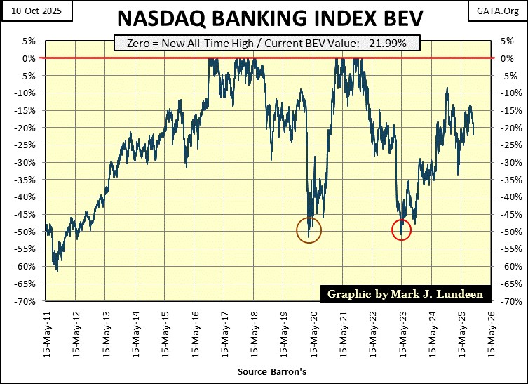
Okay, all that is nice to know. But what did the NASDAQ Banking Index do this week, especially on Friday? It was down each day this week, but on Friday it was down by 3.25 BEV points from Thursday’s close.
Here is the NASDAQ Banking Index’s BEV Chart. Its last all-time high was in November 2021. As all the other market indexes I follow have been making new all-time highs these past four years, the NASDAQ Banking Index has done nothing positive. That really bugs me, as that can’t be good. We’re looking at the banks, and when the banks are in trouble, other than gold and silver, what else isn’t?
Is this sub-standard performance flagging growing credit problems somewhere in the economy?
- Vacated brick and mortar retail space that no longer services its monthly mortgage payments?
- Sub-prime auto loans in arrears?
- Credit card debts in default?
There are so many areas in the economy the banking system has been providing credit, by the trillions-of-dollars to. Seeing these banks’ BEV chart now breaking below their BEV -20% line, is a bad omen for the rest of the stock market.
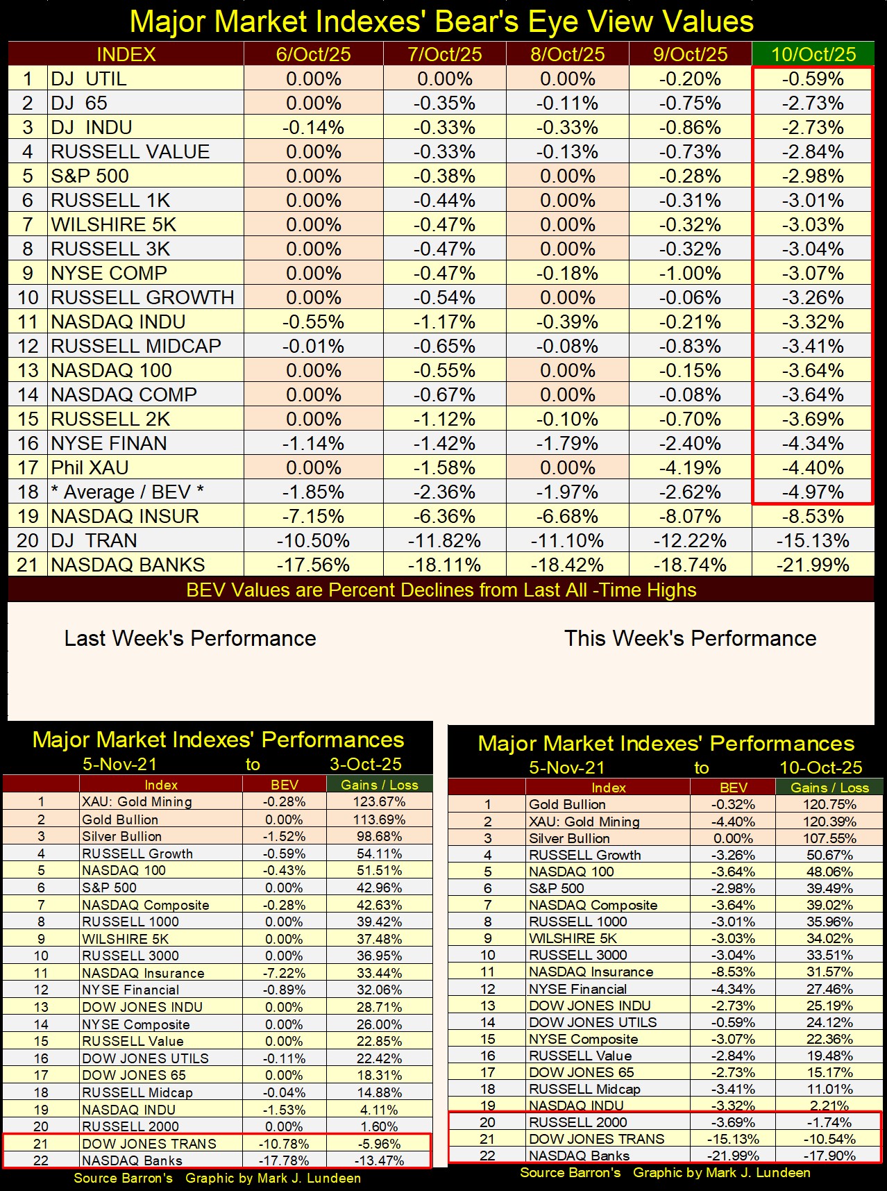
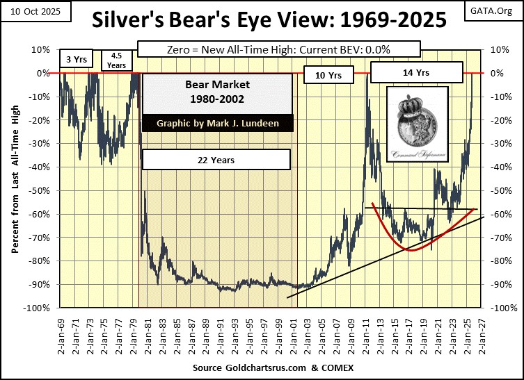
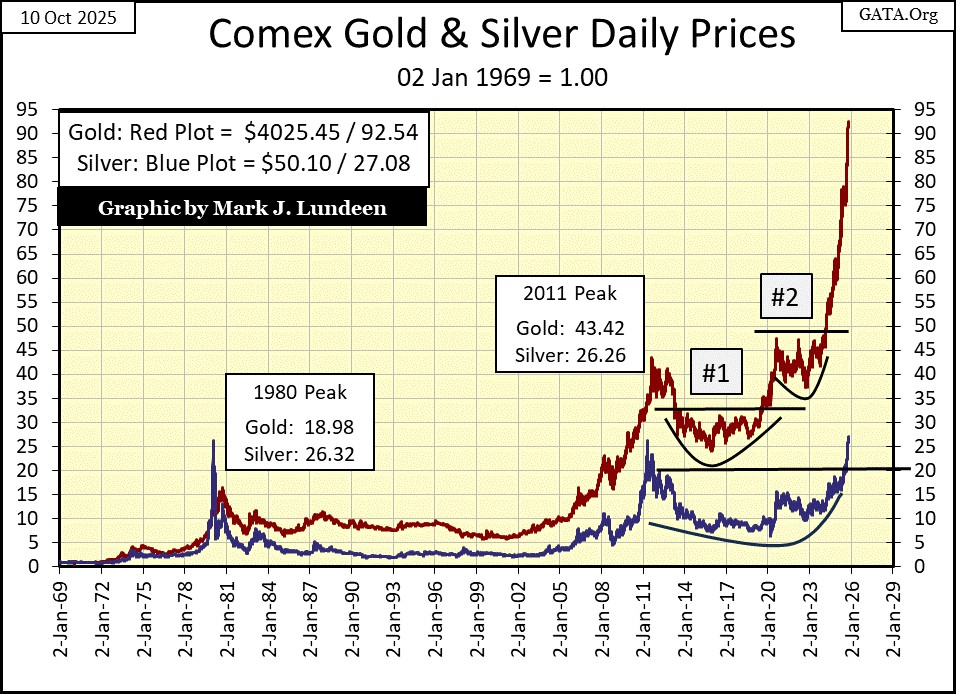
Looking at this week’s performance table above, gold at #1 was down a bit, but the XAU and silver were up nicely. And did you notice that silver’s BEV value was a BIG 0.0% this week? SILVER THIS WEEK CLOSED AT NEW ALL-TIME HIGHS FROM WEDNESDAY TO FRIDAY’S CLOSE, FOR THE FIRST TIME SINCE JANUARY 1980!
Silver’s BEV chart below is a very pretty picture. It took forty-five years for it to happen; a new all-time high for silver; but there it is. What’s to follow for silver in the months to come should be very interesting.
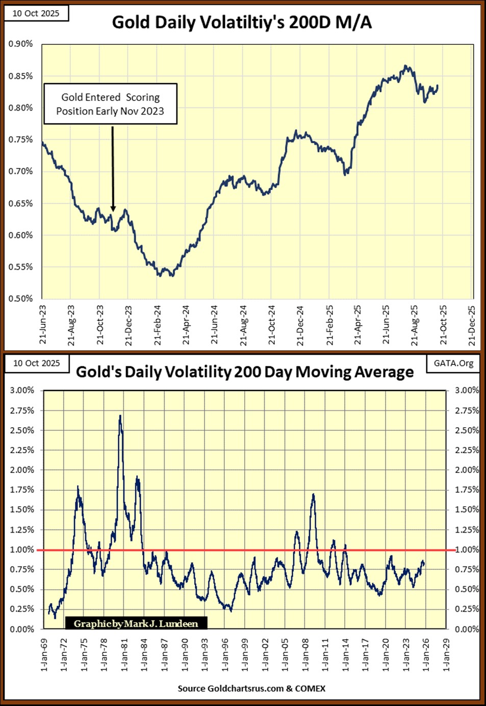
Here is a little anomaly in the gold market; for all of gold’s current advance since November 2023, gold’s daily volatility’s 200D M/A has been very restrained.
Gold entered into scoring position in its BEV chart in November 2023. Though its daily volatility has been rising with the price of gold, its volatility’s 200D M/A has remained below 0.90% (Chart Below). For an advance that has taken gold up from $1935.90 on 10 Nov 2023, to $4025.45 this week, a gain of $2089.55, or 107% in the past two years, seeing this very restrained rise in gold’s volatility seems odd to me.
Then maybe not. The money coming into the gold (and silver) market isn’t from money managers, or the public, groups still enthralled with the stock market as a whole. So, whoever is buying gold and silver, they have been taking their time doing so. Meaning this flow of funds into the gold market has been very disciplined, as seen by the constrained increase in daily volatility seen below.
One thing we can be sure of; when money managers and the public do come to the realization of the necessity of their owning gold, as badly as they now want to own AI stocks, this chart of gold’s daily volatility will soon spike to something well over 1.00%. That is something we can count on!
Daily volatility for gold is different than it is for the Dow Jones. Since 1885, rising daily volatility for the Dow Jones (my proxy for the broad stock market), has been bearish. It just has been, and still is. During every bear market for the Dow Jones, when Mr Bear really begins drawing blood from the bulls, it’s then the dreaded Dow Jones 2% days are seen, days the Dow Jones moves +/- 2% or more, from a previous day’s closing price. Take a moment to review my Dow Jones daily bar chart from the March 2020 Flash Crash I published above to see the truth of this.
But gold, silver too is different. Rising daily volatility in the old monetary metals note when money is flowing into (Bull Markets), or out of (Bear Markets) precious metals. So, seeing big increases in daily volatility in the old monetary metals doesn’t tell us whether the market is bull or bear, only that the market is seeing significant flows of funds, into or out of the market.
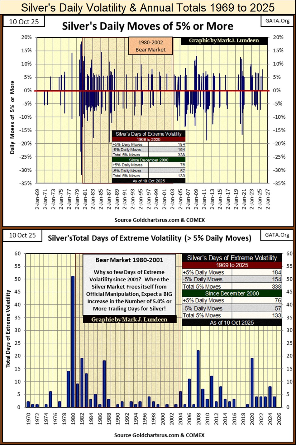
In my personal market research, I’ve established 2% daily moves to be days of Extreme Volatility for the Dow Jones. But gold is a more volatile market, so I used 3% days for gold, as a threshold value for a day of extreme volatility. For silver, the threshold for a day of extreme volatility is a 5% day.
I’ve plotted below, every day of extreme volatility; gold’s 3% days since January 1969. One fact that stands out, is how volatile the gold market was from 1971 to 1983, a period of time that includes the 1969 to January 1980 bull market, and the first few years of the 1980 2001 bear market. Since 1983, volatility in the gold market has been much reduced.
Our bull market in gold began in February 2001. In the chart below, it is evident that 3% days in gold have picked up since then, but nowhere near their frequence seen in the 1970s. I’m no “market expert,” but seeing an advance that took gold up from $253 in February 2001, to $4025.45 just this week, an increase by a factor of 15.91, should have generated more 3% days since 2001, than it actually has.
Why would that be? The thought comes to my mind that money managers, and investors in general, have since 2001, ignored the current bull market in gold (and silver). This was not so for the 1969 to 1980 gold bull market, a bull market that enjoyed wide public participation.
Let’s compare the 1969 to 1980, to our 2001 to 2025 gold bull market;
- 1969 to 1980; gold advanced from $35 to $840 in eleven years, up by $805, or a factor of 24.
- 2001 to 2025; gold advanced from 253 to 4025.45 in twenty-four years, up by $3772 or a factor of 15.91.
So, gold from 1969 to 1980, advanced more in percentage terms than ours has, in less than half the time. But that bull market became extinct a long time ago, while our gold bull market is still in progress.
Other driving factors operative during the 1969 to 1980 bull market were;
- Gold was still considered to be money by the general population; decoupling the dollar from its $35 gold peg in 1971 was very much a concern to people.
- The US National Debt approached, and then broke above $1 TRILLION DOLLARS in 1980, a fact widely covered in the media. Seeing the National Debt above $1 Trillion dollars greatly disturbed people, especially bond traders.
- CPI Inflation was double digits for most of the 1970s, exceeding 10%, to even above 15% by the late 1970s and early 1980s.
- The bond market was in a bear market that began in 1958, and the stock market was a loser, with or without factoring in CPI Inflation.
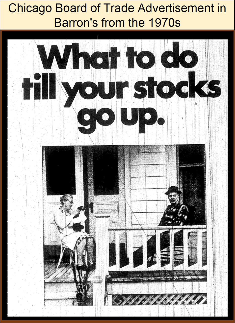
Below is an ad by the CBOT during the 1970s. It’s hard for people today to believe it, but before 1982, investing in the stock market was seen as a fool’s errand if one was investing for the future. The message in the ad below is; investing in the stock market was a good way to waste your time and money as one waited for – well you know what I mean. Few people in the 1970s doubted that as the truth.
Most of these factors that were concerns in the 1969 to 1980 gold bull market, have become nonfactors for our bull market in gold;
- Gold is no longer associated with money,
- The US National Debt is now over $37 TRILLION DOLLARS, and most people either don’t know, or care,
- CPI inflation is becoming a concern, but not as it was in the 1970s,
- The stock and bond markets are currently seen as the place to be for investing in one’s future.
But things are changing. The fiscal and monetary malfeasance of the “policy makers” will one day impact the financial markets in a very negative way. Gold, and silver, being assets with no counter-party risks, will once again be in great demand.
I expect to know exactly when this realization comes into public’s mind; as daily volatility for gold in the chart below, once again sees a huge increase in days of extreme volatility; gold’s 3% days.
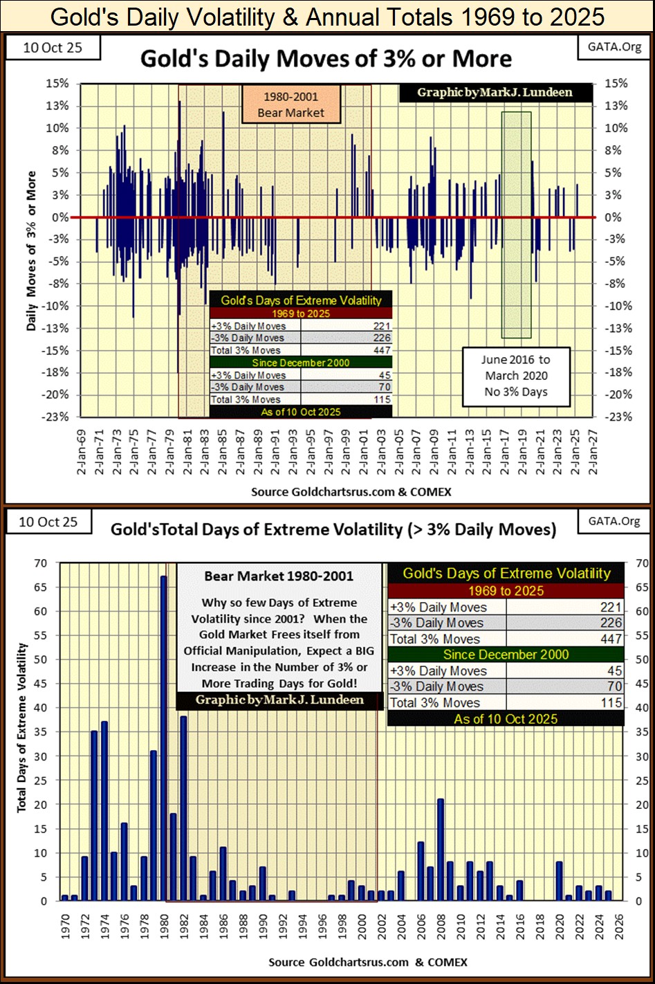
Above are the annual totals of gold’s 3% days. Since 2008, daily volatility for gold has been very subdued, even as the price of gold has increased to new all-time highs. So far for 2025, gold has seen only two days of extreme volatility; 3% days. When gold once again sees panic buying, as it did in the 1970s, it will once again see a spike in 3% days in the chart above.
For your information, I’ve included charts for silver’s 5% days, but without any commentary, as it’s the same as I used for gold above.
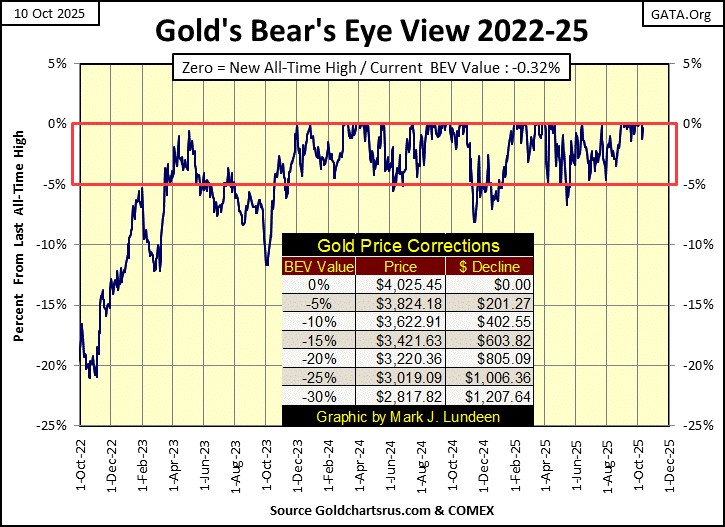
Let’s move on to gold’s BEV chart. Like the Dow Jones, gold too closed the week in scoring position, but only 0.32% from its last all-time high.
One difference between gold and the Dow Jones, is the frequence of their BEV Zeros. Both gold and the Dow Jones entered into scoring position in November 2023, and for the most part, both gold and the Dow Jones have daily closed in scoring position for the past two years.
This is odd, as gold and the Dow Jones have historically been counter-cyclical to each other; when one is going up, the other is going down, but not so since November 2023.
Also, since 01 November 2023;
- The Dow Jones has made sixty-six new all-time highs,
- Gold has made eighty-three new all-time highs,
- The Dow Jones has advanced by 36.68%,
- Gold has advanced by 102.12%.
So, the advance in gold has been superior to the Dow Jones, and most of the major stock indexes I follow these past two years, though the public as a whole is totally unaware of this. If these trends continue, they will attract the attention of money managers and the investing public. This would be much to the benefit of anyone who purchases gold and silver at today’s low, low prices.
Let’s now go to the indexed values for gold and silver.
Every time I look at this chart, I’m thinking a correction for this advance is due. But the market doesn’t care what I think, as gold and silver continue to rocket into market history.
What is this? Did silver really close the week above $50 an ounce? Geeze Louise, after I finish writing tonight, I’m going to have to have a generous glass of bourbon to settle my nerves.
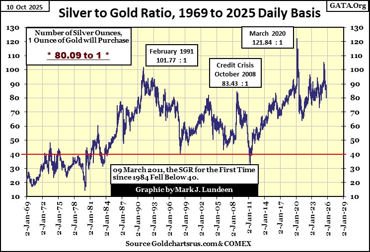
The Silver to Gold Ratio (SGR chart below) is coming down, as it always does during a bull market in gold and silver. A declining SGR indicates that silver is providing more in the way of profits than is gold. However, a rising SGR indicates that holding silver is losing more money, than holding gold.
But damn it, thinking like that is thinking that gold and silver are still in a bear market, which they are NOT! So, given the choice of owning silver or gold, owning silver will prove to be the more profitable investment, as this precious metal bull market continues.
Silver is a more volatile market, one that can make a silver bull’s hair go grey. A fact I can attest too. But damn it anyway. For a retail investor to get 80 ounces of silver (five pounds of silver), for the price of one ounce of gold, that is hard to say no to.
How has silver done compared to gold, since gold entered into scoring position in November 2023?
- Gold has advanced by 103%,
- Silver has advanced by 118%.
As this bull market in gold and silver continue, as the SGR continues to decrease in this bull market, the profitability for silver will continue to outperform gold.
For example, from today’s SGR of 80, should the SGR decrease to 40, as it did in April of 2011, the gains for silver will be twice that of gold. A SGR of 20, as seen in January 1980, would see the gains for silver to be four-fold that of gold, from today’s SGR of 80.
Is that possible? I believe it is. But like me, my readers will have to wait to see what actually happens in our uncertain future.
For gold in its step sum table below, it added three new BEV Zeros / new all-time highs this week. Since September 8th, for the last twenty-five trading days, gold has seen a new all-time high in thirteen of them, advancing the price of gold by 10.18%. Gold is a hot market. How much longer can this go on? I don’t have a clue, but I’m going to enjoy the show for as long as gold continues going up like this!
Gold’s 15-count closed the week with a very overbought +9. Markets don’t like being very overbought, so tend to sell off when they see a +9, 15-count. But in October 2025, does gold give a damn what a market doesn’t like? I’m beginning to think it doesn’t.
If gold sees daily advances for the first three trading days next week, it will see a 15-count of +11, which would make gold an extremely overbought market. Will gold give a damn about that?
As seen in the table below, since December 1970, gold has closed with a 15-count of +11, for only thirty-four trading days, or 0.25% of the 13,711 trading days in the sample. What a crazy market gold is in today, that we should be thinking of the possibility of it seeing a 15-count of +11!
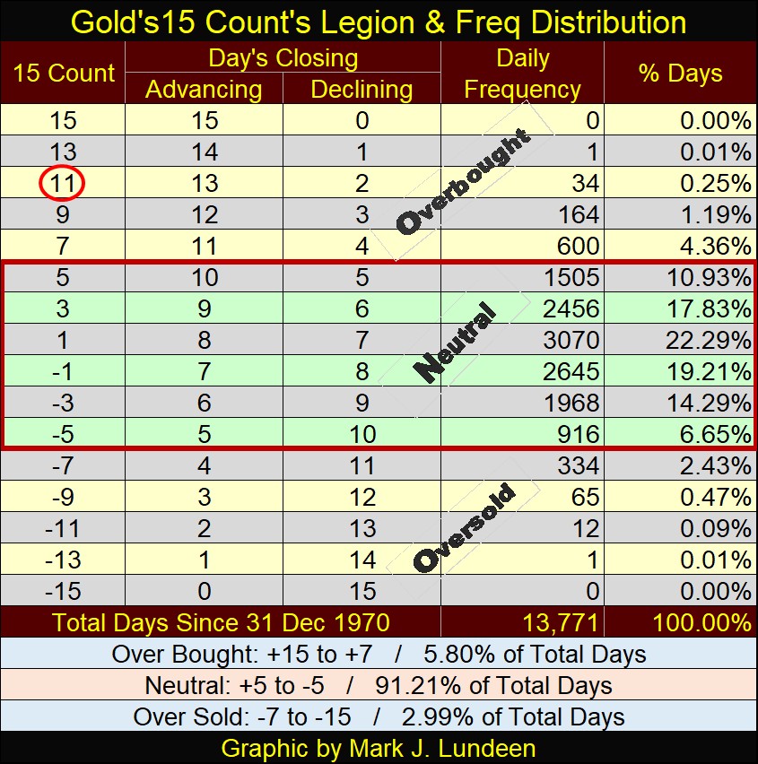
Gold’s daily volatility’s 200D M/A is creeping upward, closing the week with a pathetic 0.84%. What does that mean? Only that gold is now an extremely overbought market, no thanks to the public or money managers coming into the gold market, in any meaningful way. This is such fun!
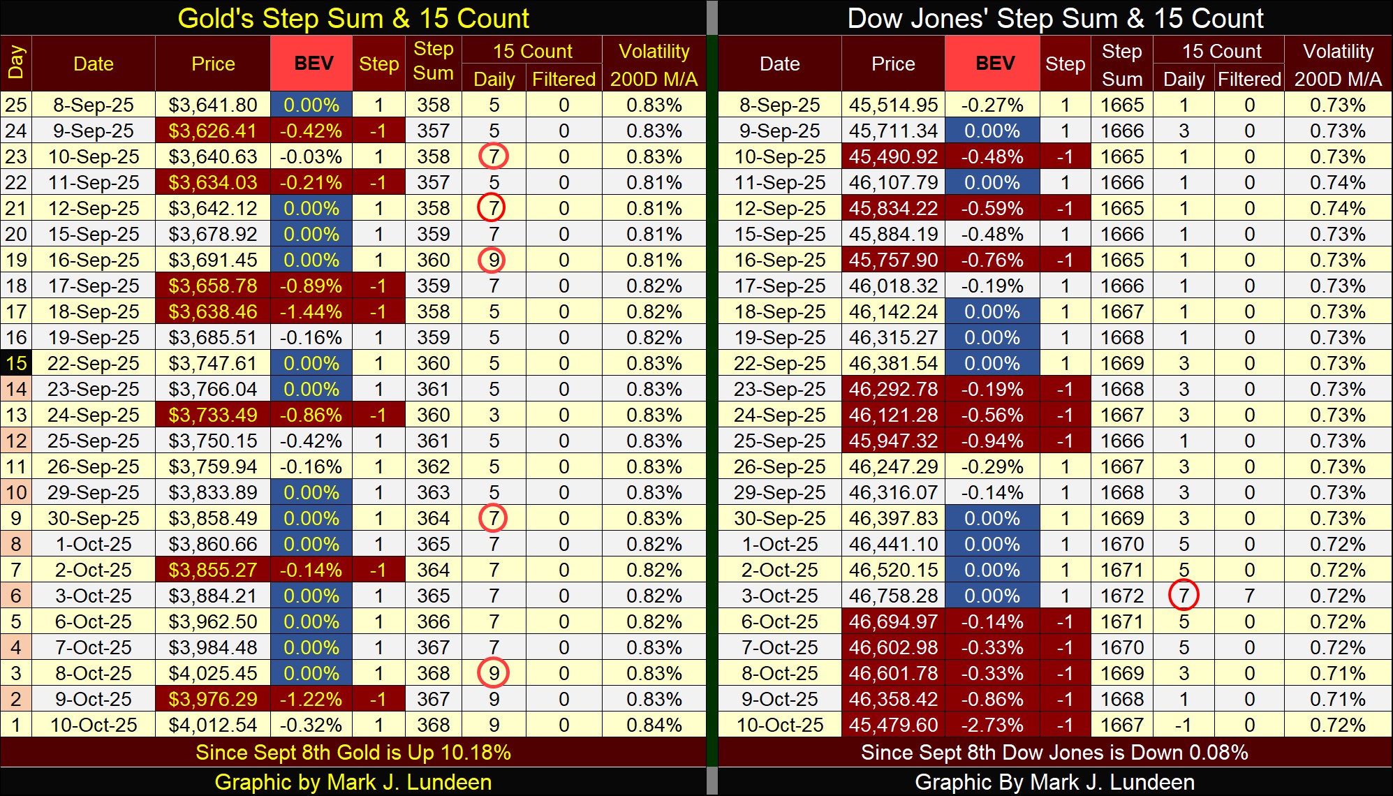
On the Dow Jones side of the table above, last week it closed with a 15-count of +7, making the Dow Jones an overbought market. I note that last week, four of those daily advances were new all-time highs.
It’s hard to do any better than that. So, this week, the Dow Jones didn’t even try.
This week saw the Dow Jones decline for five straight days, with a nasty decline on Friday, taking down its 15-count from an overbought +7, to a very neutral -1.
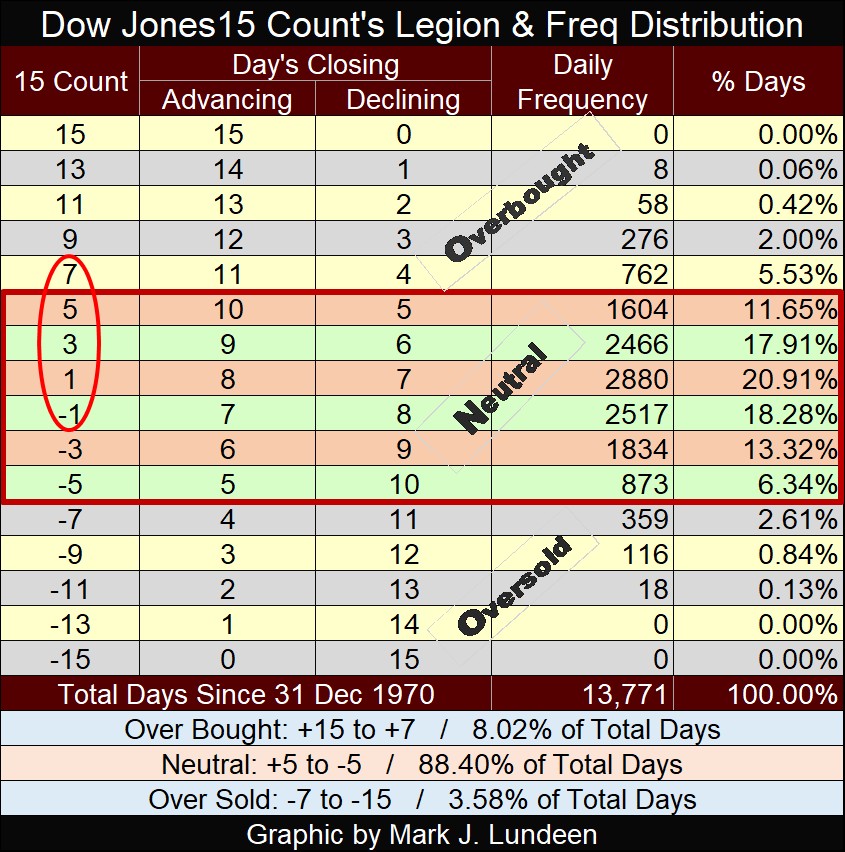
Is there something to be seen on the Dow Jones side of the step sum table, that the gold market might benefit from? I doubt it.
When one reads about the economy, by Austrian Economists, such as Ludwig Von Mises, one sees the term of “malinvestment;” where credit creation unhinged by a gold standard, flows into areas of the economy that have no chance of providing a return on the investment.
Mark J. Lundeen
********


