Gold Is Speaking Through Its Charts…Let’s Listen In


In this Weekend Report I would like to take an indepth look at gold that is showing a potential small double bottom. There is also a larger double bottom or part of a bigger consolidation pattern that also needs to be looked at. Some of the charts I’ve shown you many times and some are charts that I follow I have never posted before but I still keep a close eye on. As you will see, this area we are in right now, is very critical to the short term and the long term look for gold. Remember we have to keep an open mind and let the charts speak for themselves.
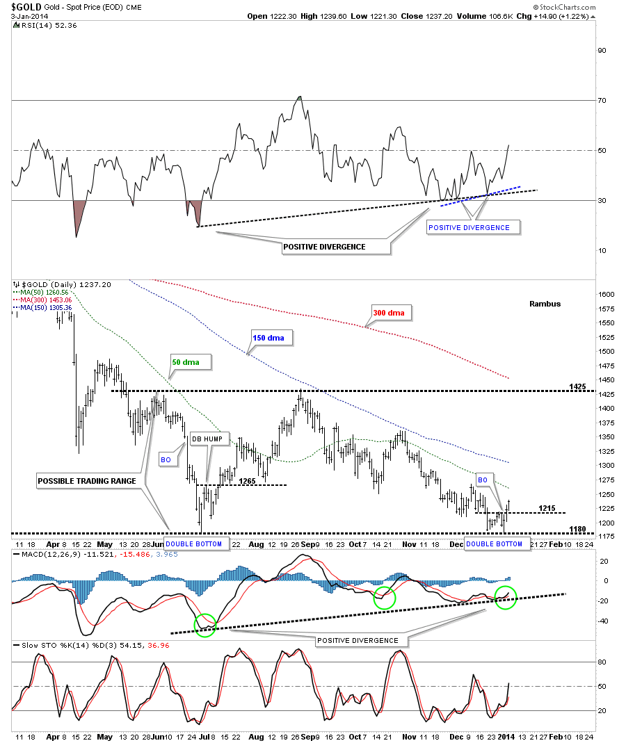
This first chart is a 10 month daily look at gold that shows our current small double bottom that broke above the double bottom hump on Thursday with some follow through on Friday. If you look to the left hand side of the chart you will see the June low that was also a double bottom of the unbalanced kind. Note how the Double Bottom hump, at the June low, held support many times, when it was backtested from above at 1265. The next thing I would like to show you on the chart below is the positive divergence on our current short term double bottom and also the positive divergence off the June low which is six months in the making. I’ve add what I consider to be the most important moving averages for gold which are the 50, 150 and 300 dma. Going back to the June low you can see how much work gold needed to do before it finally broke above the 50 dma. Once it did it was a straight shot up to the top of the possible trading range where the 150 dma came into play and held resistance. The 150 dma also held resistance at the October high. You can see where the 300 dma will come in IF gold can reach the top of the trading range around the 1425 area. So this chart represents the short term look at gold. Note that we sold most of the Kamikaze Portfolio on the second bar on the far right hand side of the chart because of the possibility of a double bottom forming. Until that point we didn’t know which way the price action would go.
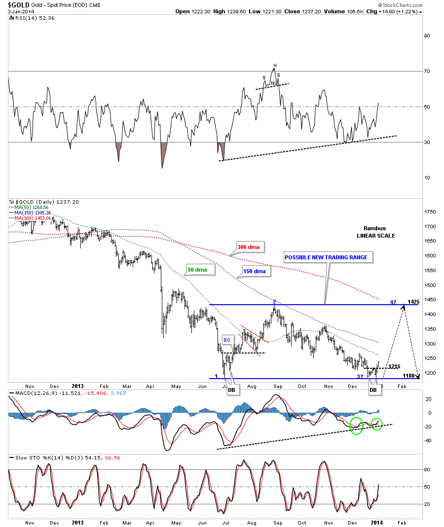
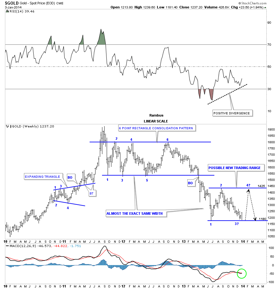
This longer term daily chart for gold shows the possible new trading range between 1180 and 1425. If this is going to be a consolidation pattern then we are at the 3rd reversal point right down here. We would then need one more reversal point #4 to complete a consolidation pattern which could show up at the top of the trading range where the 300 dma will come into play.
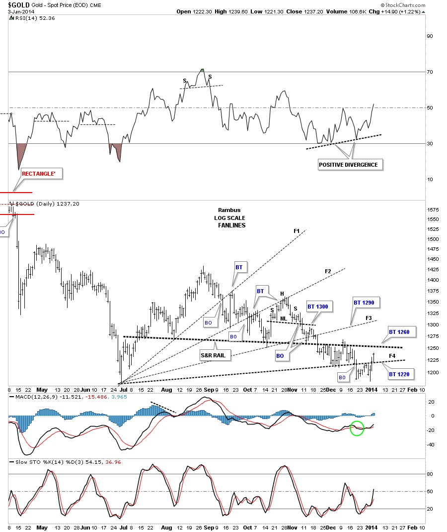
The next gold chart shows the fanlines that had been working so well until we hit this double bottom area. The move above fanline #4 shouldn’t have happened. That area should have held resistance. The next area of resistance is the heavy black dashed S&R rail that comes in around the 1260 area. This is how gold is talking to us. When it has the energy to start taking out overhead resistance rails it’s showing strength and we have to respect that.
Below is our gold Diamond that we’ve been following for some time now. The apex of the big blue Diamond represents a strong area of resistance which comes in around the 1295 area. A move above the apex will negate the blue Diamond which would put the double bottom, that I showed you on the charts above in play. So the apex is another important area to keep and eye on.

There is another important resistance point which comes in around the neckline of the H&S consolidation pattern that is part of the blue Diamond pattern we looked at earlier. Again a break above the neckline will negate the H&S consolidation pattern.
We’ve talked about inflection points which are areas that can break either way. Gold is at an inflection point right here trading at the June low. At this point we have to give the advantage to the bulls as they have already defended this area once before. If this low can hold, which would be reversal point #3, that could setup a good move higher. You can see a very strong positive divergence on the RSI at the top of the chart.
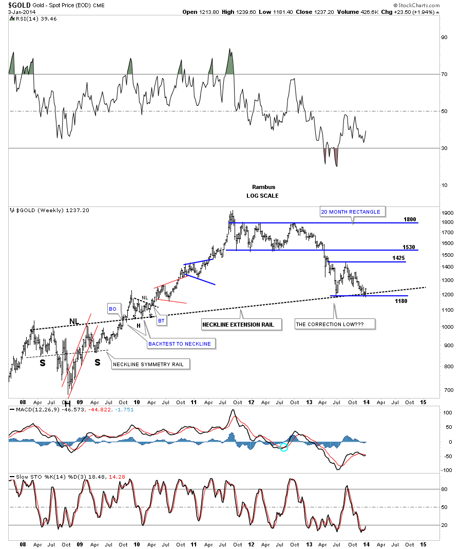
This next weekly chart for gold puts our possible consolidation pattern into perspective. Note the neckline extension rail that is taken off the 2008 inverse H&S bottom. We’ve been watching how the price action was going to interact with that important trendline. As you can see it has held the June low and now the Decembers low so far. As with any trendline you put on a chart it will act as support when the price action is above and resistance when the price is below. So far the neckline extension is holding support.
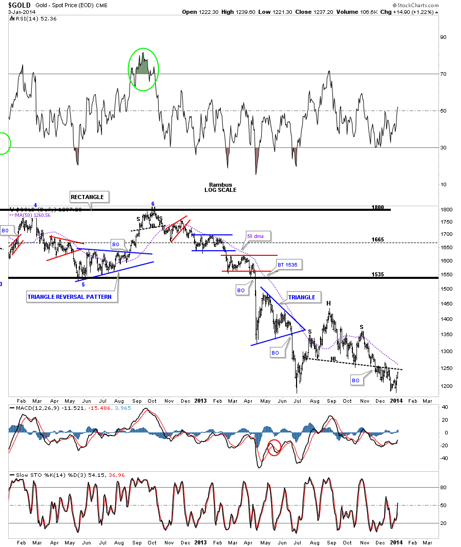
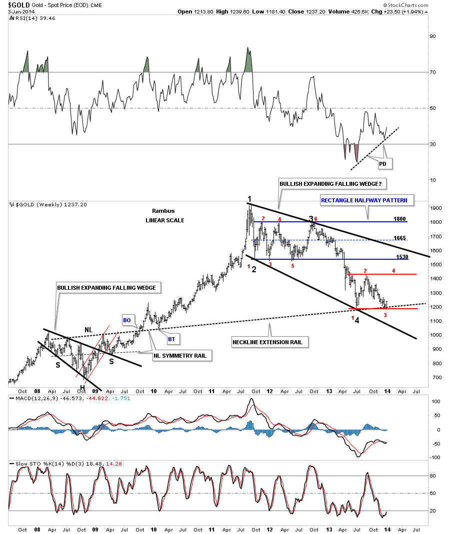
I mentioned that I spend almost as much time looking for the bullish scenarios for the markets as I do the bearish scenarios. This chart below is similar to the chart above except I’ve added what could be a bullish expanding falling wedge as a very large consolidation pattern that has formed since the 2011 high. I just want to state right here, I’m still in the bear camp without question. Gold has a ton of work to do to turn this chart positive. At the very least gold is sitting on support right here at reversal point #3 which is really a multi year low going back to 2010. I’ve labeled the reversal points in the falling expand wedge with bold black numbers. As you can see if the June low holds, for whatever reason, that would mark the 4th reversal point within that pattern once it broke the top black rail. Note the 2008 bullish expanding falling wedge that looks similar to our possible current one.
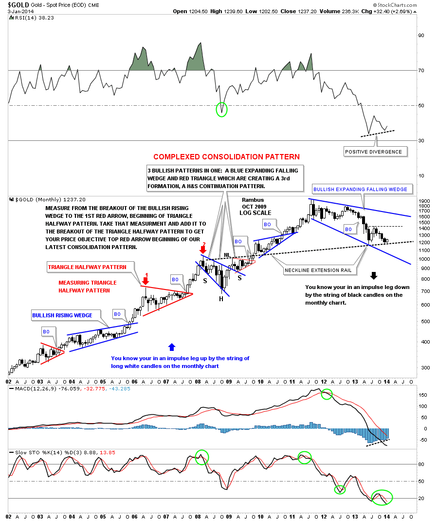
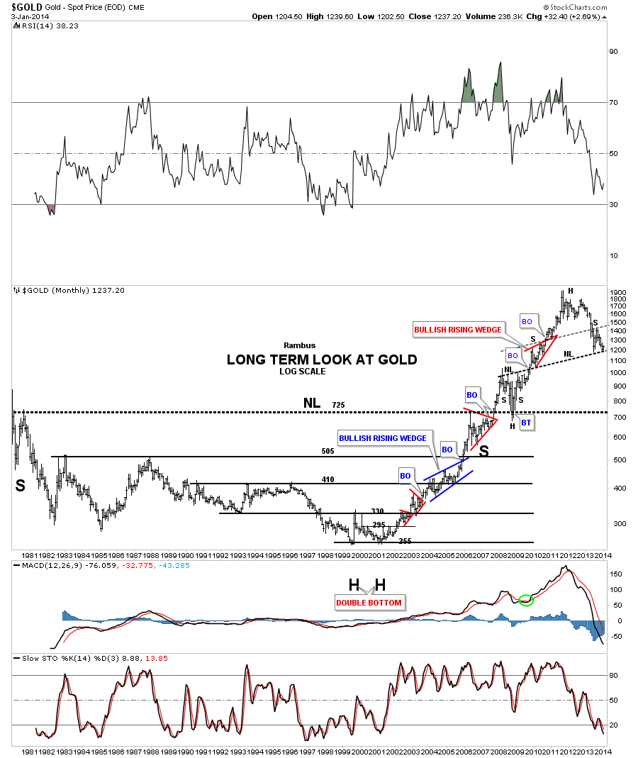
Let's take a very long term look at gold that shows the important chart patterns since the bull market began. This chart shows how our possible current bullish expanding falling wedge would fit into the bull market that began in 2001. Note all the white candles that formed in each impulse leg up during the bull market years when the price action broke out of one of those consolidations patterns. Note all the black candles that have formed during gold’s bear market impulse legs down. You can see the black candles that were made during our last decline that stopped at the neckline. It is way too early yet, as the month of January is just beginning, but if gold is to find a bottom here it would be nice to see a white candle at the end of the month.
This next chart is a very long term look at gold that goes all the way back to the 1980 high. You can see the multi year huge bases that were made to launch gold’s bull market. The chart above had a bullish perspective, this one has the potential bearish look that we’ve been following for quite awhile now. The million dollar question right now is is gold building out a right shoulder for the H&S top? There is still one more scenario I could throw in throw in here that nobody is looking at. This is one of those WHAT IF moments. What if gold is building out a high level consolidation pattern ranging from the all time high at 1920 and the low at 1180. If you look at the price action in the 90′s you can see there were some very long periods of side ways price action. It’s only a possibility but we have to be aware that this can happen.
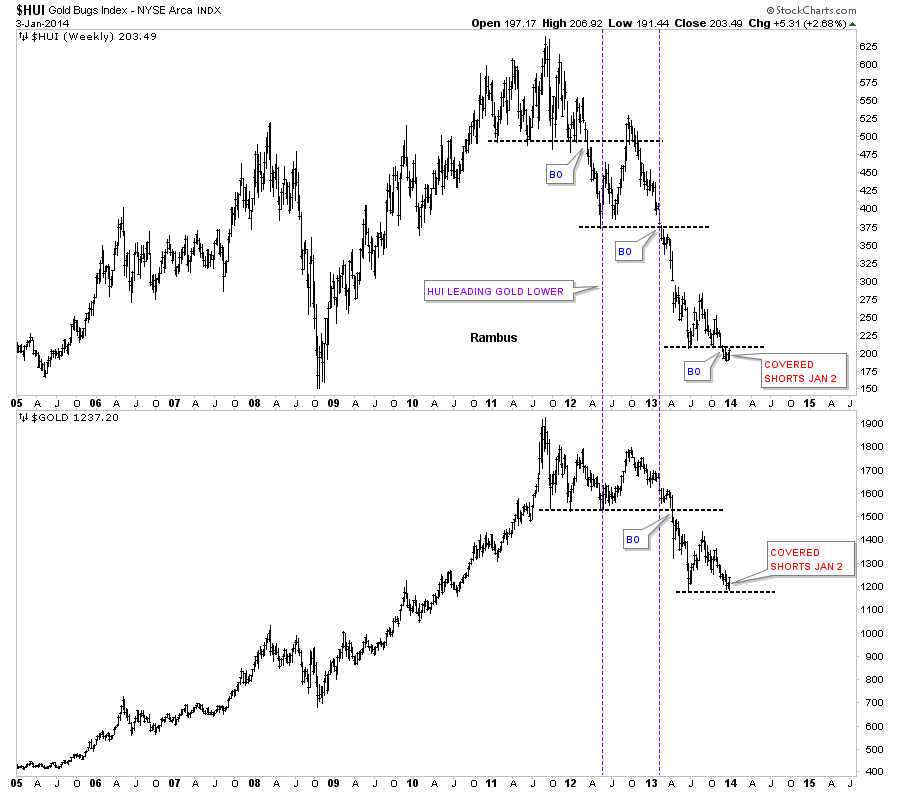
Below is a combo chart that has the HUI on top and gold on the bottom. As this chart shows the HUI broke down well ahead of gold. Even today the HUI is trading below its June low while gold has found support there. So who’s leading who?
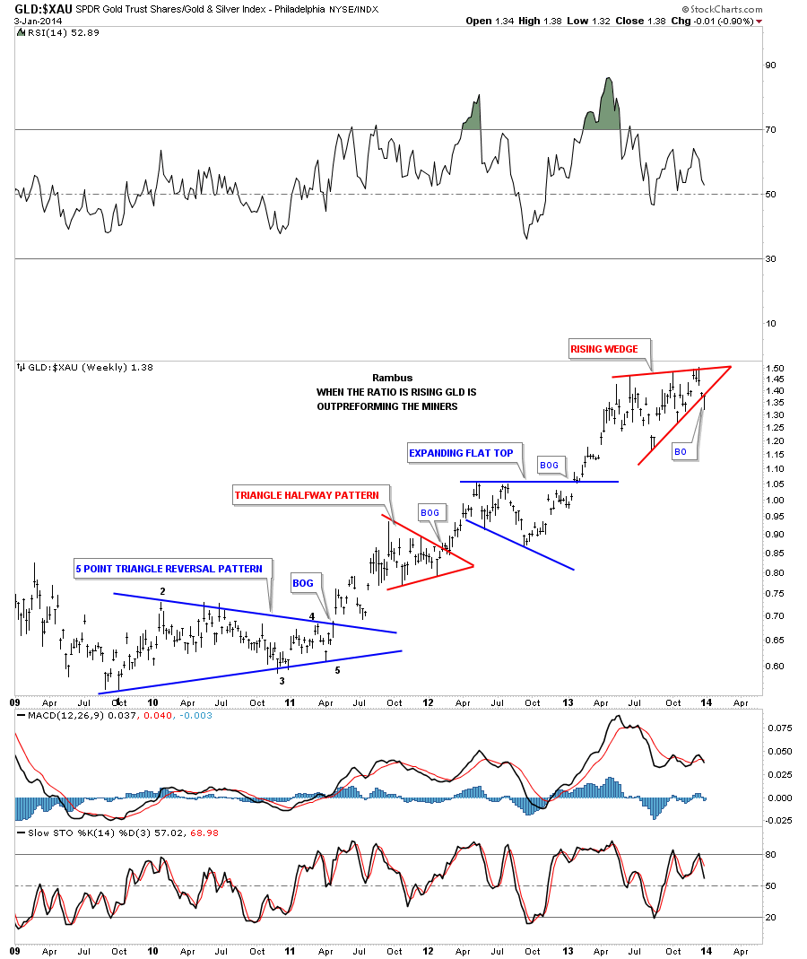
There was an important development this week in the GLD to XAU ratio. I have shown you this chart many times as it has been building out a rising wedge formation. This week it broke below the bottom rail. This could be a very big deal for the precious metals stocks as they have not been this far out of whack with gold in history. Is it possible a means to something halfway normal could occur with this ratio? If we see this ratio continue to fall we’ll know something is in the wind.
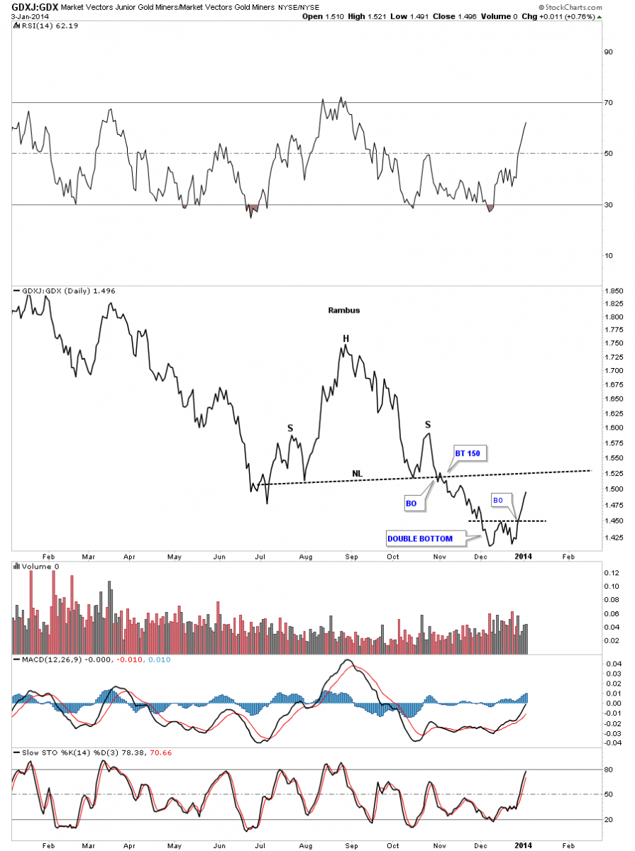
I want to show you one last chart that compares the GDXJ to GDX, the small caps vs the big cap ratio. As you can see this ratio put in a nice H&S top as the big cap precious metals stocks were outperforming the small caps. Just recently this ratio put in a small double bottom and has broken out. If this ratio can trade above the neckline extension rail that would be a really positive event. I know it should be the other way around where the big caps lead and the small caps play catchup according to the fundamentals but for the last couple of weeks the juniors have been outperforming the big caps.
What these charts above are telling us is that we are at an inflection point in the precious metals complex. Gold is King so if it’s putting in a bottom the rest of the complex will follow. This week should be very telling as everyone will be back from their Christmas break. Playing the long side for a while will be a nice break as there are so many more options to play with. One can just buy GLD, SLV or the GDX with no price depreciation. And of course we can buy individual precious metals stocks as well. I’ve been working on a shopping list for some of the precious metals stocks that I may recommend soon for at least a short to intermediate term move. You should be working on your own also. Stay strong. All the best…Rambus
 Meet Rambus, a seasoned trader and technical analyst renowned for his unbiased and insightful chart work. Through his website, Rambus Chartology, and Substack newsletter, Rambus shares his expertise with a global community of subscribers, providing daily updates, commentaries, and hands-on training in the art and science of chartology. With his calm, humble, and down-to-earth approach, Rambus demystifies complex market trends, helping his followers navigate the challenges of today's volatile markets. Join the Rambus Chartology community today and discover a unique blend of technical analysis, trading expertise, and time-tested protocols. Subscribe now at www.rambus1.com or https://rambuschartology.substack.com/


