Gold/Silver Ratio, SPX, Yield Curve And A Story To Tell


I most often use linear scale charts for stocks, markets and indicators for their more absolute views. But in the case below we conjure up a long-term log scale chart showing the Gold/Silver Ratio (GSR) and the S&P 500 (SPX), as it works better in providing a percentage-based relationship between an indicator of market liquidity and inflation when declining and lack of liquidity, deflation or… it has to be said, Goldilocks, when rising.
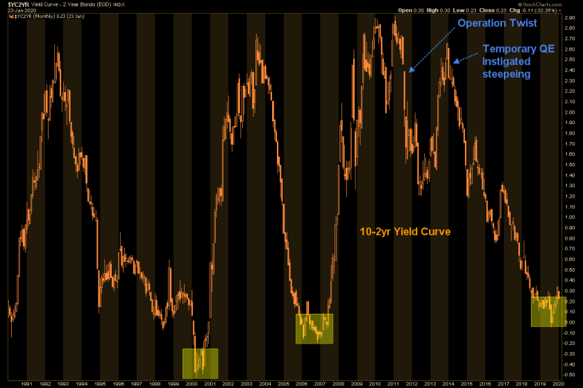
Now, when viewing the most recent Goldilocks phase, where SPX has gone in positive correlation with the GSR we will have to suspend disbelief that this is anything normal or natural. It was created by will of man as first the Bernanke Fed conjured a balls out inflation out of 2008’s deflationary destruction and then as a crowning achievement, concocted Operation Twist in order to manipulate the bond market into flashing this signal… ‘Nope, no inflation here!’
It was a macro parlor trick to “sanitize” (the Fed’s own word used to describe the operation at the time) the inflation signals the Fed itself had created. The scam was to buy (manipulate) long-term Treasury bonds and sell (manipulate) short-term Treasury bonds. Those are debt instruments traditionally used by the mythical posse known as the Bond Vigilantes (back in a more innocent time) who would use the bond market for its inflation signals, and in turn signal it to the world.
But this is a new Wonderland, where anything is now possible and you need a completely open mind in order to manage it, because we have long-since abandoned normal. By will of man Op/Twist eventually kick started the yield curve in a southerly direction and instigated an epic flattener that has run with the man-made (manipulated) boom in stocks to this very day. More on that below.
But first, when talking about and illustrating a thoroughly manipulated macro over years and decades it is tempting to try to throw the kitchen sink at any given article. There’s so much more to the picture. But here I want to try to avoid information overload (always hard for me) and just give you a picture to consider. It’s a picture of the post-1980 journey together taken by this macro indicator (GSR) and the world’s most visible stock market (SPX).
Click the chart for the full size version.
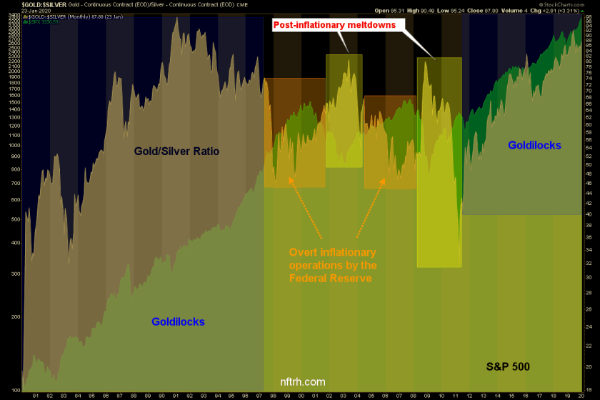
When I note “Goldilocks” for instance, please allow artistic license. I know that the thing has been screwed with every which way from Sunday. But the relationship is what it is to this point, regardless of its inputs. And what it is in my opinion is very vulnerable to a steepening yield curve if that is what is in store for 2020. The curve has flattened post-Op/Twist and Goldilocks has flourished. A new steepener would significantly change the global macro at best and bring destruction to that which thrived under the flattener at worst.
I guess the main point that the chart above is trying to make for us is that the bull market in stocks that has taken place post-2011 (and post-Op/Twist) is nothing like the inflated bull market that terminated in 2007 or the last (inflationary) phase of the bull market that terminated in 2000. This bull market has feasted on the rising GSR and lack of inflation signals (and flattening yield curve) that went with it.
The market needs a clearing of the distortions and manipulations. Unfortunately, I am not able to write intelligently about the path that would be followed toward such a situation because we are off the charts, off of traditional indicators and into new possibilities. These could range from perma-inflation and a von Mises Crack-Up-Boom to complete and utter deflationary destruction.
One thing is clear though; a steepening of the yield curve (linear scale) would significantly inform the nature of the next major macro change. The tack we are taking in NFTRH is to be on the right side of events, constantly evaluate and adjust and above all, take profits, maintain balance (the precious metals have worked wonderfully in that regard since May) and manage risk along the way. In due time, the unclear details will also emerge.
Subscribe to NFTRH Premium (monthly at USD $35.00 or a discounted yearly at USD $365.00) for an in-depth weekly market report, interim market updates and NFTRH+ chart and trade setup ideas. You can also keep up to date with actionable public content at NFTRH.com by using the email form on the right sidebar and get even more by joining our free eLetter. Follow via Twitter @NFTRHgt or StockTwits.
**********
More from Gold-Eagle


