Great Expectations For Gold, Silver And The Precious Metals Mining Companies In 2020


I’ve been missing-in-action for the past month, during which many interesting things have happened in the market, such as the Dow Jones making eight new all-time highs as it advanced 893 points since December 20th.
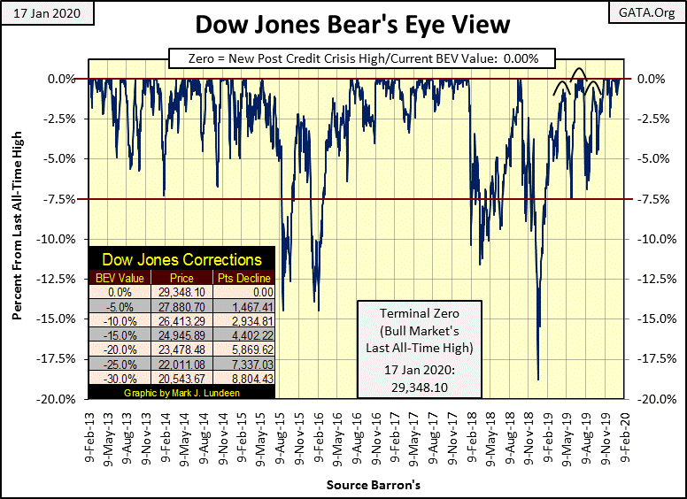
How much more can the Dow Jones advance before gravity once again pulls it down into correction territory? Let’s call that below the -10% BEV line below, or 26,413.29, a loss of 2,934.81 points in the Dow Jones (see table in chart).
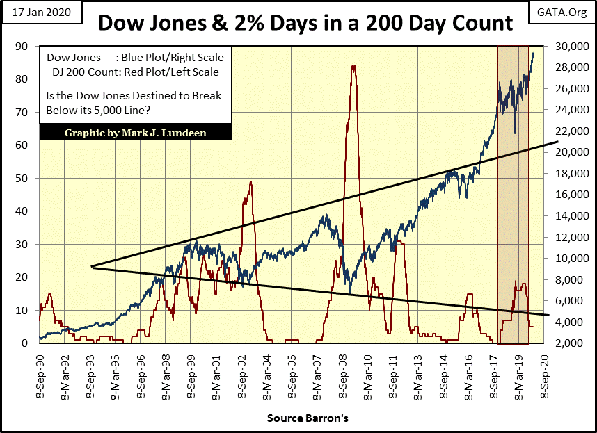
Who can say? The best answer I can give that question is the Dow Jones will continue advancing until it once again sees frequent days of extreme volatility, or Dow Jones 2% days, days the Dow Jones moves +/- 2% or more from a previous day’s closing price. Until then, don’t be surprised should the Dow Jones rise well above 30,000.
Below I have plotted the Dow Jones (Blue Plot) with its 200 count (Red Plot), or the number of 2% days the Dow Jones has seen in a running 200 day sample. We saw low volatility (low values in the 200 count) in the 1990s until volatility began rising in 1997. The Dow Jones then peaked in early 2000, and then saw a big 38% market decline in October 2002 as the 200 count reached 49 in April 2003. So, the 200 count proved to be a leading indicator for a bull market top, and a lagging indicator for a bear-market bottom.
Post April 2003 with the 200 count in decline, the Dow Jones then inflated to its sub-prime mortgage bubble high in October 2007. As expected, in the summer of 2007 the Dow Jones began seeing 2% days. At the Dow Jones’ bull market peak in October its 200 count had risen to eight and the count would continue increasing until it reached 84 in April 2009; one month after the March Dow Jones 54% bear market bottom. Again the 200 count gave a heads up to a bull market top, and a safe reentry signal after a bear-market bottom.
The same happened with the 200 count during the bull market of the 1920s and the Great Depression crash.
No market indicator is 100% dependable, and a rising 200 count may only signal a correction, as was the case in late 2018 when the Dow Jones’ 200 count increased to 19 on an 18% market correction. But following the Dow Jones 200 count since January 1900 proves it has worked well during all the significant market tops and bottoms, and that’s good enough for me.
This chart is amazing. These bear markets of 2000-2002 and 2007-2009 saw big bear market bottoms. In fact the bear market of October 2007 - March2009 was the second deepest market decline the Dow Jones has seen since 1885, exceeded only by the Great Depression’s 89% market crash.
But in afterglow of the 22,801 points the Dow Jones has advanced since its 09 March 2009 bottom, this chart no longer displays the bear-market drama everyone felt in October 2002 and March 2009 at those big market bottoms.
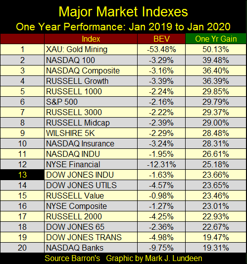
Let’s see how the major market indexes I follow performed in 2019 (table below), from 02 January 2019 to 02 January 2020. The gold miners in the XAU were clear winners in 2019, but even the bottom dwellers in the list advanced by at least 19%. Question: can 2020 repeat the performance of 2019? I can’t say, but if the “policy makers” continue doing in 2020 what they did in 2019 it just might.
All the same I’m keeping an eye out for Dow Jones 2% days. Should we get five or six of them during a two month period I’d find that concerning. The Dow Jones’ last 2% day happened in August, and it’s getting moldier every day.
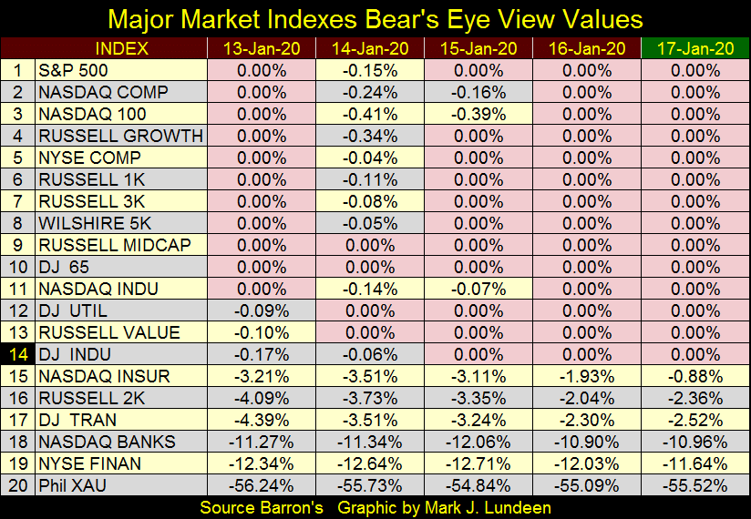
Next are the BEV values of the Major Market Indexes seen above for last week. I highlighted the new all-time highs (BEV Zeros) in pink, and there are lots of them. Thursday and Friday saw fourteen BEV Zeros, with #15-17 in scoring territory (within 5% of a new all-time high).
The financial indexes (#18 & 19) are near to single digit percentages from their last all-time high, which for the NYSE Financial Index occurred on 04 June 2007. The NYSE Financial Index then saw a 79.86% bear-market bottom in March 2009. It may have gone down to -100% BEV level, a total wipeout of the big Wall-Street banks had Dr. Bernanke not rescued Wall Street from their sub-prime mortgage woes with his three QEs. Eleven years later, the NYSE Financial Index is finally approaching a new all-time high.
Since November, the Dow Jones once again is seeing one new all-time high after another. As of the close of this week the Dow Jones has seen an additional twenty-three new all-time highs in the past two and a half months.
As far as the public is concerned nothing could be more normal than seeing a rising stock market. This is understandable as since August 1982, thirty-eight years, the Federal Reserve has actively “supported market valuations.”
It wasn’t always so, as before 1913 there wasn’t a Federal Reserve “injecting liquidity” into the financial system which it has since dominated.
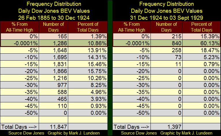
I created two frequency distribution tables below. The left one spans from February 1885 to December 1924. February 1885 is when Charles Dow first began his now famous Dow Jones Averages; December 1924 marks the start of the Roaring 1920s bull market which saw its last all-time high (BEV Zero) on 03 September 1929.
The table on the left displays the Dow Jones in a non-inflationary economy, where the volume of money in circulation is dependent on the volume of gold coins in circulation. To issue more paper money into circulation than a country had gold to back them was considered barbaric, something only banana republics did.
Looking at the rows for:
- 0%: Daily closings at all-time highs;
- -0.0001%: Daily closings just short of a new all-time high down to -4.999% from one;
We see in the first four decades of the Dow Jones Industrials that it closed at or within 5% of a new all-time high for only 12.25% of its daily closings. The Dow Jones “performance” suffered from this want of monetary inflation, rising from 40.85 in February 1885 to only 115.78 in December 1924; a gain of just 183.42% during these four decades.
So why did people buy stocks if their valuations didn’t inflate as they have since the 1920s? It wasn’t only the Dow Jones that didn’t inflate before the creation of the Federal Reserve. Consumer and producer prices in the economy also didn’t inflate under a gold standard. Actually prices in an economy under a gold standard are subject to deflation; meaning the goods and services offered by the economy increased faster than the money supply, so the money people saved became more – not less valuable over time. That plus the interest paid by banks on the public’s savings actually provided an extremely attractive real-world return.
Before the 1920s people purchased stocks because dividend income from stocks was greater than income from bond-coupon income, as dividend income was risker than from bonds. But all that changed after December 1924, as evident on the right side table above. The Dow Jones closed within 5% of a new all-time high in the following five years for a whopping 75.52% of those daily closings. Unfortunately, the boom time of the 1920s was followed by the bust of the Great Depression.
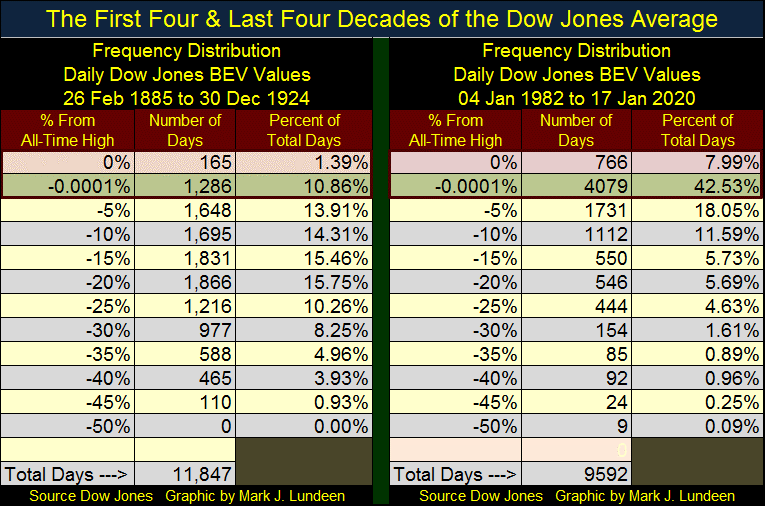
I also created a BEV frequency table showing the Dow Jones’ first four decades (left side) and the Dow Jones’ last four decades (right side) below. Note the number of days is different for the two four decade periods as Wall Street traded on Saturdays before the 1950s. But back then everyone had a six day work week too.
Since January 1982 the Dow Jones closed at or within 5% of a new all-time high for 50.52% of its daily closings, resulting in the valuation of the Dow Jones inflating from 882.52 at the close of 04 January 1982 to 29,348.10 at this week’s close, an increase of 3,219.77%. A valuation Increase such as this is only possible because the Federal Reserve’s Open Market Committee (FOMC) has used monetary inflation to actively “support market valuations” for the past four decades.
One might wonder if central-bank interference in the financial-market place is the new normal; that after four decades the FOMC has finally mastered their inflationary bull-market dynamics that would prevent the dangers of repeating the horrors of the depressing 1930s.
But I don’t think so.
Not when the FOMC:
- Has lost control over interest rates;
- Their involvement in the overnight repo-market has increased alarmingly;
- The debt burden they’ve laden on individuals, corporations and government is supportable only with current artificially low interest rates;
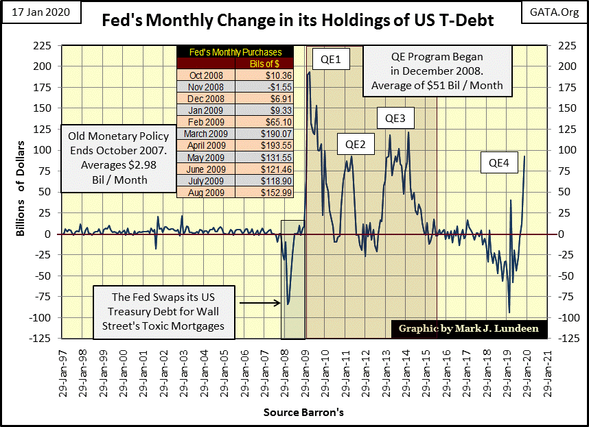
- And since October they have felt the need to deny initiating their fourth round of QE, which they have (chart below).
I think they, and the rest of us are in deep trouble for all the “policy makers” have done since they decoupled the US Dollar from the Bretton Woods $35 gold peg in August 1971.
But who cares about any of that when the market capitalization for Apple has increased by a fantastic 70.59% in a single year, and Microsoft’s single year market capitalization increase of 52.56% isn’t far behind (see table below).
I’m not an accountant; and I haven’t seen any of these, or any other company’s financial statements. But below is a list of the twenty biggest blue-chip companies trading on Wall Street, and seeing their combined market capitalization leap by 29.06% in the tenth year of a Dow Jones’ 22,801 point advance is not normal; actually it’s very alarming.
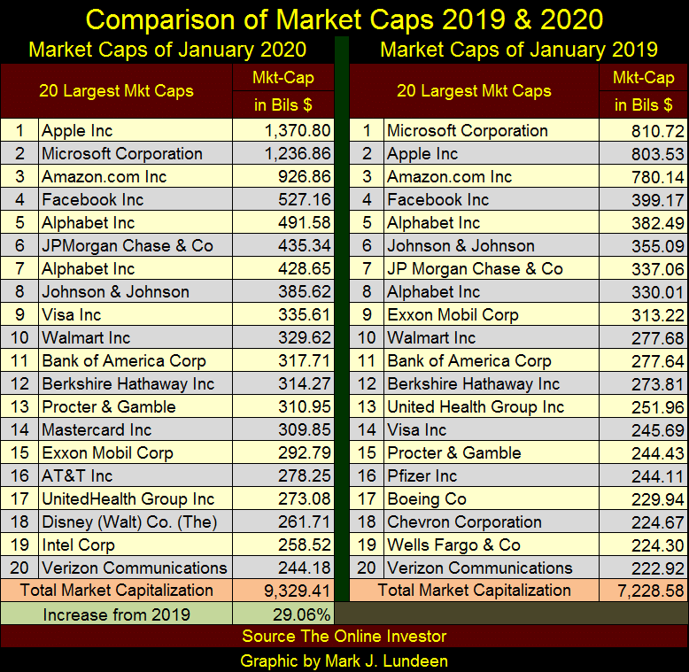
My first impression when I created the above graphic was to wonder how many of these companies would survive should bond yields and interest rates return to where they were in 2007. Damn what the Chairman of the Federal Reserve wants; one of these days bond yields are going to double, and then double again as defaults and counter-party failure become real-world horrors haunting the bond market.
In the chart below we see what a doubling of current bond yields would mean. That bond yields today are where they were in the late 1940s is only because the FOMC manhandled them down by using monetary inflation to “support market valuations” in the bond market.
These artificially low yields have encouraged corporations to load up on the cheap money available to them in the bond market (swapping equity for debt), to finance their share buyback and dividend programs.
Such practices would have been unthinkable in the late 1940s as corporate management, still traumatized by their personal experiences during the Great Depression strove to maintain their balance sheets strong. Today they are standard practice and I wonder what pending horrors now lay buried deep in corporate America’s finances.
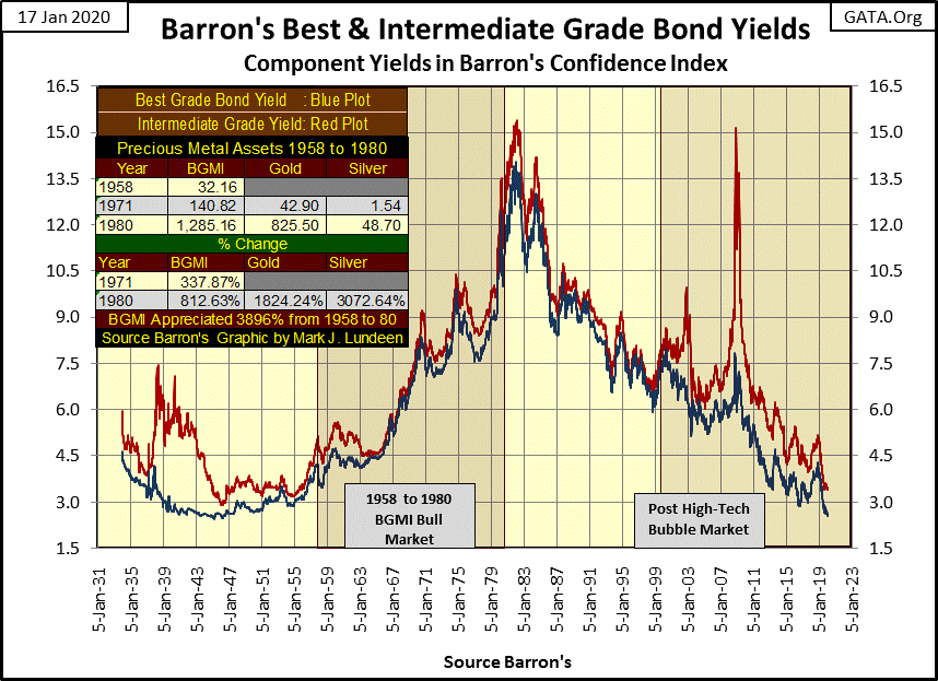
Note too that as bond yields and interest rates rose from 1958 to 1980, the Barron’s Gold Mining Index (BGMI) saw a wonderful bull market. I’ve provided the details in the table.
That since 2000 gold, silver and their miners have advanced as bond yields have collapsed is a remarkable testament of the potential power this still nascent precious metals bull market possesses. When yields once again rise, and bond (as well as stock and real estate) prices once again enter into a protracted bear market, the explosive potential of gold and silver will be revealed to all.
Next is a table listing the big market caps trading on Wall Street in 1975 and in 2020. In 1975, IBM with its then gigantic-market cap of 31 billion dollars was an astonishing-immense company. Everyone called it “Big Blue” because that’s what it was – the biggest and the best company in the world that brutally crushed all those who opposed it in the world of computing.
In 2020 IBM didn’t even make the list of the top 20 big-cap companies. Something investors in Apple, Microsoft and Amazon (2020’s #1-3) should keep in mind, how the mighty can fall.
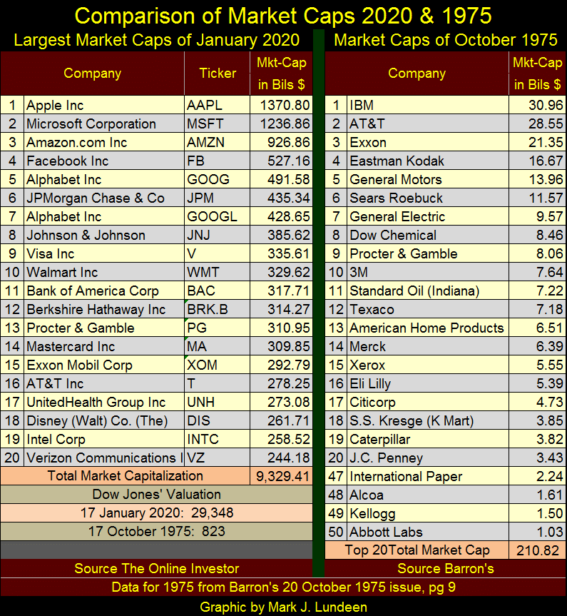
Anyway, the table above illustrates just how busy the Federal Reserve has been these past five decades “supporting” market valuations and market capitalizations of the companies trading on Wall Street. It’s all going to end badly – but when?
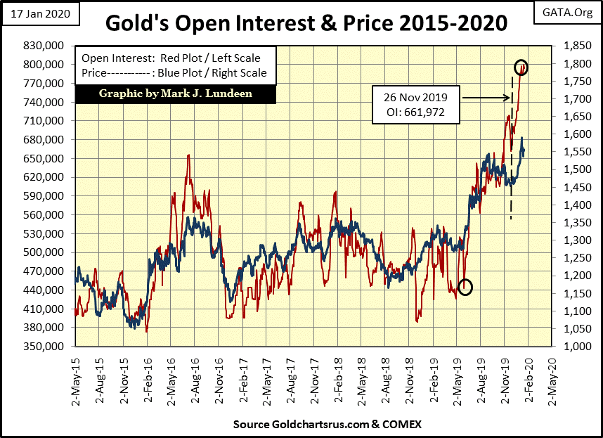
It’s not just me thinking this, I believe this is why gold and silver are doing so well as the big commercial shorts (the big Wall Street banks) flood the COMEX futures markets with digital-precious metals. This is gold and silver that doesn’t exist and can never be delivered to the real market. Since early last summer COMEX gold open interest (Red Plot below) has almost doubled, but the bulls in the gold futures market are holding on remarkably strong.
This has to be a growing concern for the COMEX, as all commodity exchanges guarantee their contracts. Yes, I know COMEX gold and silver shorts have the option of settling their contracts in dollars instead of delivering metal should circumstances demand it. That’s good for the big banks. But what’s to become of a gold market, like the COMEX, that fails to deliver millions of ounces of promised metal, forcing buyers to accept a check payable in dollars in lieu of precious metal instead?
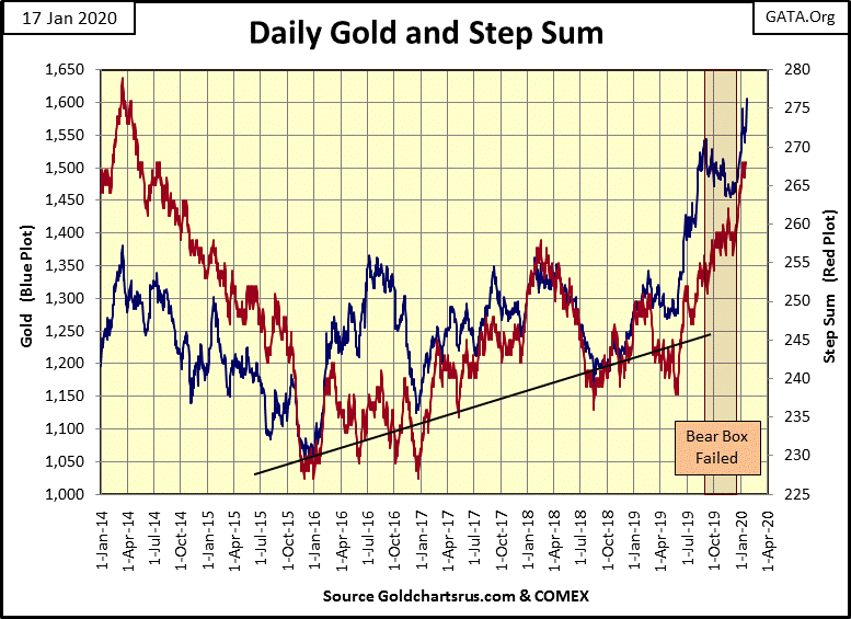
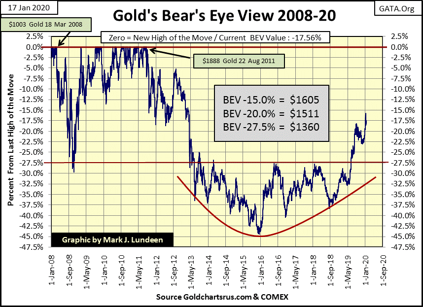
Also, the bear box in the gold market below has failed. Note how since late December the plots for the price of gold (market reality) and gold’s step sum (market sentiment) have both recoupled, but to the upside. This is unusual and I think highly encouraging for us bulls in the gold market.
In gold’s Bear’s Eye View (BEV) chart below spanning back to 2008, we see additional encouragement for the bulls in the gold market. Since May 2013 gold’s BEV -27.5% line proved an impenetrable level to rise above, until last summer when gold finally broke above it and is now poised to take out its BEV -15% line.
And most of this advance has occurred inspite of the COMEX commercial shorts increasing open interest in the gold market to historic levels. But then, since August 2011 gold has seen a 45% bear market bottom in December 2015, forming a beautiful six year bowl pattern on the decline, and on its rebound to once again break above its BEV -27.5% line last summer.
What we see below is a very powerful six-year basing and breakout chart pattern in the gold market. Just based on what I see below, gold could easily be in all-time high territory sometime in the next twelve months.
I’m not celebrating just yet, as these big banks don’t like to lose and aren’t above cheating if they have to. The government’s regulators exist to protect them.
…"There are two administrative law judges at the CFTC, myself and the Honorable Judge Bruce Levine. On Judge Levine’s first week on the job, nearly twenty years ago, he came into my office and stated that he had promised Wendy Gramm, [wife of then Republican Senator from Texas: Phil Gramm] then Chairwoman of the Commission, that we would never rule in a complainant’s favor. A review of his rulings will confirm that he has fulfilled his vow."
- CFTC Enforcement Judge George Painter in his retirement letter
Remember: we have the best government that money can buy, and Wall Street has more money than you or I do. I love President Trump as he’s really rattling their world.
Anyway, I remain bullish on gold, but until we see a significant reduction in open interest, say about 50% resulting in a historic surge in the price of gold, I’m not mortgaging the farm to speculate on the long side at the COMEX gold market. And the big break out for gold and silver may not happen until Mr Bear visits Wall Street bearing his gifts of deflation and counter-party defaults to the bulls now running wild and free in lower Manhattan.
But if you want to exchange some of your paper money for gold and silver bullion at today’s prices, I wouldn’t try to talk you out of it.
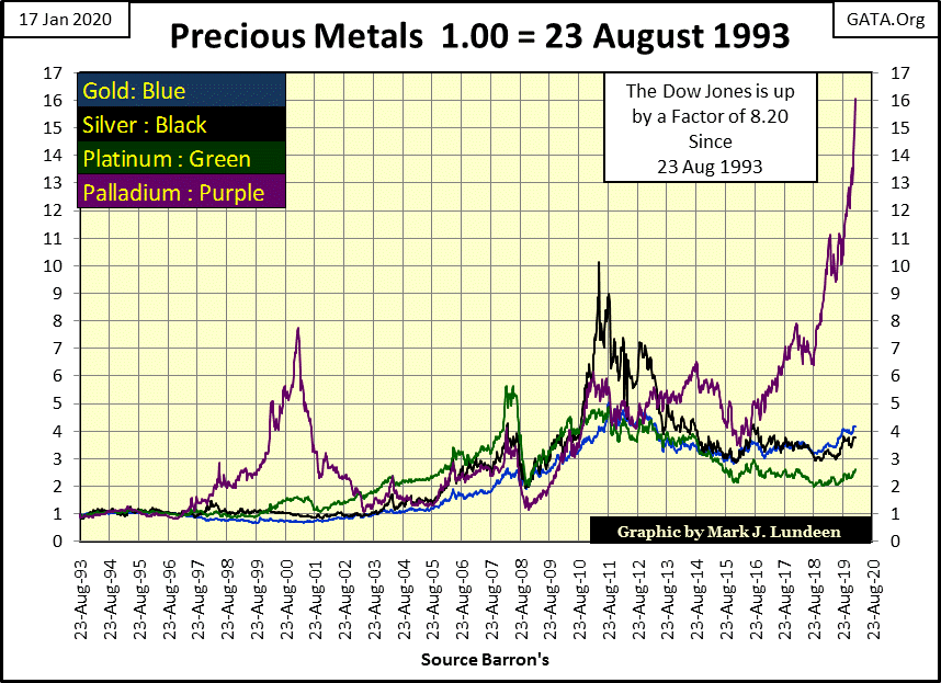
And what’s going on with palladium (chart below)? Well I don’t exactly know, but I like it! Should you buy some palladium? No. After a rise like that I’d be very concerned about a BIG pending correction. I know the market action for gold and silver is tedious, and has been for years. But I really think they are where one should be in the early days of 2020. Patience can be a virtue in the market.
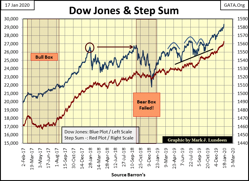
Looking at the Dow Jones and its step sum below; I find nothing wrong with this chart. Anticipating a pending correction in the stock market at this time is risking being gored by a herd of wild bulls.
But this too shall pass. Wait until the Dow Jones once again begins seeing multiple days of extreme market volatility – the dreaded Dow Jones 2% days. Should we see about 15 of these in the 200 count, this wild run by the bulls could change so fast it might make your head spin.
Finally a quick look at gold’s and the Dow Jones step sum tables below. Since December 11th both have seen more daily advances; +1 steps than declines; -1 steps. Gold’s step sum has advanced from 258 to 268 in the past twenty-five trading days, an advance of 10 in its step sum.
The Dow Jones’ step sum has advanced by 12 in the same time period. But in the past twenty-five trading days the price of gold has advanced by 6.29% as the Dow Jones managed an advance of only 4.32% even after its two additional daily closing advances.
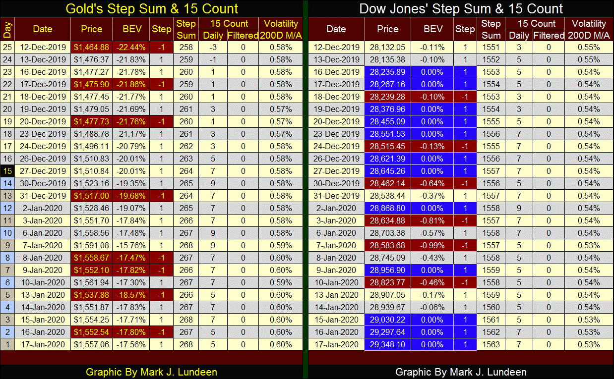
Considering the entire financial establishment is actively opposing any increase in the price of gold, while doing everything necessary to maintain upward momentum in the stock market, it’s darn impressive seeing gold outperform the Dow Jones this past month.
But I’m not the grateful type when it comes to markets. Yes, while I was missing-in-action we’ve had a great month for both precious metals and the stock market. But I’m back with great expectations for gold, silver and the precious metals mining companies in 2020. In the weeks and months to come should the COMEX gold bulls prove to be pathetic weaklings, I promise to let my readers know all about it.
Mark J. Lundeen
********


