July 2019 May Be A Big Month For Both The Dow Jones Index And Gold


Last week I was still optimistic on the prospects of the Dow Jones making new all-time highs in the weeks and months to come. However, seeing this tired old bull fall down and bang its head on the BEV -7.5% line below at the close of this week changes all that. And that -7.5% decline is from the BEV Zero of last October, but as recently as April 30th the Dow Jones was only -0.88% from making a new all-time high; less than 1% from making history, and the Dow Jones couldn’t do it.
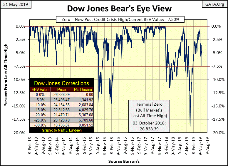
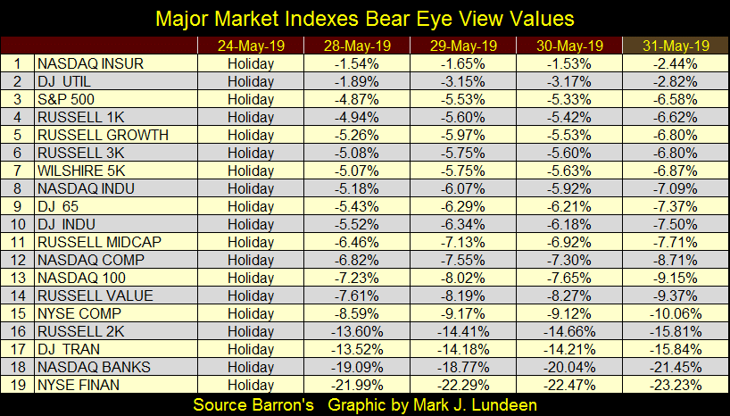
Failing to break into new all-time highs was an almost singular achievement of the Dow Jones. Most of the major market indexes, except for the Russell 2K, NYSE Financial and NASDAQ Banking indexes made market history in April and May. The S&P 500 (#3 below) made four new BEV Zeros in late April, but since then has been leaking “liquidity,” closing the week 6.58% from its last all-time high.
I don’t dwell on what the mainstream financial media has to say on the markets. However, looking at the headlines “market experts” are reporting the tariffs Trump levied first on China, and then on Mexico this week are responsible for the stock market’s recent reversals.
These tariffs may be the triggering events for these declines. But have no doubt the biggest problem this market has is its market valuations have been grossly inflated by the actions of the Federal Reserve for the past ten years. Should these declines begin to pick up in speed in the coming weeks, it will be very difficult for the “policy makers” to intervene and reflate the above market indexes’ valuations.
I’m going to resist the temptation of predicting what’s ahead of us in the next few months. But I’m thinking of deflation, and the summer of 2019 may be one to be remembered.
Looking at the Dow Jones daily bar chart below, we haven’t seen a week this bearish since last December. But this week didn’t produce a Dow Jones 2% day, and that’s saying something; that this week could have been worse. Meaning this week wasn’t climatic, so the current direction (down) for the market may be the path of least resistance.

The Dow Jones with its 52Wh High & Low Lines (Chart Below) is interesting.
-
In February 2016 the Dow Jones gave its 52wk low line a push down, the last time for the next three years.
-
The Trump Election rally (November 2016 to January 2018) is easy to see, the Dow Jones and its 52wk high line for about fourteen months were inseparable.
-
Following January 2018, the Dow Jones saw a much needed correction (12%), and then in October 2018 it once again pushed up its 52Wk high line, but not by much.
-
Following October’s all-time highs the Dow Jones saw a 19% correction on Christmas Eve before it began another run at new all-time highs in late April 2019.
The key item the chart below is flashing at us is that since February 2016, the Dow Jones has seen three surges towards new all-time highs (52Wk Highs too):
-
The first surge lasted for fourteen months, with new 52wk highs a daily occurrence.
-
The second surge lasted six months from April to October 2018 and produced only a few 52wk highs.
-
The last surge lasted only four months from January to April 2019 and produced no new 52wk highs.
One word comes to my mind when I look at this chart: exhaustion.
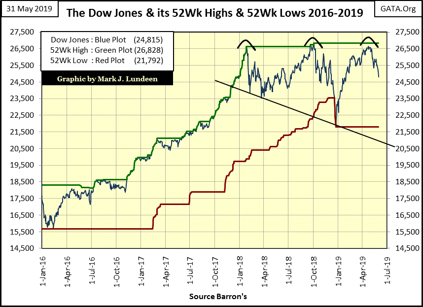
In the first numbered series above; what will #5 of the series tell us; the next 52wk line the Dow Jones will push on will be its 52wk low line? I believe that’s a very strong possibility, as the story this chart is telling us is one of the high-flying Dow Jones running out of gas at 26,593 feet (points) on April 30th.
Geeze Louise, on April 30th the Dow Jones was only 0.88% away from its 52wk high line, and it couldn’t get the job done? I wouldn’t risk a buck in this market. I’m keeping my seat in the peanut gallery, as the stock market in the summer of 2019 may best be appreciated as a spectator.
What could happen to change my mind? Let’s see some more new all-time highs! But really, this advance began over ten years ago. It’s time to let this bull die with dignity, and that means getting some distance between this stock market and your net worth.
The yield curve’s inversion is becoming more pronounced, and that isn’t bullish for the stock market. The two plots below are from Barron’s May 6th and June 3rd issues; in the past month some T-bond yields have declined by thirty basis points. That’s a lot!

Why are T-Bond yields going lower? I don’t think I can rightfully blame the FOMC on this one, at least not directly. The problem is there’s a lot of uncertainty in the world, like seeing the US stock market declining.
But last week’s national elections in Europe went to the political parties who favored leaving the EU, and for good reasons these people mean it too! So what does that mean to people and institutions whose worldly wealth is defined in terms of the EU’s euro? There are people and institutions, who own many billions of euros; and I’m looking at the above yield curve and thinking someone is selling euros and buying dollars via US T-bonds.
For a European fiduciary sitting on a few billion euros for a pension fund, in May 2019 they have to be at least aware of where the exits are located, because popular anger and frustration against the EU’s elitists class in Brussels is rising.
https://youtu.be/DPn0O2PRpD0?t=361
Here’s a chart for a 30 year T-bond issued in February 2011; the blue plot is its price and the red its yield. The entire T-bond market is about the size of the US national debt, as that is what T-bonds are; Uncle Sam’s IOUs.
What you’re seeing below is happening to every T-bond trading in the market, prices rising and yields falling. How much money flowing into New York does it take to make this post October 2018 move happen to the entire US national debt, and where is this money coming from?
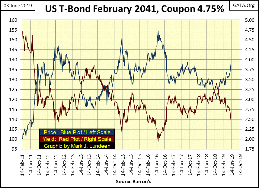
U.S. corporate and municipal bonds are strong too, but nothing like the rush into Uncle Sams “IOU Nothings” trading in the Treasury market. But then since the 1980s moving money into the Treasury market has been big money’s response whenever uncertainty appears in the global market place. And since the 1980s it’s been the correct thing to do.
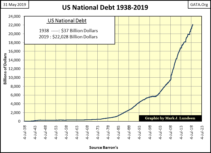
But considering the growth in the US national debt (chart below), how much longer will T-bonds continue being seen as a safe haven? And when that perception changes and money begins to flow out from the $22 trillion dollar T-bond market, where can it go?
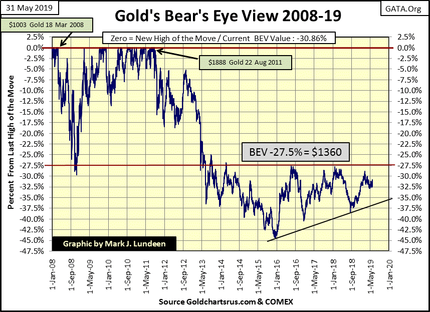
Once again gold in its BEV chart below closed the week “attractive.” But unlike previous weeks, as May 2019 comes to a close, it seems something is happening in the gold market. Gold closed the week over $1300, something not seen since early April.
What’s needed now are some days of extreme volatility in the gold and silver markets; >3% days for gold and >5% days for silver. We haven’t seen them since late 2016, and the old monetary metals have done little in the below BEV chart since.
At week’s close the Silver to Gold Ratio (SGR) was 89.57 ounces of silver for one ounce of gold. In terms of gold, silver hasn’t been this cheap since 1992. If you like gold you have to LOVE silver.
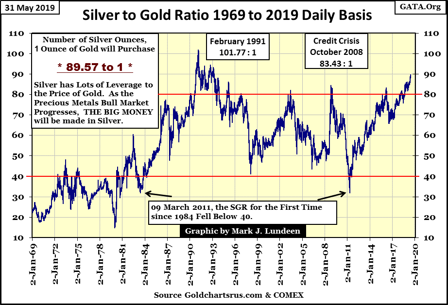
I know I’ve been saying this for many years, but when the precious-metals bull market resumes, people will want exposure to silver, as silver is the best way to play a bull market in gold.
Using today’s closing prices in the table below fixes the SGR at 89.55. When the price of gold once again begins advancing, silver’s response will be to advance too, but at a greater rate than gold sending the SGR lower. This situation will create opportunities for precious metals investors. For example; when gold reaches $4000 an ounce, a SGR of 15 is very possible, which would fix the price of silver at $266.67 an ounce.
Keep in mind this is only an example. No one today can possibly know what the SGR will be when gold is trading for over $4000 an ounce. I used a SGR of 15 as that was its low at the top of the 1969 to 1980 gold and silver bull market. In the coming bull market the SGR may not fall to 15, and then it’s possible it could decline far below 15.
Should the SGR decline to 1.00, the price of silver will be equal to the price of gold. That would be a happy day for me. But then should my neighbor buy me a Maserati sports car just because he thinks I’m a great guy – that too would be a happy day for me. It could happen. There are no laws of nature or man preventing my neighbor from buying me a Maserati. But like seeing the SGR decline to 1, I think it’s best I don’t plan on it.
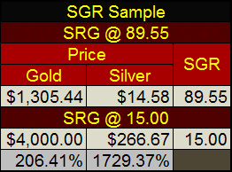
Look at the performance comparison between gold and silver in the example above. Seeing the SGR decline to 15, owning gold returned 206% to investors, while silver returned 1729%. That’s quite a difference.
For an individual whose allocation of physical bullion is worth only ten one ounce coins of gold, they should consider forgoing the ten gold coins in favor of 895.5 ounces of silver the current SGR would provide them.
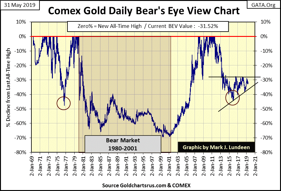
Let’s take a look at the long-term Bear’s Eye View (BEV) chart for gold below. So, what are we looking at here; the daily changes in the price of gold as Mr Bear sees them. Being a dumb beast, he likes keeping things simple; simple like every new all-time high is worth only 0.00%; only a big fat zero and never more to Mr Bear. As far as gold’s dollar valuations go, the first time it below broke above $100 as a new all-time high (14 May 1973 / $102.50), or $1,000 (08 Sept 2009 / $1002.80) it’s all the same to Mr Bear: 0% and never more.
The only thing Mr Bear cares about is how many percentage points from each new all-time high can he claw back from the bulls, and that is precisely what we see below; new all-time highs (BEV Zeros / 0%) and percentage claw backs from those BEV Zeros.
In effect, the Bear’s Eye View compresses a data series into a range of only 100% with:
-
0.00% = New All-Time Highs
-
-100% = Total Wipeout in Valuation
With a BEV chart we can objectively compare the price action in the gold-bull market spanning from 1969 to 1980, with the twenty-one year bear market that followed, and with the 2001 to 2011 bull market and the eight year bear market that followed August 2011.
During the 1969 to January 1980 advance in the price of gold, 286 daily closings closed at a new all-time high (See BEV Frequency Distribution Table below, left table).
Note: the -0.000001% row catches all daily closings a penny or less from a new all-time high down to -4.99% from a last all-time high. This row appears odd in the table, but using it allows only actual new all-time highs to pass into the 0% row.
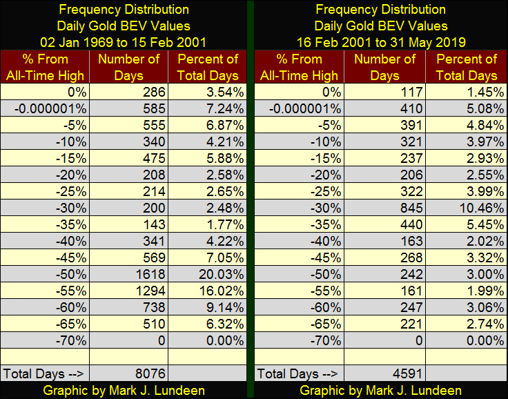
As seen in the BEV chart below, gold saw one 20% market correction in 1970, two 25% market corrections (1973 & 1974) and a 48% market correction in 1976. This bull market correction is actually greater than gold’s 47% bear market bottom seen in December 2015.
Typically a 48% correction is called a bear market, but two years later gold was once again making new BEV Zero’s in the chart below. Note the clustering of BEV Zeros during the two years from 1978-79. Major market advances always produce clusters of BEV Zeros in a BEV chart. Exactly how many dollars the price of gold increased as these new all-time high clustered themselves on the 0% line a BEV chart can’t say
This is how the 1969 to 1980 gold bull market appears in a BEV Chart; 286 new all-time highs with corrections as deep as 48% between them.
In the twenty-one year, 70% bear market that followed, the bulls had a hard time of it as you can see with gold’s red step sum plot below.
In the first year of the bear market (Jan 1980 to Jan 1981) gold step sum continued rising (more daily advances than declines) even as the price of gold continued to deflate. I didn’t mark it as such, but this was a bear box.
Following January 1981, gold’s market reality (Blue Price Plot) and market expectations (Red Step Sum Plot) were in synch until September 1990, when gold’s price and step sum plots decoupled; creating a massive six year bear box.
The rules for when a step sum box (bull or bear) begins and ends are subjective, especially when one is looking at the market in real time. But looking backwards we see market history with 20/20 vision, and in the step sum chart below its clear the bulls in autumn 1990 believed the bottom was in the gold market and they began buying, as seen in the rising step sum plot within the bear box.
That the price of gold for the next three years continued to decline didn’t change that, as bulls in a bear box believe market declines are buying opportunities. That was until early 1996, when both market reality (Blue Price Plot) and market expectations (Red Step Sum Plot) began their terminal bear-market collapse.
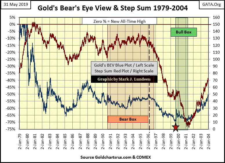
The late 1990s were a brutal conclusion to a twenty year bear market in gold and silver. After the bear box closed in 1996, the price of gold itself declined for the next three years, bottoming in July 1999 at $253 an ounce; a 69.8% bear market decline from its 1980 bull-market top of $840 an ounce. But the gold market itself was so traumatized by Mr Bear, its step sum (market expectations) continued collapsing for an additional two years, creating a bull box from July 1999 to February 2001.
In late winter of 2001 gold saw a double bottom when it closed at $255 an ounce. The bears and panicking bulls couldn’t push the price of gold below the $253 seen in the summer of 1999. Shortly thereafter gold and its step sum briskly turned upward, marking the start of the 2001 to 2019 gold bull market.
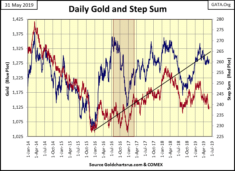
Gold’s current step sum chart is next. We’re in a holding pattern waiting for something to happen. But it’s encouraging seeing gold’s step sum declining a bit as the price of gold ignores the net down days in the market.
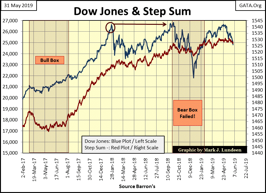
The case for the Dow Jones being in a bear box continues. The bulls know the market is declining, but they expect the current market decline will prove to be yet another buying opportunity, as has been the case for every major market decline since August 1982.
How do I know that? I really don’t. But looking at how the red step sum plot has so far refused to decline with the Dow Jones suggests exactly that. Since last October the Dow Jones has been all over the chart below, but the step sum has for the most part refused to track along with the changes in the Dow Jones.
If the Dow Jones should break below 24,000 in the weeks to come without its step sum suitably breaking down with it, I’m going to upgrade the bear box in the chart from “Failed” to current and extend its right side over to include the summer of 2019.
Looking at gold’s step sum table, since April 26th gold’s step sum has fallen by a net of 4 declining days, yet the price of gold has increased from $1286 to $1305. As James Dines would put it; “it’s a game fish that swims upstream!”
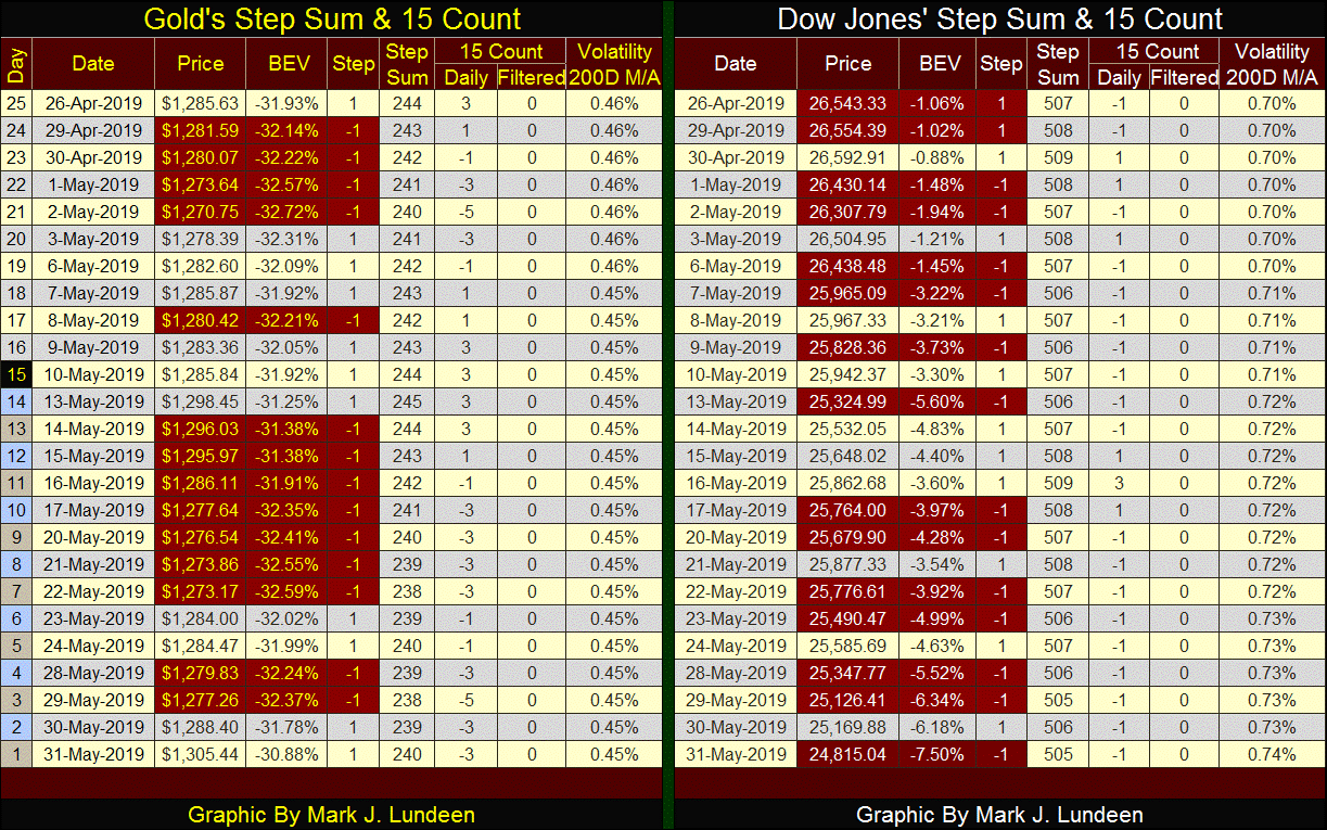
But in my last article for May 2019, it’s the Dow Jones side of the step sum table that is interesting. Since the April 30th market top of the current surge I mentioned earlier, the Dow Jones has deflated from a BEV value of -0.88% to -7.50% at the close of this week. That’s a decline of 1778 points as its step sum declined from 509 down to 505, a net of only four declining days.
So both gold and the Dow Jones step sums have fallen by four steps, but there is a world of difference between these two markets.
This is especially true when we consider where these markets currently are. Gold is currently bouncing off of a 45% bear market bottom, the December 2015 market bottom. This compared to the Dow Jones, who after failing to breaking out to a new all-time high this month, is now 7.5% from its last all-time high of October 3rd of last year.
As June 2019 begins, gold appears to be the superior investment. Before July 1st crosses our paths I’m expecting some excitement in the markets, and my money is on the old monetary metals and their miners.
Mark J. Lundeen


