The Keynesian’s Fetish For Monetary Inflation


Publication note: I’ll be taking next week off, be back April 22nd.
If I were to choose one word to describe the current market, it would have to be tedious. The Dow Jones is no longer going up, but as we see in its BEV chart below, it’s really not going down either.
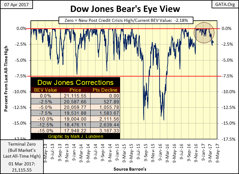
The Dow’s BEV chart begs the question of whether its next move will be to make a new all-time high (BEV Zero) or decline down to its BEV -5% line. I’m inclined to expect the Dow will break below its -5% line above.
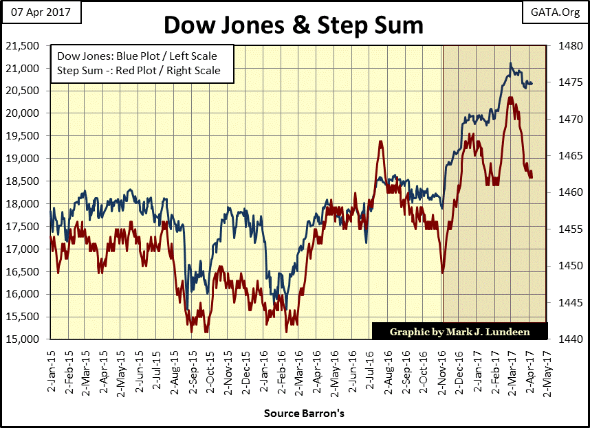
However, the Dow Jones (Blue Plot) with its step sum (Red Plot) below shouldn’t inspire the bears to short the market.
The step sum is a single item A-D line using a market series’ own daily advances and declines in its construction. The best way to understand the information gained by studying a step sum is that it’s a measurement of market sentiment.
For the past month the traders on Wall Street have been heading for the tall grass if the red step sum plot below is to be believed. Still, with the Dow Jones seeing an overwhelming number of daily declines over daily advances since the beginning of March, the Dow Jones has only declined by 2.18% from its last all-time high as of the close of today (see BEV chart above).
If the current advance wasn’t long in the tooth, which this one is, I dare say that one should be bullish on the stock market, which I’m not.
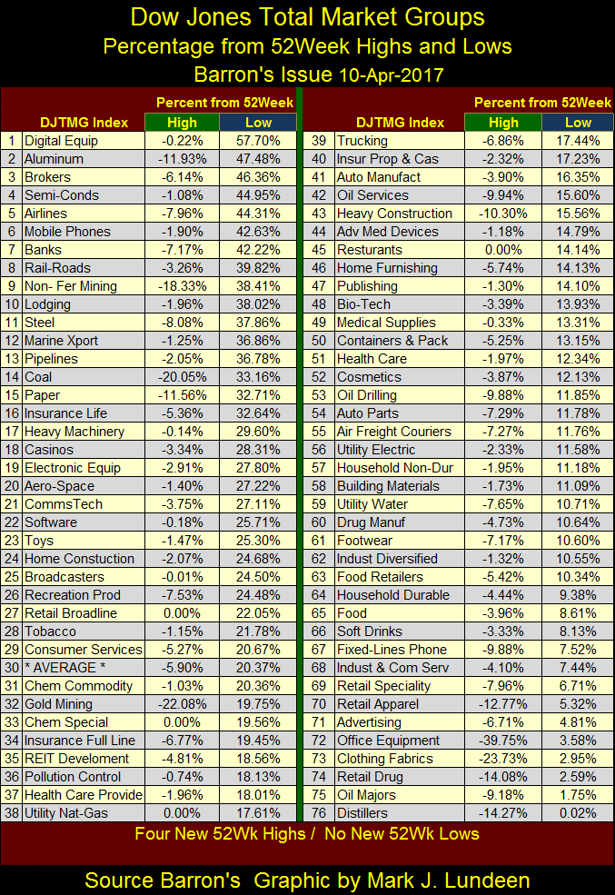
One bearish factor in this market is that the Dow Jones Total Market Groups’ (DJTMG) top 20 (the number of groups within 20% of their last all-time high) peaked in July 2014 at 52. The top 20 in the chart below closed the week at 46, and is in no hurry to break above its highs of three years ago.
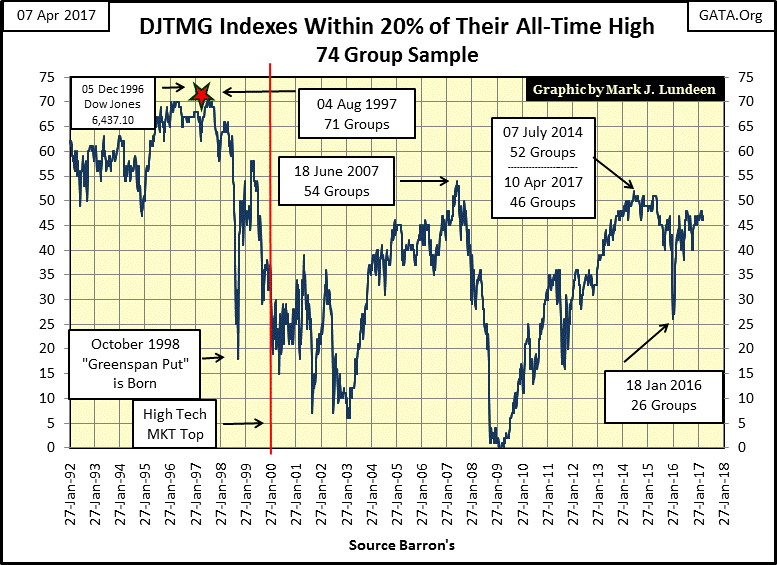
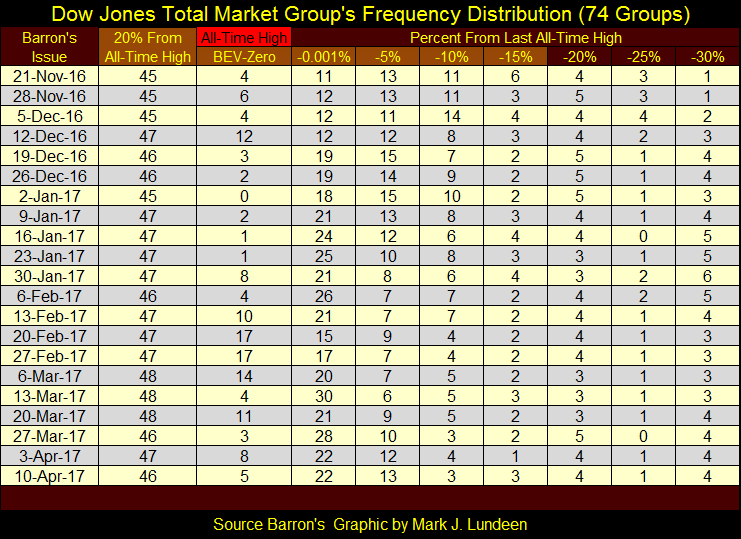
The DJTMG’s frequency distribution table below tells the tale. The top 20 data is found in the column labeled 20% From All-Time High, which is simply the sum of groups from columns BEV Zero (All-Time Highs) down to the -15% column.
The problem for the bulls in this market is that it lacks the “liquidity” to drive those groups in the -20% and below columns, up towards their last all-time highs. Until this happens (which it may not) I don’t expect we’ll see much excitement from the stock market.
The banks have done well since the November elections.
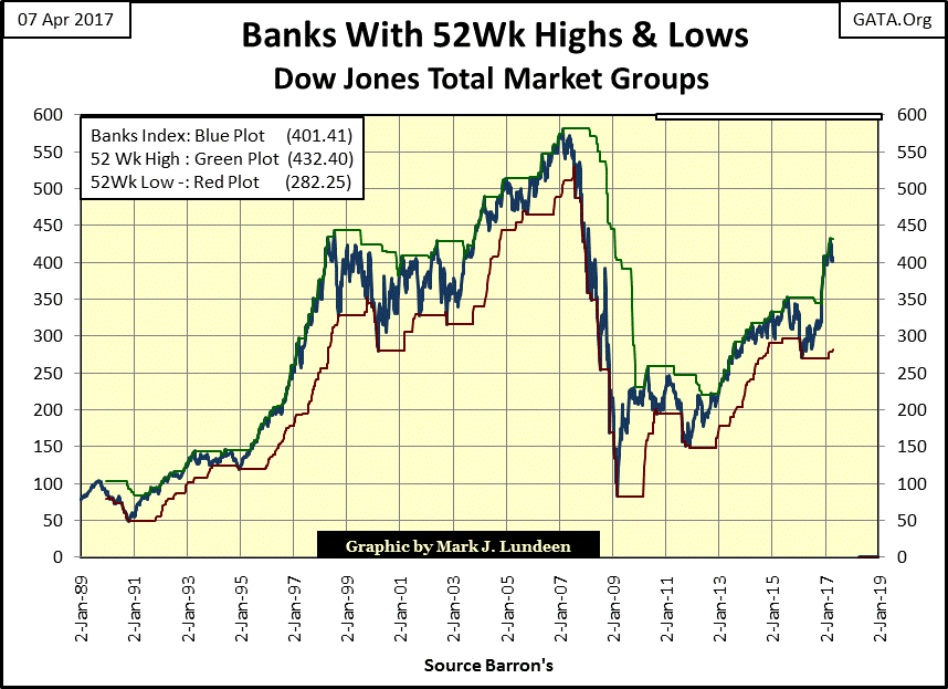
They closed the week at #7 in the DJTMG’s 52Wk Highs and Lows table below.
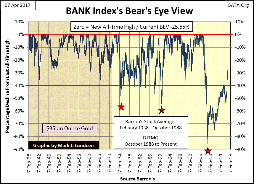
But the banks are still damaged goods as far as I’m concerned. The problem can be seen in their long-term BEV chart below. Before the dollar was taken off the Bretton Woods $35 gold peg in 1971, the banks never saw a bear market decline in excess of 40%. After 1971, they’ve fallen below their BEV -40% line far too frequently to be called investments suitable for widows and orphans.
In March 2009 they out did themselves by declining over 80% from their sub-prime mortgage highs. They may have fallen down below their -99.99% line had the government not bailed them out with a few trillion dollars of “liquidity” and an embarrassing change in accounting standards on their sub-prime reserves that’s still in place.
I find the gold and silver markets tedious too, but have bullish expectations for the old monetary metals for the months and years to come.
Every day this week gold closed above $1,250. I like that. But what this market really needs is a close above last summer’s highs to really get things going.
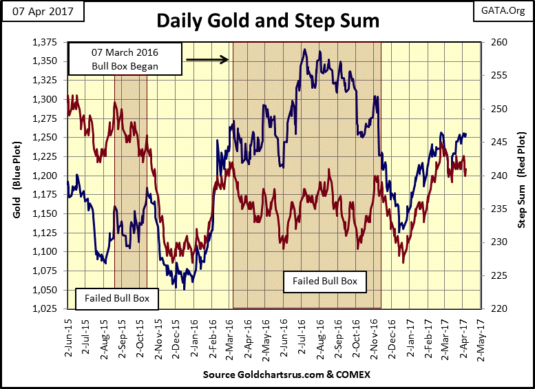
Moving on to gold’s and the Dow Jones step sum and 15 count table below, its apparent how both markets have seen more declining than advancing days in the past month. In the past twenty-five trading sessions, gold’s step sum is down by two days, yet the price of gold has advanced by twenty-nine dollars (2.34%) since March 6th.
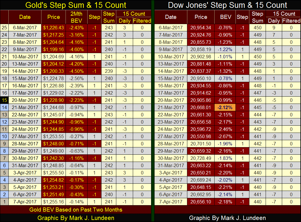
The Dow Jones is down by 298 points (-1.42%) since March 6th, however most of that decline occurred in a single trading session (March 21st). The Dow Jones has done remarkably well considering that in the past twenty-five trading sessions, it’s seen only seven advancing days. Like gold, the Dow Jones, my proxy for the general stock market doesn’t want to go down.
It will be interesting to see what these two markets do when they once again enter into a period where advancing days once again overwhelm declining days.
Why are some people fixated on gold? The huge chasm that divides those of us who the world calls “gold bugs” and those of us who think little of gold and silver is their awareness of the history of money.
There was a time when money didn’t exist, trade was conducted by barter. Grain and cattle from the country side were traded for textiles and pottery produced in the cities. Trade by barter can be difficult, as when a farmer wishes to purchase only a half cow worth of cloth.
By necessity, it wasn’t long before gold and silver entered commerce. In Genesis 23: 12&13, about four-thousand years ago Abraham purchases Sarah’s grave from Ephron the Hittite for four hundred shekels of silver. But this exchange using silver was done by weight, not four hundred shekel coins.
History’s best guess of who made the first precious metal coins for commerce is the city state of Lydia in Asia Minor (modern Turkey) around 600 BC. Lydia became famously rich using its coins as producers and consumers of goods and services came from far away to Lydia’s markets, because economic transactions conducted there could produce change acceptable to all: in coins.
The coins used in trade were worth their weight in the market place as they are actually as hard to come by as raising livestock or grain by the farmers, or textiles by the weavers or ceramics by the potters. In fact, coins are harder to produce as someone has to first go out and find the gold and silver before the metal could be minted into money. Exploration of precious metals has never been easy, but when successful, very profitable.
Here’s a point missed by most people; money itself is not an economic good or a service, but a catalyst in economic transactions. Market participants will soon consume the food traded in the markets; services contracted will be performed. However the coins used in these transactions remain unaltered as they flow from one hand to another in the market places from one day to the next.
And so it was. Until the king realized that by diluting his coins’ precious metal content with base metal, the state could increase its revenue to the extent it inflated the supply of coins without increasing taxation. Thus began the state’s perpetual war against its own unit-of-trade, a war that continues today.
Inflating the money supply increased the state’s footprint in the market place; which the king liked. But inflating the supply of coins in the market place didn’t increase the supply of food stocks or services available for purchase. The king didn’t give a damn about that.
When market prices increased because the public’s footprint in the market place was reduced by the king’s new “monetary policy” of coin inflation – His Majesty could always execute the “greedy bastards” selling food and consumer goods in “his market” at exorbitant prices. That made everyone happy; until the day came when suppliers of goods and services went elsewhere to trade in honest coin.
Today, we all know that the above model of a market place using a stable unit of exchange, such as gold or silver coinage is simplistic, not really applicable to today’s complex economy. Of course we know that as the people who made today’s economy complex are the same people teaching economics; Keynesian economists.
The Keynesian’s fetish for monetary inflation is now demanding the removal of paper money and base metal coins from the market place. In today’s digital markets, where “policy makers” desire only to increase the supply of currency and credit to facilitate “economic growth”, why bother with a printing press to print money with ink on paper when a keyboard can do so at no cost.
In a world now plagued by computer hacking and identity theft, the best and brightest in current economic thought now want all personal wealth, and the money it’s dominated in, to be stored on computer hard drives controlled by our ethically challenged banking system. Good Grief!
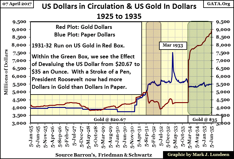
Keeping all the above in mind, lets study the history of gold as money in the United States as recorded in the dusty old pages of Barron’s in the chart below. Dollars in gold are plotted in Red. Dollars in paper (CinC) are plotted in Blue. CinC data from 1925 to 1931 are annual statistics from Milton Friedman and Anna Schwartz’s Monetary History of the United States. CinC data after December 1930 are as published in Barron’s.
The 1920s was a very inflationary decade, but the banking system used bank credit rather than CinC to inflate market values. This was the decade where the Singer sewing machine company coined the slogan; “buy now pay later” as the banks showered consumers with cheap credit, and speculators with margin debt for the stock market.
So, from January 1925 to September 1931 we see the red plot (gold dollars) above the blue plot (paper dollars) as was demanded by the gold standard. But when Mr Bear went to work deflating inflated valuations in financial assets and real estate, banks and individuals were forced to take huge losses in the financial and real estate markets during the Great Depression.
I don’t remember the issue in Barron’s, but in the early 1940s, there was an ad for an estate on acreage overlooking Thomas Jefferson’s Monticello in Virginia. It had a barn for horses and a guest house. Obviously a very nice place, and as I recall in the early 1940s, one could purchase it for $10,000. The ad had a little note on the bottom; this property went for a million dollars in 1929.
In late 1930, Washington’s political establishment response to deflating market prices was to flood the economy with paper money, as seen below. This did little to support the market’s over inflated prices, but eventually it did result in a run on the US gold reserves (Red Box) from 1931 to 32.
The monetary system stabilized in the following years, but with more dollars in paper than in gold circulating in the economy. This was a huge imbalance that was not allowed under a gold standard. A situation everyone knew must be corrected, which it was in 1934, when Roosevelt devalued the US dollar from $20.67 to $35 an ounce; a70% devaluation in the dollar.
After the devaluation of the dollar, Roosevelt now had more dollars in gold (Red plot) than in paper (Blue plot). But it was the wrong thing to do, an act of infamy that the dollar still suffers from to this day.
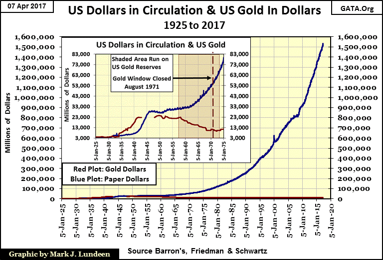
Since the depressing 1930s, paper-money inflation has gone from vice to virtue, as seen in the chart below which continues the two data series plotted above to April 2017. In our world with thousands of billionaires, it’s hard believing how in 1925 the entire money supply for the United States was only four billion dollars. Yet somehow, with the limited money supply the gold standard guaranteed, the United States during the 19th and early 20th centuries built its huge industrial base (as did the UK, Europe and Japan), all the while maintaining stable consumer prices.
Ninety two years later, CinC has increased to over 1.5 trillion paper dollars, with no end to inflation in sight. This is going to end very badly.
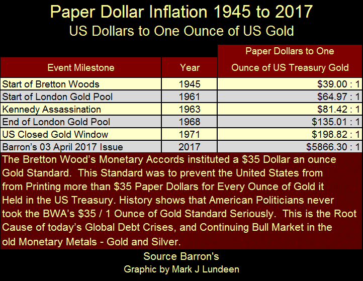
Here’s a table for how many paper dollars there were issued for each ounce of gold held by the US Treasury since the ratification of the Bretton Woods monetary accords in 1945. Everyone blames Nixon for “closing the gold window” in 1971. But the fact is that every president since 1945 was as guilty as Nixon for demonetizing gold, as they were all as guilty of issuing more paper money than the $35 gold peg allowed.
Next is a chart of the price of gold in constant 1920 dollars (Blue Plot) with CinC (paper money in circulation) indexed to 1.00 = 1920 in Red. The price of gold in 1920 dollars is derived by taking the market price of gold as a ratio to the indexed value of CinC seen in the Red Plot.
Gold in August 1920 was fixed at $20.67 an ounce, and by law the US Treasury couldn’t print more paper money than the US Treasury had gold in its reserves. So for every ounce of gold held by the US Treasury, the government could print $20.67 paper dollars. American coinage was silver, except for the copper penny and the five cent piece which was, and still is minted in nickel. CinC in August 1920 was only $4.48 billion dollars.
A historical study, such as the one seen below, is useful not so much for its predictive value – how high the price of gold may eventually increase to, but as an assessment of whether or not something, like the current price of gold, is over or under valued. That is how I use this chart, and right now gold at $3.41 in 1920 dollars terms is deeply undervalued, making gold at $1,250 a compelling bargain.
This is actually a very interesting chart spanning almost a hundred years. Gold going for $30 in constant 1920 dollars highlights those times when Washington, and the world in general had problems with the American dollar. This was certainly the case in 1933-34 and the late 1970s. Gold at or around $2 in 1920 terms in 1970, and again in the early 2000s, signaled that gold was too cheap, marking the start of the 1971-79 bull market and our current bull market beginning in 2001.
Studying the past 100 years of history seen below, and knowing what happened in the early 1930s and the late 1970s, I can’t help but believe that a day is coming when a deflationary crisis (the 1930s) or an inflationary crisis (the 1970s) will once again take the price of gold in 1920 terms, seen below, back up to $30. To do so today would take a market price of gold up to $10,500, which I believe would be a low bid.

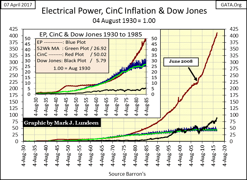
Let’s see what CinC indexed with Electrical Power Consumption (EP) and the Dow Jones looks like.
Note: I have CinC indexed to 1920 in the chart above that appears different than the one below. But markets and “monetary policy” are dynamic things. In 1920 CinC was larger than it was ten years later in 1930, which explains why in April 2017 the indexed CinC is larger in the 1930 base than the 1920 base chart. But I have to use 1930 as a base year in the following chart as August 1930 is the first year I have for EP’s 52Wk M/A. It really makes no difference as after nine decades we can still see the trends of these plots.
Looking at the chart’s insert, it’s obvious how CinC (Red Plot) and EP (Green and Blue Plots) frequently increased with each other during these fifty-five years. Was the increase in the demand in electrical power from the mid-1950s to 1975 a consequence of the ever rising CinC inflation? Maybe. But after 1976, CinC inflation soon began increasing far above the economy’s demand for EP and would continue to do so for the next forty-one years. Since January 1976, CinC has increased by a factor of 18 while EP has only seen a double in demand.
In the insert the Dow Jones (Black plot) benefitted little by the increase in CinC over these fifty-five years, though one can’t deny that since 1985 the Dow Jones has seen tremendous gains. However, the chart shows the gains made in the stock market have not kept up with the monetary inflation flowing from the Federal Reserve.
Since late last year, I believed the key to Trump’s success or failure in his first term in office will ultimately be found on the laptop computer seized from former Congressman Antony Wiener by the NYPD. My feelings on this are based on the fact that the current Democratic Party leadership and much of its rank and file are now dominated by the hippies and Maoist anti-Vietnam war groups from the 1960s. The leadership’s ability to enforce their “party line” on members despite of the reality of any given situation is something from Lenin’s Third International.
These people haven’t changed one bit in the past fifty years.
One can’t negotiate with people who refuse to recognize contract agreements, when doing so inhibits their quest for ever more power. If Trump is to succeed he simply must not compromise with them, but go for their weak points and get them out of his way. For example: “LOCK HER UP” when it can be proven that laws have been broken, which in Hillary and Bill Clinton’s case, would be very easy to prove.
Reportedly, there was a file on Wiener’s hard drive labeled “Life Insurance.” No one outside of law enforcement knows what’s contained in that file. But knowing Wiener’s background it’s reasonable to suspect it has to do with pedophilia at the highest levels of government.
Paul Joseph Watson produced the following video that covers this topic in detail.
I don’t like covering this topic. I rather cover Mr Bear. But I have come to believe these abominations are happening worldwide at the very top of our social order. This is a very dark subject that needs the light of day shined on it.
Did you know that since Trump took office law enforcement has made over 3,000 arrests for traffickers of children and pedophilia? The cops sometimes find kids locked up in cages like live stock.
WHAT!? Where is the MSM? Our vast news media outlets, organizations that clamor for sensational tidbits to expose are missing in action; having chosen instead to focus on bogus claims of global warming or Russian involvement in American politics.
Yes, the New York Times, Washington Post, CNN and the rest of the MSM have no more desire to cover law enforcement’s pursuit of these pedophiles than the Wall Street Journal has to cover the activities of the big banks at the COMEX gold and silver markets. Which is zero.
Well, it doesn’t take a Sherlock Holms to understand the reason why the dog didn’t bark; was because its master kept it quiet. Is that what’s going on here?
Mark J. Lundeen
[email protected]
07 April 2017


