Last Week Was More Of The Same…Which Is Good For Gold And Silver


Friday was another day of extreme volatility (a day when the Dow Jones closes (+/-) 2% or more from a previous day’s closing price). However I suspect the “policy makers” ripped off Mr Bear this week. On Monday and on Thursday the Dow Jones Index was down more than 2% intraday, only to close well above the 2% threshold. Had the markets on Monday and on Thursday closed at their lows, I expect we would have also seen at least one day of extreme market breadth.
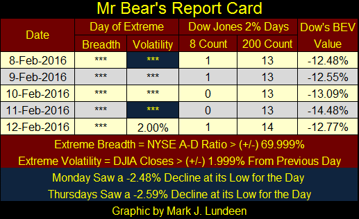
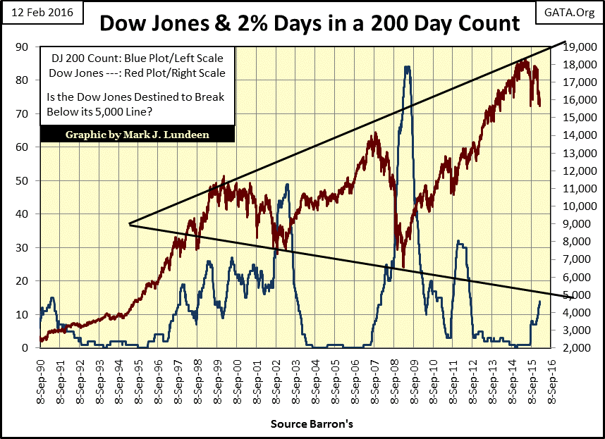
The week ended with an 8 count of 1 and a 200 count of 14, but these counts should have been higher. It doesn’t matter though, because Mr Bear is still racking up Dow Jones 2% days (days of extreme market volatility) in the 200 count (Blue Plot) below. Ever since January 1900 a rising 200 count has been a harbinger of woe for the NYSE. Seeing it rise to 14 this week (since last July) won’t prove to be any different.
How do we know if we really are in a bear market? Since bear markets begin at the absolute peak of bull markets, when investors are full of optimism, it’s hard to recognize when the top is in and a new bear market has begun. This is especially true if one follows only the major market indexes like the Dow Jones or S&P 500. Fortunately there are other means available to monitor the stock market; one of my favorites is new NYSE 52Wk Highs and Lows.
The simple fact is that during bull markets, major market indexes routinely make new 52Wk Highs, just as they make new 52Wk Lows during bear markets. The Dow Jones made a new 52Wk Low this week. In bull and bear markets companies trading on the NYSE will also be making new 52 Wk Highs and Lows, frequently before the major indexes themselves. So let’s look at the NYSE Breadth & 52Wk H-L data to see if the NYSE itself is telling us if we are in a bear market.
In the table below I show the raw daily data of Advancing, Declining and Unchanged shares (from which I compute the Shares Traded sums), and the daily 52Wk Highs and Lows. Using this information I calculate two data sets:
- NYSE 70% Days (Advancing & Declining Shares)
- NYSE High – Low Ratio
For the NYSE 70% Days (Days of Extreme Market Breadth, far right column) I compute as follows:
Advancing Shares – Declining Shares / Shares Traded.
Whenever this formula produces a result exceeding (+/-) 69.999% the NYSE had a Day of Extreme Market Breadth, as happened three times between January 11th - 29th. Bull markets see very few days of extreme market breadth, while they are a regular feature in bear markets. Having three NYSE 70% days in the past month is a very bearish.
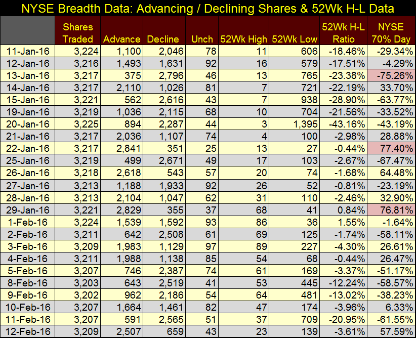
The NYSE 52Wk High – Low Ratio (table’s second column from right) data points plotted in the chart below are computed exactly as the Advance – Decline data:
52Wk Highs – 52Wk Lows / Shares Traded that day
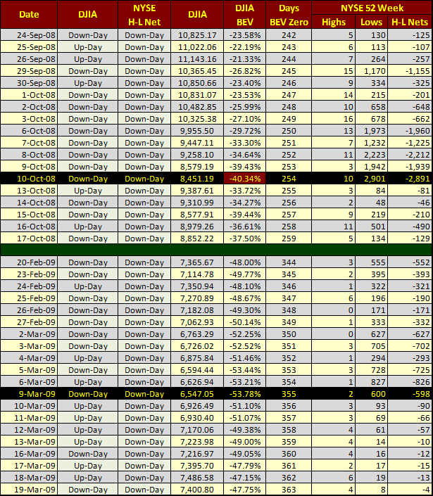
Below, the final eighteen months of the sub-prime bubble are easy to identify; the NYSE 52Wk H-L Ratio had been making regular advances above the +10% line. However the NYSE 52Wk H-L Ratio began falling below its -10% line in late July 2007, just as the stock market began deflating. This was months before the major market averages reached their last 52Wk highs in October 2007.
A good rule of thumb is that whenever the major market indexes are making new 52Wk Highs, the NYSE 52Wk H-L Ratio had best be making plus 10% days as well or something is wrong. At such times you may not want to liquidate your positions if they are still going up, as they may continue to advance for months to come. But it is a time to begin looking for reasons to sell your stocks and begin locking in your profits instead of buying more.
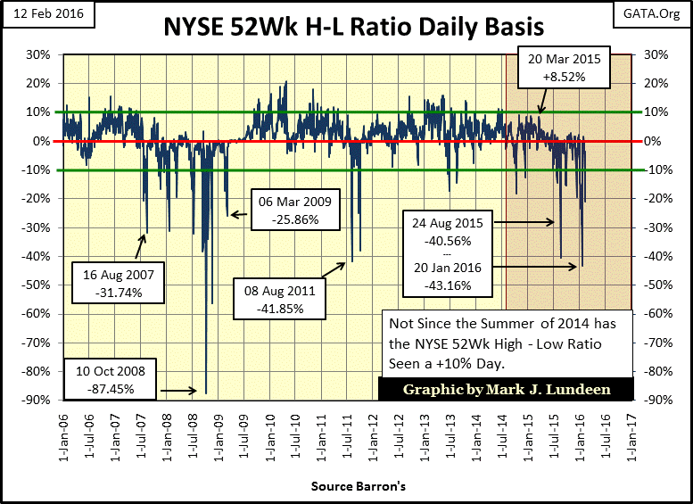
We see the same thing happening at bear market bottoms (chart above and table below). During the credit crisis the peak in NYSE 52Wk Lows occurred on 10 Oct 2008. On that day the Dow Jones made its first 40% decline from its all-time high since November 1974; 2,901 companies trading on the NYSE reached a 52Wk Low. But the Dow Jones itself didn’t bottom for another five months; 09 March 2009. When it finally did just 600 NYSE listings reached a new 52Wk Low.
Although Doctor Bernanke’s multi-trillion dollar QE-1 had been working, many companies trading on the NYSE benefitted from his “injections of liquidity” weeks and months before the major market indexes did. Look below at what happened to NYSE 52Wk Lows after the Dow Bottomed on 09 March 2009; they just disappeared as the stock market floated ever higher on a rising tide of “liquidity.”
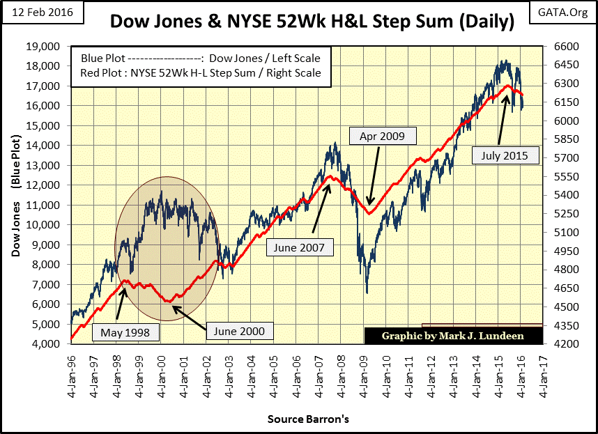
Going back to the NYSE 52Wk H-L Ratio chart above, it’s obvious the stock market began deflating after the summer of 2014 when the NSYE 52Wk H-L Ratio stopped seeing +10% days. The major market indexes continued seeing new 52Wk (and all-time) highs until May of 2015, but the NYSE was becoming increasingly selective.
The last significant positive day occurred in March when the Ratio was at +8.52%. Since then the best the ratio has achieved have been small single digits positive days, with more negative -10% days than should be seen in a bull market correction. Take a moment to study the NYSE 52Wk H-L Ratio chart from March 2009 through today. There were times when the ratio declined below its negative 10% line, but during true bull-market corrections it snaps back to its +10 line soon thereafter. This hasn’t happened since the summer of 2014 and is a big red flag flying over the stock market.
The best way to plot the NYSE 52Wk H-L Ratio for a clear Big Picture view of the market is to construct a step sum from it.
- Positive days: equal +1
- Negative days: equal -1
Then plot the resulting step sum with your favorite major market index, as I have done with the Dow Jones below. During periods when the NYSE has been seeing more 52Wk Highs than Lows its step sum advances with the Dow Jones. Those times when the NYSE sees more 52Wk Lows than Highs, its step sum declines with the Dow Jones. But note this did not happen during the late 1990s and early 2000s.
Alan Greenspan’s bull market of the 1990s became a bull market in high-tech shares beginning in May of 1998. Any market sector that wasn’t digital began a bear market decline two years before the high-tech top of January 2000. You can see this in the NYSE 52Wk H-L Ratio’s step sum (Red Plot) below. Interestingly, during the tech wreck we see the NYSE 52Wk H-L Ratio bottom in June 2000. While the Dow Jones and the tech stocks continued to deflate for two more years, 52Wk Highs were overwhelming 52Wk Lows at the NYSE.
The Dow Jones reached its sub-prime mortgage bubble top in October 2007, although the NYSE began seeing more 52Wk Lows than Highs four months earlier in June. The Dow Jones bottomed in March 2009, as did the NYSE 52Wk H-L Ratio’s step sum a month later. The Dow Jones reached its post credit-crisis peak in May of 2015; the Ratio’s step sum peaked two months later in July. As evident above, ever since the NYSE 52Wk H-L Ratio step sum turned down last July the market has been under a lot of pressure.
We should expect this to continue until the Ratio’s step sum reverses to the upside, when once again 52Wk highs begin to dominate trading at the NYSE. However, I doubt that will happen until we’ve see many of the old bear-market records from the 1930s broken. Records such as how many dump trucks Mr Bear will require to haul out the inflationary filth now stinking up balance sheets for government, corporations, charitable institutions and individuals.
Bear markets are a process, and our current process is still in the denial stage, but when it eventually shifts into the liquidation phase you’ll know it. Stock indexes will be down 70% or more, dividend and bond yields well into double digits and gold, silver and mining shares will reach prices that are unimaginable today.
On Thursday of this week the Dow Jones made its third new 52-Week Low of the current bear market, moving the Dow Jones’ 52-Week line (Red Plot) down just six points. You can’t see it in the chart below – but it’s there.
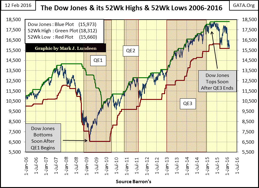
The banks in the DJTMG are under a lot of pressure. In the chart below we see that for four of the past five weeks this index has closed at a new 52Wk Low. It’s gotten so bad that J.P. Morgan’s Jamie Dimon, as per CNBC (Chief Cheerleader for the big banks) is putting his money where his mouth is:
“Jamie Dimon has put his own money where his mouth, institutionally speaking, has long been. The JPMorgan chief executive on Thursday bought more than $25 million of his bank's stock. It's a personal extension of his mantra that lenders do best buying back stock is when it is near book value – and right now, JPMorgan carries a roughly 10 percent discount. # This vote of confidence is also an important counterweight to the panic gripping investors in U.S. financial institutions.”
What’s this! CNBC admitting “panic is gripping investors in U.S. financial institutions?” That’s something you don’t see every day.
http://www.cnbc.com/2016/02/12/jamie-dimon-aligns-money-and-mouth.html
If a bill ever came before Congress to resume marking J.P. Morgan’s (and the rest of the big banks on Wall Street) assets to market on a daily basis (as was the practice many years ago), Jamie would be the first to lobby Congress to kill this proposal as he knows what the actual book value of J.P. Morgan is. Personally I’d say that even with the continual aid provided by the FOMC since the credit crisis, Morgan’s book value would most likely prove to be negative if they had to mark the bank’s assets at market. This may not even be possible for their multi-trillion dollar derivative obligations.
This story reminds me of the 1929 crash when JP Morgan made a much to do multi-million dollar purchase of US Steel on the floor of the NYSE to wild applause by the traders and media, only to quietly short the shares moments later. Is that what Dimon is doing? Looking at the banks in the chart below I wouldn’t doubt that he is hedging this $25 million dollar “investment” in his own company using derivatives. This would be cheap insurance for his highly risky publicity stunt.
It is painfully apparent that after trillions of dollars in aid from the Federal Reserve the banks have yet to recover from the sub-prime mortgage debacle. And now they are rolling over again! Keep in mind that the market crash of 2007-09 was due to a banking crisis. I expect this will also prove to be the case for the current market decline.
Before the Dow Jones and everything else declines to their ultimate bottom in the current bear market we’ll see many more new 52Wk Lows, as will the NYSE 52Wk H-L Ratio. But don’t expect the “policy makers” to stand aside and allow the financial markets to upchuck the many decades of inflation they’ve injected into it. At some point expect CNBC with much fanfare to announce that Janet Yellen’s FOMC is considering implementing QE4. As evident in the Dow Jones chart above, the first three QEs were very effective at reflating the Dow Jones from its March 2009 bottom, but not the banks. Maybe a fourth round of QE could do the same, but then again, maybe not.
When speaking of bull markets in stocks and bonds it’s becoming painfully apparent that it’s best to speak in the past tense for fear of appearing foolish. However this chart plotting gold with it step sum is looking better and better all the time.
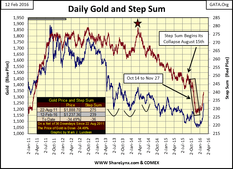
Gold is up 16.8% since mid-December, so it may be due for correction. But should the banking stocks crash in the weeks to come, or an international crisis arise in the Mid-East, gold and silver could gap up too.
So just how big a toll has the market taken on gold and silver since 2011? A quick look at the chart below tells the tale. But for someone who purchased gold (Brown Plot) or silver (Black Plot) in January 2000 and just held it, they’d still have made twice as much at the end of this week as investing in blue-chip stocks.
From 2000 to through 2011 the gains in gold and silver were fantastic, which is why they got stepped on by the “policy makers.” Even so their gains, even after market declines of 45% for gold and 70% by silver never fell below the rate of CinC inflation (Green Plot), while the Dow Jones (Blue Plot) never appreciated faster than the rate of CinC inflation for the past sixteen years.
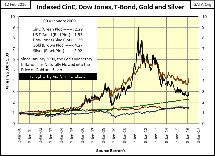
Since the beginning of January this year everything has changed. Look at the nice recent up turns in the price of gold and silver in the chart. In the next year capital flight may drive the Dow Jones well below its January 2000 level (1.0 line), and some of that deflating liquidity will flow into gold and silver. However after a century of unrelenting monetary inflation from central banks, gold and silver today are tiny, illiquid markets compared to global stock and bond markets. I expect the gains in the metals will be significantly greater than the losses in the Dow Jones. But like me you will to have to wait to see what actually happens.
This week saw the surprise early opening of THE ABX (ALLOCATED PHYSICAL GOLD EXCHANGE) - https://abx.com/ On Wednesday which hadn’t been expected to open until April. Not only was this done without fanfare, it was totally ignored by the (worthless) western media. This is likely what’s behind gold returning more than any other investment category so far this year, and gold’s impressive performance this past week. It also explains why silver’s daily and weekly gains didn’t exceed gold’s, as usual. This could be a game changer in coming months.
Here’s a link to a Craig Hemke interview with Andrew Maguire and the new ABX CEO for those interested in the new exchange:
http://www.tfmetalsreport.com/podcast/7441/launch-allocated-bullion-exchange
For the foreseeable future the place to be will be gold, silver and precious metals mining shares. Make sure to get a position in bullion first, before you invest in the miners.
12 February 2016


