A Look At Futures Contracts
Every bull market advance eventually sees its last all-time high. No one rings a bell when it happens, but from that point on things begin to change for the worse for the bulls.
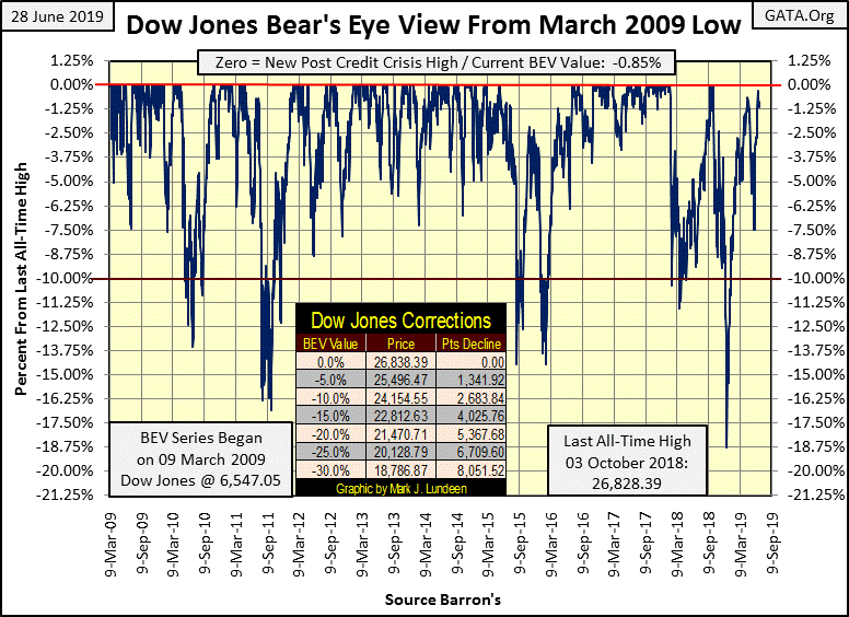
The Dow Jones’ BEV chart below begins at the -54% bear-market bottom of the 2007-09 credit crisis. We don’t see a -54% BEV value as I began this series on the March 09, 2009 bear-market bottom. So instead we see a 0.00%, as the first data point of all BEV series begins at zero percent.
In the past ten years the Dow Jones has, depending on how you count them, seen five or six 10% corrections. Corrections within a bull market are healthy, and should be expected by anyone who follows a market. Following a correction, the market advance should once again be ready to rise up to new daily all-time highs; seen as clusters of BEV Zeros (0.00%) in the BEV chart below.
But the last time this bullish scenario played out as advertised was after the 10% correction bottom seen in February 2016. Following the November 2016 election victory of Donald Trump, the Dow Jones continued making new daily all-time highs for over a year, exactly 100 of them to be precise.
Then in January 2018, this Dow Jones advance saw its last BEV Zero as it began a well-earned 10% correction that bottomed two months later. Now here’s where the story becomes interesting to us bears; following this March 2018 correction bottom, the Dow Jones began making new all-time highs again in the autumn. However, the bulls could only take the Dow Jones into record territory for 2 days in late September and another 2 days in early October 2018. This was a total of only 4 new BEV Zeros for the advance before the bulls called it quits and the Dow Jones began its deepest post March 2009 correction (-18.77%).
Seeing only four new BEV Zeros at the peak of an advance is very weak market action. This tiny cluster of BEV Zeros formed during this advance stands out when compared to the others seen since 09 March 2009. Since March 2009, no other advance between two of these 10% corrections saw such a famine of new all-time highs.
And now following an eighteen percent correction in the Dow Jones, a situation where the bulls should be well rested and ready to once again take the Dow Jones into record history, for the second time since January 2018 the bulls are once again showing signs of exhaustion at the BEV Zero line.
No serious student of the markets can actually see into the future. The best we can do is to study the past and attempt to see patterns in the market, with a focus on noting when those patterns change. In the Dow Jones BEV chart above we see an established pattern of multitudes of BEV Zeros (market tops) sandwiched between 10% corrections.
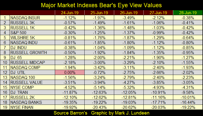
But following the January 2018 Dow Jones’ market top and its associated 10% correction, all that changed with an advance that could produce only 4 new all-time highs in autumn 2018. And now following an 18% correction last December, the bulls since early June have failed to drive the Dow Jones up to new all-time highs, though the bulls have driven most of the major market indexes in the table below into record territory.
The S&P 500 (#4) saw a -19.78% correction last December, yet beginning on April 23rd it began making new all-time highs, with the last of this series seen on Thursday of last week, for a total of 5 BEV Zeros so far in this advance.
So, is the Dow Jones doomed NOT to see another BEV Zero before it begins its next correction, or possibly bear market? I don’t know. I wouldn’t be surprised if it did rise up above last October’s all-time high. At week’s close it was less than 1% from making market history, so what’s the problem? I don’t know, I’m only noting the market action for the Dow Jones has changed since October 2018, with its pathetic cluster of only 4 BEV Zeros topping a market advance.
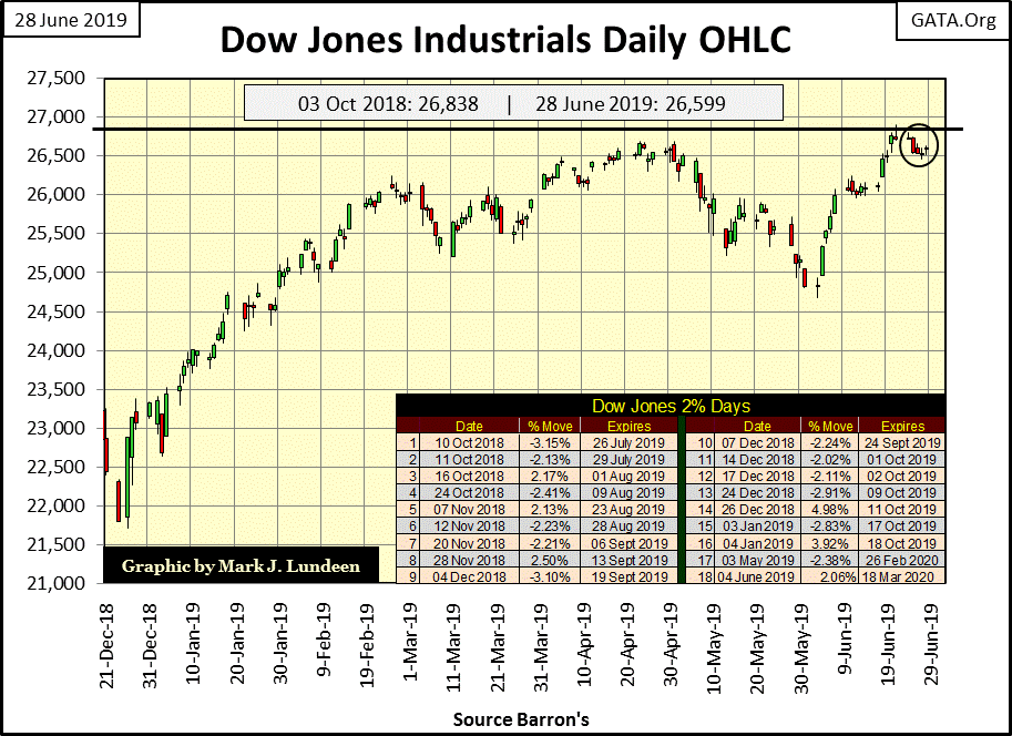
Looking at the Dow Jones’ daily bar chart below I note the market’s weakness, its failure to produce a new all-time high last April. This was followed by a shallow correction in May (-7.5%) and another failed attempt at making market history in June. Last Friday’s bar saw its high (26,907) peeking above October’s last all-time high (26,838), but the bulls couldn’t hold it to the close of the market.
If I were in a burning building, this is not the fireman I want to see scaling the ladder coming to save me!
I probably spent too much time and text in the explanation above of why I don’t like the Dow Jones, which functions as my proxy for the broad stock market. In a nutshell, let’s just say that since last October advance’s dearth of BEV Zeros, something has changed in the stock market; the inability for the bulls to take the Dow Jones into record territory.
After a ten year advance where the Dow Jones inflated its valuation by over 20,000 points, no one has yet rang a bell warning everyone the end is near. But then they never do. So maybe you should be looking for an excuse to exit the stock market and move your investment funds on to greener pastures. If you are, seeing how the Dow Jones has performed since last October is as good of an excuse to sell as you’ll find.
Open interest in the gold and silver COMEX market is becoming interesting. But before I cover that let’s review how a futures contract works, as it is in the COMEX futures market where the gold cartel controls the price of gold and silver.
Here’s an example of a corn contract trading at the Chicago Board of Trade (CBOT). Each contract is a standard contract, meaning there’s no difference between one and another. Each contract is for 5,000 bushels of corn, and the corn in the contract for future delivery is guaranteed to be clean (free from dirt and grit) and have such a moisture content. The corn to be delivered, for instance in September may currently be located in a farmer’s silo somewhere in Iowa, or it may not exist at all.
That’s not a problem as futures contracts are just that: contracts for the PROMISED FUTURE DELIVERY of a commodity. So, in March a farmer in Illinois can actually sell corn (aka: going short) at the CBOT for corn he anticipates harvesting in September. Doing so allows farmers to lock in corn prices acceptable to them, ensuring a profitable growing season. There’s a nice negative feedback loop to the selling of future production by the farmers; farmers want the highest price they can get, but the more they sell the lower the price of corn goes.
Food processors also use the futures market to buy corn (aka: going long). As with farmers, food produces find it useful having the option of taking delivery of corn at fixed times during the year. Like farmers, food processors buying corn in the futures markets (promising to take future delivery) have a nice feedback loop to it; food producers like the lowest price possible, but the more they buy the higher the price of corn goes.
In the futures markets, farmers and food processors are classified as “commercials”, as they may profit from their trading of corn contracts, but their primary source of profit in the corn market is either by producing or processing corn for consumption. As commercials, farmers and food processors have fixed costs associated with farming or processing and distribution of corn to the public for consumption. Their use of trading corn contracts at the Chicago Board of Trade (CBOT) is primarily to hedge the financial risks associated with growing and processing corn.
And what is the use of the CBOT? It functions as a market; and what markets do is to discover prices. A farmer may want to sell his corn at $8.00 a bushel, but if no food processor is willing to pay $8.00, the farmer is going to discover that he must lower his price if he wants to sell his corn. A food processor may want to buy corn at $1.00 a bushel, but if no farmer wants to sell his corn at $1.00 a bushel, the food processor is going to discover he must offer more if he wants to buy corn.
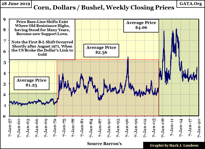
Here’s a chart for the price of a bushel of corn going back to 1957, sixty-two years of price discovery in the corn market at the CBOT. In the plot the rise and fall in the price of corn due to seasonal and global factors are clearly seen. But within the boxes I’ve placed on the chart we see another factor in the price of corn the CBOT has discovered: monetary inflation.
In what I call Base-Line Shifts in prices, we see the price of corn shift up in 1972, shortly after the US Treasury defaulted on the Bretton Wood’s $35 gold peg. The price of corn once again saw a base-line shift in November 2006, after which $3 corn became a floor rather than a ceiling price as it had before. As the Federal Reserve’s “monetary policy” is as inflationary as it has ever been, I expect we’ll see another base-line shift in the price of corn sometime in the next five years.
There’s a third group of people trading in the corn market; the speculators. There’s a little quip that best explains who speculators are in any market:
“Speculators sell what they don’t have and buy what they have no use for.”
Speculators are the ultimate low cost producers of corn, as their capital costs are only a computer, software and a commodity brokerage account, with which they can sell and buy corn in middle of Manhattan, or Reykjavik, Iceland.
Like a farmer, when a speculator shorts a corn contract (sells a contract at the CBOT), they too have just added 5,000 bushels of corn to the market. Like a food processor, when a speculator goes long (buys a contract at the CBOT), they too have just increased demand for corn in the market by an additional 5,000 bushels.
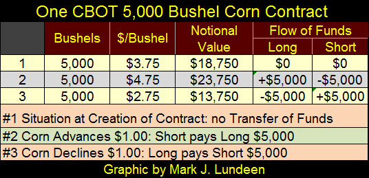
The table below is self-explanatory; a short (seller) and a long (buyer) of 5,000 bushels of corn enter into a contract at $3.75 a bushel. The notional value of the contract is $18,750. This price to a farmer may represent the lowest price of corn he can have for a profitable season, so he shorts (sells) his corn in this contract. The long may be a speculator, who believes the price of corn is going up before harvest time.
At condition #1 (corn at $3.75), neither the farmer (short side) or the speculator (long side) have made any money, which to the farmer is no big deal as he will make his profit after he harvests and then sells his corn, this contract is only a hedge. For the speculator it is a big deal as he needs the price of corn to rise, to profit from this contract.
But the speculator is wrong; corn goes down to $2.75 (#3) and the notional value of the contract is now $13,750; or $5,000 less than at #1. It’s at this point the speculator discovers that he owes the farmer $5,000, which is how the farmer gets his $18,750 for 5,000 bushels of corn when corn declines from $3.75 down to $2.75 over the course of the growing season.
This is a very simplified example of how a farmer hedges his corn crop. Keep in mind farmers, speculators and food processors buy and sell their contracts as needed to cut their losses.
But my purpose of covering a CBOT corn contract is to provide an example of how a future market should work, with commercials; those entities who produce and process a commodity for public consumption along with speculators in the corn market.
But unlike farmers and food processors whose activities in the corn market are controlled by a negative feedback loop, speculators unlike everyone else, don’t care what the price of corn is trading at; they just want its price to move as that’s their sole means of profiting in the corn market. Whether that means the price of corn goes so low farmers are forced into bankruptcy, or so high corn products are no longer affordable to the public, speculators don’t care.
So why are speculators allowed to buy and sell, go long and short corn at the CBOT? The commercials like the speculators as speculators typically lose money to the commercials. As the activities of speculators are closely monitored and regulated, speculative supply and demand is never the primary source of supply and demand in the corn market.
In the case of agricultural commodities where futures’ prices are largely set by environmental factors, such as whether or not it rains during the growing season, and if harvest time is dry or wet, a nimble corn speculator has as much chance profiting from trading corn contracts as anyone else. But I don’t recommend it.
I don’t believe this is true for speculators in the COMEX gold and silver markets, as banks are this market’s largest class of commercials. But these banks’ profiles are more like speculators than commercials. Commercials are market entities that produce or process a commodity. But American banks don’t mine, smelt, process or market gold or silver for jewelry or mint bullion bars for investment demand. So why are they involved in the gold and silver futures markets?
Unlike the commercials in the CBOT corn market, these banks in the COMEX gold and silver markets have little direct involvement in the gold and silver markets’ production and distribution. Their interests in the gold and silver markets are only tangential.
As price trends in gold and silver can have huge impacts on interest rates and bond yields, as well as foreign exchange rates, these banks use their commercial positions in the gold and silver futures markets to contain price increases in the old monetary metals. This is accomplished by their promising to deliver impossible amounts of gold and silver (always sometime in the future) anytime the price of gold or silver begin to rise. But this increase in the supply of metal is fictional; only the insincere promise of delivery of metal by a bank that has little to nothing to do with mining gold or silver.
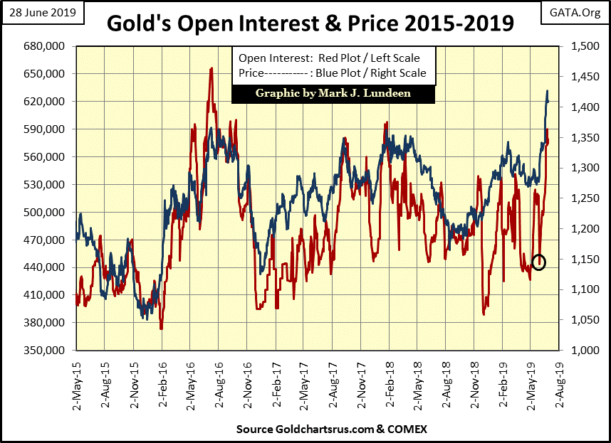
Look at the chart below, where the price of gold is in blue and open interest (number of active contracts trading) is in red. Since the end of May (black circle) the price of gold has advanced nicely, but so too has open interest, which has increased from 443,325 on May 31st to 579,514 contracts at the end of this week.
As each of these contracts is for 100 ounces of gold, and since May 31st open interest has increased by 136,189 contracts, these big banks have in the past month flooded the COMEX gold market with 13.6 million ounces of gold they will never produce or deliver to the COMEX gold market. This is done only to break the current advance in the price of gold.
These banks have been doing this for years as “market regulators” look on and do nothing. Look at the surge in the price of gold from gold’s December 2015 low. Gold went from $1050 with an open interest of 393,010 on December 17th 2015 to $1363 with an open interest of 651,923 on July 7th 2016. These same banks three years ago flooded the market with 25.9 million ounces of fictional gold in response to a $313 advance in the price of gold, and were successful in breaking that advance in the price of gold.
If these banks are so successful in controlling the price of gold and silver, why should anyone risk their investment funds in gold or silver? Because since the end of WWII, central banks such as the Federal Reserve and their sponsoring central governments, such as the US Federal Government have converted their monetary policy from stability to one of wanton theft via monetary inflation.
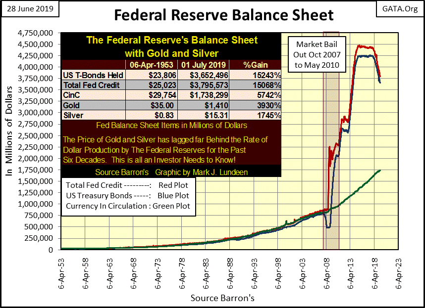
The following chart of the Federal Reserve’s balance sheet and growth in CinC is an obscenity.
Look at the following quote from Barron’s in 1979, and then look at the chart above where 1979 is located. Had Robert M Bleiberg: Barron’s Managing Editor in 1979 saw what the Federal Reserve did in response to the 2007-09 sub-prime mortgage crisis, he would have had a stroke!
“Extravagances and absurdities like floating exchange rates and Special Drawing Rights [IMF’s SDR] come and go. Gold endures.
“And what a lot it has had to put up with. After insisting for decades - over optimistically, in the event – that the dollar was as good as gold, the U.S. monetary authorities, by fiat, so to speak, desperately sought to prove that in global financial affairs it was better. First they closed the gold window thereby reneging on a generation of solemn pledges to the contrary. They threw their weight behind the Special Drawing Right, a bastard form of what John Exter has aptly termed the “I-Owe-You-Nothing.” Several years ago as hundreds cheered, gold was officially drummed out of the international monetary system and the IMF launched on a series of sales aimed at disposing of the barbarous relic forever. In turn, the Treasury beset by a plunging dollar has stepped up its own liquidation from 300,000 ounces per month to the current rate of 1.5 million.”
- Robert M Bleiberg: Barron’s Managing Editor, 29 January 1979
But today everyone is fine with the expansion in the Fed’s balance sheet seen above as a result of Doctor Bernanke’s QE1-3, especially as this “injection of liquidity” drove the Dow Jones up over 20,000 points! We’ll never know, but I wonder what would have happened if the banks hadn’t suppressed the price of gold these past ten years? Could we have seen the Dow Jones continue collapsing below 5000 in 2009 as the price of gold instead headed towards $20,000 as all this “liquidity” flowed into the markets?
What should we think of the quantitative tightening (QT = Reduction of Fed’s Balance Sheet) of the past eighteen months? Is it possible this deflation in the Fed’s balance sheet is the reason the Dow Jones is having difficulty breaking above last October’s all-time high? I believe it is, and if the Federal Reserve continues deflating their balance sheet, the stock and bond markets are going to crash.
That would be bad for stocks and bonds – but good for gold, silver and their miners as the global financial system loses faith in the US dollar.
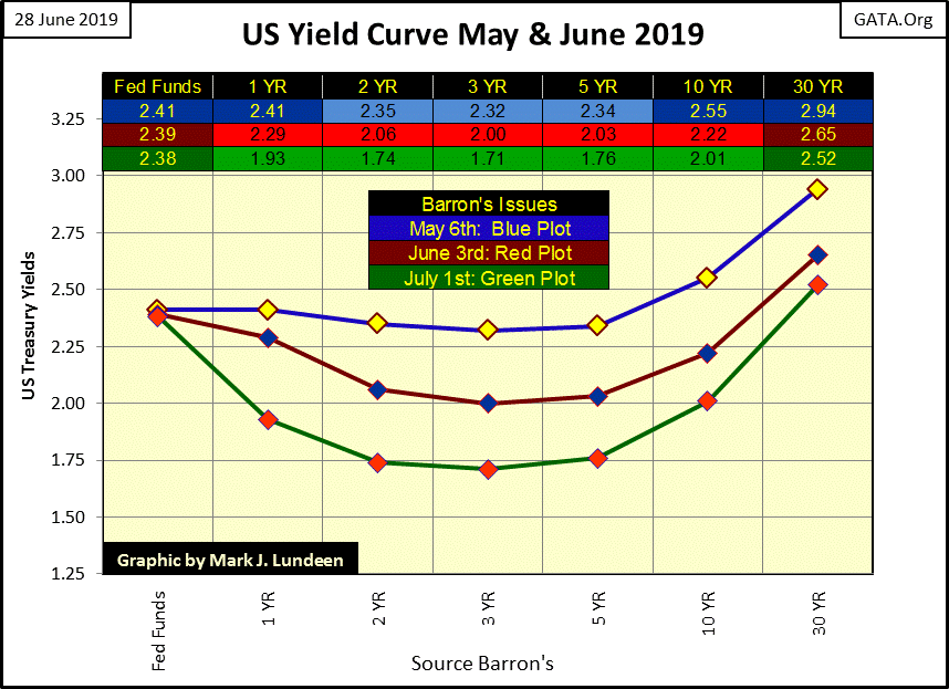
Look at the yield curve below, data taken from the first week of the months of May to July. Money is flooding into the US Treasury Bond Market, and this time it’s not coming from the FOMC. As seen in their deflating balance sheet above, the Fed is selling their T-Bonds. That makes this flow of funds what was once called “Hot Money”, the flow of money driven by greed or fear from Market A into Market B. The thing about hot money is that it can get up and go out faster than it came in.
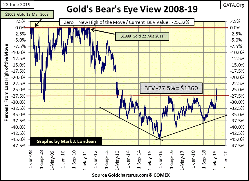
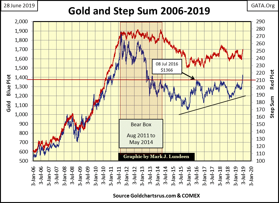
Moving on to gold’s BEV chart below, and what a beautiful chart it is! After six years of failing to rise above, and stay above its BEV -27.5% line ($1360), gold has finally done that. There is much concern that gold will once again break below this critical level, and it just might.
But before our breakout this BEV -27.5% level was a line of resistance, a level where the bears could put gold back into its place. I expect that now after the breakout, this BEV -27.5% level will function as a line of support where the bulls can bring it back above this level where they believe it belongs. But then maybe gold’s next step isn’t to correct down to the BEV -27.5% line, but upward and onward. Let’s see what happens next week.
Gold’s step sum chart looks good. Hopefully in the next few years we’ll see these plots advancing as they did from 2009 to 2011.
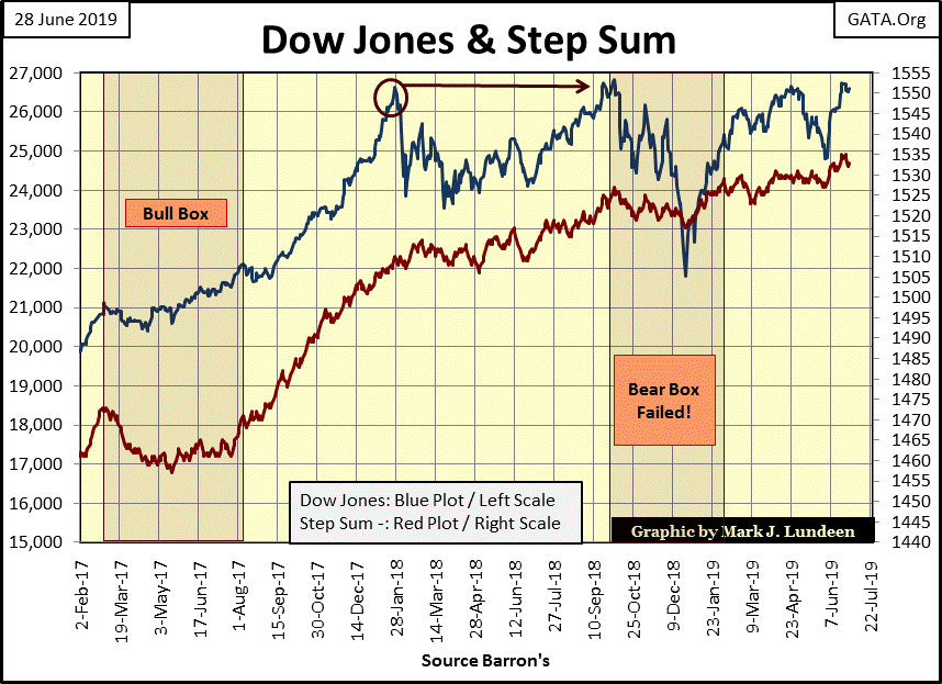
As far as the step sum chart for the Dow Jones goes, we need to see if the bulls can take the venerable Dow Jones into record territory. If so how are they doing it; with enthusiasm or are the aging bulls gasping for breath?
For myself, after studying the Dow Jones’ BEV chart at the beginning of this article, and seeing how the Federal Reserve is continuing their QT, I’m thinking the bulls are very near to their point of exhaustion. So, I’m thinking by September the Dow Jones will once again be trending down in the early stages of a big bear market, if so, I want to see how the Dow’s step sum plot reacts to the deflating Dow Jones.
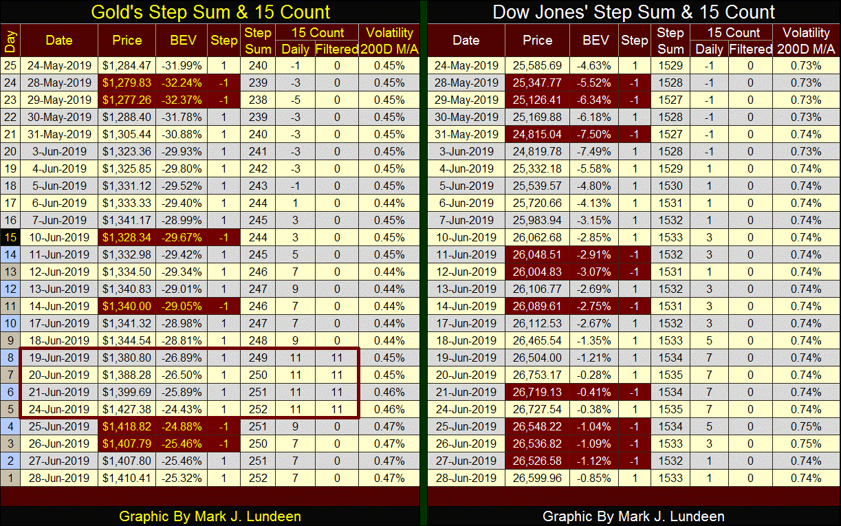
Looking at the step sum tables below, since May 24th the price of gold has advanced by 9.8% as its step sum moved up 12 steps. At the close of this week it appears gold is breaking out. There are two ways of looking at this:
From the stand point of the past eight years where holding gold only caused pain and suffering;
Recognizing eight years is a long time to suffer, making this a time to anticipate the good things to come.
You can put me into category #2 above.
Not much happening on the Dow Jones side of the table. With the Dow Jones so close to making market history by breaking above its last all-time highs of last October, maybe that’s a hint of things to come.
Mark J. Lundeen


