A Look at Yield Curves


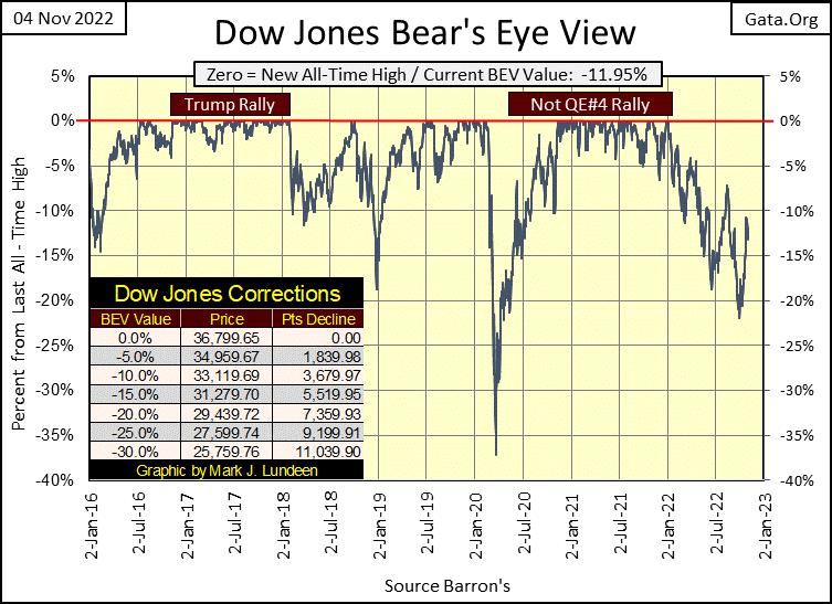
As October was an up month, pushing the Dow Jones BEV plot up ten, big BEV points (chart below), I really can’t complain the first week of November saw a bit of a correction in it, with the Dow Jones closing the week down from last Friday. But it wasn’t much of a correction. I could have used last week’s Bear’s Eye View chart for this week’s article.
I still believe the market’s primary trend is down; that we are in a massive bear market. Decades of having “liquidity injected”, trillions-of-dollars of monetary inflation into the financial system by the FOMC has to have consequence somehow, somewhere, sometime; meaning a big bear market is somewhere ahead of us.
But for the shorter-term, seeing the Dow Jones break above its BEV -10% or even its BEV -5% lines in the BEV chart below are real possibilities before Mr Bear claws the Dow Jones far below its BEV -20% line. Who knows, maybe the Dow Jones will see yet a few more BEV Zeros (0.0% / New All-Time Highs) below before the current advance comes to its end.
All the same, for investors its pennies to the upside, and dollars to the downside, as invested money in this market has vastly more risk, than a chance for financial gain. I’m out, and won’t be back until Mr Bear takes the Dow Jones way below its BEV -40% line.
Keep in mind what risk is to invested money in the stock market; that it will lose a good percentage of what was originally invested in the market. Understanding risk is no more complicated than that. So, just as a matter of investment discipline, don’t risk your money in any market when it’s at a top, as at market tops, risk to invested money is at its maximum.
By showing some control, and waiting until the market comes down a good amount, investors can greatly reduce their exposure to market risk, as they increase their potential for financial gain.
Okay, so how much risk does this market present to investors? And I’m talking about the stock and fixed income markets. How much perceived risk this market has, depends on how you see this market advance.
I see this market advance as a consequence of the US Treasury doing away with the Bretton Woods $35 gold peg in August 1971 (Red Star in Chart Below). The post 1971 advance in the Dow Jones below is purely a consequence of monetary inflation being “injected” into the stock market. The risk in this market is that one day, all the “injected liquidity” will decide to flow away from the financial markets, and go somewhere else. Somewhere else like commodities, energy and precious metal assets.
From this perspective, the stock and bond markets currently contain an insane amount of risk, with little, to no chance of a suitable reward to compensate investors for the massive risk they assume when buying into this market.
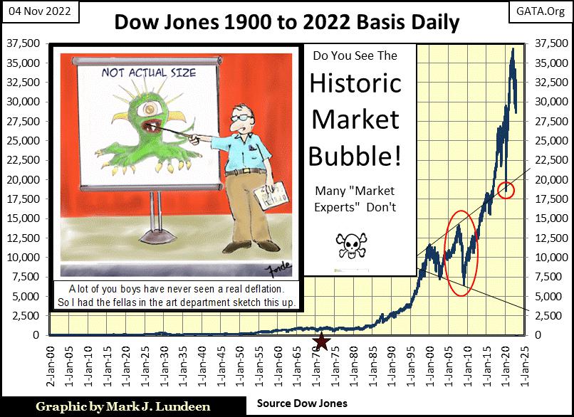
So how far could the Dow Jones (my proxy for the broad stock market) deflate from its last all-time high of 36,799? In the chart above, we see two important bottoms;
The March 2020 Flash Crash: 18,591 a 49.9% decline in the Dow Jones,
The March 2009 Sub-Prime Mortgage Crisis: 6,547 an 82.2% decline in the Dow Jones.
Hopefully, the Dow Jones doesn’t test its lows of March 2009. But with the people we see running Washington and Wall Street today, I’m not going to limit the pending lows in the Dow Jones to something above 6,547.
And this is something people should be aware of too; if the market begins to melt down, and the idiot savants at the FOMC decide to do another QE, their fifth since 2009, they may ignite another bull market run deep into historic values. But the dollar and the fixed income markets may not survive.
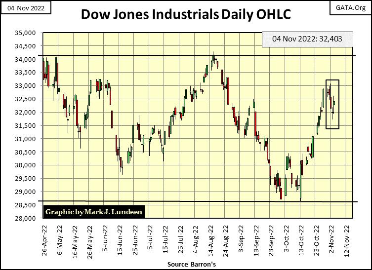
Here’s the Dow Jones in daily bars below. Since early October the market made some nice gains. That it took a break last week is only to be expected.
Right now, I’m watching two levels; 34,000 on the upside and 28,500 to the Downside. Should the Dow Jones break above 34,000, that would be good. Should the Dow Jones close below 28,500, that would be bad. This is a simple way of looking at the market. But as there is no point with making it any more complicated, there it is.
Here are the BEV values for the major market indexes I follow. For this week, like the Dow Jones most are down a bit. While the XAU (gold and silver mining) is up nicely from the lows of Thursday. The gold miners are due for a break.
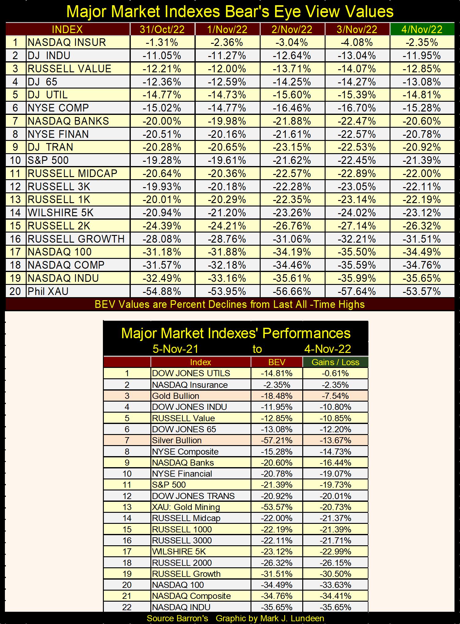
Not generally known, but gold and silver bullion (#3 & #7 above) have done better in the past year than the majority of the major stock market indexes market watchers follow. Also, a common repeating theme of mine is that market valuations for the stock and debt markets are overvalued to an extreme degree. That maybe the thing for investors to do as 2022 comes to a close is to position their investments into undervalued assets.
Undervalued assets pretty much sum up gold and silver billion, and this is especially so for the miners of precious metal, as seen in the XAU chart below. The XAU began trading in 1983. And this week, the XAU closed almost exactly where it closed on its first day of trading; thirty-nine years ago. Thirty-nine years of massive waves of inflation flowing from the FOMC, that somehow totally missed the miners of gold and silver in the XAU.
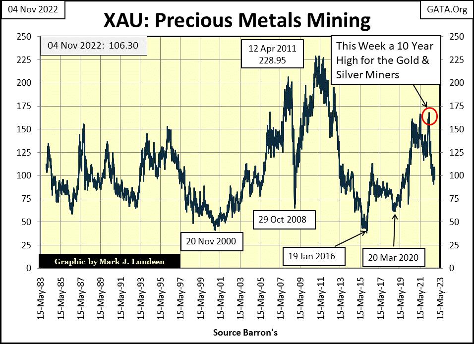
Sounds like gold and silver mining have been a terrible investment for a long time. Well, they have been.
But it wasn’t always that way, as seen below in the Barron’s Stock Groups (BSG), published in Barron’s from 1938 to 1988. Once gold mining; the Barron’s Gold Mining Index (BGMI) was the BSG’s #2 stock group. In October 1980, gold mining was then one of the glamor sectors in the stock market, and had been for decades. Can you believe that? Well, it was!
Within a year, 1981, the BGMI would see the first year of a two-decade long bear market, and the gold miners have been struggling ever since, as seen in the XAU chart above.
Why was Office Equipment the Barron’s Stock Groups #1 market sector? From before WWII, digital computers were like staplers and ball point pens; considered as office equipment. That all changed after Apple and IBM began manufacturing computers for the public in the early 1980s.
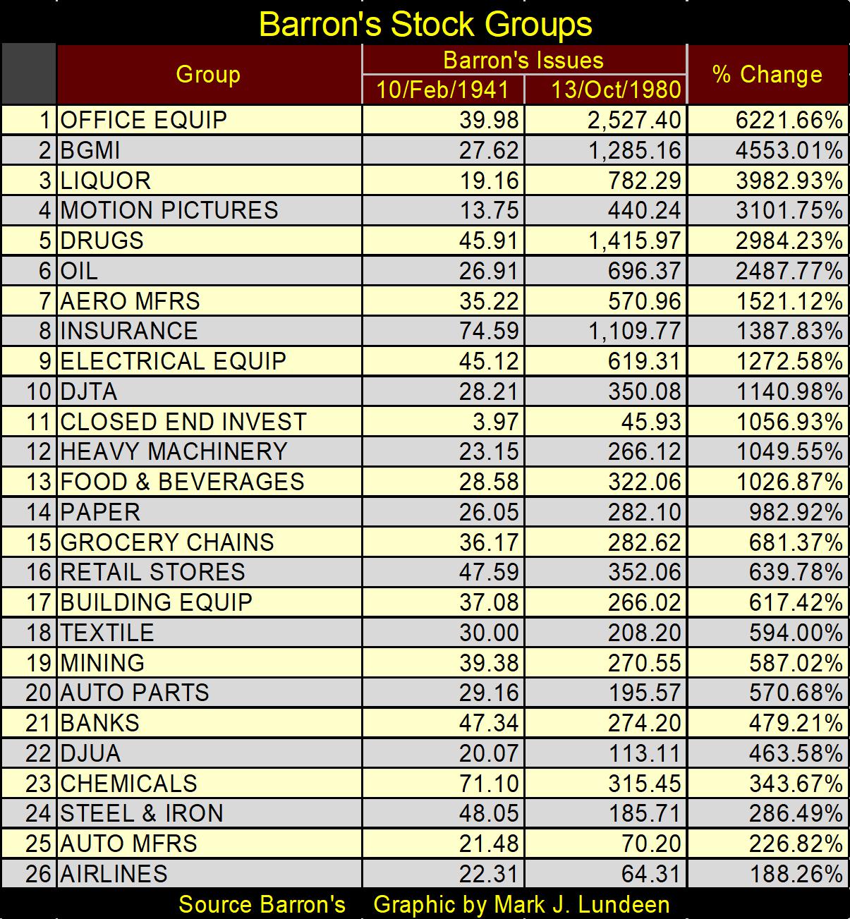
A big problem with investors, they somehow don’t see how things can change in the market. That the status of winners and losers in the market today, somehow have a permanence that market history proves isn’t there.
I’m just a market enthusiast. A retail investor who has done his homework in studying market history. Who else could publish a performance table for the discontinued Barron’s Stock Groups above? And from my studies, I believe precious metal assets are the place to be in the coming decade, with energy and food processors coming in close in my lists of future glamor issues for the next ten years.
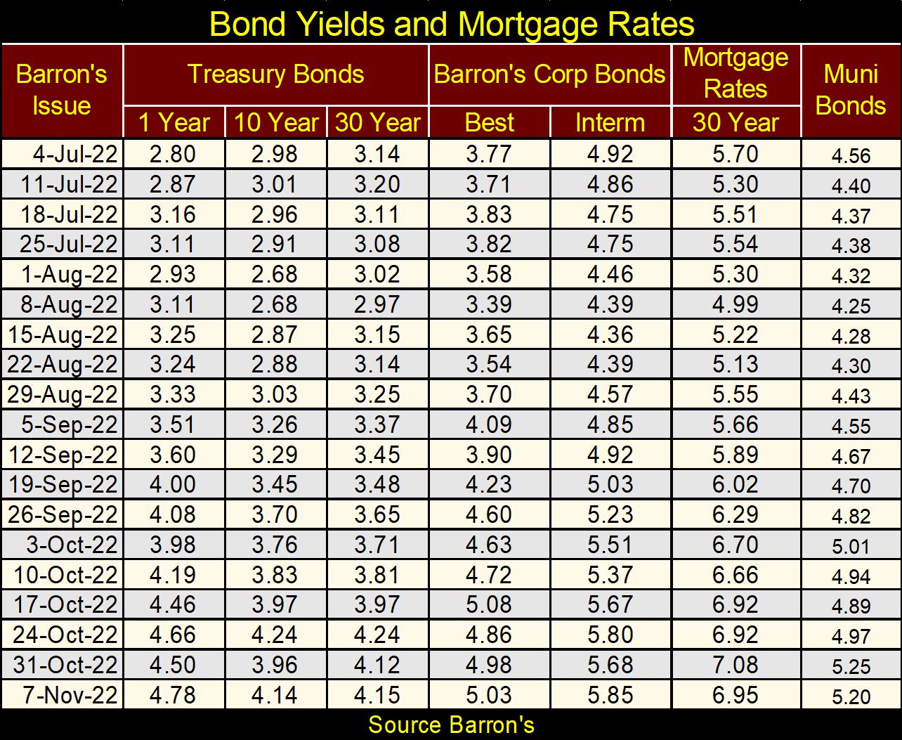
Here is a new table I’m going to be using in the future, a table listing yields for various fixed income investments. The table below makes clear how bond yields have been rising (bond valuations deflating). I suspect what we’re seeing in the fixed income markets, is the smart money exiting early in a massive bear market in debt.
After these people sell their bonds, what do they do with the proceeds of the sales? I believe that they will see investments in precious metals, energy and food processors increasingly attractive.
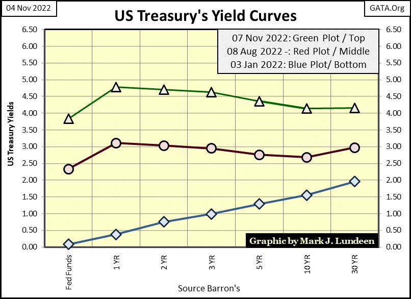
Things of interest are happening between the short and long end of the yield curve. But first; what is the yield curve? It’s a plot of all the yields for debt instruments issued by the US Treasury at that moment of time. The times I use are weekly closings. I don’t track all of them. I ignore the monthly Treasury bills and begin with the 1Yr Treasury bill. That plus I also use the FOMC’s Fed Funds Rate for my shortest interest rate.
In the chart below, I have the yield curve for three weeks in 2022. The yield curve for January 3rd is at the bottom, and obviously yields have risen significantly since the first of the year. Most notably the FOMC’s Fed Funds Rate, which has increased from 0.25%, up to 3.83% in the past ten months. That’s a huge move in only ten months.
Another thing to note about the yield curve for January 3rd, is how rates increase as one goes further out on the curve. When the yield curve is so structured, the idiot savants at the FOMC are encouraging “growth” in the economy. Also known as inflating a bubble somewhere in the economy.
When the idiots desire to retard “economic growth”, (pop a bubble they’ve inflated) they’ll increase their Fed Funds Rate above the other yields in the curve; something not yet evident in the chart below.
Note though in the yield curves for July and November below, the yield for the 1yr T-note is higher than the yields for the 10yr T-note and 30yr bond. That’s an indication that maybe one should reduce their exposure to the stock market, as the idiots are thinking about popping a bubble they’ve inflated in the market.
How is today’s (November 2022) yield curve compared to the historical extremes seen since August 1971? From the perspective of seeing the Fed Funds Rate inverting above the other yields in the curve, July 1981 is the most extreme yield inversion (Blue Plot below). Then from the perspective of yields that couldn’t go lower, August 2020 (Green Plot below) is the other extreme.
The yield curve inversion of July 1981 was that extreme because then Fed Chairman, Paul Volker, was determined to pop the bubble in Consumer Price Inflation (CPI), a bubble the FOMC had been inflating since before WWII. Consumer price inflation in the late 1970s and early 1980s was double digit. And as expected, so were all bond yields in 1981.
That the Fed Funds Rate was over 21% proves that the FOMC was very serious about popping their bubble in CPI inflation. Volcker keep his Fed Funds Rate inverted above T-debt yields for a few years before he broke the back of consumer price inflation.
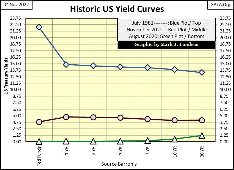
The yield curve for August 2020 (Green Plot above) was the most “stimulative” ever seen. The idiots were taken by surprise five months earlier, with the March 2020 flash crash, which instigated their massive Not QE#4. The FOMC was resolved to reflate their bubble following the March 2009 bottom of the sub-prime mortgage crash, the bubbles in real estate and the stock market that were reflated by Dr. Bernanke’s QE #1-3.
With today’s yield curve rising above its lows of August 2020, and seeing shorter term debt yielding more than longer term debt, it’s best assuming the idiots are once again considering popping a bubble in the market.
Another important aspect to be seen above is how the bond market saw a three-decade long bull market (inflationary bubble), as bond yields above declined from double-digits in July 1981 to below 1% in August 2020. With bond yields now rising off their lows of August 2020, it’s prudent assuming we are two years into a massive bear market in bonds, that will ultimately see bond yields exceed those seen above in the early 1980s.
Let’s look at the spread between the Fed Funds Rate and the US Treasury’s long bond below. The FOMC controls the Fed Funds Rate (Blue Plot), while market forces control the yields of the Treasury’s long bond. Or market forces did before Alan Greenspan and Doctor Bernanke became Fed Chairmen.
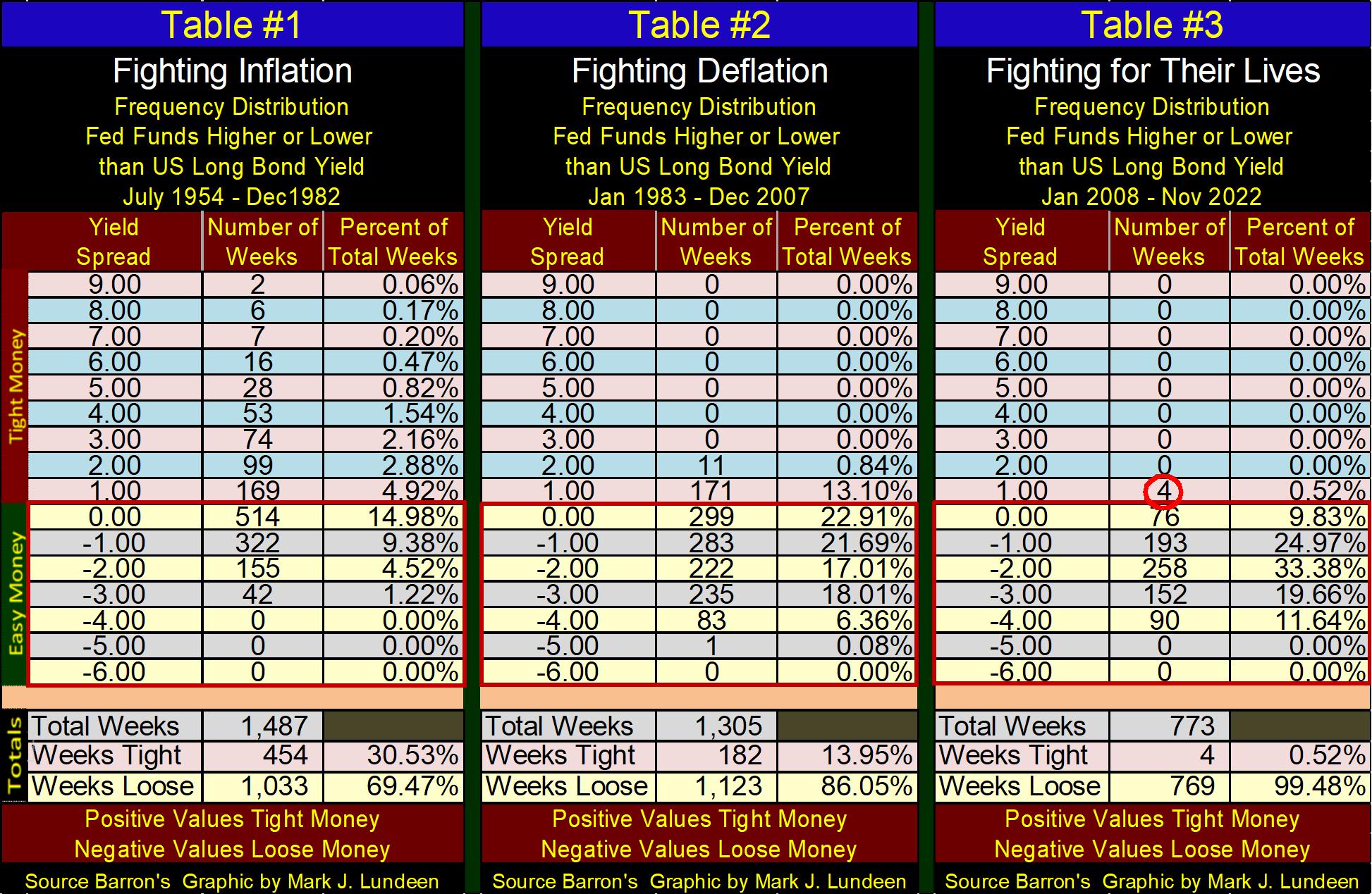
In the chart below, when the blue Fed Funds Rate is above the red Treasury’s long bond yield, “monetary policy is tight”, as the FOMC is attempting to pop a bubble they’ve inflated somewhere in the economy. Before 1982, that bubble was in consumer prices (CPI Inflation). This was a time when the FOMC fought inflation (consumer price inflation), and note how high they were willing to take their Fed Funds Rate above the long T-bond’s yield.
The next era seen in the chart below is when the FOMC fought deflation in the bubbles they’ve inflated in market valuations. Note the inversions following 1982 were small, compared to those seen before 1982, for fear of instigating a bear market somewhere on Wall Street. Still, bear markets did happen four times since 1982 in Boxes #1-4.
When the blue Fed Funds Rate is below the red Treasury’s long bond yield, “monetary policy is loose”, as the FOMC is inflating a bubble somewhere in the economy.
Alan Greenspan was fearless when it came to inflating bubbles in the stock market. At the time everyone loved him for it, and why not? With inflation flowing into market valuations, instead of consumer prices, in the 1990s, people loved the bull markets the FOMC was inflating into Wall Street. Economists and “market experts” called it “economic growth”, but no, these bull markets were only inflationary bubbles blown into the stock market by the FOMC.
But those who live by monetary inflation, also die from monetary inflation.
The last era of “monetary policy” was where the “policy makers” are fighting for their lives. This era began with the collapse in sub-prime mortgage market in 2008, where the Fed Funds Rate went to Zero – THEN STAYED THERE FOR SEVEN YEARS.
It’s not a good sign when the Fed Funds Rate falls down, and can’t get up for fear of what happens should it rise above Zero. Suddenly, being a central banker just wasn’t as much fun as it was when Greenspan stood like a giant over Wall Street.
The idiots raised their Fed Funds Rate from 2015 to 2020, until they inverted the yield curve for the fourth time since 1982 (#4), resulting in the March 2020 flash crash. And once again, the Fed Funds Rate was pegged at Zero for the next two years.
For 2022; in May the FOMC began raising their Fed Funds Rate, and this week the Fed Funds Rate closed at 3.83%. How much longer must we wait for the Idiots to once again invert the yield curve?
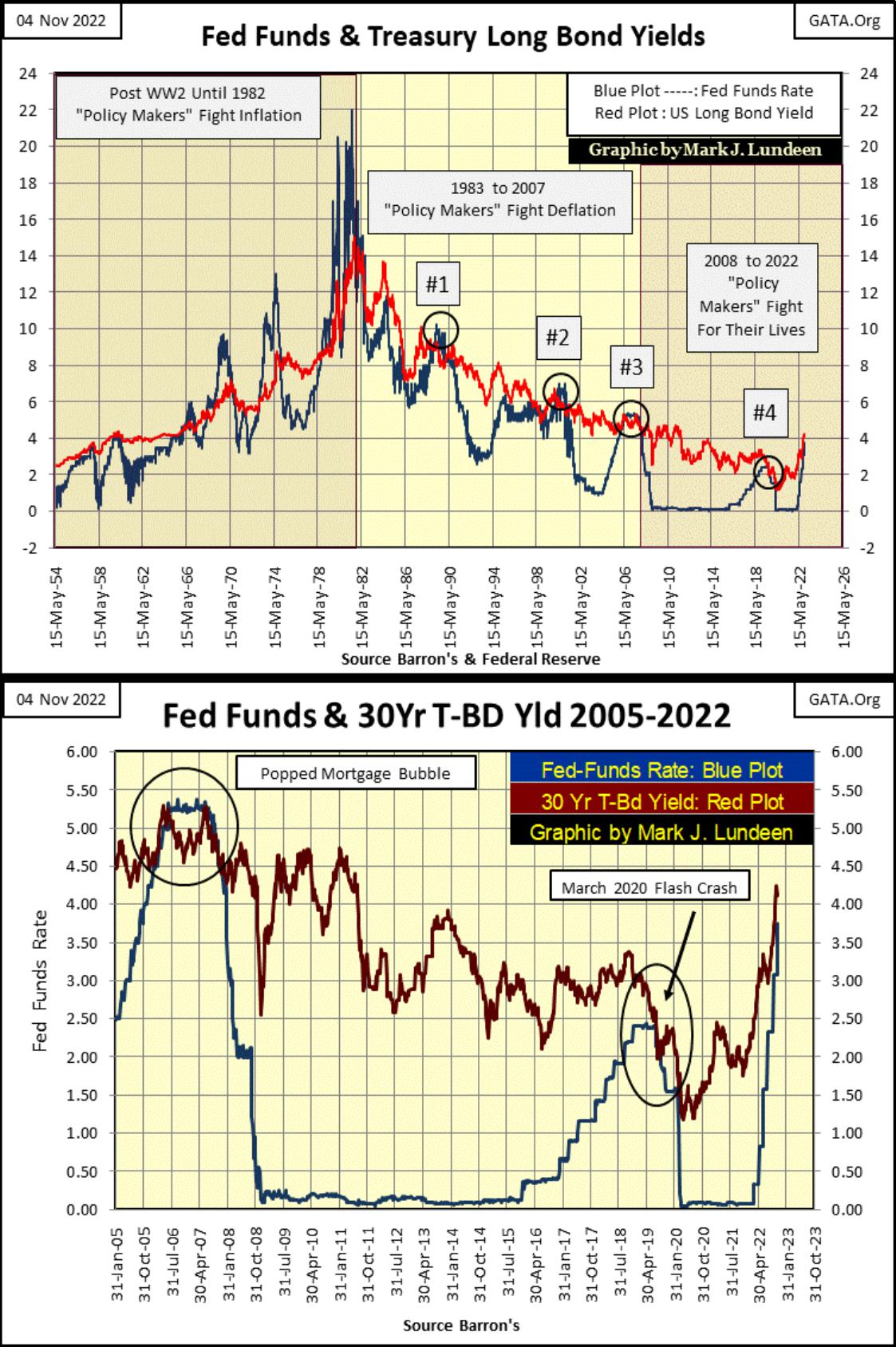
The chart above plots the Fed Funds Rate and the 30yr T-bond yield going back to 2005. We see the post 1982 yield inversions #3&4, the inversions that popped the sub-prime mortgage and the January 2020 market tops. Look at how quickly the FOMC has increased their Fed Funds Rate in 2022. I have to believe the FOMC, where “monetary policy” is dictated, wants to pop the bubble in the financial system they’ve been inflating since March 2020, when they last decreased their Fed Funds Rate down to Zero.
A term once frequently heard when Alan Greenspan was Fed Chairman (1987 to 2006) was that of “a soft landing”, where the FOMC could invert the yield curve to quell inflation in market valuations – yet not actually pop the bubble in the market or result in a recession in the economy. They tried to manage “a soft landing” many times, but never manage to make one happen.
And it isn’t going to happen now in 2022, for the reason seen in Table #3 below (see totals). Since January 2008, the FOMC has inverted the yield curve for only 4, of the 773 weeks during this time period, and the inversions were always less than 1%. The impact of this is; the current bubble inflated into the financial system is huge. I can see why they don’t talk of “soft landings” anymore, after seeing the totals in Table #3.
Compare the totals in Table #3, with the totals seen in Tables #1&2. Since January 2008, the FOMC has been continuously inflating bubbles in the financial markets. As this can’t go on forever, it won’t.
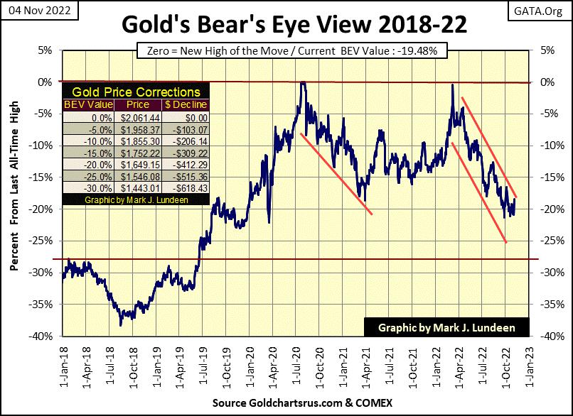
Let’s look at gold’s BEV chart next. Gold was up for the week, and looks like it’s about to break above its upper channel line. That would be a positive development. We’ll know more next week.
I’m going to skip the step sum charts this week, as there isn’t much new going on there, and move on to the step sum tables below.
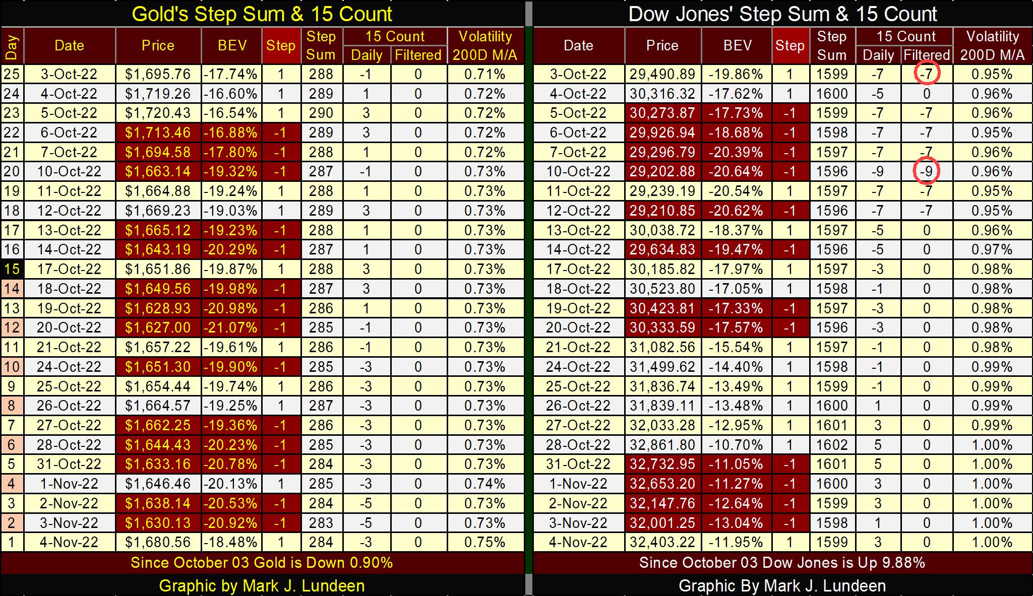
Looking at gold’s table below, the gold market experienced a lot of selling pressure by the bears in the past month. But for all those down days in the gold market, the bears failed to create a selling storm that would have driven gold below $1600.
Can we be far from a turn in the gold market? I don’t know. But if the gold market is going to see overwhelming down days over a period of twenty-five trading days, as seen below, I like it when the gold bears efforts had little effect on the price of gold.
Eric King has an interview with Alasdair Macleod this week at King World News that is of interest to investors in precious metal assets. Alasdair is someone with a solid background in the London and New York gold and silver market, and he said ---. I think it’s best if I just let you read his quote below.
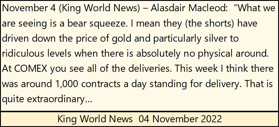
To hear this important market development at the COMEX, here’s the link to King World News.
https://kingworldnews.com/massive-physical-gold-silver-deliveries-continue-on-comex/
Moving on to the step sum table for the Dow Jones, nothing new to comment about. So, we wait to see what next week will bring. Will the run-on COMEX gold and silver, noted by Alasdair Macleod continue next week and beyond? What will the Dow Jones do in the coming weeks?
I’d tell you if I knew. But like you, I have to wait to see what happens in the markets as 2022 quickly comes to term.
Mark J. Lundeen
********
More from Gold-Eagle


