Market Turning Points


SPX: Long-term trend - Bull Market
Intermediate trend - Is the 7-yr cycle sketching an intermediate top?
Analysis of the short-term trend is done on a daily basis with the help of hourly charts. They are important adjuncts to the analysis of daily and weekly charts which ultimately indicate the course of longer market trends.
A NEW UPTREND?
Market Overview
Perhaps, but what kind? Now that the SPX has made a new all-time high, the pattern that was made over the past two months offers two possibilities. It was either a consolidation in a long-term uptrend, in which case another significant advance will follow over the next few months or, it was only part of an incomplete, large topping formation which is ongoing. At this time, trying to decide which it is would be guessing. When dissected, the market behavior can support either option.
As an example, neither the DJIA nor the TRAN has made a new high, and the latter is just a little weaker than the former. Only by waiting a little longer and seeing what transpires will we be able to decide which way the evidence is tilting.
Indicators survey
Momentum: The weekly MACD has turned up slightly but remains in a bearish cross position. Its negative divergence has also increased. The daily MACD continues to crawl upward in positive territory.
The weekly SRSI has continued to move up, has made a bullish cross, and is slightly positive. The daily continues to trade at the very top of its range.
Breadth: My daily A/D oscillator continues to show negative divergence and a lack of upside momentum.
Structure: Still guessing.
Accumulation/distribution: The short-term pattern turned out to be re-accumulation. The long-term pattern could still be an incomplete distribution pattern.
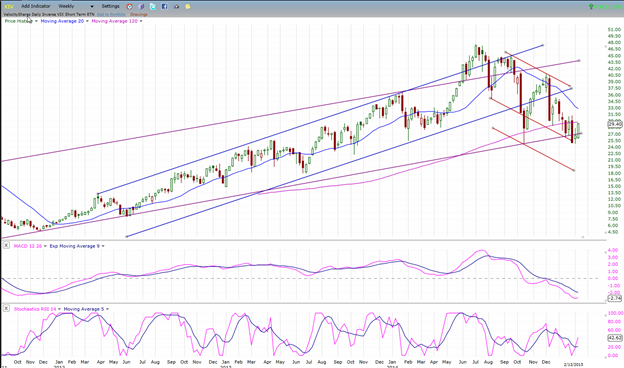
XIV: retains pronounced relative weakness to the SPX
Cycles: The 7-year cycle will become a threat to the market when it starts to assert itself.
Chart Analysis
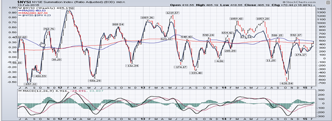
We start with the weekly SPX (chart courtesy of QCharts.com, including others below) with the McClellan Summation Index (courtesy of StockCharts.com) posted underneath it.
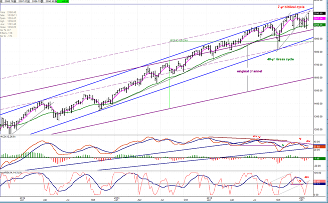
Even though the SPX has made a new high, its upside potential may be very limited. The weekly chart shows that the upper boundary of the blue channel has acted as resistance to prices almost from its inception three years ago. Since that trend already moved through the upper part of the original long-term channel in October 2013, it’s difficult for me to conceive that, after more than five years in a bull market during which the SPX has more than tripled in price, it would still be strong enough to accelerate upward and pierce the top of the intermediate channel, as well. However, I must admit that there has been no deceleration in the trend since the index again touched the top of the channel when it made its last high in December. More likely, the index could remain in an uptrend a bit longer with price deceleration beginning to set in as it makes new highs which fail to reach the top of the channel before finally turning down for a long overdue intermediate correction. I pointed out in the past couple of weeks that increasing deceleration was taking place in the MACD. It would be logical for deceleration to start appearing in the price itself.
While all the oscillators have turned up, they remain in a strong negative divergence condition. Also, it is not conceivable that the new high represents a trend which could develop enough strength to eliminate this divergence.
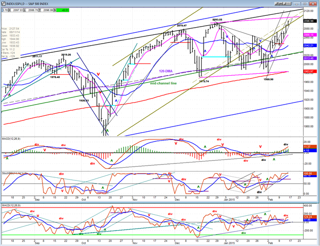
The daily chart shows that, in spite of its ability to make a new high, the move from 2080 is not a strong move. The price pattern (which portrays an uptrend channel) shows that, over the past five days, the index has traded in the lower half of the channel and has hugged the bottom channel line. This is a sign of weakness which is also apparent in the A/D oscillator (below). Compare this pattern with the move which started in mid-October; then, the price remained at the top of its channel line as it moved aggressively higher. Also, look at the explosive move of the A/D oscillator at the start of the move -- another indication of initial strength. Nothing in the current move compares to the October rally.
It also looks as if the index is approaching the top of a new, broad pattern which is defined by the pink parallels. If it cannot go beyond, my interpretation that the index is simply expanding its topping pattern may turn out to be correct.
The oscillators also reflect the weakness of the move, especially the lower one (A/D). The SRSI is overbought and can, of course, stay there for an undetermined amount of time. The MACD is in a weak uptrend, but it is still positive and going up. But it would take a strong follow through in the price to overcome this problematic and tentative condition.
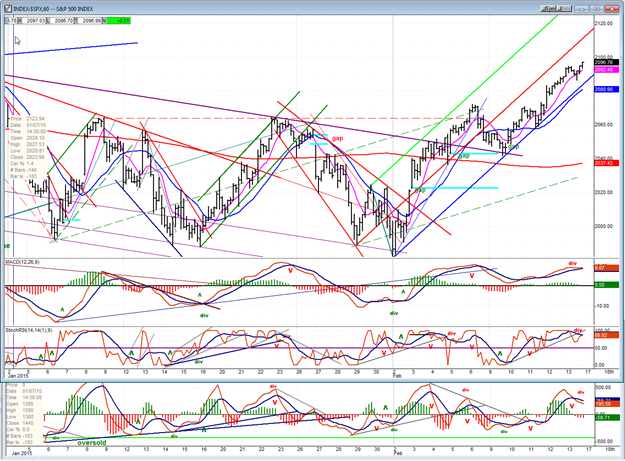
In the hourly chart, I am using Andrews Pitchfork to depict the uptrend from 2080. Here we can see more clearly that the momentum has already moved from strong to neutral with the index dropping into the lower channel and hugging its lower trend line. Judging by the negative divergence which has built up in all the oscillators, it also looks as if it is ready to move through it. That would give a near-term sell signal which would be the first test of the break-out to a new high. If we stay above the red MA, it will simply be a consolidation, but if we drop below it, it could turn out to be more. I suspect that next week will be a commentary on the market’s strength.
All the charts posted below are weekly charts which cover the same time span as the weekly SPX chart posted above. By comparing them to the SPX, we can see which are keeping up and which are falling behind. If the leaders continue to lag (as they have started to do), bulls will need to exercise some caution.
XIV (Inverse NYSE Volatility Index) - Leads and confirms market reversals.
This is the index which has the worst relative weakness to SPX. It may have started a consolidation in a downtrend which could last a little longer. When it resumes its decline it should precede another spell of market weakness. On the other hand, if it turns up, it will be a sign that the market could remain in an uptrend a bit longer.
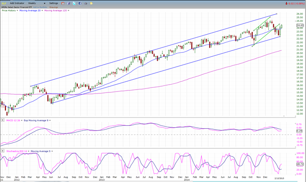
XLF (Financial Sector SPDR) - Historically a market leader.
XLF has found support at the bottom of its intermediate channel and rallied. What it does from here should determine the path of the SPX.
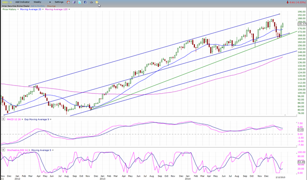
XBD (American securities Broker/Dealer) (market leader as well)
XBD found support on the mid-channel line which had supported it several times before. It can now choose to move back to the top of its channel, or make a new low. Whichever direction it takes should have a material effect on the future market trend.
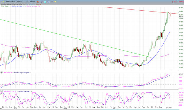
UUP (dollar ETF)
The dollar is stuck against a long-term downtrend channel line. It has had quite a run and is entitled to a pause. When it can get out of this channel, it should resume its uptrend.
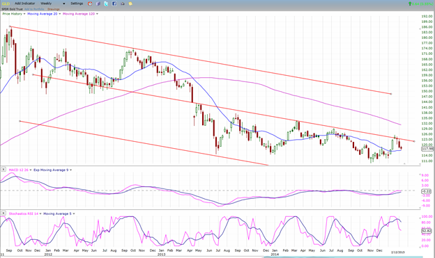
GLD (Gold trust)
GLD was also stopped, but only after a short-term bounce and at the middle of the long term corrective channel. It is unclear if it is in the process of building a large base or if it is going to continue moving lower. Must be given some time.
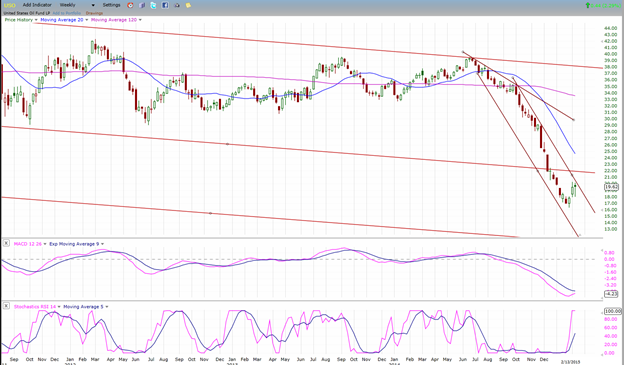
USO (US Oil Fund)
On the very long term chart, WTIC appears to have decisively broken an uptrend line originating in 1998. On the weekly chart, it has dropped below the mid-channel line of a long-term corrective channel. Both actions imply continued weakness, as does the P&F chart. The current pause is related to that of the dollar. When the latter resumes its uptrend, USO should continue its downtrend.
Summary
The indices are mixed. SPX managed to make a new high by a small margin, but DJIA has not. Also some of the leading indexes such as XLF and XBD are beginning to show relative weakness. If this continues and worsens, it will be unlikely that SPX is on its way to make a significant new high. Instead, it could be in the process of completing a topping formation which is generated by the down-phase of the 7-year cycle. However, if real strength should develop from here, an extension of the bull market will be under way.
********
FREE TRIAL SUBSCRIPTON
Market Turning Points is an uncommonly dependable, reasonably priced service providing intra-day market updates, a daily Market Summary, and detailed weekend reports. It is ideally suited to traders, but it can also be valuable to investors since highly accurate longer-term price projections are provided using Point & Figure analysis and Fibonacci projections. Best-time reversal estimates are obtained from cycle analysis.
For a FREE 4-week trial, send an email to: [email protected]
For further subscription options, payment plans, weekly newsletters, and for general information, I encourage you to visit my website at www.marketurningpoints.com . By clicking on "Free Newsletter" you can get a preview of the latest newsletter which is normally posted on Sunday afternoon (unless it happens to be a 3-day weekend in which case it could be posted on Monday).
The above comments and those made in the daily updates and the Market Summary about the financial markets are based purely on what I consider to be sound technical analysis principles. They represent my own opinion and are not meant to be construed as trading or investment advice, but are offered as an analytical point of view which might be of interest to those who follow stock market cycles and technical analysis.

When Andre Gratian was a stock broker years ago, a friend introduced him to technical analysis of the market. Consequently, it is not an exaggeration to say that Andre fell in love with this approach! Ever since then, it has become an increasingly important part of his professional life. Gratian has studied the works of Wyckoff, Edwards & Magee, Edward J. Dewey (cycles) and many others. However, one of my most profitable undertaking has probably been to study Point & Figure charting, which he finds invaluable in analyzing stocks and indices. If he were restricted to one methodology, this is the one that he would choose. This well-rounded background has given him what he feels to be a special insight into the stock market, facilitating the recognition of meaningful patterns and the ‘turning points’ in all trends, whether they be short or long term. Andre feels very comfortable discussing the stock market and passing on meaningful information to others. His subscribers include individuals and money managers throughout the world. Moreover, his Newsletters are currently published on several financial sites, here and abroad.