Market Turning Points
Current position of the market


SPX: Very Long-term trend – The very-long-term cycles are in their down phases, and if they make their lows when expected (after this bull market is over), there will be another steep decline into late 2014. However, the Fed policy of keeping interest rates low has severely curtailed the full downward pressure potential of the 40-yr and 120-yr cycles.
Intermediate trend – Failed to overcome resistance at the high.
Analysis of the short-term trend is done on a daily basis with the help of hourly charts. It is an important adjunct to the analysis of daily and weekly charts which discusses the course of longer market trends.
ARE LEADING INDEXES TURNING BEARISH?
Market Overview
By any definition, Friday was a bearish day. Call it “failed break-out”, “key reversal”, or “bearish engulfing” -- or whatever else you can think of -- Friday’s market action should have brought a smile to the face of the bears! It’s not so much because we had a strong down day, but it’s the potential connotation behind those terms; they often mark the end of a market trend.
These patterns are not infallible, so what happens over the next couple of weeks should tell us if it was a false alarm, or the genuine item! Most of the damage was done to the Nasdaq 100, the Russell 2000, and the Amex Securities Broker/Dealer. These indices had already made their highs over the past month, so you cannot apply the above terms to them. They simply resumed their downtrends with XBD outpacing the other two. This could be significant because the Amex Securities B/D is considered to be one of the most important leading indicators.
You can add to the bearish significance of Friday’s action the fact that two of the three indices mentioned above have already formed H&S tops (we’ll examine them in detail in our Chart Analysis section).
It is true that the Dow Industrials is not nearly as bearish – for the short-term! But over the intermediate term, it barely managed to surpass its January high on Friday before selling off, while all the indices mentioned above rose decisively to new highs before turning weak. So we will need to watch how the collective market performs in the days ahead.
Chart Analysis
Let’s start with the daily SPX chart (courtesy of QCharts.com).
The consolidation that the index had formed over the past month was contained by two parallel lines. I had mentioned earlier that if the SPX was able to move out of the top of the channel decisively with strong support from the A/Ds, we could be in the process of establishing a measured move which could take us up about 100 points. I also added that I had a great deal of difficulty visualizing this taking place. The alternative (besides continuing the sideways move) would be a decisive move through the bottom of the channel, in which case the entire pattern would have to be considered a top formation.
Friday’s action pretty much erased the first possibility. We’ll find out over the next few days if the second is realized. The last key reversal occurred on 5/22/13 with a daily high of 1687.18 and was followed by a 5-week decline to 1560.33. It is too soon to say if something similar will happen this time but if it does, it would not be surprising if we have an even longer and deeper retracement. For one thing, the index is starting this reversal from a much higher and much more overbought level. Another is that the distribution pattern is much greater at this top than it was then.
But are we starting such a retracement? Too soon to tell! Several things need to take place with breaking below the lower channel line and the 1840 level being first on the list. If we did this, a drop down to the 200-DMA line (1758) or lower would be a good bet.
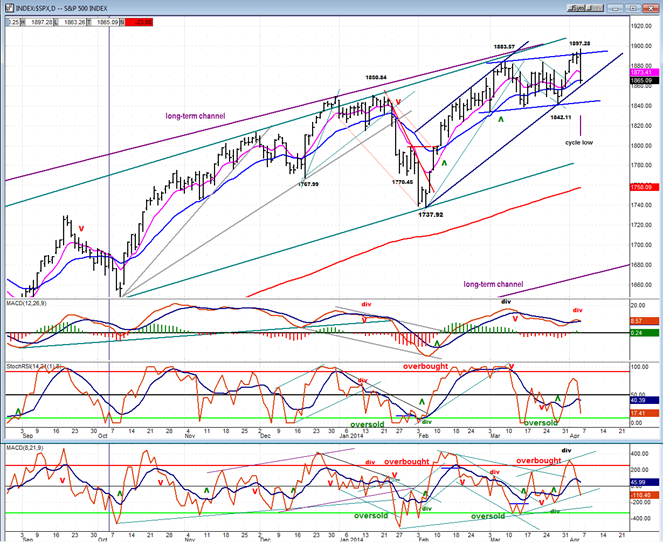
On Friday, the two lower oscillators turned down sharply and made bearish crosses. They normally do not recover from this kind of weakness right away, so it would be logical to expect a continuation of the decline. The MACD is slower and only turned down slightly, but it did something bearish: it turned back down after displaying strong negative divergence to the price. But (again) it is still positive and needs to turn negative before suggesting that an important decline may be underway. It is making a similar but weaker pattern than the one it made in January. That one resulted in a decline of 100+ points.
What the SPX did on Friday is bearish enough. But let’s look at the daily charts of the leading indices I mentioned earlier (also courtesy of QCharts.com)!
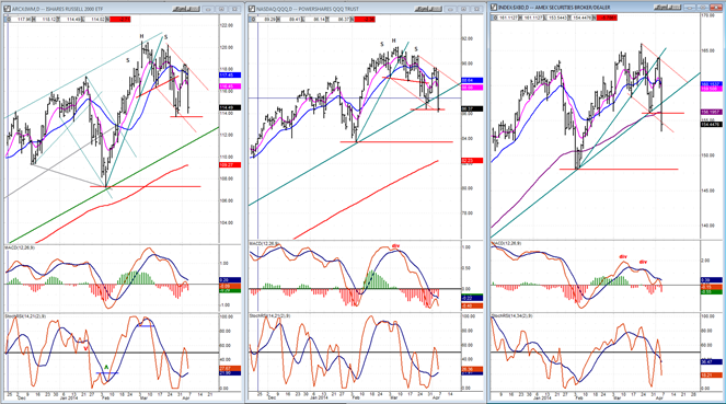
If you compare them to the SPX chart (above) it’s obvious that they are all weaker. IWM (Russell 2000) and QQQ (Nasdaq 100) both made their highs on 3/07 while XBD made its high on 3/21. SPX made its high on Friday. All three have broken their former short-term lows while SPX has not. We’ll have to see if that relative weakness is maintained in the coming days and weeks.
I have assigned H&S patterns to IWM and QQQ but not to XBD, although one could consider that it made an unorthodox pattern with the right shoulder going slightly above the head. For that matter, they are all somewhat unorthodox H&S patterns, but they do look like tops and that is the main consideration. Still, none of the indices (including SPX and DJIA) will develop severe declines unless they take out their early February lows.
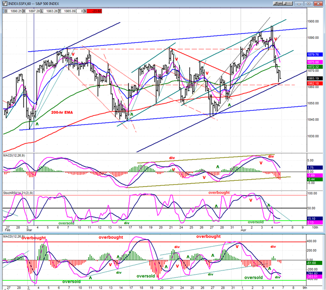
We’ll conclude the analysis segment with the SPX hourly chart (also courtesy of QCharts.com). Here you can see the blue channel more clearly and what it will take to go below. In spite of the strong rejection at the top of the channel and the fact that a good portion of the support has been penetrated, the SPX still has work to do before it can challenge the bottom of the channel. Note that on Friday, the low of the day came in the next to the last hour. The index was finding some buyers just above a strong support level consisting of the 200-hr MA, the bottom channel line from 1738, and the dashed red line which represents the next support level.
Note also that the A/D oscillator (bottom) is oversold with positive divergence. In fact, the thing that surprised me about the extent of the decline is that the A/Ds were not really supportive, and there was little buying interest in the VIX. It closed up only .59 for the day which seems out of sync with the SPX suffering a 24-point loss. Something does not compute.
Another indicator, SRSI, is also oversold so it would seem that at least a temporary respite is logical.
Cycles
Friday was the ideal cycle low. To be frank, I had given up on it! It waited until the last day of its normal phase to make its presence felt, and did so in a big way when it was ready. The market decline should end when it has made its low. Since it could extend its phase by a day or two, we may not get a short-term low until early next week.
Breadth
Below, we have the McClellan Oscillators and the Summation Index (courtesy of StockCharts.com).
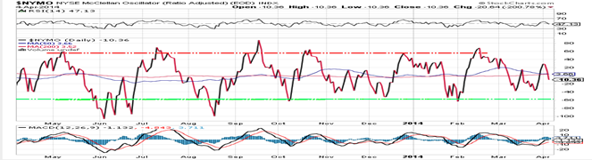
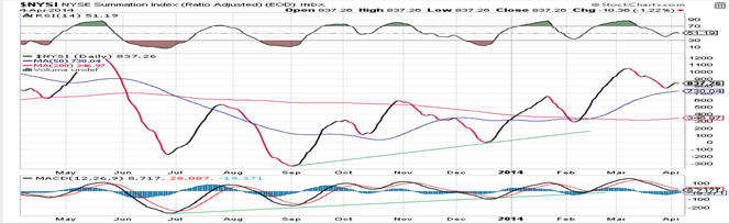
 The McClellan Oscillator tried to rally, but was stopped cold by Friday’s reversal. Actually, Wednesday and Thursday were also negative days for the A/Ds and this affected the NYMO adversely and turning down the Summation Index and its RSI, both of which were trying to rally. If there is to be additional market weakness, both should continue to decline.
Sentiment Indicators
It’s unanimous! The SentimenTrader (courtesy of same) long-term and short-term indicators have now filled the page with 7 consecutive similar Friday values.
VIX (Velocity Index)
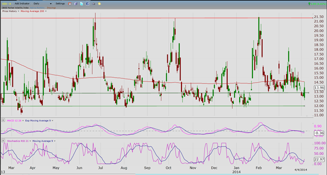
There was little reaction from the VIX to Friday’s market negativity. This would suggest that a substantial follow-through on the downside is unlikely, at least right away. If the market is in the process of making a top, VIX appears to be telling us that it is not complete.
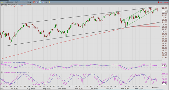
XLF (Financial ETF)
XLF did not make a new high on Friday and its correction was proportional to that of SPX. There is not much to glean from this chart until, like SPX, there is a break-out from the consolidation pattern.
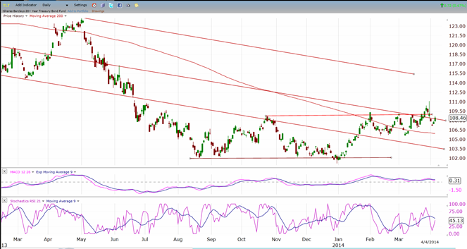
TLT (Barclays 20+ year Treasury Bond Fund)
The same with TLT: it tried to break out, fell back, and is now moving sideways. All these chart patterns need to be given more time to evolve into a sustained trend.
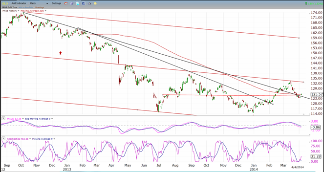
GLD (ETF for gold)
GLD has retraced about 50% of its advance and found support where it should have, but does not look quite ready to resume its uptrend. More consolidation in this area will be needed but, by then, the 25-week cycle will be past its peak and it may be difficult for GLD to make further upside progress.
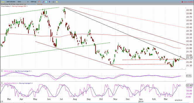
UUP (dollar ETF)
UUP is trying to break out of its down trend line. If it succeeds, the 200-DMA and the top of the declining channel will limit its advance. There is also a lot of overhead resistance to overcome.
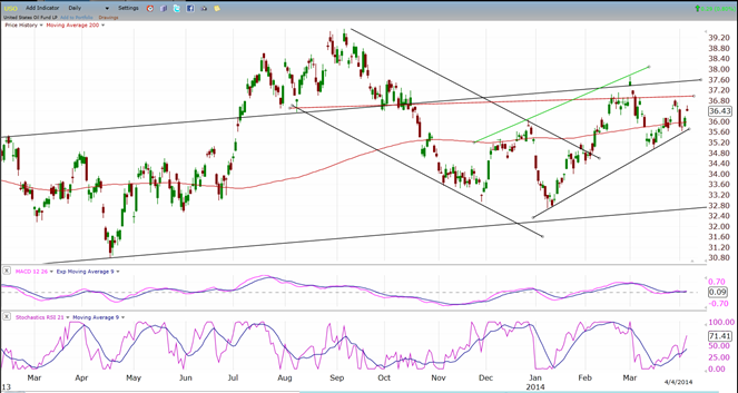
USO (United States Oil Fund)
As suspected, USO does not have the technical strength (at this time) to overcome the overhead resistance that stands in its way. If it backs off more, it will risk going through its bottom channel line and resuming its downtrend. Like most of the charts above, USO is trading in a sideways pattern, waiting for some incentive to move in one direction or the other.
Summary
On Friday, SPX tried to move through the top of its consolidation pattern and failed! This brought about a wave of selling which, by the end of the day, had created a key reversal. This type of pattern often signals the end of a trend and the beginning of a correction. However the volume for the day was about average. Therefore, the follow through action needs to be watched closely to see if this turns out to be a valid warning. In addition, the behavior of the VIX and of the A/D was not conclusive.
On the other hand, the selling which took place in some of the leading indices suggests that they may already have made a top and started a substantial correction. Additional weakness in the Dow and SPX will be needed to establish them in a downtrend.
********
FREE TRIAL SUBSCRIPTON
Market Turning Points is an uncommonly dependable, reasonably priced service providing intra-day market updates, a daily Market Summary, and detailed weekend reports. It is ideally suited to traders, but it can also be valuable to investors since highly accurate longer-term price projections are provided using Point & Figure analysis. Best-time reversal estimates are obtained from cycle analysis.
For a FREE 4-week trial, send an email to: [email protected]
For further subscription options, payment plans, weekly newsletters, and for general information, I encourage you to visit my website at www.marketurningpoints.com. By clicking on “Free Newsletter” you can get a preview of the latest newsletter which is normally posted on Sunday afternoon (unless it happens to be a 3-day weekend in which case it could be posted on Monday).
The above comments and those made in the daily updates and the Market Summary about the financial markets are based purely on what I consider to be sound technical analysis principles. They represent my own opinion and are not meant to be construed as trading or investment advice, but are offered as an analytical point of view which might be of interest to those who follow stock market cycles and technical analysis.

When Andre Gratian was a stock broker years ago, a friend introduced him to technical analysis of the market. Consequently, it is not an exaggeration to say that Andre fell in love with this approach! Ever since then, it has become an increasingly important part of his professional life. Gratian has studied the works of Wyckoff, Edwards & Magee, Edward J. Dewey (cycles) and many others. However, one of my most profitable undertaking has probably been to study Point & Figure charting, which he finds invaluable in analyzing stocks and indices. If he were restricted to one methodology, this is the one that he would choose. This well-rounded background has given him what he feels to be a special insight into the stock market, facilitating the recognition of meaningful patterns and the ‘turning points’ in all trends, whether they be short or long term. Andre feels very comfortable discussing the stock market and passing on meaningful information to others. His subscribers include individuals and money managers throughout the world. Moreover, his Newsletters are currently published on several financial sites, here and abroad.


