Market Update


For what seems like a few months, I've been saying that there is no chance for the Dow Jones would ever close above 13000; okay I was wrong! But I wasn't wrong about what drives the stock market up and down; the "policy makers."
"7/27/2012 5:47:57 AM - European Market rumour: Le Monde newspaper reports the ECB is preparing to purchase Italian / Spain debt 06:25 Follow-up : Le Monde newspaper reports the ECB is preparing to purchase Italian / Spain debt
According to Le Monde, the ECB and member states are preparing a concerted intervention on the market to limit the surge in interest rates in Spain and Italy. We are also hearing unconfirmed talk that the German Finance Minister Schaeuble is planning to issue a general statement soon and that Hollande and Merkel will speak by phone today at 1pm CET."
To prevent the big banks' counterparties in Spanish and Italian sovereign debt derivatives from coming into the money, by the tens or hundreds of trillions, the ECB has committed itself to destroy the euro as an economic asset.
What could be more bullish for the Dow Jones?
As soon as I heard this, I was on the phone to my broker to see if I could go short on one of those inverse-floating-collar derivatives in the Abyssinian sovereign debt market. She told me there was no such thing, so I told her "I didn't care, because when Draghi talks; I listen!" I then told her that; "I'm going to my bank to get a second mortgage to buy one, and when I get back in an hour, she better find one!" And do you know what, when I got back with the money, she connected me with J.P. Morgan who was more than happy to take the other side of the trade; real service with a smile! That was a few hours ago, and I haven't developed buyer's remorse yet.
Last summer a good friend, one Mr V, asked me to say something about the monster head and shoulders pattern forming in the Dow Jones. The Dow Jones may have closed above 13K for the week, but it that doesn't change this H&S chart pattern; it really looks horrible! The way to understand what is going on here is to know recognize that bull markets, as do (just like bear markets) don't go from one extreme to the other in one easy step. They move in surges with corrections in between. Always have, and always will.
Below we see the surge of 2000, which was corrected in 2002 with a 38% Dow Jones bear market. This was followed by a greater surge of in 2007, which was then corrected by the second deepest Dow Jones bear market since 1885. We should note that these bullish surges are very unusual, as and since 2000, they've been are corrected by massive bear markets. This has never happened before. Then, from the lows of March 2009, the Bulls once again took off to see if they could once again rise above the highs of the previous surge, but since January 2011, they are having problems getting the job done.
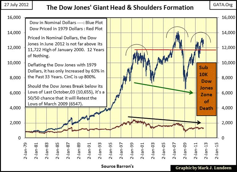
We see a green arrow under the lows of 2002 & 09. As it's pointing down, this is called a "declining neck line." Technically, this indicates that should the Dow Jones fail to exceed the highs of 2007 in the current surge, the following "correction" will result in a BEAR MARKET greater than the lows of 2009, meaning . Meaning that should the Dow Jones decline below 10,000, there is a damn good chance that it won't stop until it falls below 6000. Well, that is what this H&S chart suggests is possible for the Dow Jones' future. Whether or not the Dow Jones falls into the Zone-of-Death is something only time will tell. But I expect this H&S chart will become a historic chart to be studied by chartists for a very long time to come.
I also included a Dow Jones plot deflated with 1979 dollars (red plot above). For all the excitement in nominal dollars since 1979, the Dow Jones has actually been a poor investment since 1995 when adjusted for inflation.
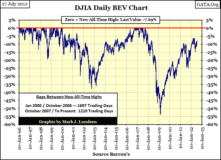
Here is the Dow Jones Bear's Eye View (BEV) chart. It has needs to move up only 7.69% to create a new all-time high; but can it? I don't think so.
For one thing, trading volume for the Dow Jones stinks, and has for the entire move up from the lows of March 2009. The funny thing about this next chart is that at the March 2009 bottom, when the public was fleeing from the stock market for their lives, trading volume for the Dow Jones hit its all-time high. So who was buying at the bottom? It certainly wasn't from bargain hunters using their own money.
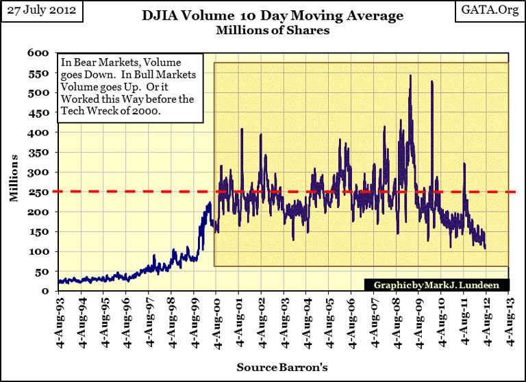
This historic and massive buying in the stock market was from central banks like the Federal Reserve. Don't just takemy word on this; Doctor Bernanke is proud of what he did in March 2009:
"Policies have contributed to a stronger stock market just as they did in March 2009, when we did the last iteration of this. The S&P 500 is up 20% plus and the Russell 2000, which is about small cap stocks, is up 30% plus." - Doctor Benjamin Bernanke, CNBC Interview with Steve Liesman 13 Jan 2011 (1:40 PM).
We should also compare last August's Dow Jones decline in the BEV chart with the latest spike in trading volume. Yep, when the Dow Jones was under pressure a year ago, once again trading volume saw a buying spike. Before 2000, going back to 1885, except for the first few days, or week, of a market panic, when everyone wants out NOW,declines in the Dow Jones occur with declines in trading volume. That makes sense. When people get out of the market, they take their money with them. This is why real bargains occur at market bottoms, as there are no buyers to make bids for cheap stocks, and trading volume reflects that fact, until 2000. So what happened in 2000? Hey, Doctor Bernanke just told you in the quote above!
Here is a plot that gives the number of 2% daily moves (up or down 2%) in a 200 day running count. Large, and frequent daily moves in the Dow Jones correspond to bear markets. The #1&2 Dow Jones bear markets bottoms are easy to identify in the chart below.
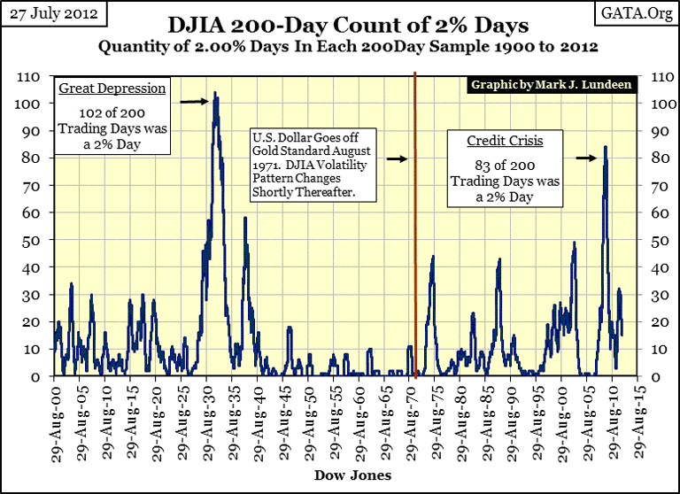
The thing we should note above is how volatility in the stock market has increased since August 1971, since the US dollar was taken of the $35 gold peg. It's been five years since this plot has seen zero 2% days in a 200 day running count. It seems to me that volatility in the Dow Jones is telling us something important; maybe to sell stocks and buy gold and silver?
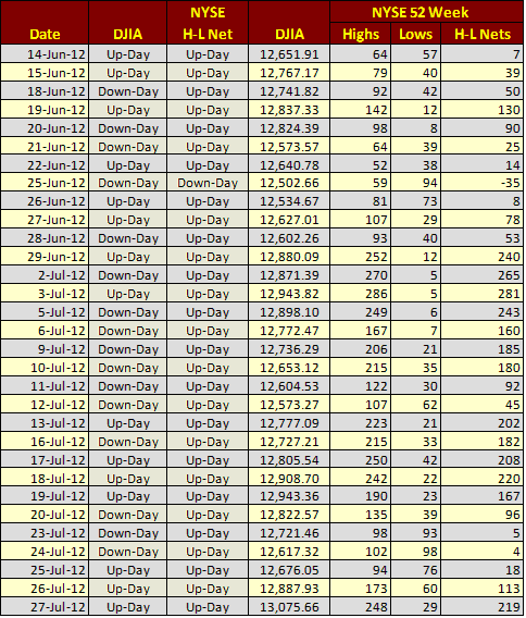
Looking at the NYSE's 52Wh H&L data, since June 14 to the close of today, there has only been one negative day in the H&L data, and the Dow Jones only today exceeded finally managed to exceed 13K after thirty one trading sessions like we see below?
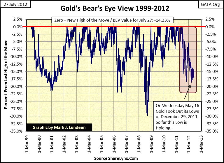
Let's look at some gold and silver charts. The lows of May 16 are holding, but remarkable remarkably, this low of a yearlong correction was less than a 20% drop, as we see in the BEV chart below. For all the verbal abuse gold's received in over the past year, it really is amazing that to date, the bottom of this correction was only an 18.66% decline from its record high in August 2011. a few months ago. Look at the BEV chart below. Since the absolute low in the 1980-2001 bear market (1999), the current correction comes in at #4! What does that tell us? That the gold bugs stopped listening to the "gold experts" on TV and Bloomberg! Currently gold is 14.33% from making a new all-time high, while the Dow Jones is 7.69% from doing so. Who Which one do you think will be first to make a new all-time high? I say gold will, sometime in the next few months.
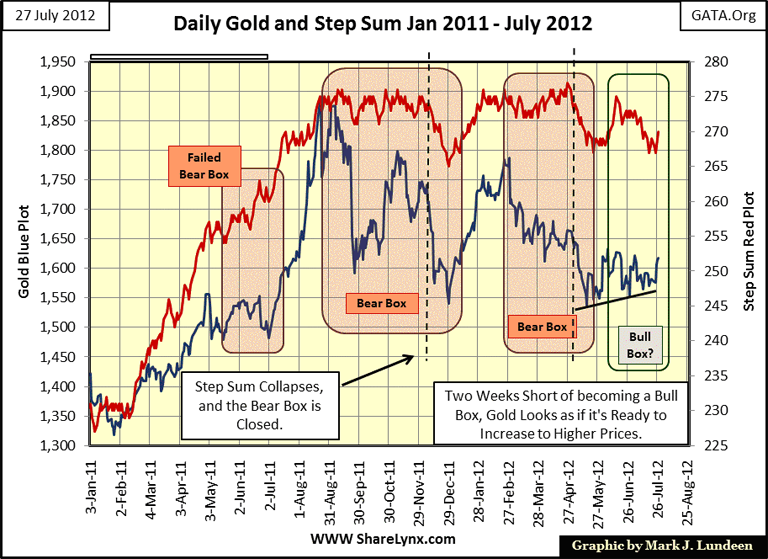
How is gold's step sum doing? It's doing well enough for me to say that gold has not only bottomed, but appears to be in the first few days of a new advance towards its next all-time high. This is exactly what I like to see, an asset's price and step sum trends bouncing off the bottom together. Remember, step sum analysis, like all technical market indicators, are at best informed assumptions of an uncertain future by looking backward at market history. But it's the best we can do for making predictions for tool we have for predicting future market trends.
Gold and its step sum looks really good. We might see an eruption in the price of gold in the not too distance distant future.
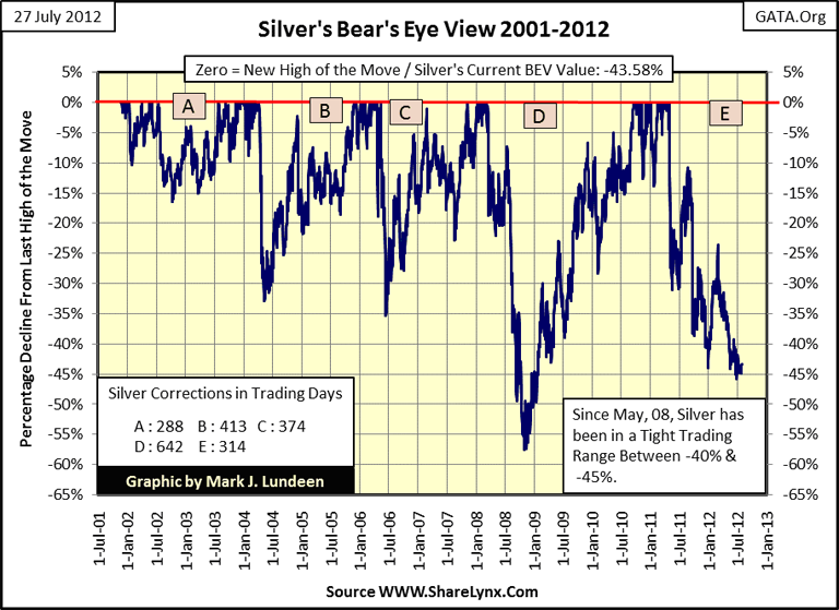
Silver's BEV plot shows almost no change, but when a price series is down 45%, it takes a lot to get it back to a new all-time high. Look at gold; I frequently use gold's BEV value for how much of to show how large a percentage advance it will take for a new all-time high, but that isn't correct. Gold's BEV value may be at -14%, but it will take a +17% move to generate the next BEV Zero in the series.
Silver closed the week with a BEV of -43.58%, meaning that it will take a +77% advance in silver to see a new all-time high. Can silver do this? Sure it can, and it can do it quicker than a TV expert can change their opinion in the metals market. Silver is being held down by the big banks that control the paper markets. There is a looming derivatives debacle somewhere ahead. When these banks become overwhelmed by demands to perform on their derivatives positions, all hell is going to break loose. A 77% advance for silver in a few weeks, or days is not out of the question in a selling panic out of paper assets.
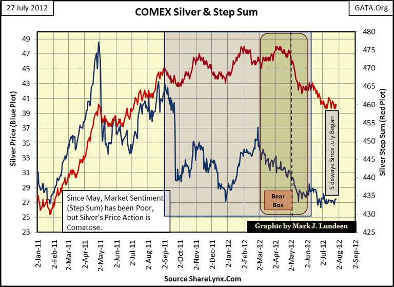
In the chart, shouldn't it read: Since May 2012, or since May 8th? Looking at Silver's step sum chart, it appears the price and step sums trends aren't doing much, well, they haven't. However, for the past month these trends have refused to up, or down, however, that isn't a bad thing to happen in after a fifteen months correction. I'll tell you what I really like about this chart. In late January 2011, silver was at $27, two months later it was over $48. Just keep that in mind.
I need a rest from writing until after Labor Day. This is becoming too much like work, and I hate work. Personally, I like fun, and fun is what writing is like after I take a break from my weekly articles. No doubt I'll get bored…and write something anyways every now and then. But I need to get away from this keyboard until early September.
Mark J. Lundeen
[email protected]
[email protected]


