Market Update for mid-February 2023


As it’s been since August, the Dow Jones continues struggling to break above its BEV -5% line. That’s a long time. Then since early November, the Dow Jones has daily closed in a tight trading range bounded just under its BEV -10% line, and its BEV -6.50% level.
Tedious markets like this makes for boring reading. The only thing worse is trying to keep one’s readers attention by finding something interesting to write about. This too shall change, as sometime in the future we’ll all have more excitement in the market than we can stand, when Mr Bear and his cleanup crew rip into the dumpsters many famous companies now trading on Wall Street call their balance sheet.
But whatever the current entertainment value of the Dow Jones BEV chart below is, good or bad, the story remains the same; we wait until the Dow Jones either breaks above its BEV -5% line to the upside, or its BEV -10% line to the downside. And the break out from this trading range should be something with some authority, or it’s likely the Dow Jones will once again slip back into it.
How long can this go one? With each passing NYSE trading session, we come closer to its termination, if knowing that is any help.
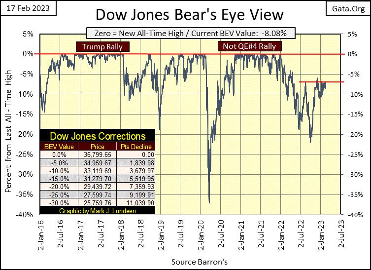
Looking at the BEV values for major market indexes I follow below, this week saw no new BEV Zeros (new all-time highs). But the NASDAQ Insurance Index, the one index that has been making new BEV Zeros remains in scoring position. So, more new all-time highs for the NASDAQ Insurance Index in the weeks to come are very possible.
Note, the other indexes are far from closing in scoring position, or a daily closing BEV value of something less than a BEV -5%. That plus comparing their performance from Monday to Friday’s closing in the table below; some made gains, but just eyeballing the data below, many were down for the week.
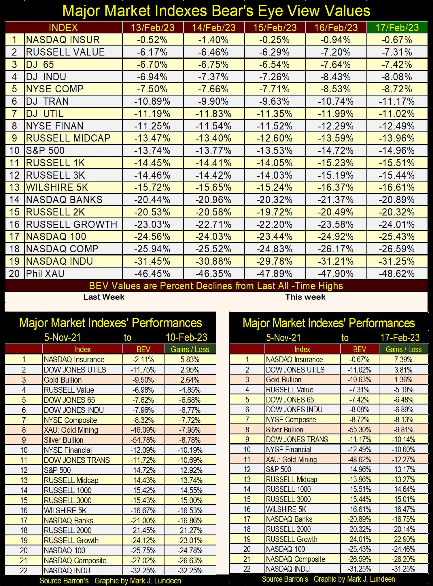
A few weeks ago, gold, silver and the XAU were all in the top 5 in the table above. Sadly, that is not so at the close of this week. Still, gold at #3 remains above its close of 05 November 2021, something only the Dow Jones Utilities and NASDAQ Insurance indexes can also say. And even silver (#8) and the XAU (#11) are outperforming the hot-glamor issues of the post March 2020 flash-crash advance, and have been for some time. Not by making capital gains for their owners, but in not being the big losers the formerly hot NASDAQ glamor issues have become.
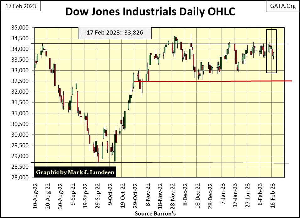
Next is the Dow Jones in daily bars, plotting the Dow in dollars instead of BEV points. And the story remains the same as with the Dow Jones’ BEV chart; since last August, the Dow Jones’ 34,250 level has resisted any attempt by the bulls to get above, and then stay above it, with 32,500 providing support for the bulls.
Between 34,250, the line of resistance, and its line of support at 32,500, the Dow Jones finds itself in a tight trading range that will not contain it forever, but did this week. On Monday and Tuesday, the Dow Jones appeared to be making another attempt on breaking above 34,250; then came Wednesday, Thursday and Friday.
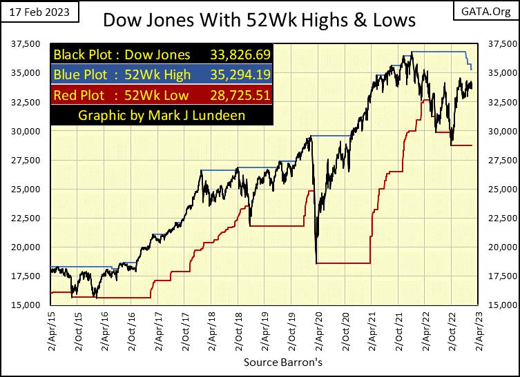
Looking at the Dow Jones with its 52Wk high and low lines in the chart below, the Dow Jones is about to make a new 52Wk High, by its inability to make a new all-time high since 04 January 2022. As expected, 52 weeks after a last new all-time high, the 52Wk high line begins coming down. For the bulls, this is pathetic market action, but better this than seeing the Dow Jones once again aggressively pushing down on its 52Wk low line.
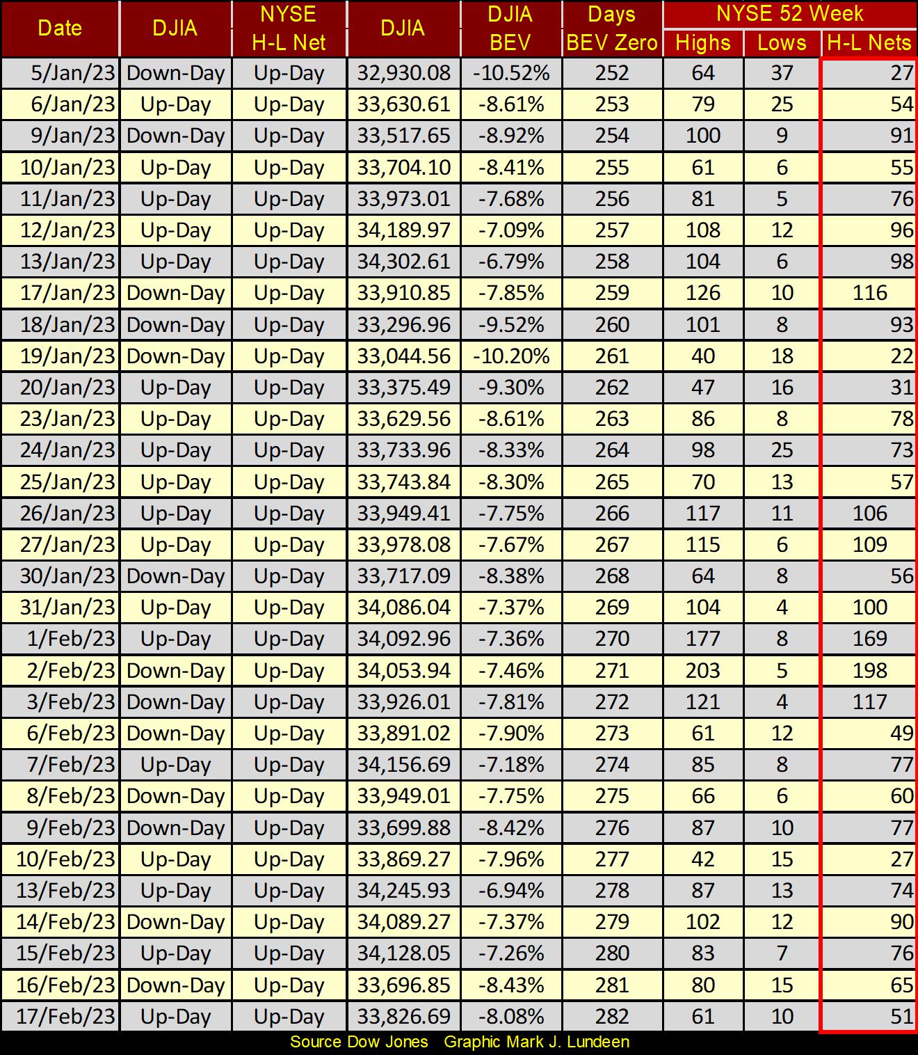
NYSE 52Wk H-L Nets in the table below continue being weak. Though from January 26th to February 3rd,the H-L Nets did break into triple-digits, but fell back into double-digits since then. Typically, during a normal market advance, we’d begin seeing a few daily 52Wk H-L nets in excess of +300. Maybe next week? I’m not holding my breath until it does so, as this is a stock market that can’t go up, but refuses to go down.
What’s the problem here? I believe some insight into the problems the stock market is having can be found in the bond market. From the end of December 2021 to September 2022, bond yields were rising – a lot! So, it’s no real mystery why the stock market has been struggling for the past year; rising bond yields will make corporate finance, and generating profits much more difficult when trillions-of-dollars in bonds come due, and must be rolled over into new, and higher yielding bonds. The same goes for Uncle Sam’s IOUs.
Here is my chart for a 30Yr T-bond issued in February 2020, and since August 2020, it has been a story of woe, with its rising yields and deflating valuation. But most of this woe began in late 2021, pretty much the same time the stock market’s former advance topped and stalled out, and then began to deflate.
The stock market hit a bottom in October, as did the valuation for this T-bond (Blue Plot), when both stocks and T-bonds saw some advances in valuation.
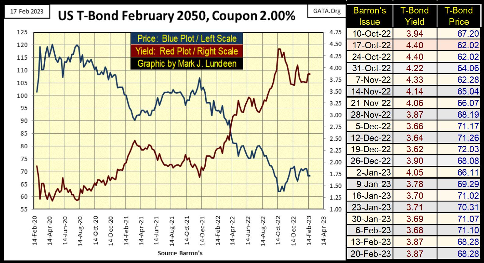
Something we should understand about this chart above, and its August 2020 bottom in its yield. In a mega long-term bond bull market that began in 1981, the yield for the long T-bond went from a high of 15.08% in Barron’s 28 September 1981 issue, down to 1.20% in Barron’s 03 August 2020 issue. That’s huge! And there is absolutely no reason to expect the next thirty years in the bond market to look anything like the past thirty years.
Bond yields may come down a bit from current levels, but in the years to come, they have no other way to go but up. And that is bad for both bonds and stocks.
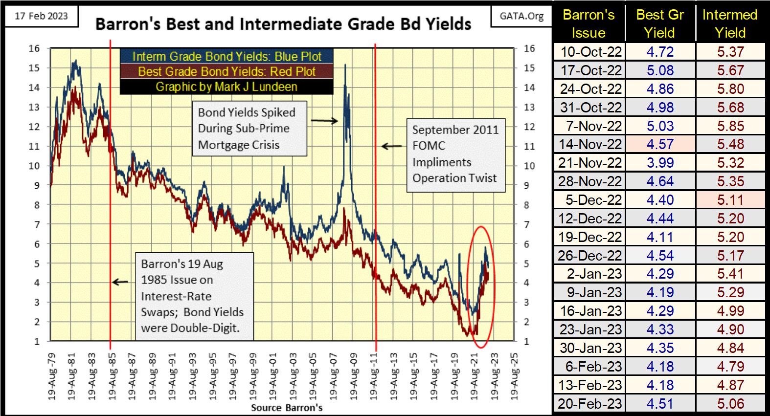
Looking at the yields for Barron’s Best and Intermediate Grade Corporate Bonds below, we see the bond bull market that began in October 1981, and how bond yields declined for the three decades. Then in January 2022, just thirteen months ago, all that changed as these bond yields spiked from historic lows to where they continue to trade now.
As I see it, the bond market is beginning to recognize credit concerns in the same companies that trade in the stock market. Following the 2007-09 sub-prime mortgage bear market, corporate America took on huge amounts of consumptive debt in the bond market, many trillions of dollars to restore valuations in the stock market, debt used to fund many companies’ share buybacks and dividend programs.
Having these companies swell their balance sheets with dubious debt worked wonders for Wall Street, and investors in the stock market following the sub-prime mortgage bear market bottom. But that was then, and this is now. Looking at bond yields spike since December 2021 in the chart below, its alarming. Indicating something fundamental has changed in the financial markets; something that promises nothing good for the bulls.
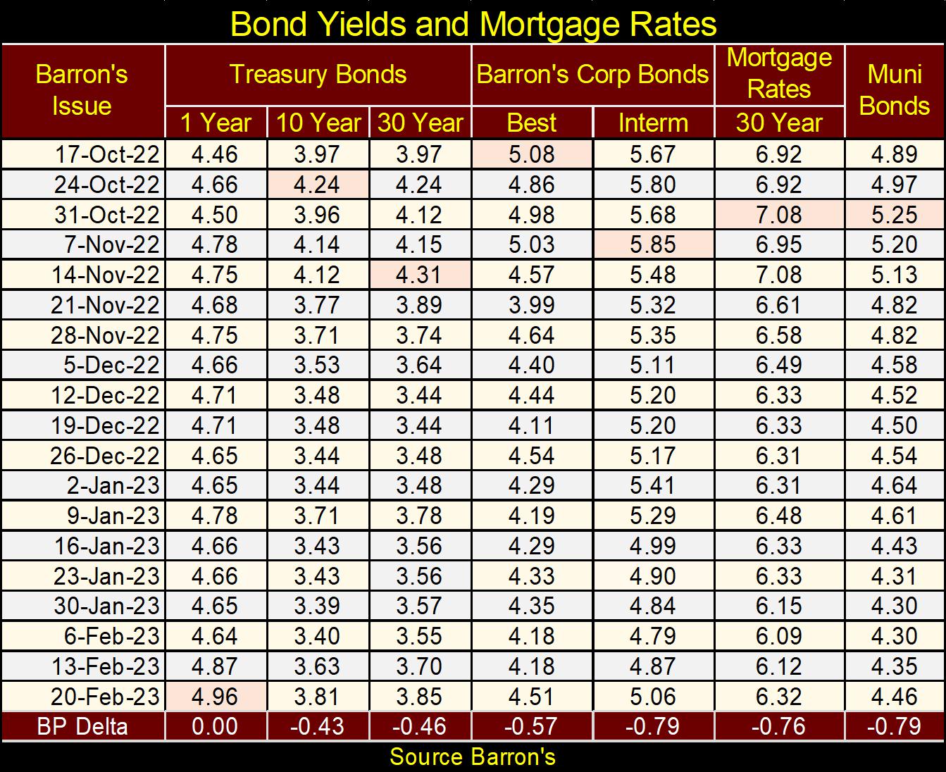
Below is a table for the bond yields I track, along with mortgage rates. They peaked in October, and then came down some. But in the past two weeks bond yields have once again begun to rise. For how long, and how much more we don’t yet know. But if we are now in a bear market, and I believe we are, expect yields and rates to rise much higher, as bad things happen in bear markets.
Moving on to gold’s BEV chart below, gold is seeing a correction in its advance off its October bottom. I had hoped this was avoidable, that gold would go on to a new all-time high (BEV Zero) without one, but that was not to be. No big deal, as corrections are to be expected. Now we wait to see what gold’s next move will be, to break below its BEV -15%, or above its BEV -5% lines.
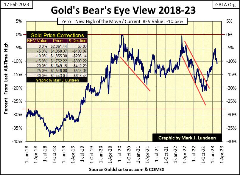
What do I think it will be; the BEV -15% or -5% line? Being the eternal optimist that I am, I’m looking really hard at gold’s BEV -5% line. However, I also remember all of the past times I made bad calls in the gold market, so I’m going to keep that to myself. But with the world as it is today, it’s dangerous becoming too bearish on the precious metals markets. With what the nincompoop sitting in the Oval Office is doing on a daily basis, it’s possible seeing gold rise up several hundred dollars in a single day.
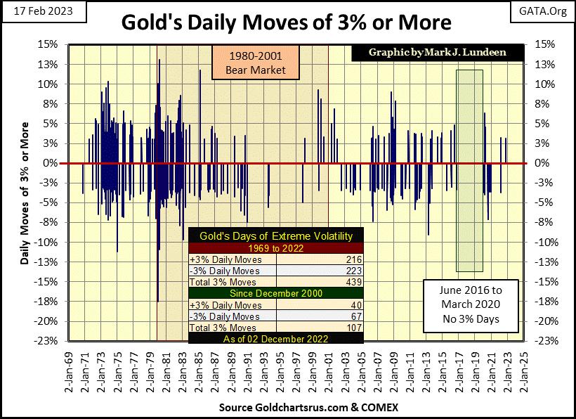
That may be unlikely, but it’s not impossible. During the 1970s and early years of the 1980s, +10% daily advances in the price of gold did happen, as seen in the chart below. From gold’s current level, one such day today could take gold up to a new all-time high in a single trading session.
If the warmongers in Washington continue poking the bear over Ukraine, and finally succeed in producing a tactical-nuclear exchange somewhere in central Europe, we may just see that. Not that I would like seeing gold finally break free of the COMEX goons strangle hold via a nuclear exchange. But this is the world we live in – God help us!
Moving on to gold’s step sum table below, we see gold’s overbought condition (15 Count of +9) being worked off with copious down days since then. With all of those down days in the gold market, I’m pleasantly surprised seeing how gold has only fallen down to a BEV of -10.63% at Friday’s close. It could have been much worse! That it wasn’t is a sign of underlying strength in the gold market.
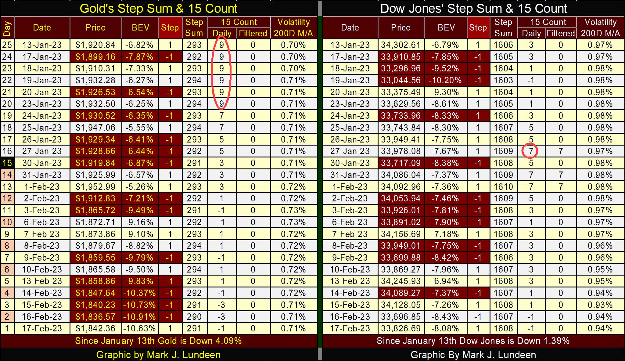
The Dow Jones too became overbought, with a 15-count of +7 in late January. Like gold, the Dow Jones is also selling off, but not as much as gold has. So far anyway.
One big positive development for the Dow Jones is, its daily volatility’s 200D M/A in the table above is declining, closing the week at 0.94%.
In the chart below, we look at this data going back 123 years. Without exception, since August 1900, for the Dow Jones’ daily volatility’s 200D M/A to spike above this critical 1.00% line in the chart below, records a bear market resulted. That plus the higher the spike in daily volatility, the worse the bear market.
In this chart, it’s easy identifying the two deepest bear market declines the Dow Jones has seen since January 1900; the Great Depression’s 89% market crash, and the 2007-09 sub-prime mortgage bear market’s 54% decline, by their volatility spikes of something over 2%.
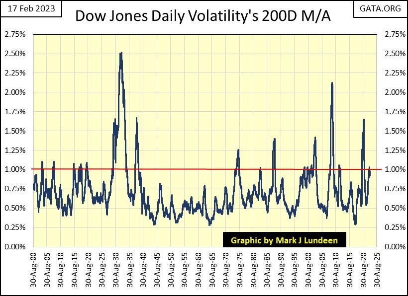
Though few remember today, the March 2020 flash crash generated a volatility spike of something over 1.50% in the chart above. This tells us just how intensely bearish those twenty-eight days in February / March 2020 were. When Mr Bear and his clean up crew once again pays Wall Street another visit, we’ll see another volatility spike in the chart below. Don’t be surprised if it becomes the third 2% spike since August 1900.
That we haven’t yet seen another bear market decline in the past year is due to the idiot savants at the FOMC once again manhandling valuations in the stock market, thus preventing the current, but truncated spike in daily volatility to not exceed the 1.00% line. Let’s see if the idiots can keep this up as 2023 rolls along.
Mark J. Lundeen
********