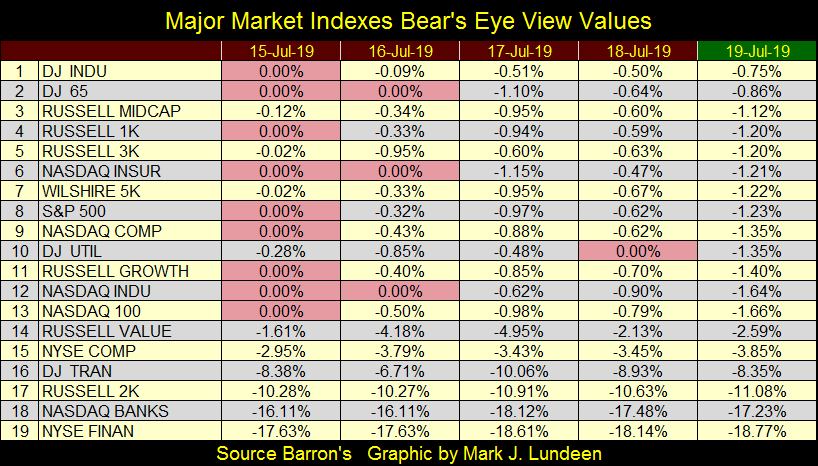
The NYSE Advance – Decline Ratio: 1926 To Today


Coming back from a two week break I see the Dow Jones made four new all-time highs in the past three weeks. That doesn’t surprise me, nor will it if the Dow continues doing so for a good time to come.
So the Dow Jones is again making new all-time highs, but if you look at NYSE breadth data going back to 1926, it becomes apparent it’s getting plenty of help. But before I post my NYSE breadth chart, I need to explain a few details on how I processed this data to produce an Advance and Decline Line.
During the Roaring 1920s’ bull market, the NYSE saw fewer issues trading daily as compared to what it does today. I took two dates out of this data series; 04 May 1926 & 01 July 2019 to illustrate this point in the table below.
On 04 May 1926 there were only 486 issues trading at the NYSE, while on 01 July 2019 there were 3,053; that’s quite a difference, as is the comparative Advancing - Declining Nets of those days (83 to 508 / table below). Looking at the Advance – Decline totals for these two days and a problem becomes apparent; the A-D totals from ten decades ago are incompatible with those of today.
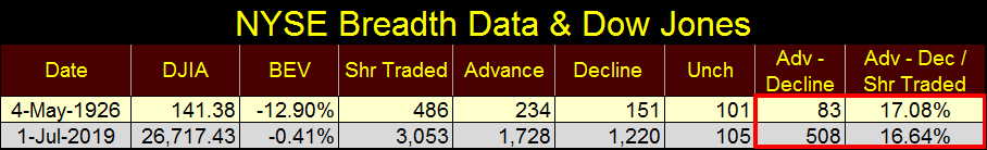
So, what I did was to add an additional step in the process by dividing these A-D Nets by the number of shares trading at the NYSE for that day. Looking at the table’s last column we see that in fact 04 May 1926, with its A-D Ratio of 17.08% and 01 July 2019’s A-D Ratio of 16.64%, are very similar to each other. That plus the daily NYSE A-D Ratios from any day since 1926 is given equal weight in the A-D Ratio plot in the chart below.
This A-D Ratio plot functions exactly as does an A-D Line, but corrects for daily differences in the number of issues trading at the NYSE over the past century.
What the A-D Ratio plot displaying are those times when daily advancing shares at the NYSE overwhelm its declining shares, driving the plot upwards, and those times when daily declining shares at the NYSE are overwhelming its advancing shares, driving the plot downwards.
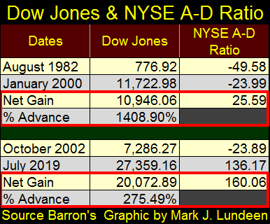
Take a moment to study how the NYSE A-D Ratio responded to the Roaring 1920s, the depressing 1930s and the post war era. I placed a Red Star on August 1982 to note the beginnings of the massive bull market that continues today. The eighteen years spanning from August 1982 to January 2000 saw the Dow Jones advance 1408% as the NYSE A-D Ratio advanced from -49.58 to -23.99, or up 25.59 points. The NASDAQ High-Tech bear market then began, deflating the Dow Jones by 38% by October 2002.
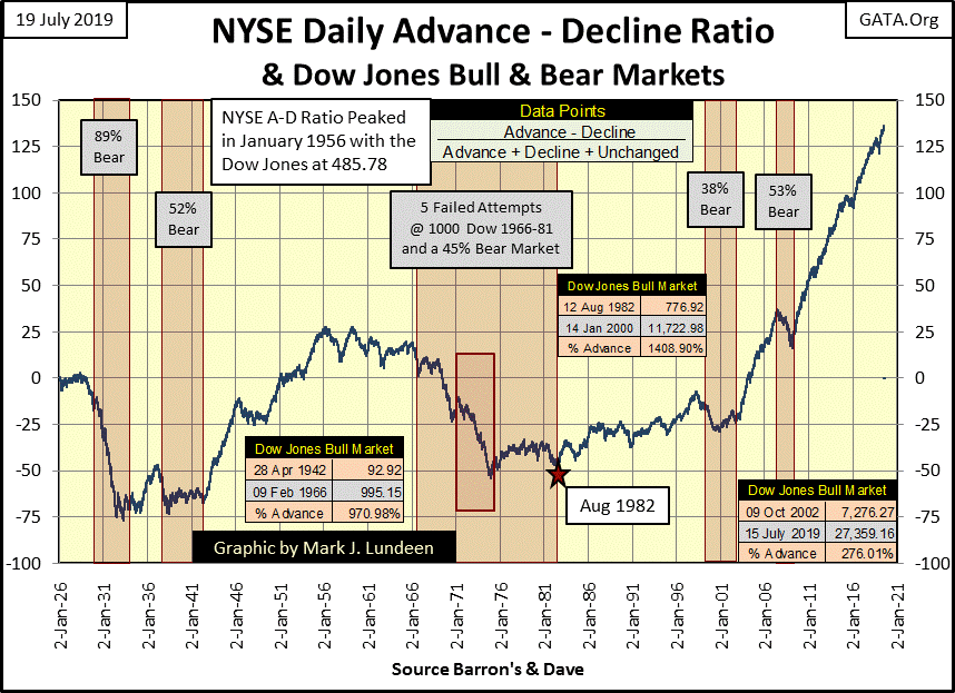
Following this decline a marked change began in the NYSE A-D Ratio plot; at no other time since the 1920s has advancing shares overwhelmed decliners as they have these past seventeen years. Yet since October 2002, the Dow Jones has advanced by only 276% as the NYSE A-D Ratio plot advanced by a whopping 160 points (see chart above and table below).
What’s going on here? Well I think I know. In the wake of the deflating NASDAQ dot.com bubble in November 2002, Doctor Benjamin Bernanke gave a speech at the National Economists Club were he said the following.
“Like gold, U.S. dollars have value only to the extent that they are strictly limited in supply. But the U.S. government has a technology, called a printing press (or, today, its electronic equivalent), that allows it to produce as many U.S. dollars as it wishes at essentially no cost. By increasing the number of U.S. dollars in circulation, or even by credibly threatening to do so, the U.S. government can also reduce the value of a dollar in terms of goods and services. We conclude that, under a paper-money system, a determined government can always generate higher spending and hence positive inflation. Of course, the U.S. government is not going to print money and distribute it willy-nilly……..”
- Ben S. Bernanke, Federal Reserve Board Governor, November 21, 2002, the National Economists Club, Washington, D.C.
This speech given in November 2002 was a declaration-of-war by the Federal Reserve against deflation in the stock market, and its impact on the NYSE was immediate; as seen in its A-D Ratio plot. The sub-prime mortgage -54% bear market, a market decline exceeded only by the Great Depression -89% market crash, was only a speed bump on the NYSE A-D Ratio. Yet for all those advancing shares overwhelming decliners at the NYSE since 2002, the Dow Jones has only advanced by 276% in the past seventeen years.
That seems like a lot of effort for little in return. But considering the current market advance began in August 1982, thirty-seven years ago, a market advance that has been manipulated by the Federal Reserve since Alan Greenspan became its Chairman in August 1987, maybe what we are seeing in this data is the Law of Diminishing Returns taking effect in late 2002.
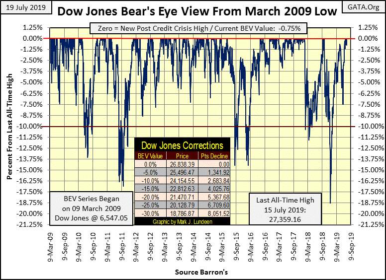
Every market advance is ultimately doomed to see its final all-time high, but at the end of this week I doubt the BEV Zero for the Dow Jones (#1) this past Monday will prove to be its last. But one can never know for sure, and as this advance has been going on since August 1982, thirty-seven years, the stock market to my eyes has the appearance of being over-ripe fruit.
Sure, at the close of the week stocks tasted yummy, but they could sour quickly and soon lose favor. Buying stocks in July 2019 is no time for a buy-em and hold-em for the long term strategy. If you want to go along for the ride, and promise not to fall in love with your position, go ahead and take a walk on the wild side.
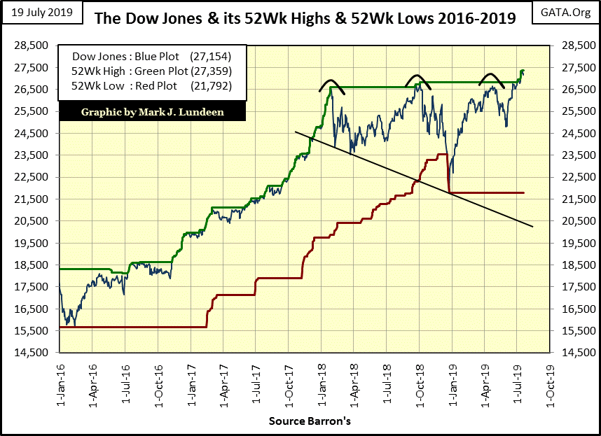
A month ago I noted the Dow Jones had a bearish head and shoulders top formation in its chart with its 52Wk High & Low lines (chart below). A month later all that has changed as the Dow made four new all-time highs since July 3rd, proving the perils of market prognostication.
Next is the Dow Jones in daily bars. After making its last all-time high on Monday (circle), the Dow took the rest of the week off. In the chart below, comparing the advance since early June to what the Dow Jones did from early January to early March, I don’t see much enthusiasm with the current bulls in the chart below.
A month from now I may regret saying that. But just looking at the data I have for July 19th I can’t in good conscience recommend that anyone trust their wealth in the stock market.
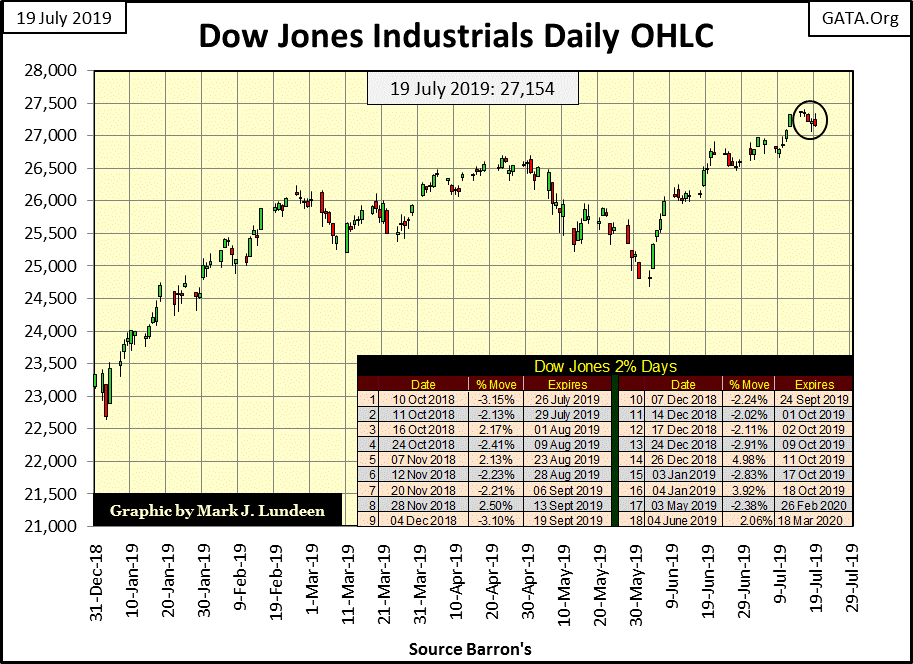
One factor that favors the bulls is the Dow Jones’ 200 count (Red Plot / chart below) will soon be coming down from its current count of 18 Dow Jones extreme days of market volatility in a running 200 day sample. Looking at the table in the chart above, the Dow Jones 2% day (a day of extreme volatility) for 10 October 2018 will expire come July 26th, Friday of next week. Another fifteen days of extreme volatility will soon follow, all expiring by 18 October 2019.
If you look at when these extreme days occurred, they occurred during the October to December 2018, 18.75% market correction, a market event best seen in the Dow Jones BEV chart above. With the market recovery since early January, the Dow Jones stopped seeing these days of extreme volatility, days where the Dow Jones sees market moves of (+/-) 2% or more from a previous day’s closing price.
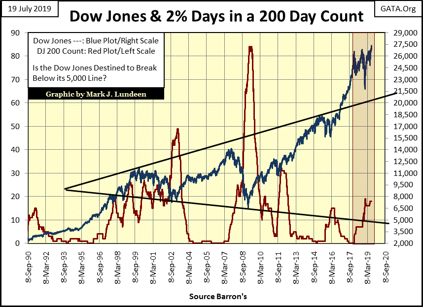
The following is a very important point for my readers – until the Dow Jones once again begins seeing multiple days of extreme market volatility, its path of least resistance is upward. The question in my mind is just how high can the current crew of bulls driving take the Dow Jones up? Come on! Whether you choose to see this advance beginning in August 1982, or in March 2009, it’s evident this advance is getting on in years.
Of course it wouldn’t be hard for me to change my mind should the stock market begin performing spectacularly as measured by the performance of the Dow Jones. I’d be happy to take back all the unkind things I’ve said about it. But until that happens I’ll remain seated in the market’s peanut gallery tossing empty peanut shells at the lazy bulls lounging around the end zone on the playing field.
With gold acting so well after breaking out of a basing pattern, where it was capped at its BEV -27.5% line ($1360) for six years, why mess around with the stock market? Comparing the potential for advancement between the BEV charts for the Dow Jones above and gold below, gold’s BEV chart is far superior.
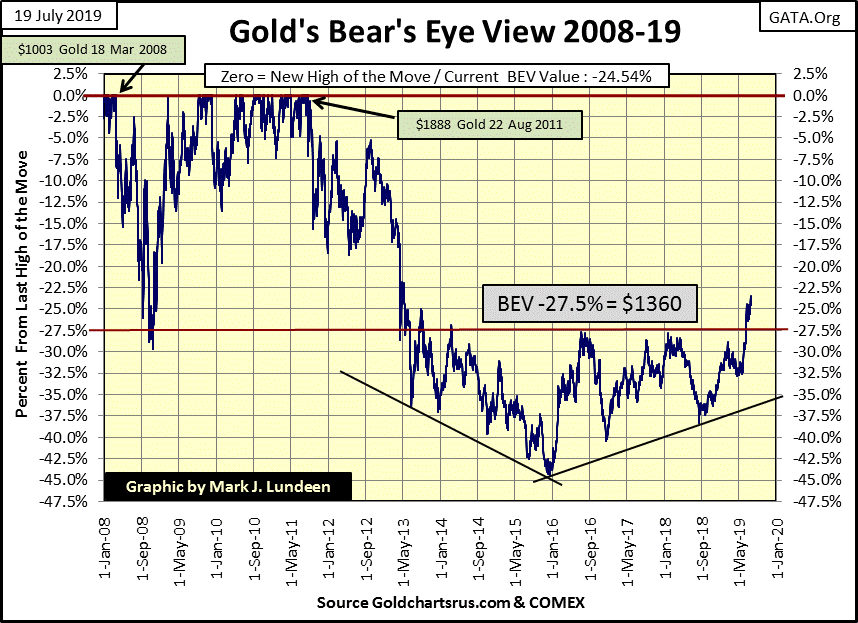
But if the stock market is being supported by the “policy makers”, you can be sure the gold and silver markets are being suppressed by these same people. Still, after six years of containing the price of gold below its BEV -27.5% line above, why since June 18th did these “Masters of the Universe” allow it to slip above this critical level?
Maybe they still wanted to contain the price of gold, but circumstances in the global market place are not what they used to be. Here’s a CNN link to a massive employee lay off for one, if not the largest bank in Europe – Deutsche Bank.
https://www.cnn.com/2019/07/08/investing/deutsche-bank-layoffs/index.html
The link has a video in it that I found humorous, where a very attractive “market commentator” was discussing this lay off with another very attractive “market commentator.” Their market focus was on how surprised many “market analysts” were with this development. Such market comments from CNN “market experts” are, more times than not, only for public consumption for the useful idiots who still use CNN for information on the world they live in.
What wasn’t commentated on was something that has been well known for over a decade on the internet; that Deutsche Bank’s balance sheet is a toxic-waste site for OTC derivatives, some tens-of-trillions of dollars in notional value. So far this hasn’t been an issue as these derivatives haven’t come into the money, creating a no harm / no foul situation. But something has changed in the past month; are insiders now painfully aware of problems outsiders remain ignorant of?
Being an “outsider”, all I know is what CNN tells me, which isn’t much. Still, I find it interesting how gold broke out of its six year basing pattern just fourteen trading days (on June 19th) before this CNN article was published on the internet (July 9th).
Gold’s step-sum chart below looks GREAT!
Market reality, as seen in the price of gold (Blue Plot) is breaking out while market sentiment, as seen in gold’s step sum (Red Plot) is pulling in its head like a frightened turtle. This is called “climbing a wall of worry”, a development frequently seen in the early stages of a bull market where most people who would like to invest in a market are still suffering from what I call Battered-Bull-Syndrome or BBS.
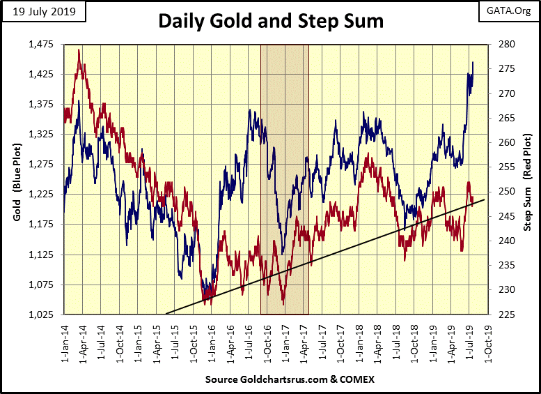
In effect we see the makings of a Step Sum Bull Box. I don’t label such a development, the decoupling of market reality from market sentiment as a bull or bear box unless it continues for over eight or nine weeks, which in this case would be sometime in early to mid-September.
But for now that doesn’t matter as what I’m thinking is the potential for a nice little “injection” of torpedo juice into the price of gold when the step sum’s plot reverses and recouples with the price of gold. That’s what I’m thinking of.
Of course there is always the possibility that the price of gold could come down and recouple with the declining step sum plot. But that’s not how situations like this usually work out, as typically it’s the trends in price (Blue Plot) that proves a superior predictor of future price trends than is fickled market sentiment (Red Plot).
Whether one see it one way or the other depends on whether one is suffering from BBS in the gold market or not.
One thing is certain; the bulls in the stock market have long since gotten rid of their BBS since the Dow Jones’ 54% market bottom ten years ago in March 2009. Look at the Dow Jones’ step sum plot in the chart below; since January 2018 market sentiment refuses to go down with the Dow Jones.
I see the humor in this situation; at week’s end the bulls in the gold market scan the sky for incoming shells from Mr Bear, ready to jump into the first fox hole they see on any advance in the price of gold. What a difference with the Dow Jones step sum; the bulls in the stock market are more likely to believe in Santa Claus than Mr Bear.
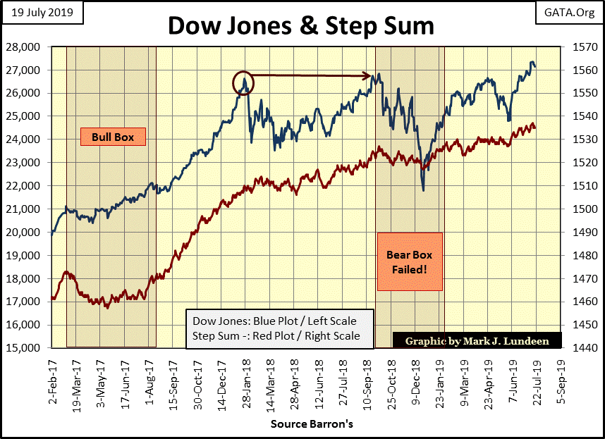
That market sentiment in the stock market is brimming with confidence is also typical of a market top, though it’s way too early for anyone to be calling for that. But as I said earlier, should the Dow Jones begin to see multiple days of extreme volatility; aka Dow Jones 2% days, I’d place some distance between my money and the stock market.
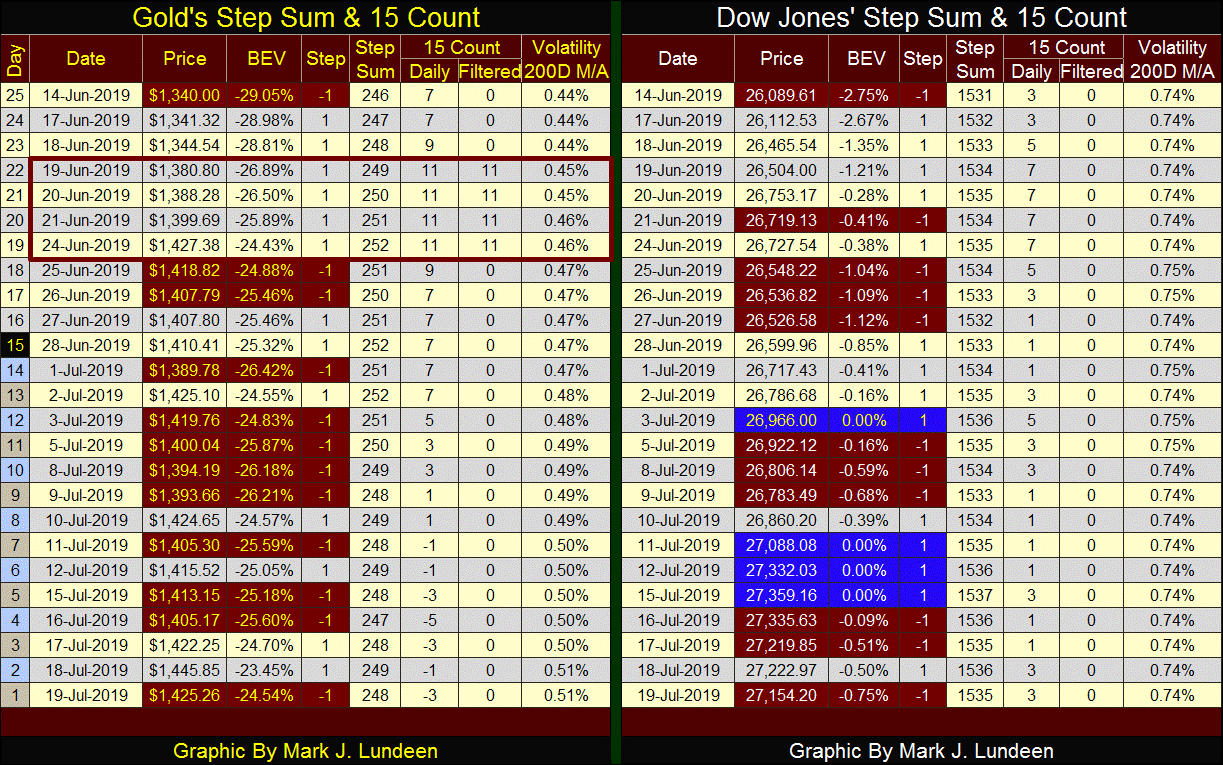
Here are the step sum tables for gold and the Dow Jones. The first thing that catches my eyes is how volatility in the gold market has increased from 0.44% up to 0.51% in the past twenty-five trading days. Rising volatility may be bad for the stock market, but bull markets in gold and silver thrive on rising volatility.
Like the Dow Jones, gold too has days of extreme market volatility. But gold hasn’t seen a 3% day since 04 October 2016, almost three years ago. If this advance in the price of gold is real we should begin seeing big daily moves; (+/-) 3% in the weeks and months to come. Silver’s days of extreme volatility are (+/-) 5%, and silver too hasn’t seen a day of extreme volatility since late 2016.
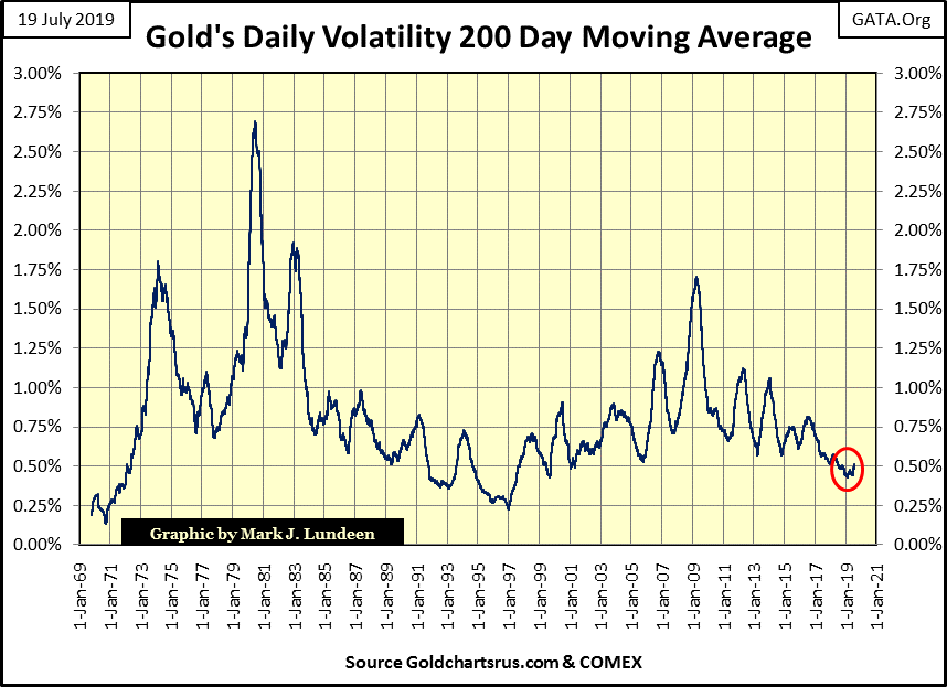
Here’s the chart for gold’s volatility 200 day M/A. Just a few months ago gold’s daily volatility had declined to levels not seen since the late the 1990s, which happened to be the bottom of a twenty-one year bear market in gold. It bottomed at 0.44% on June 6th and has been rising ever since. I call this a conformation that the bottom in the gold market is in; a solid reason for expecting better things to come for gold in the weeks, months and years to come.
Here’s the Dow Jones volatility’s 200 day M/A. In November 2017 daily volatility had declined to levels not seen since the end of WWII, which isn’t surprising as that was when the Trump election victory rally neared its top. But since then the Dow Jones has seen a series of corrections (bouts of short-term deflation) which always increases market volatility in the stock market.
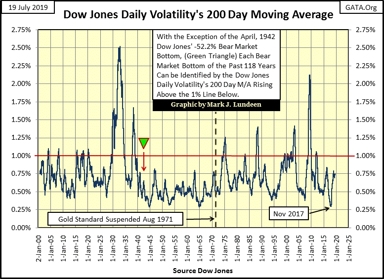
Between now and the end of October, fifteen Dow Jones 2% days are going to expire in the 200 day M/A seen above. That should significantly reduce daily volatility seen in this chart, and be a real positive for the bulls in the stock market. But if the stock market once again begins deflating, the Dow Jones is very capable of replacing any stale Dow Jones 2% day now in its 200 day count.
As we approach the end of July 2019, maybe the best way to understand the gold and stock market is in terms of their daily volatility. Gold bulls should pray for continued rising volatility as bulls in the stock market should pray that the Dow Jones daily volatility stays far away from the dreaded 1% line seen in the chart above.
Mark J. Lundeen
********


