Precious Metals’ Bull Market Continues


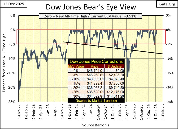
The advance that began two years ago, in November 2023 when in the chart below, the Dow Jones first entered scoring position (Red Rectangle, within 5% of its last all-time high), continued this week. On Thursday, the Dow Jones saw a new all-time high; a 0.0% (BEV Zero) in its Bear’s Eye View (BEV) chart below. Its 73rd new all-time high since entering scoring position two years ago.
Of course, as a BEV chart compresses price data into a range of only 100 possible percentage points, with;
- 0.0% = a new all-time high,
- -100% = a total wipeout in valuation,
a BEV chart cannot tell us how many dollars this advance has pushed the Dow Jones up since November 2023. I also maintain the Dow Jones in dollars, and since the Dow Jones first entered into scoring position two years ago, it has advanced 13,306 points, or 37.85%.
Next, looking at the Dow Jones in daily bars below, by this week’s Tuesday’s close, it looked as if the Dow Jones was completing a bearish Head & Shoulders chart formation. But the last three days of this week, removed any thought of a market decline in my mind. Next week, I best remove those three curves noting the Head & Shoulder formation, as I suspect the market is once again thinking of 50,000 on the Dow Jones. Just another 1,600-point advance, and 50K on the Dow Jones is a done deal.
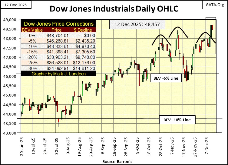
But, Dow Jones 50,000 inspires only fear and loathing on my part. Dow Jones 50K is only the inflationary consequence of decoupling the dollar from its $35 gold peg a half century ago.
I’m not saying the advance seen below, from its lows of March 2009 wasn’t fun. Oh, it was! But reasonable people can see most of the possible gains from the lows of March 2009, are now priced into the Dow Jones. Looking at this chart, the next big thing for the stock market is one hell of a deflationary hangover, the inevitable consequence from these many years of inflationary gains.
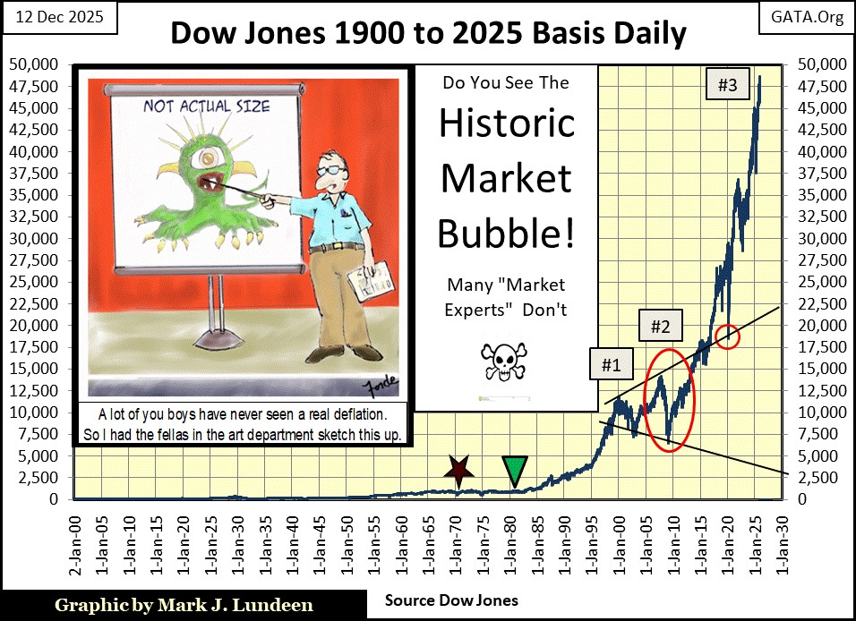
If there was something I wished people would keep in mind about market advances; is when a market advances, risks to invested funds can only increase, as the potential for gains can only decrease. Risking your hard-earned money in this stock market, is a high-risk, low-potential for profit proposition.
So, when is the bubble seen above going to go bust? I haven’t a clue. A few years ago, I thought it would top out when the Dow Jones’s valuation inflated to something over 30,000. Now in December 2025, apparently this market will top out with the Dow Jones over 50,000. Following that, I’ll be whining about the Dow Jones at 55,000 in the chart above, and then, horror of horrors; Dow Jones at 60,000.
But 60K on the Dow Jones, is only a 20% move from Dow Jones 50K. So potentially, the Dow Jones offers only a 20% gain, while on the downside, it could easily deflate by 50%, and much more before it finds a bear-market bottom.
One thing for sure about this market; the higher the Dow Jones rises, the higher the market risks are to the funds invested in it. I want no part of this market, especially when we have the option of investing in gold, silver and the companies that mine them. But as always, what you do with your money, is up to you.
Big bear though I be, market bullishness is the thing on display in the table below. On Wednesday and Thursday this week, there were no shortages of new all-time highs (0.00% = BEV Zeros) seen in the major market indexes I follow. Friday saw no new all-time highs, but seventeen of these indexes closed the week deep inside scoring position; within 5% of their last all-time highs. And when an index closes inside scoring position, we should assume additional new all-time highs will follow.
Even the NASDAQ Banking Index (#21) almost closed within 10% of its last all-time high, seen four years ago in December 2021. Seeing these banks perform so poorly in the past four years is a point of concern to me. But the NYSE Financial Index (#1), is keeping up with the pack.
So, what is the difference between the NASDAQ Banking, and the NYSE Financial indexes? I believe the NASDAQ Banks follow the smaller regional banks that serve local retail businesses and consumers, while the NYSE Financial Index tracks Wall Street itself.
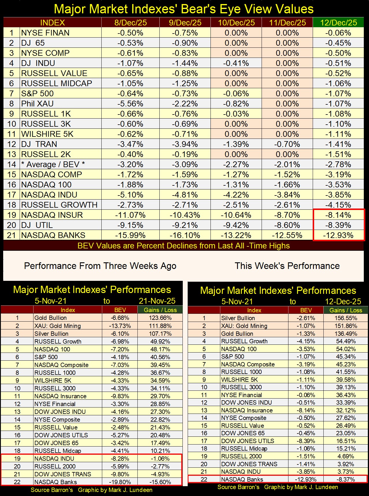
In this week’s performance table, right side above, silver (#1) advanced by 50% from where it was in late November, while the XAU (#2) is up 40%. Gold itself was up about 20% in the past three weeks. The major market indexes included in this table, are also going up, but failing to achieve the gains the old monetary metals, and their miners have seen above.
I believe there is a good reason for that. Since August 1971, when the dollar was decoupled from its $35 gold peg, silver, one of the old monetary metals, as seen below, has underperformed not just the stock market, but also a simple can of beans sold at the supermarket these past fifty-four years.
Beginning in late 2023, that has begun to change, and I expect this amazing advance has much more to go before it concludes. Like gold, and the XAU, following their astonishing advances of the past two years, one would think all precious metal assets would be due for a price correction, a pullback of 20% to 30% from current levels.
And that might happen. But I wouldn’t be surprised should this amazing advance in silver continue for a good while longer, without a correction, as silver for many decades, has endured not one profound bear market, but two, since January 1980, as seen in the charts below.
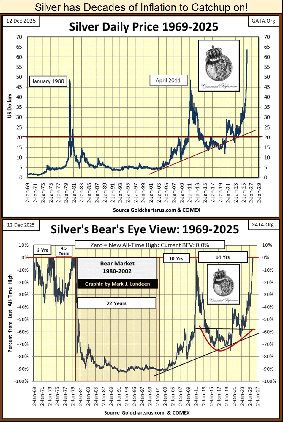
How severe the bear markets in silver have been seen since its highs of January 1980, is seen in its BEV chart above. Silver’s 1980 to 2001 bear market saw lows deeper than the Dow Jones endured during the depressing 1930s, a market decline of over 90%. Following its April 2011 highs, which didn’t break above its highs of January 1980, silver then endured a bear market that saw declines of more than 70%. These horrendous bear markets have made silver a hated investment, one that in the minds of the public, could only lose money.
Following all the decades of the silver’s market woes seen above, from 1980 to today, it’s easy understanding silver as an investment, has become something of a farce to most investors, be they professional money managers or retail investors. That means the potential for investment demand for silver is enormous, as people eventually recognize silver for what it now is in 2025; a tremendously undervalued asset they don’t own, but one day will desperately want too.
I’m not making a prediction here, as every time I do I’m usually wrong. BUT should silver rise to over $200 an ounce, before it sees it’s a proper price correction, a pullback in price by 20% to 30%, I wouldn’t be surprised.
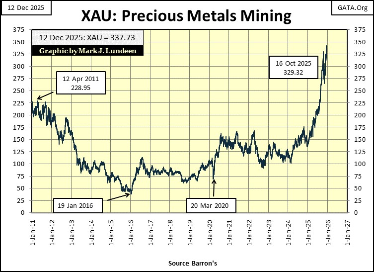
Like silver, the XAU also suffered from a huge bear market following its highs of April 2011, declining by 83% at its bear market lows seen in January 2016. But the gold and silver miners in the XAU have been surging to new all-time highs, with almost no public awareness of the amazing advance seen below.
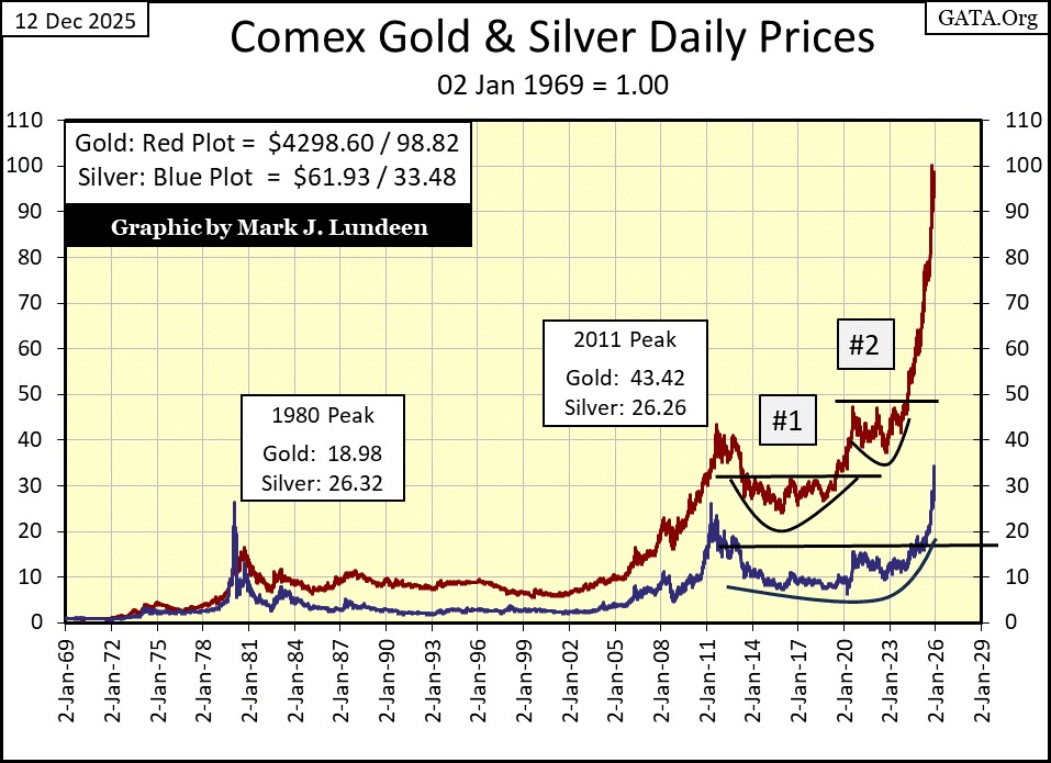
As significant as silver’s recent advance has been, since 1969 it has underperformed gold by a large measure, as seen below. But that wasn’t so during the 1969 to 1980 precious metals bull market, where at their January 1980’s peak, the gains in silver far outperformed the gains seen in gold.
Will that happen again in this advance? I’m thinking it. Let’s see what the price of silver must be for it to advance to a factor of 100, to have silver at par with gold in the chart below: $185 an ounce. An advance of 198% from silver’s close of this week. Can silver really do that? I’m thinking that, and much more.
Here is gold’s BEV chart. In November, gold fell below scoring position, but bounced off its BEV -10% line. Now in December, once again gold is in scoring position. So, once again we should assume gold will soon be making new all-time highs, or BEV Zeros in its BEV chart below. Gold closed the week only 1.33% below its last all-time high, a gap that could easily be closed should gold see a good day next week.

Gold in its step sum table below is looking good for us bulls. Since November 7th, gold has seen more daily advances than declines, and its price has benefitted from those overwhelming daily advances, up by $297, or an advance of 7.4%. I have my fingers crossed, that next week we’ll see a few new blue BEV Zeros in gold’s step sum table below.
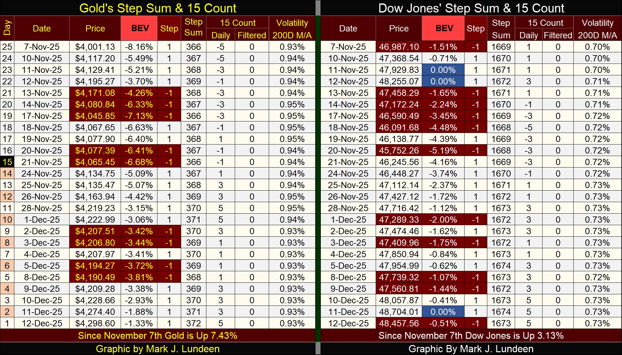
Speaking of blue BEV Zeros, the Dow Jones on Thursday’s close made one in its step sum table above, its 73rd new all-time high since the Dow Jones entered into scoring position in November 2023.
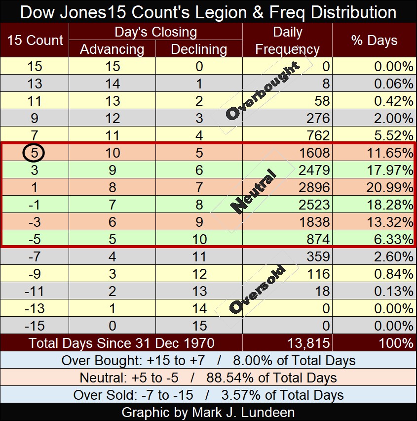
Like gold, the Dow Jones also closed the week with a 15-count of +5, a neutral count, just below having the market overbought with a +7, see table below.
We may see an uptick of daily declines in gold and the Dow Jones next week, which would be a bullish technical development for both these markets.
The thing about an increase in daily declines during a bull market, market valuations may advance in spite of them. Look at the Dow Jones this week, it saw only two daily advances, yet advanced by 503 points from last week’s close.
Mark J. Lundeen
*******


