Precious Metals New Bull Market Or Bear Market Rally?
 share
share
 share
share
 share
share
 share
share
 share
share
Buckle up and pour yourself your favorite beverage…and take some time. This Report will be an in depth Chartology analysis of the current situation in this ever interesting and often exasperating market we are participating in. Oh, and don’t forget to open your mind. Let’s begin.
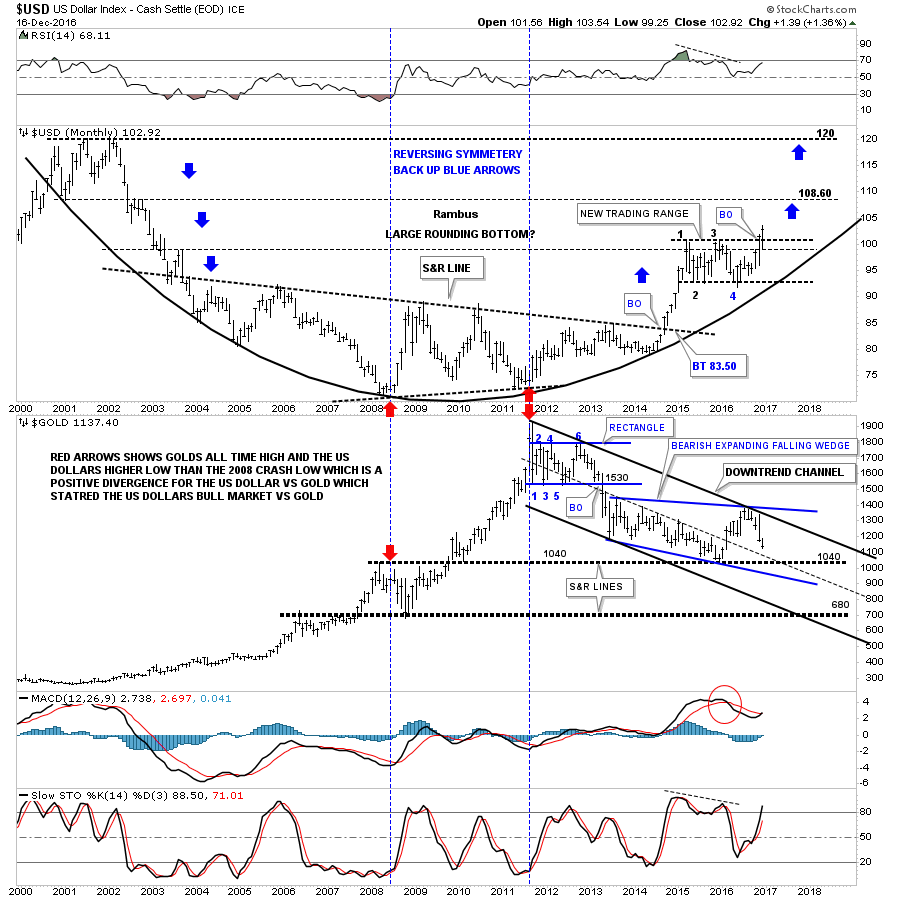
I would like to start the Weekend Report by looking at a combo chart which has the US dollar on top and gold on the bottom, which shows you a better version of the positive divergence the US dollar had vs gold in 2011. First note the red arrows on the US dollar and gold back in 2008 when gold was making a high, and the US dollar was making a low, which is what you would expect. Now look at the two red arrows in 2011 which shows the all-time high for gold and a higher low for the US dollar vs the 2008 low. Gold rallied almost 1200 points to its 2011 bull market high, but the US dollar made a higher low. If they were on an equal footing the US dollar should have traded much lower when gold was making its all-time high. That’s how I viewed the positive divergence for the US dollar vs gold.
The blue arrows on the US dollar chart on top shows how I was, and still am looking for reverse symmetry to the upside based on how the dollar came down when it started its bear market in 2000.
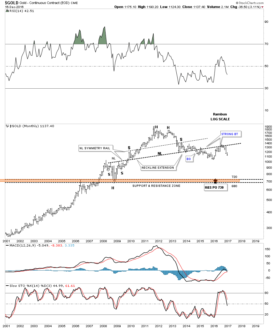
The two heavy black dashed horizontal lines on the gold chart at the bottom are still original from when I built this chart. I have adjusted the downtrend channel, and what was the falling wedge, I’m now annotating it as a bearish expanding falling wedge. During the construction of the original three year falling wedge I always labeled it as a bearish falling wedge and thought it would eventually breakout to the downside until last year at this time.
You can see the original falling wedge when you look at the mid dashed line of the downtrend channel, and the bottom rail of the blue expanding falling wedge. There is no doubt that the S&R line at 1040 did indeed hold support after being tested several times from above. That rally took the price action up to the top rail of the downtrend channel and the top rail of the blue expanding falling wedge, which looks obvious now. It was that H&S top on gold we’ve been following since the US elections, which was the frosting on the cake in showing a reversal pattern at that critical juncture.
One last note on this combo chart. As you can see the US dollar is breaking out to new highs, while gold has failed to take out the 1040 area. What I’ll be watching very carefully as the US dollar continues to make new highs, is that we should see gold take out the 1040 low for more confirmation, gold is still in its 2011 bear market.
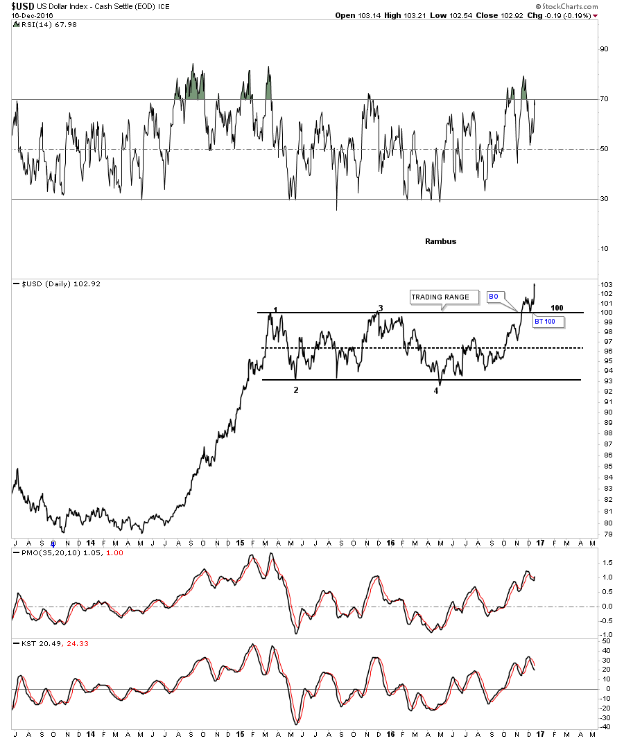
This next chart for the US dollar is a daily line chart which shows the rectangle with four completed reversal points with a breakout and back test to the top rail. To negate the breakout we would have to see the dollar trade below the top rail on a daily closing basis, until then the breakout is valid.
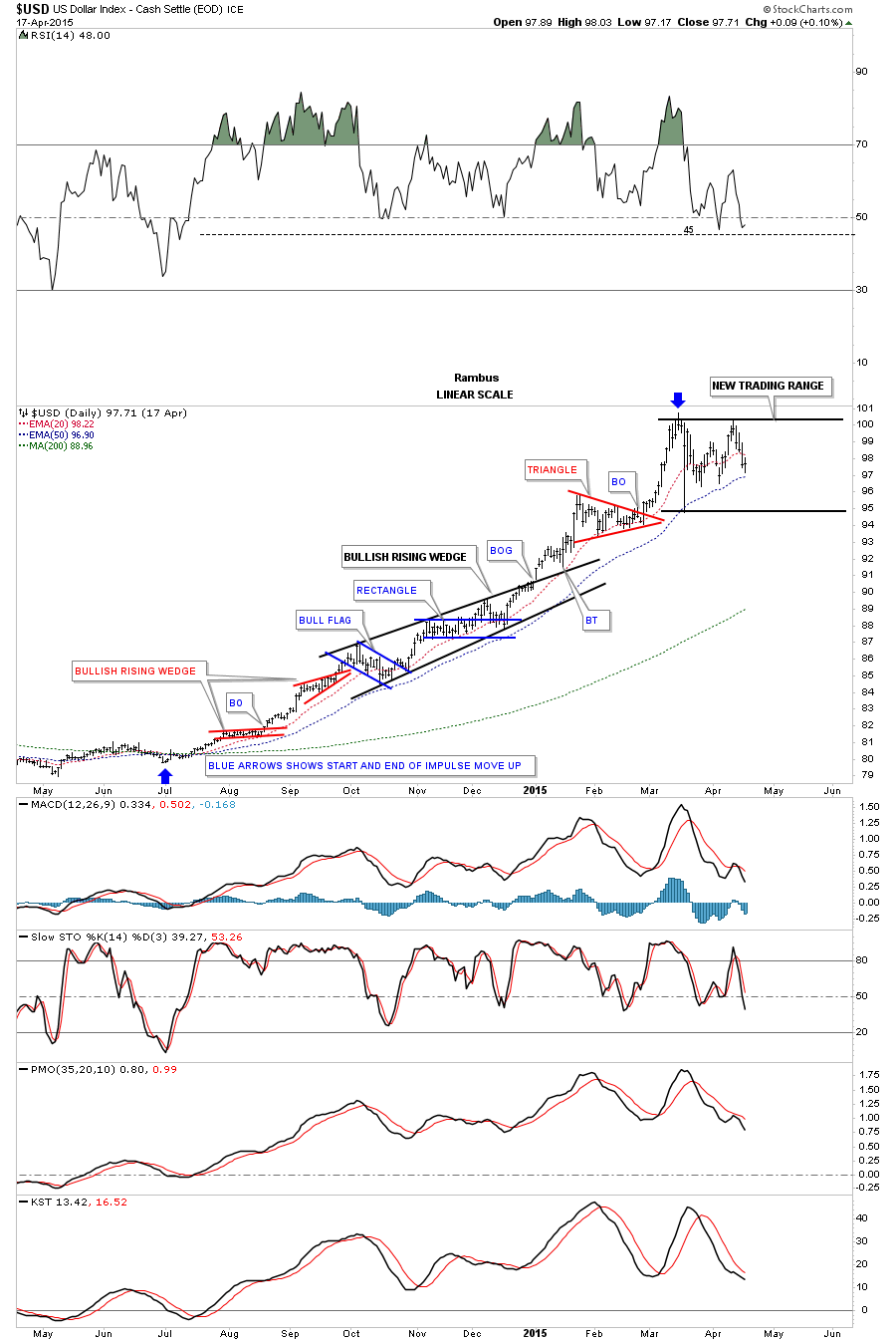
This next chart focuses on the impulse move up in the US dollar that began in mid-2014. I ended the time for this chart to April of this year so you could see the big impulse move up more clearly. This chart shows you exactly what a strong impulse move looks like by forming one consolidation pattern on top of the next. Note the beautiful black bullish rising wedge which formed in the middle of that big impulse move that was made up of two smaller consolidation patterns. There was a breakout gap above the top rail with a nice clean back test which confirmed the black rising wedge was a bullish rising wedge. There is a strong possibility that we may see something similar to this impulse leg up in our current leg up.
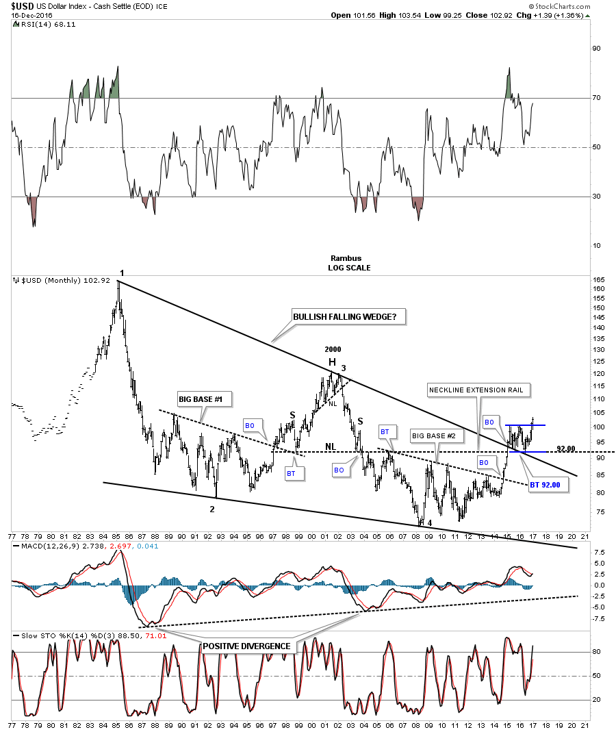
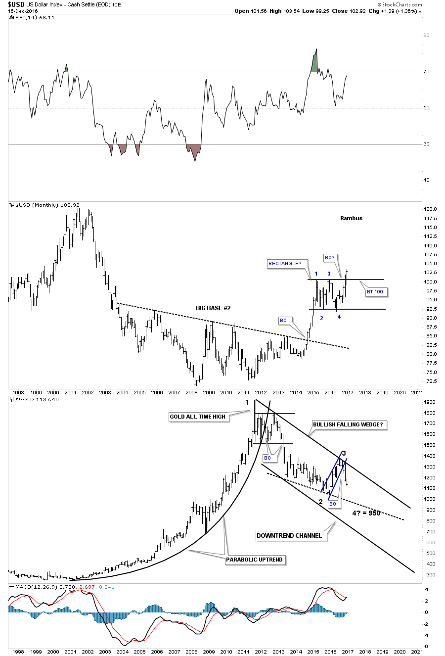
This next chart for the US dollar is a forty year look we’ve been following for a very long time which shows the massive bullish falling wedge. Note how the blue rectangle has formed as the back test to the top rail of the bullish falling wedge, and the neckline extension rail that formed that massive 2000 H&S top. What actually led to the breakout from that 40 year bullish rising wedge was when big base #2 finally matured and broke out. What is hard to even imagine right now is that the price objective of that 40 year bullish falling wedge is to where it began to build out, which is all the way up to 160 back in 1985. It will take many years for the US dollar to reach that price objective, and what will it mean for everything that is affected by the US dollar.
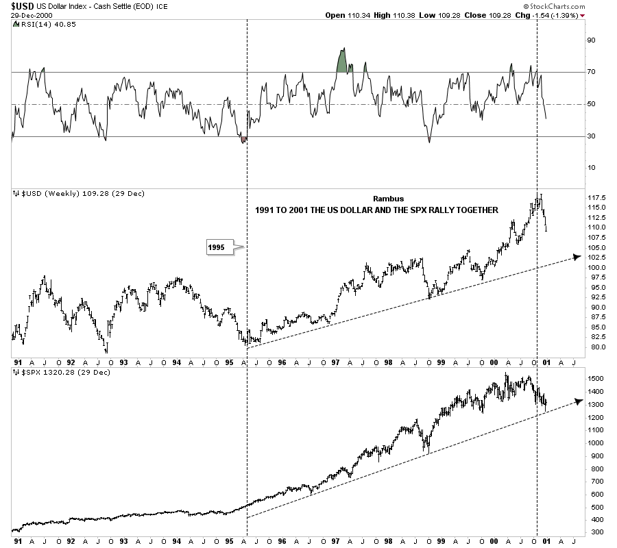
This next chart is a combo chart which has the US dollar on top and the SPX on the bottom. This chart shows how the US dollar and the SPX rose together during the last five years of the bull market that ended in 2000. Not so much on the SPX, but on many other index charts I always viewed the rally from 1995 to the 2000 top as the runaway or acceleration move into the bull market top, which is how most bull markets end.
Below is another combo chart which has the US dollar on top and gold on the bottom. I built out this combo chart right after the US elections as something dramatically had changed. The US dollar still hadn’t broken out yet and gold was still trading at the top rail of its downtrend channel, but in just six weeks or so you can see how things have really changed for these two.
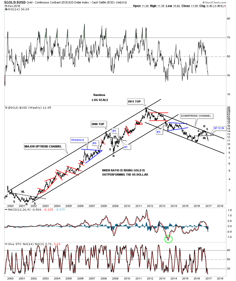
This next chart is the gold to US dollar ratio chart which shows that H&S top forming right at the 2016 high just below the top rail of the downtrend channel. That is the same area on the gold chart above, which is reversal point #3, top of the blue bearish rising wedge.
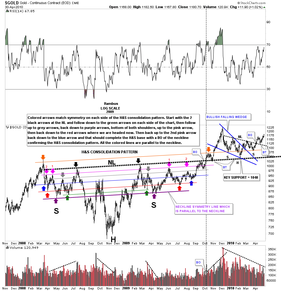
Next I’m going to bring out some old charts we haven’t looked at since the bear market years. This first chart is a daily chart for gold that shows one of the most symmetrical H&S consolidation patterns I’ve ever built out. I won’t get into the details as it’s explained in the annotation box. What is most important about this chart, other than its symmetry, is the heavy dashed black neckline. That neckline played a key role several years later as some of the longer term members may remember. After the top was finally put in at the 1920 area I was looking for a big correction, or even a bear market to begin building out. There is an old saying in Chartology, that an important trendline never dies it just slowly fades away, which I’ll show you in a bit.
Below is just a simple uncluttered look at the massive H&S top.
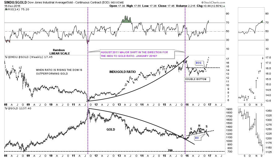
This next chart is a ratio combo chart which has the INDU to gold ratio on top, and gold on the bottom. Since the US election the ratio chart on top has broken out and made a new high for this move. Gold on the bottom chart shows that H&S top which has been showing up in so many different areas in the PM complex. Since the low in 2011 on both the ratio chart and gold, the INDU has been outperforming gold in a pretty big way.
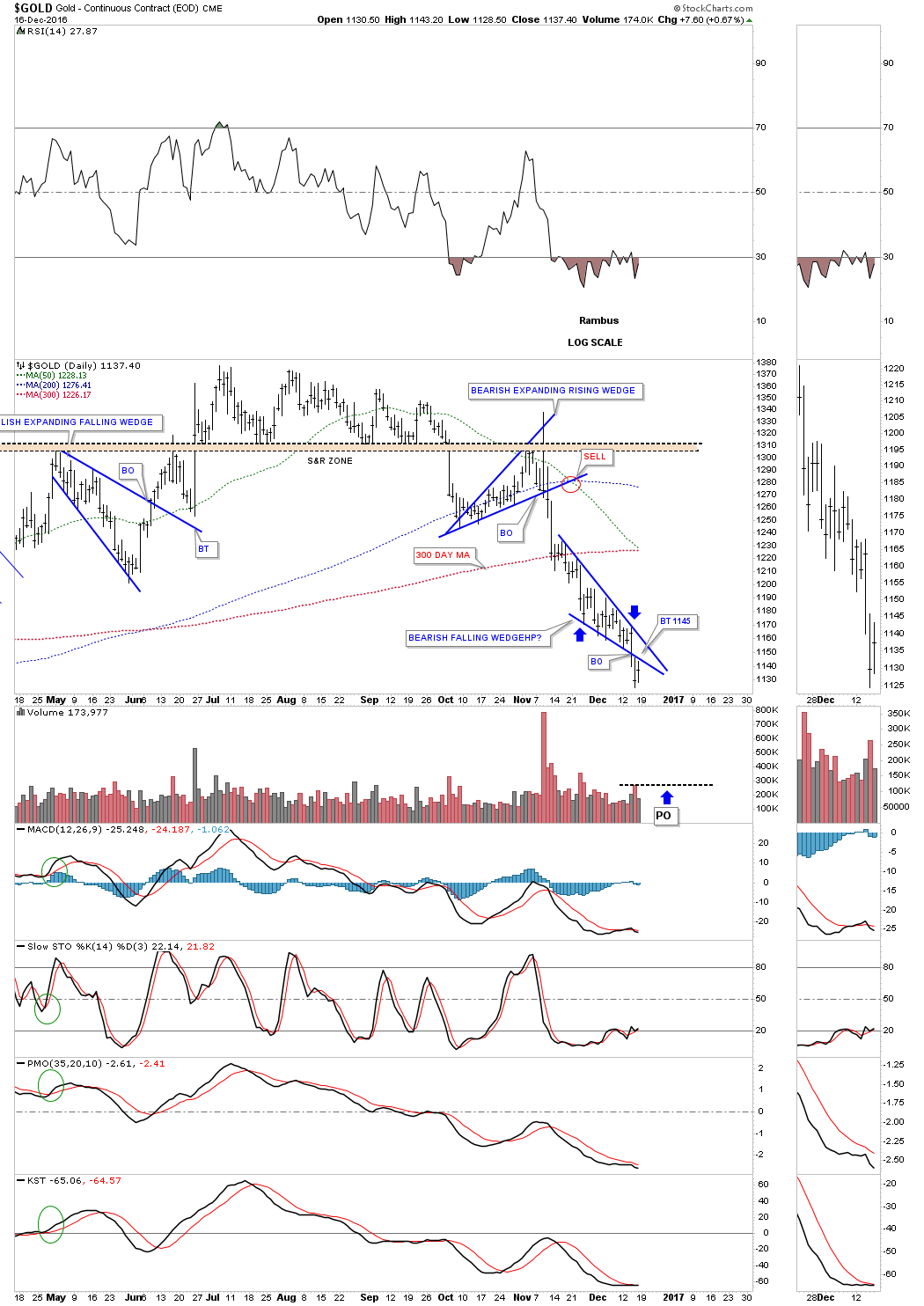
Again if the PM complex is in a strong impulse move down this last chart for tonight shows a possible bearish falling wedge on gold. We should get our answer to this question in the next few days.
What I tried to do tonight is paint a picture of the long-term status for the PM complex based on chart patterns, currencies pairs, ratio charts and combo charts, coming from many different areas. What all these charts above are strongly suggesting to me is that the rally out of the January low made this year was a bear market rally…and not the start of a new bull market for the precious metals complex. I know this is a hard pill to swallow, but until the bulls can start showing some strength, the bears seem to be in charge. Keeping ones trading capital safe is more important than anything else when it comes to the markets. There will be many more trades if one has the capital to take advantage of the situation when the time comes. This trade in the PM complex started out very good this year, and a good time was had by all. Knowing when to leave the party can be a totally different scenario.
share
share
share
share
share
 Meet Rambus, a seasoned trader and technical analyst renowned for his unbiased and insightful chart work. Through his website, Rambus Chartology, and Substack newsletter, Rambus shares his expertise with a global community of subscribers, providing daily updates, commentaries, and hands-on training in the art and science of chartology. With his calm, humble, and down-to-earth approach, Rambus demystifies complex market trends, helping his followers navigate the challenges of today's volatile markets. Join the Rambus Chartology community today and discover a unique blend of technical analysis, trading expertise, and time-tested protocols. Subscribe now at www.rambus1.com or https://rambuschartology.substack.com/