Quantitative Tightening Continues


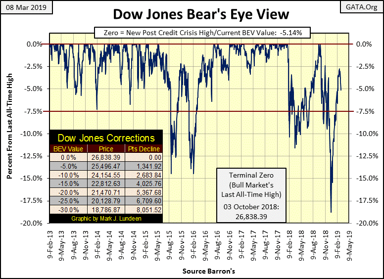
The Dow Jones Index continues correcting, closing this week below its -5%BEV line in the BEV chart below. Time to panic? Well, in a bear market the first loss is always the best loss; meaning it’s best to panic early and sell everything before everyone else does – at much greater losses. But I’m looking at the Dow Jones’ advance since the December 24th bottom in the BEV chart, an advance from below its -18% BEV level to almost its -2.50% BEV line on February 25th; that’s a big two month, 20% move with no significant correction.
So I’m not ready to toss in the towel on the bulls just yet. Like all moves in the market, this downward move in the Dow Jones will someday bottom and once again advance. On this coming advance should it break above the -2.5%BEV line, I’m expecting more new BEV Zeros for the Dow Jones to come. But failing that, my advice is to get the heck out of the stock market.
Understand that predicting market moves today is tricky, as today central banks have a personal and well known investment in them. And as central banks have unlimited funding via the monetary inflation they produce, if they want a market to advance, they can make that happen. Or can make that happen until the debt these central banks have created in government, corporate and individuals’ balance sheets overwhelms the economy’s ability to service it.
A big problem for the FOMC is since Paul Volcker was Chairman of the Federal Reserve (August 1979 to August 1987), everyone became very aware of the power over the markets the Fed possess. But before Volcker’s congressional testimony on double-digit CPI inflation in the late 1970s and early 1980s, congressional testimony which the network news outlets,(which were the only news outlets at the time) gave extensive coverage, most Americans were ignorant of the existence of the Federal Reserve, and that was how central bankers liked it.
Alan Greenspan followed Volcker as Fed Chairman, and Greenspan loved the fawning coverage the media gave him. I was in the Navy at the time, and I saw how Greenspan, and his ever inflating NASDAQ bubble made him famous in Asia and the Middle-East. I believe he was the most well-known and beloved American in the 1990s, until the high-tech bubble popped in 2000.
But before Greenspan and Volcker, bull and bear markets were once understood by most investors as manifestations of “market forces” and not the manipulation of interest rates and “injections of liquidity” by the Fed into the market.
The main-stream financial media can write about bull markets as if they are a thing unto themselves; no need to credit the FOMC for a rising market. But come a bear market and all eyes become focused on the Federal Reserve, with the expectation of tens-of-millions of voters for the Fed Chairman to do something to stop the pain.
This is not a healthy situation for the financial markets to be in. Overvalued assets are never allowed to find their fair-market value, insolvent assets are never written off, and the debt load weighing down the economy is encouraged to expand towards a breaking point.
But we’re not at that breaking point as of today. So, I still expect the Federal Reserve will continue to support the stock market, and wouldn’t mind if the Dow Jones made a few new all-time highs in the coming year.
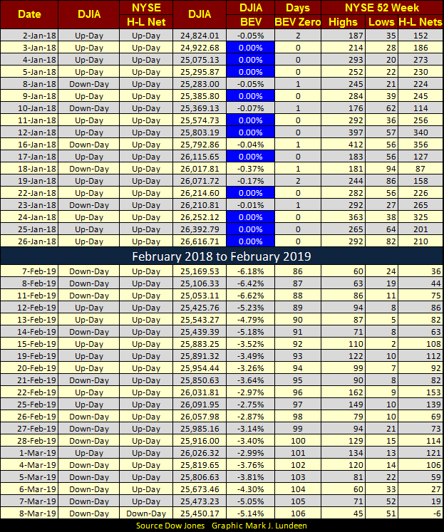
Looking at the NYSE 52Wk Highs and Lows below, 52Wk highs for the current advance (lower table) have been light, but for the last month we’ve seen more daily 52Wk Highs than Lows until today, March 8th. You can compare that to the 52Wk High –Low action from last year (top section of table) when the Dow Jones was making new all-time highs on almost a daily basis as NYSE 52Wk Highs dominated 52Wk Lows.
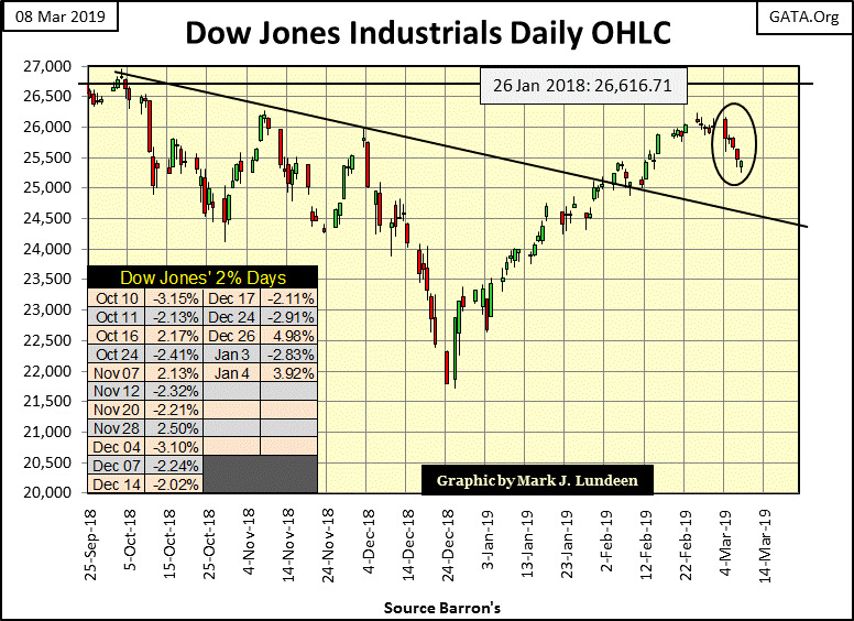
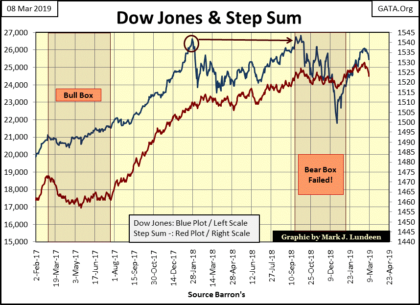
The daily bar chart for the Dow Jones became interesting this week, with it closing down every day. But unlike the down days of last week, Mr Bear clawed back some market value this week. Let’s see if he can take the Dow Jones below the line of support in the chart.
Personally, I’m thinking that’s not going to happen. However I’ve been wrong before, and I promise you I’ll be wrong again in the future. But until we see the Dow Jones once again seeing those dreaded days of extreme volatility – Dow Jones 2% daily moves, I’ll remain short term bullish.
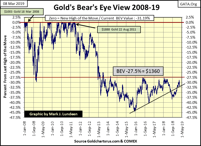
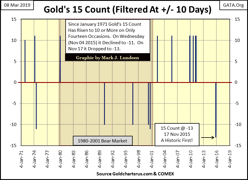
This week gold pulled back to its line of support, but I expect this current decline is near its bottom. As you’ll see in gold’s step sum table below, gold’s 15 count ended the week with a -5, or 10 down days in the past 15. That’s a lot of selling, and gold saw eight consecutive down days in the step sum table below. That’s something we don’t see very often.
What’s even rarer is seeing a step sum 15count in the (+/-) double digits. Below we see all the double digits 15 counts for gold since 1971. The last one was in late November 2015, where gold saw a historic -13, or 14 down and 1 up day in a 15 day sample. What happened in December 2015 can be seen above; gold began its current advance.
So, with this week’s 15 count at a -5, I’m expecting a bullish turnaround in the precious metals markets in the coming weeks. When that happens, seeing gold break well above its -27.5% BEV level ($1360) will be most important.
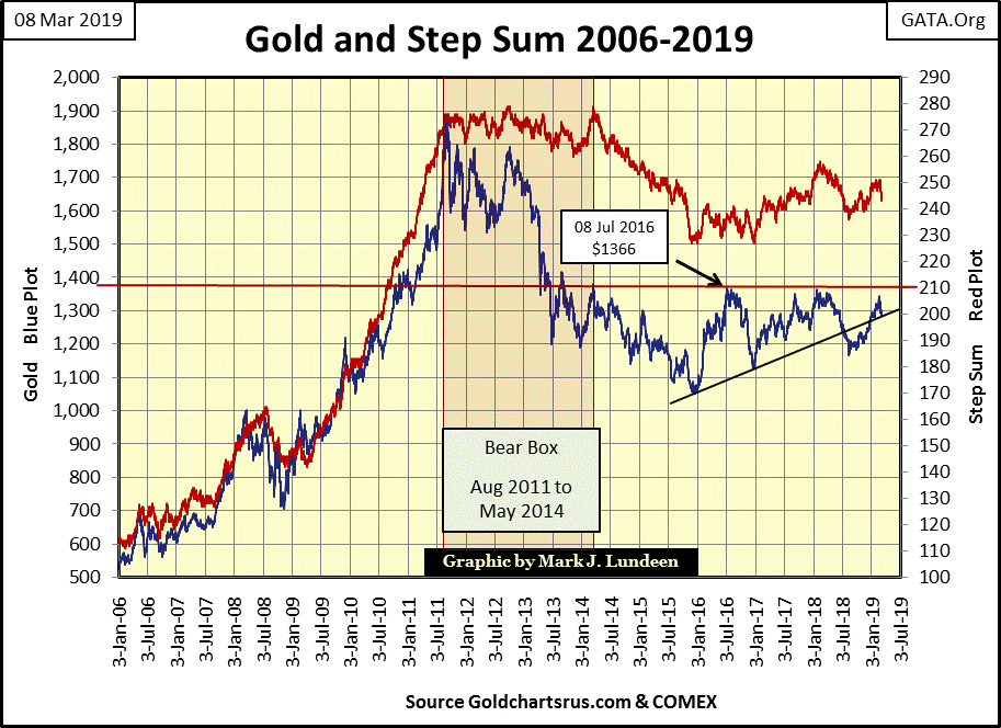
In gold’s step sum chart below, both gold's valuation (market reality) and its step sum (market sentiment) are in synch in the little correction we’ve seen since February 19th. This is a good looking chart, as long as gold holds above its line of support. But even if it goes below it, I remain long-term bullish on gold for reasons not apparent in gold’s charts below and above.
At the end of this article I posted a Greg Hunter interview with Catherine Austin Fitts. Be sure to take a half hour and listen to it. Washington and Wall Street are so corrupt, gold and silver may be the only investment vehicles that will survive the pending massive deflationary bear market.
The Dow Jones and its step sum below have both turned down. Is this a normal correction? Something to be expected after a two month 20% advance that began on December 24th? So far that’s how I see it – so far.
Gold in its step sum table below has seen a lot of selling since February 1st; with only nine advancing days in the twenty-five day sample seen in the table. Also, since February 25th, gold saw eight consecutive down days, leaving gold’s 15 count at a -5 at the close of this week.
However, if you look at gold’s last four down days, the bears’ ability to dominate the bulls has weakened. All that selling over a four day period and all they got for it was a $3.22 decline in the price of gold? I’d say gold is currently oversold and is ready for a rebound.
So, I’m thinking it’s time for the bulls in the gold market to counter-attack in the coming weeks, and they should have sufficient fire power to take out gold’s current line of resistance at $1360.
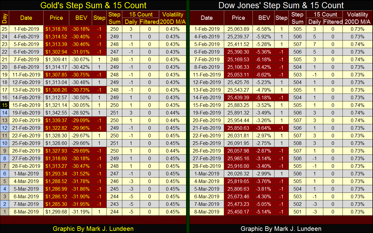
The Dow Jones’ 15 count closed the week at a -3; or 6 advancing and 9 declining days in a 15 day sample. As 15 count values from +3 down to -3 are considered neutral, I don’t see the stock market as oversold just yet. But all that may change next week.
President Trump has pressured Fed Chairman Powell to constrain his program of raising interest rates with some success.
However, the FOMC’s program of quantitative tightening (QT) remains unchanged, as seen in the chart below.
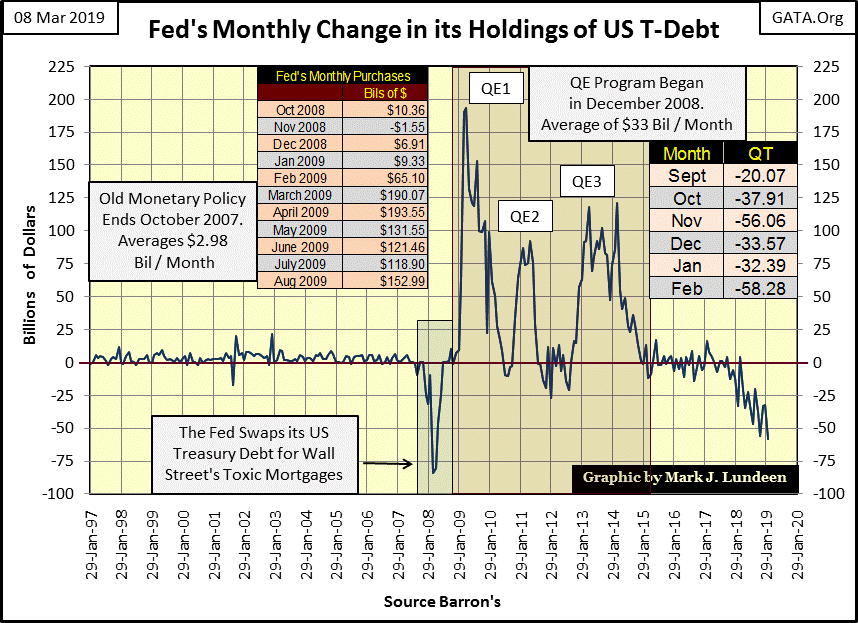
What’s plotted above is the net monthly change in $bils in the holding of US Treasury debt for the Federal Reserve System’s balance sheet. From 1997 to 2007, the last half of the Greenspan Fed, the Federal Reserve monetized on average $2.98 billion dollars of US Treasury debt per month. What’s remarkable about this increase in monetary inflation is the Fed had to monetize only about $3 billion dollars a month to inflate huge bubbles in the high-tech shares in the 1990s, and in single family housing mortgages from 2001 to 2007.
Everything changed when the housing market peaked, and the mortgage bubble began deflating in late 2007. The problem with inflating a bubble in mortgages is the housing market is an illiquid market. This was especially so with this particular real-estate bubble as toxic (insolvent) sub-prime mortgages had become significant reserves for the global banking system by 2007. One day a big Wall Street bank could sell as many mortgages as they cared to; the next liquidity in the mortgage market dried up as bids vanished.
When this happened can be seen in the chart above; late 2007, when the Federal Reserve began swapping their US Treasury debt for Wall Street’s now toxic mortgages.
Late 2007 marked a dramatic change in “monetary policy.” Previously to November 2007, the Federal Reserve could inflate bubbles in huge markets by monetizing only a few billion dollars a month in US Treasury bills, notes and bonds. But the deflation of the mortgage bubble during 2007-09 market crash was a true monetary catastrophe that to this day is still being played out, and won’t end well.
The chart above has a table; “Fed’s Monthly Purchases” which records the monthly purchases of US Treasury debt by the Federal Reserve from October 2008 to August 2009. To prevent the financial markets seeing a replay of the Depressing 1930s, the Federal Reserve System was monetizing, and “injecting liquidity” into the financial system by triple-digit billions of dollars during Bernanke’s QE1, with more of the same in his QE 2&3.
Everyone in the global banking system knew what was going on; China for one.
“We hate you guys [American Policy Makers]. Once you start issuing $1 trillion-$2 trillion [$1,000bn-$2,000bn] . . .we know the dollar is going to depreciate, so we hate you guys but there is nothing much we can do.”
- Luo Ping, a director-general at the China Banking Regulatory Commission , 11 February 2009
During congressional testimony, Dr. Bernanke (Fed Chairman) stated the Federal Reserve wasn’t going to monetize the national debt six months and 605 billion dollars into his QE #1:
(When asked directly during congressional testimony if the Federal Reserve would monetize U.S. government debt, the Fed Chairman responded) "The Federal Reserve will not monetize the debt."
- Doctor Benjamin Bernanke: June 03, 2009
In fact the FOMC had by June 2009 monetized 605 billion dollars of the US National Debt, almost doubling its pre-credit crisis portfolio of Treasury Debt.
Wowie wow wow! This was yet another under-oath whopper (some would call it perjury) told to a gullible Congress by a Chairman of the Federal Reserve.
Returning to this table in the chart above, it’s no mystery why the stock-market crash of 2007-09 bottomed and then began rising again in March 2009, an ocean of “liquidity” was being “injected” into the financial markets. And for the best part of the following decade, “liquidity” would continue rising as the Federal Reserve flooded the world with dollar-based credit.
But in December 2017, the Federal Reserve began liquidating their inventory of US Treasury debt with what they call quantitative tightening (QT), with the latest month (February 2019) seeing a reduction in the Fed’s holding of Treasury debt of $58.28 billion dollars.
Next is a chart plotting the Federal Reserve’s balance sheet from April 1953 to March 2019:
Red is Total Fed Credit
Blue is US Treasury Debt Holdings
Green is Currency in Circulation (CinC)
Remarkably, the three plots overlay themselves almost exactly from the early 1950s to late 2007, when the Fed first began swapping their US Treasury Debt for Wall Street’s toxic mortgages. Total Fed Credit (Red Plot) began expanding far above the Fed’s holdings of T-Debt as the Federal Reserve began monetizing toxic mortgages.
After 2007, no longer did inflationary growth in CinC (Green Plot) keep in step with the other items in the Fed’s balance sheet. I expect this was because purchases of T-Debt and mortgages could be accomplished with a few key strokes on a keyboard, while increases in CinC requires tons of cotton based paper and special ink on the monetary presses at the Bureau of Engraving.
With the largest unit of US currency only $100, what would global cotton prices be should the US Treasury demand an additional $3.5 trillion dollars in CinC? I wouldn’t be surprised if ten years ago this point came up during a meeting of the FOMC.
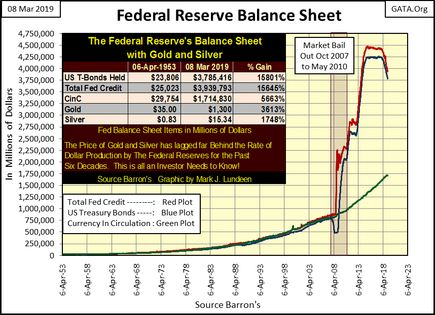
Since December 2017, the Federal Reserve’s program of quantitative tightening has impacted their balance sheet in the chart above. As best as I can tell from the data published by the Federal Reserve, Fed data that has never been independently audited since its creation in 1913, the Red plot is basically illiquid mortgages, and I’d like to know exactly which insurance company, pension or mutual fund is buying them from the Fed. The blue plot is US Treasury debt.
Since Barron’s 11 December 2017 issue:
Total Fed Credit Down by: $456.76 bil / -10.39%
US Treasury Debt Holdings Down by: $430.04 bil / -10.18%
Currency in Circulation Up by: $111.34 bil / +6.96%
These are significant changes in the Fed’s balance sheet. Should the Fed continue their program of QT, deflating their balance sheet, eventually it will have an impact on valuations in the financial markets.
And it’s not only the Federal Reserve that’s liquidating their holdings of US Treasury debt. The US Treasury tracks foreign holders of US T-Debt (see table below) and the link where I’ve compiled this data from.
http://ticdata.treasury.gov/Publish/mfh.txt
Data in the table is updated to December 2018, the latest data available, and sorted by the Dec-18 column. The Max Val and Min Val columns show the maximum and minimum values in billions-of-dollars these countries have held since May 2008. In the Percent From columns, the Max Val column gives the percentage from the Max Val these countries now hold as of December 2018. A 0% signifies December 2018 is a new all-time high. The Min Val column indicates the percentage increase of a county’s holding of T-Debt from its Min Val as of December 2018.
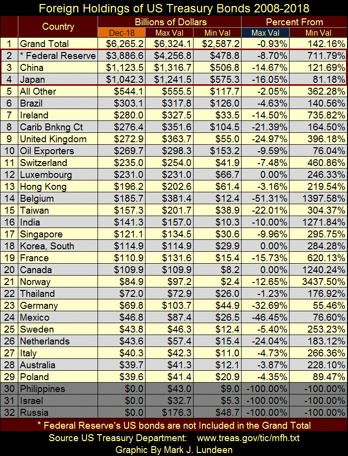
I have rows #30-32 darken as the Treasury’s latest report omitted these countries. But with the exception of Russia, which has completely liquidated its T-Debt, the Philippines and Israel’s T-Debt holdings may again be included in future reports, so I’m keeping them in the table for now.
The item I focus on in this table is seen in the Percentage From / Max Val column. This is the column which tells us how far down in percentage terms these countries have reduced their holdings of US T-Debt. In past articles where I’ve published this table, there was many more 0% (new all-time highs) to be seen than are now in this article. Also, as of December 2018 the number of countries who have reduced their inventory of T-Debt by double-digit percentage are noticeable higher.
As seen above, it’s not just the Federal Reserve that’s selling their T-Debt, and they’re shedding their Treasury debt for good reasons.
Greg Hunter interviewed Catherine Austin Fitts in the link below discussing current shenanigans in accounting standards as practiced by government and corporations. It’s not good, and makes me wonder if my “data” seen above is actual information or just government propaganda.
For instance, considering the massive levels of Treasury bonds being sold worldwide, why are Treasury yields currently so low? No doubt because of “natural market forces.”
Catherine and Greg like gold and silver, and so do I.
The interview is 36 minutes long, and every minute of it is VERY INTERESTING!
One more chart where I’ve plotted the Federal Reserve’s holdings of US T-Debt with the Treasury’s data for China and Japan.
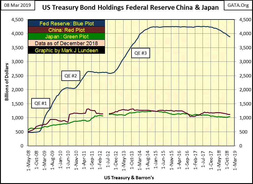
Today in 2019 no one is surprised the Federal Reserve’s holdings of US Treasury bond is several times larger than what China and Japan now hold. But as seen in the chart above, in 2008 (before Bernanke’s QE #1) both China and Japan owned more Treasury debt than did the Federal Reserve.
The Federal Reserve’s increase in its holding of Treasury debt from just 500 billion in 2008 to over 4 trillion in 2014 (an eight fold increase) will prove to be a historic episode of monetary malfeasance to bailout Wall Street from a self-inflicted derivative disaster in the US single family mortgage market. That the Federal Reserve is now selling this debt (to individuals and entities unknown) changes nothing.
Expect Mr Bear in the coming years to conduct a balance-sheet stress test that most individuals, corporations and government institutions will fail. What that will mean for the Dow Jones, interest rates and bond yield will be historic; something historically bearish!
In a world such as ours, you really want some exposure to gold, silver and the mining companies that mine precious metals.
Mark J. Lundeen
More from Gold-Eagle


