Reasons to Avoid The Stock Market


Deflation seems to be the primary theme in the market as we come to the end of October.
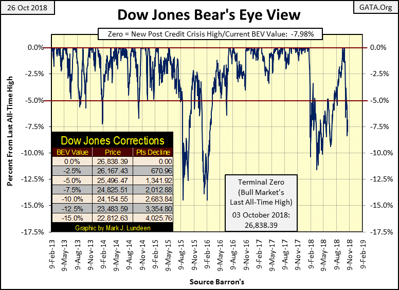
The last time the Dow Jones saw its BEV value at -8% was in early July of this year (BEV chart below). It took fifty-three NYSE trading sessions for the bulls to work up to a new all-time high on September 20th. The last Dow Jones all-time high was on October 3rd, from where it took Mr Bear only fifteen NYSE trading sessions to deflate the Dow down to -8.37% on Wednesday this week.
Looking at the Dow Jones’ BEV chart, we see the same thing happening at the end of January; the Dow Jones breaking down sharply, correcting by 11% at the end of March. At which point the venerable Dow began a six month recovery that included four new all-time highs in late September and early October.
That could happen again, and then maybe not. Two factors working against a repeat of the January / October correction and recovery scenario are bond yields continue to rise, and the Federal Reserve’s policy of raising its Fed Funds Rate seems intact, despite the current problems in the stock market.
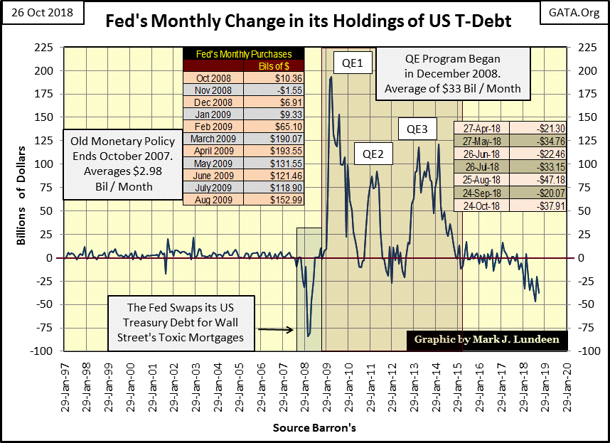
Another factor working against a continuation in a market advance is the Federal Reserve is draining the financial system of the “liquidity” it injected into it with its three bouts of quantitative easings (QE 1-3 below). In October it reduced its balance sheet by $37.91 billion dollars. Small potatoes when compared to the increases seen in the spring and summer of 2009, but at some point this “quantitative tightening” (QT) by the Federal Reserve is going to trigger deflationary forces now latent in the stock and bond markets.
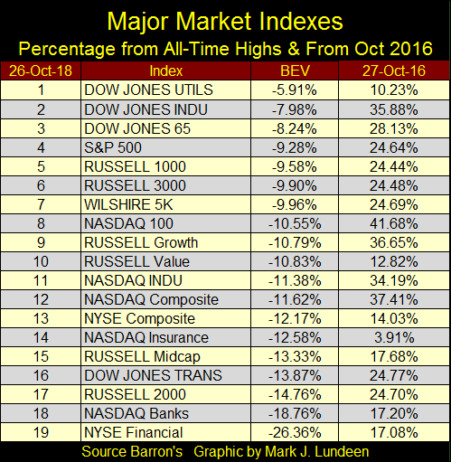
Here’s a table listing how the major market indexes I follow are doing. The BEV column shows the percentage declines from their last all-time highs, and the 27-Oct-16 column gives their percentage advances in the past two years, or how much of the amazing President Trump’s post-election market advance they have retained at week’s end.
The financials are a bit concerning to me (#14, 18 & 19). The NASDAQ Insurance index is down 12.58%, and has managed to hold on to only 3.91% of its gains of the past two years. This tells us that the two-year gain for this index wasn’t much to begin with.
Seeing the NASDAQ Banks and NYSE Financials at the bottom of this table isn’t good. These were the companies that lead the stock market down during the sub-prime mortgage crisis. Are we are seeing this developing again?
No one speaks of it anymore, but a decade ago to get the financial system back on its feet during the mortgage crisis, the “policy makers” sent trillions of dollars into the banking system to keep it afloat. They also altered the banking system’s accounting standards to allow garbage assets to stand as viable banking reserves.
It was all a fraud, a deception that stands to this day. If next week it was announced that the banking system’s accounting standards were to return to where they were in 2006, what do you think would happen to the Dow Jones as this news hits the wires? I expect it would be a day long remembered, a day when honest accounting proved to be toxic to market valuations in the stock market.
Next is a ninety-three year chart for the daily NYSE Advancing – Declining Issues Ratio. Note I said A-D RATIO, not A-D line. A ratio is necessary as the number of NYSE listings since the mid 1920s has changed drastically. In 1926 having only 500 shares actively trading at the NYSE on any given day was typical; today we typically see over 3000. To give each day’s breadth equal weighting in the plot, I use the following ratio:
Advancing Issues – Declining Issues
Advancing + Declining + Unchanged
There’s a lot of history contained in the chart below, and market breadth; the daily number of advancing and declining shares is a bedrock fundamental feature of the stock market. Taking a few moments to study the chart in some detail is very useful to any serious student of the market.
During bull markets one expects seeing more advancing shares than decliners, resulting in the A-D Ratio plot progressing upwards. But we note how the A-D Ratio actually turned down in May 1929, four months before the September 1929 Roaring 1920s bull market top. Apparently some of the issues trading on the NYSE began their Great-Depression Bear Market months before the Dow Jones did.
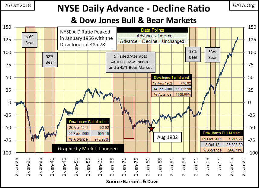
The same thing happened in 1956; the NYSE A-D Ratio peaked a full decade before the Dow did in 1966. This ten-year gap between the peaking of the NYSE A-D Ratio and the Dow Jones is unique; it hasn’t happened since. But seeing the NYSE A-D Ratio peak and then turn down before the Dow Jones begins a market decline is normal.
After the bottom of a major-bear market, the market begins to reflate taking the Dow Jones and just about everything else up with it. So, after a major market decline, it’s easy picking winners in the stock market. However as the bull market matures, as the Dow Jones approaches its final bull-market top, the market becomes increasingly selective of which groups and stocks continue advancing. This is why the A-D Ratio often turns down before the Dow Jones prior to a major market decline.
From 1966 to 1981, five times the Dow Jones increased above, or darn near to 1000, but just couldn’t stay above 1000; this happened in the context of a down trending NYSE A-D Ratio (chart above). With the NYSE having “bad breadth” during these years, we shouldn’t be surprised the Dow Jones was struggling with its 1000 Line of Doom.
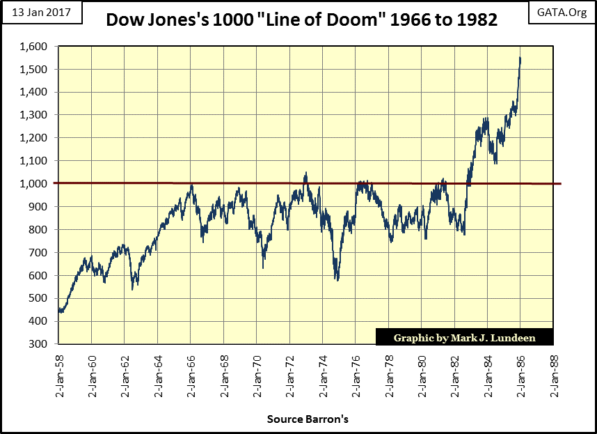
The 1982 to 2000 advance in the Dow Jones was supported with positive breadth; more NYSE listings advancing than declining daily during these eighteen years. But advancing shares didn’t dominate the decliners as they did from 1942 to 1956, still the Dow Jones advanced by 1408%.
The truly fascinating feature of this chart is how advancing shares have dominated decliners since 2002, the bottom of the high-tech bear market. The sub-prime mortgage’s -54% bear market was only a speed bump for this plot’s astounding advance. Yet for all that the Dow Jones itself has advance by only 268% in the past sixteen years. For all their work it seems the bulls didn’t get much in return.
It’s no secret the “policy makers” have become intimately involved in the internal workings of the financial markets. In my mind I credit this amazing rise in the post October 2002 NYSE A-D Ratio as yet another finger print their “policy” has left on the market place.
Had the FOMC and its Wall Street minions not done what they so obviously did, whatever that was, where would the Dow Jones be at today? More importantly, when the day comes that the “policy makers” find it impossible to continue their “policy” of a perpetual bull market, where will the Dow Jones, and people’s IRAs and 401s be then?
Exactly what is it that the FOMC has been doing in the financial markets? It has to do with “injecting liquidity” into them. And whenever they “inject liquidity” into anything, they first have to monetize (purchase with inflation) some asset, like US Treasury bonds. Here’s a chart for US Treasury holdings for the Federal Reserve (Red Plot) and Foreign Central Banks (Blue Plot).
In the wake of the High-Tech bear market (2000-02) foreign central banks began monetizing US T-debt in big way, until November 2012 when they decided enough is enough.
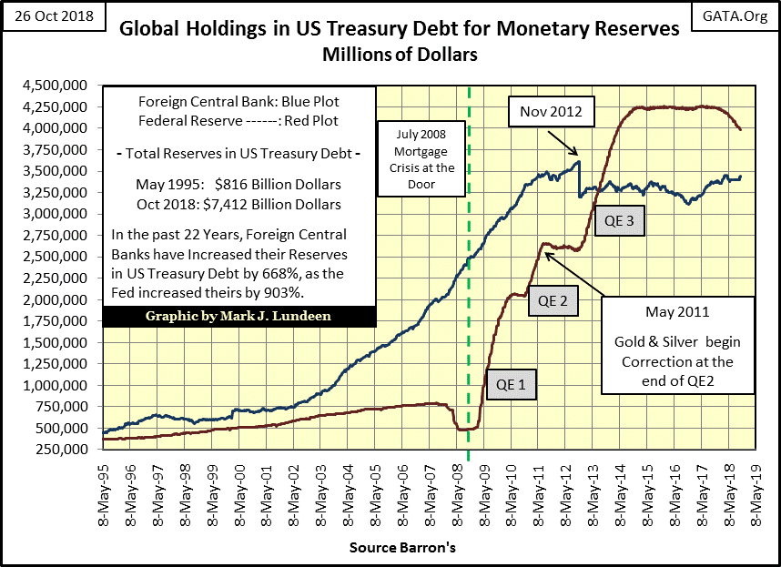
The FOMC began monetizing US Treasury debt with abandon in the wake of the Sub-Prime Mortgage crisis. Beginning with the Fed’s first bout of quantitative easing (QE-1/December 2008) they initiated their largest program of monetary inflation in their history in a desperate (yet so far successful) attempt to reflate valuations in the stock, bond and real estate markets.
The gains in the financial markets since March 2009 have all been inflationary market events as seen in the rise of the red plot above. But note what assets haven’t been inflating since 2011 – precious metal assets. So much for the old market axiom that valuations in gold and silver are driven higher by monetary inflation. Not true! The assets driven higher by monetary inflation are stocks, bonds and real estate.
The day when gold and silver resume their bull market will come when market valuations in the stock, bond and real estate markets begin deflating in earnest. There will be no shortage of flight capital seeking safety from deflation in the financial markets by flowing towards the now currently despised monetary metals and their miners.
When the markets realize how many inflationary dollars were created by the “policy makers” in the past few decades, and how few the numbers of ounces of gold and silver are available for purchase, it will be a stunning revelation.
Currently the US Treasury reports holding about 262 million ounces of gold in its gold reserves. That’s less than an ounce of gold for each US citizen. Then looking at the US Debt Clock below:
we see that each US citizen’s burden of the national debt is $65,900 as of October 2018 and growing. As for silver, there is more above ground gold than there is silver, and the market capitalization for the entire precious metals mining industry is something less than the daily change in market cap for a company like Amazon or Apple. If you want to buy cheap; gold, silver and their miners are the place to be in 2018.
Note too in the past year the FOMC has been reducing their holdings of US Treasury debt. Like rising interest rates and bond yields, having the Federal Reserve shrink is balance sheet, as seen in the red plot above, will ultimately prove to be a huge deflationary event in the financial markets – but a boon for precious metals assets.
Here’s a table I publish now and then; the Monetizing History of the Federal Reserve. In 1937 the US national debt was a then alarming $36 billion dollars, of which the Federal Reserve had monetized only $2 billion (5.6%) of the national debt. The US Treasury also held 370 million ounces of gold for its dollar reserves.
Since then the US national debt has only grown as the Federal Reserve’s inflationary purchases of T-debt have increased at an ever greater rate. Also the US Treasury’s gold reserves have been reduced to 262 million ounces.
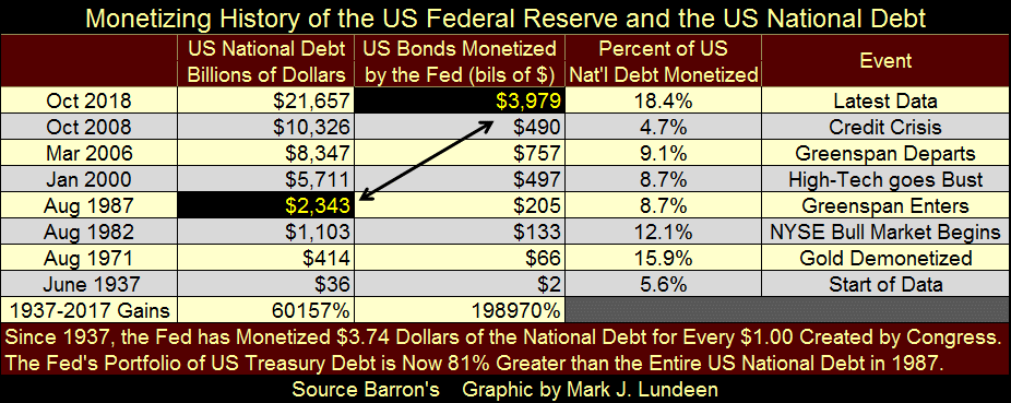
I highlighted the National Debt as of August 1987 and the Federal Reserve’s holdings of Uncle Sam’s IOUs as of this week. Currently the FOMC holdings of T-debt is 70% greater than the entire national debt of thirty-one years ago. I find this shocking. What’s even more shocking is the casual attitude of those in positions of power to this erosion of purchasing power in the US dollar.
I haven’t a clue when this disgusting growth in debt and monetary inflation is going to come to an end – but end it will, and when it does the potential for gold and silver as well as their miners is mind boggling.
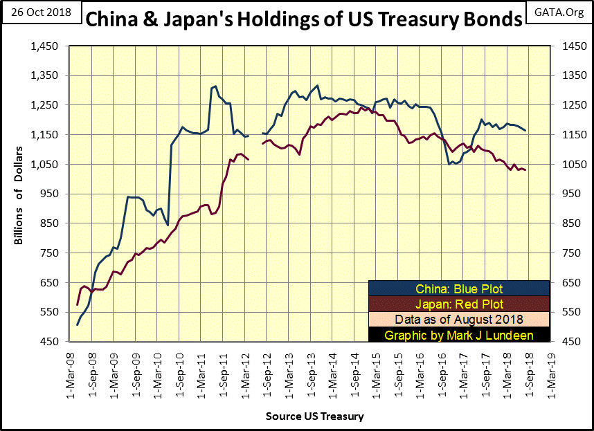
I updated my table of foreign holdings of US Treasury Debt (below). Federal Reserve data is not included in the data set from the US Treasury, but I included it as it is germane to this data set.
The current largest holders are:
The Federal Reserve
China
Japan
….with the holdings of the Federal Reserve being about twice that of China and Japan combined. But in May of 2008 the holdings of these three entities were as follows.
The Federal Reserve: $479 billion
China: $507 billion
Japan: $575 billion
These central banks have been busy these last ten years.
In the Percent From (Max Val) column, there are many double digit percentage reductions in the holdings of US Treasury Debt. Most are from small nations, but even the Federal Reserve has reduced its holdings by 5.23%, as China has by 11.51% and Japan by 17.04%. It goes without saying that should this trend seen below continue, T- bond yields will continue rising as T-bond prices continue to deflate.
When major central banks are selling their T-debt, a logical question is who is buying? I have no data on this, but I suspect the insurance industry and pension funds, as well as the big banks that manage Wall Street are buyers. When the day comes that they too want to sell these deflating assets, who will want to buy them?
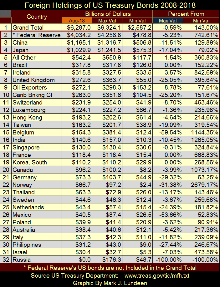
I see Russia has sold 100% of its Treasury debt holdings, or so I’m assuming as Russia is no longer listed in the Treasury report. Sometime in the next five years I expect most of the nations in the list will have wished they too had done so.
Here’s the chart plotting the T-bond data for China and Japan from the above data set from May 2008. The US Congress plans on issuing another trillion dollars in T-debt in the coming year. If they do, and should the world’s appetite for Uncle Sam’s IOUs continue to falter as they have in the past few years, that means bond yields will continue rising (bond prices continue to deflate); and that’s another reason to avoid the stock market for the foreseeable future.
Next is an ugly chart; the Dow Jones in daily bars for the past five months. The post October 3rd change in daily volatility is in full view. Before October 3rd intraday volatility was subdued, after daily volatility in the Dow Jones noticeably increased as it began to shed market valuation.
Look at the market down trend in the chart during June of last summer. It took the Dow Jones down 1500 points, in little baby steps. Yet the rebound from the Dow’s lows of March continued from July to October. But the post October 3rd market decline is a completely different animal from what we saw in June. This beast has big teeth and sharp claws that if it wanted to, could seriously maul the bulls in the stock market.
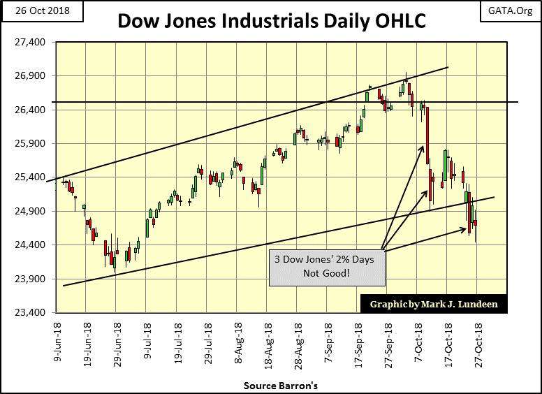
Of course should daily volatility return to what it was before October 3rd, I could become short term bullish once again. But at week’s end I really have nothing positive to say about the stock market. If the Dow Jones sees one or two big up days in the weeks to come, advances of more than 2% from a previous day’s closing price, its only Mr Bear luring in the unwary.
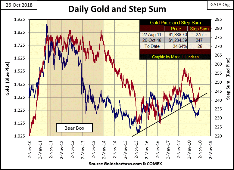
Gold is looking positive. Nothing spectacular mind you, but gold’s price and step sum trends are heading in the right direction - upward. The problem with gold is that it has yet to see an increase in its daily volatility. Unlike the stock market, bull markets in gold and silver benefit from increases in daily volatility.
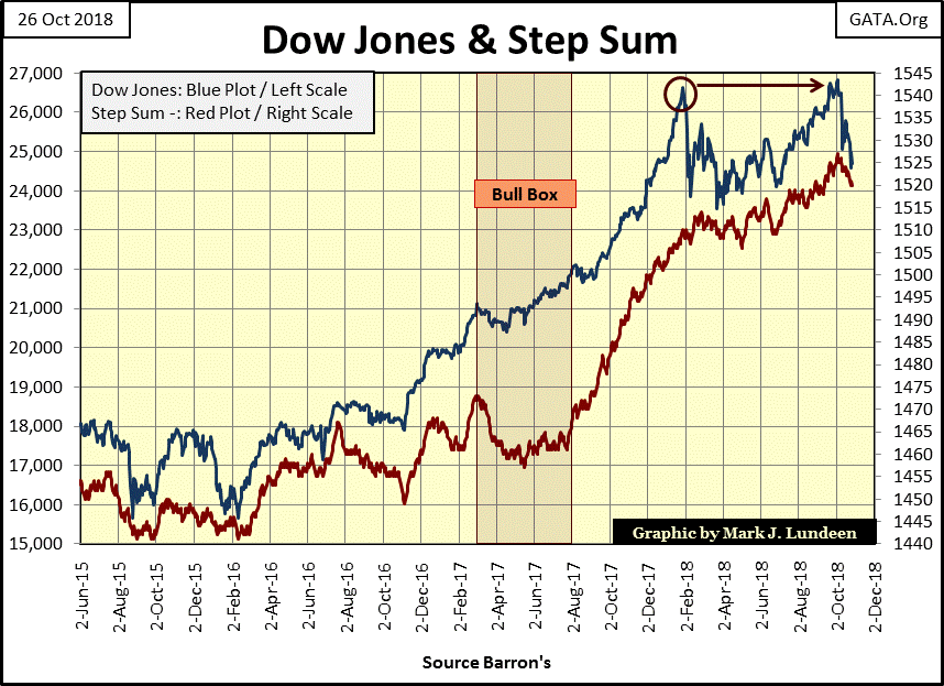
Here’s the step sum chart for the Dow Jones. With one word I can sum up what’s on display below – weakness. But last February, with this same chart I could have said the same thing.
However, last winter the Dow Jones found a bottom in March, and then rebounded to new all-time highs in September and October. Is that to happen again, say come next April, or will this market decline do something completely different?
Like me, you are just going to have to wait to see what 2019 has to offer the bulls and the bears in the stock market. But considering everything going on in the world, I fear 2019 will not be kind to the bulls.
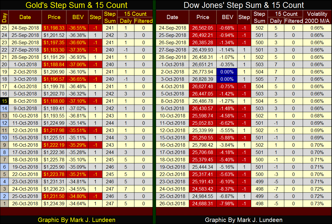
The step-sum tables for gold and the Dow Jones are seeing a reversal. Weeks ago it was gold that had to endure down days overwhelming its up days. But since October 3rd’s last all-time high for the Dow Jones, Mr Bear is now showing the stock market some serious disrespect.
Gold on the other hand has seen plenty of advancing days. Since the end of last week its 15 count has been a +5 or +7. But the problem for gold is so far in its current advance, it hasn’t seen an increase in its daily volatility. The last time gold saw a day of extreme volatility (a 3% day) was in October 2016, and silver hasn’t seen a 5% day since November 2016.
Gee, two years is a long time to be free of days of extreme volatility, a two year period that wasn’t particularly kind to investors in gold and silver.
So, when is gold and silver to see an increase in their daily volatility? I don’t know, but I’m looking at the Dow Jones’ far right column in its table above, the Volatility 200D M/A column. It was stuck on 0.66% up to October 9th, but after the Dow Jones began its current decline it has moved up sharply, ending the week at 0.73%.
At some point this progressive increase in daily volatility in the stock market will trigger a similar increase in volatility in gold and silver. Maybe I should also include a 200 day M/A for gold’s daily volatility in gold’s step sum table.
Anyway, I’m anticipating increasing volatility in the Dow Jones will be very bearish for the stock market. An increase in daily volatility in gold and silver promises the exact opposite; a resumption of their bull market that have been sidetracked since 2011. So I’m anxiously waiting for those days of extreme volatility: +/- 3% for gold & +/- 5% for silver.
As you know I’m a Christian, and Christians aren’t supposed to keep quiet about their faith. But I do realize my readers follow me for my market comments, not my personal beliefs, which is fine with me. So whenever I have something to offer that isn’t market based, and it’s not every week, it always follows my weekly market commentaries.
A big problem I see in our current culture is how the big social media companies are censoring free speech. There’s nothing new with this, but the ability for these companies to censor free speech is global, 24 hours a day and in real time.
Christians familiar with the Bible’s book on Revelation are very aware that such a system is a precursor to what is called the Beast System, a total dictatorship that knows all, sees all and oppresses all. So the current policy of censoring free speech is a sore spot for us, and generates much commentary in the Judeo-Christian areas of the internet.
Steve Cioccolanti of Discovery Ministries produced an excellent video on this exact topic, as he reads Dr. Seuss’s Yertle the Turtle to his children. Apparently Dr. Seuss is becoming a banned author in many school systems, so you know this has to be good!
https://www.youtube.com/watch?v=GFfD2Eg9IHs
Mark J. Lundeen


