The Stock Market Continues Deflating


There comes a point in every major-market advance where one has to decide whether or not the best the market has to offer is in the past, and it’s now time to GET OUT. Of course one may be wrong in their timing of a market top. There is always the possibility that market returns for the next few years will be similar to those of the past few years, maybe even better; but then again maybe not.
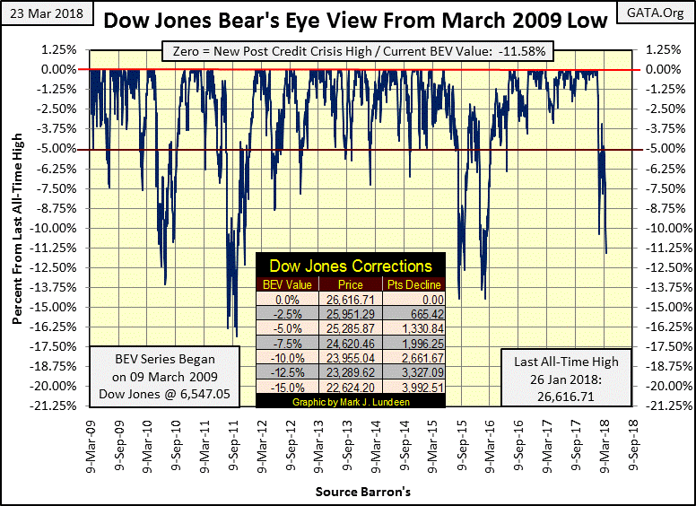
It’s a fool’s errand attempting to sell at the absolute top, when selling within 10% of the top is about as good as anyone can do in the market. At the close of this week, with the Dow Jones BEV chart below ending the week at 11.58% from its last all-time high of January 26th, that sounds like wise counsel.
There’s talk of how President Trump is (or will be) responsible for the current market decline with his tariffs on foreign imports to the United States. In most cases these tariffs are only a reaction by the president to tariffs these countries have imposed on the United States for decades. He ran for office promising to renegotiate past trade treaties like NAFTA, which is exactly what he is doing with these tariffs. After decades of Bushes, Clinton and Obama, I’m glad we finally have a president who is finally putting America first.
But that’s beside the point I’m making now, which is there is always bad news in the market. Usually bad news results in only a transitory decline in the market. That is unless the market is at a top; in which case the bad news is only a reason for “market experts” to banter about as the proximate cause in the market decline. But that’s nonsense, as the real reason for the bear market is that after years, or in our case decades of monetary inflation bloating market valuations, Mr Bear is coming back to clean up the mess left behind by Wall Street and the Federal Reserve.
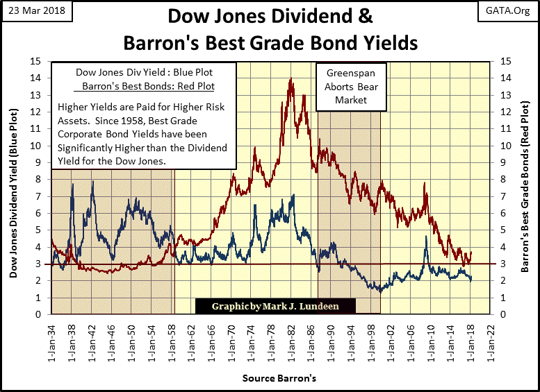
And there is a lot of garbage for Mr Bear to clean up too! Dividends for the Dow Jones (Blue Plot below) have been below 3% since the early 1990s. Bond yields (Red Plot) have declined to ridiculous levels since the 2007-09 credit crisis.
In the coming bear market we’re going to see plenty of bad news. But the real, if untold story is how since August 1971 the “policy makers” have inflated asset valuations far above where natural market forces would have taken them. Now Mr Bear is going to correct this “policy-driven” anomaly by driving dividend and bond yields up to double digits before the next bear market concludes. Of course, this will result in deflating market values well below 50% from their market tops, resulting in the failure of many financial institutions “market experts” today believe are rock solid.
Assuming I’m correct, it will be some time before this bear-market reality becomes universally accepted, and then only after the pain inflicted on people by Mr Bear forces them to abandon all hope of further capital gains. Ultimately this bear market will create a historic buying opportunity not seen since July 1932; the bottom of the Great Depression bear market.
Do you want to read bad news about the economy and market place? Go read Barron’s 11 July 1932 issue where the absolute bottom of the Great Depression Bear market was recorded. “Market experts” provided more reasons to go ahead and end it all than to buy stocks in that issue! No one reading Barron’s in July 1932 could have expected how in the next twelve months the Dow Jones would see its best year ever, advancing over 150%.
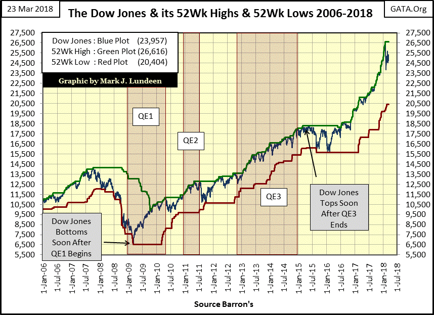
Here’s the Dow Jones with its 52Wk High and Low lines. For the first time since the summer of 2016 the Blue Dow Jones plot has separated from its Green 52Wk High line. Seeing the Dow Jones lying atop its 52Wk High line for a year and a half is something not often seen in the market; another indication of the extreme valuations currently held in the stock market.
The question to ask ourselves now is whether the next thing to happen in this chart is if the Dow Jones will resume pushing its 52Wk High line to higher levels, or will it for the first time since 2009 begin BEARING down on its 52Wk Low line.
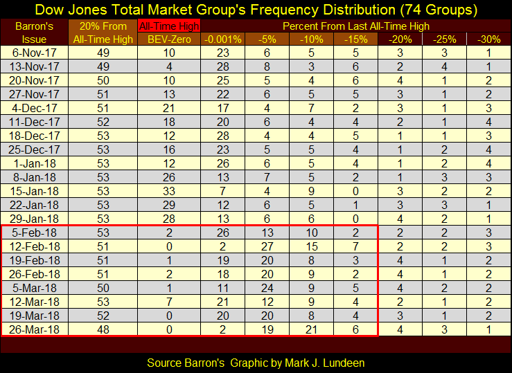
Looking at the Dow Jones Total Market Groups (DJTMG) top 20 this week declining from 52 to 48 below, I’m expecting we’ll see the Dow Jones beginning to bear down on its 52Wk Low line in the chart above in the months to come.
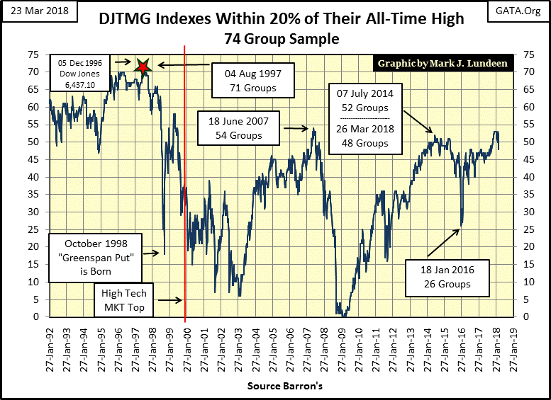
One can really see this week’s deflation of market valuations in the top 20’s frequency table below. I placed a red box covering the weeks since the Dow Jones January market top, and this week’s market decline exceeded those seen in Barron’s February 12th issue.
There may be a recovery in the weeks to come, and then maybe that’s not to be.
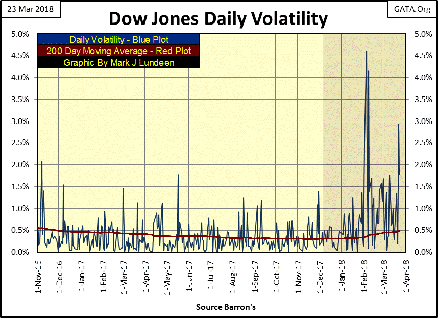
One of the market themes I’ve been stressing in past weeks is the increase in daily volatility in the Dow Jones, NEVER a good indication for the stock market. Keeping in mind how our current top in the Dow Jones occurred on January 26th, what happened shortly after that market top in the chart below? Daily closings in the Dow Jones began to see ever larger gaps from their previous day’s closing prices.
This increase in daily volatility is for both advancing and declining days, but that makes no difference – it’s bearish! Look at daily volatility from 01 November 2016 to 26 January 2018 below. These were fourteen months when the Dow Jones saw ninety-nine new all-time highs, yet most of the daily closings were less than 0.50% from their previous day’s closing price. That’s bull market action; something the stock market hasn’t seen since its January 26th top.
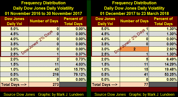
Next are the frequency distribution tables for the two periods seen above. I used November 30th as the cutoff date as this was when the Dow Jones daily volatility’s 200 day Moving Average (Red Plot above) began rising above it bottom of 0.30%.
Comparing these two tables by their “Percent of Total Days” columns, the increase in daily volatility is easily seen. Their 0.5% rows are very telling. On the right side 79.12% of daily Dow Jones closings were 0.5% to 0% from their previous day’s closing price. After November 30th, those days declined to only 53.25%, and look at the five Dow Jones 2% days (Days of Extreme Volatility). This Thursday saw another one, with the Dow Jones closing -2.93% from its close on Wednesday. That placed this 2% day in its table’s 3.0% row, its second.
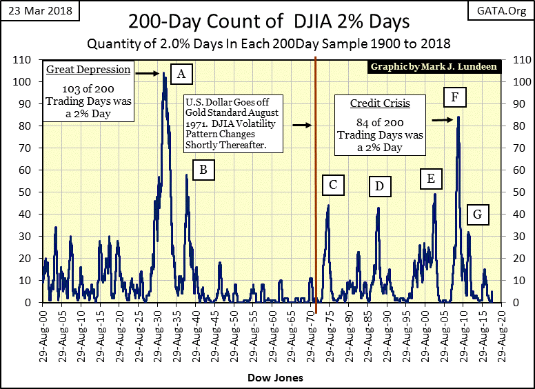
Next is the Dow Jones’ 200 count, the number of 2% days in a running 200 day sample. With the exception of peaks D & G, the growth phase of these peaks in market volatility were times investors were wise to avoid the stock market. That proved true for every spike from zero to over 20 seen from 1900 to 1920. Why are the volatility spikes seen after 1920 so much larger than those seen before 1920? The Federal Reserve’s “monetary policy” seems to be the answer to that question.
As seen in the table above, and chart below, currently the 200 count is a five, and I’m going to assume this developing spike in the Dow’s 200 count will continue until it earns the moniker of H, becoming something historic and acknowledged as so by all.
Gold did well this week; closing above its BEV -30% line in the BEV chart below.
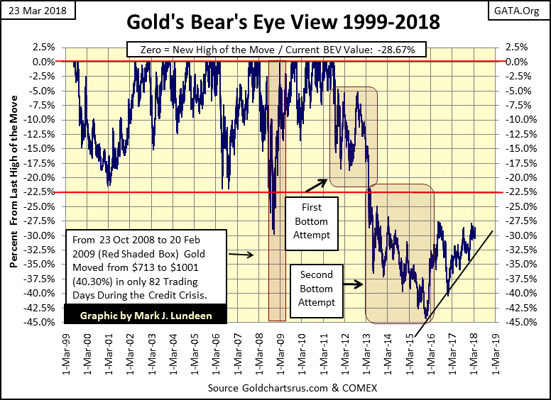
Gold’s performance this week is better seen in its step sum chart below. When just about every stock trading on the NYSE closed lower for the week, gold is attempting to take out its highs of 2018. The same can be said for the gold and silver miners this week too.
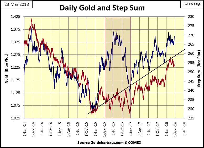
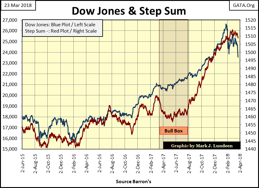
As I’ve said before, I’m not expecting anything big happening in the gold and silver markets until the stock and bond markets begin deflating in earnest. Something the Dow Jones and its step sum below are beginning to show signs of. Note the beginning pattern of declining peaks and valleys from the Dow Jones last all-time high of January 26th (Blue Plot). This is what a historic market top looks like, but it will take more declining peaks and valleys to really make that case.
In gold’s and the Dow Jones’ step sum tables below, both ended the week with a -1 for their 15 counts. Or, since March 5th (day 15 in the tables) they’ve both seen eight daily declines and seven daily advances. But since March 5th gold has advanced by $25 (1.87%) while the Dow Jones has declined by 1,341 points (-5.39%). This suggests gold wants to advance, while the Dow Jones finds it path of least resistance going down.

Moving over to the Dow Jones’ 200 day volatility column on the far right, it ended the week at 0.49%, an increase of 0.08% in the past twenty-five NYSE trading sessions – not good for the bulls.
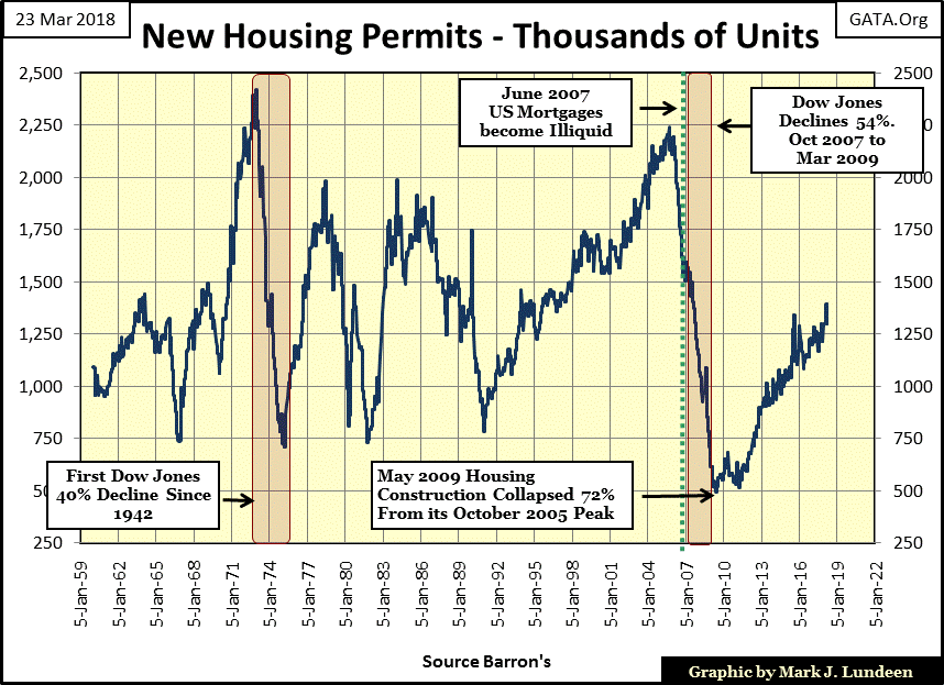
I expect we’ll look back at 2018 as a turning point in the economy and markets, so I thought I’d post some charts on basic economic activities I haven’t published for a few years. First is housing permits with data going back to 1960. This is an interesting chart as I suspect it also tells the story of how “monetary policy” gradually became dominant over more and more of the economy in the past six decades.
Housing permits from 1960 to 1991 were seen rising and falling with the economy. We see housing endured a big slump during the 1972-74 bear market, the first Dow Jones 40% decline since April 1942. Following this January 1975 bottom, permits peaked at around 2000 in 1978 and again in 1984, with a decline in the demand for housing following both peaks.
But then Alan Greenspan became Chairman of the Federal Reserve in 1987, and beginning in 1991 housing permits began a rise that continued unchecked until October 2005. This fourteen year uncorrected growth in demand for housing looks very out of place when compared to the thirty-one years preceding it. At first I’m sure the demand for housing was organic. However, without a doubt its continued growth following the NASDAQ bubble market decline (2000-02) was largely fueled by speculative-fund flows from the Greenspan Fed. See quote below.
"Innovation has brought about a multitude of new products, such as subprime loans and niche credit programs for immigrants. With these advances in technology, lenders have taken advantage of credit-scoring models and other techniques for efficiently extending credit to a broader spectrum of consumers. These improvements have led to rapid growth in subprime mortgage lending . . . fostering constructive innovation that is both responsive to market demand and beneficial to consumers."
- Alan Greenspan (At the Federal Reserve System’s Fourth Annual Community Affairs Research Conference, Wash D.C. April 8, 2005
Housing permits peaked in October 2005, eighteen months before cracks were seen in the sub-prime mortgage scheme. The bottom came in May 2009, with a 72% decline in housing permits. Demand for housing permits have increased for the past nine years.
From the deep decline seen from 2005-09, our current advance shouldn’t be unexpected. But looking at the data I have, from 1960 to present, before Greenspan became Fed Chairman in August 1987, we never saw a nine year advance in demand for housing permits without a correction. That we didn’t before Greenspan, but have now for the second time since 1991, strongly suggests that before 1991 the “policy makers” didn’t involve themselves so deeply in the housing market as they have since Alan Greenspan dictated “policy.”
Keep in mind the Federal Reserve’s balance sheet has evolved greatly since its inception. In 1913 it was almost exclusively gold bullion. During the Great Depression the Federal Reserve began using (monetizing) US Government debt as reserves. When Barron’s first began publishing the Federal Reserve’s holdings of US Treasury debt in its 21 December 1936 issue, the Fed held $11.22 billion in gold, while only $2.43 billion in Treasury debt on its balance sheet. In Barron’s latest issue the Federal Reserve reports holding $11.04 billion in gold, almost no change from nine decades ago, but a whopping increase in its holdings of Treasury debt: $4,191.34 billion dollars.
Finally, in 2008 it began monetizing garbage mortgages created by Wall Street. How much of the Fed’s balance sheet is backed by single-family mortgages neither I nor “economic experts” like Larry Kudlow know as our central bank isn’t required to have a public audit of its books. But by looking at the uninterrupted advance in housing permits since January 2011, and realizing that in most major markets housing values today have exceeded those at the peak of last housing bubble, I’d guess single family mortgages currently are a considerable item backing the US dollar.
How this will impact America’s central bank, and the US dollar it manages, when the current bubble in housing begins to deflate is something we’ll all see in the months and years to come.
Looking at oil rig operations is an excellent metric to gauge how things are going in what was once called “the oil patch.” During Reagan’s first term there were plenty of oil rigs drilling for oil, as oil prices were very high due to the second oil shock. Then Reagan and Saudi Arabia decided to reply to the USSR’s invasion of Afghanistan by going after Moscow’s energy and precious metals exports. Petroleum prices plummeted as the Saudis flooded the global markets with cheap oil, ditto for gold as the COMEX went into high gear with paper gold contracts.
In the history books, much is made of the diplomacy President Reagan used to bring down the now defunct Soviet Union. But what is usually left unsaid is how manipulating the price oil and gold down below the Russian cost of production forced Mikhail Gorbachev, the last ruler of the USSR back to the negotiating table following the break down at the Reykjavik summit meeting.
Need I say the “policy makers” have continued manipulating the price of gold and silver down below the cost of production for many, if not most of the known ore bodies mining companies could be, but currently aren’t mining. It’s part of what Robert Rubin and Lawrence Summers, US Secretaries of the Treasury for President Clinton, called the strong-dollar policy. Apparently, the other two legs the “strong-dollar policy” stands on are mendacity and fraudulent derivatives.
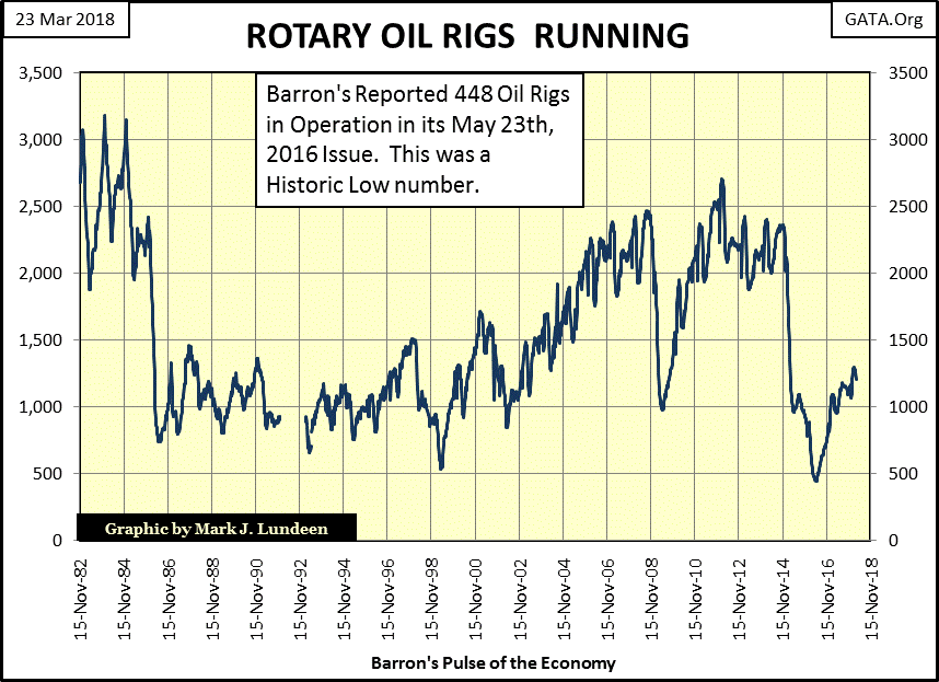
As for the plot following the 1989 demise of the USSR, we see demand for drilling rigs rise and fall with the price of oil. But not for an instant do I believe that the current price of oil is “set by market forces.”
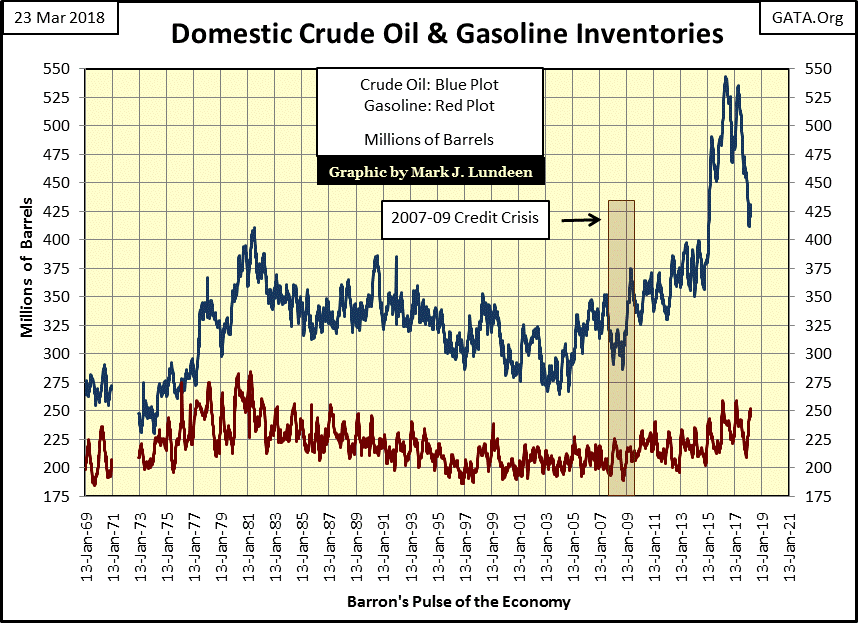
The following chart is on US crude oil inventories. I remember in the early 1970s when “experts” claimed oil production for the United States had peaked, and would approach near zero in the next thirty years. Fifty years later we now know how much those “experts” knew about the production potential for North American oil. Fifty years from now I expect the same will be said for today’s “experts” on global warning.
I wonder if any of my readers are active followers of the Q Anon posts? I find them fascinating, but they aren’t for everyone. Apparently, key officials in the White House with connections in military intelligence are posting questions for the public to answer.
The range of topics these questions beg answers to range from Edward Snowden to the Royal Family, along with the scandals of the Clinton Foundation and so much more sandwiched in between.
I did a Google search of Q Anon, which came up with nothing. But then Q has been asking questions about Google and its founder Eric Schmidt, so I wasn’t surprised seeing Google censoring searches for Q Anon. I found the following using the search engine DuckDuckGo, which provided plenty of Q Anon links to go to.
https://gumshoenews.com/2017/11/28/who-or-what-is-q-anon/
One of Q’s themes is that of military tribunals and Gitmo’s detention camp being used for the prosecution of a vast number of corrupt individuals being investigated by the Trump administration. If you really desire to see “the swamp drained”, this is an excellent way to go about it. As I understand there are over 10,000 sealed indictments, personal invitations to Gitmo waiting to be served.
I’m not surprised the obvious corruption in Washington is so large, or that the Trump Administration would desire to try these people for treason in a military tribunal in Gitmo’s detention center. I’m sure Hillary Clinton would want her case tried by Judge Ito, the same judge who tried O. J. Simpson in a farce of a trial.
I was in the Navy for twenty years, and every one of them I was under the Uniform Code of Justice (UCMJ). When I retired it was no small relief that I was no longer under military justice. But in defense of the UCMJ, in no way was it a system of tyranny. In fact it was the opposite.
If I were innocent of a charge my command accused me of, I’d feel safer being tried under the UCMJ than a civilian court. Though I have to say that in my twenty years military experience with Naval and Marine Corps officers, and Chiefs and NCOs, I’ve never seen anyone court-martialed that didn’t work hard earning this distinction. Truth told, I can recall only three sailors being court martialed of the many thousands I’ve served with. Fearing for one’s personal liberty because of a false prosecution under the UCMJ isn’t a fear service people live with.
That’s pretty much how I feel about anyone listed in one of those sealed indictments. If someday they and their civilian lawyers (who are allowed in a court martial) find themselves in front of a Gitmo general court-martial, they worked damn hard earning this distinction.
And there is so much these people need to be called in to account for, as seen in the link below.
https://duckduckgo.com/?q=clinton+cash&t=hf&atb=v82-3__&iax=videos&ia=videos
Mark J. Lundeen