The Stock Market Looks Good, But The Gold Market Looks Better


This week I thought I’d start off covering my Bear’s Eye View (BEV) charting technique with a little more detail than I usually do for the benefit of my new readers. For my regular readers, an occasional refreshment on this technique is good too.
I did * NOT * invent the Bear’s Eye View, and I never said I did. However, I know a good thing when I see it. I first saw it in a Dow Theory Letter by Richard Russell in 1995, when one of Mr. Russell’s subscribers sent it in as a quicky Excel chart of the S&P 500. Mr. Russell published it, commenting it was interesting. I never saw it again in the Dow Theory Letter, or any place else.
At the time I was busy compiling historic-market data, including the Dow Jones. 20th century inflation has made charting the Dow Jones, from start to finish in points (dollars) nonsensical, as inflation had bloated its market valuations from below 75 in January 1900 to over 4,000 by 1995 when I first saw the BEV technique.
A dollar chart for the Dow Jones’ spanning from 1900 to 1995, failed to show the impact of the Great Depression Bear Market’s 89% market collapse. But that unusual chart, published in Mr. Russell’s letter, had it gone back to 1900 for the Dow Jones, it would have displayed the Great Depression’s market crash as the most dramatic market event of the 19th, 20th and 21st centuries, as seen below.
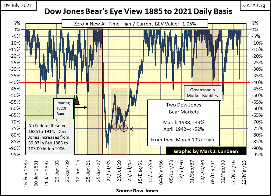
So, I figured out how to reproduce it and gave it a catchy name; The Bear’s Eye View. I called it The Bear’s Eye View, as it seemed to me that’s what it was; Mr Bear’s view of the market; where every new all-time high was worth only 0.00% (aka BEV Zero), a big fat zero to Mr Bear.
In effect, what the BEV chart above does to the Dow Jones above is compress 136 years of market history into a range of only 100%;
- Each new all-time high is equal to 0.00%, and never more,
- Total wipeouts in valuation are equal to -100%.
Whether a new all-time high (0.00%) was from 03 September 1929, the Roaring 1920s Bull Market’s last all-time high before the Great Depression’s 89% market collapse, or the Dow Jones current last all-time high of July 9th (today’s close), makes no difference to him. All Mr Bear cares about is how large of a percentage he can claw back from the bulls, which the Bear’s Eye View chart displays beautifully.
Following the 03 September 1929’s BEV Zero, he clawed back 90% of the Dow Jones’ market valuation by July 1932. Since November 2020, when the Dow Jones once again began producing new BEV Zeros, so far Mr Bear has yet to claw back 5% from a Dow Jones’ BEV Zero for the past eight months. The bulls also produced two new BEV Zeros, one at the close of last week, and again at the close of this week.
Being able to compare these two markets, one from the early years of the 20th century, the other ninety years later in the 21st century (at week’s end) is difficult using the as published data on the Dow Jones. But looking at this data in the BEV format, comparing the Dow Jones from one period of market history to any other is easy, as each is displayed in terms of new all-time highs and percentage claw backs from them.
Another thing to understand about the BEV format; it plots its data exactly the same as does plotting the data in dollars: between one BEV Zero to the next in the series. The best illustration for this is looking at Silver, whose last BEV Zero (last all-time high) was in January 1980.
Below, I’ve charted silver going back to January 1969, with the BEV format in Red / left scale, and in dollars Blue / right scale. From January 1969 to January 1980, silver’s valuation increased from $1.85 to $48.70 (Blue Plot), making many new all-time highs as it advanced during these eleven years.
The BEV View of these eleven years (Red Plot) is very different, and actually more informative. We see three periods where silver increased to its BEV 0.00% line, those times when silver was actually advancing, and producing new all-time highs. Silver’s Bear’s Eye View from January 1969 to January 1980 also displays two corrections in the price of silver, which is not obvious in the blue dollar plot. Neither of these corrections shown in the BEV plot sees silver’s valuation deflating more than 40% from a BEV Zero.
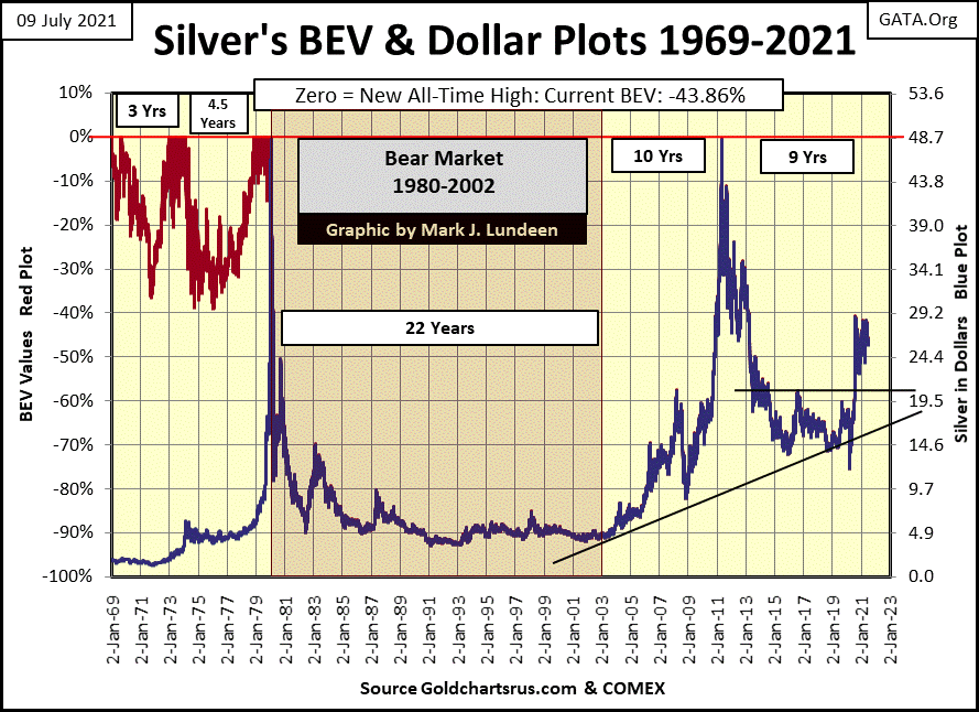
After silver’s last all-time high in January 1980, the blue dollar plot has laid down on its red BEV plot. I had to be creative on this chart’s dollar scale (right side) to accomplish this. Had I charted silver in dollars by itself, the dollar-scale unit would have been in $5 increments, not the $4.87 increment required to comingle the BEV and dollar plots above.
Having done so, one can take the post January 1980 chart of silver and read its BEV value on the left scale, or its price in dollars on the right scale, but note the chart of silver itself is identical for both the BEV and dollar scales. And so, this will continue to be until the price of silver advances above its last all-time high from over four decades ago.
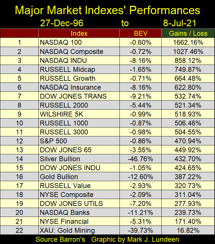
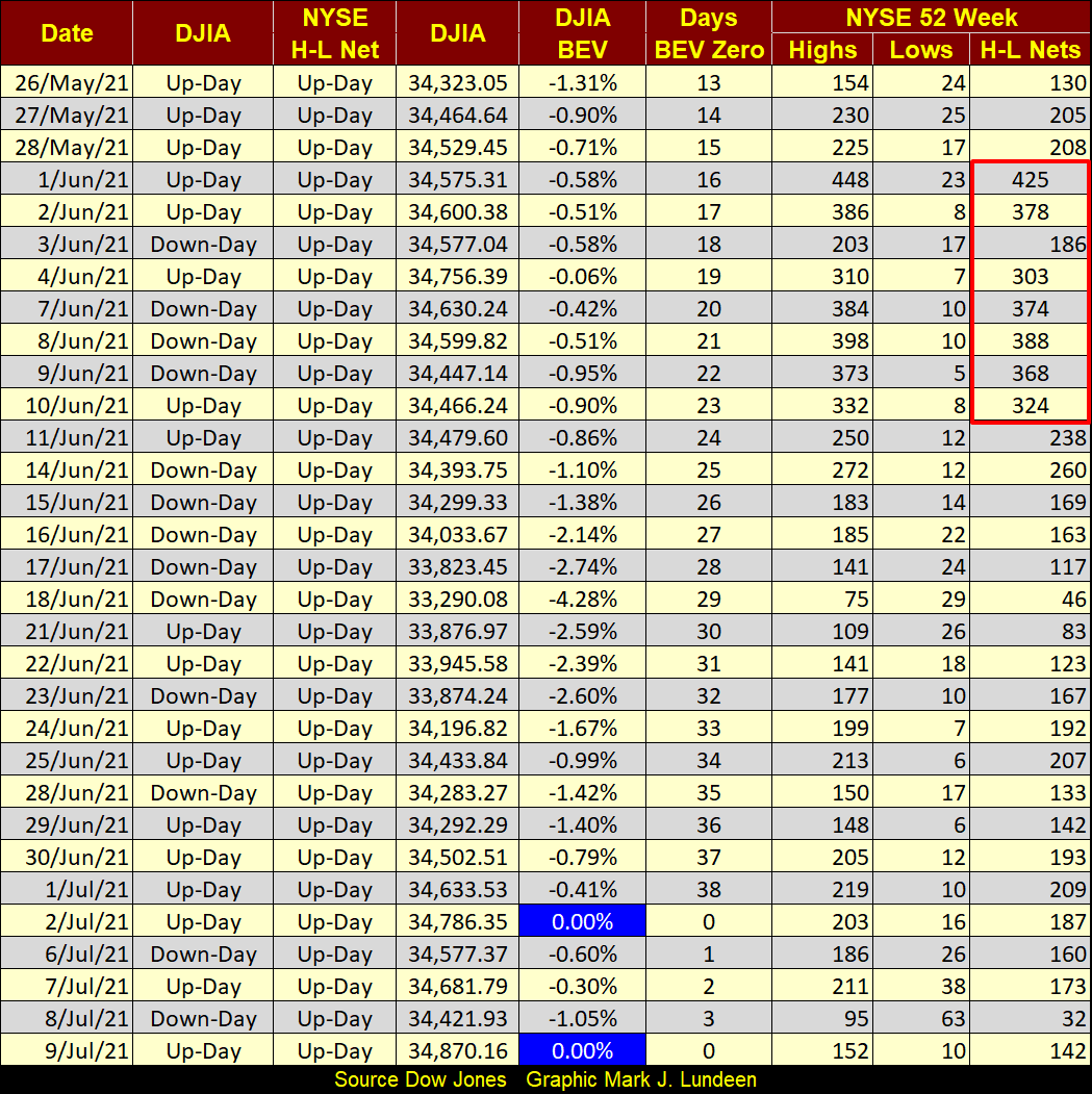
My weekly table on Major Market Indexes is done using BEV values, because doing so places each index on equal terms; new all-time highs and percentage claw backs from them.
But a table of market indexes using BEV values is limited to informing me of how the general market is doing from day to day. Keep in mind, historically the market performances of these indexes are not equal (table below). Since December 1996, the NASDAQ indexes have far outperformed the gold and silver miners in the XAU. Performance data, as seen in the table below, is not possible using the Bears Eye View format.
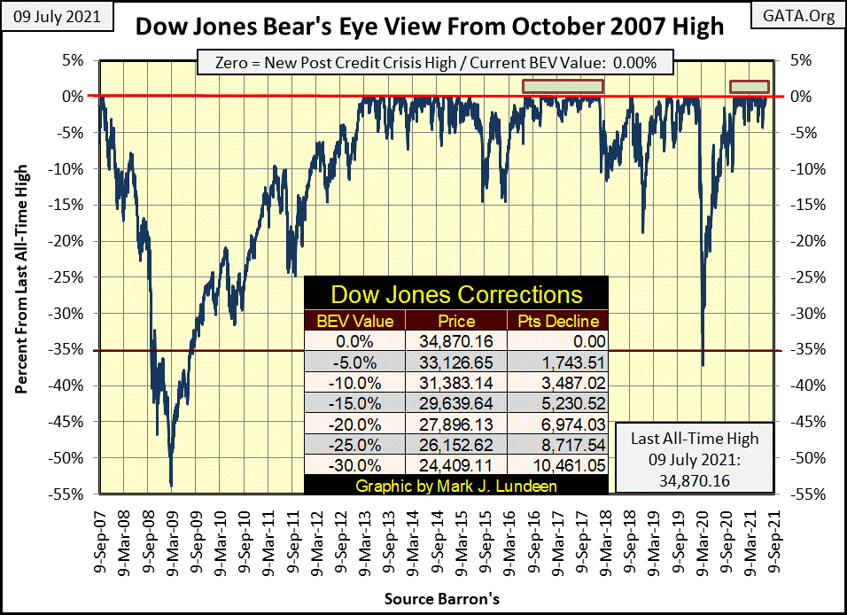
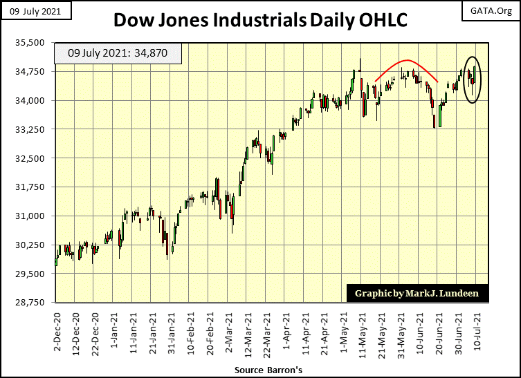
Now, let’s take a look at this week’s Dow Jones’ BEV chart below. In the past month it appeared the Dow Jones was in danger of falling out of scoring position, breaking below its BEV -5% line. But that didn’t happen. The Dow Jones has been in continuous-scoring position since mid-last November, eight months ago. During this time the Dow Jones has seen thirty-three new BEV Zeros, which increased the Dow Jones’ valuation by 4,920 points or 16%. How much longer can this continue?
If you look at the chart, I placed two red rectangles above the 0.00% line. The far right one is for the Dow Jones’ current advance, where it has remained in continuous-scoring position for the past eight months. The red rectangle to the left was during President Trump’s first two years in office, where the Dow Jones remained in continuous-scoring position, above its BEV -5% line for about eighteen months.
The point to take away from this is; during strong market advances, Mr Bear’s ability to claw back from the bulls is limited. But all good things must end. For the Dow Jones, that may prove to be a daily close below its BEV -5% line below.
A closing BEV value for the Dow Jones of >-5% doesn’t mean the end of the world. There have been plenty of times, seen below, where a Dow Jones’ break down below its BEV -5% line didn’t terminate an advance in the market. But should the end of the world come about, one of the first things the stock market would see is the Dow Jones falling below scoring position in the chart below, possibly in a dramatic manner.
You know what I’m talking about; the Dow Jones begins seeing its dreaded days of extreme-market volatility, +/-2% or greater daily percentage moves from a previous day’s closing price. We’ve not seen one of those since the end of January, where the Dow Jones moved down 2.03% from the day before. Last January’s Dow Jones 2% day had no negative consequence on our current market advance. Maybe the next one will also prove to be market neutral. But should we begin seeing a series of Dow Jones 2% days, that would be bad.
Just realize how quickly things can change in an aging market advance, such as ours. In such a market, it’s best to stop thinking of reasons to buy, and begin to think of reasons to sell. Seeing the Dow Jones deflating below its BEV -5% line, and begin experiencing a series of its dreaded days of extreme-market volatility, would provide time tested tripwires to protect one’s money from Mr Bear. Another excellent trip wire would be seeing bond yields begin to rise, which so far they have not.
Also, history provides us with many examples where it was best for investors to be out of the market for prolonged periods of time. So, if you’re in the market and making money; don’t let anything I’m saying stop you. Just don’t get married to your positions; where for better or worse, unto death do you depart from your investments.
Next is my table for the major market indexes BEV values. As last week was a holiday shortened week, we see last Friday’s data in Monday’s spot. The market this week was deflating until it saw a dramatic turn around on Friday. With a long-established market advance, such as ours, bullish reversals are to be expected.
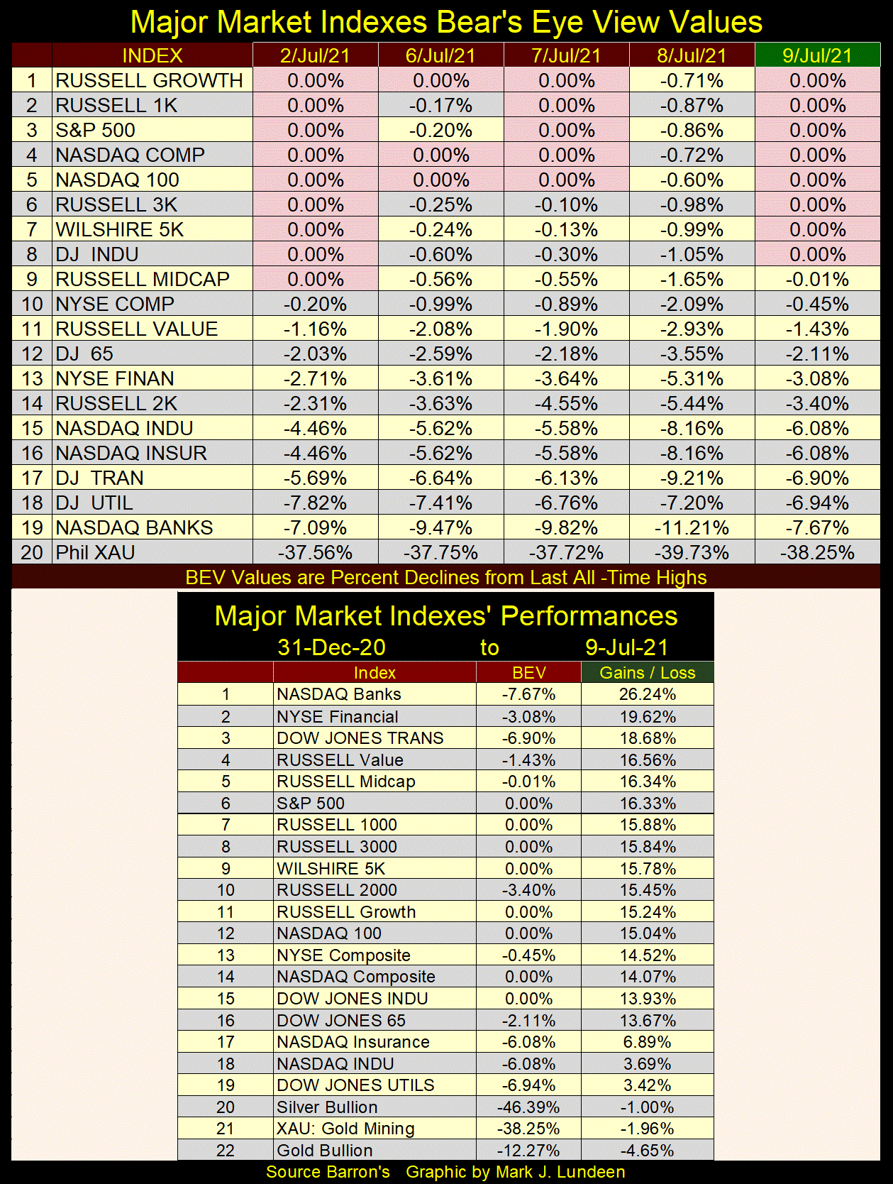
In the market performance table above, the gains for these indexes since the first of the year are given. They’re looking good, until we see the precious metals at the bottom of the list. This too shall pass.
The Dow Jones in daily bars below looks very heavy. True the Dow Jones saw not one, but two new all-time highs since Friday last week. But just looking at the chart as is, what comes to my mind is the Dow Jones is working on bearish double top formation. But, considering we are in well established market advance, I’m not going to get bearish soley based on what I see below.
One of two things is going to happen in the weeks and months to come in the chart below;
- The Dow Jones continues seeing its valuations inflate,
- The Dow Jones begins seeing its valuations deflate.
What do I think will happen from here? Until the Dow Jones begins seeing daily moves of >+/-2%, I think the bulls on Wall Street will continue running wild and free. So, a Dow Jones close of above 36,000 is very doable for the bulls before end of August.
But, as is the case for any aging market advance, as time goes by the rewards of being bullish become ever smaller as the risks of losing a large percentage of one’s money exposed to the market grows ever larger. For the bulls in July of 2021, I think it’s pennies to the upside, while risking dollars to the downside.
This market advance has been going on since August 1982. In late 1982, when the Dow Jones first broke above 1,000, and then stayed above 1,000 for the first time in history, Wall Street has seen four decades of advancing markets. That’s never happened before. What else has never happened before is seeing the Federal Reserve’s FOMC flood the financial system with “liquidity” as seen below.
The problem the “policy makers” are having is the “liquidity” they are “injecting” into the financial markets (chart below) is now also flowing into commodity prices. Ultimately, that will inflate consumer prices, and with rising consumer prices comes rising bond yields. With rising bond yields comes Mr Bear’s goon squad, who will pay the bulls on Wall Street some serious disrespect.
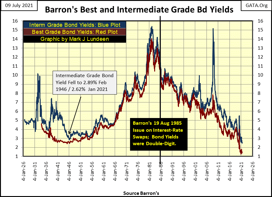
But when? Heck if I know. What I do know is should corporate and Treasury bond yields return to where they were in October 2007, just prior to the sub-prime mortgage bear market (something above 5% / see chart below), it will be a bad day on Wall Street.
The Dow Jones, as well as other major indexes are seeing new 52Wk highs. But for issues trading on the NYSE, since June 10th things have cooled down, as seen in the 52Wk H-L Nets column below. Again, as we’re dealing with a well established market advance, its best to assume the NYSE 52Wk H-L nets will once again rise above 300 as seen in the red rectangle.
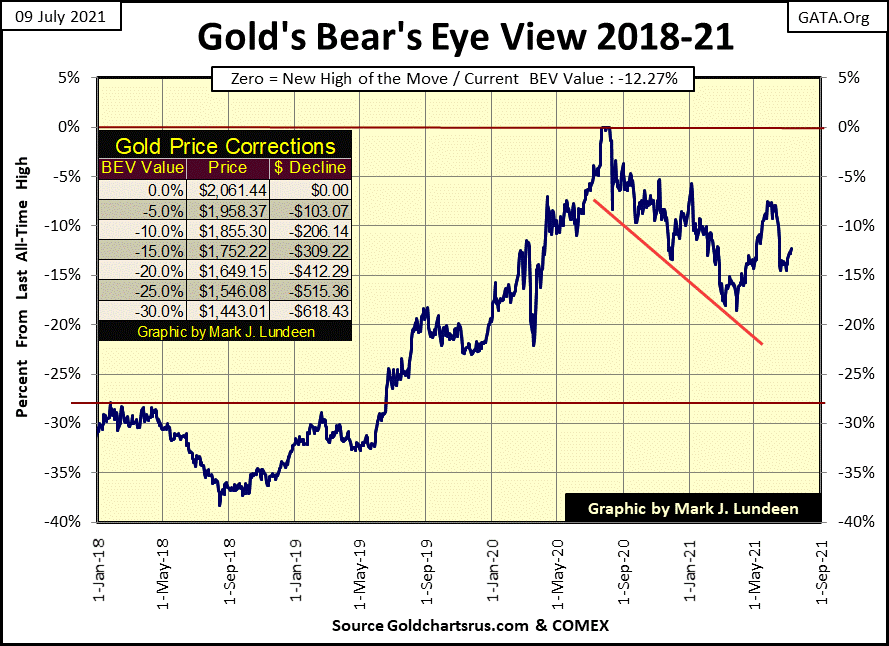
Moving on to gold’s BEV chart below, so far, the bears have failed to drive the price of gold down below its BEV -15% line, with gold closing the week half way between its BEV -10% and -15% lines. I believe the bottom of this correction is in. In April the bears failed to drive gold below its BEV -20% line, and now three months later they’ve failed to drive gold below its BEV -15% line, so far anyway.
The key level now for gold is its BEV -10% line, which would be gold at $1855.
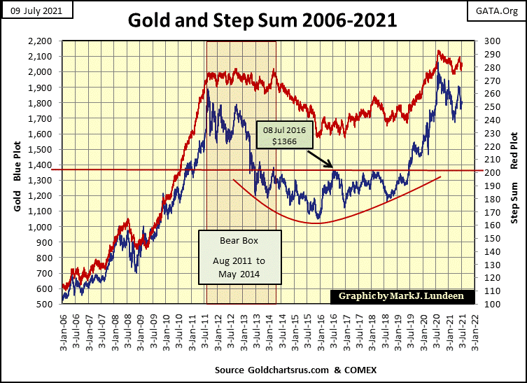
Gold with its step sum plot in the chart below remains bullish. Twenty years ago, Jim Sinclair called the start of the current bull market in gold in 2001 based on what he called a “teacup with a handle” chart formation. Two decades ago, Mr. Sinclair called such chart formation one of the most bullish there is.
What does a “teacup with a handle” formation look like? Exactly like gold’s dollar plot below (Blue Plot), from 2011 to the close of this week. When one sees a multi-decade long, massive bottoming formation, as seen below, its best to take note of it and maybe take an early position in the market.
One day gold is going to take out its last all-time high of last August. When it does things of gold and silver could become very exciting, and I want to be there when it happens. Now seems like a good time to get one’s positions in the precious metal markets, and have the patience to wait.
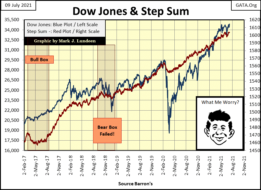
Nothing new to say about the Dow Jones and its step sum chart below, except say it remains bullish. Dow Jones 36,000? Why not?
Next is my step sum tables for gold and the Dow Jones. Daily volatility’s 200 Day M/A for both are trending down. That’s great for the Dow Jones, as low volatility is the stuff bull markets are made from on Wall Street. But for gold and silver, their big-bull markets are very exciting, volatile market affairs. So, seeing daily volatility increase for gold and silver would be a bullish factor in the market, something we’ve not seen for awhile.
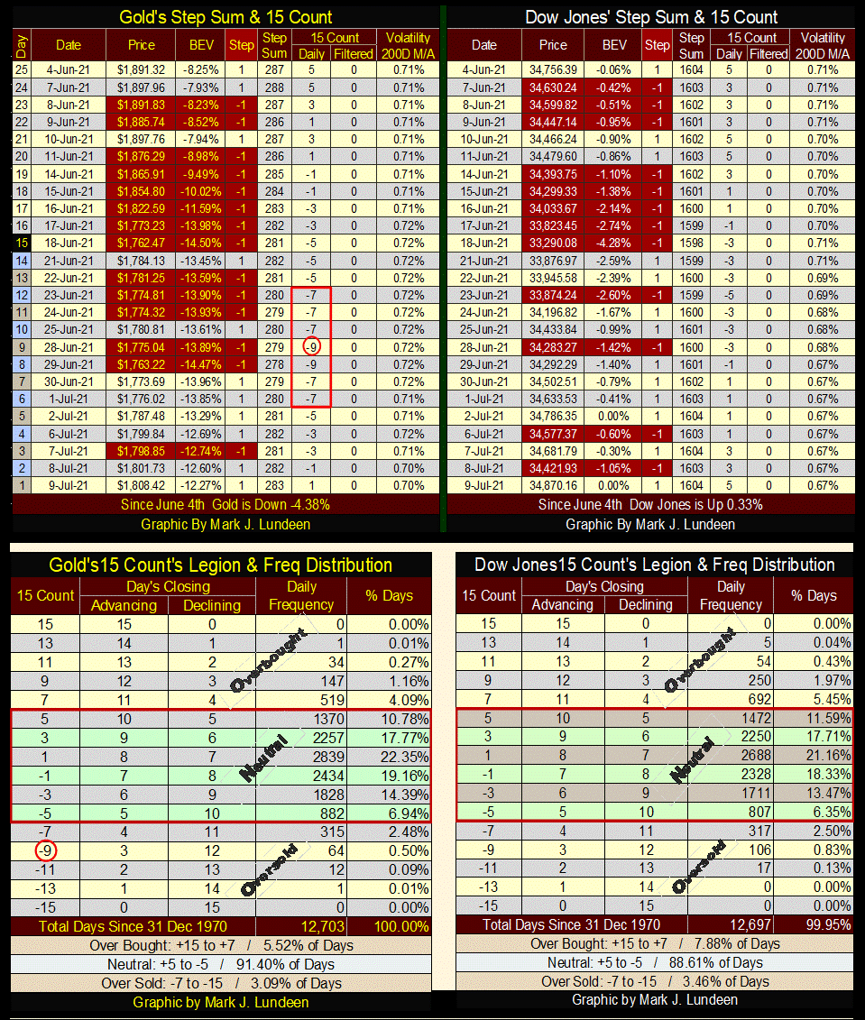
Are you worried gold may be headed down? After seeing gold’s 15 count hit a -9 in late June, I’m not. A -9 is an extremely oversold gold market, a market due for a bullish bounce in price. As seen in its frequency distribution table above, since December 1970, gold’s 15 count had closed at a -9 in only sixty-four trading sessions. And with it I believe the precious metals bottom is in!
Next Thursday (July 15th) at 1:00 PM Pacific time, 3:00 PM Central, Eskay Mining is having a webinar. Registration for it is free (link below).
I don’t know what management and the company’s excellent geologists are going to talk about. But if this spring’s aero-survey confirms last year’s drilling assay results at their Jeff and TV targets, people will have damn good reason to be optimistic that other areas their aero-survey have highlighted will also be richly mineralized with gold and silver. To see exactly what that means, you will have to register for free at the link below and watch.
A week from now we may see ESK’s share price up by a nice pop. I have my fingers crossed, and ask the good Lord to bless all they do. Mac Balkam, Eskay Mining’s CEO and his team of experts have worked very hard these past years. It would be great seeing them report excellent results of aero-survey next Thursday.
Eskay Mining - Company Webinar with Q&A (webinarjam.com)
Mark J. Lundeen
*******


