The Stock Market Looks Great; Except for Some Minor Details


Tyler Durden from Zero Hedge posted on July 28th how the collapsing Chinese stock market has devastated Chinese retail investors. My heart goes out to those people. And these are people just like you and I who were trying to better their lives by investing in the stock market, only to be crushed by deflation.
Stuck In Market Purgatory: How China's Citizens Lash Out At The Broken Market, In Their Own Words
The problem is immediately evident in reading Mr. Durden’s post; everyone believed their authoritarian government was in control of the stock market as monetary inflation bloated market values far above reason. Chinese retail investors now find themselves in Mr Bear’s re-education camp learning the limits of government power to create wealth by expanding credit and currency. Of course most of the little people were leveraged to the hilt with margin debt, provided by the People’s Bank of China.
As we are on the topic of “regulating” markets by authoritarian government, since the beginning of the Greenspan era, a widespread belief that government “regulation” of financial markets could tame their wild spirit has become a global phenomenon. At the peak of the sub-prime mortgage market bubble, which was also the beginning of the second deepest Dow Jones bear market since 1885, I gleaned the following quote from Barron’s. I knew one day it would come in handy.
“One reason that monster declines are less likely now is that investors recognized something that they didn’t in 1987: The Federal Reserve is on their side.”
- Andrew Barry, Barron’s 15 October 2007 issue
No doubt the total breakdown of the international payment system over the next sixteen months caused by illiquid-mortgage assets paralyzing the banking system shook the faith that the Federal Reserve was on everyone’s side – for a while. However the massive post October 2008 “reliquification” of financial markets by the Fed (see below) managed to restore the public’s faith in the idiot savants managing “monetary policy.” Washington’s politicians, (the sub-prime mortgage scandal’s unindicted co-conspirators) were also quick to take credit for “saving the financial system.”
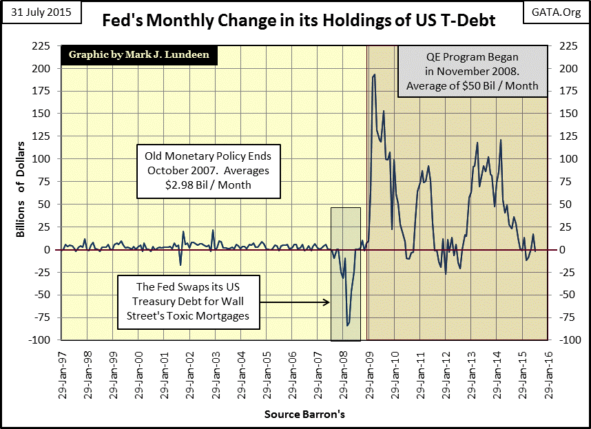
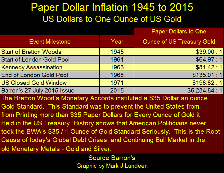
But they didn’t really save anything. All that the “liquidity” injected into the financial system actually accomplished was to postpone the inevitable collapse of a corrupt system of credit that was doomed from day one after it broke loose from the Bretton Woods $35 gold peg. And when exactly did that happen? Ask any economist or “market expert” and they will tell you it happened when President Nixon closed the US Treasury’s gold window in August 1971. But in fact the “policy makers” had been violating the Bretton Woods $35 gold peg since before the ink was even dry on this international monetary treaty, as Barron’s noted in this quote from January 1950:
“We hope that the government of the United States, despite the big spenders, and the gold tinkerers, maintain a sound dollar, a dollar worth saving, a dollar worth earning, and a dollar that can be traded in any part of the civilized world.”
- Barron’s World at Work, 02 January 1950 issue, Front Page
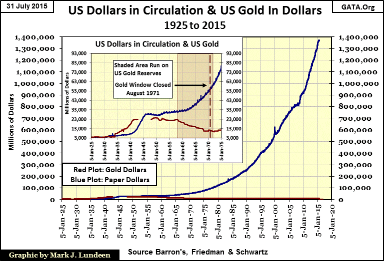
Hope that Washington would preserve a dollar “worth saving” proved forlorn. By 1961 the US Treasury had recklessly issued $65 paper dollars for every ounce of gold in its vaults to back the $35 an ounce gold standard. But the laws of God and man can’t bind the “hands of policy.” By the time “Nixon closed the gold window” in 1971 the Treasury had issued $199 paper dollars for every ounce of gold it held to back the dollar.
President Nixon closed the gold window to stop a run on the US gold reserves that had actually begun in 1958, as seen in the chart insert below. Facts are stubborn things and it’s a fact that the economy, and the people who must work for their dollars have suffered from chronic monetary inflation since the end of World War II. Sometimes the monetary inflation flowed into consumer prices, other times it flowed into the financial, credit, or real estate markets creating ruinous booms and busts which devastate the lives of millions, but always it flowed because it was good for Wall Street and Washington’s entrenched elite. Everyone else be damned.
As of Barron’s 27 July 2015 issue the “policy makers” have issued $5,235 paper dollar for every ounce of gold the US Treasury claims to hold in reserves, reserves which haven’t been audited for six decades. I fear that someday we’ll discover whatever gold remains in Fort Knox now belongs to George Soros. As Mr. Soros is a very popular guy in Washington and Wall Street don’t be surprised when the Federal courts uphold his legal claim to it.
Monetary inflation of the US dollar has caused some profound changes in markets, mostly forgotten today or now accepted as normal. Long ago foreign exchange (FX) rates were bolted together (pegged). Any government that allowed its currency’s exchange rate to fluctuate caused a scandal sure to make international news and a loss of national prestige. It was only after August 1971 that exchange rates were unpegged and began to float, allowing banks to profit by creating FX futures contracts for businesses to “hedge THEIR currency risks”, risks that didn’t even exist when the US dollar and all global currencies were defined in terms of gold and international trade imbalances were settled annually in gold bullion.
“Extravagances and absurdities like floating exchange rates and Special Drawing Rights (IMF’s SDR) come and go. Gold endures.
And what a lot it has had to put up with. After insisting for decades - over optimistically, in the event – that the dollar was as good as gold, the U.S. monetary authorities, by fiat, so to speak, desperately sought to prove that in global financial affairs it was better. First they closed the gold window thereby reneging on a generation of solemn pledges to the contrary. They threw their weight behind the Special Drawing Right, a bastard form of what John Exter has aptly termed the “I-Owe-You-Nothing.” Several years ago as hundreds cheered, gold was officially drummed out of the international monetary system and the IMF launched on a series of sales aimed at disposing of the barbarous relic forever. In turn, the Treasury beset by a plunging dollar has stepped up its own liquidation from 300,000 ounces per month to the current rate of 1.5 million.”
- Robert M Bleiberg: Barron’s Managing Editor, 29 January 1979
Today, decades after the fact all this is now long forgotten. However the residual after effects of this “monetary policy” can still be seen if one knows where to look.
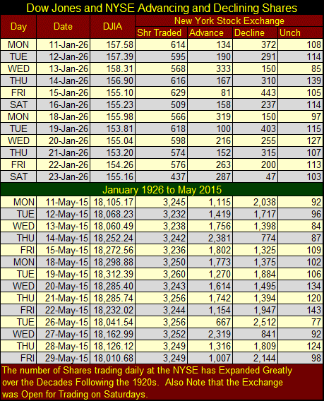
I use the NYSE Advance-Decline data as a ratio to total shares traded daily. This eliminates the variable of the number of listed companies trading on the NYSE which has changed greatly over the decades. Today the NYSE lists about 3,200 companies, but in the 1920s and 30s there were only about 950 listings on the NYSE, and it wasn’t unusual for just 450 of these companies to actually be traded on any given day (Shr Traded column in table below). Keep in mind this was a time when only the wealthy had telephones in their lives; day traders during the 1920s had to take public transportation to make a trade at a broker or the NYSE. Also note too that the Dow Jones has expanded more than one hundred fold since January 1926 courtesy of pure monetary inflation from the Federal Reserve.
The NYSE A-D Ratio (chart below) is a fascinating study of the changing nature of the stock market since 1926. The 1929-32 market crash saw declining shares overwhelm advancing issues as investors panicked and left the market much poorer than they entered it.
The same thing occurred from 1966 to 1981 when the Dow Jones attempted to break above, but failed to stay above 1,000 five times. Retail investors became bored with the market and abandoned the NYSE. The small Red Box below shows the January 1973 to December 1974 bear market, the first time the Dow had declined more than 40% since April 1942.
The NYSE A-D Ratio was remarkably subdued throughout the Greenspan bubble market that ended in January 2000. Still as we see in the Dow Jones Bull Market text box, the Dow Jones was up 1400% from 1982 to 2000; $1000 invested in the Dow in 1982 grew to $14,000 by the year 2000.
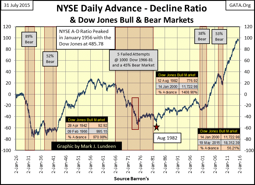
After January 2000 this data becomes very strange. Though the NYSE has seen two historic bear markets over the past fifteen years, advancing shares have overwhelmed decliners to an extent never seen before. What a difference from A-D Ratio’s reaction to bear markets before WWII. Yet with all these advancing shares over the past fifteen years somehow the Dow Jones only managed to advance by 56.21% since January 2000; not even a double.
The pathetic gains since the 2000 high of 11,723 have been due to the Dow being grossly overvalued since its dividend yield broke below 2% in January 1997. Look at the Dow Jones Dividend yield chart below. From 1925 to 1987 seeing the Dow Jones yield 3% was a surefire signal that the bull market was over. Seeing the Dow Jones yielding over 6% was a dependable signal the bear market was approaching its end. But all this changed when Alan Greenspan became Fed Chairman in August 1987. Since then markets have become unhitched from any historical standard of valuation, such as dividend yields.
For your information; to calculate the Dow Jones valuation from its dividend data you divide its payout by its yield. Using the data for 14 January 2000 (the top of the 1982-2000 Dow Jones bull market), the payout of $152.40 / 0.013 (the 1.30% Yield) = 11,723 (Dow Jones published it at 11,722.98).
On 14 January 2000, as it price reached its bull market high of 11,723 the Dow’s dividend yielded a historic low of 1.30% with a dividend payout of $152.40. Had the old standard of a 3% yield terminating a bull market was still in effect, the $152.40 in dividend payout would have only supported a Dow Jones valuation of 5,080; 56% below its actual high of 11,723. Assuming the Dow Jones could maintain its January 2000 payout of $152.40 in the following bear market, as the Dow’s dividend yield reached 6% the Dow Jones would have declined to 2,540. This would have been a 50% decline from the Dow Jones at 5,080 (its 3% dividend valuation) or a tremendous 78.33% decline from its actual 11,723 top (its 1.30% dividend valuation).
In the Dow Jones dividend chart below note that I have identified the past fifteen years as a bear market. From a historic dividend perspective it will continue to be a bear market until the Dow Jones dividend once again rises above 6%. But that isn’t going to happen until stock valuations are once again anchored to their dividends, as was the case before the Greenspan Fed.
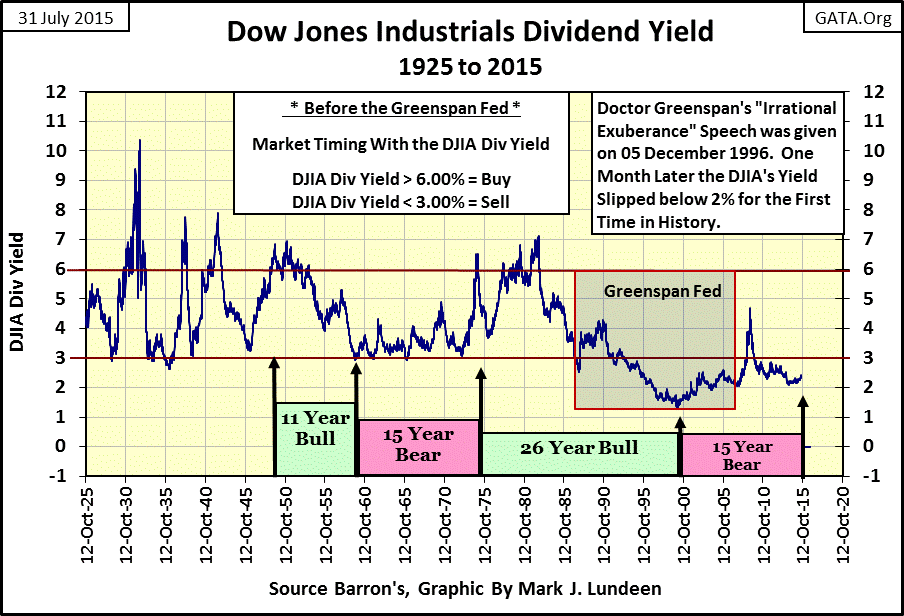
Mr Bear’s recoupling the stock market to reality will be a painful process. The Dow Jones closed on Friday at 17,689.86 with a payout of $422.90 yielding a miserly 2.39%. Assuming a 50% cut in payouts ($211.45), when the Dow Jones once again sees a 6% yield the Dow Jones would decline to 3,524. That would be an 80% crash from the Dow Jones last all-time high of 18,312 seen in May.
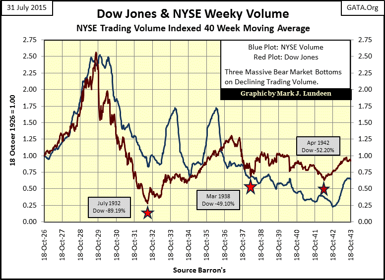
How the “policy makers” have managed to maintain bloated stock market values, and the astounding advance in the NYSE A-D Ratio since January 2000 can best be explained by examining trading volume (the number of shares traded daily in the stock market). Below we see the Dow Jones and NYSE’s trading volume’s 40Wk moving average from 1926 to 1943. There are two bull market tops in it (1929 & 1937) and three bear market bottoms (1932, 1938 & 1942). During these two decades we see trading volume increasing during bull markets, and declining during bear markets. This makes perfect sense as the public comes into the market during bull markets anticipating capital gains and exits during bear markets after suffering capital losses.
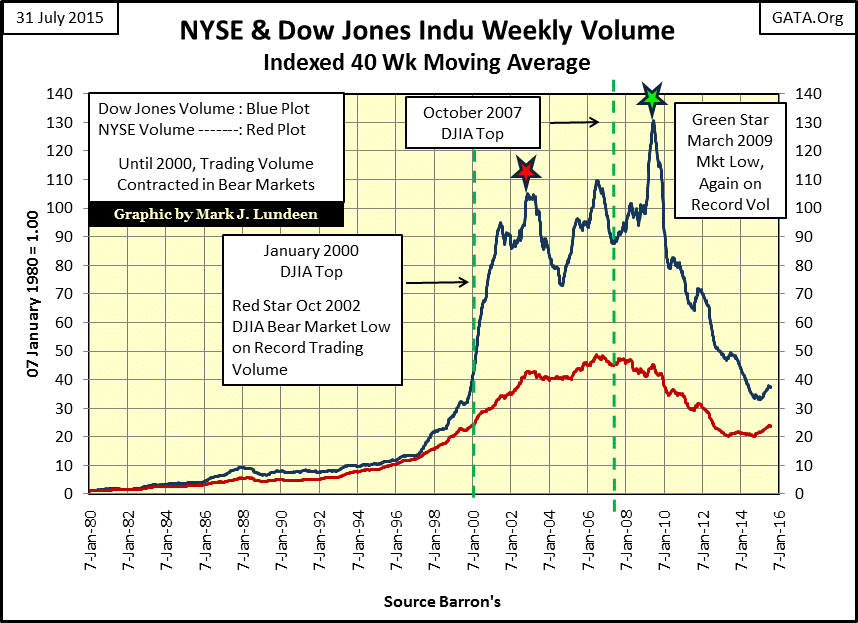
However, after January 2000 this relationship between the Dow Jones and market volume became inverted. As seen below both Dow Jones bear market bottoms of October 2002 and March 2009 (Red and Green Stars) occurred on record trading volume. The 54% gains in the Dow since March 2009 occurred as NYSE Trading volume declined by 50% and trading volume for the thirty stocks comprising the Dow Jones collapsed by 70%. A 54% advance in the Dow Jones over the past six years while trading volume collapsed by 70% is highly unnatural, an obvious red flag that all is not what it appears to be.
In the next market downturn expect market volume to once again explode as the “policy makers” attempt to “stabilize” the stock market. This is what happened on the Chinese stock market over the past month; the People’s Bank of China became the buyer of last resort with the market in freefall, exactly as the Federal Reserve was during the tech wreck and credit-crisis bear markets.
Here is a chart plotting the NASDAQ daily trading volume’s 10Day M/A.
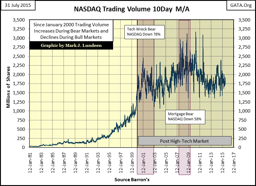
It’s obvious that since January 2000 the US Government has thwarted price discovery in the American stock market, opting instead to dictate market values by direct intervention. In the chart above we see how during the NASDAQ’s tech-wreck bear market the NASDAQ Composite index crashed 78% on exploding market volume. By the time the NASDAQ had declined 45% most of the public was OUT OF THE MARKET, yet trading volume continued to increase. How far would Greenspan’s NASDAQ bubble have deflated had he not provided the inflationary means to halt the bear market decline at 78%?
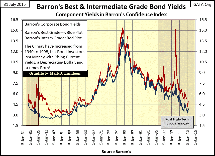
There’s been a lot of disagreement between Mr Bear and the “policy makers” over how the stock market should be valued for the past two decades. Barron’s Confidence Index (CI) has monitored the Greenspan era of market euphoria (1987 to 1999) as well as the bond market’s growing concerns over market stability since then. But first let’s study the two corporate bond yield series Barron’s uses to construct its CI: Best Grade and Intermediate Grade.
From 1947 to 1981 these two bond yields increase from low single digits to mid-teens as the American bond market reacted to growing consumer-price inflation flowing from the Federal Reserve. By the late 1970s and early 1980 CPI inflation had risen to the teens, as did bond yields. After bond yields peaked in 1981 monetary inflation from the Federal Reserve stopped flowing into the CPI and began flowing into financial markets, inflating bubbles in stocks, bonds and real estate.
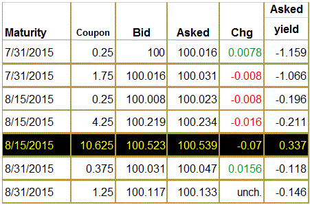
Special note: this month (August) we’ll see the end of an era of bond market history when the last US Treasury Bond with a double digit (10.625%) coupon (issued in August 1985) matures (see table below). There was one 20-year T-Bond issued in 1981 with a coupon of 15.75%! Believe it or not in 1981, a US T-Bond with a 15.75% coupon was about as popular with investors as gold is today at $1,080. And like gold today selling at $1,080, someone purchased those Treasury bonds yielding 15% and in the years to come was glad they did.
Anyway, following the consumer price inflation of the 1960s and 70s there were a multitude of US T-Bonds sporting double-digit coupons (if not always double-digit current yields) for the next thirty years. The bond tables were packed full of them. But that era will end come September when the last one of its kind quietly slips into history. If you want to see market history in the making, just visit this link to the WSJ T-bond table once a week for the next few weeks.
http://online.wsj.com/mdc/public/page/2_3020-treasury.html?mod=topnav_2_3010
By the way; don’t rule out the possibility of seeing T-bonds with double-digit coupons once again sometime in the future. It’s Saturday night as I write, and my remote camera pointed at Janet Yellen office at the Washington DC’s Federal Reserve building shows she’s hard at work making “monetary policy.”
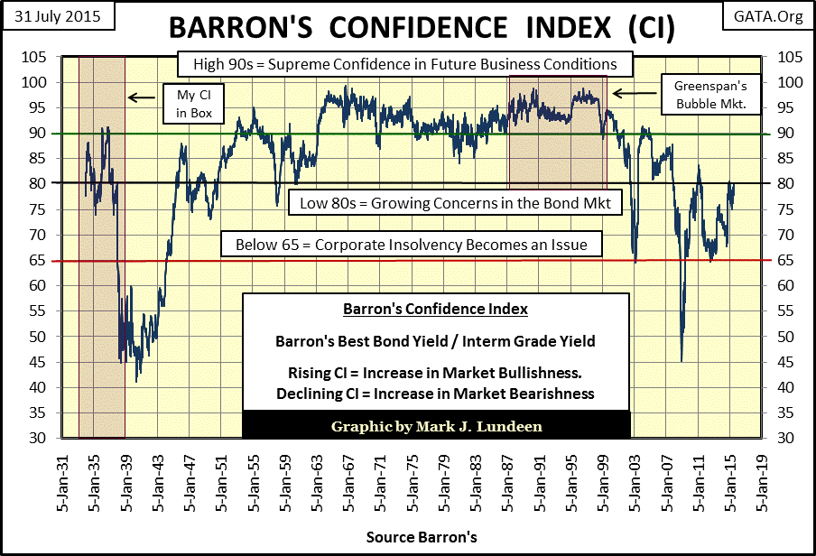
Moving on to the Confidence Index, I should note that it is the worst bond market timing tool ever devised. It increases during bond-bear markets and declines during bull markets and frequently meanders as the bond market moves up or down. So what good is it? The CI is the bond market’s best guess of the prospects of average quality bond issuers’ ability to service their debts to term – and that’s it. But that’s all it takes to make the CI a superb economic indicator.
For example, as we see in the CI’s component yield chart above, the bond market endured a horrific bear market from 1947 to 1981. Bond owners suffered from capital losses on their bonds as well from inflationary losses on their bond’s coupons payments. Yet in the CI chart below, the CI itself increased or remained range bound high in the chart during this period. The reason for this was the CI doesn’t concern itself with bond holders’ profits and losses, only on the prospects of issuers of intermediate-grade corporate bonds to service their debts to term. During the period from 1947 to 1981 inflation was beneficial to companies carrying debt, even if it wasn’t to their creditors in the bond market.
From World War II through 1981 the US dollar was a wasting asset. Companies borrowing a million dollars anytime during this period were able to pay back the loan in dollars worth substantially less than the dollars they borrowed decades earlier. In addition, CPI inflation allowed them to raise the prices of their goods or services continually over the years, greatly easing their debt service. And unlike today, those were prosperous years for America.
Now let’s look at the CI during the period of the Greenspan bubble (1987-2000); it never declined below 90 until 1999, and was frequently above 95, the very picture of irrational exuberance.
However, how CI has responded to the “policy makers’ stabilization efforts” since the January 2000 stock market top is the period of most interest to us. During the past fifteen years, as bonds continued a bull market begun in 1981, the CI itself has experienced declines not seen since the depressing 1930s. This makes perfect sense when we realize that in “stabilizing” the markets the “policy makers inject liquidity” by the trillions of dollars in the form of newly created debt, much of which is assumed by corporate America, usually for the frivolous reason to buy back their shares to support inflated market valuation. During the period from 1947 to 1981, companies could easily pass price increases of their goods and services on to consumers. But in the 21st century consumers are just as overloaded with debt as the companies themselves; so raising prices today frequently results in lost customers.
Barron’s Confidence Index is warning all who are willing to listen that a debt crisis is approaching. When it arrives it won’t be just the Chinese retail investors having to deal with the aftermath of disastrous central-bank policies. Gold and silver never looked so good.


