Stock Market Update And Electrical Power (EP) Outlook


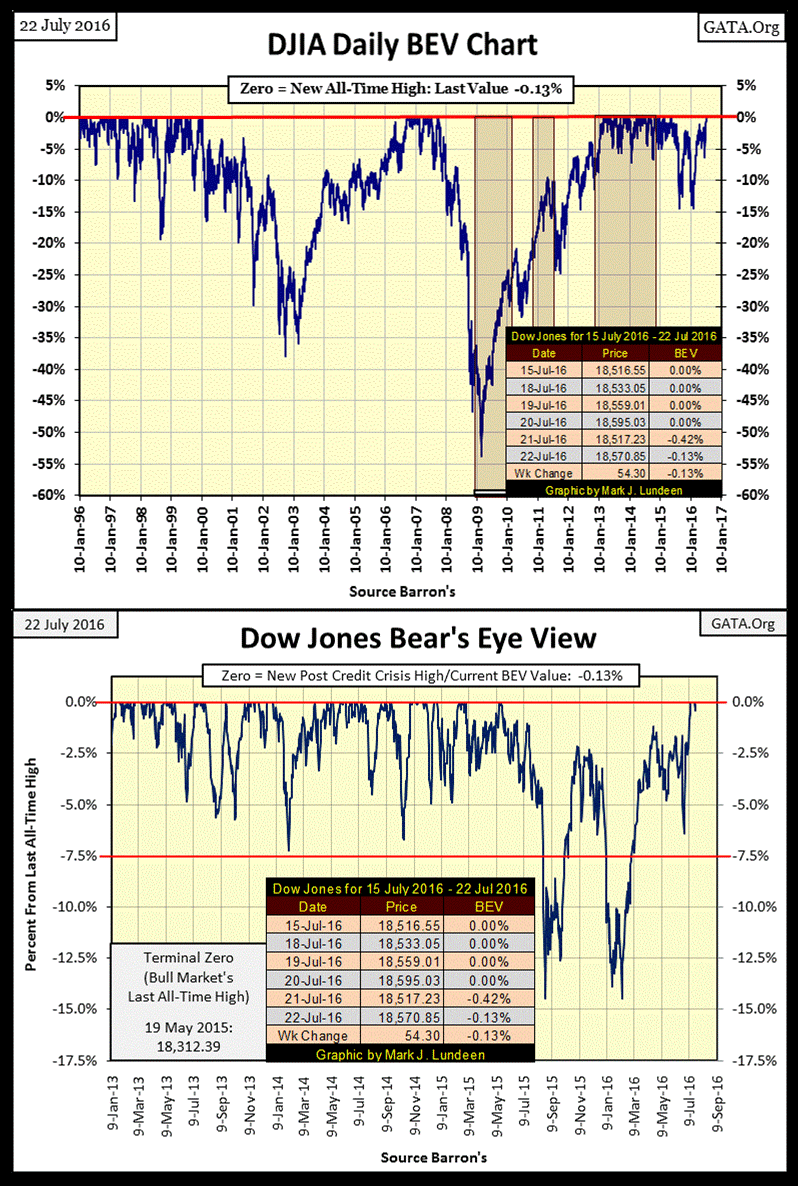
I’ve been away for a few weeks, during which the Dow Jones Index managed to make six consecutive new all-time highs (July 12-20) in the BEV Chart below. It ended the week only 0.13% from making the seventh. I didn’t believe the venerable Dow could do it without a new round of quantitative easing (QE), but it did. In the upper chart of the Dow’s BEV graphic below, the post credit crisis QEs are highlighted, which does much to make my point that the market gains of the past eight years were primarily a monetary event.
So with no new QE, how was it possible for the Dow Jones to go to new all-time highs? I don’t know for sure, but I suspect a large percentage of the public float that once traded daily in New York has been removed from the trading floor by the massive corporative share buyback programs of the past few years. Also, I wouldn’t be surprised if the Federal Reserve itself has been “monetizing” shares of companies contained in the Dow Jones Index and the S&P500, or shares in the big NY banks on market weakness.
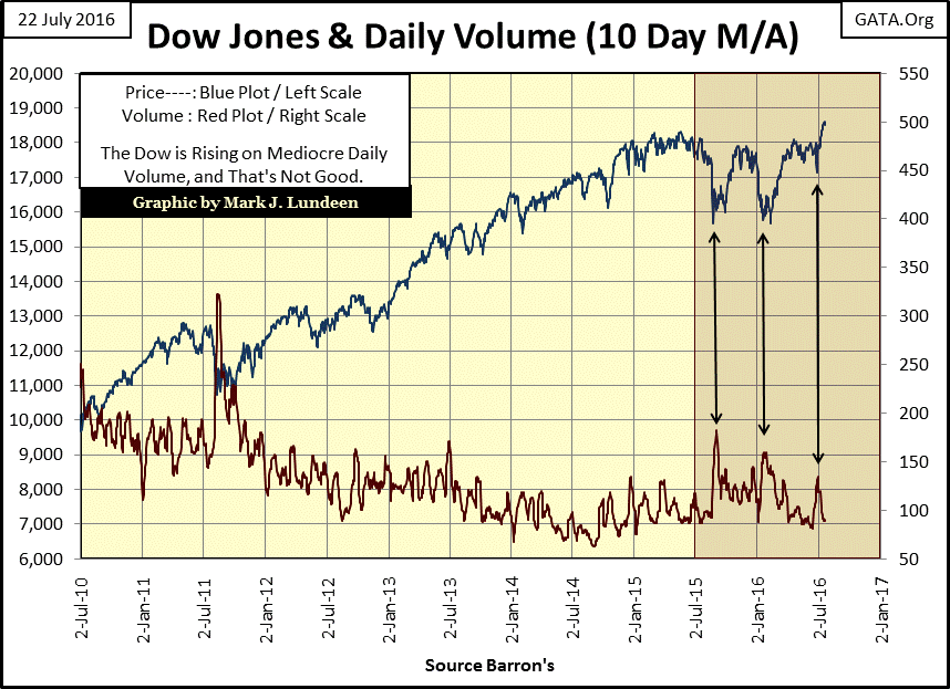
One thing is for certain; the stock market doesn’t behave as it once did; like the oddity of seeing the Dow Jones current advance to new all-time highs on light trading volume (chart below). Since January 2000, the historical relationship between price and volume has been inverted. For the hundred years from January 1900 to 2000, rising prices in the stock market were driven by increase in demand for stocks by investors as seen in expanding trading volume. Declining prices occurred as trading volume contracted, exactly as the law of supply and demand would have it.
But since the high-tech bubble popped in January 2000, as far as the stock market is concerned, economic laws such as the law of supply and demand, no longer apply. I highlighted the last year in the chart below. On each of the three declines, trading volume saw a notable spike, just as it had in August/September 2011. And after the Dow Jones bottomed, trading volume once again contracted as the Dow Jones advanced – bizarre!
Seeing the Dow Jones make its six new all-time highs in the past two weeks as trading volume nears its lows of the past six years is unnatural. But that’s to be expected when a cadre of academics at the FOMC make “monetary policy” that’s basically a price fixing scheme for stocks and bond yields. This is going to end badly, but heck if I know when all this comes crashing down.
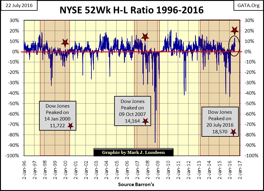
A common complaint of mine for well over a year was how the NYSE 52Wk High-Low Ratio hasn’t managed to break above 10% since the summer of 2014. As you can see below, I can’t complain about that any more.
Maybe I’ll start grumbling about how the NYSE 52Wk H-L Ratio broke above 10% on declining trading volume. All kidding aside, for stock-market bears such as me, these are frustrating times. It’s not just that the more I point out why the Dow Jones should NOT be going up, the higher the Dow Jones goes in spite of my facts, as frustrating as that is. But I know that the methods being employed by the “policy makers” are only temporary fixes, which in the end are going to prove to be catastrophic; such as providing trillions of dollars in funding for corporate buyback programs.
Sure, these programs have been a superb technique to keep the earning per share numbers up as the economy has stalled. That, plus the buyback programs have also been an excellent new source of demand for shares, keeping share prices elevated.
But what happens when the economy goes into a recession, or God forbid a depression, and corporate America has to service the junk bonds it took on to fund those share buybacks? It’s only a matter of time before we all find out, but I’ll give you a hint: we’ll see a Panic in Needle Park when less than best quality bond prices begin to crash, sending bond yields soaring upwards towards double digits.
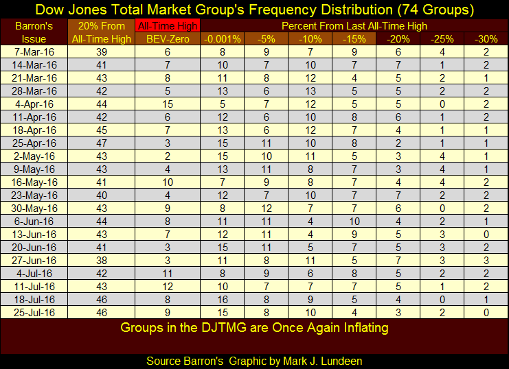
Looking at the Dow Jones Total Market Groups (DJTMG) new all-time highs (upper chart below) and its Top 20 (the number of groups within 20% of making a new all-time high / lower chart below), the stock market is still far from its highs of 2013-14. I can’t see into the future, but presently the attempt to re-inflate the stock market isn’t as successful as I’m sure some at the FOMC would have liked. The major indexes, like the Dow Jones and the S&P 500 are doing well. But the two charts below strongly suggest how finding individual stocks that offer superior profits, capital gains above those seen in the major indexes are hard to come by in today’s market.
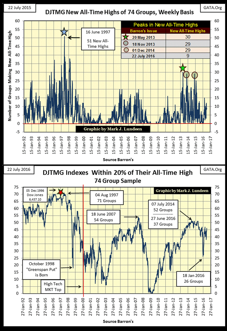
Below is the frequency distribution used in the two charts above. The new all-time high plot is from the BEV –Zero column. The Top 20 data is found in the 20% From All-Time High column; which is the sum of groups found in the BEV Zero to the -15% columns.
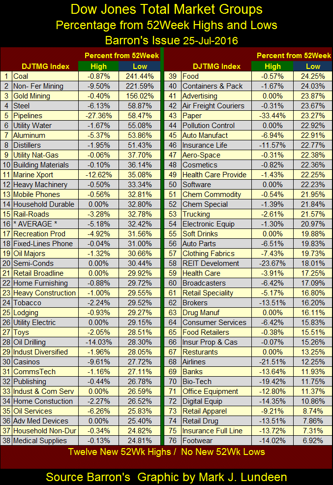
The DJTMG’s 52Wk High and Low standings are shown below. For those who purchased these groups at their 52Wk Lows, the gains so far this year have been excellent. But understand that at 52Wk lows people typically sell, not buy. So, most investors in these groups have not done as well as we see below.
The gold miners (#3) are still advancing. Since Barron’s 18 April 2016 issue (last 15 weeks), the gold miners have made nine new 52Wk Highs, gaining 42% just since mid-April. And where are the banks? Down there at #69. I know there is more money to be made buying investments when they are cheap, and the banks are certainly cheap today. However, I fear that the banks are going to get much cheaper before they offer investors another true buying opportunity.
Summing up my comments on the stock market; even with some of the major market indexes making new all-time highs, most of the individual stocks trading at the NYSE and NASDAQ are for the most part simply holding on. But that isn’t a reason to buy them as you won’t realize capital gains from stocks that do nothing.
The current doldrums in the stock market won’t last forever. However, my guess is that when the current boredom breaks in the market, it will happen on bad news and sharp declines. After all, the current advance began in March 2009; seven years ago. We’re overdue for a significant market decline.
If you’re looking for excitement, with the real possibility for significant capital gains, you’ll find all that and more over at the gold and silver markets. Since COMEX gold open interest (OI / Blue Plot below) bottomed on January 29th of this year, it has almost doubled in the past six months as the “policy makers” have now made three attempts to shake the longs from the market.
The first attempt occurred in March (Star) failed, where they engineered a collapse in OI, without much success in driving the price of gold down (Red Plot). From March to May they once again ran up OI before their second engineered collapse in OI (second star), again without much success in driving down the price of gold. And now in late July, for the third time in 2016, once again we see COMEX gold OI collapsing without much success in driving the price of gold down.
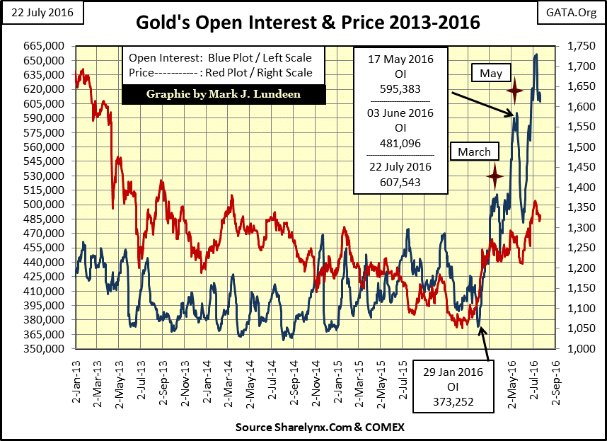
It’s too early for the bulls to claim victory. Still, for the steep decline in OI seen above, I would have thought the “policy makers” would have gotten more of a decline in the price of gold than what we see.
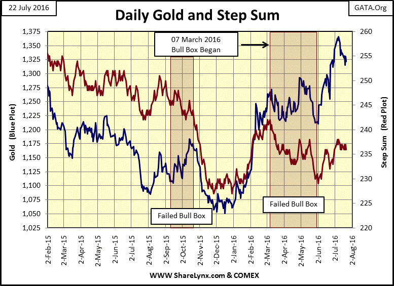
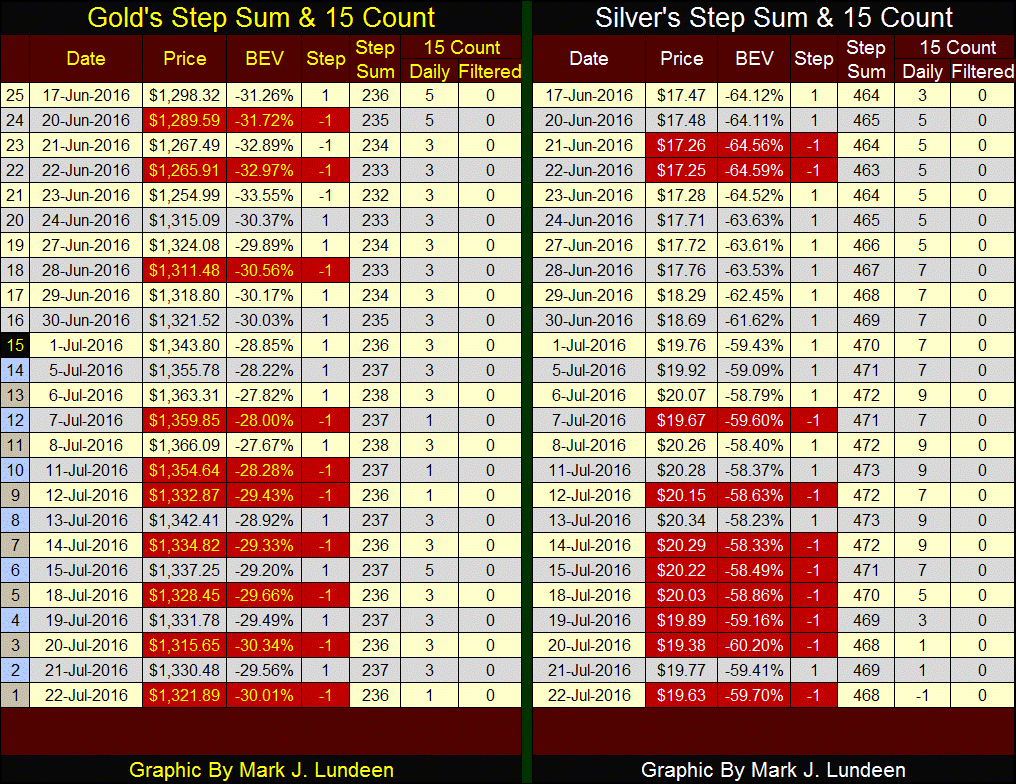
In gold’s step sum chart we have the beginnings of a bear box, with the price of gold declining as its step sum refuses to follow. If this continues that won’t be a plus for the gold bulls, but I don’t take a box seriously until after it has seasoned for more than a month or two, which this one has yet to do.
Looking at gold and silver’s step sum and 15 count table below, since July 6th the bulls have so far shrugged off the many down days, holding on to most of their gains of the past few months. Markets can take only so many up or down days before there’s a counter reaction. Seeing silver’s 15 count go from +9 to a-1 since July 14th , a huge drop of 10 which resulted in only a 3.3% decline in the price of silver, tells me the current down cycle in the continuing bull market for gold and silver has pretty much played itself out. I expect in the weeks ahead we’ll see higher gold and silver prices, with silver hopefully taking out $22 and gold breaking above $1,400.
Gold’s step sum closed the week at 236; exactly where it was twenty five trading days ago. When the price of gold once again begins to advance, a rising step sum will validate the move. But so far its step sum’s high of last March (242) is still in place.
I haven’t covered electrical power consumption (EP) for a few months, making this a good time for an update. Electrical power consumption is just that, the power required to drive the economy from one day to the next. EP is an excellent metric for measuring economic growth (or its contraction), as it’s measured in the kilowatt (KW); an engineering unit that cannot be manipulated by Washington’s statisticians at the Labor Department. The reason for this is simple; calculating EP comes down to a simple law of nature: Ohm’s Law or E=I*R. Where E is voltage, I is the amperage demanded by the electrical grid, and R is the electrical grid’s resistance to the flow of the amperage.
A simple example of EP is as follows: E(120 volts) = I(2 amps) * R(60 ohms). If the demand for electrical power were to double, we would see 120V = 4 amps * 30 ohms. You see, to maintain 120 volts, the utility would have to double the amps as resistance to the flow would be halved by the utility’s customer base demanding more amps at 120V. Engineers and electricians understand what most people don’t about electricity; voltage is cheap. However, to drive current (amperage) down the line you have to burn coal or fuel oil and build infrastructure, and that cost money.
From the stand point of Ohm’s Law, the electrical utility is obligated to maintain the electrical grid’s rated voltage. The grid’s “load” is 100% determined by the utility’s customers. Whenever someone turns on a light bulb, or starts a 500HP electrical motor to drive an assembly line, the utility must send additional amperes down the line if it’s to maintain the grid’s rated voltage. So, it’s easy to understand that when the economy is growing, its demand for EP grows too. When the economy is contracting, its demand for EP contracts like wise.
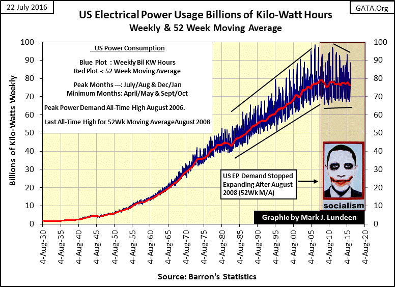
Barron’s has published weekly EP consumption statistics since August 1929. In the chart below the blue plot is the actual weekly data points, the red plot is its 52Wk MA. Before the 1970s, seasonal factors for heating and air conditioning were minimal. After 1970 these seasonal factors became significant as residential and commercial air conditioning became a fact of life for most Americans, and to electrical utilities in all fifty states.
From 1929 to the 1960s, weekly variances in EP were insignificant, as EP was primarily used for industrial and commercial purposes. However after 1970, to filter out the growing seasonal factors in EP, a 52Wk MA is needed to measure actual economic demand; not perfect, but good enough.
Looking at the chart’s red plot (52Wk MA), we see EP’s last all-time high in demand for power occurred eight years ago in August 2008. Also, peak demand for electrical power was ten years ago in August 2006. The summer of 2006 must have been a hot one! Looking at the economy by its demand for electrical power, there has been no economic growth during the entire Obama Presidency.
Below is a Bear’s Eye View of the 52Wk MA for US EP demand (Red Plot above). Let’s take a look at its upper portion for a historical review. During the Great Depression demand for EP contracted by brutal 17.32%. The 1930s also saw a smaller, yet still painful 6.58% economic contraction in 1938.
The next contraction in EP occurred in 1946. But this 8.21% contraction was a result of shutting down American’s production lines to retool factories for peace time production, as tanks were out and automobiles were back in. Interestingly, this second largest decline in EP didn’t come from a post war recession, or so said the editors of Barron’s at the time who were a bit amazed at this.
From 1946 to 1980, except on rare occasions, demand for electrical power saw new all-time highs on a weekly basis. Then a significant contraction in EP occurred during the early years of the Reagan Administration. In the early 1980s as interest rates soared to double digits, EP contracted by 4.12%. It may not look like much, but that 4% reduction in EP caught everyone’s attention!
The popping of the high-tech bubble resulted in a 2.45% contraction in EP in 2002, but then things became weird. Up to this point, all economic contractions in EP formed V shaped declines in the BEV plot. A last all-time high in EP occurred, economic demand for EP then contracts as the recession develops, which ultimately reached a bottom, where demand for EP once again increased to new all-time highs as the economy recovered.
As you can see below, all that changed in August 2008. I believe the major cause for this has been the Federal Reserve’s Zero Interest Rate Policy, which began in December 2008, and the three doses of QE the FOMC had injected into the economy.
Had the “policy makers” allowed Mr Bear to take out the trash from the sub-prime mortgage debacle, I suspect we’d have seen an economic contraction in EP of over 10%. As you see that didn’t happen. However, since 2008 there hasn’t been a real economic recovery either.
Before Mr Bear and his cleanup crew finally pack up and leave, expect a contraction in the demand for EP to go straight down through Mr. Obama’s photo in the chart below.
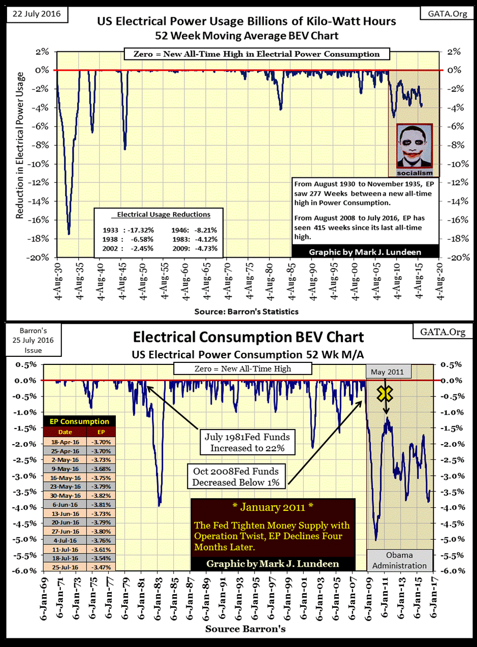
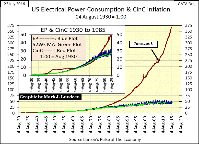
The question these charts beg to be asked is; how can Washington’s statisticians report record levels of economic growth? That’s simple, “economic growth”, as measured by the Labor Department, is measured in dollars, not kilowatts. And as is painfully evident in the chart below, since August 1971 when the dollar was decoupled from the Bretton Woods $35 gold peg, there has been no shortage of “economic growth” (Red Plot) for Washington’s statisticians to measure. Though the growth in the economic demand for EP (Blue & Green Plots), has fallen far behind.
As EP has seasonal factors for heating and air conditioning, its data of summer peaks provides us with impartial observations to confirm or refute claims of “global warming.” In the charts below I’ve plotted the weekly EP data to its 52Wk M/A. There are two seasonal peaks for EP demand. The smaller winter peaks occur near the vertical-grid lines (January), while the summer peaks are found between them. Take a moment to study these charts. As far as the demand for EP to satisfy summer cooling requirements, the data makes a better case for global cooling than warming.
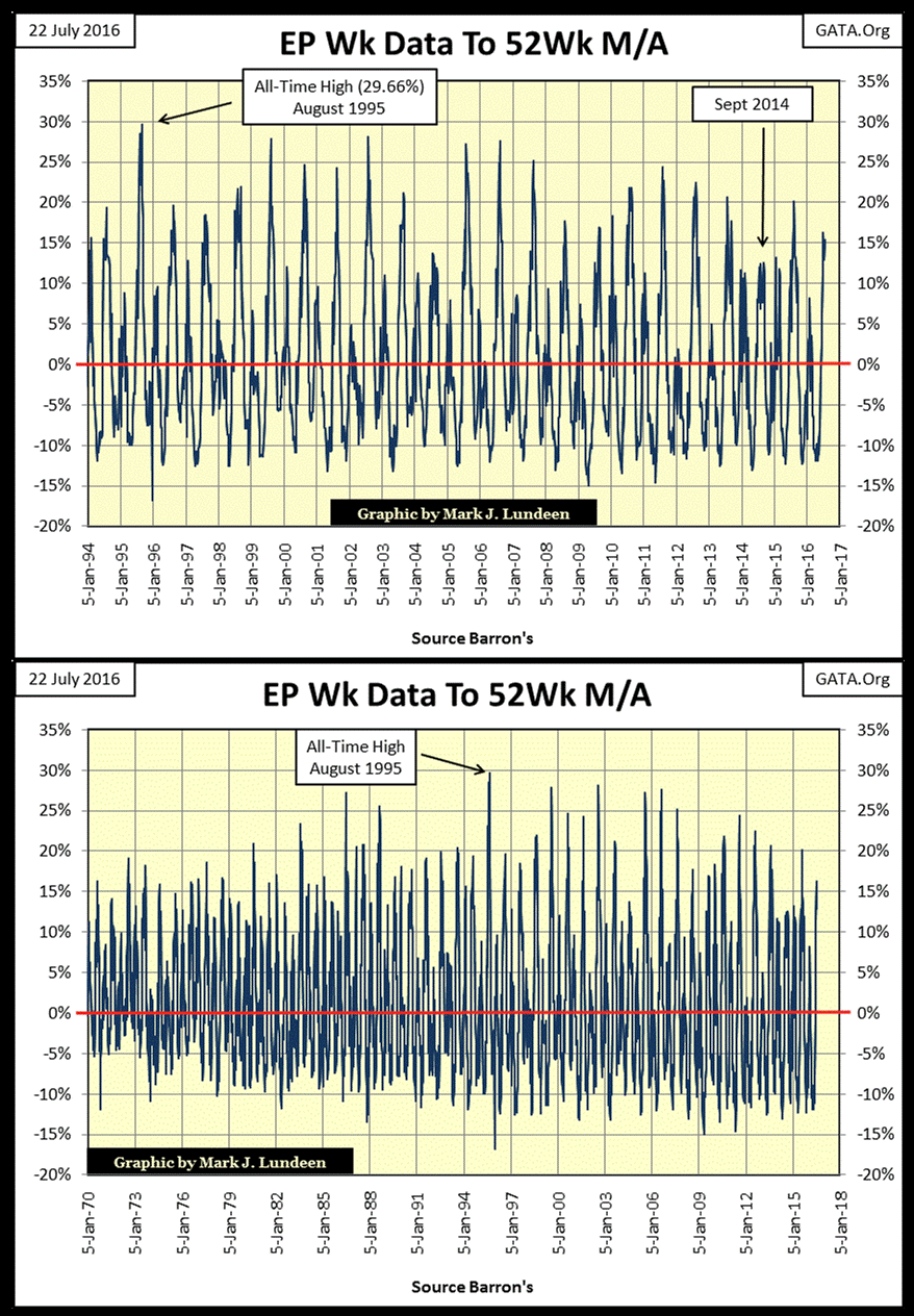
This season’s peak demand for the summer has yet to pass. This should happen sometime before mid-September. Hopefully, the northern hemisphere sees its thermal peak soon, as “scientists” investigating the effects of “global warming” on the Arctic Ocean have gotten stuck in the ice not far north of Murmansk, Russia.
“An expedition to the North Pole intended to measure the effects of global warming ground to a halt this month when the scientist’s ship got blocked by the ice packs near Murmansk, Russia, reports reveal.” - Breitbart / Big Government 21 July 2016
This is embarrassing! And not the first time “scientists” investigating “global warming” have been exposed as gullible dolts. These people only do this because some governmental bureaucracy is funding their research with tax money, but only if the “scientists” objective is to find data to confirm dubious allegations of global warming. Global warming skeptics need not apply for the funds.
********


