Technical Analysis Of The Markets


Current Position of the Market
SPX: Long-term trend – Final long-term phase on the way? How much longer is the question.
Intermediate trend – The trend which started at 2346 could be close to making a final high before another significant correction begins.
Analysis of the short-term trend is done on a daily basis with the help of hourly charts. It is an important adjunct to the analysis of daily and weekly charts which discusses the course of longer market trends.
Alarm Bells?
Market Overview
Erik Hadik (Insiide Track) has probably done more in-depth cycle research than just about anyone. Prior to the September 2018 high, Erik warned that important cycles were peaking and that a severe stock market correction could take place imminently. Those that heeded his warning had much to be thankful for, since the SPX embarked on a three-month, 595-point decline soon after. This is past history and since then, the index has fully recovered its entire loss with a new all-time closing high of 2939.88, last Friday (vs. 2930.75 on 9/20/18). As a moot point, it should be mentioned that the all-time intra-day high of 3940.91 of 9/21/18 has not yet been surpassed! But Erik is again sounding the alarm as he sees the cycles which caused the September-December 2018 decline coming back into play over the next few weeks. With that warning in mind, it may be wise to see if technically, the market is sending a warning as well.
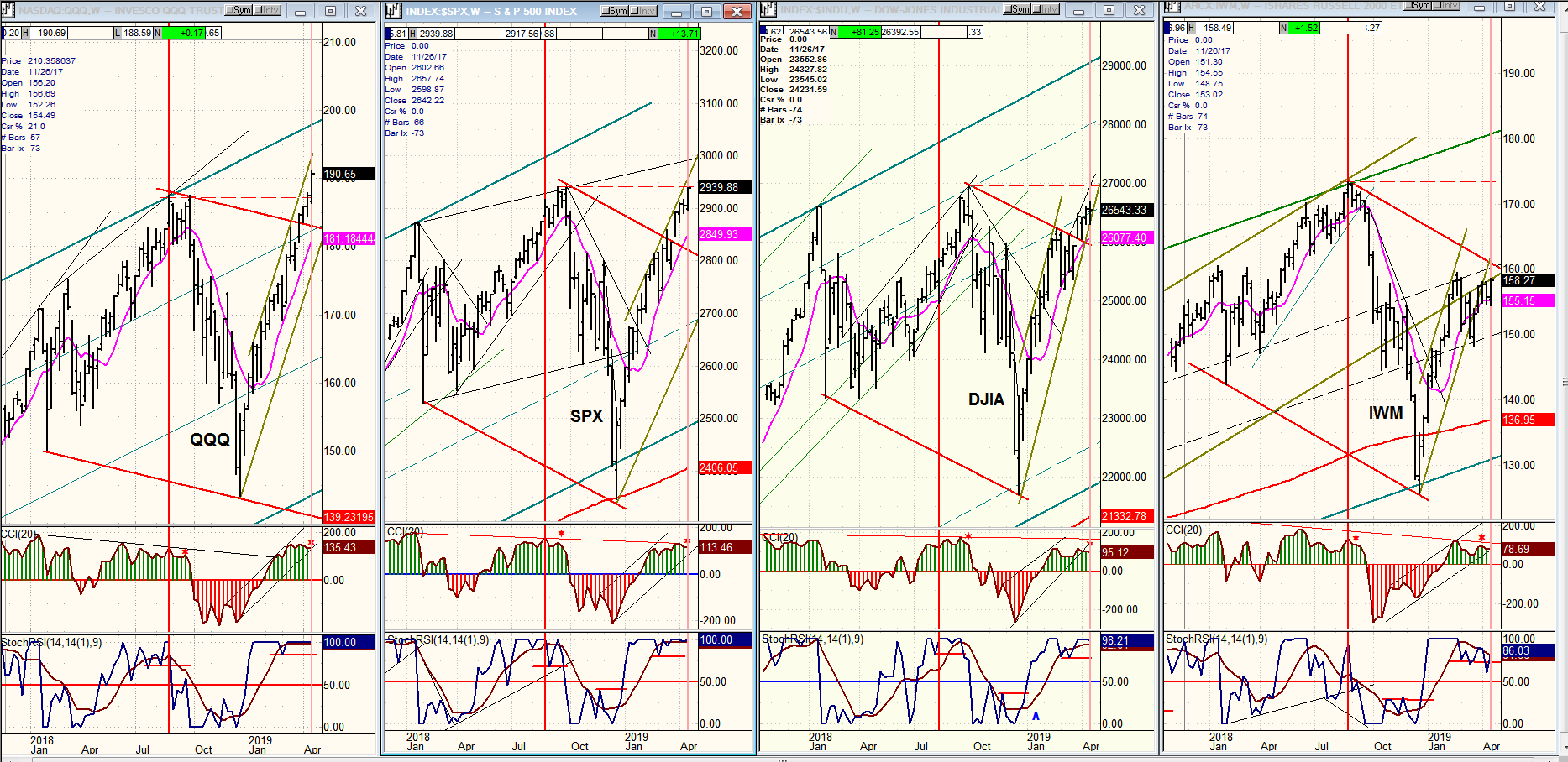
There is one outstanding feature of the current market action which compares favorably with 2018’s and which, by itself, makes Erik’s warning credible. We’ve discussed it before, and it’s well worth pointing out again. It concerns the relative performance of IWM to SPX. Let’s start with that! Below, I have posted weekly charts of QQQ (NDX), SPX, DJIA and IWM (Russell 2000) which are displayed in order of relative weakness.
Chart Analysis (The charts that are shown below are courtesy of QCharts)
QQQ, SPX, DJIA, IWM (weekly)
Are we about to have another severe correction? This is what Erik Hadik is expecting based his cycle analysis. This week’s newsletter looks for evidence that could support his view. We will not find it in fundamental analysis -- such as in the better than expected GDP number which came out Friday morning and which has left many analysts scratching their heads in confusion. But we may find it in technical analysis if the analyst is objectively reading the charts and not using them to bolster his own wishful thinking. In order to get a proper perspective, we should look at price charts involving a time frame which adequately reflects the long-term war being waged between buyers and sellers. This cannot be gleaned from a market chart which only represents a moment in time during which prices are influenced by factors only having a short-term impact. Weekly charts are probably the best suited for this purpose.
Here, we will analyze the weekly charts of four major indexes spanning about fifteen months, with the understanding that these represent the last fifteen months of a bull market trend which started in March 2009 -- one of the longest bull markets in history. To say that the trend is mature would be an understatement. As bull markets age, they tend to bring about larger and larger corrections, as more and more long-term investors sell their positions, and this eventually causes the supply/demand equation to shift the trend from a bull to a bear market. This is obviously a gross over-simplification of the process; but we simply want to point out that larger corrections do take place toward the end of a bull market. We had such a correction at the end of 2018 . Erik Hadik predicted it. Is he going to be right again?
Of the four indexes that we are analyzing, IWM has proven itself to be a good leading indicator for the market top of last September, (as well as for the top in 2007) by peaking ahead of the others. On the charts below, the September price peak for IWM has been marked with a vertical red line. A vertical red line has also been drawn in the other three charts on the same date. From this, we can see that IWM made its high five weeks before SPX and QQQ, and seven weeks before DJIA. Also, by the time the other three indexes made their final highs, IWM was already in full decline. Will we be so fortunate as to get such a clear sell signal again this time?
There is already some good evidence coming from IWM alone that Hadik may be right and that we may be about to have a repeat performance of what happened at the end of last year. From the intermediate low of 12/23, IWM kept up with the others in its recovery but this stopped with the short-term market correction a few weeks ago when both IWM and DJIA pulled back to a larger degree than the other two indexes. Since then, DJIA has managed to continue keeping pace with QQQ and SPX, but not so with IWM which is currently showing much greater relative price weakness than it did at the September top. This is not something that we can ignore.
But there are other technical concerns (besides the fact that DJIA is also underperforming). Some (minor, granted) negative divergence has begun to appear in the CCI oscillators at the weekly level. It is more severe at the daily level, indicating that some sort of correction may be coming in the near-future.
I have drawn channels marking the path of the recovery from their December lows for all four indexes. As of last week, both QQQ and SPX were still pushing against their top channel line while DJIA was flirting with its bottom channel line, and QQQ was already trading completely outside of it. (Note: channel lines vary in what they portray according to the time frame involved, as we will see in the hourly SPX chart, next.) So far, only QQQ has made a decisive new all-time high. SPX may do so next week, but it is not at all certain that DJIA will; and IWM appears to have very little chance of doing so before a correction starts.
So, based on the above, we can say that there is some evidence to support Erik’s view that another important correction may be about to begin, and it behooves us to keep that possibility in the front of our minds as we look for danger signs supporting that view at the near-term time frame.
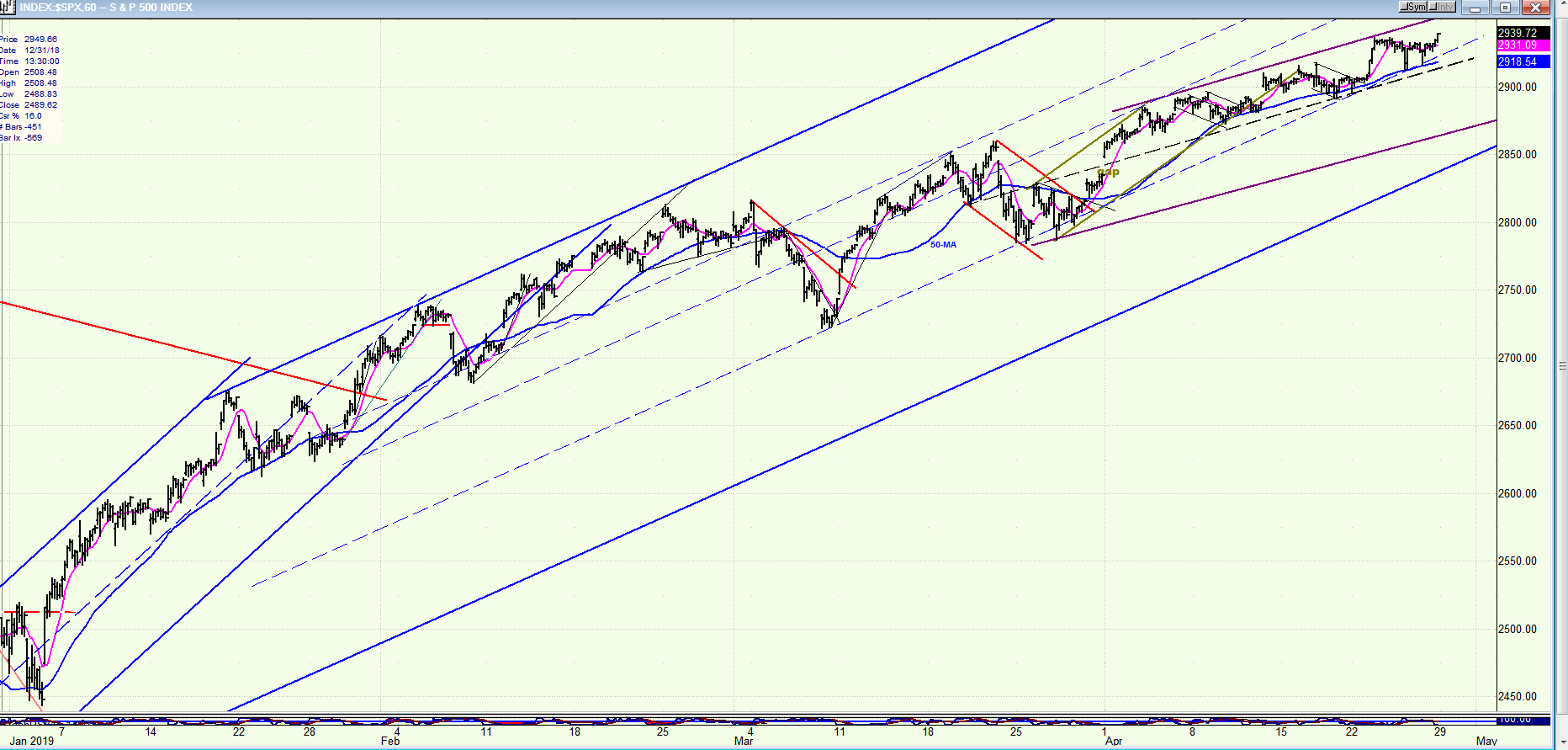
SPX hourly chart
Now that we have spotted some potential (but inconclusive) signs of an important top taking shape at the intermediate-term level, let’s skip over to the hourly chart to see what needs to happen to get confirmation that another intermediate correction is about to start. This 60m SPX chart represents most of the uptrend from 2346, including the most important part which consists of the last few days of trading when the market action becomes more and more significant, and where we should focus our attention.
The heavy blue lines form the channel in which the uptrend is occurring. During the first half, prices hugged the top channel line indicating strong buying interest. About half way through, there was a spell of profit-taking which encouraged renewed buying, but at reduced intensity resulting in deceleration of the trend with prices continuing to rise, but at a less steep angle. Since the end of March, the index has formed a smaller, lateral channel within the longer-term one. This is identified by heavy purple lines and it most likely denotes the final stages of the uptrend from 2346 which has, so far, resisted serious selling.
The first sign of weakness will appear when the dashed line marking the middle of that channel is penetrated to the downside. If the weakness comes gradually, prices will probably find temporary support on the bottom (purple) channel line, and then on the main blue channel line. Currently, the majority of professional traders tends to use the same buy and sell algorithms, so that when these determine that the market is vulnerable to an important correction, the decline does not start gradually but all at once, as it did last September; especially if it is triggered by a news catalyst. Therefore, when SPX begins to trade below the dashed line, it may not remain inside the larger channel line for very long.
My purpose in writing this report is to make you aware of Erik’s warning, and to help uncover the evidence that supports his view. Of course, my subscribers will be the first to be alerted through daily updates if bearish signs begin to materialize.
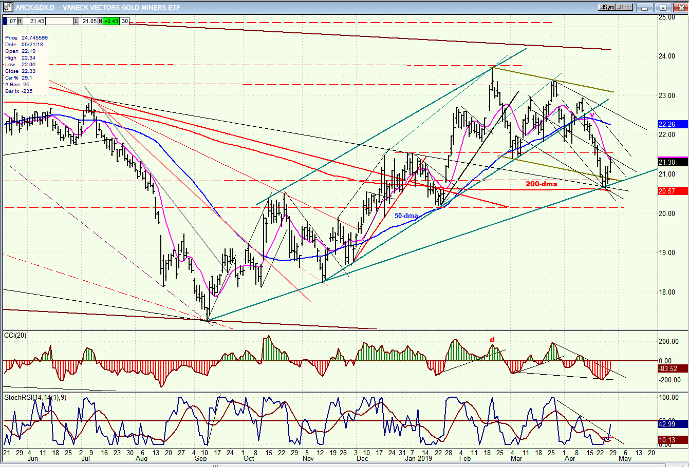
GDX (Gold miners ETF) (daily)
GDX’s correction has come to rest at a good support level composed of several trend and channel lines and its 200-dma from which it has already bounced. The decline retraced just about 50% of the rise from the September low, which is normal for a corrective move. Thus far, there is no sign of longer-term weakness, and if it can remain in this general area for a few more days, it could start to challenge the top of the corrective channel.
Summary
Erik Hadik has, once again, sounded the alarm that, according to his cycle analysis, another important correction could arrive in the next few weeks. This letter looks for technical evidence that supports his view.
Andre
FREE TRIAL SUBSCRIPTON
With a trial subscription, you will have access to the same information that is given to paid subscribers, but for a limited time period. I think you will find that knowing how far a move can carry is one of the most useful benefits of this service, whether you are a trader or an investor -- especially when this price target is confirmed by reliable indicators which give advance warning of a market top or bottom. Furthermore, cycle analysis adds the all- important time element to the above price projections.
For a FREE 4-week trial, further subscription options, payment plans, and for general information, I encourage you to visit my website at www.marketurningpoints.com.
The above comments about the financial markets are based purely on what I consider to be sound technical analysis principles. They represent my own opinion and are not meant to be construed as trading or investment advice, but are offered as an analytical point of view which might be of interest to those who follow stock market cycles and technical analysis.

When Andre Gratian was a stock broker years ago, a friend introduced him to technical analysis of the market. Consequently, it is not an exaggeration to say that Andre fell in love with this approach! Ever since then, it has become an increasingly important part of his professional life. Gratian has studied the works of Wyckoff, Edwards & Magee, Edward J. Dewey (cycles) and many others. However, one of my most profitable undertaking has probably been to study Point & Figure charting, which he finds invaluable in analyzing stocks and indices. If he were restricted to one methodology, this is the one that he would choose. This well-rounded background has given him what he feels to be a special insight into the stock market, facilitating the recognition of meaningful patterns and the ‘turning points’ in all trends, whether they be short or long term. Andre feels very comfortable discussing the stock market and passing on meaningful information to others. His subscribers include individuals and money managers throughout the world. Moreover, his Newsletters are currently published on several financial sites, here and abroad.


