Technical Analysis Of The Markets


SPX: Long-term trend: Severe correction underway.
SPX: Intermediate trend – .618 retracement reached. End of rally likely.
Analysis of the short-term trend is done on a daily basis with the help of hourly charts. It is an important adjunct to the analysis of daily and weekly charts which discuss longer market trends.
MAX. PROJECTION 95-100% COMPLETE – DISTRIBUTION SHOULD START
Market Overview
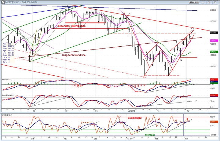
Last week, SPX continued what is ostensibly a countertrend rally, tacking on another 52 points to the uptrend which started at 1810 for a total of 199 points. That performance is not likely to be repeated next week, for the simple reason that, if the maximum total P&F base count prevails, we should be just about done. We will soon find out if this premise is correct because, at the late stage of a rally, this is the time that distribution begins to appear. It may have started on Friday and could take several weeks to complete before the index can resume in earnest its primary trend to the downside.
The structure of the rally is turning out to be an ascending wedge which, besides being close to reaching its full count potential, has also retraced .618 of the previous decline from 2116, another reason to expect the rally to come to an end at this time.
Since this powerful rally has put the main indexes in a strong short-term uptrend, there is no visible confirmation that it is ending except, perhaps, some early signs from a least likely source: the strongest index of the bull market, the NDX, which has closed unchanged for the past four days while prices kept climbing in the SPX and DJIA.
SPX Chart Analysis
Daily chart (This chart, and others below, are courtesy of QCharts.com.)
Another sign that the rally is coming to an end is that the resulting wedge pattern was penetrated to the upside (overthrow) on Friday. Normally, this is the end of the move; a form of ending climax – providing, of course, that we don’t keep climbing out of it, but start to retrace immediately. If we do that on Monday, it will be additional proof that the rally has ended. It would be ideal if we were to reverse from here and start a new downtrend. A new trend line could then be drawn at a steeper angle than the primary one, suggesting that the bearish trend is accelerating. But we are getting ahead of ourselves! First, let’s see if a top is being created and prices beginning to decline.
Besides the reasons stated for a top at this level, note that prices have reached some overhead resistance which should increase if they try to go higher. In that case, the index would also have to deal with the primary downtrend line. It goes without saying that if prices continue to rise above the trend line after only a short and shallow pull-back, this analysis will have to be revised. But it is unlikely since we have a fairly clear a-b-c corrective pattern with the “c” wave just about matching wave “a” in size. I don’t see how one could transform this pattern into an impulse wave, which is what would be needed to regard this move as the onset of a new uptrend.
Because of the steepness of the move, the MACD has not had a chance to form negative divergence (except in its histogram), and neither has the SRSI. Its flat top is because 100 is as high as it can go. The A/D indicator, however, shows that the “c” wave of the price move is being matched by an almost flat pattern in breadth. Plenty of negative divergence here!
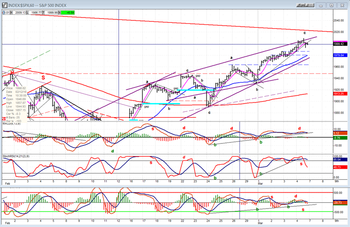
Hourly Chart
The hourly chart also clearly shows a wedge pattern with the index making a brief excursion outside of its top trend line on Friday, followed by an immediate reversal which is not yet conclusive. However, if we do reverse from here, the blue dashed trend lines should determine where the index could find temporary support on its way to challenging the lower uptrend line. Better support will be found at the red dashed trend line which has stronger support points. Bounces and rallies from those levels would contribute to making the necessary distribution pattern which would, when complete, tell us how much of a total decline we can expect. The final confirmation that we are resuming the primary trend will, of course, come when we break below 1810.
The chart shows that the minor (thin) trend line from “b” has already been breached, with SPX closing slightly below on Friday. That may be enough to bring sellers on Monday morning. We will certainly need more than this slight penetration to cinch a reversal.
Looking at the indicators, SRSI and the A/Ds have already given a sell signal. So has the MACD but only barely and not really visible unless you enlarge the chart. With sell signals coming after negative divergence appeared on the two outside indicators, this increases the odds of extending the reversal on Monday.
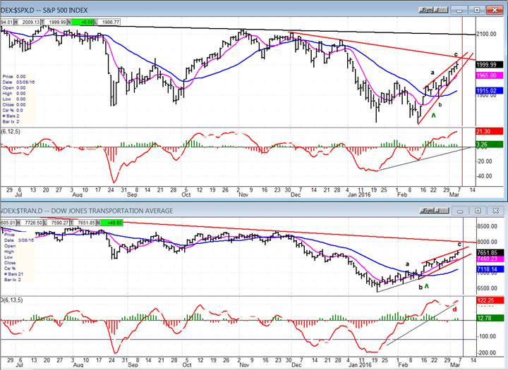
SPX vs. TRAN (Dow Jones Transportation Average)
The TRAN started its rally a full minor phase ahead of the SPX, thereby warning of a potential reversal in the market after the next decline. Because of the rally, it has now made a corrective a-b-c pattern twice the length of SPX. The “c” pattern of the TRAN is also in the form of a wedge, practically matching the SPX tick for tick. Thus, it has gone from being stronger than SPX, to being in lockstep with it. Does that mean that we now have to wait for it to show relative weakness to SPX before we can be assured that a decline is coming? Not necessarily, but all the better if it does.
Actually, some negative divergence is showing in the TRAN MACD while in the SPX, it only does in its histogram.
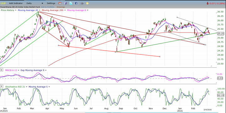
UUP (Dollar ETF)
Does UUP have one more leg down before breaking out, or is it ready to do so now – if it holds on the 200DMA and the extension of the green trend line? Should know, soon!
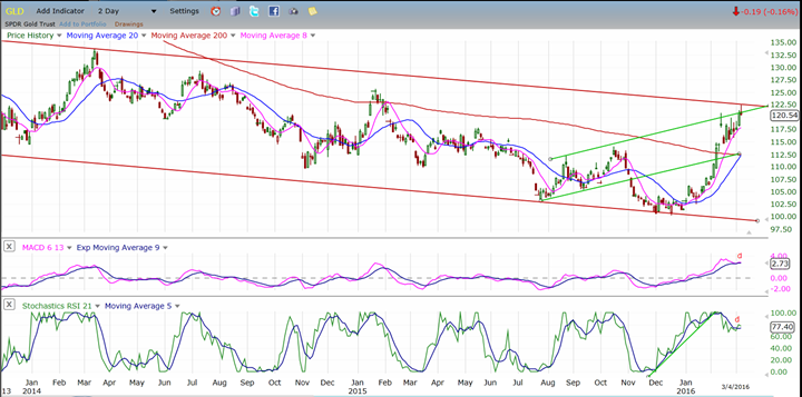
GLD (SPDR Gold Trust)
GLD tried to extend its move over the last couple of days but hit the overhead channel line and pulled back. The indicators both show negative divergence -- a warning that it may not succeed in the near future. Let’s give it a couple of days. On the P&F chart, the channel line comes a couple of points higher, giving it a little more leeway.
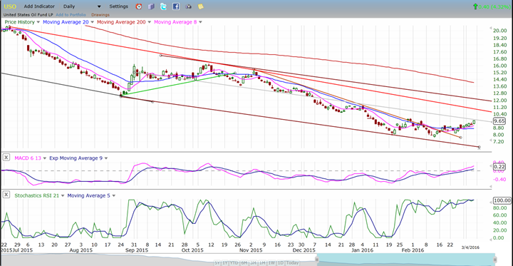
USO (US Oil Trust)
SPX and oil may be in the process of decoupling and it may now be a case of oil going with the market instead of the market following oil. USO is trying to get past its former near-term high, but may find resistance at the mid-trend line of its declining channel. Should it go through, it will meet more resistance at the red downtrend line. SRSI, however is extremely overbought and may need to correct, first. Also, the structure looks like a shallow corrective pattern at this time.
Summary
SPX has either reached its maximum P&F count potential from the base which formed across the 1842 level, or is very close to doing so. If it has, distribution should begin to appear although, in the case of wedge formations, a reversal often quickly extends to the point of origin (1810).
Cycles also make this an ideal time for a reversal to occur.
The hourly indicators suggest that the correction might actually have started on Friday. Let’s see if our interpretation is correct…
********
FREE TRIAL SUBSCRIPTON
Market Turning Points is an uncommonly dependable, reasonably priced service providing intra-day market updates, a daily Market Summary, and detailed weekend reports. It is ideally suited to traders, but it can also be valuable to investors since highly accurate longer-term price projections are provided using Point & Figure analysis and Fibonacci projections. Best-time reversal estimates are obtained from cycle analysis.
For a FREE 4-week trial, send an email to: [email protected]
For further subscription options, payment plans, weekly newsletters, and for general information, I encourage you to visit my website at www.marketurningpoints.com. By clicking on "Free Newsletter" you can get a preview of the latest newsletter which is normally posted on Sunday afternoon (unless it happens to be a 3-day weekend in which case it could be posted on Monday).
The above comments and those made in the daily updates and the Market Summary about the financial markets are based purely on what I consider to be sound technical analysis principles. They represent my own opinion and are not meant to be construed as trading or investment advice, but are offered as an analytical point f view which might be of interest to those who follow stock market cycles and technical analysis.

When Andre Gratian was a stock broker years ago, a friend introduced him to technical analysis of the market. Consequently, it is not an exaggeration to say that Andre fell in love with this approach! Ever since then, it has become an increasingly important part of his professional life. Gratian has studied the works of Wyckoff, Edwards & Magee, Edward J. Dewey (cycles) and many others. However, one of my most profitable undertaking has probably been to study Point & Figure charting, which he finds invaluable in analyzing stocks and indices. If he were restricted to one methodology, this is the one that he would choose. This well-rounded background has given him what he feels to be a special insight into the stock market, facilitating the recognition of meaningful patterns and the ‘turning points’ in all trends, whether they be short or long term. Andre feels very comfortable discussing the stock market and passing on meaningful information to others. His subscribers include individuals and money managers throughout the world. Moreover, his Newsletters are currently published on several financial sites, here and abroad.


