Technical Analysis Of The Markets


Current Position Of The Market
SPX Long-Term Trend: If the market strength persists, the long-term trend may need to be re-evaluated.
SPX Intermediate trend: SPX intermediate P&F count to 2300 is still possible before a reversal occurs.
Analysis of the short-term trend is done on a daily-basis with the help of hourly charts. It is an important adjunct to the analysis of daily and weekly charts which discuss longer market trends.
Is 20,000 A Bridge Too Far?
Market Overview
On 1/06, the Dow Index reached 19,999.63 and started correcting. Last Thursday it got down to 19,678, but had a good bounce on Friday. However, time is running short to reach the magic number; as it is for SPX to reach 2300, especially with a minor cycle low due in early February. There could be an intervening high before then, but if it comes on Monday, we could see a short-term decline taking hold for the next two weeks and, if SPX drops below 2230 over that time frame, we may have missed our chance to print 20,000 DJIA and 2300 SPX!
Intermediate cycles are topping and are expected to pressure the market into April, so we may be witnessing the high point of the bull market; although, if this decline is not too severe, there may be one more and final opportunity after the April low. The amount of distribution which has taken place over the past month is already enough to generate a downtrend of at least 100 SPX points. That would not guarantee a long-term reversal, but if we fail to make a new high on the next rally, this is when things could become really negative! The monthly money flow indicator (a volume-weighted version of the RSI) has correctly called the past two bull market peaks (in 2000 and 2007). Today, its divergence with the SPX is far worse than it was at the previous peaks. In addition, geopolitical storm clouds are gathering over some of the world’s largest economies: Europe, China and Russia. (See article by George Freeman on the Market Oracle)
Analysis (This chart and others below, are courtesy of QCharts.com.)
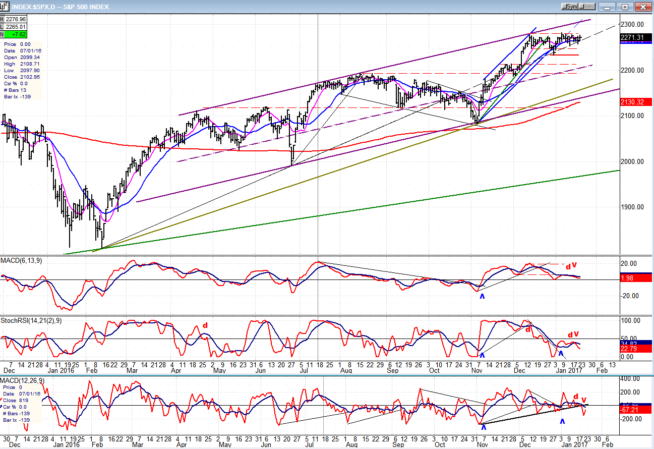
Daily Chart
The move from 1810 looks like a wedge or, if you will, an ending diagonal, which is a bearish pattern. A characteristic of a wedge is that it normally retraces down to the start of the formation so, if the uptrend does not regain its upside momentum soon, it will roll over and probably initially challenge the uptrend line which is currently at about 2160 and runs in approximation with the 200-DMA.
The index has traded in a narrow range for the past month and is probably forming a distribution pattern which is very similar to what it did at the last August short-term top. When the sellers finally overwhelm the buyers, the result will be the same as it was then, except that the decline may be steeper because 1) the index is even more overbought this time, and 2) because the intermediate and long-term cycles which are turning down are even more advanced and should apply more downward pressure.
The price trend which started at 2084 evolved into a channel which was breached when SPX retraced to 2234 (horizontal red line). The rally tried to hold within the channel line for a few days but gave up as the trend turned sideways, forming either a consolidation pattern to move higher (2300?), or preparing to roll over and start a decline. The extension of the original trend line across 1810 and the Brexit low (1992) seems to have provided support for prices over the past couple of weeks. A downward penetration of that dashed trend line would most likely start a reversal, and if prices drop below the red horizontal line, an intermediate correction will be on its way.
All three oscillators are showing increasing weakness. They have turned down after showing the negative divergence which was lacking at their former peak, and have made bearish crosses in their MAs. The lower two attempted to develop an uptrend, but the MACD never did give a buy signal. It did find support on the zero line on the first pull-back, but it looks ready to drop below, this time. In other words, all three oscillators, unless they are rescued by an immediate strong wave of buying, are currently screaming “sell”.
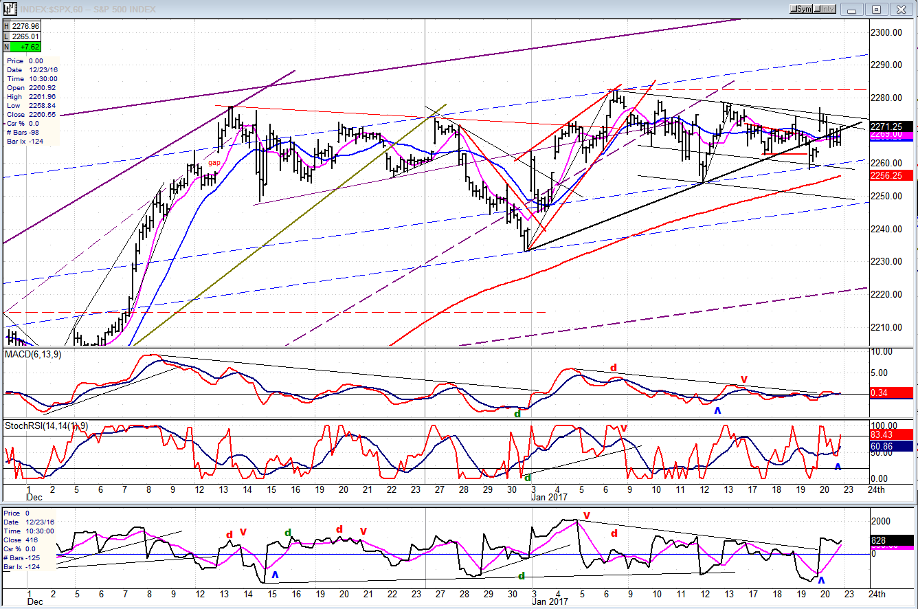
Hourly Chart
The (assumed) distribution pattern of the past month is shown in greater detail on the 60m chart. The dashed blue lines are parallels to the top purple line which itself, is the top of the wedge discussed earlier. They provide points of support and resistance to the near-term moves. The lower, heavier dashed purple line is also a parallel to the top one and is the mid-channel line of a lateral channel which has the Brexit low as an anchor point for its lower trend line (see daily chart). That pattern may turn out to be an important analytical tool for the price action of the next few weeks.
Getting back to the hourly chart, the minor black uptrend line was breached on Thursday, but prices recovered enough on Friday to suggest that the index is getting ready for another small push upward. There is a 15-day cycle due on Monday, and if it turns out to be a high, we could be looking at a decline into the first week of February starting Tuesday -- unless that cycle inverts and becomes a low. If that’s the case, we could still get up to 22,000 and 2300.
The oscillators have turned up but, as you can see, there has been a great deal of volatility lately, even intra-day. Monday’s action is key to the entire week.
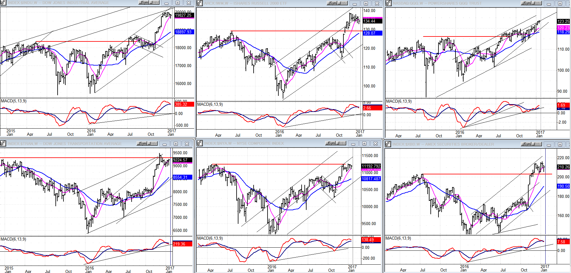
An Overview Of Some Major Indexes (Weekly Charts)
It was another week of consolidation/topping behavior in all indices shown below, except for the QQQ (top right) which made a marginal new high. However, it is still one of the weakest since it is playing catch-up to the others and its MACD continues to show significant negative divergence. Also, the current uptrend is in the form of an ending diagonal. It is noteworthy that both the TRAN and NYA (bottom left) have, so far, failed to overcome their previous highs. The total picture is that of a market whose rally has run out of steam and may be about to reverse.
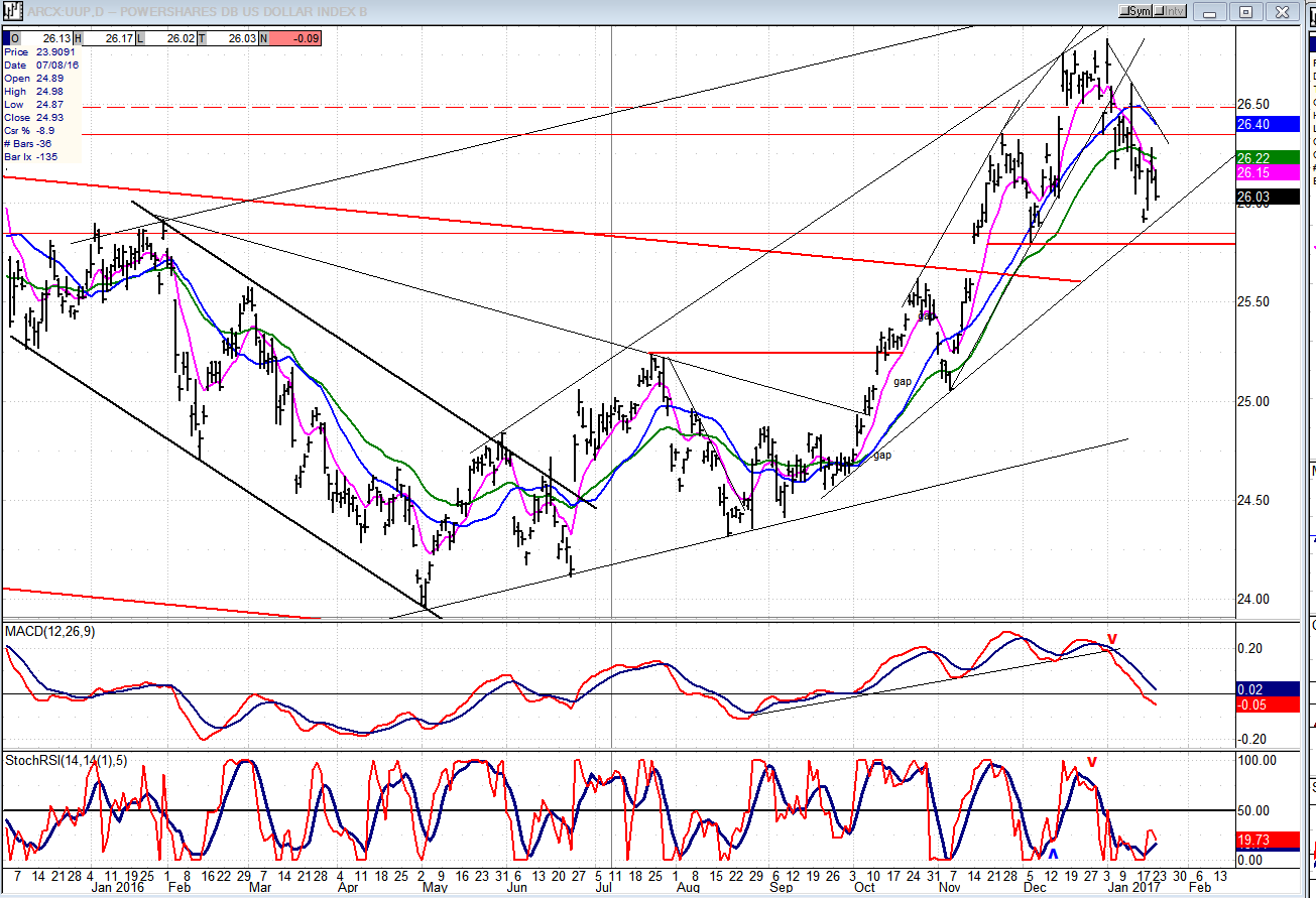
UUP (Dollar ETF)
UUP continues to pull-back from its recent multi-year high and appears to have found support on its intermediate-trend line. This is a strong support level since it incorporates several price peaks made in 2015. Continuing to decline below the horizontal red line could turn out to be an important reversal.
GDX (Gold Miners ETF)
GDX appears to be ending its break-out wave with a small ending diagonal. If that’s the case, it should remain below the trend line drawn across the tops or, if it penetrates it, should pull back immediately. Failure to do so would be an extension of the uptrend.
Both indicators are on the verge of giving a sell signal which would be confirmed by a close below 22.00
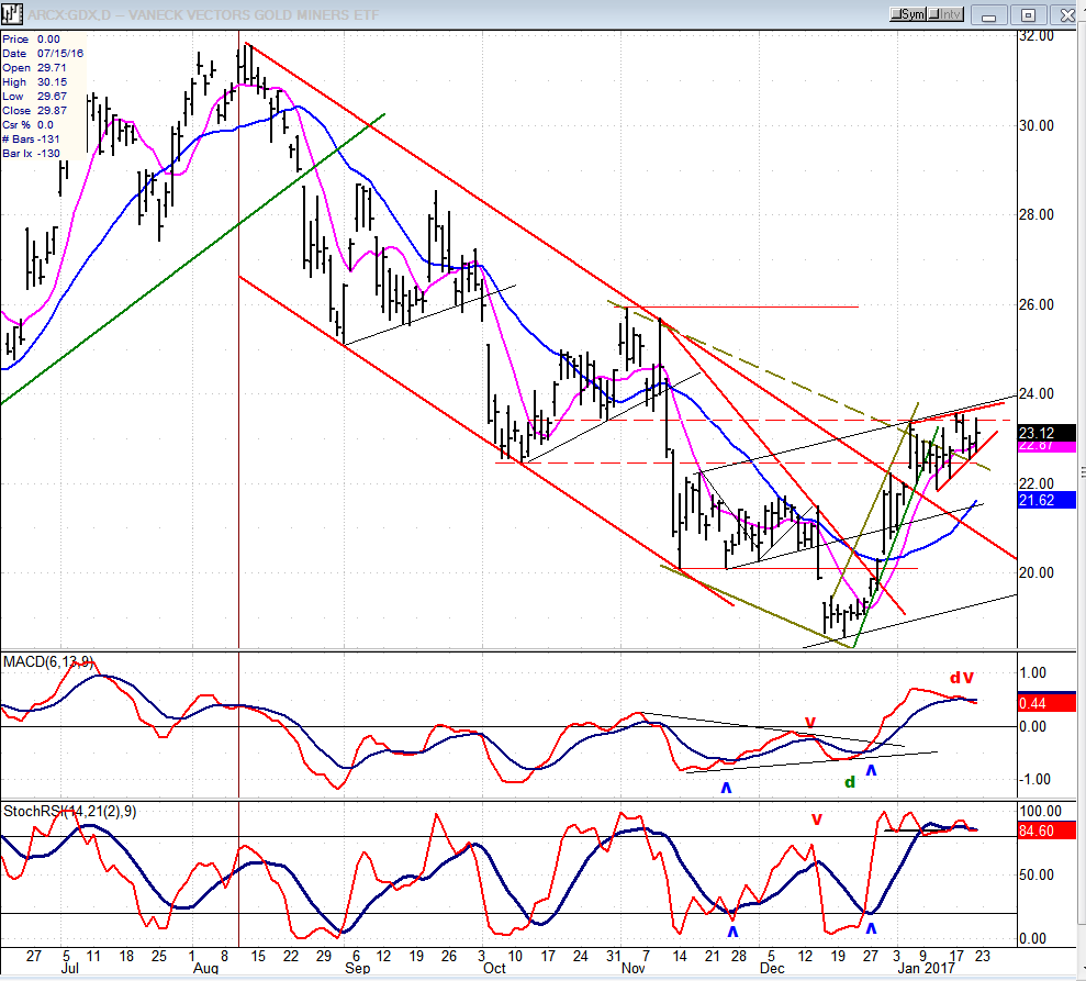
Note: GDX is now updated for subscribers throughout the day, along with SPX.
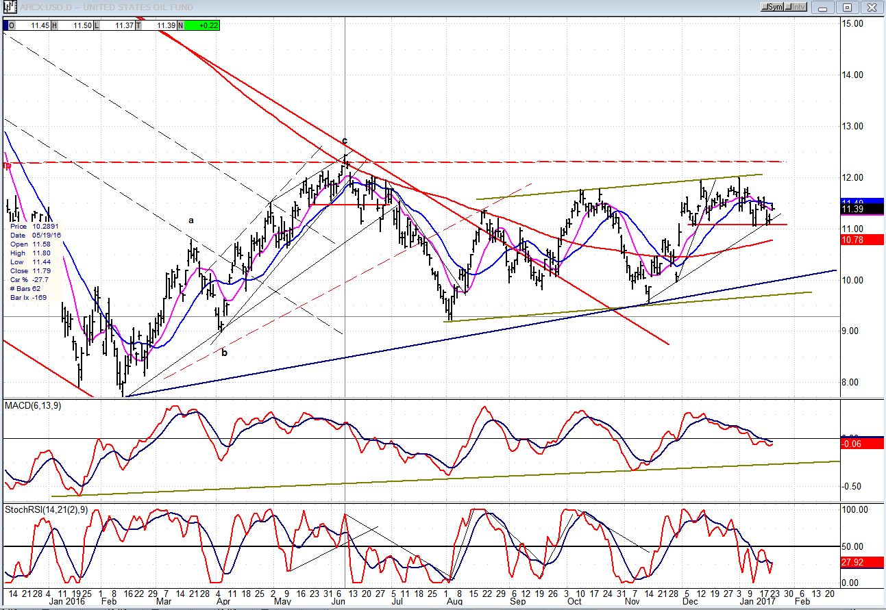
USO (US Oil Fund)
USO continues to hold on to its short-term support. Breaking it would entail a return to the major trend line.
Summary
Last week was not decisive since SPX continued to trade in a narrow, volatile range. The coming one should be if on Monday we rally into a 15-day cycle top and reverse on Tuesday without having reached the ultimate 2300 projection. In that case, we could continue to decline into early February.
On the other hand, a low on Monday would muddy the trend pattern, perhaps for the entire week, but could provide an opportunity for SPX to reach 2300.
********
For a FREE 4-week trial, send an email to [email protected], or go to www.marketurningpoints.com and click on “subscribe”. There, you will also find subscription options, payment plans, weekly newsletters, and general information. By clicking on "Free Newsletter" you can get a preview of the latest newsletter which is normally posted on Sunday afternoon (unless it happens to be a 3-day weekend, in which case it could be posted on Monday).
The above comments and those made in the daily updates and the Market Summary about the financial markets are based purely on what I consider to be sound technical analysis principles. They represent my own opinion and are not meant to be construed as trading or investment advice, but are offered as an analytical point f view which might be of interest to those who follow stock market cycles and technical analysis.

When Andre Gratian was a stock broker years ago, a friend introduced him to technical analysis of the market. Consequently, it is not an exaggeration to say that Andre fell in love with this approach! Ever since then, it has become an increasingly important part of his professional life. Gratian has studied the works of Wyckoff, Edwards & Magee, Edward J. Dewey (cycles) and many others. However, one of my most profitable undertaking has probably been to study Point & Figure charting, which he finds invaluable in analyzing stocks and indices. If he were restricted to one methodology, this is the one that he would choose. This well-rounded background has given him what he feels to be a special insight into the stock market, facilitating the recognition of meaningful patterns and the ‘turning points’ in all trends, whether they be short or long term. Andre feels very comfortable discussing the stock market and passing on meaningful information to others. His subscribers include individuals and money managers throughout the world. Moreover, his Newsletters are currently published on several financial sites, here and abroad.


