VIX - Markets Set To Get Volatile!


With the stock market edging up with nary a decent pullback in yonks, I thought it timely to investigate the Volatility Index (VIX). Let’s commence proceedings by looking at the daily chart.
VIX DAILY CHART
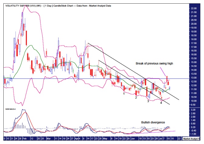
We can see a downtrend has been in force the last few months. I have added a Moving Average Convergence Divergence (MACD) indicator and it can be seen that a bullish divergence has formed with the last four, no less, consecutive lows. That fourth low sure looks like it was the final flush out of sellers. Also, the red line is currently below the blue line which generally signifies rising prices.
I have drawn a couple of black down trending lines with the higher trend line recently being broken. This appears to be signalling a trend change is in progress. Add to that a few days ago price rose up to break the previous swing high which is denoted by the horizontal line. A close above that level of 12.89 would surely signify this is ready to rock n roll to the upside.
I have added some Bollinger Bands and price can be seen to be toing and froing recently between the higher and lower bands. Another sign of a trend change in progress. The candle that broke the previous swing high traded well outside of the upper band so a move back down, a la regression to the mean, is no surprise.
Let’s have a look at the weekly chart to see what it reaps.
VIX WEEKLY CHART
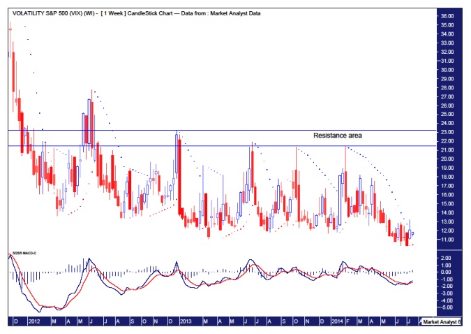
That weekly red candle of a couple of weeks ago which closed near its lows really looks to have exhausted the selling. The fact that there was no follow through to the downside after that is a bullish development.
Now once again I have added a MACD indicator and what is revealing is the crossing of the two averages last week. As long as the red line stays below the blue we can expect upward movement.
I have also added the Parabolic Stop and Reverse (PSAR) indicator and what is interesting is the breaking of the dots to the upside last week. The PSAR this week is currently at 10.43 so as long as the VIX stays above that level in any pullback then more upside can be expected going forward.
Finally, I have drawn a couple of horizontal lines denoting resistance. The first line is along the triple tops set in June 2013, October 2013 and February 2014. If price does indeed start to head up from here, then price could be expected to smash that triple top because, as Gann noted, fourth attempts at support or resistance are generally successful. A failure to break that resistance would be very bearish but that is the unlikely scenario in my opinion. And if price does indeed bust higher then it is long odds on that the resistance level from the December 2012 top would be busted in short order. Put simply, if this resistance area is broken then the floodgates will really open up to the upside.
Now let’s looks at the monthly chart.
VIX MONTHLY CHART
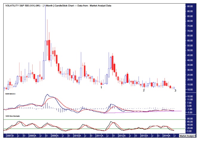
The MACD has been revealing in both the daily and weekly analysis and we can also include the monthly. A bullish divergence has formed with each of the last three consecutive lows in the VIX. Also the Stochastic Indicator is currently quite low and looking ready to turn back up. So perhaps we could surmise that the month of July looks set to witness a nice reversal back to the upside.
Now let’s take a quick look at the Dow Jones Industrial Index and the UK stock market, the Footsie. Let’s start with the Dow.
DOW DAILY CHART
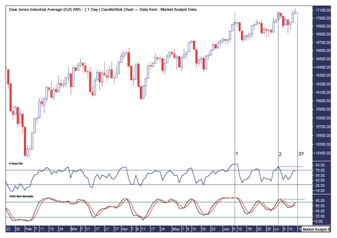
I have drawn three black vertical lines on this Dow daily chart and numbered them 1 which refers to the 9th June top, 2 which refers to the 3rd July top and 3? which refers to the next Bradley Model turn date of 16th July. We are right in the zone now with price heading up into this turn date. Combine this fact with the two other indicators I have added, the Relative Strength Indicator (RSI) and the Stochastic Indicator which are both showing bearish divergences. If we get a top now then both indicators will most likely show triple bearish divergences. A bearish sign indeed!
DOW WEEKLY CHART
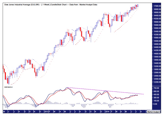
The Dow has made new weekly highs this week. But it looks on shaky ground. I have added a MACD indicator which shows a triple bearish divergence setting up with this latest high. And the averages look just about ready to cross over, quite possibly this week. So perhaps we get a big reversal this week with the week ending in negative territory and hence a cross over in the averages signifying the next likely significant movement in prices to be down.
And perhaps we could surmise that this new weekly high in the Dow to be accompanied by a higher low in the VIX. Something to keep in mind anyway.
FOOTSIE DAILY CHART
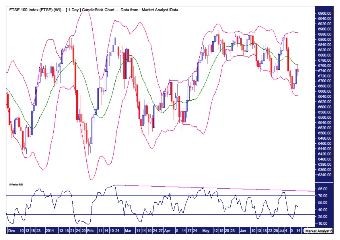
I have been predicting one last final top in the Footsie between the recent high of 6895 and the 1999 high of 6951. Since my last report price went up and hit a high of 6875 on the 4th July. As Maxwell Smart would say, “missed it by that much”. The toing and froing between the upper and lower Bollinger Bands suggest a trend change is in progress. This last move back down to the lower band looks ominous and the uptrend may now be done.
The RSI is showing weaker readings at each consecutive high and I wouldn’t want to see the down trending line drawn across tops to be broken in this current run up.
FOOTSIE WEEKLY CHART
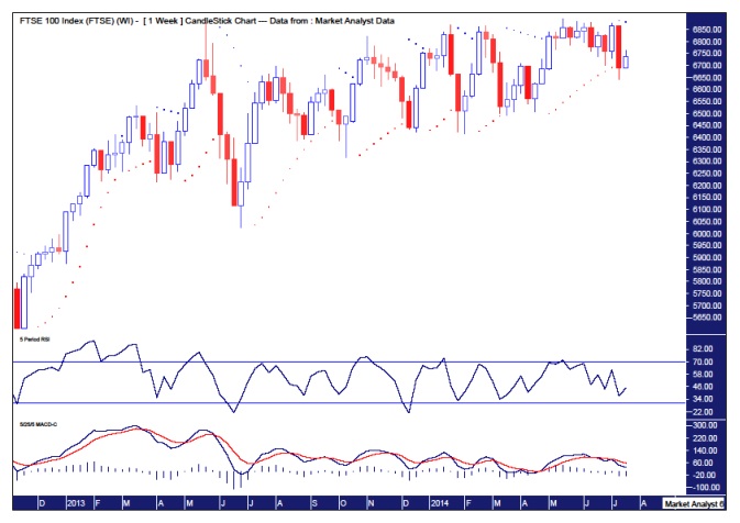
The weekly chart of the Footsie also suggests the uptrend is complete. The recent move down last week did enough damage to break the PSAR dots to the downside. The dots to the upside this week are currently at 6882 so price is unlikely to trade above there in my opinion.
I have added a RSI really just to show the weak position the Footsie is in. Also, the MACD currently shows the red line above the blue signifying lower prices are likely.
So both the Dow and the Footsie are currently looking very shaky. And the VIX looks ready to rumble. A brutal combination one might surmise! See you on the other side.
More from Gold-Eagle


